
Cinematic Portrait Photography Techniques: Creating Depth with Backdrops (2026)
Posted on Jun. 11, 2026
There is a moment, early in the afternoon, when north-facing studio light drops to its warmest angle and a hand-painted canvas backdrop reveals its full topography. The brushstrokes cast their own micro-shadows. The layered pigment shifts from cool undertone to warm surface tone. The backdrop stops being a background and becomes a presence in the frame.
This is what hand-painted canvas does that no other surface material can: it responds to light the way a painting in a gallery responds to light. Directionally. Dimensionally. With depth that changes as the source moves. When you shoot a cinematic portrait at f/1.4 against a hand-painted canvas backdrop, the shallow depth of field does not flatten the background into a featureless wash. Instead, the tonal variations in the pigment create what we call painterly bokeh: a dimensional field of color that reads like brushwork even when it is optically blurred. This is the foundation of cinematic portrait photography with backdrops that carry real depth. The backdrop is not decorative. It is part of the visual language you are building with every frame.

The OLIVINE backdrop behind this bride isn't a wall. It's a hand-painted canvas that absorbs light, holds texture at every aperture, and makes every frame feel like a painting. That's the difference Chasing Stone makes.
Why Canvas Texture Creates Cinematic Depth That Flat Surfaces Cannot
The difference between a cinematic portrait and a snapshot is often not the lens, the lighting, or the skill of the photographer. It is the surface behind the subject.
Canvas absorbs light. Vinyl reflects it. This is not poetry. This is physics. When studio light hits a vinyl backdrop, the light bounces back toward the camera, creating hot spots and flattening the tonal range of the image. The background reads as a two-dimensional wall. When that same light hits a hand-painted canvas backdrop, the cotton fibers and layered pigment absorb the light and diffuse it, creating a rich, dimensional field of color that recedes behind the subject.
The reason is material topography. A hand-painted canvas is not flat. It is a surface built from multiple layers of pigment, each layer applied by hand, each layer creating ridges and valleys that catch directional light differently. When light grazes the canvas at a shallow angle, those micro-ridges cast tiny shadows. When light faces the canvas head-on, the pigment reads with full tonal saturation. This three-dimensional quality is what creates visual depth: the sense that the backdrop exists in space rather than as a flat object.
At Chasing Stone, Jennifer hand-paints every canvas backdrop herself, applying multiple layers of pigment over the course of two to three days per piece. There are no assistants. There is no production line. Each canvas goes through the same process: prime the cotton, sketch the composition, apply base layers, build tonal depth with mid-tone glazes, refine edges and details, final adjustments for color harmony. The result is a surface that has been built, not printed. When a photographer shoots against one of these canvases at f/1.4 or f/1.8, they are shooting against the accumulated visual knowledge of an artist who has hand-painted thousands of surfaces and understands how pigment behaves under studio light at every possible depth of field.
This is the differentiator that matters: hand-painted canvas is made by someone who paints for a living, not manufactured on a printing press. The quality is not in marketing. It is in the surface itself. Browse the full collection of hand-painted canvas backdrops to see the range of colorways available for cinematic portraiture.
Hand-painted canvas absorbs and diffuses studio light, while vinyl reflects it, creating hot spots that flatten the tonal range of the image. On canvas, the layered pigment creates a dimensional field of color that becomes part of the visual language of the frame.
The Optics of Cinematic Depth: Focal Length, Aperture, and Subject-to-Backdrop Distance
Cinematic portraiture is built on three optical principles working in concert: the focal length of the lens, the aperture setting, and the physical distance between the subject and the backdrop. Master these three variables, and you control how the backdrop participates in the frame.
An 85mm lens at f/1.4 to f/2.0 is the cinematic portrait standard for good reason. The focal length compresses space just enough to make the subject feel three-dimensional without the extreme perspective distortion of a 50mm. The shallow depth of field isolates the subject from the background, rendering the backdrop as a soft, dimensional blur. This is the look you see in luxury editorial work, in the films of cinematographers who understand how to use depth as a compositional tool, in the portfolios of photographers like Jose Villa where every frame feels like it belongs to a different world than the viewer inhabits.
For even more compressed, filmic perspective, move to a 135mm lens at f/2.0. This focal length flattens spatial relationships, bringing the subject and backdrop closer together optically while increasing the painted quality of the background. The backdrop becomes less a wall and more a painted environment. The subject feels surrounded by color and texture rather than positioned in front of a separate surface.
Here is the technical reality: at an 85mm focal length, f/1.8, with the subject eight feet from the camera and five feet from the backdrop, the depth of field (the zone of acceptable sharpness at the focal plane) is approximately 0.5 feet deep at the plane of the subject. The backdrop, positioned two to three feet behind the subject, falls into that soft, dimensional blur zone where the hand-painted canvas texture resolves as tonal variation rather than sharp detail. This is the cinematic sweet spot. The backdrop reads as painted without appearing out of focus and distracting.
Subject-to-backdrop distance controls this effect as well. Position the subject only three feet from the backdrop when shooting at f/1.4, and the canvas texture comes into focus, the brushstrokes become readable. This works beautifully for editorial portraits where the canvas surface is meant to be part of the composition. Move the subject to six feet from the backdrop, and the canvas falls further into blur, becoming an atmospheric wash of color that surrounds the subject without demanding attention. At eight feet of separation, the backdrop nearly disappears, becoming pure color.
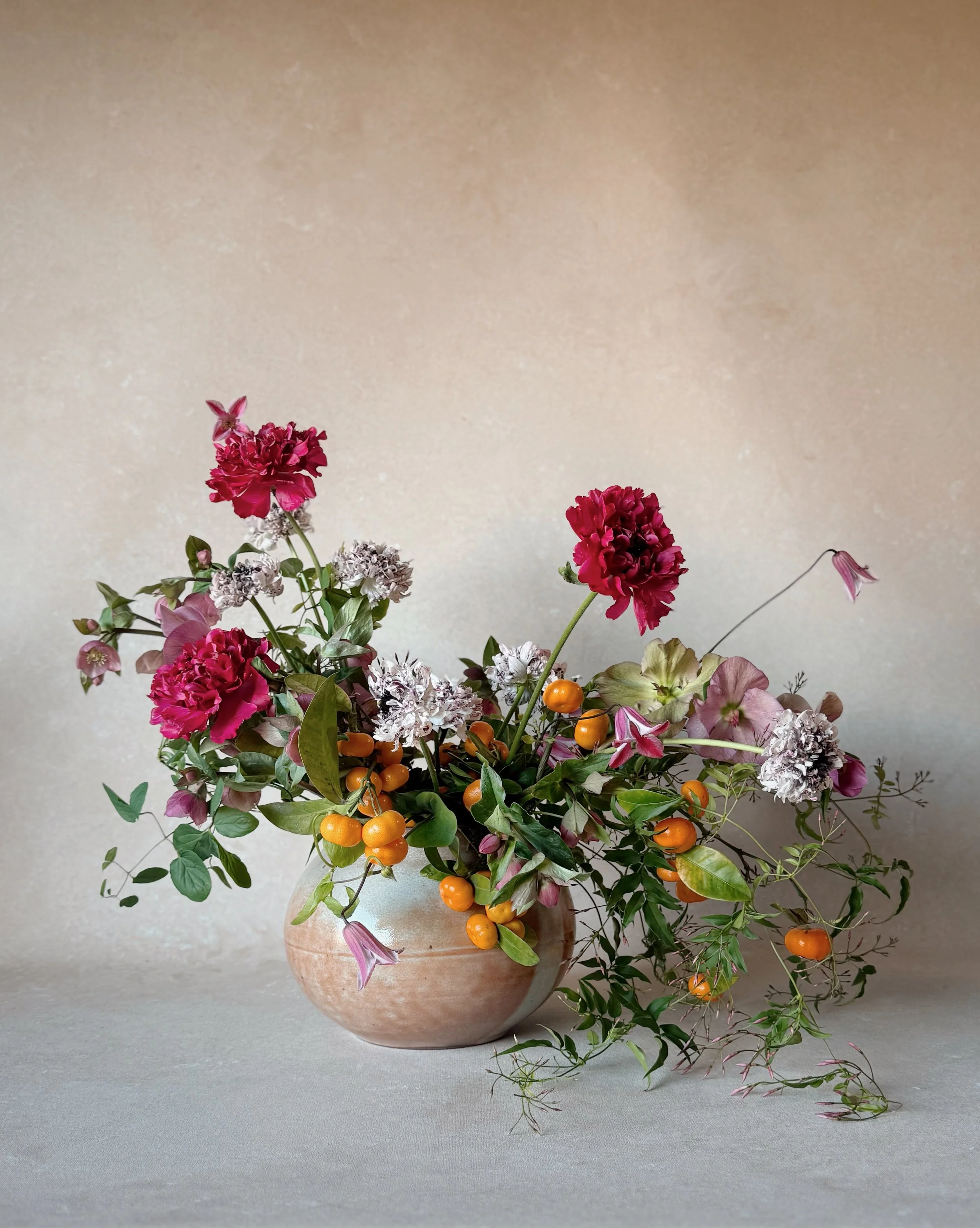
We hear this from florists all the time: 'My arrangements look so much better in person than in photos.' Nine times out of ten, the backdrop is the missing piece. This is Sandstone, and this is what changes.
Cinematic Portrait Settings by Style: Focal Length, Aperture, and Canvas Texture Effect
| Cinematic Style | Focal Length | Aperture | Subject-to-Backdrop Distance | Effect on Canvas Texture |
|---|---|---|---|---|
| Intimate Close-Up | 85mm | f/1.4 | 3 to 4 feet | Heavy blur with warm tonal wash; brushwork resolves as subtle color shifts |
| Editorial Three-Quarter | 85mm | f/2.0 | 5 to 6 feet | Soft texture visible; painterly quality apparent without sharp detail |
| Dramatic Full-Length | 135mm | f/2.0 | 6 to 8 feet | Compressed perspective; canvas reads as painted wall behind the subject |
| High-Key Contemporary | 50mm | f/2.8 | 4 to 5 feet | Moderate blur; texture detail preserved; wider view includes more backdrop |
ISO and shutter speed matter less for the cinematic look, but consistency matters. Set ISO between 100 and 400 depending on available light, keeping it as low as possible to preserve shadow detail and tonal separation. Use a shutter speed of at least 1/125th of a second to freeze subtle subject movement. Faster shutter speeds (1/250th or higher) prevent any motion blur that might obscure the crisp separation between subject and background.
Cinematic Lighting Patterns for Hand-Painted Canvas Backdrops
Lighting is where the hand-painted canvas backdrop truly earns its presence. A flat surface under directional light remains flat. A textured canvas surface under directional light becomes a landscape.
Rembrandt lighting is the foundation of cinematic portraiture. Position your key light at 45 degrees or greater from the camera, high enough to create the iconic triangle of light on the far cheekbone of the subject. This lighting pattern is used in film, in high-end editorial portraiture, in the work of every photographer who understands how light creates drama and dimension. On a hand-painted canvas backdrop, the angle of Rembrandt lighting does something extraordinary: it reveals the brushstroke micro-shadows that exist in the painted surface. The canvas is no longer a neutral color field. It becomes a topographic map of the artist's hand. The unlit side of the canvas falls into shadow, creating the illusion that the backdrop recedes further, that the subject is truly standing in space rather than in front of a flat object.
Loop lighting, positioned 25 to 50 degrees from center, is softer and more flattering than Rembrandt but still directional enough to activate the canvas texture. The light grazes the side of the face, creating a gentle sense of dimension and modeling without the dramatic shadow contrast of Rembrandt. On a hand-painted canvas, loop lighting brings out the warm undertones of earth-tone canvases like Clay and Sandstone, intensifying the golden atmosphere that makes these surfaces so prized for beauty and editorial work.
Split lighting divides the face in half, with key light on one side and the opposite side falling into shadow or receiving only fill from a reflector. Split lighting is intensely cinematic, used to dramatic effect in film noir, in contemporary editorial work, in portraits meant to convey psychological complexity. On a dark hand-painted canvas like Graphite or Carbon, split lighting becomes even more powerful. The unlit side of the backdrop disappears into shadow, creating the illusion that the subject is emerging from darkness. The visual depth is profound.
Rim light, or backlight, is the secret weapon of cinematic portraiture. Position a light behind and to the side of the subject, aimed at the edge of their profile or the back of their hair. This light creates a glowing edge that separates the subject from the canvas backdrop with pure light. The rim light does not illuminate the subject's face directly, but it creates visual separation that makes the subject feel three-dimensional, floating in front of the backdrop rather than pressed against it. On a warm-toned canvas like Bronzite or Umber, rim light creates a halo effect that feels almost painterly.
The lighting ratio (the relationship between the brightness of the key light and the fill light) controls the cinematic intensity. A 2:1 ratio, where the key light is twice as bright as the fill, produces gentle modeling suitable for beauty work. A 3:1 or 4:1 ratio creates more dramatic shadow contrast, more cinematic darkness. At 4:1 and higher, you enter high-contrast cinematic territory where shadows are deep and the subject feels dramatically lit. On a hand-painted canvas backdrop, increasing the lighting ratio increases the canvas's participation in the drama. Shadows deepen on the backdrop as well as on the subject, creating a unified visual field.
Here is what we see daily in our studio when we test new canvases under light: a warm-tone canvas like Clay or Sandstone absorbs warm light and intensifies the golden atmosphere. When you direct your key light, a warm-toned head around 3200K color temperature (the Kelvin scale measurement of light warmth), onto a Clay canvas backdrop, the canvas absorbs that warm light and reflects it back in soft diffusion. The golden quality intensifies. The backdrop becomes almost incandescent. This is why editorial photographers choose these colorways for work meant to feel luxurious and warm.
Cool-tone canvases like Slate and Celestite maintain separation even under warm light. Slate is a concrete-like architectural gray, not a jewel tone. It remains neutral, modern, gallery-like even under warm key light. Celestite is a soft sky blue. It reads as cool space even when surrounded by warm light. The colorway you choose determines how light interacts with your backdrop, which determines the emotional quality of the final frame.
On a hand-painted canvas backdrop, the angle of Rembrandt lighting reveals the brushstroke micro-shadows of the painted surface, transforming a neutral color field into a topographic map of the artist's hand that adds a second layer of depth behind the subject.
Choosing Backdrop Colors for Cinematic Portraiture
The colorway you choose shapes the entire visual story before the first frame is captured.
For dark, moody cinematic portraiture, the deep neutrals dominate. Graphite is a deep charcoal that absorbs light and creates an almost theatrical backdrop for low-key work. Carbon is near-black, so dark that under low-key lighting it nearly vanishes, leaving the subject glowing against what reads as infinite depth. Umber is a deep brown with warm undertone, creating a richly shadowed atmosphere that feels organic rather than neutral. These three colorways are the foundation of the cinematic look. A subject lit with a 4:1 ratio Rembrandt setup against a Carbon hand-painted canvas is cinematic by definition. The visual drama is nearly automatic.
For warm, atmospheric cinematic work, the earth tones are unmatched. Clay carries terracotta warmth that intensifies under warm key light, producing the golden-hour indoor quality that luxury wedding and portrait photographers seek. Sandstone is warm beige with enough neutrality to feel modern while maintaining warmth. Bronzite is a warm bronze-gold that reads almost metallic in certain light, creating an opulent backdrop for luxury editorial sessions. These colorways produce the sense that the light is warm because the world is warm, not because the photographer has gelled their key light.

Groom portraits this clean don't happen by accident. Chasing Stone's Sandstone backdrop is in stock now and ready for your next wedding season. Shop at chasingstone.com.
For contemporary, editorial cinematic portraiture, the cool neutrals offer clean, modern backgrounds. Slate is a concrete-like architectural gray, precise and modernist. It reads as a gallery wall: neutral but present, offering separation without distraction. Celestite is soft sky blue, creating the illusion of outdoor space indoors, the feeling that the backdrop is open atmosphere rather than a physical wall. Both of these colorways work beautifully for editorial work where the backdrop is meant to feel designed rather than painted, architectural rather than atmospheric.
The blush and mauve tones are the emerging frontier of cinematic beauty and fashion work. Rose-Quartz is a soft pink that photographs as delicate but substantial. Rhodonite is a deeper mauve-pink with gray undertone, less traditionally feminine and more editorially commanding. These colorways are not neutral backgrounds. They are compositional elements. A subject photographed against Rhodonite is surrounded by color that shapes the mood of the frame, creating something between portraiture and fine art.
The hand-painted nature of Chasing Stone's canvases means that color saturation and warmth vary subtly between individual pieces. This is not a manufacturing limitation. It is the defining characteristic of handmade work, the same principle that gives a painting its value over a print. When you order a 5x8 ft hand-painted canvas backdrop beginning at $497, you are receiving a unique painted surface, not one of ten thousand identical prints. For deeper exploration of how backdrop color functions as negative space in portraiture, read our guide to negative space in portrait photography and minimalist backdrop composition.
Building Painterly Bokeh: How Canvas Texture Transforms Background Blur
There is a difference between "smooth bokeh" and "painterly bokeh," and it lives entirely in the material you choose for your backdrop.
When you shoot at f/1.4 against a vinyl or paper backdrop, the shallow depth of field produces a soft, out-of-focus wash of color behind the subject. The bokeh circles are smooth, creamy, pleasant. The background reads as a textureless field. This is the standard bokeh discussion in photography education: bokeh quality depends on the lens, the aperture shape, the rendering characteristics of the optics. But the backdrop material never enters the equation, because flat surfaces produce flat bokeh.
On a hand-painted canvas backdrop, something different happens. The bokeh is still soft, still shallow, still optically driven by aperture and focal length. But the background retains tonal variation even in the blur. The subtle color shifts created by layered pigment and brushwork continue to register as dimensional, as painterly, even when optically out of focus. This is because pigment topography preserves tonal micro-contrast. When the depth of field extends past the subject but does not reach the backdrop surface, the micro-ridges of the canvas fall into soft focus, creating a texture that reads as deliberate brushwork rather than photographic accident.
The physics is straightforward: optical blur attenuates high-frequency detail (sharp edges, fine lines) but preserves low-frequency tonal variation (broad color shifts, gradual tonal gradations). A flat, printed surface has no low-frequency tonal variation to preserve. It is uniformly flat in color and texture. When optically blurred, it becomes uniformly smooth. A hand-painted canvas, by contrast, has low-frequency tonal variation built into its surface through layered pigment and artistic brushwork. When this surface is optically blurred, the tonal variation persists. The bokeh reads as painterly because the underlying surface was painted.
On hand-painted canvas, the tonal variations in the layered pigment create subtle gradations even in optical blur. The out-of-focus background looks like a painting, not a wall. This is the physics of painterly bokeh: real texture survives depth of field in ways that flat, printed surfaces cannot replicate.
We paint each canvas knowing that a photographer shooting at f/1.4 will see our brushwork differently than one shooting at f/5.6. At wide apertures, the layered pigment creates a dimensional field of color, a painterly wash that feels intentional and artistic. At narrower apertures, the individual brushstrokes become part of the composition, small decisions about color and texture that the viewer can read. Both are intentional. Jennifer does not paint these surfaces with a single depth of field in mind. She paints them as complete visual environments, knowing that different photographers will use different techniques and that the canvas needs to hold its visual character across the entire range of aperture settings.
This is the maker expertise that matters in this category: a hand-painted canvas is made by someone who understands how paintings behave under light and optics, not by someone following a production workflow. The difference in the final image is unmistakable. For a detailed material comparison of how hand-painted canvas performs against vinyl, muslin, and paper surfaces, see our photography backdrop materials comparison guide.
Cinematic Color Grading and Your Backdrop: From Capture to Post-Production
The cinematic look does not end at capture. It is shaped and refined in post-production color grading, and the backdrop you choose determines your grading workflow from the moment you import the images.
A hand-painted canvas backdrop carries true, rich color from capture. The pigment has saturation and depth that a camera sensor reads accurately. When you import a RAW file captured against a Chasing Stone canvas, the backdrop color carries information: tonal shifts, subtle gradations, the warm-to-cool transitions Jennifer builds into every surface. When you adjust the color temperature in Lightroom or Capture One, the canvas responds authentically. The tonal depth is there to work with.
A vinyl or printed backdrop has flat, one-dimensional color. When you adjust color temperature, the backdrop shifts as a uniform field with no tonal depth to express. The grading workflow becomes a matter of correcting the printed color rather than interpreting the painted surface.
For cinematic grading, this difference is profound. The teal-and-orange grading that defines contemporary cinematic color (where shadows carry teal undertone and highlights carry warm orange) lives beautifully on a hand-painted canvas. A subject lit against a Slate or Graphite backdrop, graded with teal shadows and warm highlights, feels three-dimensional because the backdrop carries tonal depth that the grading can enhance. Against a flat vinyl backdrop, the same grading produces a flat, artificial effect.
Split-tone grading, where you push highlights in one color direction and shadows in another, is a powerful cinematic technique. On a hand-painted canvas backdrop, the existing tonal variation in the pigment amplifies the split-tone effect. The shadows in the backdrop interact with the cooler shadow tones of your grading. The highlight areas of the canvas interact with the warmer direction. The result feels unified, as though the grading was painted onto the canvas rather than applied to a digital file.
Preserving the canvas texture in post-production requires restraint. In Lightroom, resist aggressive texture reduction or clarity reduction on the background areas. The subtle topography of the hand-painted surface is part of the visual story. In Capture One, avoid over-smoothing the background with healing tools or detail reduction. The brushwork should persist in the final image, even when soft. For a deeper guide to color grading techniques specific to backdrop photography, see our article on professional color grading for backdrop photography in Lightroom.

The surface under these details isn't an afterthought. It's a hand-painted canvas that makes every gold, every pearl, and every soft blue pop the way they deserve to. This is Celestite, and this is what intentional detail photography looks like.
The Cinematic Session Workflow: From Setup to Final Frame
All of this theory becomes actionable in the session workflow. Here is how to set up a cinematic portrait session from backdrop deployment to final edited frame.
Backdrop setup comes first. You will need the hand-painted canvas backdrop, a C-stand or two-post backdrop stand, and the floating adapter mount ($107) that secures the canvas without stretching or damaging the painted edges. Position the backdrop far enough behind where your subject will stand to allow meaningful air between subject and surface. In a medium-sized studio, eight to ten feet of total depth gives you flexibility. In a small studio, six feet works, though it limits your focal length choices.
Subject placement is critical. Position the subject four to six feet in front of the backdrop when shooting at f/1.4 to f/2.0 with an 85mm lens. This is the distance that produces the painterly bokeh we described, where the canvas texture falls into a soft blur that retains dimensional quality. Have the subject move or tilt their head slightly to confirm that the backdrop separation feels right, that the subject reads as standing in front of a painted surface rather than pressed against a flat wall.
Lighting setup depends on the mood you are creating. For a single-light cinematic setup, position your key light at 45 degrees from the subject, high enough to create the Rembrandt triangle of light on the far cheekbone. Meter the light at the subject's face. For more drama, set your fill light or reflector to create a 3:1 ratio, metering the shadow side at approximately one-third the brightness of the key side. For a softer look, a 2:1 ratio is gentler.
Camera settings are where the technical becomes intuitive. Set your shutter speed to at least 1/125th of a second. Set your ISO between 100 and 400, choosing the lowest value your metering indicates will produce clean exposure in the shadows. Set your aperture to f/1.4 or f/1.8 to begin. Shoot tethered if possible, reviewing images on a larger screen as you work. This allows you to evaluate the interaction between the subject, the light, and the hand-painted backdrop in real time, to see how the canvas texture is rendering in the background blur, to adjust aperture or subject distance if needed. For more on tethered workflow, see our guide to shooting tethered for portrait photography.
Shoot a series at f/1.4 to evaluate maximum background separation and painterly blur. Then adjust to f/2.0 and shoot again. The difference between f/1.4 and f/2.0 is subtle but significant: at f/1.4, the backdrop falls almost entirely into blur, becoming an atmospheric wash. At f/2.0, the canvas texture begins to resolve, the brushwork becomes slightly more apparent. Both are cinematic. Both are beautiful. The choice depends on the visual statement you are making.
If you have questions about which colorway will work best for your cinematic vision, or need guidance on pairing backdrop colors with your lighting and color grading approach, reach out at info@chasingstone.com. We work with photographers at every stage of building their cinematic visual language.

Building your brand shoot this season? Chasing Stone's Slate backdrop is in stock now and this is exactly what a clean, editorial studio setup looks like. Shop at chasingstone.com.
Frequently Asked Questions
What camera settings create the most cinematic portrait look with a backdrop?
An 85mm lens at f/1.4 to f/2.0 with the subject eight to ten feet from the camera creates the quintessential cinematic look, producing shallow depth of field that separates the subject from the backdrop while rendering the background as a soft, dimensional field. For more compressed, filmic perspective, a 135mm lens at f/2.0 flattens spatial relationships and enhances the painted quality of a hand-painted canvas backdrop. Keep ISO at 100 to 400 for clean shadow detail, and set shutter speed to at least 1/125th of a second to freeze subtle movement.
How far should the subject stand from a hand-painted backdrop for cinematic depth?
For meaningful background separation with cinematic depth, position the subject four to six feet in front of the backdrop when shooting at f/1.4 to f/2.0 with an 85mm lens. This distance allows the hand-painted canvas texture to fall into a soft, painterly blur while retaining enough tonal variation to read as dimensional. Moving the subject closer to the backdrop increases texture detail in the background, which works well at f/2.8 to f/4.0 for editorial portraits where the canvas surface is part of the composition.
What backdrop colors work best for cinematic portrait photography?
Dark neutrals like Graphite (deep charcoal) and Carbon (near-black) create the moody, low-key atmosphere associated with cinematic portraiture, while warm earth tones like Clay and Umber produce the golden atmospheric quality of natural-light cinema. For contemporary editorial work, Slate (a concrete-like architectural gray) and Celestite (soft sky blue) offer clean, modern backgrounds. Chasing Stone's hand-painted canvas backdrops start at $497 for a 5x8 ft surface in any of 20 colorways.
Can you achieve cinematic depth with a small studio space?
Yes. Even in a space as small as 10 by 12 feet, an 85mm lens at f/1.4 with the subject four feet from the backdrop produces cinematic background separation. The key is using the longest focal length your space allows and the widest aperture your lens offers. A hand-painted canvas backdrop helps considerably in tight spaces, because its layered pigment creates tonal depth even where a flat vinyl surface would read as a featureless wall.
How does hand-painted canvas texture affect depth of field differently than vinyl?
Hand-painted canvas has real physical topography, with ridges, valleys, and layers of pigment that create tonal micro-contrast even when thrown out of focus at wide apertures. This produces what photographers describe as painterly bokeh, where the background retains dimensional quality rather than dissolving into a flat wash of color. Vinyl and printed surfaces have no such variation, so shallow depth of field simply renders them as smooth, lifeless fields. On a Chasing Stone canvas, the $497 5x8 ft surface carries the same painterly depth as the $797 8x10 ft surface, because the hand-painting technique is identical across all sizes.
What lighting setup creates the most cinematic portrait on a canvas backdrop?
A single key light at 45 degrees (Rembrandt position) with a 2:1 lighting ratio produces the dramatic, directional quality that defines cinematic portraiture, and on a hand-painted canvas backdrop, this angle reveals brushstroke micro-shadows that add a second layer of depth behind the subject. Add a rim light behind the subject to separate them from the backdrop with a glowing edge. For a softer cinematic feel, loop lighting at 25 to 30 degrees from center activates the canvas texture without the dramatic shadow contrast of Rembrandt.
Craft the Cinematic Frame Your Work Deserves
Cinematic portrait photography with backdrops that carry real depth is not about a single technique or a single camera setting. It is about understanding how light, optics, and material work in concert to create dimension and visual storytelling. A hand-painted canvas backdrop is not a background. It is a creative partner: a painted environment that responds to your light, that sustains tonal depth even in optical blur, that transforms a simple portrait into a cinematic moment.
The photographers whose work defines the standard in this category, photographers whose images appear in the pages of Vogue and Over the Moon, choose hand-painted canvas backdrops because they understand this principle. The surface matters. The paint matters. The hand that painted it matters.
Every Chasing Stone canvas is made to order, hand-painted over two to three days by Jennifer, our founder and sole artist, in her California studio. We ship domestically in entirely biodegradable, plastic-free packaging, the first styling surface maker to offer completely sustainable shipping. Explore the full collection of hand-painted photography backdrops to find the colorway that will define your cinematic visual language. For personalized colorway recommendations or questions about sizing for your studio, reach out at info@chasingstone.com.

Creators of premium photography backdrops and styling surfaces
Trusted by thousands of discerning creatives worldwide
Every piece is handcrafted with intention in Orange County, California