
Welcome to
The Journal
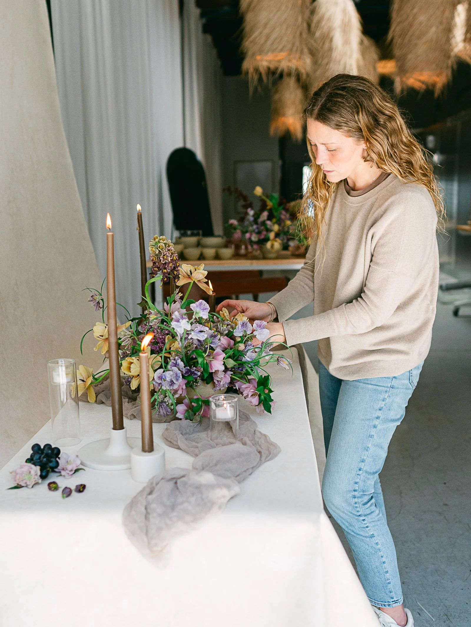
Welcome to the Chasing Stone blog! We’re so glad you’re here. Our story began in 2018 with a simple need for a portable, textured, stone-like styling surface. This idea quickly grew into the vibrant and diverse collection of backdrops and styling surfaces you see today. Each piece is inspired by my deep love and fascination for the natural world.
This blog is a place where we hope to answer your frequently asked questions, share tips and tricks, and connect with our amazing community. Whether you're a photographer, florist, or creative enthusiast, we’re here to support you and inspire your artistic journey. Alongside my passion for travel and design, I am excited to share insights and stories that can spark your creativity. Thank you for joining us and being a part of the Chasing Stone family!
Explore
OUR
JOURNAL
CATEGORIES
TUTORIALS
BTS
TRAVEL
SPOTLIGHTS
FAQ
COLOR THEORY
Professional Color Grading for Backdrop Photography in Lightroom (2026)
Hand-painted canvas backdrops respond to Lightroom adjustments differently than vinyl or muslin, and understanding that difference is what separates good grading from masterful grading. Canvas absorbs light and re-emits it through layered pigment, creating the optical depth that emerges the moment you lift shadows in the Develop module. This guide walks through white balance, tone curve, HSL, and texture work specifically for hand-painted canvas, with grading settings for warm, cool, and neutral colorways. Restraint is the professional move. Canvas deserves editing that honors its craft.