
How to Layer Photography Backdrops for Editorial Fashion Photography (2026)
Posted on May 28, 2026
There is a moment in the late afternoon, when the light comes in at a shallow angle, that a second canvas becomes visible behind the primary backdrop. A rim of color at the edge of the frame. A whisper of a different tonal world existing just outside the composed shot. That partial revelation, that sense of dimensional space extending beyond the subject, is what transforms a studio with a single backdrop into a set with narrative depth. This is the craft of editorial fashion photography: learning to layer hand-painted canvases so that the space itself becomes part of the story. When you introduce a second backdrop, drape a third, or position canvases to create a tonal transition behind and beneath your subject, you shift from backdrop as background into backdrop as environment. Layering hand-painted photography backdrops is the technical and artistic practice that separates a single-surface studio from one that breathes with visual complexity, and it is a technique that every editorial photographer working at the top of the field understands intimately.
Quick Answer
Layering photography backdrops means positioning two or more hand-painted canvases strategically within your frame to create dimensional depth, tonal separation, and visual narrative. The most effective approaches are background overlap (placing one canvas partially behind another), draping (allowing canvas to fall naturally as a styling element), floor-and-wall combinations (using one canvas as the primary backdrop and another as a floor surface), and tonal transitions (pairing analogous colors to create gradient depth). Starting with a three-canvas kit covering warm, cool, and deep tones gives you the flexibility to compose layered editorial sets that feel three-dimensional and sophisticated.
Why One Backdrop Is Never Enough for Editorial Work
The editorial photographer's challenge is not documentation. It is world-building. When Jose Villa frames a subject against a single backdrop, the composition is not about the surface behind the subject; it is about the light that the surface catches, the dimensional quality that hand-painted pigment creates, and the emotional tone that color establishes. But a single backdrop, no matter how beautifully rendered, is a two-dimensional plane. The moment you introduce a second canvas, you introduce depth. You introduce the possibility of compositional layering that mirrors the way environments actually exist in the three-dimensional world.
Consider the difference between a fashion photograph shot against a single Limestone backdrop and one composed with Limestone as the primary plane and Clay visible as an accent or floor surface beneath. In the first scenario, the backdrop is exactly that: a background. In the second, the backdrop system becomes an environment with foreground and background separation. Your subject exists not against a surface but within a spatial arrangement. The light behaves differently because it now has multiple surfaces to interact with. The tonal relationship between the subject and the space changes. The narrative potential of the image expands.
This is why editorial photographers who work with Chasing Stone hand-painted canvases typically maintain a kit of at least three backdrops. It is not because one backdrop is insufficient for a single session. It is because a curated collection of hand-painted surfaces in different tonal families allows you to compose with intention at the moment of capture, rather than being limited to the single backdrop you happened to bring. The difference between "this is the only backdrop I have available" and "I chose this backdrop and this one specifically because their tonal relationship creates the mood I want" is the difference between a default and a deliberate choice.
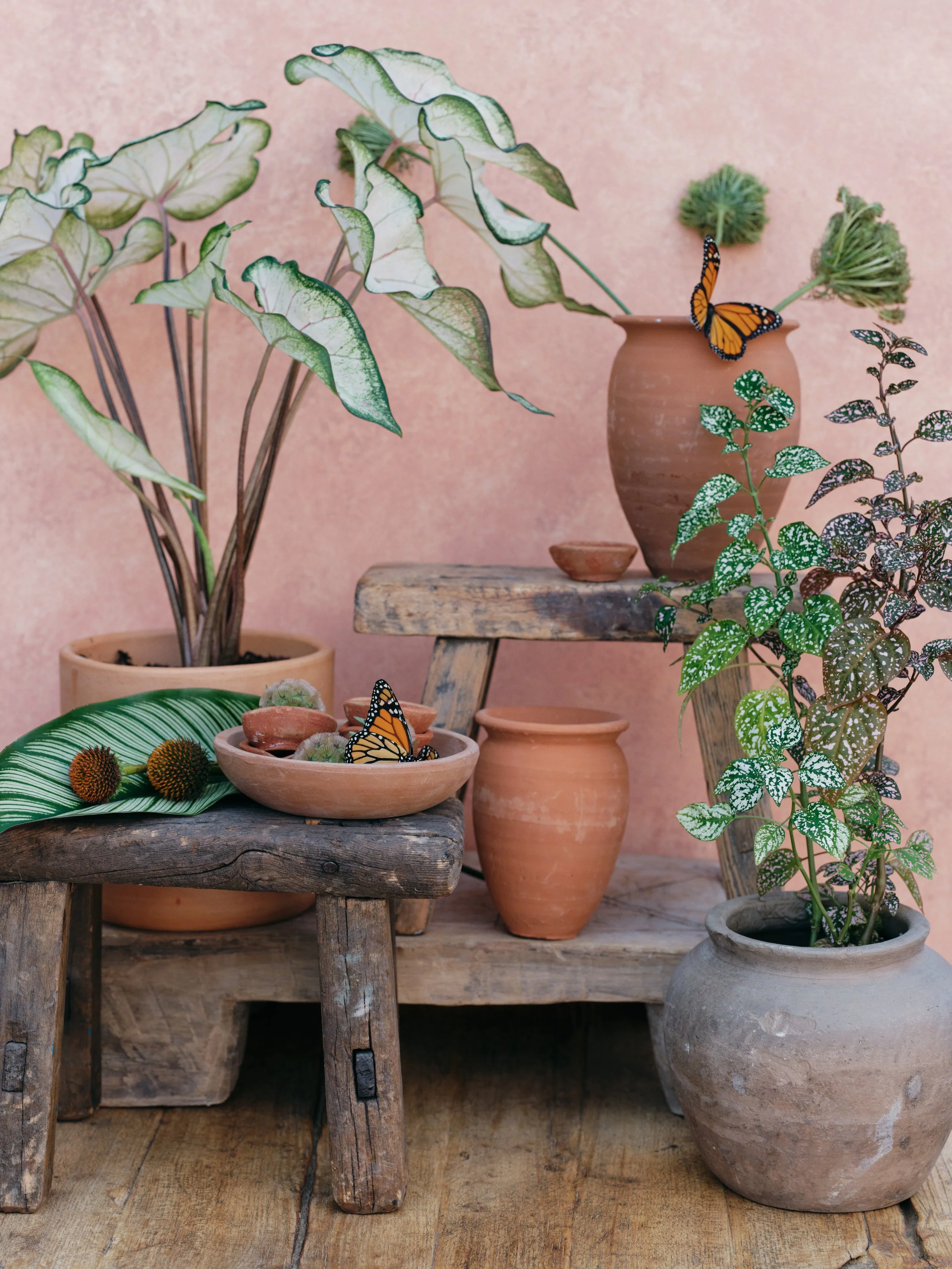
Each Chasing Stone canvas is hand-painted by Jennifer over two to three days. No two are identical, which is precisely what allows them to layer without the mechanical repetition of printed backdrops.
Hand-painted canvas backdrops from Chasing Stone offer a particular advantage in layering work: no two canvases are identical. The organic variation in Jennifer's brushwork (each canvas takes two to three days of hand-painting to complete), the subtle shifts in color across the surface of each hand-painted piece, mean that when you layer two canvases, they do not blend into a monotonous gradient. Instead, they create a conversation. The texture of one surface responds to the texture of another. The warm undertones in the Limestone catch light differently when positioned next to the cool gray of Silt. This is the atelier principle applied to photography surfaces: each canvas is a unique object, and when arranged with intention, multiple canvases create compositional depth that mass-produced, digitally printed backdrops cannot achieve.
The photographers and stylists who work at the editorial level understand this intuitively. They do not view backdrops as interchangeable commodities. They view them as surfaces with character, with individual presence, with the capacity to either support or elevate a composed image. Layering is simply the natural expression of this understanding: using multiple surfaces not because you lack a single comprehensive backdrop, but because the intersection of multiple surfaces creates visual possibilities that no single surface, however beautifully crafted, can produce alone. Explore our full collection to see the range of hand-painted surfaces available.
The Four Layering Techniques Every Editorial Photographer Should Know
Layering photography backdrops operates within four primary compositional frameworks, each with its own aesthetic and practical applications. These are not rigid categories. They often overlap within a single session, and the most sophisticated editorial photographers move fluidly between them. But understanding each technique gives you a deliberate vocabulary for composing your set.
The first is background overlap. This is the simplest and most frequently used technique in editorial work. You position two canvases so that one sits slightly in front of the other, with the rear canvas visible at the edges of the frame. The overlap region creates a natural transition zone where the two colors or tones interact. When you position a warm neutral like Limestone as the primary plane and allow a cooler tone like Slate to show at the edges, the viewer's eye reads both colors simultaneously, creating a sense of environment rather than a single flat surface. The key to seamless background overlap is overlap distance: position the rear canvas so that the front canvas obscures it by 12 to 18 inches. This depth of overlap prevents visible seams while allowing enough of the rear canvas to show that its presence is unmistakable. Shooting at f/2.8 to f/4 with moderate subject-to-backdrop distance softens the overlap region further, creating a bokeh effect where the transition between layers becomes almost painterly.
When you position a warm neutral like Limestone as the primary plane and allow a cooler tone like Slate to show at the edges, the viewer's eye reads both colors simultaneously, creating a sense of environment rather than a single flat surface.
The second technique is draping. This is where canvas becomes a styling element rather than a fixed backdrop. You allow canvas to fall in natural folds across furniture, cascade down from a perch, or pool onto the floor around your subject's feet. This approach works particularly well in fashion photography, where the textile quality of hand-painted canvas adds tactile dimension to the composition. A Chasing Stone canvas draped over a chair or table catches light differently depending on how the fabric folds, revealing the brushstroke texture and the subtle color variations that make each hand-painted surface unique. Draping demands a particular material quality: cotton canvas has weight and body that allows it to hold shape and fall in elegant lines. Vinyl or muslin, by contrast, either clings to surfaces in a limp way or reflects light so heavily that the draped textile becomes a distraction rather than a compositional element. The hand-painted canvas, because of its material integrity and because Jennifer's pigment work creates visual interest at every scale, becomes an active design element when draped.
The third technique is the floor-sweep-with-layered-wall approach. You use one canvas as your primary vertical backdrop and another as a horizontal floor surface or sweep. This is the most environmentally immersive of the four techniques because it establishes a defined spatial plane both vertically and horizontally. An 8x10 ft Umber canvas positioned vertically, with a complementary 5x8 ft Limestone canvas laid horizontally to create a floor plane, establishes a complete corner environment. The subject exists within this defined space rather than positioned in front of a surface. The lighting behavior changes dramatically because light now interacts with two planes at different angles. The floor canvas picks up key light differently than a vertical plane does. The tonal relationship between wall and floor creates spatial definition that editing cannot replicate.
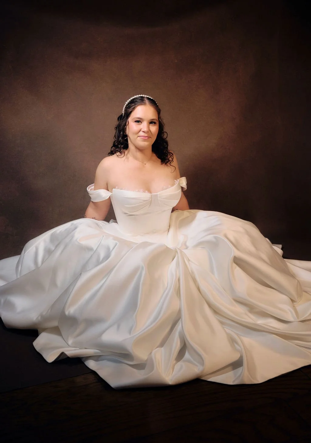
The Umber canvas is one of Jennifer's most requested colorways for bridal editorial work and frequently sells out ahead of spring wedding season. Browse the full collection.
The fourth and most advanced technique is tonal transition. Rather than using two canvases of distinctly different tones, you select two from the same tonal family or closely analogous tones and position them to create a subtle gradient or chromatic shift across the composition. Pairing two warm neutrals like Limestone and Sandstone creates a nearly imperceptible transition from cream to warm beige. This technique rewards precise positioning and sophisticated lighting. The difference between the two canvases is nuanced enough that it reads not as two distinct surfaces but as a single atmospheric shift. This requires more planning than background overlap, but it produces some of the most visually sophisticated editorial results: the space feels coherent while simultaneously feeling dimensionally complex.
Each of these techniques addresses a different creative intention. Background overlap is about introducing a visible second tonal note without overwhelming the composition. Draping is about using canvas as an active design element. Floor-and-wall combinations are about creating a complete spatial environment. Tonal transitions are about establishing subtlety and atmospheric nuance. The editors and photographers working with hand-painted canvases at the highest level often use all four within a single session, switching between them as the creative direction evolves.
Colorway Pairings That Work for Layered Compositions
The selection of which two or three canvases to pair is not a technical decision. It is an aesthetic one, and it determines the emotional register of the entire session. This is where knowledge of the Chasing Stone colorway palette becomes essential. Each colorway has distinct visual character, and when layered, the interaction between two colorways creates specific mood and tonal depth that no single canvas can establish alone.
Chasing Stone Colorway Pairings for Layered Editorial Compositions
| Pairing Strategy | Wall Canvas | Floor / Accent Canvas | Mood | Best For |
|---|---|---|---|---|
| Warm tonal | Limestone | Clay | Golden warmth, approachable luxury | Bridal editorial, lifestyle, warm-skin-tone portraiture |
| Cool contrast | Slate | Silt | Architectural modern, cool sophistication | Fashion editorials, cool-toned styling, minimalist work |
| Earth plus blush | Sandstone | Rose-Quartz | Romantic editorial, soft femininity | Wedding editorials, lifestyle, romantic styling |
| Deep and light | Umber | Limestone | Dramatic depth, fine art intensity | Fine art portraiture, high-contrast editorial fashion |
| Jewel accent | Carbon | Lapis | Bold editorial statement, saturated luxury | Avant-garde fashion, jewelry editorials, dramatic styling |
| Neutral minimal | Bentonite | Mica | Quiet sophistication, understated elegance | Minimalist portraiture, clean editorial, corporate |
Understanding these pairings requires understanding the actual character of each colorway. Slate, for instance, is not a cool jewel tone. It is concrete-gray, architectural, a neutral that reads almost as absence of color. Layering Slate behind Silt creates architectural depth because you are layering two grays in different values, both fundamentally cool and neutral in tone. The effect is the visual equivalent of architectural photography: clean, modernist, emotionally restrained.
By contrast, pairing Umber with Limestone is about creating chromatic and tonal extremes. Umber is deep brown, nearly black in the shadows, with warm reddish undertones in the mid-tones. Limestone is pale cream, almost white in its lightest regions. Layering these two creates maximum separation and visual drama. This pairing works for fine art portraiture where you want the subject to feel like it is emerging from darkness into light, where there is visual poetry in the tonal contrast.
Pairing two warm neutrals like Limestone and Sandstone creates a nearly imperceptible transition from cream to warm beige. This technique rewards precise positioning and sophisticated lighting, producing some of the most visually sophisticated editorial results.
The jewel tone pairings like Carbon with Lapis are for bold editorial work where color itself becomes a statement. Carbon is near-black with cool undertones, while Lapis is deep saturated blue. Together they create a jewel-box effect: the Lapis reads as a rich accent against the near-black Carbon, and the combination has the visual intensity of luxury jewelry editorials or avant-garde fashion work.
The romantic pairings like Sandstone with Rose-Quartz work because they are analogous colors: both warm, both soft, but in different tonal families. Sandstone is warm beige, earthy and grounded. Rose-Quartz is soft pink, delicate and romantic. Layered together, they create a gradient effect where the warmth of the earth tone provides stability and the softness of the blush tone adds emotional resonance. This is the pairing that editorial photographers choose for bridal work, for wedding editorials, for any composition where the mood is romantic without being saccharine.
For a deeper exploration of how color relationships inform backdrop selection, our guide to color theory for photographers provides the foundational framework that these pairing recommendations are built upon.
These pairings are not rules. They are templates based on the actual visual interaction between specific colorways. The editorial photographer's task is to understand the character of each surface and then select pairings based on the creative direction of the session. A photographer working toward architectural minimalism would never choose a warm tonal pairing; that photographer would reach for Slate and Silt. A photographer shooting editorial fashion with bold color would select Carbon and Lapis. The pairing reflects the visual intention of the shoot.
Lighting Layered Backdrops for Editorial Fashion Photography
Lighting a layered backdrop system is fundamentally different from lighting a single backdrop. When you have only one backdrop, the lighting goal is relatively straightforward: illuminate the surface to show its color and texture evenly, or deliberately create highlight and shadow zones for compositional effect. When you introduce a second backdrop, you now have an opportunity and a responsibility to use light to visually separate the two layers.
The principle is directional asymmetry. You light each layer with intention so that the viewer can perceive the spatial relationship between them. This typically means positioning your key light so that it catches the foreground canvas more directly than the background canvas. A 45-degree angle from the subject, positioned to one side, is the standard setup for this effect. The key light emphasizes the brushstroke texture and tonal nuance of the foreground canvas while allowing the background canvas to fall into softer shadow. This creates visual separation: the foreground reads as dimensionally closer because it is brighter and more detailed, while the background reads as more distant because it is darker and less textured in appearance.
The relationship between canvas texture and directional light is one of the great material advantages of hand-painted backdrops. Jennifer's brushwork creates micro-topography on the surface of each canvas. When directional light hits the foreground canvas at a shallow angle, those brushstrokes cast micro-shadows that create the appearance of even greater three-dimensionality. Printed backdrops, by contrast, are completely flat. No matter how good the printing technology, there is nothing on the surface to catch light and create depth. The brushwork on a hand-painted canvas is not incidental to the aesthetic; it is the mechanism by which directional light reveals dimensional quality.
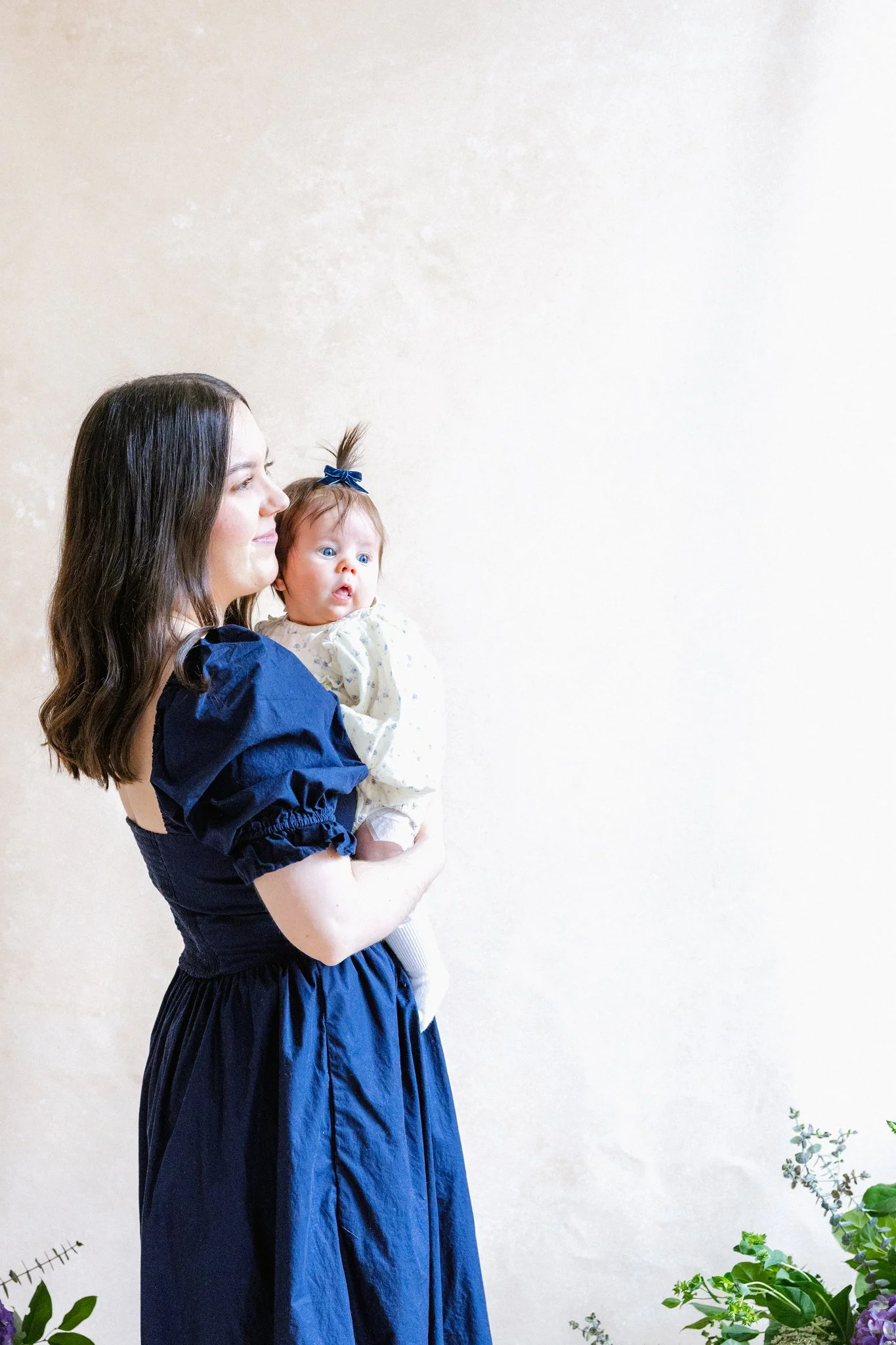
This is what makes Limestone the foundational warm neutral in nearly every editorial kit: it holds quiet authority behind the subject without ever stepping forward. Whether paired with Clay for warmth or Umber for dramatic depth, it begins the layered composition.
For traditional portrait lighting patterns, the same principle applies. A Rembrandt light placement (60-degree angle, creating a triangular highlight on the shadowed cheek) works beautifully when combined with a layered backdrop because the light reveals texture in the foreground canvas while the background canvas remains in comparative shadow. A butterfly light (directly frontal) can work for layered setups if you add a secondary light source to illuminate the background canvas separately, creating intentional tonal separation. A split light (lighting one side of the subject fully while the other side falls into shadow) creates the most dramatic separation between backdrop layers: the lit side reads against a brighter foreground canvas, the shadow side reads against a darker background canvas, and the tonal variation creates additional dimensional effect.
The critical insight is this: you are no longer lighting one surface. You are lighting a spatial environment. This means thinking about how light enters the environment from different angles and what that reveals about the spatial depth you have constructed. A single overhead light will flatten a layered backdrop system because it illuminates both layers roughly equally. A directional key light combined with a softer fill on the background canvas will enhance separation. A rim light on the background canvas, catching its edge while the foreground remains relatively dark, can create striking three-dimensional effect.
The technical execution of this lighting work is where the hand-painted canvas material advantage becomes most apparent. The pigment on a Chasing Stone canvas absorbs and diffuses light in ways that printed surfaces cannot replicate. The deeper pigment layering that results from Jennifer's hand-painting process means that shadow regions on the canvas do not flatten to black. Instead, they retain tonal nuance and color information that allows the canvas to maintain visual presence even in shadow. This is why a layered backdrop system feels three-dimensional and spatially coherent: each layer is visible and has presence, whether it is highlighted or shadowed. For more technical guidance on this subject, our studio lighting tutorial provides detailed setups for working with hand-painted surfaces.
Camera Settings and Depth of Field for Multi-Backdrop Compositions
The camera settings you choose determine how much of the layered backdrop system appears in focus in the final frame. This is a deliberate choice that should reflect your aesthetic intention.
For fashion editorials where you want maximum separation between subject and backdrop layers, aperture settings in the range of f/2.0 to f/2.8 are standard. At these apertures, the subject remains sharply focused while the backdrop layers fall into graduated bokeh. The bokeh effect on a hand-painted canvas is particularly beautiful because the texture of the brushwork creates organic bokeh patterns rather than the mechanical circular bokeh you might get from a smooth surface. A 85mm or 105mm lens at f/2.8 with 8 to 10 feet of subject-to-backdrop distance creates shallow enough depth of field that the foreground backdrop remains just barely in focus while the background canvas falls into complete blur. This setup is ideal when you want the primary focus to remain entirely on the subject and styling, with the backdrops providing color and mood rather than textural detail.
For editorial work where you want to show more textural detail in the backdrop layers, f/4 to f/5.6 is more appropriate. At these apertures, you maintain sufficient depth of field to show the brushwork texture on the foreground canvas while still keeping the background canvas softly out of focus. This is the sweet spot for editorial fashion work where the styling and the backdrop environment are equally important to the compositional statement. An 85mm lens at f/4 allows you to show dimensional separation between the layers while still rendering them as distinct visual elements rather than completely blurred abstraction.
For fine art portraiture or editorial work where the entire layered environment is compositionally important, f/5.6 to f/8 renders both the subject and both backdrop layers with sufficient sharpness that all elements feel equally present in the frame. This is more rarely used in fashion editorial, but it is the approach you would take if the dialogue between subject and backdrop environment is the central theme of the image.
Focal length choices interact with aperture to determine how much backdrop is visible. An 85mm lens at f/2.8 frames tightly on the subject and background. A 135mm lens at f/2.8 compresses space so that both backdrop layers appear to exist in the same plane, which can either enhance unity or flatten the dimensional effect depending on your intention. A 50mm lens at f/2.8 includes more of the ambient environment and shows more of the floor plane if you are using a layered floor-and-wall setup.
The relationship between subject-to-backdrop distance and aperture is critical. At close distances (4 to 6 feet), even f/4 will produce significant bokeh separation. At moderate distances (8 to 12 feet), f/2.8 is necessary for the same effect. At farther distances (15+ feet), you can use f/5.6 and still achieve beautiful separation. Editorial photographers typically work in the 8 to 12-foot range because this distance allows for full-length fashion poses while maintaining comfortable working distance for lighting and styling adjustments.
ISO and shutter speed are determined by available light and flash power. The material properties of hand-painted canvas mean you can use lower ISO values than you might with other surfaces. Canvas absorbs light and does not create the blown-out highlights that reflective surfaces produce. You can expose to the canvas texture more confidently without fear of overexposure. This allows you to maintain lower ISO and cleaner shadow details, which is a small but measurable advantage when shooting fashion editorials where image quality is paramount. For a detailed comparison of how different backdrop materials interact with light, see our canvas vs. muslin vs. vinyl comparison.
Draping Hand-Painted Canvas as a Styling Element
The introduction of draping expands the possibility space for composition. Instead of restricting canvas to a fixed backdrop position, you introduce canvas as a dynamic styling element that can be positioned and repositioned according to the creative direction of the session. This requires understanding canvas as textile first and backdrop material second.
Chasing Stone's hand-painted canvases are fabricated from 100% cotton canvas, which has weight, body, and natural draping characteristics that fundamentally differ from lighter materials. A 5x8 ft hand-painted canvas has enough mass that it holds shape when draped over furniture or perched on a stand. The textile behaves like fine fabric rather than like a lightweight backdrop paper. When Jennifer completes a canvas, the pigment is integrated into the cotton fiber in a way that respects the textile's natural properties. This means that when you drape a hand-painted canvas over a chair, the folds and shadows in the fabric reveal the subtle color variations and brushwork texture in sophisticated ways.
Draping applications in editorial fashion work range from the subtle to the theatrical. In the subtle register, you might position a canvas partially visible behind furniture, with just the edges visible and the canvas acting as a secondary tonal element in the composition. A single fold of canvas across the corner of a styled chair, catching light to reveal the brushwork texture while the rest of the canvas remains in shadow, adds visual complexity without overwhelming the composition. In the theatrical register, you might allow canvas to cascade down from a high perch, pool onto the floor around the subject's feet, or drape entirely around the subject like an unusual garment. Fashion editorials from avant-garde editorial teams often employ this more theatrical approach, where canvas becomes as much a costume element as a backdrop.
The technique of draping hand-painted canvas also offers a practical advantage: it allows you to reconfigure your backdrop environment in seconds. If the creative direction shifts midway through a session, you can reposition draped canvas without stopping to reset permanent fixtures. A canvas that was functioning as a floor plane can be rehung as a wall backdrop, or vice versa. This flexibility is part of the reason that editorial photographers who work frequently in multi-canvas environments often favor hand-painted canvas: the material is versatile enough to support multiple compositional approaches within a single session.
The interaction between canvas texture and fabric folds creates accidental pattern complexity that adds visual interest. The weave of the cotton, combined with the direction of the brushwork and the way light catches the folded fabric, creates compositional richness that a flat backdrop cannot offer. This is why draped canvas works so effectively in fashion editorials: it introduces textile complexity that harmonizes with clothing and styling without competing for visual attention.
Building a Multi-Backdrop Kit for Editorial Sessions
The question of which canvases to acquire first is ultimately a question about creative intent. However, for photographers building a layered-backdrop practice from the ground up, a structure-first approach offers the most flexibility across the widest range of editorial assignments.
Begin with a tonal foundation: one warm neutral, one cool neutral, one deep or saturated tone. This three-canvas kit allows you to compose layered environments across nearly every editorial scenario. The Chasing Stone Studio Pack Three collections are specifically designed around this principle. The 5x8 ft Studio Pack Three (starting at $1,371 sale pricing for three 5x8 ft canvases) offers three 5x8 ft canvases selected for complementary tonal relationships. The 8x10 ft Studio Pack Three ($2,197 sale pricing, $2,391 retail) scales this foundation up to the size necessary for full-length fashion editorials. Either bundle provides the tonal breadth to execute all four layering techniques across different creative directions. If you are considering which canvases to pair for your first layered editorial session, our team is happy to discuss colorway selection and studio needs at info@chasingstone.com.
For photographers whose editorial work focuses on fine art or fine fabric portraiture, the 5x8 ft format offers sufficient height (5 feet) for traditional headshot and three-quarter poses. For fashion editorials requiring full-length posing, the 8x10 ft format (10 feet tall) provides adequate vertical coverage. For sprawling environmental editorial work, the 8x14 ft format ($1,197 per canvas, up to $3,297 in a three-pack) allows for complete environmental layering that encompasses floor, wall, and overhead space.
A second layer of expansion adds chromatic specificity. Once you have tonal breadth, acquire one additional canvas in a saturated or jewel tone that aligns with your primary editorial clients' brand aesthetic. A photographer working frequently with luxury fashion brands might add the Carbon and Lapis pairing. A photographer specializing in editorial bridal work might add Rose-Quartz or Lavender-Quartz to the warm neutral foundation.
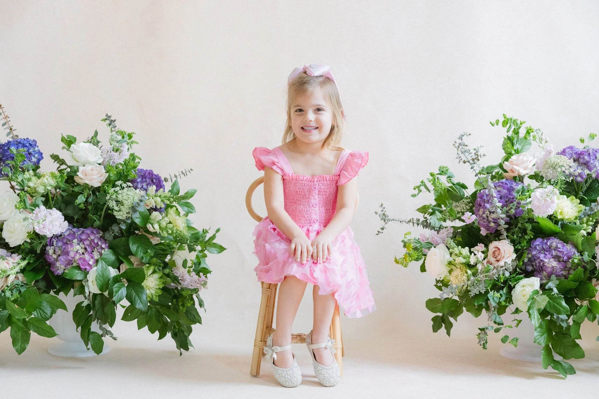
This is the question portrait photographers ask before every styled session: what surface will support florals, fabric, and a small subject without competing with any of them? Limestone is the answer, the warm neutral that begins the layered composition and lets the styling speak.
The investment in a multi-canvas kit yields returns that extend far beyond individual sessions. Each canvas is hand-painted by Jennifer and therefore unique. No two Clay canvases are precisely identical; the variation is a feature, not a defect. Over time, as you accumulate canvases, you develop an intuitive understanding of how each surface behaves under specific lighting conditions, which color pairings produce the most sophisticated tonal relationships, and how to position each layer to achieve specific compositional effects. This accumulated knowledge translates directly into faster, more intentional session setups and richer creative output.
For photographers shipping to location work, the practical advantage of hand-painted canvas is substantial. Each canvas rolls tightly onto a cardboard core and ships in a rigid protective tube. Three 5x8 ft rolled canvases stack and transport easily in a standard vehicle. Three 8x10 ft canvases require slightly more space but remain manageable in a van or large SUV. At the location, canvases unroll and relax in approximately 30 minutes. Unlike muslin or paper backdrops, hand-painted canvas does not crease or wrinkle. The material integrity that allows for sophisticated draping also means that rolled-and-transported canvas arrives at location ready to use without the smoothing labor required by lighter materials. Every Chasing Stone canvas ships in entirely biodegradable packaging, with no plastic in the shipping materials, a detail that matters for photographers whose creative values extend to their environmental commitments.
The economic case for a multi-backdrop kit rests on the production value gained per shoot-hour. An editorial photographer billing at $3,000 to $5,000 per day gains far greater creative flexibility and faster session pacing with three curated canvases than with a single backdrop. The ability to shift between color pairings, to execute layered compositions quickly, to introduce textural variety within a single session all compress timeline and expand the quantity and quality of final selects. A three-canvas kit costs approximately $1,500 to $3,500 (at sale pricing) and produces a measurable return in session efficiency and creative confidence within the first five to ten editorial assignments. The ultimate photography backdrop guide provides additional context for evaluating backdrop collections.
Layering Photography Backdrops for Fashion and Editorial Work: The Creative Advantage
The technical knowledge required to layer photography backdrops successfully is precisely the technical knowledge that defines contemporary editorial photography. Understanding colorway relationships, mastering directional lighting across multiple planes, composing depth of field intentionally, and employing canvas as both fixed backdrop and dynamic styling element: these are the skills that allow an editorial photographer to move from competent documentation into creative authorship.
Hand-painted canvas backdrops from Chasing Stone offer a particular material advantage in this practice. The dimensional quality of hand-painted pigment, the textile integrity of 100% cotton canvas, the individuality of each surface because no two are identical: these material characteristics transform layering from a technical exercise into an aesthetic practice. When you layer two hand-painted canvases, you are not layering two identical color fields. You are layering two unique objects, each with its own tonal nuance and brushwork character, each responding to light in slightly different ways because the pigment application was done by human hand rather than by machine.
This is what separates editorial work produced with hand-painted canvas from editorial work produced with mass-produced backdrops. The sophistication is not incidental. It is intrinsic to the material. A photographer working with Jennifer's hand-painted canvases is working with surfaces that reward intentional composition because the surfaces themselves contain intentional artistry. Layering these surfaces is not compromise or workaround. It is the fullest expression of what hand-painted canvas can offer: dimensional depth, tonal conversation, and the quiet authority of craft working in dialogue with craft.
For photographers ready to build a layered-backdrop practice, the starting point is understanding that you are not acquiring tools. You are acquiring collaborators. Each hand-painted canvas from Chasing Stone is a unique artist's work, and the photographer's task is to position these works in spatial relationships that amplify their individual presence while creating coherent compositional environments. That is the discipline of layering. That is the craft that transforms a studio into a set, and documentation into editorial art. Browse hand-painted backdrops to discover the full range of hand-painted surfaces available for your editorial practice.
Frequently Asked Questions
How many backdrops do I need for editorial fashion photography?
Most editorial fashion photographers maintain a minimum of three hand-painted canvas backdrops to cover their tonal range: one warm neutral, one cool neutral, and one deep or saturated tone. Chasing Stone's Studio Pack Three bundles (starting at $1,371 sale pricing for three 5x8 ft canvases) offer a curated entry point. For layered compositions specifically, having at least two complementary canvases in different tonal families gives you the wall-and-floor or overlap options that define editorial depth. Many photographers working frequently in editorial work expand beyond three canvases as their practice evolves and their client base develops specific colorway preferences.
Can you layer hand-painted canvas backdrops without visible seams?
Yes. The key is overlapping canvases by 12 to 18 inches and using the natural weight of cotton canvas to create a clean transition. Hand-painted surfaces, because their tonal variations are organic rather than repeating, blend at overlap points far more naturally than printed backdrops, which show obvious pattern breaks. Shooting at f/2.8 to f/4 with 8 to 12 feet of subject-to-backdrop distance softens the overlap further. Jennifer's hand-painted process means each canvas has unique color variation, so the transition between two canvases feels natural rather than mechanical.
What backdrop colors work best for layered editorial compositions?
Analogous color pairings (colors adjacent on the color wheel) create the most sophisticated layered compositions. Pairing Chasing Stone's Limestonewith Clay produces warm tonal depth ideal for bridal and fashion editorial. Slate and Silt create a cool architectural palette suited to modern fashion work. Complementary pairings (opposite on the color wheel) produce bolder contrast: Carbon behind Lapiscreates dramatic editorial statement.
How do you light layered backdrops to show depth between layers?
Directional lighting at 30 to 45 degrees from the subject creates distinct highlight and shadow zones across each layer, revealing the dimensional separation between foreground and background canvases. A key light positioned to one side allows the brushstroke texture of the foreground canvas to catch light while the background canvas falls into softer shadow. This tonal separation is what makes layered hand-painted canvas compositions feel three-dimensional rather than flat. The micro-topography created by Jennifer's brushwork becomes visually apparent under directional light, enhancing the sense of depth.
What size backdrops work best for layered editorial fashion shoots?
For layered compositions, an 8x10 ft canvas as the primary wall backdrop paired with a 5x8 ft canvas as the floor surface or accent provides the most versatile coverage. The 8x10 gives full-length vertical coverage for standing fashion poses, while the 5x8 adds texture to the floor plane without overwhelming the composition. For editorial work requiring full environmental coverage, pairing two 8x10 ft or an 8x14 ft with a 5x8 ft allows for sweeping, multi-layered sets that work for dynamic posing and movement.
How do you transport multiple canvas backdrops to an editorial shoot?
Hand-painted cotton canvas backdrops roll tightly onto cardboard cores, and Chasing Stone ships each canvas in a rigid tube for this reason. Three rolled 5x8 ft canvases fit comfortably in the back of a standard vehicle. At the location, unroll each canvas 30 minutes before shooting to let any minor travel compression relax. Canvas holds its shape better than muslin and does not wrinkle like paper, making it the most transport-friendly material for on-location editorial work. Unlike lighter backdrop materials, hand-painted canvas arrives ready to use without steaming or additional preparation. Every Chasing Stone canvas ships in entirely biodegradable packaging, with no plastic in the shipping materials, a detail that matters for photographers whose creative values extend to their environmental commitments.
Explore Hand-Painted Canvas Backdrops for Your Next Editorial Session
The photographers who work at the highest levels of the editorial industry understand something fundamental about surfaces: they are not neutral. A backdrop is not simply a space-filler. It is a decision about visual language, about color theory, about how light will behave in your composed frame. When you layer multiple hand-painted canvases, you make that decision not once but repeatedly, creating visual environments with dimensional depth and tonal sophistication that no single surface can produce.
Jennifer's hand-painted canvas backdrops are made to be layered. The individual character of each surface, the way cotton canvas accepts light and pigment, the organic variation that makes no two canvases identical: these qualities are at their best when multiple surfaces are in conversation. Building a layered-backdrop practice is not a technical skill you add to your existing process. It is a commitment to the idea that your studio environment is as carefully curated as your lighting, your posing, and your creative direction. It is the understanding that craft deserves to work alongside craft.
If you are ready to explore hand-painted canvas backdrops for layered editorial composition, visit https://www.chasingstone.com/shop-all/backdrops to browse the full collection, or reach out to info@chasingstone.com to discuss which colorways and sizes best suit your editorial practice. Chasing Stone exists for photographers who understand that the best creative work happens at the intersection of intention, craft, and material excellence. We look forward to seeing your work.
Creators of premium photography backdrops and styling surfaces
Trusted by thousands of discerning creatives worldwide
Every piece is handcrafted with intention in Orange County, California