
How to Style Stunning Flat Lays for Florists (Step-by-Step)
Updated on Apr. 11, 2026
You've just finished designing the most beautiful bridal bouquet. The colors are perfect, the texture is divine, and every bloom is placed with intention. Now comes the moment that separates good florists from great ones: styling your work in a way that captures its beauty.
Flat lay styling isn't just about arranging flowers on a surface. It's about telling the story of your artistry, attracting dream clients, and creating images that reflect the quality of your work. Whether you're styling bouquets for a photographer at a wedding, creating content for Instagram, or preparing portfolio pieces, understanding how to compose and style flat lays will transform how your floral designs are captured.
This guide will walk you through every step of creating professional flat lay styling that showcases your arrangements beautifully.
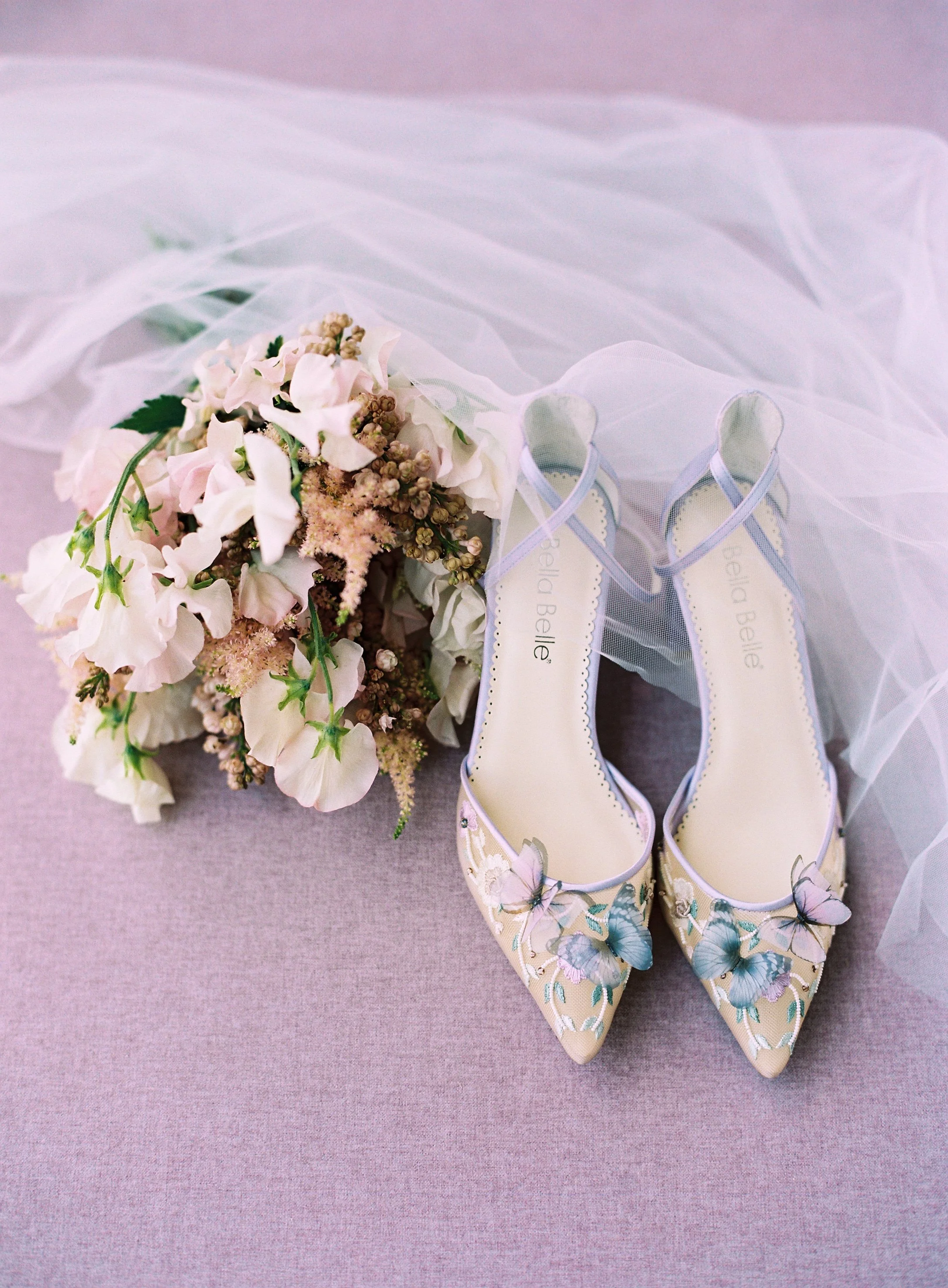
Don’t let beautiful details go unnoticed. Thoughtful flat lay styling helps florists showcase bouquets, shoes, and textures with intention and elegance. See exactly how it’s done.
Start with the Right Foundation
The surface you style on makes or breaks your flat lay. This is especially true for florists, where the delicate colors and textures of your flowers need a backdrop that enhances rather than competes.
Many florists make the mistake of styling on whatever's available. A hotel bedspread at a wedding venue. A wooden table in the studio. These surfaces often have distracting patterns, textures, or colors that pull attention away from your flowers.
Professional styling surfaces are designed specifically to complement floral work. They provide clean, intentional backgrounds that let your arrangements shine. For traveling florists who work on-site at weddings and events, rollable fabric surfaces are essential. They pack flat in your kit, don't wrinkle, and set up instantly wherever you're working.
The key is building a small collection of complementary surfaces in colors that work with most floral palettes. A deep, moody tone like Ironwood creates drama and makes jewel-toned florals pop. Rich greens like Alocasia complement natural, organic arrangements beautifully. For softer, romantic work, gentle neutrals like Lotus provide the perfect canvas.
These surfaces are made with stain-resistant fabric technology, which matters tremendously for florists. Flower stems drip water. Petals shed. Greenery leaves residue. With stain-resistant surfaces, you can work confidently without worrying about damage during styling. The protection is woven into every fiber, not just applied as a coating that wears off over time.
Understand Color Theory for Floral Styling
Color relationships make or break flat lay styling. You already understand color as a floral designer. Now apply that knowledge to your entire composition, not just the flowers themselves.
Your surface color is the foundation of your entire color palette. It occupies the most visual space, so choose strategically based on the flowers you're styling.
For vibrant, saturated florals like dahlias, ranunculus, or garden roses in rich tones, neutral or complementary surfaces prevent color clash. A soft gray like Guilin lets bold flowers command attention without competition.
For soft, romantic arrangements in blush, ivory, and champagne tones, surfaces with subtle warmth prevent your styling from feeling too cool or sterile. Havana adds just enough warmth to complement delicate color palettes without overwhelming them.
For organic, garden-style arrangements with lots of greenery, deeper tones create beautiful contrast. Your greens will actually look greener against a surface like Alocasia, which provides tonal variation without fighting for attention.
Think about complementary colors from the color wheel. Orange and blue. Purple and yellow. Red and green. When your flowers contain one color, consider a surface that leans toward its complement to create visual interest and make colors appear more vibrant.
Also consider analogous colors, which sit next to each other on the color wheel. These create harmony and cohesion. Blue flowers on blue-gray surfaces. Coral flowers on warm terracotta tones. This approach feels sophisticated and curated.
Seasonal inspiration naturally guides color choices. Spring calls for fresh, light palettes with soft neutrals and gentle pastels. Summer embraces vibrant, saturated colors with lots of contrast. Fall leans into warm, earthy tones with depth and richness. Winter pairs beautifully with cool grays, deep greens, and dramatic, moody palettes.
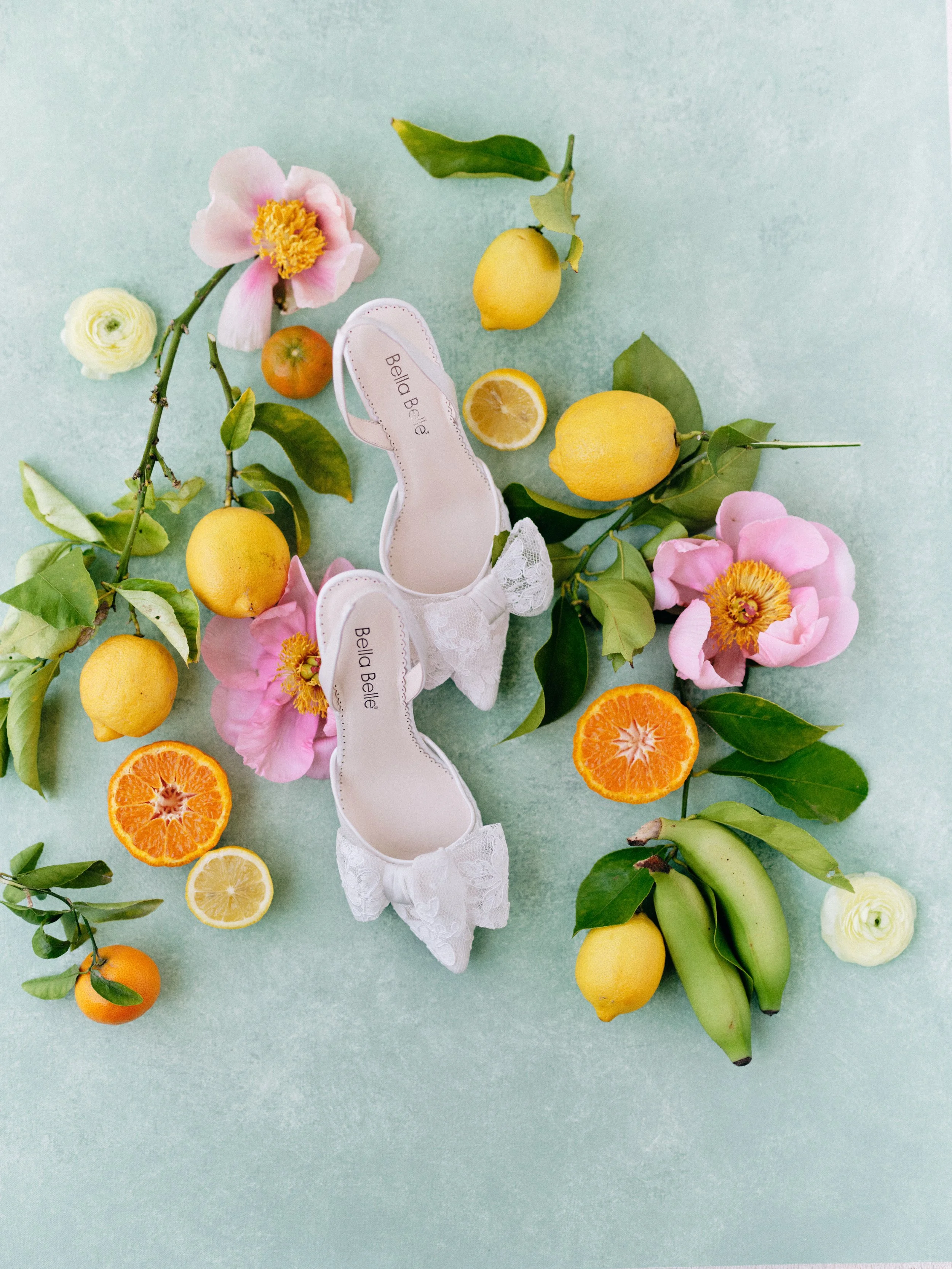
Flat lays falling flat? Bright citrus, bold florals, and layered textures can instantly elevate your styling. Learn how to create eye-catching compositions like this.
Master Texture Layering
Flowers are inherently textural. Velvety rose petals. Delicate sweet pea tendrils. Rough eucalyptus bark. Fluffy peonies. Your flat lay styling should celebrate this variety through intentional texture layering.
Start with your surface, which provides foundational texture. Hand-painted styling surfaces offer subtle texture variation that adds visual interest without competing with your flowers. This is very different from completely smooth surfaces that feel sterile or heavily textured surfaces like raw wood that distract from your subject.
Layer different floral textures intentionally. Combine structured blooms like roses or dahlias with loose, flowing elements like trailing jasmine or sweet pea vines. Include foliage with varying textures. Soft, fuzzy lamb's ear next to glossy camellia leaves next to delicate fern fronds.
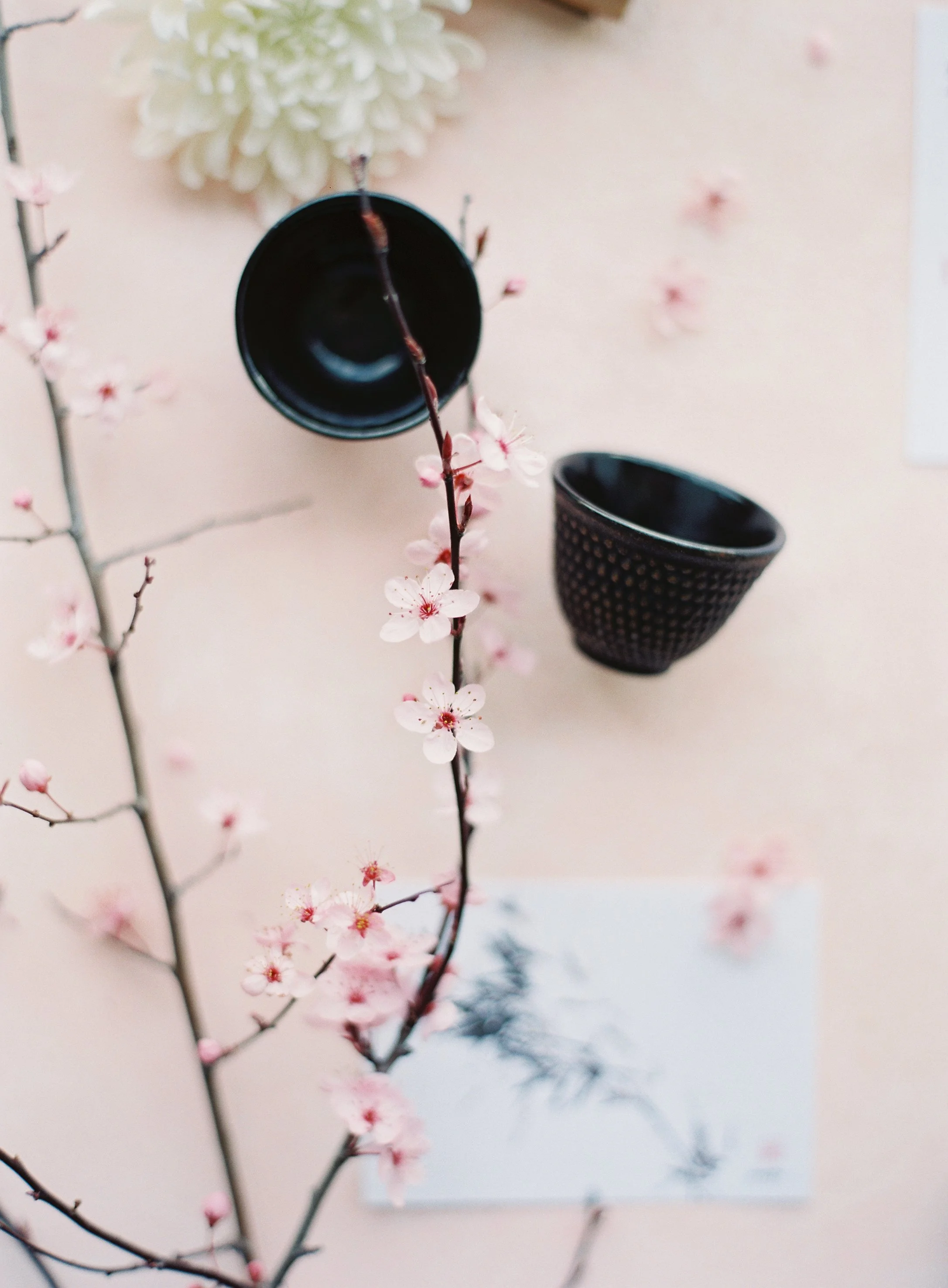
Beautiful flat lays don’t need more, they need intention. Simple elements like cherry blossoms and clean space create calm, balanced compositions.
Add non-floral textures that complement your story. Silk ribbon provides soft, flowing texture that contrasts beautifully with structured flowers. Natural linen adds organic, slightly rough texture. Velvet ribbon introduces luxurious, tactile appeal. Handmade paper or cotton rag invitation suites contribute subtle texture.
For bridal work, include rings on velvet ring boxes, pearl details, or delicate lace from the gown. These textures tell the complete story while creating visual interest.
Avoid too much of any one texture. All smooth and shiny feels cold and disconnected. All soft and matte feels flat and boring. The magic happens in the contrast.
Think about how your textures will look when photographed. Varied textures catch light differently and create dimension in the final image. Side lighting will emphasize your texture choices, so layer with that in mind.
Compose with Intention
Good composition is what separates a basic arrangement from a portfolio-worthy styled flat lay. For floral arrangement photography, composition requires both planning and intuition.
Start by identifying your hero element. What's the star of this flat lay? Usually, it's your bouquet or centerpiece arrangement. Everything else should support and enhance this focal point, not compete with it.
Think about the rule of thirds when placing your arrangement. Rather than centering your bouquet perfectly in the middle of your surface, position it slightly off-center. This creates natural visual interest and movement through the frame.
Embrace negative space. New florists often try to fill every inch of the surface, but professional styling needs breathing room. Let your flowers and props occupy roughly 40% of your surface, leaving 60% as negative space. This makes your important elements stand out and gives the composition room to breathe.
Create visual flow with your styling. How will the eye move through the image? Use trailing elements intentionally. A ribbon flowing from the bouquet toward the corner. Greenery that guides the eye from one element to another. Scattered petals that create subtle direction.
Layer elements at varying heights when possible. Tuck some elements partially under others. A corner of an invitation peeking out from beneath the bouquet. Ribbon winding around stems. This creates depth even in an overhead shot.
Balance doesn't mean symmetry. Asymmetrical compositions often feel more organic and interesting. A large bouquet on the left can be balanced by several smaller elements grouped on the right. Visual weight matters more than physical size.
Let some elements extend beyond the edge of your surface intentionally. A trailing vine flowing off the side. Ribbon that extends to the edge. This makes the composition feel less rigid and more natural, like you captured a moment rather than staging a scene.
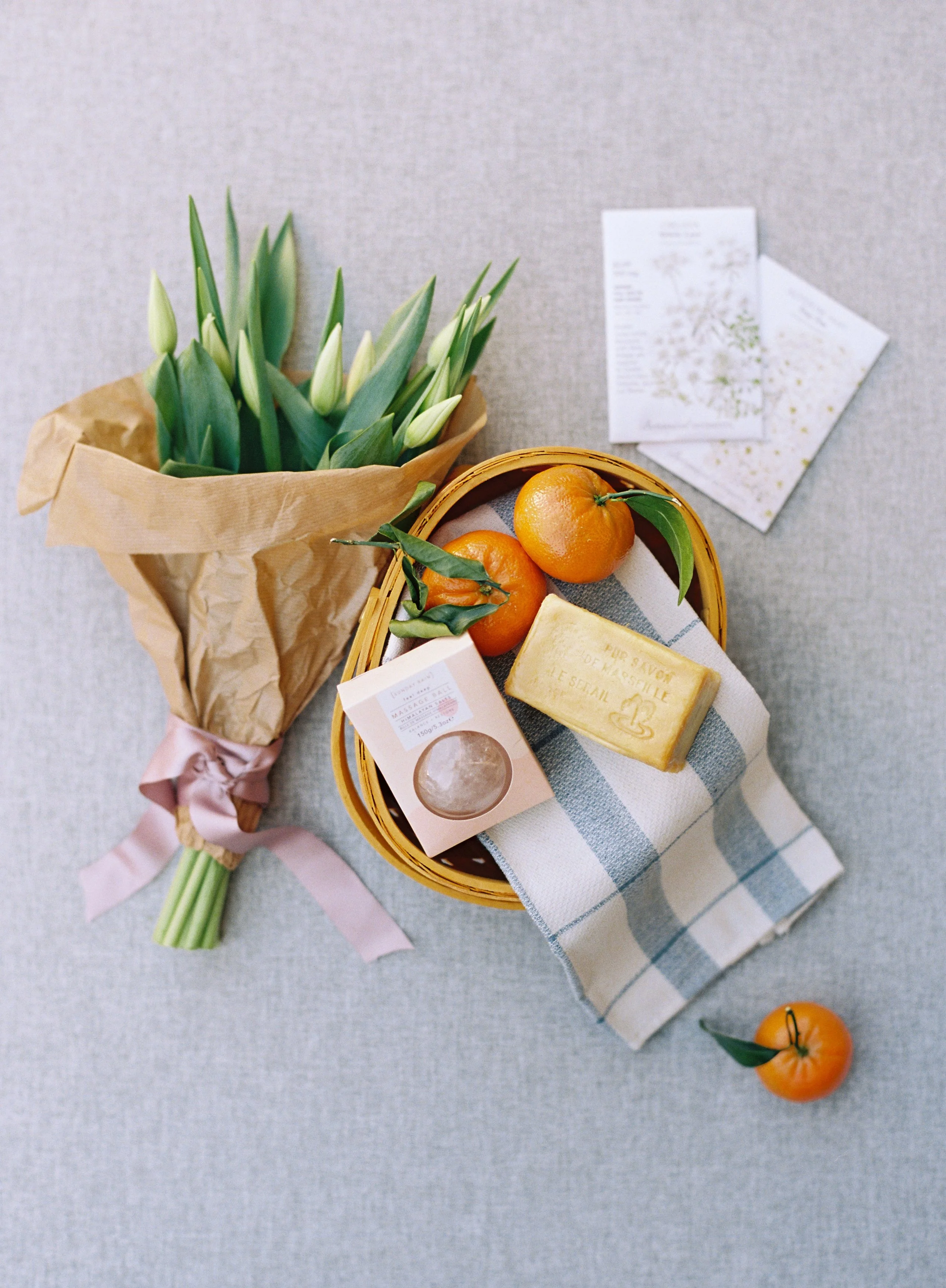
Ever wonder how to make your flat lays feel more ‘real’? Try combining simple elements like flowers, fruit, and textiles to create a lived-in, effortless look.
Style with Purpose and Quality Props
Every element in your flat lay should earn its place. Random props or unnecessary additions clutter your composition and distract from your floral work.
Start with the essentials. Your bouquet or arrangement is the star. What else is absolutely necessary to tell the story? For bridal work: invitation suite, rings, maybe a detail from the gown or veil. For styled shoots: items that reinforce your concept or color palette.
Choose props that complement rather than compete. Ribbon should enhance your flowers, not overpower them with loud patterns or clashing colors. Silk ribbon in complementary tones works beautifully. Velvet adds luxury. Natural linen provides organic texture.
Quality matters tremendously. Dollar store props look cheap and make your entire composition feel low-end. Invest in a small collection of beautiful items you reach for repeatedly. Vintage dishes or trays. Handmade pottery. Quality fabric pieces. These elevate everything they touch.
Maintain your props. Keep ribbon pressed and free of wrinkles. Polish any metallic elements. Ensure everything is clean and in good condition. Details matter when everything will be captured from directly overhead.
Consider the wedding style or shoot concept. Romantic garden wedding? Include organic elements like raw silk, handmade paper, maybe vintage stamps or wax seals. Modern minimalist wedding? Keep props clean-lined and simple with lots of negative space. Bohemian desert wedding? Incorporate natural elements, earth tones, and organic textures.
For styled shoots or portfolio work, props help establish style and aesthetic. Joshua Tree surfaces work beautifully for desert-inspired styling with lots of texture and warmth. Guilin provides the perfect backdrop for moody, editorial work.
Don't forget about the little details that make styled flat lays feel polished. Scattered petals add natural, organic appeal. Trailing ribbon creates movement. A corner of lace or fabric adds softness. These small touches make compositions feel intentional and complete.
Edit ruthlessly before the photographer shoots. Start with more props than you think you'll need, then remove elements one by one until the composition feels balanced. When in doubt, less is more. No prop is better than a cheap or poorly chosen one.
Work Smart at Wedding Venues
Styling flat lays on-location at weddings requires preparation and flexibility. You're often working in less-than-ideal conditions with limited time and space.
Scout your location when you arrive. Look for good natural light near windows. Find a stable surface where you can set up without being in anyone's way. Coordinate with the photographer about timing and location.
Bring your own surfaces. Don't rely on finding something suitable at the venue. Rollable fabric styling surfaces are perfect for traveling florists because they pack flat, resist wrinkles, and set up in seconds. You can transform any space into a professional styling area.
Keep your styling kit organized and portable. Have your surfaces, props, and styling tools in one bag that's easy to grab and transport. This saves precious time when you're working on a tight wedding day timeline.
Communicate with the photographer. Ask about their preferred composition style. Do they like lots of negative space or fuller compositions? What angle will they be shooting from? This helps you style appropriately for their vision.
Handle flowers carefully when styling. Fresh arrangements for flat lays need to be styled quickly before flowers wilt under warm lights or in hot venues. Have a spray bottle handy to keep blooms looking fresh.
Protect your surfaces from water damage. Even with stain-resistant fabric, laying down a piece of clear acrylic or glass under wet stems provides extra protection and makes cleanup easier. The acrylic won't show in overhead shots.
Be ready to adjust on the fly. Venues have different lighting, space constraints, and available surfaces. Your ability to adapt while maintaining professional results is what makes you valuable to photographers and clients.
Build Your Signature Styling Aesthetic
The most successful florists have recognizable, consistent work. When potential clients browse your portfolio or Instagram feed, they should immediately recognize your aesthetic through both your arrangements and how they're styled.
Develop consistency in your surface choices. When you use the same high-quality styling surfaces across your work, your portfolio naturally feels more cohesive. The colors and textures become part of your signature look.
Consider your overall brand aesthetic. Your flat lay styling should align with your floral design style. If your arrangements are romantic and garden-inspired, your styling should reflect that softness with gentle colors and organic props. If you specialize in modern, architectural arrangements, your styling should feel clean and contemporary.
Create a mood board of flat lay styling you admire. What elements do you gravitate toward? What colors appear repeatedly? What props show up in your favorite images? This helps you identify your natural aesthetic preferences.
Invest in props that reflect your style. If you love romantic, ethereal work, collect silk ribbons, vintage stamps, delicate papers. If you prefer modern, minimalist styling, invest in clean-lined props with simple elegance.
Work with photographers who understand your vision. The best photographer-florist relationships happen when both parties appreciate each other's aesthetic and can collaborate to create cohesive work.
Your Work Deserves Beautiful Surfaces
Flat lay styling is how your artistry gets shared with the world. It's how you attract dream clients, build your reputation, and showcase the skill that goes into every arrangement you create.
The difference between amateur and professional flat lay styling for florists often comes down to having the right tools. Quality styling surfaces designed specifically for photography. Surfaces that travel well for on-location wedding work. Surfaces that resist stains so you can work confidently with wet stems and delicate petals.
At Chasing Stone, we create styling surfaces specifically for traveling creatives who refuse to compromise on quality. Every piece is handcrafted in our California studio with professional-grade materials. Our revolutionary stain-resistant fabric surfaces mean you never worry about spills or damage during styling. The protection is woven into every fiber, not just applied as a coating that wears off.
For florists, this changes everything. Style bouquets with wet stems. Work with arrangements that drip and shed. Create confidently knowing your surfaces can handle whatever your florals require.
Our surfaces roll without wrinkling, pack flat in your kit, and set up instantly at any venue. No ironing. No fussing. No compromising on quality because you're working on-location.
Ready to elevate your floral flat lay styling? Explore our complete collection and discover the surfaces that will transform how your work is showcased.
Your flowers are works of art. Style them that way.

Creators of premium photography backdrops and styling surfaces
Trusted by thousands of discerning creatives worldwide
Every piece is handcrafted with intention in Orange County, California