
10 Flat Lay Mistakes That Make Your Work Look Amateurish
Updated on Apr. 11, 2026
There's a certain magic to a well-executed flat lay. The kind that makes people stop mid-scroll, lean in closer, and wonder how you achieved that editorial quality. It looks effortless, but here's what most people don't realize: those stunning images aren't the result of expensive gear or innate talent.
They're the result of knowing exactly what to avoid.
The gap between amateur and professional flat lay photography often comes down to a handful of technical details. Small, fixable things that are easy to miss in the moment but make all the difference in the final image.
After working with thousands of photographers, florists, and wedding creatives, we've identified the exact missteps that hold most people back. Let's walk through the ten most common mistakes and how to fix them.
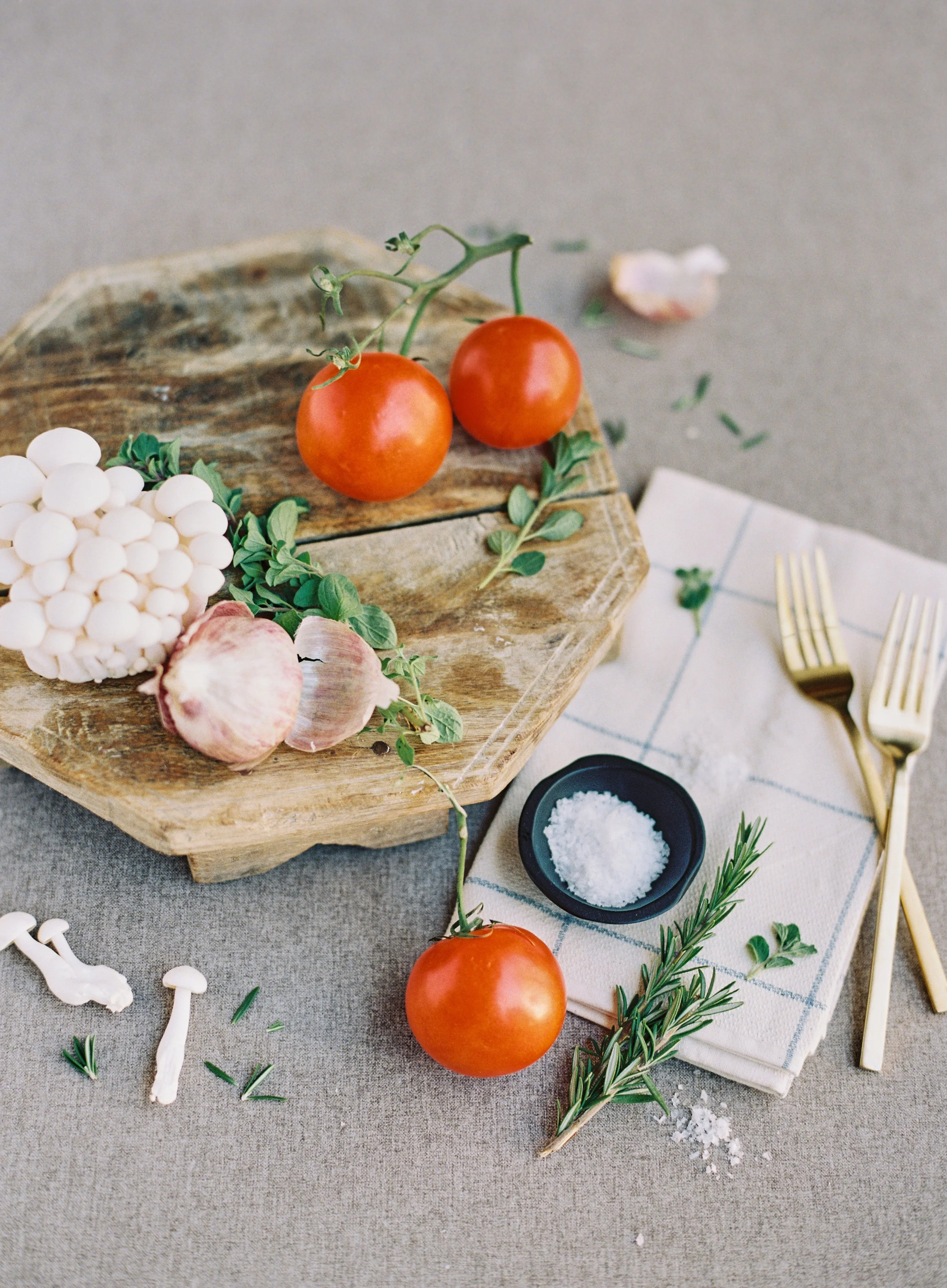
Most flat lay mistakes come down to clutter and lack of balance. Thoughtful placement of ingredients, textures, and negative space makes all the difference.
Mistake #1: Using Distracting or Low-Quality Backgrounds
This is the single biggest mistake we see, and it undermines everything else you do right.
You've styled beautiful objects. Your composition is thoughtful. Your lighting is decent. But you shot on a wrinkled bedspread, a stained table, or worse, a surface with a busy pattern that competes with your subject matter.
Your background should enhance your subject, not distract from it. When viewers notice your surface before they notice your carefully styled objects, you've lost them. Wrinkles, stains, strong patterns, or obvious textures like wood grain or tile pull attention away from what you're actually trying to showcase.
You'll see this show up as hotel bedspreads with visible wrinkles or patterns, wood surfaces with prominent grain that creates visual noise, marble or tile with strong veining that draws the eye, plain white backgrounds that feel sterile and lifeless, or dirty, stained, or damaged surfaces that look unprofessional.
Invest in professional styling surfaces designed specifically for photography. Hand-painted surfaces offer subtle texture and tone variation that adds visual interest without competing with your subjects. They're sophisticated enough to look intentional but neutral enough to let your styling shine.
For traveling creatives, rollable fabric surfaces are game-changers. They pack flat, don't wrinkle, and set up instantly in any location. Plus, stain-resistant technology means you can work confidently without worrying about spills or damage.
Build a small collection of complementary styling surfaces in neutral tones. A soft white or cream like Santorini, a warm beige or terracotta like San Miguel, and a gentle gray like Silt give you versatility for any project or aesthetic.
Mistake #2: Overcrowding the Composition
More isn't better. In fact, it's usually worse.
New flat lay photographers often try to include too many elements, thinking abundance equals impact. But overcrowded compositions feel chaotic, overwhelming, and unfocused. The viewer's eye doesn't know where to land, so they keep scrolling.
Every element in your frame should have a purpose. When you include too much, nothing stands out. The important details get lost in visual noise. Instead of feeling curated and intentional, your work looks cluttered and amateur. You'll see objects crammed edge to edge with no breathing room, too many props competing for attention, no clear focal point or hero element, visual chaos that makes the eye jump around frantically, and an inability to identify what you're actually trying to showcase.
Embrace negative space. Follow the 40/60 rule: let your objects occupy roughly 40% of your frame, leaving 60% as negative space. This isn't wasted space. It's what makes your important elements breathe and allows the viewer's eye to rest.
Before you shoot, ask yourself: "What am I trying to showcase here?" Remove anything that doesn't support that answer. Start with more than you need, then edit ruthlessly, removing elements until the composition feels balanced.
When you're working with hand-painted styling surfaces that feature subtle texture and tone variation, your negative space becomes an active part of the composition. It's not just emptiness, it's a sophisticated design element that enhances everything else.
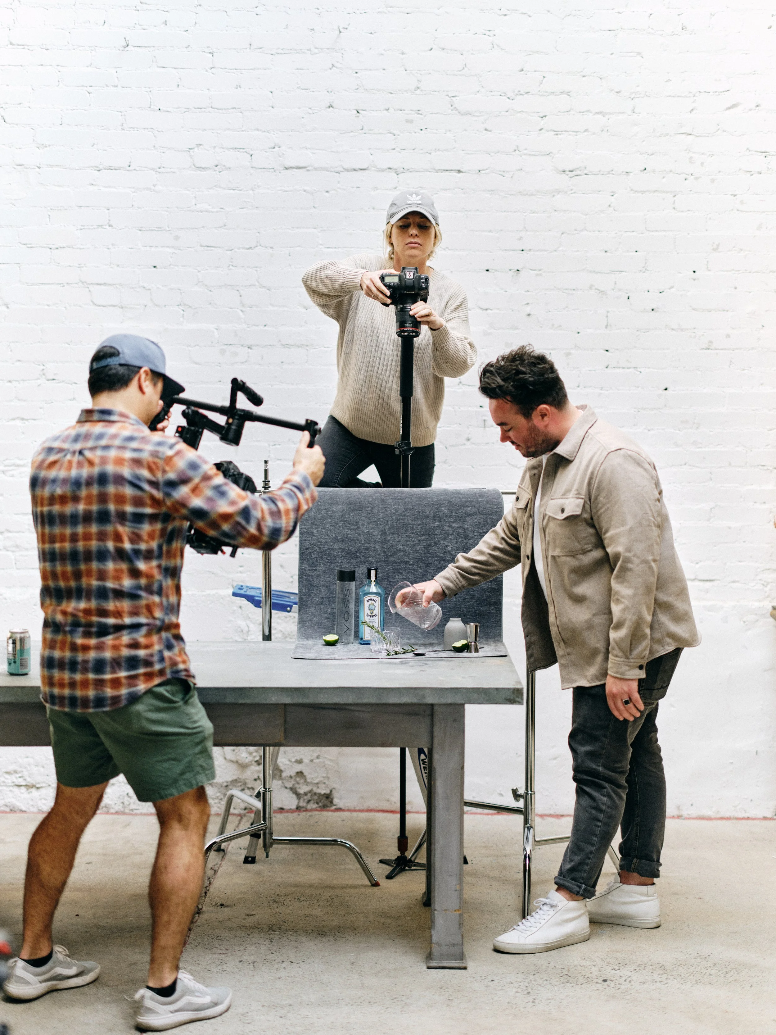
Ever feel like your flat lay just isn’t working? Most of the magic happens right here by tweaking, moving, and refining every small detail.
Mistake #4: Ignoring the Rule of Thirds
Centering everything might seem like the safe choice, but it's one of the fastest ways to create static, boring compositions.
Perfect centering creates symmetry that feels rigid and uninteresting. The human eye is drawn to compositions with dynamic tension and visual flow. When everything is centered, there's no movement and no journey through the image. It feels like a catalog shot rather than artful photography.
This mistake typically looks like a hero object placed dead center in the frame, all elements arranged in a bullseye pattern, equal spacing between all objects creating unnatural rigidity, static, lifeless feeling despite beautiful styling, and compositions that feel like product shots rather than editorial imagery.
Embrace the rule of thirds. Imagine your frame divided into a 3x3 grid, most cameras can display this overlay. Place your hero element at one of the four intersection points rather than dead center.
This creates natural visual interest and gives the composition breathing room. Your eye naturally moves through the frame rather than landing in the middle and stopping.
Balance doesn't mean symmetry. You can create beautiful balance with asymmetrical compositions where a large element on one side is balanced by several smaller elements on the other.
Let some elements extend beyond your frame edge intentionally. A trailing ribbon or foliage flowing off the side adds movement and makes the composition feel less static.
The subtle tone variations in hand-painted styling surfaces can help guide this process. You can strategically place darker objects against lighter areas of your surface for natural contrast and visual flow.
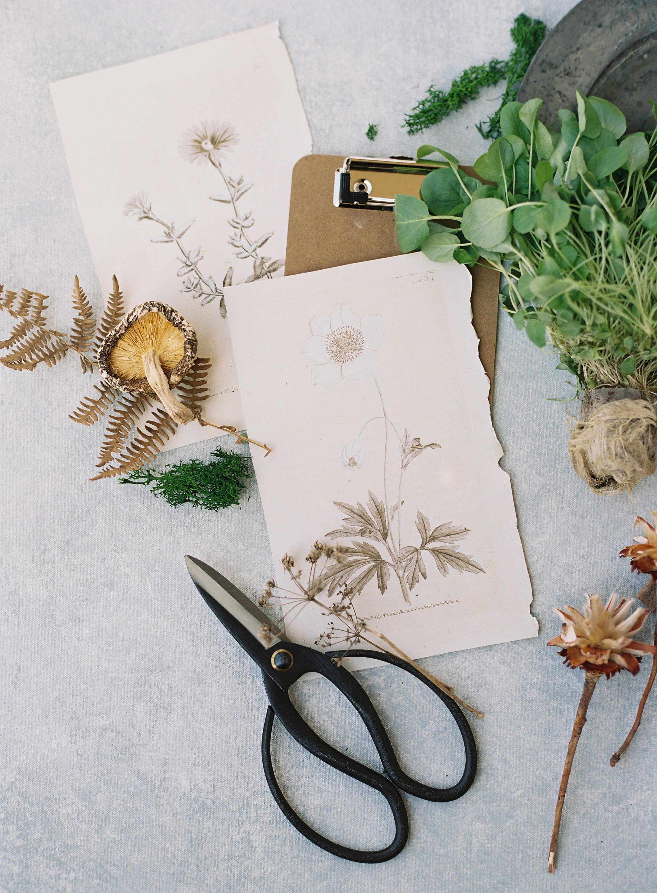
Flat lays feeling flat or uninspired? Mixing organic textures like botanicals, paper, and natural elements can instantly add depth and visual interest.
Mistake #5: Shooting from the Wrong Angle
Flat lays should be shot from directly overhead. It's in the name. Yet many photographers shoot at an angle, creating distortion and losing the clean, editorial aesthetic that makes flat lays so appealing.
When you shoot at an angle instead of straight overhead, you create perspective distortion. Rectangular objects like invitations or books appear warped and trapezoidal. Circular items look elliptical. The composition loses its clean, graphic quality and starts to feel off, even if viewers can't articulate why.
You'll notice invitations or rectangular items that appear wider at the bottom than the top. The angle obscures elements so you can't see the full composition. Shadows fall in strange directions. Something just feels "off" about the perspective, and you lose that clean, organized aesthetic that makes flat lays appealing.
Position your camera perfectly parallel to your surface. This is easiest with a tripod that has a horizontal center column or boom arm. These allow you to extend your camera directly over your composition.
If your tripod doesn't have this feature, position it carefully so the camera points straight down. Use your camera's level indicator to ensure perfect alignment.
Shooting tethered to a laptop or tablet helps tremendously. When you're directly overhead, you can't easily see your camera's LCD screen. Tethering lets you see exactly what you're capturing in real-time.
A step stool or small ladder helps you get high enough above your composition to capture everything without distortion, especially for larger flat lays.
Mistake #6: Poor Focus and Sharpness
Soft, blurry images are the hallmark of amateur work. If your details aren't tack-sharp, nothing else matters.
Flat lays are all about showcasing details: the texture of paper, the engraving on rings, or the delicate petals of flowers. When these details aren't sharp, you've failed at the primary goal. Soft images suggest lack of technical skill and make even beautiful styling look unprofessional.
Common issues include critical elements like text or main subjects that lack crisp detail. You might see overall softness throughout the image, or some elements in focus while others are unacceptably soft. Fine details disappear even when viewing large. And images that look fine on your phone appear soft on a computer screen.
Use the right aperture. For flat lays, f/5.6 to f/8 is typically ideal. Wide open like f/2.8 or wider risks having elements fall out of focus, especially if your surface isn't perfectly flat or items have varying heights. Too narrow at f/16 or more and diffraction reduces sharpness.
Focus on your most important element using single-point autofocus. In Live View mode, use focus magnification to ensure critical sharpness on your hero element.
Always use a tripod. Even tiny camera shake at slower shutter speeds will destroy sharpness. A tripod ensures every shot is crisp.
Use a cable release or your camera's timer to avoid any vibration from pressing the shutter button.
Shoot in good light so you can keep your ISO low between 200-400 and your shutter speed fast enough, at least 1/125, to eliminate any motion blur.
Mistake #7: Ignoring Color Harmony
Throwing together colors randomly creates visual chaos. Professional flat lays use color intentionally to create mood and guide the eye.
Color relationships affect how viewers feel about your images. Clashing colors feel jarring and unpleasant. Too many colors create confusion. Poor color choices can make beautiful objects look cheap or unappealing. When color isn't handled skillfully, even perfectly styled compositions fail.
Watch for colors that clash or create visual tension in unpleasant ways, too many competing colors with no clear palette, surface color that fights with your objects rather than complementing them, overall feeling of discord or confusion, and objects that don't "pop" because the color relationships are off.
Understand basic color theory. Complementary colors that are opposite on the color wheel create impact and make elements stand out. Analogous colors that are next to each other on the wheel create harmony. Monochromatic palettes with variations of one color feel sophisticated and cohesive.
Choose your surface color strategically. If you're showcasing vibrant objects, neutral surfaces let them shine. If you're working with soft, subtle objects, styling surfaces with gentle warmth like Havana prevent your images from feeling too cool or sterile.
Follow the 60-30-10 rule: 60% dominant color, often your surface and negative space, 30% secondary color for your main objects, and 10% accent color for pops of contrast or interest.
Build a collection of styling surfaces in complementary tones so you're prepared for any color palette. Soft neutrals like Santorini, warm tones like San Miguel, and cool grays like Silt give you versatility.
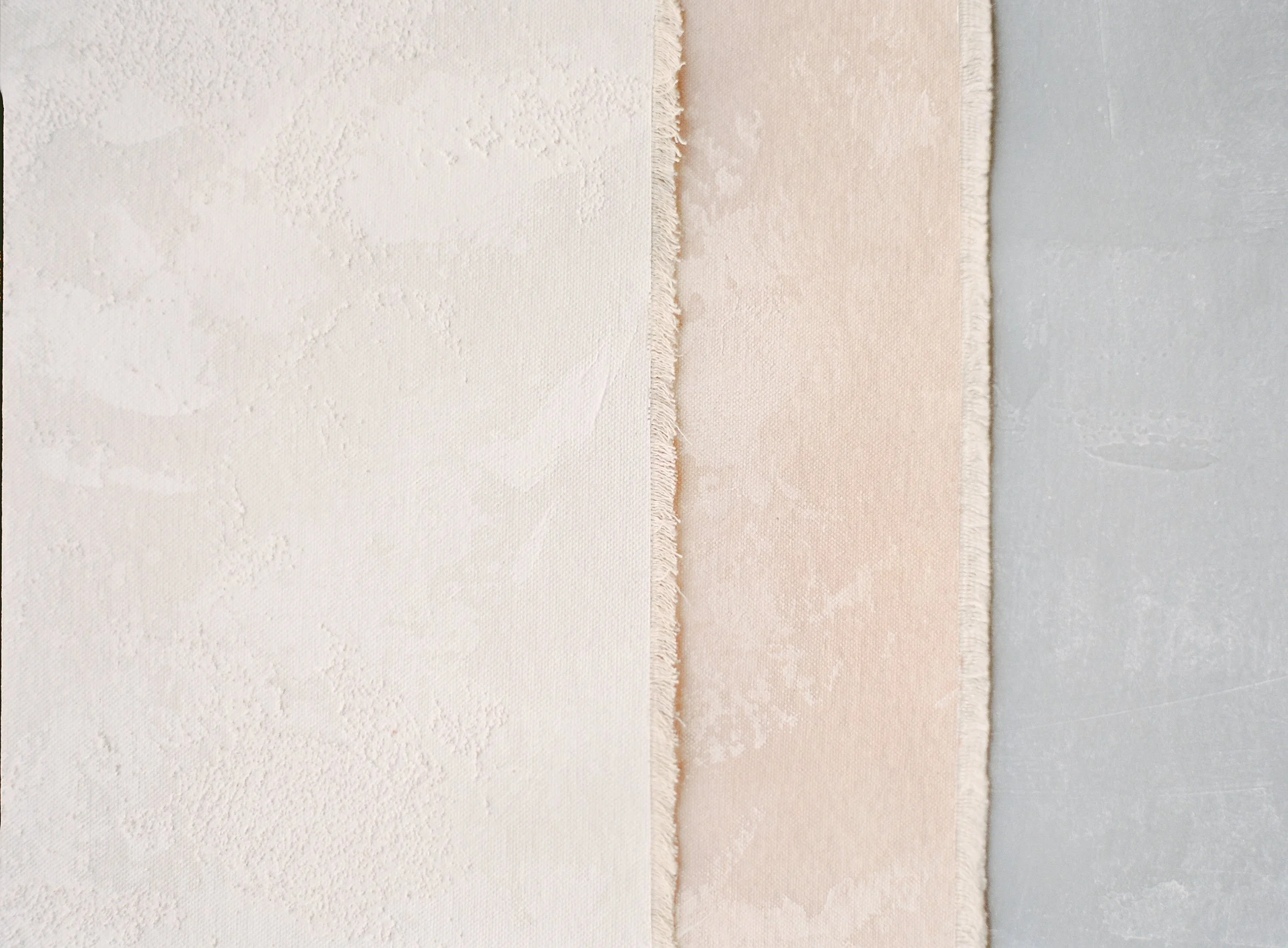
The best flat lays start with the right foundation. A curated set of styling surfaces in complementary tones gives you flexibility to style any scene with ease and consistency.
Mistake #8: Forgetting About Texture Variation
Flat images need textural interest to feel three-dimensional and engaging. Too much of the same texture feels flat and boring.
Texture is what makes a two-dimensional image feel tactile and real. When everything in your composition has similar texture, there's no visual intrigue. The image feels flat in a bad way and fails to engage viewers. Your eye needs texture variation to create interest and dimension.
Common problems include everything smooth and shiny with no contrast, all matte surfaces with no variation, lack of visual interest despite good composition, images that feel flat and lifeless, and inability to engage viewers for more than a second.
Intentionally combine different textures in every flat lay. Mix smooth elements such as glass, paper, metal with textured ones like fabric, florals, natural elements. Include both matte and slightly reflective surfaces.
Your background provides foundational texture. This is why hand-painted styling surfaces work so beautifully. They offer subtle texture variation that provides visual interest without competing with your subjects. Unlike completely smooth surfaces that feel sterile, or heavily textured surfaces that distract, artfully painted surfaces hit the perfect balance.
Consider how light reveals texture. Side lighting emphasizes texture better than flat, frontal light. Position your light source to create gentle shadows that show off the textures in your composition.
Layer deliberately: smooth invitation on a textured surface, soft ribbon across structured paper, delicate florals next to hard objects.
Mistake #9: Inconsistent Editing Across Your Portfolio
Your individual images might be beautiful, but if they all look different, your portfolio feels disjointed and unprofessional.
Consistency is a hallmark of professional work. When potential clients browse your portfolio or Instagram feed, they should immediately recognize your aesthetic. If every image has different color grading, contrast levels, or mood, you look like you're still finding your style or copying other photographers without a clear vision of your own.
This shows up as some images warm-toned, others cool-toned with no clear reasoning, varying levels of contrast and saturation across your portfolio, no recognizable editing style or signature look, a portfolio that feels like it belongs to multiple different photographers, and difficulty building a cohesive brand identity.
Develop your signature editing style and apply it consistently. This doesn't mean every image looks identical, but they should all feel cohesively "you."
Create Lightroom presets that reflect your aesthetic. Start with your color temperature preference like warm, cool, or neutral, typical contrast and clarity adjustments, and any color grading you apply. Use these as starting points for every flat lay, then fine-tune as needed.
Before posting or delivering images, view them together. Do they feel like they belong to the same collection? If not, adjust until they do.
Pay attention to how you edit your backgrounds. If you're using professional styling surfaces, their consistent quality makes editing easier and more uniform across your work.
Consider the overall mood you want to convey. Bright and airy? Moody and dramatic? Soft and romantic? Modern and crisp? Choose one and commit.
Mistake #10: Using Crooked Lines and Poor Alignment
Nothing screams amateur louder than elements that should be straight but aren't. Tilted invitations, misaligned papers, or skewed compositions destroy the polished look you're working toward.
Flat lays rely on clean lines and intentional placement to feel professional. When rectangular elements are crooked or the overall frame is tilted, it looks sloppy and unintentional. Even a slight tilt that you might not notice while shooting becomes glaring when viewed on a larger screen.
You'll see invitations or paper goods that appear tilted, horizontal or vertical lines that aren't parallel to your frame edges, overall composition that feels slightly "off" or uncomfortable to view, loss of the clean, organized aesthetic that makes flat lays appealing, and a sense of carelessness that undermines otherwise beautiful work.
Use your camera's grid overlay when shooting. Enable the on-screen grid, usually a 3x3 grid or rule-of-thirds overlay, and use it to align rectangular elements with the frame edges.
For overhead shooting, ensure your camera is perfectly parallel to your surface using your camera's built-in level. Most modern cameras have electronic levels.
When arranging elements, use the edges of your surface as guides. Align rectangular items parallel to these edges unless you're intentionally creating diagonal interest. And if you are, make it obviously intentional with significant angle, not just slightly off.
In post-processing, use the straightening tool in Lightroom or Photoshop. Even if you shot carefully, a minor adjustment often makes the image feel more polished.
When you're working with professional styling surfaces that have clean edges, it's easier to align everything correctly during the shoot itself.
Bonus Mistake: Using Poor Quality Props
Your main subjects might be beautiful, but cheap or inappropriate props undermine the entire composition.
Props should enhance your story, not detract from it. Dollar store items, obviously plastic flowers, or mismatched elements that don't fit your aesthetic make the entire composition feel low-quality. Your props communicate just as much about your style and standards as your main subjects do.
Look out for fake flowers when using artificial florals, props in poor condition that are tarnished, damaged, or worn, items that obviously don't belong together aesthetically, and elements that feel like afterthoughts rather than intentional choices.
Invest in quality props that align with your aesthetic. You don't need many. A few beautiful pieces you reach for repeatedly are better than a large collection of mediocre options.
Choose props that tell a story relevant to your subject matter. For wedding photographers: invitation suites, ribbon, jewelry, meaningful personal items. For florists: quality ribbon, handmade pottery, natural linen. For product photographers: items that complement your products' lifestyle or use.
Make sure to maintain your props and ensure everything is clean and in good condition.
When in doubt, less is more. No prop is better than a cheap or inappropriate one.
The Common Thread: Intention
Notice the theme running through all these mistakes? Lack of intention.
Amateur flat lays happen by accident. Throwing together whatever's available, shooting in whatever light exists, hoping it turns out okay. Professional flat lays are crafted deliberately with every element chosen purposefully, every decision made with clear reasoning.
The good news? Intention is a skill you can develop. You don't need expensive equipment or years of experience. You need awareness of what makes flat lays work, practice implementing those principles, and the right tools to execute your vision.
Ever wonder why your flat lays don’t look like this? It’s not just the props. It’s the setup, the surface, and the small adjustments happening behind the scenes.
Transform Your Flat Lay Photography
Here's what professional flat lay photography comes down to: thoughtful choices and quality tools.
You now know the mistakes to avoid. You understand why they happen and how to fix them. The next step is having styling surfaces and equipment that set you up for success rather than fighting against you.
At Chasing Stone, we create styling surfaces specifically for photographers and creatives who refuse to compromise on quality. Every piece is handcrafted with intention in our California studio, designed to eliminate many of the mistakes we've discussed here.
Our hand-painted styling surfaces provide clean, professional backgrounds that enhance rather than distract. The subtle texture variation adds visual interest without competing with your subjects. The carefully curated color palette works with virtually any styling choice.
Our revolutionary stain-resistant fabric surfaces mean you never have to worry about spills, damage, or that sinking feeling when something goes wrong during a shoot. The protection is woven into every fiber, not just applied as a coating that wears off.
For traveling creatives, our styling surfaces roll without wrinkling, pack flat, and set up instantly. No ironing, no fussing, no compromising on quality because you're shooting on-location.
We believe that in a world of mass production and automation, handmade artistry matters. Just as you're creating art with your flat lays, we're creating art with our styling surfaces. That alignment of values shows in the final result.
Ready to eliminate these amateur mistakes and create flat lays that truly showcase your artistic vision?Explore our complete collection of styling surfaces and backdrops, each piece designed to help you avoid common errors and create work that stands out.
Your most professional flat lay is one beautiful surface away.

Creators of premium photography backdrops and styling surfaces
Trusted by thousands of discerning creatives worldwide
Every piece is handcrafted with intention in Orange County, California