
Negative Space in Portrait Photography: Using Backdrops for Minimalist Composition (2026)
Posted on Jun. 4, 2026
The most powerful element in a portrait is often the one the photographer chose not to fill. A subject suspended in breathing room. Light moving across a surface that holds dimension even when defocused. The space around the figure becomes as compositionally active as the figure itself, and the photograph is no longer about filling the frame. It is about the architecture of what surrounds the subject: the deliberate choice to leave room for the viewer's eye to rest, to contemplate, to project their own emotional response onto the silence.
This is the power of negative space in portrait photography, and here is what separates sophisticated minimalist composition from work that merely looks sparse: the backdrop you choose is not a neutral container. It is the negative space itself. Hand-painted canvas backdrops function as an intentional compositional element, providing tonal depth and textural presence that prevents emptiness from reading as mere absence. In 2026, as editorial publications increasingly favor cinematic breathing room and fine art print markets reward compositions with generous empty space, the choice of backdrop surface has become a direct extension of your compositional voice.
We explore how to use hand-painted canvas as a conscious partner in minimalist portrait composition, from geometric subject placement to material expertise that transforms negative space from empty background into living presence.
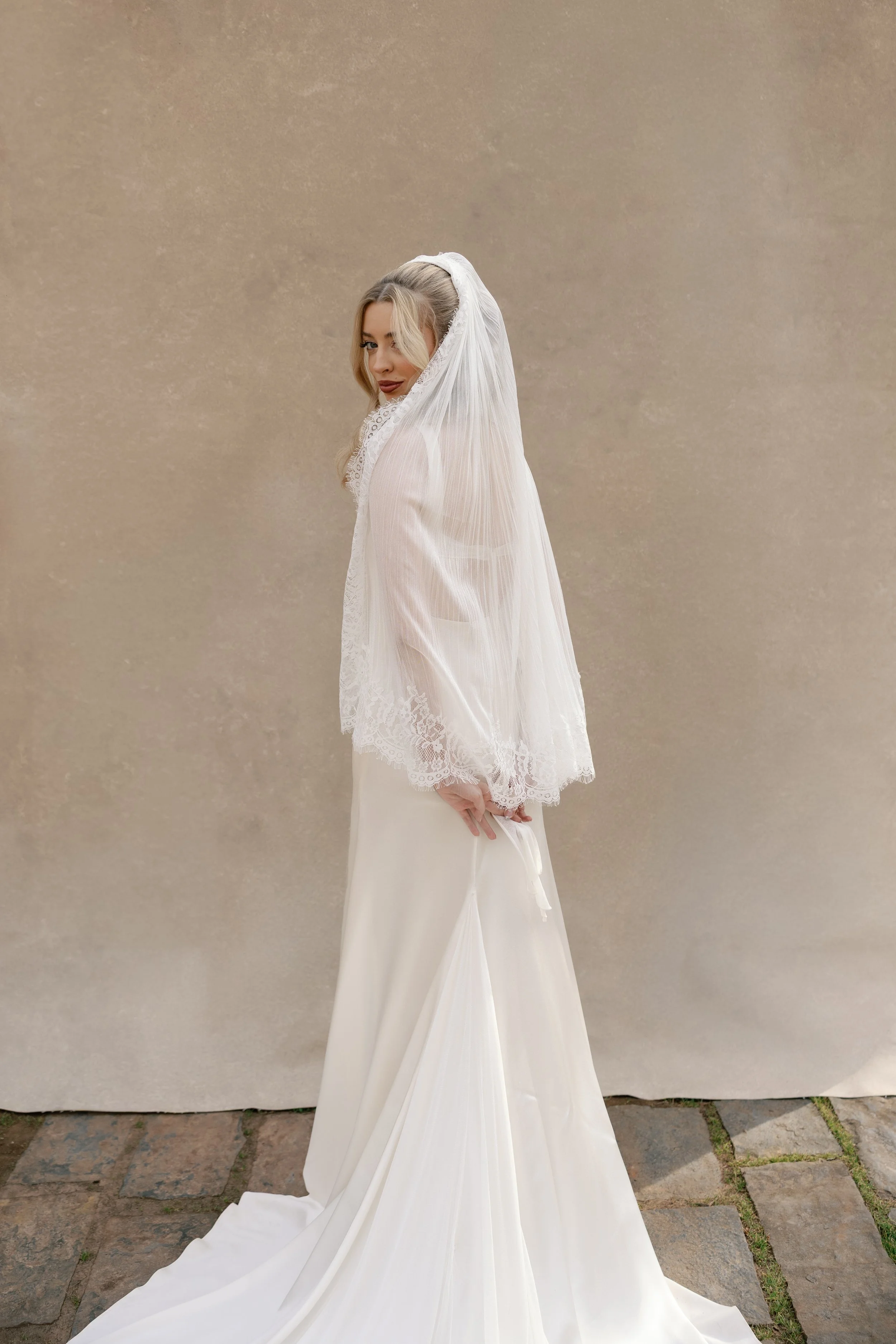
This is what 70/30 negative space looks like when the surface behind the subject holds tonal depth, the warmth and texture remain present even out of focus, so the empty space reads as composition rather than absence. Every Chasing Stone canvas is hand-painted to deliver exactly this quality on demand.
The Compositional Power of Nothing
Negative space (sometimes called white space or void) is the area of a composition that surrounds the subject without containing additional visual elements. For most photographers, this is a learned discipline, a deliberate decision that comes only after years of practicing the opposite impulse: filling the frame, including context, building richness through layered elements. The minimalist approach represents a reversal. It is the understanding that what you choose not to include carries as much compositional weight as what you do.
The trend toward negative space compositions has accelerated considerably. There are several reasons. First, the digital ecosystem has trained viewers to process images at multiple scales: the same photograph appears on a three-inch phone screen, a monitor, and a large-format print. Negative space photographs translate beautifully across these scales because the composition does not depend on fine detail or visual complexity. The tonal relationships and subject positioning remain legible at any size. Second, editorial platforms like WedVibes, Over the Moon, and luxury wedding publications have increasingly favored wide-aspect layouts with generous breathing room for text and editorial context. A minimalist portrait with ample negative space accommodates these layouts naturally. Third, the fine art print market (galleries, collectors, interior designers) has embraced negative space as a mark of intentionality and confidence. A photographer willing to leave 60 or 70 percent of the frame empty is saying something about self-assurance and artistic vision.
But negative space is not absence. This is the critical distinction that separates sophisticated minimalist composition from work that merely looks underpopulated. Negative space, when executed with intention, is a form of presence. It is the visual equivalent of silence in music: not the absence of sound, but the deliberate use of quiet as a compositional device. In a portrait, negative space directs the viewer's attention to the subject with the precision of a spotlight, removes all competing visual elements, and creates emotional resonance through what the viewer brings to the emptiness themselves.
For the accomplished photographer working at the top of their field, negative space is no longer a technique to learn. It is a compositional language to master. And that mastery begins with understanding that your backdrop is not a neutral background. It is the foundation of your negative space language.
Why Backdrop Choice Defines Your Negative Space
Here is a physical truth that separates hand-painted canvas from every other backdrop material: canvas absorbs and diffuses studio light, while vinyl reflects it, while seamless paper does neither consistently. This is not an opinion. It is material science. And it has profound implications for how negative space reads in a portrait.
When you shoot against a mass-produced vinyl backdrop or a roll of seamless paper, you are working against the inherent properties of the surface. Vinyl, especially when lit from the front or at shallow angles, bounces light back toward the camera in specular reflections. These create hot spots, areas where the backdrop becomes brighter than the subject, pulling the viewer's eye away from the figure. The backdrop reads as a flat, printed plane. It does not breathe. It does not hold dimension. The negative space feels like empty background: the default choice rather than an intentional compositional decision.
Hand-painted canvas operates under completely different optical properties. The raw cotton weave has natural texture. The layered pigment that Jennifer applies over two to three days sits in those fibers, absorbing light and diffusing it across a surface with actual depth. Even when the canvas is rendered soft at f/2.8 or f/4 and the texture dissolves into bokeh, the eye perceives something the lens cannot resolve: warmth, dimension, tonal complexity. There is a presence to the negative space. The surface feels alive.

This is where every Chasing Stone backdrop begins with pigment mixed by hand in a California studio. The four to six translucent layers built over two to three days are what give each canvas the tonal depth that makes negative space feel alive.
We paint each canvas with brushstrokes that move in varied directions specifically so the surface responds differently depending on where the light falls. A single hand-painted backdrop can read as a smooth, ethereal wash under flat frontal light, or as a richly dimensional surface under directional illumination. That range is built into the painting process itself. Over the course of two to three days, Jennifer builds four to six translucent layers, each one shifting the undertone slightly, creating optical depth that remains present even when completely out of focus. This is what separates a backdrop that functions as intentional negative space from one that merely fills the frame with color.
The photographers whose work appears in the pages of WedVibes and Over the Moon understand this at an intuitive level. They choose their surfaces the way a painter chooses canvas texture, because the surface is part of the composition. When you compose a minimalist portrait, the question of backdrop surface is not peripheral. It is central to whether your negative space feels intentional or accidental, whether it commands presence or reads as emptiness.
The Geometry of Emptiness: Subject Placement for Negative Space Portraits
The placement of your subject within the frame, and therefore the proportional distribution of negative space around the figure, is a deliberate compositional choice. For generations, photographers have relied on the rule of thirds, dividing the frame into a three-by-three grid and positioning the subject along those lines or at their intersections. The rule works. It is intuitive, easily taught, and produces balanced compositions that feel natural to the viewer.
But for minimalist negative space portraiture, a more sophisticated approach often yields superior results: the golden ratio, sometimes called the Phi Grid, which divides the frame in approximately 1:0.618:1 proportions. The Phi Grid positions the subject slightly more centrally than the rule of thirds would, creating negative space around the figure that feels balanced and intentional rather than accidental. The surrounding area does not fight the subject for visual attention; it supports the subject's presence in the frame.
Beyond the grid itself, there are three specific spatial relationships that matter. The first is nose room or gaze room: if the subject is looking toward one side of the frame, leaving space in the direction of their gaze creates visual comfort and narrative motion. If you place the subject tight against the edge toward which they are looking, the composition feels cramped and closed. The second relationship is directional space: the space in front of the subject versus the space behind them. A subject positioned close to the backdrop with generous space in front creates intimacy and intensity. A subject positioned farther from the camera with more space behind them feels more expansive and contemplative. The third relationship is vertical positioning: a subject placed higher in the frame with negative space below creates openness and freedom, while a subject in the lower half with space above creates a sense of weight or grounding.
For minimalist compositions, the most effective ratios are typically between 60/40 and 70/30, meaning 60 to 70 percent negative space to 30 to 40 percent subject presence. Within that range, the exact ratio depends on your emotional intent. A subject occupying only 20 to 30 percent of the frame creates pronounced isolation, vulnerability, or grandeur depending on posture and expression. At 40 percent subject presence, the composition feels more grounded, intimate, and self-assured. Anywhere between 30 and 40 percent subject presence is the sweet spot for most professional portrait work where negative space serves as a deliberate compositional element rather than incidental framing.
In minimalist portraiture, the ratio of space to subject is not a default setting. It is a sentence you are writing about who this person is in this moment. Every pixel of empty space carries compositional weight.
Muted Colorways That Command Quiet Authority
Not all backdrop colors serve minimalist composition equally. Saturated colors demand attention. A vibrant teal or a rich coral calls the eye. Pastels feel soft but can read as sentimental or commercial depending on context. For negative space portrait photography, what works is restraint: colors with low saturation, high complexity, and tonal depth. These are the surfaces that recede without disappearing, that feel intentional without declaring themselves.
Within our collection, three colorways are specifically designed for minimalist composition. Silt is a dark taupe with warm undertones and substantial depth. It is grounding, architectural, suited to executive portraiture, fine art studies, and moody editorial work where the emotional register requires gravitas. Bentonite is a mid-range taupe neutral that shifts tone depending on how light falls across its surface. It is the workhorse color for photographers who work across multiple genres and session types, because it accommodates every skin tone and emotional palette with equal grace. Celestiteis a soft sky blue, pale and ethereal. It works beautifully for maternity sessions, bridal portraiture, and any work where serenity and luminosity are the emotional intent.
Beyond these three, two additional colorways deserve mention for minimalist work. Slate is a concrete gray with architectural coolness that reads as modern and bold, well suited to fashion work and contemporary editorial where precision of tone matters. Limestone is a pale warm cream that feels classic and timeless, ideal for bridal work, newborn sessions, and any portraiture where luminous warmth is the goal.
Hand-Painted Backdrop Colorways for Negative Space Portrait Photography (2026)
| Colorway | Tonal Character | Ideal Portrait Style | Emotional Register |
|---|---|---|---|
| Silt | Dark taupe, warm undertone | Executive, fine art, editorial | Grounding, contemplative, serious |
| Bentonite | Mid-range taupe neutral | All portrait genres | Versatile, quietly confident, timeless |
| Celestite | Soft sky blue | Bridal, maternity, ethereal work | Serene, luminous, open |
| Slate | Concrete gray, cool neutral | Fashion, architectural, modern | Modern, bold, precise |
| Limestone | Pale warm cream | Classic bridal, newborn, timeless | Warm, luminous, timeless |
When selecting a colorway for a minimalist portrait series, consider not just the aesthetic but the emotional language you are building across the body of work. A photographer who shoots all their bridal work on Celestite is establishing a visual signature: serenity, luminosity, and intentional softness. A photographer who uses Silt for their fine art practice is signaling gravity, sophistication, and an interest in tonal complexity. The backdrop color is not a neutral decision. It is a statement of creative direction.
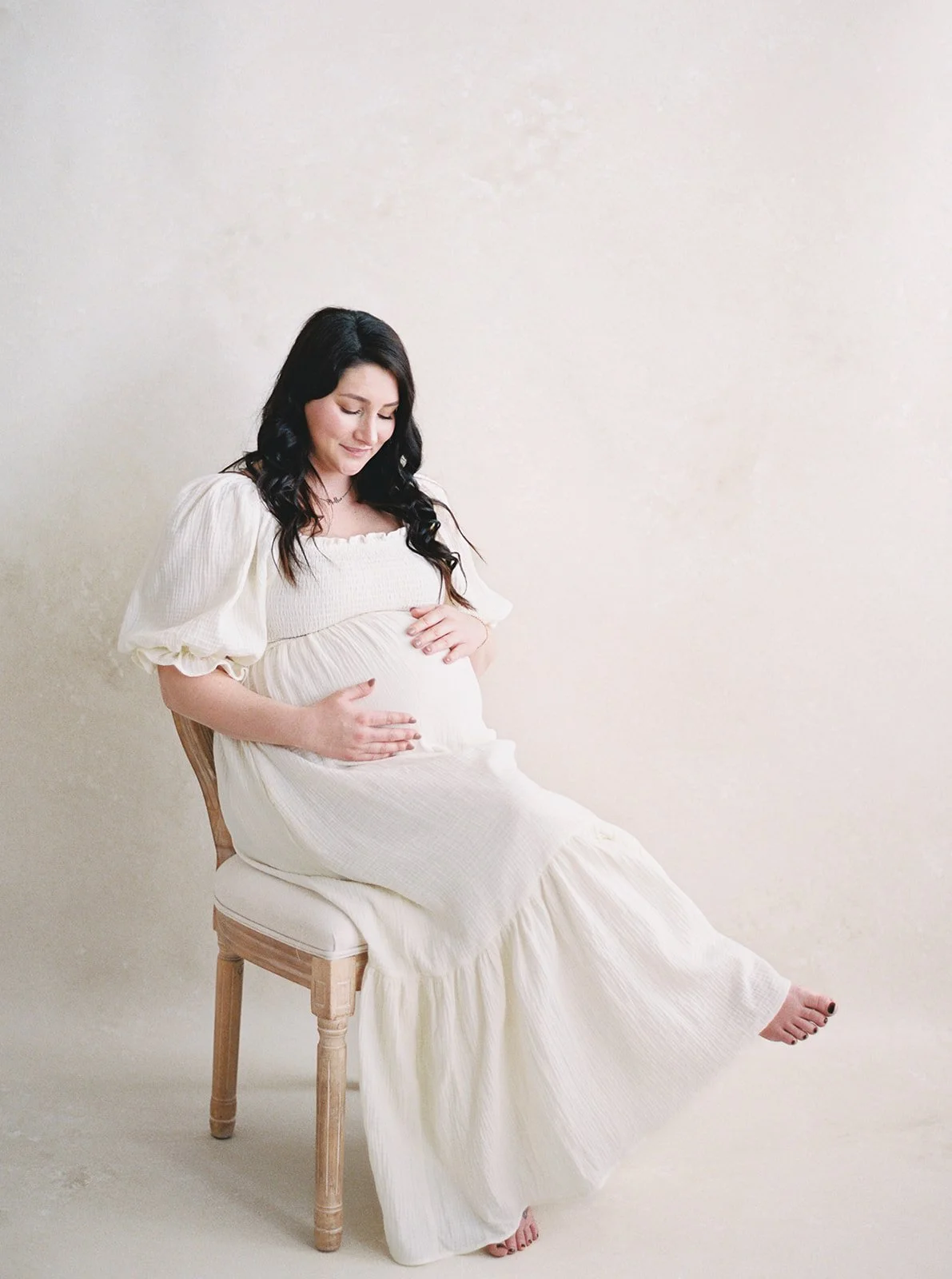
This is why Limestone is the colorway most maternity photographers eventually add to their collection. The pale warm cream tones the negative space with subtle luminosity rather than empty white, and the hand-painted layers hold depth even completely out of focus. Warmth that reads as presence, not absence.
Lighting Negative Space on Hand-Painted Canvas
The way you light the backdrop fundamentally changes how the negative space reads in the final image. This is one of the greatest advantages of working with hand-painted canvas: the surface can be lit independently of the subject, revealing different characteristics depending on your intention.
There are two primary approaches. The first is dimensional lighting: using a separate light source directed at the backdrop at a 30- to 45-degree angle, either from above or from the side. This raking light strikes the brushstrokes at a shallow angle, causing them to cast micro-shadows across the surface. The result is a backdrop that reads as a richly textured, dimensional presence even when the subject is in sharp focus. This approach works when you want the negative space itself to carry visual interest and painterly character. The texture remains subtle (especially when the subject is positioned 6 to 8 feet from the backdrop and rendered soft at f/2.8) but it is present. The negative space feels alive.
The second approach is minimalist lighting: positioning the subject 8 to 12 feet from the backdrop and either using no dedicated backdrop light or lighting the canvas flat and frontal to minimize shadow and texture. At a wide aperture like f/2.8 or f/4, the canvas dissolves almost completely, rendering as a smooth, tonal wash. The texture disappears. What remains is pure color and subtle tonal gradation: a true void in the compositional sense, but a void with depth and warmth because of the canvas's optical properties.
The optical distinction happens because of the fundamental difference between canvas and other materials. Hand-painted canvas absorbs and diffuses light across its surface. Vinyl reflects light back toward the camera. Seamless paper absorbs light but lacks texture, creating a flat monotone. When you light canvas frontally at a wide aperture, you are relying on the surface's natural ability to diffuse light evenly, creating a tonally consistent but never flat negative space. The pigment layers that Jennifer builds into each canvas ensure that even completely defocused, the surface carries subtle tonal variation (warm undertones, cool undertones, micro-shifts in saturation) that prevent the backdrop from reading as lifeless.
Hand-painted canvas absorbs and diffuses studio light, while vinyl reflects it, creating hot spots that flatten the tonal range of the image and eliminate the subtle depth that makes negative space feel intentional rather than accidental.
For photographers interested in a deeper exploration of lighting approaches for hand-painted surfaces, our studio lighting setup tutorial covers overs the full range of techniques from natural light to multi-strobe configurations.
Camera Settings for Minimalist Backdrop Portraits
The technical parameters you choose directly influence how the negative space reads in the final image. For minimalist work with hand-painted canvas backdrops, there are three critical decisions: focal length, aperture, and subject-to-backdrop distance.
Focal length should be considered in terms of what portion of the backdrop remains visible in the frame. An 85mm lens on a full-frame camera creates a moderate field of view, showing a generous ratio of backdrop to subject when the photographer stands 8 to 10 feet from the subject. This is an excellent starting point for minimalist work because the backdrop remains visible as a significant compositional element without overwhelming the subject. For tighter, more intimate crops where less backdrop is visible, a 105mm or 135mm lens compresses perspective slightly, creating the effect of the subject floating within a smaller area of canvas. For more environmental compositions, a 70mm to 85mm range allows showing more of the surface and the subject's relationship to the surrounding space.
Aperture selection directly controls how much backdrop texture remains visible. An f/2.8 aperture produces the shallowest depth of field, rendering the backdrop as a creamy, nearly textureless wash. This is the setting for maximum minimalism, where you want the negative space to feel like pure tonal field rather than a painted surface. An f/4 aperture offers a slight increase in depth of field while still maintaining sufficient softness that the canvas texture reads primarily as tonal variation rather than detail. An f/5.6 aperture begins to render more texture visible, creating a more visually interesting negative space that carries subtle brushstroke character without becoming a distraction.
Subject-to-backdrop distance is the most critical variable. At 4 to 6 feet from the canvas, even at a wide aperture, some texture will be perceptible in the bokeh. This is appropriate when you want the negative space to carry painterly presence. At 6 to 8 feet, the texture nearly disappears at f/2.8, creating the classic minimalist effect. At 8 to 12 feet, the backdrop becomes nearly invisible as a physical surface and reads purely as tonal field. For editorial work and fine art portraiture, positioning the subject 6 to 10 feet from the camera with 6 to 8 feet between subject and backdrop creates the most refined minimalist aesthetic.
ISO should be kept as low as light allows to maintain clean tonal gradation in the negative space. With studio strobes, aim for ISO 100 to 400. With natural light, 400 to 800 is typical. Higher ISOs introduce grain that disrupts the tonal purity of the negative space area.
For minimalist negative space portraits on hand-painted canvas, an 85mm lens at f/2.8 with the subject positioned 8 feet from the camera and 7 to 8 feet from the backdrop renders the surface as a luminous, tonal wash: present but never competing.
For a comprehensive breakdown of camera settings by session type, our aperture, ISO, and distance guide covers the full technical landscape of working with hand-painted backdrops.
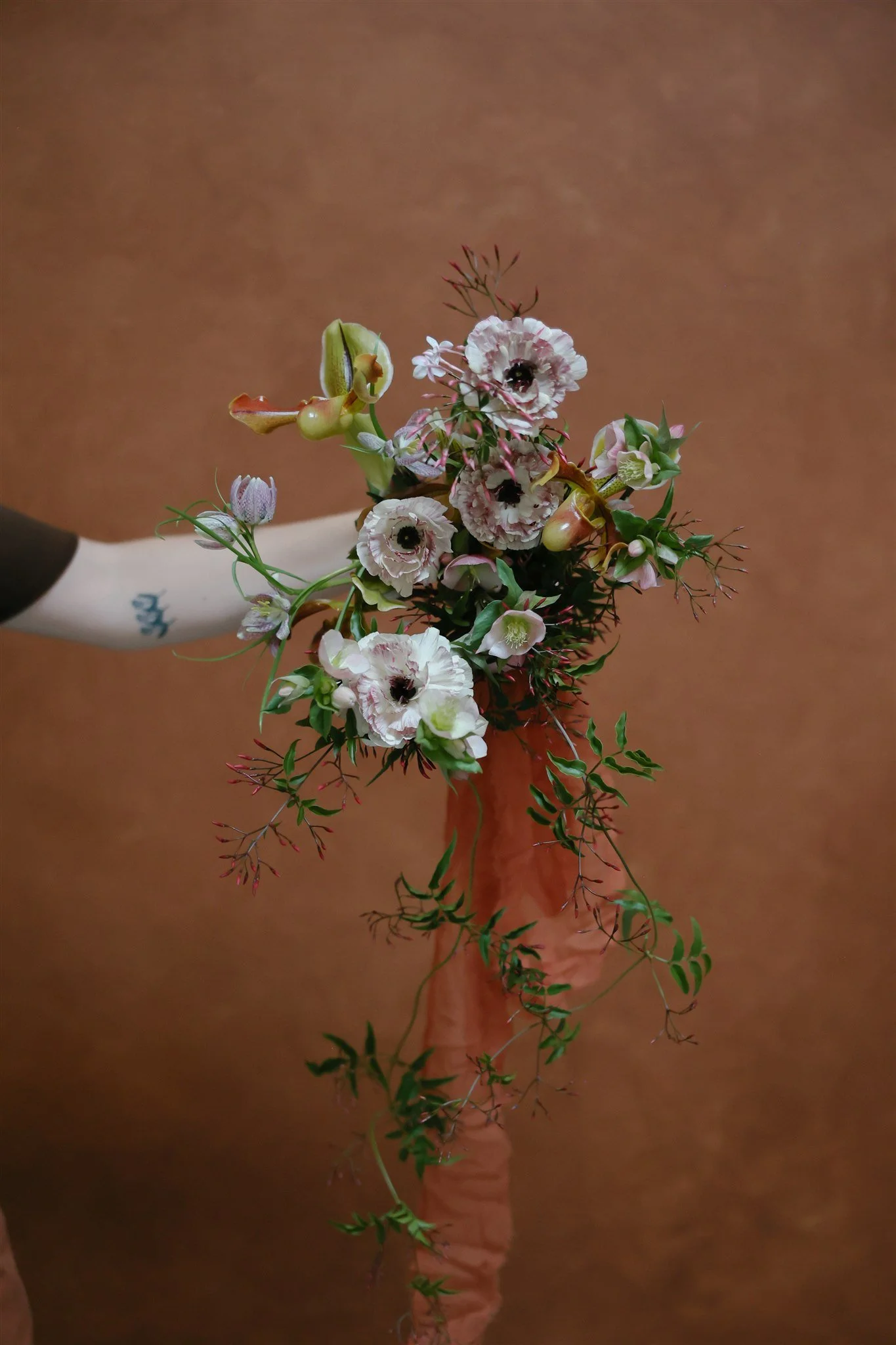
Every editorial florist eventually has the same realization that portrait photographers do: the backdrop is doing more compositional work than they thought. A bouquet against a warm hand-painted canvas reads as still-life art. The same bouquet against a flat white wall reads as documentation.
Negative Space as Editorial Language
The most accomplished photographers working in fine art and editorial portraiture understand negative space not as a default background but as a direct compositional decision with narrative weight. In editorial layouts, negative space provides breathing room for text, allows the art director to position copy and captions without competing with visual elements, and creates a sense of luxury and intention on the page. In gallery and fine art contexts, generous negative space rewards large-format printing, translates beautifully across different display sizes, and signals confidence and artistic sophistication.
Jose Villa's portrait work exemplifies this principle. His images often show the subject relatively small within the frame, surrounded by generous negative space that speaks to solitude, introspection, or contemplative presence depending on expression and context. The space around the figure is never empty; it is compositionally active and emotionally loaded. Siren Floral Co's installation photography demonstrates the same principle from a different angle: the hand-painted surfaces they choose create negative space that feels alive because the surface itself carries dimension and texture. The space is never flat.
When building your own body of minimalist work, consistency of negative space ratio across multiple images signals intentionality. A photographer who consistently works with a 60/40 or 70/30 space ratio across their portfolio demonstrates control and artistic vision. That consistency becomes part of their signature, a visual language that clients and editors recognize. This is one of the reasons backdrop choice directly affects how clients perceive your pricing and professionalism: the surfaces you work with signal the caliber of work you produce.
For photographers building editorial portfolios, negative space provides another practical advantage: it photographs well for publication submission because art directors have compositional room to work with. A portrait with generous negative space to the left or right of the subject gives a layout designer flexibility to position text, pull-quotes, or adjacent imagery. The work becomes more publishable because it is more usable within the constraints of editorial design. If you are interested in how backdrops serve portfolio building specifically, our guide to layering photography backdrops for editorial fashion explores the full range of creative approaches to editorial surface work.
From Composition to Narrative: When the Space Tells the Story
There is a threshold in minimalist portraiture where negative space transforms from a compositional principle into a narrative device. Beyond the geometry and the technical parameters, the space itself begins to carry emotional meaning that shapes how the viewer experiences the subject.
A subject positioned small within expansive negative space might read as lonely or vulnerable, depending on the subject's posture and expression. If the figure appears confident, open-bodied, and directed toward the camera, that same ratio of space reads as self-possession and quiet authority. If the subject appears introspective, turned slightly away, gazing down, the surrounding space feels contemplative and intimate rather than isolating. The emotional interpretation of negative space shifts entirely based on what the subject brings to it.
The tonal register of the backdrop inflects that emotional reading in ways that are subtle but significant. Silt's dark warmth creates an atmosphere of grounding and gravity. Bentonite's neutral middle ground creates psychological space for the viewer's own interpretation. Celestite's soft blue creates a sense of openness and ethereal vulnerability. Slate's cool gray creates architectural precision and modern intensity. The color does not just fill the space; it shapes how the viewer emotionally reads the figure within it.
There is also a principle of spatial tension: the relationship between the subject's position and the edges of the frame creates psychological force. A subject positioned off-center with generous space on one side creates directional tension that invites the viewer's eye to travel, to explore the relationship between the figure and the surrounding void. A subject more centered, with symmetrical negative space, creates stillness and monumentality. Neither approach is superior; they are different compositional languages for different emotional intentions.
The distance between a subject and the edge of the frame is not empty. It is the space in which the viewer projects their own emotional reading of the image. You are not filling space; you are creating room for interpretation.
In the most refined minimalist portraiture, negative space becomes the medium through which the photographer speaks. The choice of backdrop, the precise positioning of the subject, the quality of light, the aperture decision: all of these combine to create a statement about how the photographer sees and values the human figure within space. The negative space is never incidental. It is the foundation of the image's emotional architecture.
Frequently Asked Questions
What exactly is negative space in portrait photography, and how is it different from just having a plain background?
Negative space is the area surrounding the subject that does not contain additional visual elements, and it functions as a deliberate compositional tool that directs attention and establishes emotional tone. A plain background is neutral and incidental; negative space is intentional. The difference lies in the photographer's conscious decision to use the surrounding area as an active compositional element rather than a default container for the subject.
How much of the frame should be negative space in a minimalist portrait?
Most accomplished minimalist portrait photographers work with ratios between 60 percent and 70 percent negative space to 30 to 40 percent subject presence, though the exact ratio depends on the emotional register of the image. A subject occupying only 20 to 30 percent of the frame creates pronounced isolation or grandeur, while 40 percent subject presence feels more intimate and grounded.
Which backdrop colors work best for negative space portraits that feel intentional rather than empty?
Muted, low-saturation tones work best because they recede visually without creating a void that reads as absence. Chasing Stone's Silt (dark taupe), Bentonite (mid-taupe neutral), and Celestite (soft sky blue) are specifically suited to minimalist work, offering enough tonal depth and textural complexity from the hand-painting process to register as intentional space rather than empty background.
Do I need a large backdrop for negative space composition?
A larger canvas provides significantly more compositional flexibility for negative space portraits. Chasing Stone's 8x10 ft and 8x14 ft hand-painted backdrops allow full-length framing with generous surrounding space, while the 5x8 ft size works well for tight crops and headshots where negative space wraps above and to one side of the subject. The 8x14 ft size is particularly valuable for full-body minimalist work with ample breathing room.
How should I light the backdrop if I want dimensional negative space rather than flat emptiness?
Use a separate light source directed at the backdrop at a 30- to 45-degree angle to create raking light that reveals the hand-painted texture through micro-shadows in the brushstrokes. Position the subject 4 to 6 feet from the canvas so that even at f/2.8, subtle texture becomes visible in the bokeh, creating negative space with presence and painterly character rather than flat monotone.
What specific camera settings produce that ethereal, minimalist negative space look on hand-painted canvas?
An 85mm or 135mm lens at f/2.8 to f/4, with the subject positioned 8 feet from the camera and 7 to 8 feet from the backdrop, produces the characteristic minimalist aesthetic where the hand-painted canvas reads as a luminous, breathing space. Keep ISO at 100 to 400 for studio strobes or 400 to 800 for natural light to maintain clean tonal gradation in the negative space area.
Can hand-painted canvas texture actually be visible in negative space compositions, or does it blur away completely?
At f/2.8 to f/4 with standard working distances, the texture typically renders as soft bokeh rather than crisp detail, but the layered pigment remains optically present as subtle tonal variation and warmth. Even completely out of focus, the eye perceives depth that prevents the surface from reading as flat or digital. This is one of the key advantages of hand-painted canvas over seamless paper or vinyl: the texture never fully disappears, even when technically unresolved by the lens.
Begin with the Surface That Breathes
The negative space in a minimalist portrait is only as eloquent as the surface that creates it. A seamless paper roll or vinyl backdrop can be made to work technically, but the visual result will always feel like background rather than space: flat, printed, without the optical depth that makes negative space read as compositional intention rather than visual absence. Hand-painted canvas transforms negative space from a technical choice into a narrative element because of the fundamental properties of the surface: the way cotton fibers hold pigment, the way layered color creates optical depth, the way light absorbs into the surface rather than reflecting off it.
When you choose a hand-painted canvas backdrop for minimalist portraiture, you are choosing a surface that supports your compositional vision. Silt grounds the image in contemplation. Bentonite adapts to whatever emotional register your subject brings. Celestite floats the figure in ethereal space. Slate speaks in architectural precision. Each canvas is hand-painted by Jennifer over the course of two to three days, building the tonal complexity that makes negative space live rather than merely exist.
We invite you to explore our full collection of hand-painted photography backdrops, each made to order in California. Whether you are building a fine art body of work, creating editorial portfolios, or establishing a consistent visual signature across your practice, the right hand-painted canvas can elevate negative space from technical choice to artistic language. For questions about which colorway and size might serve your minimalist work best, we are always available at info@chasingstone.com.

Creators of premium photography backdrops and styling surfaces
Trusted by thousands of discerning creatives worldwide
Every piece is handcrafted with intention in Orange County, California