
Neutral vs. Bold: Choosing the Right Backdrop for Your Brand
Updated Apr. 30, 2026
You've been shooting against the same white wall for three years. It works. But lately, scrolling Instagram, you see other photographers creating stunning editorial images with richly colored backdrops. You wonder if it's time to evolve your style, but the question nags: what if bold colors don't match your brand? What if you invest in the wrong backdrop and regret it?
This internal debate happens to nearly every wedding photographer at some point. Your backdrop choice for portrait sessions, detail shots, and flat lay photography isn't just aesthetic. It's a fundamental part of your visual brand identity that communicates who you are, what style you offer, and which clients you attract. For a complete overview of photography backdrops, start with our ultimate backdrop guide.
Here's the truth: some photographers build incredibly successful businesses shooting exclusively on neutral tones. Others become known for bold, colorful aesthetics. The key is understanding how different backdrop colors affect your images, brand perception, and ultimately your business.
Let's explore the strategic considerations behind choosing neutral versus bold backdrops so you can make an informed decision that aligns with your artistic vision and business goals.
Understanding the Psychology Behind Photography Backdrop Colors
Colors aren't just visual elements. They evoke emotions, set moods, and create instant associations in viewers' minds.
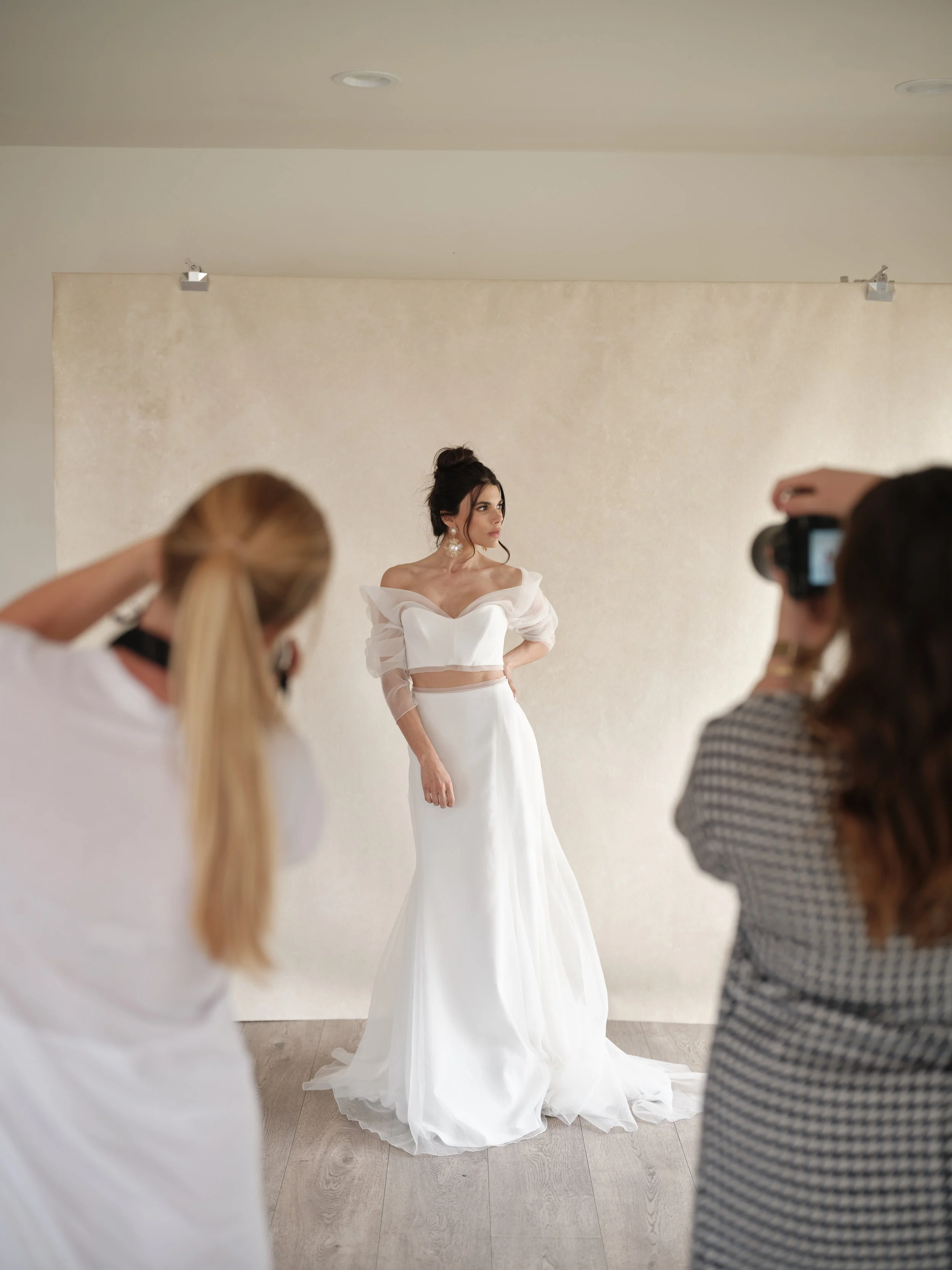
Neutral tones (beiges, grays, soft whites) create timelessness and sophistication. They're calming and keep your subject as the absolute focal point. When a bride sees her portrait against a neutral backdrop, her eye goes directly to her expression, her dress, her flowers. No competing visual elements. This is why neutrals have dominated wedding photography for decades.
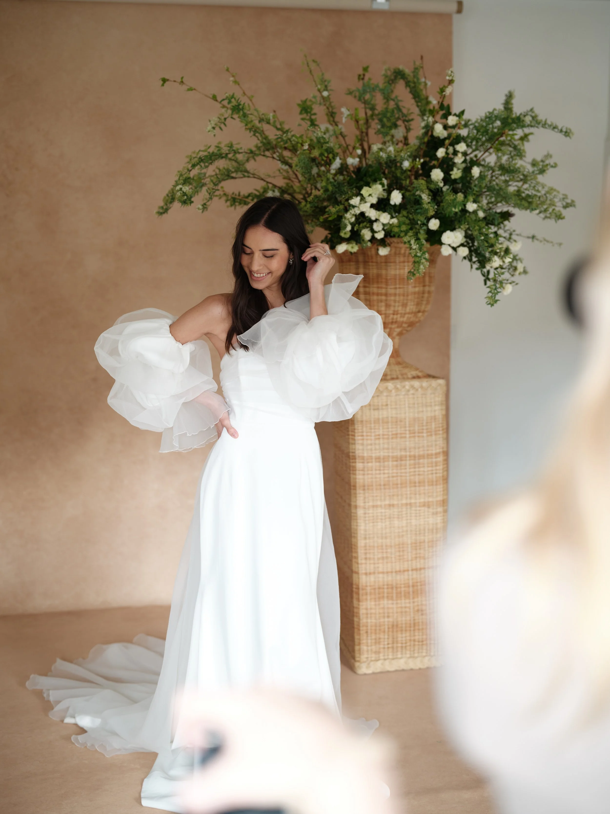
Bold colors make statements. Deep charcoal creates drama. Soft blush pink evokes romance. Rich blue suggests depth and sophistication. These colors don't just support your subject; they actively participate in telling the story. They create atmosphere and emotion in ways neutrals cannot.
The psychology extends to brand perception. A portfolio filled with neutral-toned images suggests you're versatile, classic, and focused on timeless elegance. Bold, saturated colors position you as artistic, editorial, and fashion-forward.
Neither approach is better. They attract different clients with different aesthetic preferences and budget expectations.
Understanding your ideal client is crucial. Luxury clients often gravitate toward sophisticated, muted palettes that suggest refinement. Couples planning bohemian outdoor weddings might prefer earthy tones and organic textures. Fashion-forward brides planning modern urban weddings could be drawn to bold, unexpected editorial colors.
The Case for Neutral Backdrops in Wedding Photography
Neutral photography backdrops have dominated wedding photography for good reason. They offer unparalleled versatility and longevity. When you invest in a quality neutral backdrop, you're investing in a tool that will work for virtually every session, every couple, and every wedding style you photograph.
Consider the soft, warm tones of Limestone. This hand-painted backdrop brings just enough texture and visual interest to create depth without overwhelming your subject. The beauty of a backdrop like this is its ability to complement any color palette. Whether your bride is wearing a stark white gown or an ivory dress with champagne undertones, whether her florals are blush and cream or deep burgundy and orange, Limestone provides a sophisticated foundation that enhances rather than competes.
Neutrals also photograph consistently across different lighting conditions. This consistency is invaluable when you're building portfolio cohesion. Your images from a morning session in January will have a similar quality and feel to your images from an evening session in July. This consistency helps establish your visual brand and makes your work instantly recognizable.
From a practical standpoint, neutral backdrops are less risky when you're first investing in professional equipment. If you're not entirely sure what direction you want to take your brand, starting with neutrals gives you the flexibility to explore different styles without committing to a specific aesthetic. You can always add bold colors later once you've refined your brand identity.
Neutral backdrops also tend to have broader client appeal. Not every bride wants dramatic, editorial images. Many couples are looking for classic, timeless portraits that will look just as beautiful in fifty years as they do today. Neutrals deliver this timeless quality effortlessly. They ensure that when your clients look back at their wedding photos decades from now, the images won't feel dated or tied to a specific trend.
Another advantage is how well neutral backdrops work for detail photography. When you're shooting wedding rings, invitations, bouquets, and other small items, you want the backdrop to provide texture and interest without stealing focus from the details themselves. Neutrals strike this balance perfectly, offering enough visual substance to create compelling compositions while keeping the spotlight firmly on the subject.
Not sure whether to go bold or neutral? Neutral backdrops like this create timeless, versatile imagery that works across every brand touchpoint.
When Bold Colors Elevate Your Brand
While neutrals offer versatility, bold colors can transform your brand from good to unforgettable.
If you've been shooting neutrals for years and feel your work blends into the sea of other wedding photographers, introducing strategic color might be exactly what sets you apart.
The Power of Intentional Color
Bold doesn't mean bright or garish. It means intentional.
Rose Quartz brings soft, romantic pink that's decidedly not neutral but not overwhelming. It creates ethereal, feminine quality that appeals to brides planning garden weddings, spring celebrations, or romantic, detail-oriented days. This color choice becomes part of your signature style.
The key to successfully incorporating bold colors is understanding color theory and how different hues interact with skin tones, fabrics, and other frame elements.
Warm pinks and peaches flatter most skin tones and create romantic, approachable feelings.
Cool blues and grays create sophistication and drama.
Deep, moody tones work beautifully for editorial portraits and couples wanting something outside traditional wedding photography aesthetics.
Why Bold Colors Work for Business
Instant mood creation. Photographing getting-ready details against Rose Quartz versus standard gray immediately communicates romance, femininity, and softness. It tells a story before viewers process what specific items are in the frame.
Social media performance. In the endless Instagram or Pinterest scroll, images with distinctive color palettes stop people mid-scroll. They're memorable and shareable in ways neutral images sometimes aren't.
Market differentiation. If every wedding photographer in your area shoots on white, gray, and beige, introducing color could be the differentiator that makes you the obvious choice for couples seeking something fresh.
"I added Rose Quartz to my backdrop collection and within three months, my Instagram engagement doubled. Couples specifically mention my 'signature pink backdrop' in consultations. It's become part of my brand identity."
— Jessica L., Orange County wedding photographer
Creating Drama with Dark and Moody Backdrops
Dark backdrops deserve their own conversation because they occupy a unique space between neutral and bold. A backdrop like Carbon, with its deep charcoal tones, isn't technically a bright, bold color, yet it makes just as strong a statement as any vibrant hue.
Dark backdrops create instant drama and sophistication. They're particularly effective for groom portraits, detail shots featuring dark suits or leather accessories, and couples who prefer a more editorial, fashion-forward aesthetic. The contrast between a white wedding dress and a dark backdrop creates visual impact that's hard to achieve with mid-tone neutrals.
From a technical perspective, dark backdrops require different lighting approaches than lighter backgrounds. You'll need to be mindful of your exposure settings and lighting placement to ensure your subject is properly lit while maintaining the richness of the dark background. This technical challenge can actually work in your favor, as it pushes you to refine your lighting skills and create more dimensional, sculptural portraits.
Dark and moody photography has seen a significant surge in popularity over the past few years, particularly among couples planning intimate weddings, elopements, or events with a more alternative aesthetic. If this is your ideal client, incorporating dark backdrops into your work immediately signals that you understand and can deliver the moody, romantic style they're seeking.
The beauty of a backdrop like Carbon is its versatility within the dark and moody aesthetic. It works beautifully for masculine portraits, bridal boudoir sessions, vintage-inspired shoots, and modern editorial work. Unlike brighter colors that might feel trendy or tied to a specific season, dark charcoal tones have a timeless quality that transcends trends while still feeling contemporary and artistic.

We see this in so many shoots. When the backdrop adds richness instead of distraction, everything from florals to wardrobe feels more elevated.
Strategic Color Incorporation: Starting Small
Not ready to commit fully to bold backdrops? Start with strategic accent pieces and smaller styling surfaces.
This approach lets you test different colors, see how they resonate with your audience, and refine your brand aesthetic without large, expensive backdrop investments right away.
Smart Color Introduction
A backdrop like Azurite brings a sophisticated blue tone that falls somewhere between bold and neutral. Blue backdrops have gained popularity because they photograph beautifully, work well with a variety of skin tones, and create a sense of calm sophistication. This particular shade evokes both natural elements like sky and water while maintaining an artistic, intentional quality.
The strategic use of color can also help you attract specific types of clients. If you primarily want to book luxury weddings at coastal venues, incorporating blues into your portfolio makes sense because it aligns with the aesthetic those clients are already envisioning. If your ideal client is planning a romantic garden wedding, softer pinks and lavenders help them see themselves in your work.
Consider creating a small collection of backdrops that work together cohesively. Rather than buying five completely different colors that don't relate to each other, choose two or three that share undertones or complement each other within a specific color story. This approach maintains portfolio cohesion while giving you creative flexibility.
You might also consider using bold colors selectively for specific types of sessions. Perhaps you shoot detail flats and getting-ready portraits on colored backdrops but keep couple portraits and ceremony coverage more neutral. This mixed approach can satisfy both your creative desire for color and your clients' preference for timeless couple portraits.
Warm neutral backdrops are a go-to for timeless, elevated imagery. They complement both wardrobe and florals without overpowering the scene.
Maintaining Portfolio Cohesion Across Different Backdrops
One of the biggest concerns when incorporating multiple backdrops is maintaining portfolio cohesion. You want your work to feel intentional and unified, not scattered or inconsistent.
Your Secret Weapon: Editing Style
Your editing style is actually the primary driver of portfolio cohesion. If you maintain consistent contrast levels, color grading, and tonal qualities across all images regardless of backdrop color, your portfolio will feel cohesive shooting on everything from white to charcoal to pink.
Building a Curated Collection
Think about backdrops as carefully curated wardrobes rather than random collections. Each piece should serve specific purposes and relate to others through unifying elements: undertone, intensity, or mood.
Pay attention to undertones. If you choose neutrals with warm undertones, occasional bold colors should lean warm as well. Cool-toned neutrals pair more naturally with cool-toned accent colors.
Be intentional about usage. Reserve boldest colors for editorial sessions, styled shoots, or specific wedding day parts while keeping primary coverage on neutral tones. This creates variety without feeling disjointed.
Consider texture and finish. Hand-painted canvas backdrops all share similar organic, artistic quality regardless of color. This shared texture creates visual continuity that helps different colors feel like part of the same family.

Your backdrop sets the tone instantly. A cool neutral like this creates contrast without pulling focus from your subject.
Practical Considerations for Your Investment
Choosing backdrops isn't just about aesthetics; it's also about practical considerations that affect your day-to-day workflow and business operations. Hand-painted canvas backdrops are an investment, and you want to ensure you're making choices that serve your business long-term.
Quality Matters
Professional-grade backdrops made from durable canvas with proper construction last for years and maintain appearance through countless sessions. They're designed to withstand regular use wear and tear, travel to different venues, and routine cleaning.
When comparing options, consider not just initial cost but long-term value.
Size Selection
Backdrops are available in various dimensions, typically ranging from 5'x8' for intimate portrait work to 8'x10' for full-length shots and dramatic setups.
Think about your shooting style and space requirements. If you primarily shoot detail work and headshots, smaller backdrops might suffice. For full-body portraits and group shots, larger dimensions make sense.
Storage and Transport
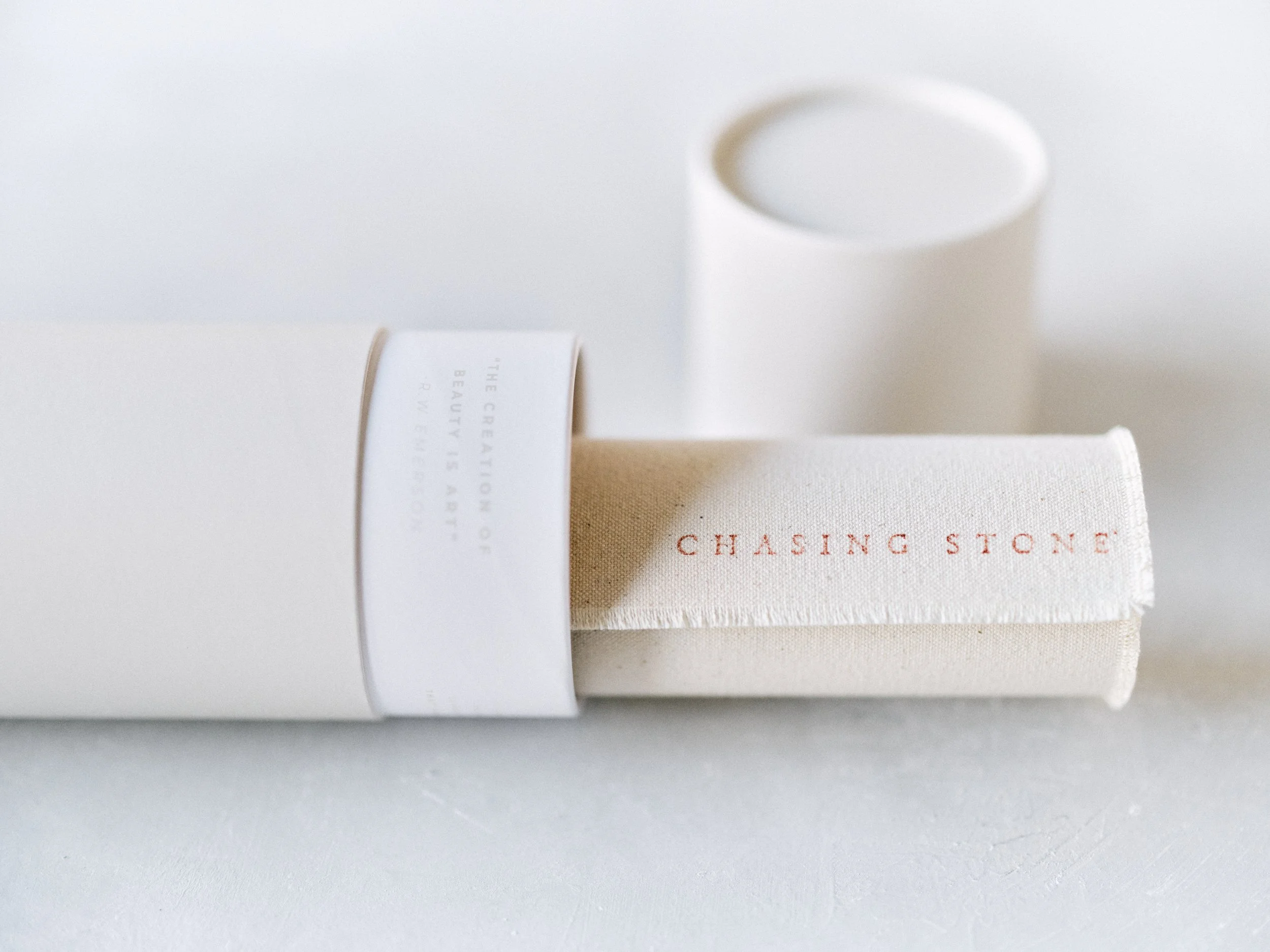
Backdrops should be stored rolled tightly on their core with retaining bands secured to prevent creasing or damage. If you shoot in multiple locations, consider transport ease.
Having designated storage areas in your studio or home where backdrops remain rolled and protected extends their lifespan significantly.
Maintenance Essentials
Keep basic cleaning supplies on hand: white art gum eraser, soft-bristled brush, terry cloth rag, and lint roller. These simple tools address dust, debris, or minor marks between sessions.
If you notice creases, gentle heat from an iron on the backside of your backdrop can help reduce them.
Lighting Considerations
Different backdrop colors require different lighting approaches. Dark backdrops need more careful lighting to avoid going completely black. Very light backdrops can reflect light affecting exposure.
Understanding these technical considerations helps you choose backdrops that work within existing lighting setups or motivates you to expand your lighting toolkit.
Consistency starts with your backdrop. Hand-painted neutral tone backdrops made by Chasing Stone create a polished, cohesive look across your entire brand.
Making Your Decision and Moving Forward
The choice between neutral and bold backdrops comes down to your unique brand vision, ideal client, and artistic goals. There's no wrong answer, only the answer that's right for your specific business and creative direction.
If You're Just Starting Out
Begin with one or two versatile neutral backdrops for a solid foundation. You can always expand your collection as your style develops and you gain clarity about your ideal client and the work you want to be known for.
If You're Established and Confident
Don't be afraid to invest in bold colors that excite you creatively. The enthusiasm you bring to sessions when using tools that inspire you translates directly into better images and happier clients.
Visual Research Strategy
Start a Pinterest board or Instagram saved collection of images you admire. Pay attention to patterns in colors, tones, and moods that attract you. This visual research clarifies aesthetic preferences and guides backdrop investments.
Choose Authenticity Over Trends
Backdrops are tools, not trends. Choose colors and tones that genuinely resonate with your artistic vision rather than what seems popular right now.
Authentic work reflecting your true style will always attract the right clients, even if it doesn't look like everyone else's portfolio.The backdrops you choose become part of your visual signature. Learn more in our complete photography backdrop guide. When you're ready to invest in hand-painted, professional-grade pieces that truly reflect your artistic vision, explore the complete collection at Chasing Stone and find the colors that define your brand.
Frequently Asked Questions About Choosing Photography Backdrops
Should I start with neutral or bold backdrops?
Most photographers find success starting with 1-2 versatile neutral backdrops (like Limestone or soft gray), then adding bold accent colors as their brand evolves. This gives you immediate versatility while leaving room for creative expansion.
How many backdrops do I need?
Most wedding photographers work comfortably with 3-5 backdrops: 2-3 neutrals in complementary tones and 1-2 bold colors for specific sessions or details. This provides variety without overwhelming storage or decision-making.
Will bold colors limit my client appeal?
Not if used strategically. Many photographers use bold colors for details and getting-ready shots while keeping couple portraits on neutrals. This showcases creativity without alienating clients who prefer classic aesthetics.
How do I maintain portfolio cohesion with multiple backdrop colors?
Your editing style is the key. Maintain consistent contrast, color grading, and tonal qualities across all images. Choose backdrops with similar undertones (all warm or all cool) to create natural harmony.
Do backdrop colors go out of style?
Neutral tones are timeless. Bold colors can feel more trend-influenced, but choosing classic bold options (soft blush, deep charcoal, sophisticated blue) rather than trendy brights helps ensure longevity.

Creators of premium photography backdrops and styling surfaces
Trusted by thousands of discerning creatives worldwide
Every piece is handcrafted with intention in Orange County, California