
Wedding Flat Lay Photography: 7 Common Mistakes and How to Fix Them
Updated December 3, 2025
Your flat lay images look...fine. Not bad. Not great. Just fine. But 'fine' doesn't get you published in wedding blogs or stop potential clients mid-scroll through your portfolio.
The problem wasn't my camera. It wasn't even my styling instincts. I was making the same mistakes thousands of wedding photographers make every single weekend, and I had no idea these tiny tweaks could transform everything.
Let me save you about two years of trial and error.
The Harsh Truth About Wedding Detail Photography
Here's what nobody tells you when you're starting out: flat lay photography is deceptively difficult. What you think should take 5-10 minutes can easily turn into an hour-long ordeal. You're working with small objects, mismatched shapes, and florals that don't align perfectly with the stationery design. One wrong choice and your images go from editorial to elementary school art project.
But here's the beautiful part: most flat lay mistakes are laughably easy to fix once you know what to look for. We're talking minutes or less.
Mistake #1: Your Surface Is Fighting Your Subject
Walk into any wedding detail session and you'll probably see it. Someone confidently pulling out a linen they're sure will match the aesthetic, only to realize they forgot to iron it. Then spending fifteen panicked minutes trying to smooth wrinkles with their hands while the morning light disappears.
Your styling surface should support your subject, not add to your pre-ceremony stress level.
The Fix: Choose surfaces that actually photograph the way they look in real life, with texture that adds dimension instead of wrinkles that add chaos.

Pictured Surface: JOSHUA TREE
Now, look. I could tell you to just use any hand-painted surface with organic variation. But we both know I'm going to recommend Chasing Stone surfaces here, because honestly? They're kind of ridiculously good at this exact thing. (I mean, I literally founded a company to solve this problem, so it would be weird if I didn't mention it, right?)
Here's why they actually work: our hand-painted surfaces are 100% wrinkle-free. You pull them out of your bag, lay them down, and start shooting. No steaming. No ironing. No spending precious wedding day minutes trying to fix preventable problems. That hand-painted texture catches light differently across every inch of the frame, adding just enough dimension to make your composition feel alive.
The best part? You don't notice the surface first. You notice the rings. The invitations. The story. And then, if you're paying close attention, you realize there's something about the foundation that makes everything else look elevated.
That's what a great styling surface should do: support without stealing the spotlight.
Mistake #2: Everything Is Almost Perfectly Aligned (And That's the Problem)
Perfect alignment is absolutely having a moment right now. Clean, aligned flat lays are all over Instagram and Pinterest, and for good reason. They look sophisticated and intentional.
But here's where photographers get tripped up: they try to create that perfectly aligned look and get it 95% of the way there. And that last 5% ruins everything.
When you're going for perfect alignment, it needs to be absolutely perfect. Not almost perfect. Not pretty close. Perfect. Because your eye immediately catches that one ring that's slightly off-center, that invitation that's rotated two degrees too far, that ring box thats not parallel to the edge.
Almost-perfect alignment looks like a mistake. Actually-perfect alignment looks like a choice.
The Fix: Commit fully to whichever direction you're going. If you want that clean, aligned aesthetic, use a grid or guidelines and get everything exactly where it needs to be. If you're going for organic and natural like the example above, break the grid completely and embrace intentional asymmetry.
Pictured Surface: BUCKWHEAT | Photo Credit: Shari and Ludo-Liz Andolina Photography
The mistake isn't choosing alignment or asymmetry. The mistake is living in the uncomfortable middle ground where it looks like you were trying for perfect and missed.
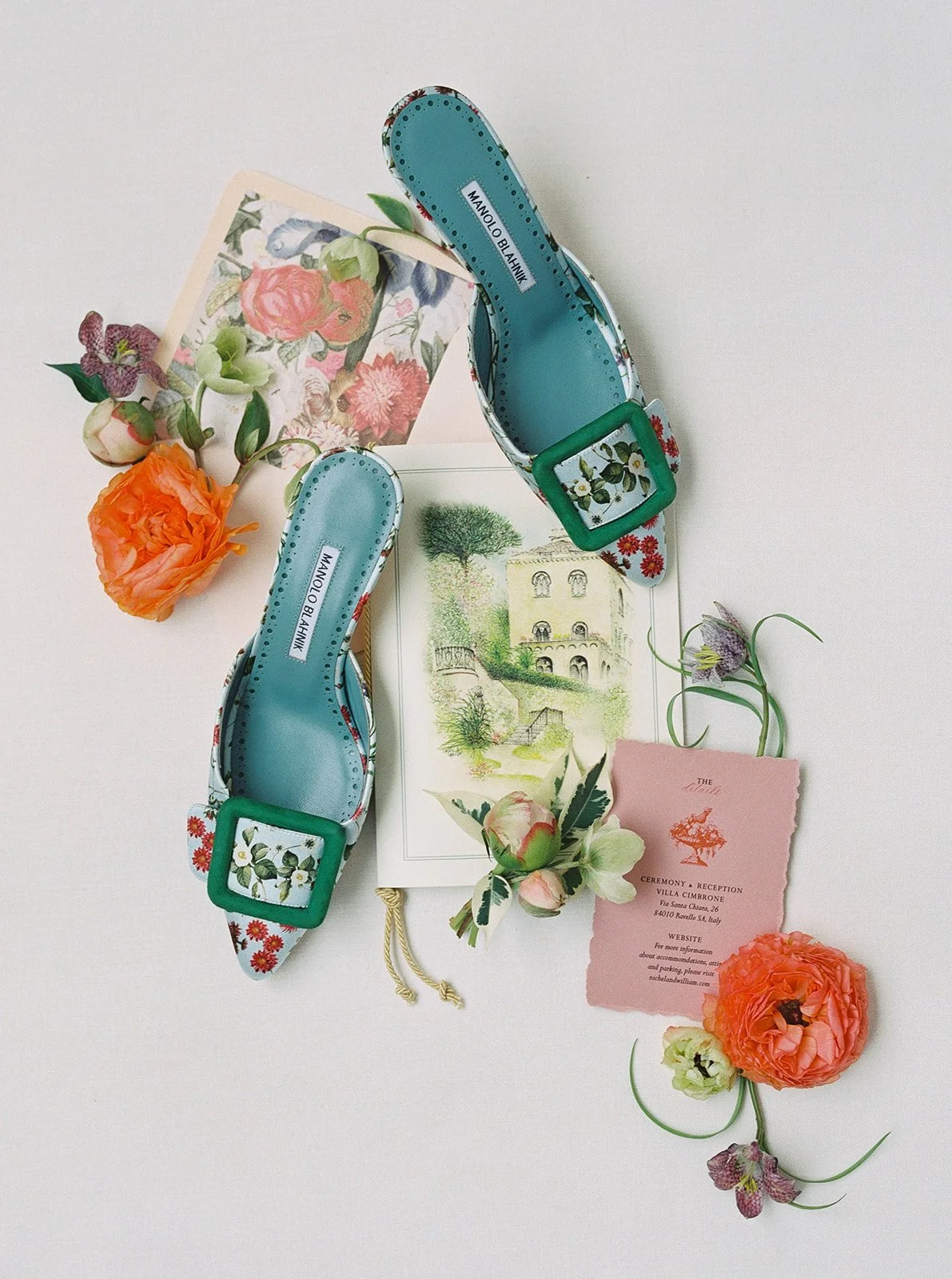
Mistake #3: Your Color Palette Is All Over the Place
Blush pink invitation. Navy blue ring box. Sage green ribbon. Gold calligraphy. Cream roses. Bronze jewelry. And somehow you're wondering why the image feels chaotic.
Color theory matters in flat lay photography just as much as it does in any other creative discipline.
The Fix: Stick to 3-4 colors maximum. Let one color dominate, use the second as support, and add the others as accents.

Pictured Surface: BUCKWHEAT
Your styling surface becomes crucial here. A subtle blue surface can tie together navy and silver elements. A warm neutral can harmonize blush and gold. The surface becomes the unifying element that makes your color story feel intentional rather than accidental.
Think of your surface as the canvas that either pulls everything together or introduces visual conflict. Choose a tone that complements your palette, not one that competes with it.
Mistake #4: You're Only Shooting From One Angle
I see this more than almost anything else. You find your angle, you nail the composition, you get the shot. And then you move on.
But here's what you're missing: that same flat lay probably has three or four other compelling compositions hiding inside it. A closer crop that emphasizes texture. A wider shot that shows context. A different perspective that changes the entire mood.
The best flat lays aren't a single image. They're a series.
The Fix: Once you get your main shot, force yourself to shoot at least two more variations. Get closer and fill the frame with just a portion of the composition. Pull back and show more negative space. Shift your angle 45 degrees and see what changes. Shoot vertical instead of horizontal.
Pictured Surface: VETIVER
Your clients (and your portfolio) will thank you for the variety. And you'll be amazed how often one of those "bonus" angles ends up being the hero shot.
Mistake #5: You're Ignoring Natural Shadows (Or Fighting Them Completely)
Either you're shooting in the brightest possible light and washing out all dimension, or you're creating such dramatic shadows that half your details disappear into darkness.
Shadows aren't your enemy. Flat, even lighting is.
The Fix: Embrace gentle, directional light that creates subtle shadows. Position yourself so light comes from a 45-degree angle rather than straight overhead. Let those shadows add depth and dimension to your composition.
Pictured Surface: ALDER
Window light works beautifully for this. Position your flat lay near a window with sheer curtains, and let that soft, directional light do the work. You'll get natural dimension without harsh shadows that obscure important details.
The texture in your styling surface becomes even more important here. A surface with subtle variation catches light and shadow differently across the frame, creating natural depth that completely flat surfaces simply cannot achieve.
Mistake #6: Everything Looks Like It's Floating in Space
You've arranged your elements. You've got your light right. But something still feels off. The composition lacks weight, lacks grounding, lacks that sense of being anchored in a real moment.
The Fix: Create layers. Let some elements cast gentle shadows on others. Allow items to overlap slightly. Use your styling surface's natural texture to create a sense of place rather than floating in an abstract void.
Pictured Surface: MONTEVERDE
This is where hand-painted canvas surfaces absolutely shine. That subtle texture and tone variation gives your composition a foundation—a sense of existing in real space rather than hovering in a digital netherworld. The organic texture provides context that helps your brain understand these objects are resting on something tangible, not photoshopped onto a generic background.
Mistake #7: You're Overcrowding Your Composition (Let It Breathe)
When you're styling wedding details, there's a temptation to include everything. Every boutonniere. Every place card. Every piece of ribbon. Every floral stem. You want to show the full story, capture all the beautiful details the couple invested in.
But cramming everything into one frame doesn't make your flat lay more impressive. It makes it feel chaotic and overwhelming. Your viewer's eye doesn't know where to land, so it doesn't land anywhere, it just keeps scrolling.
Professional flat lays aren't about showing everything. They're about showing the right things with enough space to let each element shine.
The Fix: Give your composition room to breathe. Include fewer elements arranged with generous negative space between them. Let your styling surface be part of the composition, not just background filler that needs to be covered.

Pictured Surface: DOGWOOD
Think about it like this: when you walk into a beautifully designed room, it's not packed with furniture in every corner. There's intentional emptiness that makes the pieces you do see feel more significant. Your flat lays work the same way.
Instead of arranging four boutonnieres, two corsages, six place cards, and a full invitation suite in one shot, try this: four boutonnieres and their coordinating place cards arranged with diagonal flow and plenty of negative space. The subtle texture of your surface becomes part of the visual story instead of something to hide.
Look at the difference: a crowded flat lay feels like you're trying to prove you captured everything. A composed flat lay with breathing room feels intentional, editorial, curated. It says "I made deliberate choices about what to include and where to place it."
Negative space isn't wasted space. It's what makes your styled elements feel important enough to deserve their own presence in the frame.
What Actually Makes the Difference
Wedding photography is wildly competitive. Couples have hundreds, if not thousands, of photographers to choose from in every market. The technical barrier to entry has never been lower.
So what sets the photographers who consistently book their ideal clients apart from everyone else?
It's not one big thing. It's a thousand tiny decisions. The care you take in styling. The surfaces you choose. The attention to light and shadow. The willingness to shoot multiple angles and compositions even when you're under time pressure.
Those tiny decisions add up to images that feel different. Special. Worth pausing for.
And here's the beautiful part: most of these decisions take less than a minute to implement once you know what you're looking for.
Your Next Flat Lay Can Be Different
You don't need to overhaul your entire approach to wedding photography. You don't need to spend weeks studying compositional theory or color science.
You just need to fix these seven mistakes. Start with one—maybe it's investing in a professional styling surface that doesn't fight you on wedding day. Maybe it's committing to shoot three angles instead of one. Maybe it's being more intentional about your color palette.
Pick one mistake to fix at your next wedding. Then add another. Within a few weddings, these choices become automatic, and your flat lays start looking fundamentally different from what you've been creating.
Because the photographers who consistently create scroll-stopping flat lays aren't necessarily more talented or more creative than everyone else. They've just learned which mistakes to avoid and which tools make their job infinitely easier.
Ready to transform your flat lay photography? Start with a professional styling surface that's designed specifically for wedding details. Browse our collection of hand-painted canvas backdrops and wrinkle-free fabric surfaces →

Creators of premium photography backdrops and styling surfaces
Trusted by thousands of discerning creatives worldwide
Every piece is handcrafted with intention in Orange County, California