
How Stationery Designers Photograph Their Work
Updated on Apr. 13, 2026
You've spent hours perfecting that wedding invitation suite. The paper stock is flawless. Your calligraphy is pristine. The color palette is dreamy.
Then you photograph it, and something falls flat.
The image doesn't capture what you created. Your work looks different on camera than it does in person, and you can't figure out why.
Here's the truth: stationery photography is technical. It requires the right combination of skill, creative vision, and quality tools. But once you understand the fundamentals, you can transform your product photography from basic to breathtaking.
Whether you're building your portfolio, updating your website, or creating content for social media, knowing how to properly photograph your stationery is just as important as the design work itself. Let's walk through exactly how professional stationery designers capture those stunning images you see on Instagram and in wedding magazines.

Understanding Your Photography Foundation
Before you pick up your camera, understand what makes stationery photography different from other product work.
Your invitations, place cards, and envelopes aren't three-dimensional products you can photograph from multiple angles. They're flat. This means your styling surface becomes incredibly important to the overall composition. It's not just a background; it's half of your image.
Your surface sets the entire mood. A soft, painted styling surface creates an ethereal, romantic feel perfect for garden wedding invitations. A rich, textured fabric surface might better complement a moody, editorial suite. Think about the emotion you want to evoke and choose your foundation accordingly.
Your camera matters, but it doesn't have to be complicated. Many stationery designers start with smartphones and achieve beautiful results. The key is understanding how to use natural light, not how many megapixels your sensor has. (For detailed equipment recommendations specific to flat lay photography, check out our guide on essential photography gear for wedding flat lays).
If you're using a DSLR or mirrorless camera, shoot in manual mode so you have complete control over your exposure settings. Shoot in RAW format if your camera allows it. This gives you significantly more flexibility when editing. You can recover details in highlights and shadows that would otherwise be lost, and you'll have freedom to adjust white balance, exposure, and color grading without degrading image quality.
Selecting the Right Styling Surface
Your styling surface is the canvas for your stationery, and choosing the right one can make or break your photograph. Hand-painted styling surfaces have become the professional standard among stationery designers because they add depth, texture, and visual interest without overwhelming delicate paper goods.
When building your collection, think about versatility first. Neutral tones like soft grays, warm beiges, and gentle blues work beautifully with most color palettes. For a comprehensive breakdown of surface materials, textures, and how to choose between hand-painted versus fabric options, see our complete guide on choosing the best styling surfaces for flat lay photography.
The Château styling surface, with its subtle European-inspired aesthetic, pairs wonderfully with classic, timeless stationery designs. Its understated quality allows your work to remain the focal point while adding just enough visual texture to create depth in your images.
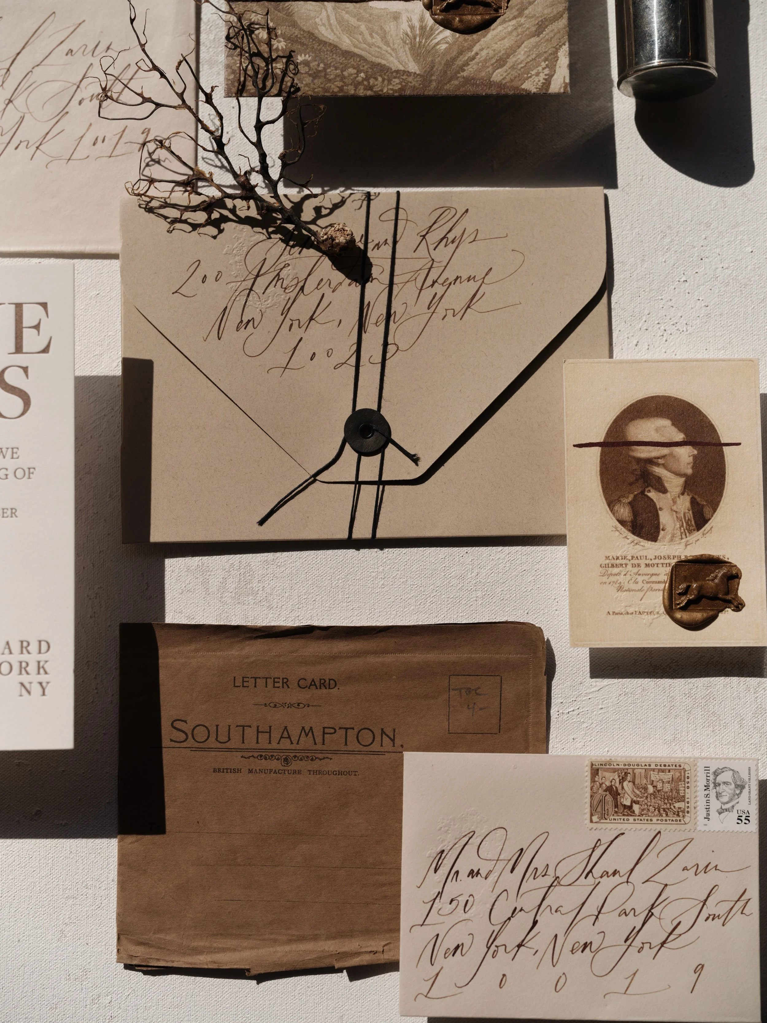
For desert-inspired or bohemian wedding suites, an earthy tone like Joshua Tree brings warmth and organic texture to your composition. The sandy, sun-bleached quality complements terracotta, rust, and sage green color palettes beautifully. It's particularly stunning when photographing suites with natural elements like dried florals or wood details.
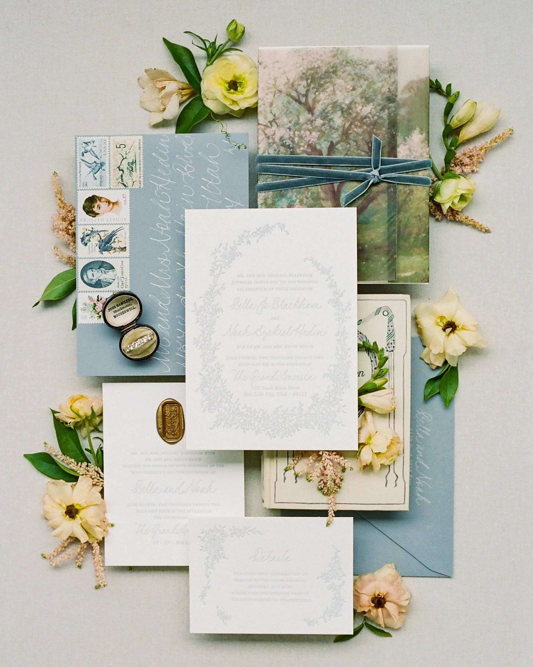
Don't shy away from color, though. A lavender-toned surface like Provence can be absolutely magical for spring and summer wedding stationery. The soft purple hues work especially well with garden-themed designs and pair beautifully with both warm and cool color schemes. This kind of colorful styling surface helps tell a story and can instantly transport viewers to the wedding day atmosphere you're trying to convey.
Fabric surfaces offer a completely different aesthetic. Stain-resistant options like Anemone provide a luxurious, textured foundation without the worry of accidental spills ruining your shoot. The beauty of fabric is in its ability to create soft, organic folds and gentle shadows that add dimension to otherwise flat compositions. These surfaces are particularly effective for romantic, fine art photography styles.
When you're working with rich, jewel-toned stationery or fall wedding designs, a deeper shade like Ceanothus creates stunning contrast. This vegan wool surface brings sophistication and drama to your images while maintaining a natural, organic feel. The texture catches light beautifully and adds tactile interest that draws viewers into your work.
Proper care of your styling surfaces ensures they'll last through countless photo shoots. Always store them rolled tightly on their core with the retaining band secured. Never fold or crease your surfaces, as this can create permanent damage. If you do notice minor creases, gentle heat from an iron on the backside of painted surfaces can help reduce them. For fabric surfaces, a quick press with your iron will restore them to perfect condition. Keep a small kit of cleaning supplies handy: a white art gum eraser works wonders on painted surfaces, while a terry cloth rag and lint roller help maintain fabric mats.
Working with Natural Light
Lighting can make or break your stationery photography. The most flattering, professional-looking images almost always use natural light, but not just any natural light. Direct sunlight is too harsh and creates unflattering shadows and blown-out highlights. Instead, you want soft, diffused light that gently illuminates your work without creating harsh contrasts.
The best natural light comes from a large window with indirect sunlight. North-facing windows provide the most consistent, even light throughout the day. If you don't have a north-facing window, shoot during morning or late afternoon hours when the sun isn't directly streaming through your windows. You can also use sheer white curtains to diffuse harsh sunlight and create that soft, even glow.
Position your styling surface perpendicular to your light source rather than directly in front of it. This creates gentle shadows that add depth and dimension to your flat lay compositions. Those shadows are crucial because they give your two-dimensional stationery a three-dimensional quality in photographs. (This is one of the most common mistakes in wedding flat lay photography that even experienced photographers make.)
Overcast days are actually a gift for stationery photographers. The cloud cover acts as a giant softbox, creating beautifully even, diffused light that's perfect for capturing true colors and subtle details. Don't let gray skies discourage you from shooting.
If you're shooting late in the day or in a room with less natural light, consider using a white foam board or reflector to bounce light back onto your styling surface. Place it opposite your light source to fill in shadows and create more even illumination. This simple trick can dramatically improve your images without requiring any expensive equipment.
Pay attention to your white balance settings. Natural light changes color temperature throughout the day, shifting from cooler tones in the morning to warmer tones in the afternoon. Set a custom white balance using a white piece of paper in your shooting environment, or shoot in RAW format so you can adjust white balance perfectly in post-processing.

Pictured Styling Surface: BUCKWHEAT | Soft diffused window light brings out the subtle texture of letterpress details on Buckwheat vegan wool surface without harsh shadows or blown highlights.
When Direct Light Actually Works
Here's something most stationery photography advice gets wrong: direct sunlight isn't always your enemy. While soft, diffused light is absolutely the safer choice for beginners, dismissing direct light completely means missing out on some stunning creative opportunities.
Direct sunlight can create dramatic, high-contrast images that feel editorial and intentional. The key is knowing when and how to use it deliberately rather than fighting against it.
If your stationery has bold colors or graphic elements, direct light can make those details pop in ways that soft light simply can't match. The sharp shadows create dimension and visual interest that draws the eye. Dark, moody invitation suites with deep jewel tones or black ink can look absolutely striking when photographed in direct light with intentional shadow placement.
The trick is treating those hard shadows as a compositional element rather than a problem to eliminate. Position your stationery so shadows fall in ways that enhance rather than obscure important details. Let a shadow cut diagonally across your styling surface to create geometric interest. Use shadows from props like eucalyptus branches or silk ribbon to add organic shapes to your composition.
Timing matters tremendously when working with direct light. Late afternoon sun, often called golden hour, provides warm direct light that's less harsh than midday sun. The lower angle creates longer, more flattering shadows that add drama without overwhelming your subject. If you have access to direct morning light, the cooler color temperature can be beautiful for fresh, crisp stationery designs.
You can also modify direct sunlight to make it more workable. A sheer white curtain still diffuses harsh light while maintaining more contrast than completely indirect light. Or try shooting near a window where direct sun hits just the edge of your styling surface, creating a gradient from bright to shadow that adds depth to your composition.
The most important thing is understanding your aesthetic and your client's expectations. If you're going for soft, romantic, dreamy images, stick with diffused light. But if you want bold, editorial, high-impact portfolio pieces that stand out, don't be afraid to experiment with direct light and embrace those shadows.
Pictured Styling Surface: SANTORINI | Using shadow as a design element: direct afternoon light creates geometric interest on Santorini neutral backdrop without overwhelming vintage calligraphy details.
Creating a Cohesive Color Story
Professional stationery photography always emphasizes the importance of color harmony. Your styling surface should complement your stationery, not compete with it. Think about color theory and how different hues interact. Analogous colors (colors next to each other on the color wheel) create harmonious, soothing compositions. Complementary colors (opposite on the color wheel) create dynamic, eye-catching contrast.
If your stationery features soft blush and ivory tones, a warm neutral or gentle lavender styling surface enhances those romantic qualities. Bold, modern stationery with navy and gold might shine against a rich, deep-toned surface that echoes the sophistication of your design. The goal is to create a color palette that feels intentional and cohesive from the very first glance.
Don't forget about props and styling elements. Fresh flowers, silk ribbons, vintage stamps, wax seals, and calligraphy tools all add context and visual interest to your composition. However, less is often more. Each element should serve a purpose and enhance your stationery rather than distract from it. Choose props that complement your color story and reflect the style of the wedding or event your stationery is designed for.
When styling with botanicals, consider the undertones in your flowers and greenery. Cool-toned eucalyptus and dusty miller pair beautifully with blue and purple palettes, while warm golden florals and terracotta-toned leaves enhance earthy, autumn designs. Even small details like the color of ribbon you choose can impact the overall harmony of your image.
Texture also plays a role in your color story. Matte surfaces absorb light differently than glossy ones, and this affects how colors appear in your final image. Pay attention to how your paper stock, envelopes, and styling surface interact with each other. Sometimes the most beautiful images come from subtle variations in texture within a monochromatic color scheme.
Pictured Styling Surface: BUCKWHEAT | Layering elements at varying heights creates depth and visual interest: invitation suite styled with vintage stamps, silk ribbon, and fresh florals on Limestone warm neutral surface.
Composition and Styling Techniques
The way you arrange your stationery in your composition is crucial to creating engaging images. Start by thinking about the story you want to tell. Are you showcasing a full suite with all the pieces, or highlighting specific details like envelope liners or wax seals?
For full suite layouts, create hierarchy with your placement. Your invitation should typically be the largest, most prominent piece in the composition. Layer other elements like RSVP cards, detail cards, and envelopes around it in a way that guides the viewer's eye through the entire suite. Slightly angle pieces rather than placing everything in a perfect grid. This creates visual movement and feels more organic and intentional.
Detail shots are equally important for showcasing the special touches that make your work unique. Get close enough to capture the texture of your paper, the sheen of foil stamping, or the delicate edges of letterpress impressions. These macro shots help potential clients appreciate the quality and craftsmanship of your work.
Create depth in your flat lay by using varying heights. Tuck a corner of one piece under another, or roll a piece of handmade paper to add dimension. Place smaller elements like wax seals, vintage stamps, or tiny botanicals on top of larger pieces to create layers that the camera can capture. For a complete workflow from setup to final shot, our ultimate flat lay photography guide walks through the entire process step by step.
Consider the rule of thirds when composing your shot. Imagine your frame divided into nine equal sections with two horizontal and two vertical lines. Placing your main focal points along these lines or at their intersections creates more dynamic, visually interesting compositions than centering everything.
Negative space is your friend. Don't feel like you need to fill every inch of your frame. Allowing breathing room around your stationery creates an elegant, sophisticated feel and draws the eye to your work. This is especially important for minimalist or modern designs where simplicity is part of the aesthetic.
While overhead flat lay shots are popular and effective, don't limit yourself to just one angle. Experiment with shooting at a 45-degree angle to show dimension and layers in your styling. This angle is particularly effective when you have elements at different heights or want to showcase envelope liners peeking out.
For certain shots, try placing your camera nearly parallel to your styling surface to create dramatic perspective and depth. This works beautifully when you have elements arranged in a line leading toward or away from the camera. It's an editorial technique that adds sophistication to your portfolio.
Pictured Styling Surface: ALDER | Negative space and diagonal placement guide the eye naturally through this composition on Limestone backdrop without overcrowding the frame.
Editing with Intention
Even the most beautifully captured photograph benefits from thoughtful editing. Your goal in post-processing is to enhance what's already there, not to completely transform your image. Start by adjusting your exposure and white balance to ensure accurate colors and proper brightness.
Pay special attention to color accuracy when editing stationery photography. Your clients need to see true representations of your work, from paper colors to ink shades. Overly warm or cool color casts can misrepresent your designs and lead to disappointed customers. Use your editing software's white balance tools to neutralize any color casts and ensure your whites look white.
Increase clarity and sharpness slightly to make details pop, but be careful not to overdo it. Too much sharpening creates harsh, unnatural-looking images. A subtle touch brings out the texture of your paper and the crispness of your printing without looking over-processed.
Consider creating a consistent editing style that becomes part of your brand identity. Whether you prefer bright and airy, dark and moody, or soft and romantic, maintaining consistency across your portfolio helps potential clients instantly recognize your work. Lightroom presets can help you achieve this consistency efficiently.
Don't forget to crop and straighten your images. Even the slightest tilt can make a professional photograph look amateurish. Use your editing software's straightening tools to ensure all lines are level and your composition feels balanced.
Finally, export your images in the appropriate size and format for their intended use. For website and social media, JPEGs at 72 dpi work well and load quickly. For print portfolios or publications, you'll want higher resolution images at 300 dpi. Always save a high-resolution master file before creating any web-optimized versions.
Building Your Portfolio Over Time
Consistency is key when building a portfolio that attracts your ideal clients. Develop a signature style that reflects the type of work you want to create and the clientele you want to serve.
Photograph every project you complete, even the small ones. Each suite is an opportunity to refine your skills and expand your portfolio. Pay attention to what resonates with your audience. Which images get the most engagement on social media? Which photographs lead to inquiries? Let this feedback guide your future photography decisions.
Invest in quality tools that make your work easier and your results more professional. High-quality styling surfaces are worth the investment because they improve every single photograph you take. When your foundation is beautiful, your stationery naturally looks more appealing.
Remember that photography is a skill that improves with practice. Don't get discouraged if your first attempts don't match the gorgeous images you see from established designers. They've spent years honing their craft. Focus on incremental improvement with each shoot, and you'll be amazed at your progress over time.
The most successful stationery designers understand that beautiful photography isn't just about showing what they've created. It's about evoking emotion, telling a story, and helping couples envision these pieces as part of their own love story. When you master the art of stationery photography, you're not just taking pictures. You're creating an experience that draws clients in and makes them fall in love with your work.
Ready to start capturing your stationery with the professional quality it deserves? Shop hand-painted styling surfaces and fabric flat lay mats designed specifically for stationery and flat lay photography.

Creators of premium photography backdrops and styling surfaces
Trusted by thousands of discerning creatives worldwide
Every piece is handcrafted with intention in Orange County, California