
Professional Color Grading for Backdrop Photography in Lightroom (2026)
Posted on May 7, 2026
There is a particular moment in post-processing that reveals whether a photographer has truly understood their backdrop. You open a Lightroom file shot against hand-painted canvas, move into the Develop module, and reach for the shadows slider. As you lift the blacks, the canvas doesn't simply brighten. It glows. The micro-shadows between brushstrokes emerge. The layered pigment that Jennifer applied over two to three days reveals itself as something altogether more dimensional than a background. It is a surface with a voice.
This is what separates hand-painted canvas from vinyl and muslin in the edit suite. The camera captures texture. Lightroom reveals depth. And a photographer who understands how to work with that depth in post-processing doesn't just recover more detail from the image. They honor the craft of the backdrop itself.
Hand-painted canvas backdrops demand a fundamentally different color grading approach than mass-produced alternatives because the hand-mixed pigment and fiber texture create tonal complexity that requires precision in how highlights, shadows, and saturation are adjusted. Vinyl reflects light back to the camera as a flat, even plane. Muslin diffuses light into a softer but still relatively uniform tone. Canvas absorbs light and re-emits it through layered pigment, creating micro-contrast that interacts with every adjustment you make in the Develop module.
The depth you see in this image isn't a filter. It's the result of hand-mixed pigment layered over multiple days, photographed on a Chasing Stone canvas backdrop, and graded with intention in Lightroom.
Quick Answer
Hand-painted canvas backdrops respond to Lightroom adjustments differently than vinyl or muslin. Canvas requires more intentional shadow lifting (without muddying), careful saturation adjustments (without oversaturating the hand-mixed color), and texture-conscious clarity work (to enhance rather than destroy the brushstroke detail). The same image graded identically on canvas, vinyl, and muslin will tell three different visual stories.
Why Canvas Backdrops Demand Different Grading Strategies
The difference starts before you even open Lightroom. When Jennifer hand-paints a Chasing Stone canvas backdrop, she is mixing pigment and applying it in layered strokes, building tone and color through accumulation rather than printing it in a single pass. The result is a surface with optical depth. Light doesn't stop at the surface the way it does with a printed vinyl or a woven muslin. It enters the pigment, gets scattered by fiber, and emerges with subtle variations in tone that a camera captures but a mass-produced surface simply cannot create.
This is the heart of the hand-painted distinction. Each backdrop is not manufactured. It is painted. Over two to three days, Jennifer applies multiple layers of pigment, allowing each layer to dry slightly before the next application. This layering creates a depth that a vinyl backdrop, printed in a single pass, can never achieve. It creates tonal variation that a muslin backdrop, uniform across its woven surface, cannot match.
In Lightroom, this optical depth becomes evident the moment you begin adjusting. A vinyl backdrop, when you lift the shadows, lifts evenly across the entire frame. The surface remains flat. The histogram adjusts uniformly. A hand-painted canvas lifts selectively. The areas where Jennifer has layered more pigment stay darker longer. The areas where pigment sits lighter come up more aggressively. The texture asserts itself. The adjustment curve reveals the artist's choices.
This is not a defect. It is the entire point. The hand-painted distinction is what makes Chasing Stone surfaces work. But it requires a photographer who understands how to preserve and emphasize that depth in the edit.
Muslin sits somewhere in the middle. It has texture, but texture that is mechanical and uniform. A woven structure, repeated infinitely across the surface, creates a texture pattern that can fight the camera if you do not manage it carefully. Canvas texture, by contrast, is organic. No two brushstrokes are exactly alike. That organic variation is what makes the tonal response in Lightroom feel alive instead of patterned. It is what allows the backdrop to feel like a surface rather than a filter.
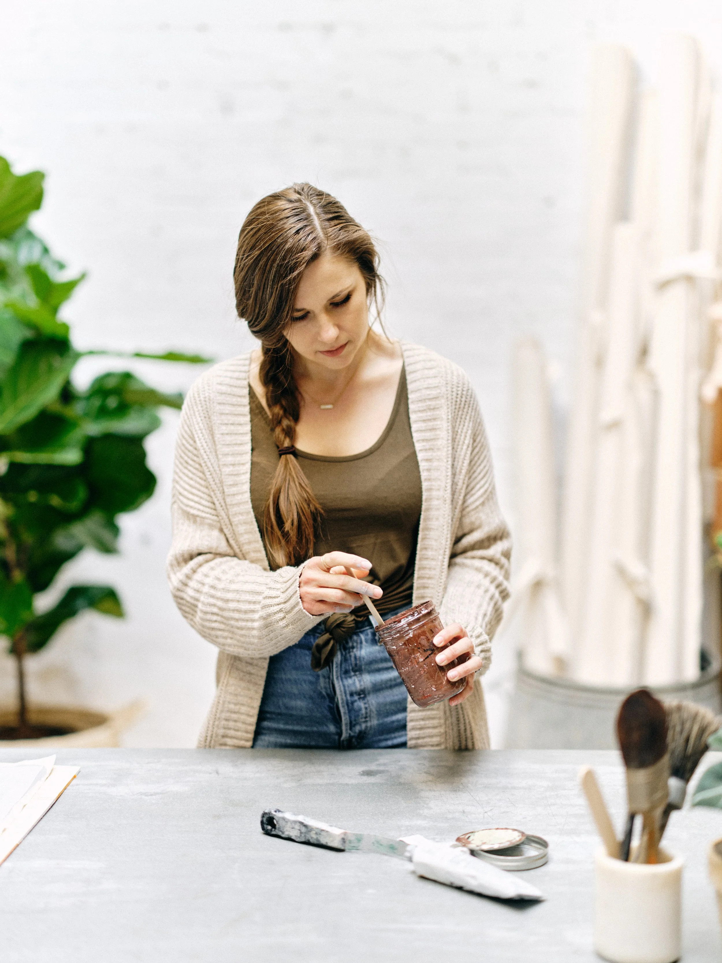
Every Chasing Stone backdrop starts here. Jennifer hand-mixes pigment in her Orange County studio, building color over two to three days of layered application.
The Lightroom Workspace Setup for Canvas Backdrops
Before you make any adjustments, the workspace matters. Most photographers are trained to work left to right through the Develop module panels: Basic, Tone Curve, HSL, Calibration. For canvas backdrops, this order still holds, but the intention shifts.
Start with white balance. This is where most photographers lose the thread. If you set a white balance to correct the canvas like you would correct skin tone, you have missed the entire purpose of working with hand-painted color. The canvas is not neutral. It is not trying to be neutral. A warm-toned backdrop like Limestone has a warm color cast because that warmth is the entire design of the surface. Your white balance should honor that, not correct it away.
Instead, set white balance to establish context. If the session was lit with warm light and the backdrop is warm, you have harmony. Your white balance adjustment should enhance that harmony, not flatten it. If the session was lit with cool light against a warm backdrop, you have deliberate contrast. Your white balance choice shapes how that contrast reads. This decision between harmony and contrast is one of the first interpretive choices you make in the edit, and it is one of the most consequential.
The Basic panel comes next. Here is where canvas begins to separate from vinyl in the most obvious way. A vinyl backdrop's histogram fills relatively evenly across the tonal range. The histogram is orderly because the surface is orderly. A hand-painted canvas, because the pigment has been layered, often shows concentration in the midtones with gaps in the shadows and highlights. This is not an exposure error. It is the texture of layered pigment. Do not fight it by stretching the whites or blacks aggressively. Let the histogram sit where it is, and trust the depth to emerge through targeted panel adjustments.
When you open the Basic panel, resist the urge to pull the Blacks slider or crush the shadows. This is the mistake that most photographers new to canvas make. They see a histogram that is not perfectly stretched from corner to corner, and they assume the exposure needs correction. On canvas, that uneven histogram is a feature, not a bug. It is the fingerprint of the artist.
Mastering the Tone Curve for Canvas Texture
The tone curve is where hand-painted canvas truly separates from its cheaper alternatives. This is because the tone curve is not just about brightness. It is about how the camera's sensor has recorded the interaction between light, pigment, and fiber.
A hand-painted canvas backdrop absorbs light. When light hits the surface, some of it bounces straight back. Most of it enters the pigment layer, scatters through the paint, bounces off the fiber beneath, and emerges back through the paint toward the camera. This path difference—the light that has gone into the material and back out—is what creates the tonal depth. The camera records all of this as micro-variations in the midtones and shadows that tell the story of the texture. A skilled grader reads that story in the tone curve and brings it to the foreground.
Vinyl reflects light back directly and immediately, creating a flat tone signature. Canvas absorbs and re-emits light through pigment, creating optical depth. Muslin diffuses light without absorption, sitting between the two extremes. Understanding these light interactions is the foundation for all color grading decisions.
Vinyl reflects light back directly and immediately. The entire tone of a vinyl backdrop is established by where the light source was and how bright it was. There are no shadows within the material because light does not penetrate vinyl. The tone curve for vinyl is straightforward: the signal is what you see. Muslin, which is fiber without pigment, allows light to diffuse but does not absorb and re-emit it the way painted canvas does.
In Lightroom, you reveal this difference in the Tone Curve panel. For canvas, you will typically lift the shadows selectively. Create a subtle curve that lifts the darkest tones without pushing them all the way to the midpoint. The goal is to reveal the micro-shadows between brushstrokes without making them disappear entirely. A hand-painted canvas should show depth. If the shadows are fully lifted, you have lost the dimensionality. The shadows are what hold the story of the brushwork. Lift them just enough that they read, but not so much that they flatten.
Compress the highlights slightly. Canvas backdrops often hit a ceiling brightness where the pigment is densest. Rather than extending the highlights toward pure white, gently pull them down slightly. This preserves the subtle tonal variation in the brightest areas of the painted surface and prevents blown-out flatness. The highlights are where the most pigment is visible, and they deserve as much attention as the shadows.
Add a slight S-curve to the midtones. The midtones are where most of the layered pigment lives. A subtle midtone lift in the curve shape brings out that layering without pushing the entire image into an unnatural look. The S-curve is your best friend here. A gentle lift at around the 40% point and a gentle push down at around the 70% point creates separation without drama.
For vinyl, you would do none of this. Vinyl benefits from a more standard curve: pull shadows up aggressively, extend highlights, maybe add an S-curve for contrast. The vinyl surface is forgiving because it is blank. For muslin, the approach sits between the two. Muslin has texture but not pigment depth, so you will lift shadows more aggressively than canvas (because there is no pigment depth to preserve) but less aggressively than vinyl (because the woven texture still needs to read as texture).
Saturation and HSL Adjustments for Hand-Painted Color
Here is where the artist's hand becomes visible. When Jennifer hand-mixes pigment, she is not pulling from a standardized CMYK palette or a Pantone swatch. She is mixing actual pigment, and each batch has slight variations. That variation is a feature of the hand-painted distinction. Over the life of the Chasing Stone collection, the Clay backdrop has subtle variations from batch to batch. The Limestone leans slightly warmer in some batches. This variation—the absence of perfect uniformity—is what makes hand-painted surfaces read as fine art instead of mass-produced product.
In Lightroom, this variation requires careful saturation work. If you boost saturation across the board, you are over-saturating the hand-mixed color and losing the subtlety that makes it feel painterly instead of posterized. You are fighting the artist's intention instead of serving it.
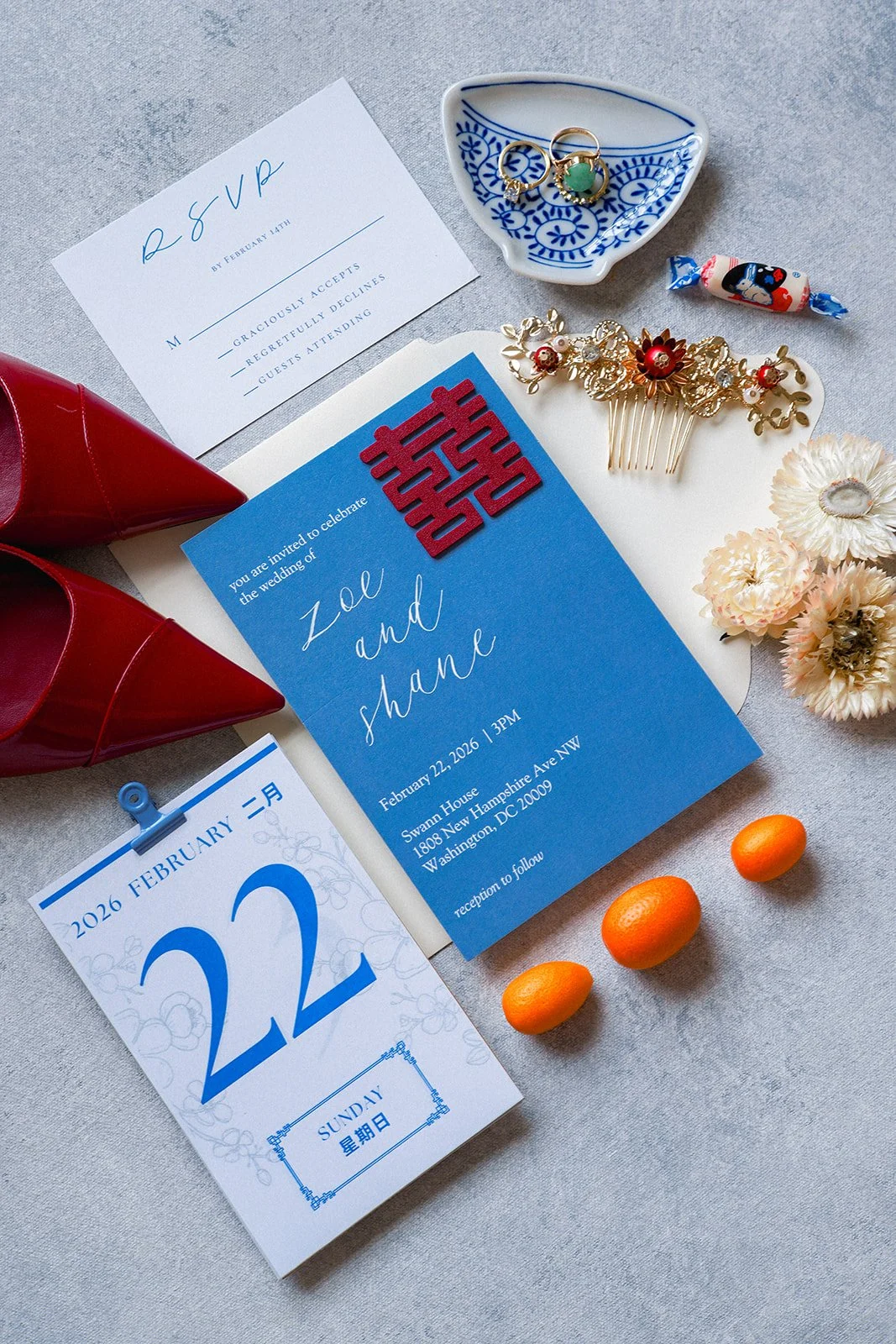
Cool-tone styling surfaces let saturated wedding details, like this red and blue Chinese wedding suite, hold their full intensity in Lightroom without fighting the backdrop.
Instead, use targeted saturation in the Basic panel, adding saturation modestly (plus 3 to 8 points for most canvas backdrops). This should feel invisible. If the saturation boost reads as "boosted," it is too much. You should not see the saturation move. You should only feel it, as a quiet enhancement of what was already there.
Move to the HSL panel and target specific hue ranges. For a warm backdrop like Clay, you will target the Oranges and Reds. For a cool backdrop like Celestite, you will target the Blues. For a neutral like Slate, you might target the Yellows to bring out warmth, or leave them untouched to preserve architectural neutrality. This targeted approach respects the painter's choice of color while enhancing the color without introducing synthetic vibrancy.
Increase the saturation in that hue range (plus 5 to 15 points, depending on the colorway). Be conservative. The goal is to make the hand-mixed color read as intentional without making it read as augmented. A professional grader is invisible. The adjustment should feel like revelation, not creation.
You can also use the Lightness slider in the HSL panel to shift specific hues slightly darker or lighter, mimicking what you might see under different light angles. This is an advanced technique, but it honors the dimensionality of the painted surface. A Clay backdrop, for instance, might have Reds that are slightly brighter in the highlights and slightly darker in the shadows. The Lightness slider allows you to recreate that dimensionality if the original exposure lost it.
Vibrance should be approached carefully. Vibrance boosts the saturation of less-saturated colors more than saturated ones. For a backdrop that is already saturated by hand-mixing, vibrance can create unnatural separation. Add vibrance sparingly (plus 5 to 10 points) or skip it altogether in favor of HSL precision.
Texture Preservation: Clarity, Texture, and Vibrance
This is where photographers most often make their critical mistake. They see the texture in the image and want to emphasize it, so they reach for the Clarity slider. Clarity, in Lightroom, is a local contrast adjustment. It adds midtone contrast and helps separation between tones. On a hand-painted canvas backdrop, it can destroy the dimensionality you worked so hard to preserve in the Tone Curve.
Here is why: clarity adds contrast by darkening midtones near light areas and lightening midtones near dark areas. This works beautifully for skin texture, where you want to emphasize pores and fine lines. On a hand-painted canvas, where the texture is already dimensional because of pigment depth, clarity can exaggerate that texture into an ugly, plasticky look. The brushstrokes become harsh lines. The soft gradations of color become choppy. The surface stops feeling painterly and starts feeling processed.
Use clarity on canvas backdrops with caution. A small positive value (plus 3 to 8) can work if you want to sharpen the texture slightly for a more graphic aesthetic. But often, zero clarity is the right choice. Let the depth created by the tone curve and saturation adjustments carry the texture work.
The Texture slider, added in Lightroom versions 2020 and later, is more appropriate. Texture enhances fine details without adding the local contrast midtone crush that clarity does. For canvas backdrops, adding texture (plus 10 to 20 points) can emphasize the hand-painted quality without introducing harshness. This is the slider that honors the brushwork. This is the slider that says: I see what you painted, and I am bringing it forward.
Vibrance, mentioned above, also contributes to the texture story. Used conservatively, it adds dimensionality. Used aggressively, it creates synthetic separation that fights the organic quality of hand-mixed pigment.
Before/After Grading Examples by Colorway Family
Warm-tone canvas (Clay, Limestone, Umber, Rose-Quartz):
| Adjustment | Setting |
|---|---|
| White Balance | Temperature plus 200-300K |
| Shadow Lift (Tone Curve) | 8-12 points |
| Highlight Compression (Tone Curve) | 2-3 points down |
| Basic Saturation | Plus 5-8 |
| HSL (Oranges/Reds) | Plus 8-12 saturation |
| Clarity | Zero or plus 3 |
| Texture | Plus 12-15 |
| Adjustment | Setting |
|---|---|
| White Balance | Neutral or temperature minus 100-200K |
| Shadow Lift (Tone Curve) | 6-10 points |
| Highlight Compression (Tone Curve) | 2-3 points down |
| Basic Saturation | Plus 3-5 |
| HSL (Blues/Greens) | Plus 8-12 saturation |
| Clarity | Zero |
| Texture | Plus 10-15 |
| Adjustment | Setting |
|---|---|
| White Balance | Neutral or temperature plus 200K |
| Shadow Lift (Tone Curve) | 8-10 points |
| Highlight Compression (Tone Curve) | 2-3 points down |
| Basic Saturation | Plus 3-6 |
| HSL (Yellows) | Plus 5-8 saturation or skip |
| Clarity | Zero |
| Texture | Plus 10-12 |
Common Color Grading Mistakes with Canvas Backdrops
The first mistake is clarity over-use. Photographers see detail and want to sharpen it. Clarity does sharpen midtones, but on canvas it also hardens them. The result is a backdrop that looks processed instead of painted. The brushstrokes become too obvious. The soft gradations of hand-mixed color become step-like. Restraint is the professional move.
The second is shadow crushing. In an attempt to recover shadow detail, photographers lift shadows so aggressively that the tonal depth of the painted surface disappears. The canvas stops reading as dimensional and starts reading as flat. The solution is patience. Lift shadows in small increments. Add 3 points, evaluate, add 3 more. You will find the balance where the texture reads but remains dimensional.
The third is over-saturation of warm tones. Warm backdrops like Clay and Umber have saturation already built in from Jennifer's hand-mixing. Adding too much saturation in the Oranges and Reds pushes them toward unnatural peachy or muddy tones. Restraint is the professional approach. You are enhancing what is already there, not inventing color.
The fourth is white balance correction toward neutral. Many photographers, conditioned to color-correct skin tones to neutral perfection, apply the same logic to backdrops. A warm canvas backdrop does not want to be neutral. Its warmth is the design. A slight warm white balance shift (temperature plus 200-300K) harmonizes with the painted color rather than fighting it. The color is the point.
The fifth mistake is neglecting the relationship between camera exposure and Lightroom adjustment. If you underexpose the image during the shoot, you can recover highlight detail but not shadow detail in a canvas backdrop. Canvas, because it absorbs light, is especially vulnerable to underexposure. The pigment does not bounce light back the way vinyl does. Get the exposure right in-camera. Lightroom enhancement should be subtle, not rescue.
The sixth mistake—the most advanced—is treating canvas like vinyl. Photographers who have worked with vinyl for years often approach canvas with the same aggressive curve: pull shadows all the way up, extend highlights, add heavy clarity, boost saturation boldly. Every one of those choices works against canvas. Canvas deserves restraint. Canvas deserves attention. Canvas deserves editing that honors its craft.
This is what hand-painted canvas does for a portrait. The backdrop holds its tone, the shadow reads as dimensional, and the warm pigment supports the subject without competing with her.
Advanced Technique: Local Adjustments for Canvas Texture
For the most demanding sessions, use Lightroom's Adjustment Brush or Radial Filter to target specific areas of the canvas. These tools allow you to preserve global restraint while making local refinements.
With the Adjustment Brush, you can selectively lift shadows in areas where the canvas fell into shadow while keeping other areas deeper. Add targeted saturation boost to areas of the backdrop that photographed slightly desaturated. Reduce clarity or texture in areas where brushstrokes are too aggressive. Add vignetting effect that darkens edges and focuses attention on the subject. Boost the Texture slider in specific regions where the hand-painted quality is most pronounced.
With the Radial Filter, you can create a vignette that deepens edge tones and draws attention away from canvas edges toward the subject. Selectively compress highlights in the brightest areas of the canvas without affecting the entire frame. Add a subtle warmth to areas of the canvas that sat in shadow. Apply local temperature shift to regions where the light quality changed across the backdrop.
These local adjustments are subtle. A photographer new to canvas backdrops should master global adjustments (Basic, Tone Curve, HSL) before attempting local work. But as skill develops, local adjustments unlock the final level of refinement in canvas backdrop grading. The difference between good grading and masterful grading often lives in these local decisions.
Comparing Grading Workflows: Canvas vs Vinyl vs Muslin
When you shoot the same scene against three different backdrop materials, the camera records three different light interactions. The edit suite reveals what the camera captured. The grading approach honors what the material is.
Canvas backdrop workflow: Preserve shadow depth with selective shadow lift. Honor hand-mixed color with modest saturation. Emphasize brushwork with texture slider, not clarity. Target hue ranges in HSL for precision over aggression.
Vinyl backdrop workflow: Recover full tonal range with more aggressive shadow lifting. Build saturation more boldly (vinyl can handle it because it has no optical depth to lose). Use clarity to sharpen the flat surface and create separation. Use vibrance to compensate for the lack of optical depth that canvas provides naturally.
Muslin backdrop workflow: Lift shadows moderately (more than canvas, less than vinyl). Add saturation to compensate for muslin's diffusion effect. Use clarity sparingly (enough to sharpen the woven texture). Avoid clarity excess that makes the weave pattern obvious and distracting.
The grading strategies diverge because the surfaces have fundamentally different light interaction. Canvas is absorbing and re-emitting light through pigment, creating optical depth. Vinyl is reflecting light specularly, creating flatness. Muslin is diffusing light through fiber, creating soft but uniform diffusion. Each approach in Lightroom acknowledges that difference and works with it.
Why This Matters for Your Creative Practice
When photographers ask us at Chasing Stone why they should invest in hand-painted canvas over cheaper alternatives, the answer includes camera work, lighting, and composition. But it also includes this: the final image will live longer in post-processing. Your Lightroom edits will feel more nuanced. Your adjustments will reveal more dimensionality. The backdrop will not be something you fought in the edit suite. It will be something you unlocked.
This is the promise of working with hand-crafted surfaces. Jennifer paints for two to three days per backdrop because that care shows up in every stage of the photographer's workflow, including the edit. That care becomes visible in your Lightroom adjustments. A professional grader can tell within seconds whether an image was shot against hand-painted canvas or mass-produced vinyl, just by looking at how the tone curve responds to adjustment. The hand is visible.
Understanding how to grade canvas is understanding how to complete the circle. The artist paints. The photographer lights and composes. The editor reveals. The final image carries all three hands. When all three hands are skilled, the result is not a photograph with a backdrop. It is a complete image, where every element—subject, light, surface, color—works in concert.
Frequently Asked Questions
Do I need different Lightroom profiles for different backdrop colorways?
No. Lightroom's standard Camera Matching profiles (Creative, Standard, or the Adobe Color profile) work well for all Chasing Stone colorways. The differences come in the HSL and tone curve adjustments, not the camera profile. A single profile can serve the entire hand-painted collection. What changes is your adjustment intention, not the profile engine.
How much should I boost clarity on a hand-painted canvas backdrop?
Rarely more than plus 5, and often zero. Canvas backdrops carry sufficient dimensionality from pigment depth that clarity can easily read as harsh. Use the Texture slider instead for a gentler emphasis on hand-painted quality. If you find yourself reaching for clarity on a canvas backdrop, pause and ask yourself: am I trying to create texture or reveal texture? Canvas already has texture. You are revealing, not creating.
Can I recover detail in an underexposed canvas backdrop?
Canvas is more forgiving than vinyl in shadows, but underexposure is still a poor choice. Recover shadow detail in Lightroom only as much as needed to reveal the texture. Beyond that, you risk introducing noise and losing the tonal subtlety that makes canvas special. The camera sees what is there. Lightroom reveals what the camera saw. If the canvas was underexposed, the camera recorded less information to begin with.
Should I grade canvas backdrops differently in Lightroom than I do skin tones?
Yes, completely differently. Skin requires neutral white balance and clarity-driven texture to emphasize pores and skin detail. Canvas requires white balance that respects the painted color and tone curve work that honors pigment depth. The two subjects demand different adjustment philosophies. Your skin tone grading workflow would destroy a canvas backdrop. Your canvas backdrop workflow would flatten skin tone.
What's the best white balance setting for canvas backdrops in Lightroom?
For warm backdrops (Clay, Limestone, Umber), a slight warm shift (temperature plus 200-300K). For cool backdrops (Celestite, Slate), neutral or a slight cool shift (temperature minus 100-200K or no change). For neutrals (Bentonite, Graphite), neutral or a slight warm shift (temperature no change to plus 200K). The goal is to enhance the painted color, not correct it to neutrality. The color is intentional.
How do I preserve the hand-painted texture when editing?
Use tone curve work to reveal micro-shadows between brushstrokes without crushing them. Use saturation work to honor the hand-mixed color. Use clarity sparingly or not at all. Use the texture slider to emphasize brushwork. Avoid pushing any single adjustment to aggressive levels. The texture survives through restraint and intention. Every adjustment should have a reason. Every reason should serve the art.
Should I use HSL or Saturation adjustments on canvas backdrops?
Both, applied in order. Start with modest saturation boost in the Basic panel (plus 3 to 8 points). Then target specific hue ranges in the HSL panel for refined control. This two-step approach gives you the range and precision that canvas backdrops deserve. Global saturation establishes the foundation. HSL precision completes the work.
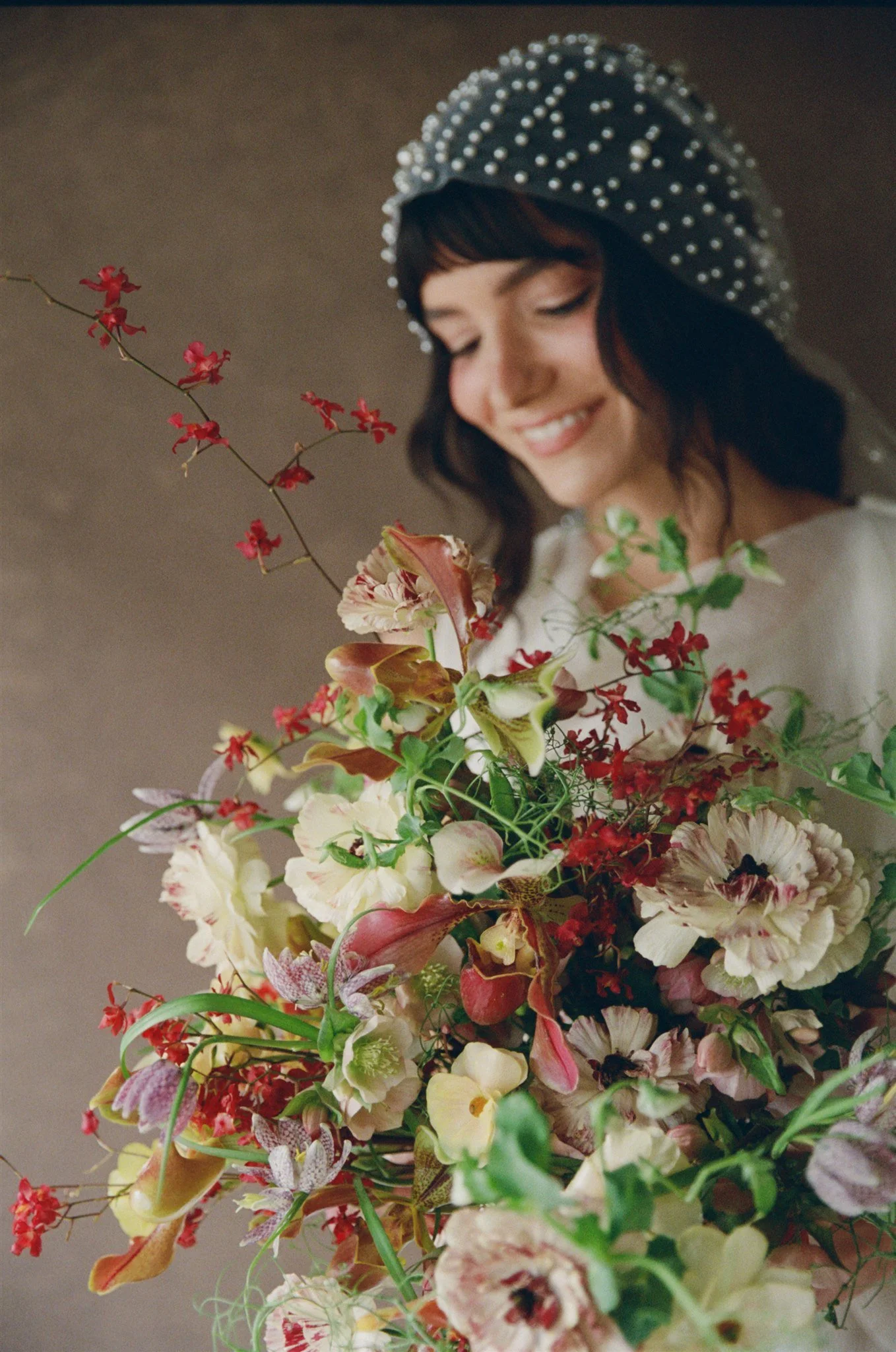
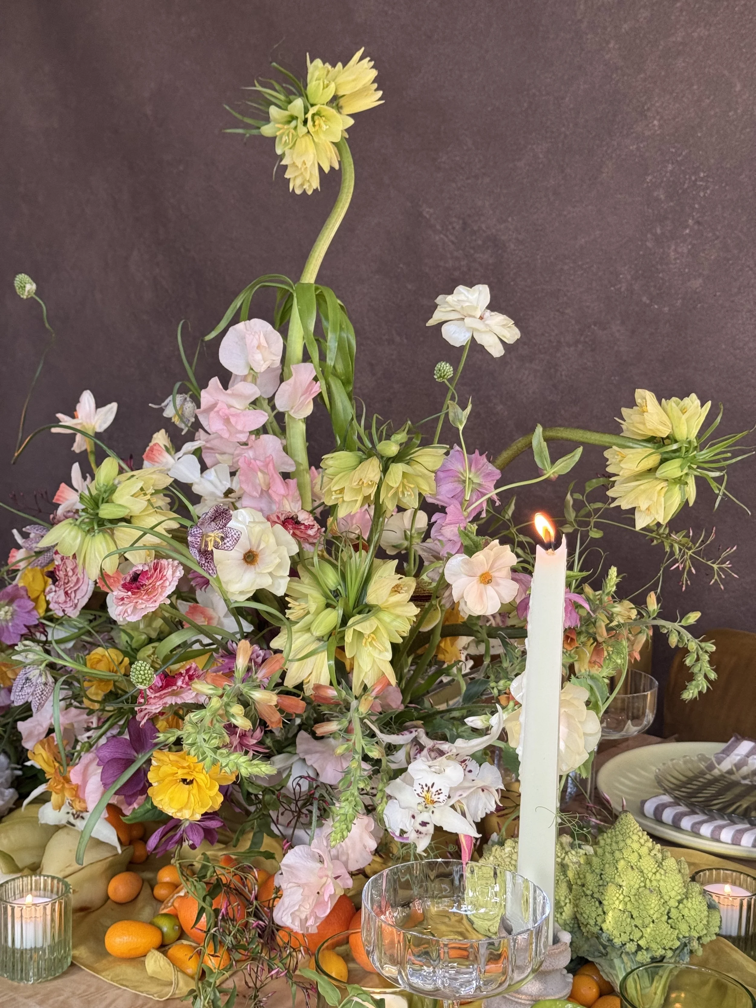
Hand-painted canvas earns its place in editorial work. The pigment depth gives the frame dimension. The neutral tone lets the florals carry the color story.
Explore Canvas Backdrops for Your Next Session
The moment you understand how a hand-painted canvas backdrop responds in Lightroom is the moment your grading process shifts from correction to revelation. You are no longer fighting a flat surface. You are unlocking the depth that Jennifer built into every surface during the painting process.
Hand-painted canvas backdrops from Chasing Stone are available in warm, cool, and neutral colorways, from intimate 5x8 ft sizes to expansive 8x14 ft formats. Each surface is unique because no two paintings are identical. That uniqueness is what makes them special to light, compose with, and grade. This is not mass production. This is fine art.
The next time you edit an image shot against hand-painted canvas, open the Develop module with this knowledge: the backdrop is not something to grade around. It is something to grade with. Let the tone curve, saturation, and texture sliders do what they are meant to do. Reveal what the artist created.
Browse hand-painted canvas photography backdrops at Chasing Stone. Explore our full collection of backdrop colors and sizing options. Each surface is made to order, painted by hand, and ready to change the way you see backdrop photography.

Creators of premium photography backdrops and styling surfaces
Trusted by thousands of discerning creatives worldwide
Every piece is handcrafted with intention in Orange County, California