
The Art of Imperfection: Why Hand-Painted Texture Beats Machine-Made Uniformity
Updated on Apr. 14, 2026
There's a moment in every backdrop I paint when it stops looking like paint on canvas and starts looking like something else entirely. Weathered plaster from a villa in Tuscany. Limestone worn smooth by centuries. The fog-softened cliffs of Big Sur.
Colors like LIMESTONE and TRAVERTINE came from chasing those exact feelings. Not trying to replicate stone, but trying to capture what stone makes you feel.
That moment doesn't happen because I'm trying to make something perfect. It happens because I'm not.
I learned this the hard way. When I first started Chasing Stone in 2018, I was obsessed with consistency. I wanted every backdrop to look exactly like the sample. Same color. Same texture. Same everything. I thought that's what professional meant.
But the backdrops photographers kept requesting weren't the "perfect" ones. They wanted the ones with more variation. More movement. More life. They wanted the ones that looked like they had a story.
It took me a while to understand why. Now, after painting thousands of backdrops and seeing how they photograph, I get it. And it comes down to something most photographers never think about: the difference between real texture and the illusion of texture.
This is why hand-painted backdrops photograph differently than printed ones. LAVENDER QUARTZ has actual texture, brushstrokes that scatter light and create dimension. Your camera captures that depth. Printed backdrops are flat ink on fabric. Hand-painted canvas has real surface variation that reads as authentic in every image.
The Problem with Printed Backdrops
Walk into any photography trade show and you'll see booths full of printed backdrops. They look impressive on the display. Rich colors. Interesting patterns. "Realistic" textures that mimic stone, wood, plaster, marble.
Then you photograph them.
The images look flat. Something's off. The backdrop that looked so good in person reads as obviously fake in the final image. Your subject doesn't separate from the background the way you expected. The whole thing feels like a step backward from just shooting against a plain wall.
Here's what's happening: printed backdrops are ink on fabric. No matter how high-resolution the print, no matter how sophisticated the texture pattern, you're photographing a two-dimensional surface pretending to be three-dimensional.
Your camera sees through the illusion immediately. Light hits a printed backdrop and bounces back uniformly because the surface IS uniform. There's no actual depth for light to interact with. The "texture" you see is just variations in ink color arranged to trick your eye.
In a still photograph, that trick falls apart.
What Happens When Light Hits Real Texture
Hand-painted backdrops are different at a physical level. When I paint a backdrop, I'm building actual texture onto the canvas. Brushstrokes create ridges and valleys. Paint layers create thickness variations. The surface becomes genuinely three-dimensional, even if those dimensions are measured in millimeters.
When light hits this surface, something interesting happens.
Light doesn't bounce back uniformly. It scatters. Some areas catch more light because they're slightly raised. Some areas fall into micro-shadows because they're slightly recessed. The color shifts subtly across the surface because paint thickness affects how pigment absorbs and reflects light.
Your camera captures all of this. Not as obvious texture (unless you're shooting macro), but as depth. As dimension. As the sense that there's something real behind your subject rather than a flat surface.
This is why hand-painted backdrops create natural subject separation without needing to add it in post. The backdrop reads as existing in three-dimensional space because it does.
This is SANDSTONE under natural window light. Watch how the hand-painted texture creates subtle variations across the surface: micro-shadows, gentle highlights, authentic depth. Your camera captures this dimension because it actually exists. Printed backdrops are uniform ink on fabric. Hand-painted canvas has real surface variation that transforms your images.
The Japanese Had a Word for This
There's a concept in Japanese aesthetics called wabi-sabi. It's the idea that beauty exists in imperfection, impermanence, and incompleteness. A cracked tea bowl is more beautiful than a flawless one because the crack tells a story. A weathered wooden beam is more beautiful than a fresh-cut plank because time has given it character.
I didn't know about wabi-sabi when I started painting backdrops. I just knew that when I tried to make things too perfect, they looked worse. When I let the paint do what paint naturally does, when I embraced the drips and the variations and the happy accidents, the results were better.
Now I understand why. Perfection reads as artificial because perfection doesn't exist in nature. Our brains are wired to recognize organic variation as real and uniform consistency as manufactured.
A printed backdrop says "factory." A hand-painted backdrop says "human hands made this." Your viewer might not consciously register the difference, but they feel it.
Why Uniformity Fails in Portrait Photography
Think about what you're photographing when you shoot a portrait. A human face. The most complex, varied, nuanced surface your camera will ever capture.
Skin has texture. Pores. Fine lines. Variations in tone and color that shift with every angle of light. Hair catches highlights and falls into shadow in ways that change from strand to strand. Eyes reflect their environment while revealing depth within.
Now put that infinitely complex subject against a perfectly uniform background.
The contrast is jarring. Not jarring in a good way, like complementary colors creating visual pop. Jarring in an uncanny way, like something is wrong but you can't quite name it.
Your subject looks real. Your background looks fake. The two don't belong in the same image.
This is why photographers who switch from printed or vinyl backdrops to hand-painted canvas always say the same thing: "My subjects just look better." They can't always articulate why. But what they're seeing is the harmony between organic subject and organic background.
The Variations Are the Point
No two backdrops I paint are identical. I use the same colors, the same techniques, the same canvas. But the results are always slightly different. The brushstrokes fall differently. The paint settles differently. The layers interact differently.
For years I apologized for this. "There may be slight variations from the sample photo." Like it was a flaw I was warning customers about.
Now I understand it's the entire point.
Those variations mean your backdrop is unique. Not unique in a marketing-speak way. Actually unique. No other photographer has the exact backdrop you have. The images you create with it are yours alone.
See how CARBON creates drama without competing for attention? This deep charcoal backdrop absorbs light beautifully, making white florals pop with maximum complementary contrast. Hand-painted texture adds subtle dimension even in darkness. This is what moody, editorial photography needs. Shop: chasingstone.com/shop-all/p/carbon
More practically, those variations mean your backdrop photographs with depth and interest from any angle. Move your light, and the backdrop responds. Shift your camera position, and you see different aspects of the texture. You're not locked into one look because the surface has dimension to explore.
Printed backdrops give you exactly one version of themselves. Hand-painted backdrops give you dozens, depending on how you light and shoot them.
What I've Learned About Texture
After seven years of painting backdrops, here's what I know about texture:
More isn't always better. Heavy, aggressive texture competes with your subject. The best backdrop texture is felt more than seen. It adds depth without demanding attention.
Texture needs to serve the light. A backdrop that looks incredible under soft window light might look completely different under hard strobe. I paint with this in mind, creating surfaces that respond well across lighting conditions.
Color and texture are inseparable. The same color painted with different techniques produces different results. A smooth application reads differently than a heavily brushed application, even in the same hue. This is why I can offer the same color in different texture styles.
Authenticity photographs. When I paint a backdrop inspired by Venetian plaster, I'm not trying to fool anyone into thinking it's actual plaster. I'm trying to capture the feeling of it. The warmth. The age. The sense of place. That emotional authenticity comes through in photographs even when the literal representation doesn't. It's why colors like CLAY and SANDSTONE feel like somewhere, not just something.
The Efficiency Argument (And Why It's Wrong)
I've heard the argument for printed backdrops: they're faster to produce, more consistent, and cheaper at scale. All true. If efficiency were the only consideration, hand-painting backdrops would make no sense.
But efficiency isn't the only consideration. Results matter.
A backdrop exists to make your photographs better. That's it. If a backdrop doesn't improve your final images, it's not serving its purpose regardless of how efficiently it was manufactured.
Hand-painted backdrops take longer to create. They cost more. They require an artist's attention rather than a machine's precision. And they produce better photographs.
That trade-off is worth it for photographers who care about the quality of their work. The ones who notice when something's off in their images and can't rest until they fix it. The ones building portfolios that book clients rather than portfolios that blend in.
Wedding photographers need backdrops that work with any color palette the couple brings. SLATE handles it all. Cool grey is the ultimate professional neutral. It lets your subject be the focus while adding sophistication. The hand-painted texture creates depth without demanding attention. This is why grey backdrops book luxury weddings.
Embracing the Handmade
Every backdrop I ship has my literal fingerprints on it somewhere. Paint under my nails, transferred to canvas. Brushstrokes that only my hand makes in exactly that way. Decisions made in the moment about where to add more paint, where to let the canvas show through, where to build up texture and where to smooth it out.
This isn't a manufacturing defect. It's the entire value proposition.
In a world of AI-generated images, mass-produced everything, and algorithmic sameness, handmade objects carry meaning they didn't carry twenty years ago. When everything can be replicated instantly, the things that can't be replicated become more valuable.
A hand-painted backdrop is one of those things. Each one required time, attention, and human judgment. Each one is slightly different from every other. Each one carries the evidence of its making.
Your photographs inherit that quality. Not obviously. Not in a way you'd put in your marketing. But in a way your clients feel when they look at your work and sense that it's different from what everyone else is producing.
The Imperfection That Makes It Perfect
I still remember the backdrop that taught me this lesson. Early 2019. I was painting a warm grey and the color wasn't coming out the way I wanted. Too much variation. Patches that were warmer, patches that were cooler. I almost scrapped it.
Instead, I photographed it. Just to see.
The images were beautiful. The color variation that bothered me on the canvas became tonal depth in the photographs. The "imperfections" created visual interest. The backdrop looked like weathered concrete, like old plaster, like something with history.
I shipped it. The photographer who bought it sent me images within a week. Her portraits looked like they belonged in a gallery. She asked when I'd have more in that color.
That backdrop eventually became what we now call BENTONITE. The variation I almost threw away is now one of our most popular colors.
That backdrop taught me to stop fighting the medium. Paint wants to vary. Brushstrokes want to show. Canvas wants to breathe through the layers. When I work with those tendencies instead of against them, the results are better than anything I could plan.
Imperfection isn't something to minimize. It's something to embrace. It's what separates handmade from manufactured, authentic from artificial, real from fake.
It's what makes your photographs look like nothing else.
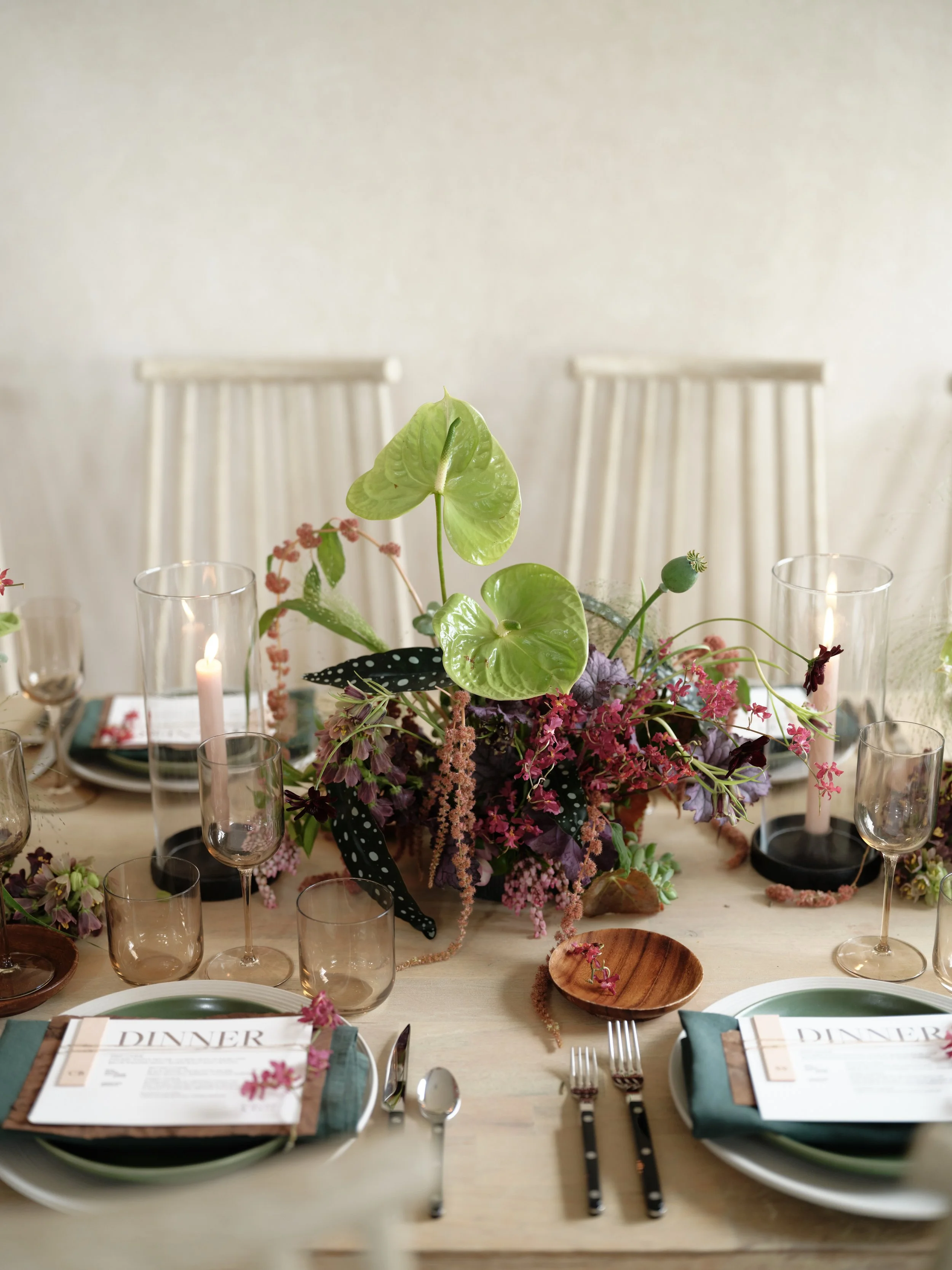
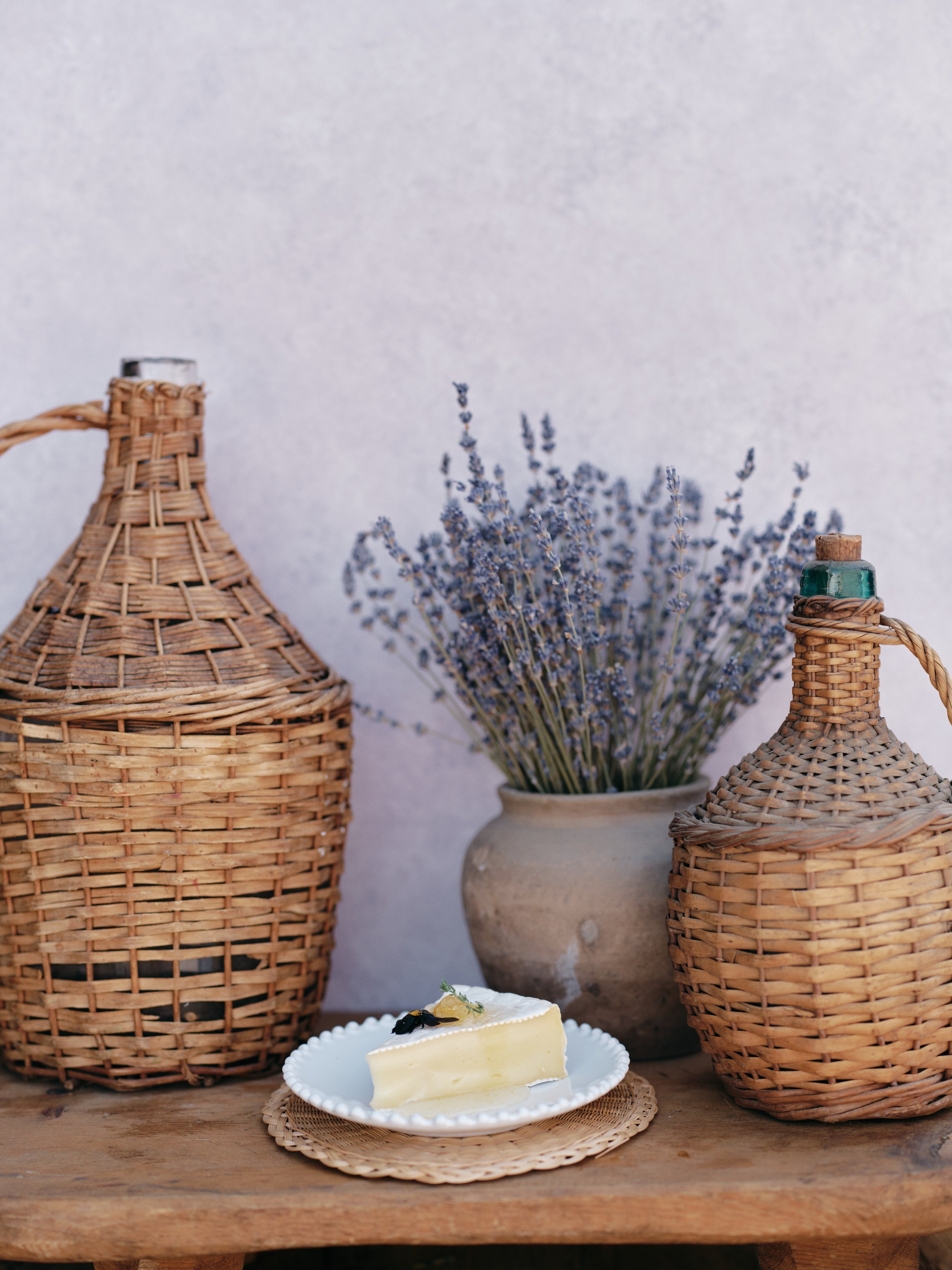
LIMESTONE doing what warm neutrals do best: supporting bold creative choices without interfering. This tablescape uses a split complementary color scheme (purple, green, and teal) that could easily feel chaotic. The warm neutral backdrop creates cohesion. Hand-painted texture adds dimension while staying neutral enough to let your styling be the star.
Your Next Step
If you've been shooting on printed backdrops or vinyl and wondering why your portraits feel flat, now you know. The surface matters. The texture matters. The realness matters.
Hand-painted canvas backdrops create images with depth and dimension that manufactured alternatives cannot match. Not because hand-painting is romantic or traditional, but because it produces a physically different surface that interacts with light in a physically different way.
Explore our hand-painted canvas backdrops at chasingstone.com/shop-all. Every backdrop is painted by hand in my Orange County studio. Every one is slightly unique. Every one is built to make your photographs better.
The imperfections are the point.
Related Reading

Creators of premium photography backdrops and styling surfaces
Trusted by thousands of discerning creatives worldwide
Every piece is handcrafted with intention in Orange County, California