
How to Light Hand-Painted Backdrops: Natural Light Techniques That Actually Work
Updated on Apr. 17, 2026
The first time I photographed one of my own backdrops, I hated the results. Flat. Lifeless. The texture I'd spent hours building into the canvas had completely disappeared.
I blamed the backdrop. Made another one. Same problem.
It wasn't until a photographer friend watched me shoot and started laughing that I realized the issue. "You're lighting it like a wall," she said. "It's not a wall. It's a painting."
She moved my backdrop perpendicular to the window instead of facing it. Shifted my subject three feet forward. Took five test shots.
The texture came alive. The color gained depth. Suddenly the backdrop looked like what I'd intended when I painted it.
That afternoon changed how I think about every backdrop I make. And it's why lighting is the first thing I tell photographers when they ask why their new backdrop doesn't look like the product photos. For a complete overview of photography backdrops, start with our ultimate backdrop guide.
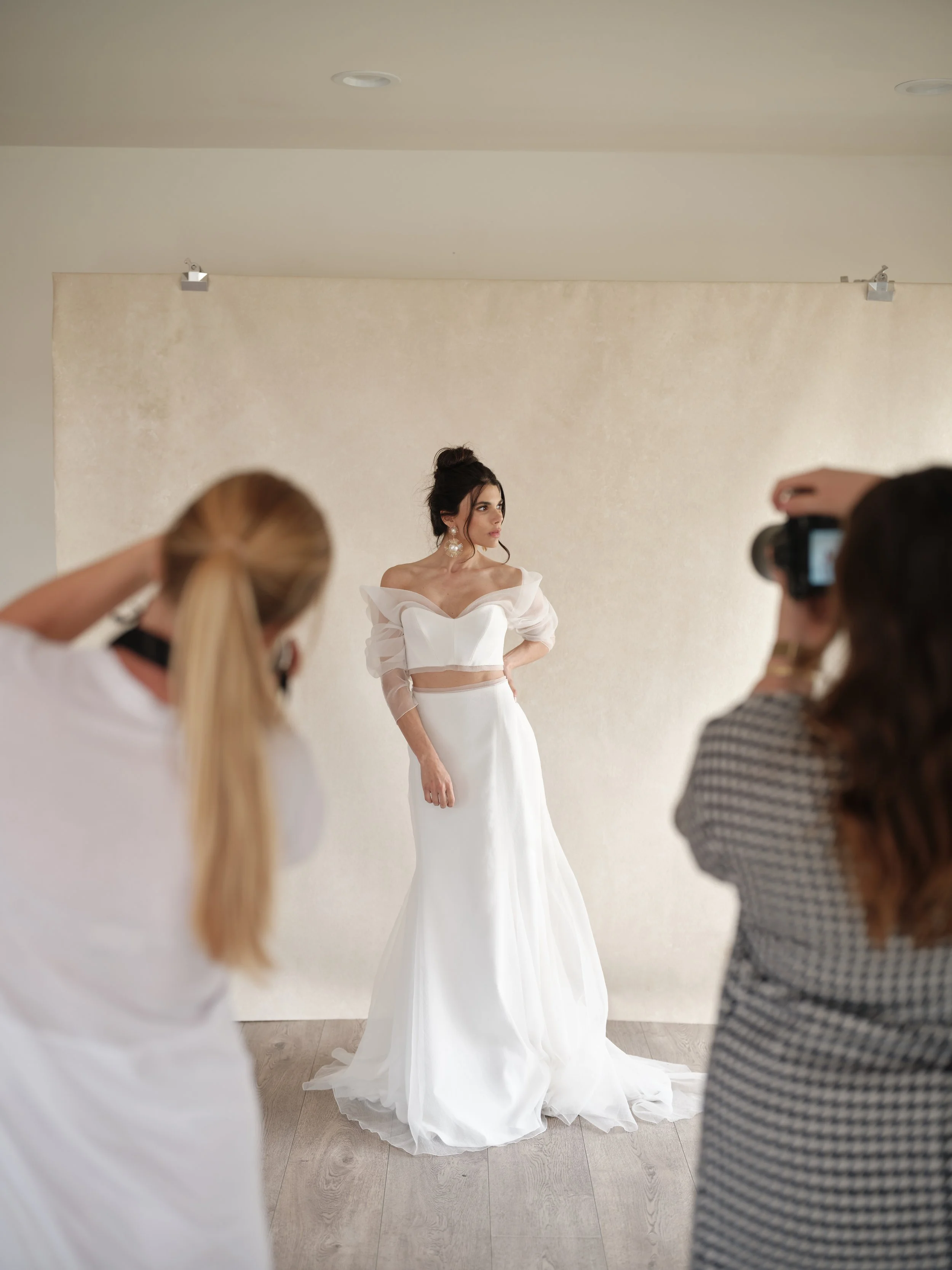
See what happens when you light BENTONITE correctly? This is natural window light positioned perpendicular to the backdrop, exactly like the blog post describes. Notice the dimension, the texture, how the bride separates naturally from the background? Light your backdrop like a painting, not a wall. Shop: chasingstone.com/shop-all/p/bentonite
Why Hand-Painted Canvas Responds Differently to Light
Most photographers learn lighting on flat, uniform surfaces. White walls. Seamless paper. Vinyl backdrops. These surfaces reflect light predictably because they have no real texture to interact with.
Hand-painted canvas is different. The surface has actual dimension. Brushstrokes create tiny ridges. Paint layers create thickness variations. The weave of the canvas shows through in places.
When light hits this surface straight-on, it flattens everything. The light bounces back uniformly, and your camera sees a relatively flat plane of color. All that texture you paid for disappears.
When light hits at an angle, the texture reveals itself. Raised areas catch highlights. Recessed areas fall into micro-shadows. The color shifts subtly across the surface as paint thickness affects how light absorbs and reflects.
This is the fundamental principle: angle creates dimension. The more perpendicular your light source is to your backdrop, the more texture and depth you'll see.
Window Light: Your Best Friend (When Positioned Right)
Natural window light is gorgeous for portraits. Soft, directional, flattering. But where you put your backdrop relative to that window determines whether your images look professional or amateur.
The mistake most photographers make: Placing the backdrop facing the window, with the subject between window and backdrop.
This feels intuitive. The light hits your subject, continues past them, and illuminates the backdrop. Everything is lit. What's the problem?
The problem is that light hitting your backdrop straight-on kills the texture. Your hand-painted canvas looks like a flat colored wall. You've essentially paid for muslin.
The fix: Position your backdrop perpendicular to the window.
If your window is on the left side of the room, your backdrop goes on the wall to your right (or on a stand in that position). The light rakes across the backdrop surface at an angle instead of hitting it head-on.
Now those brushstrokes catch light on one edge and fall into shadow on the other. The texture becomes visible. The backdrop gains dimension.
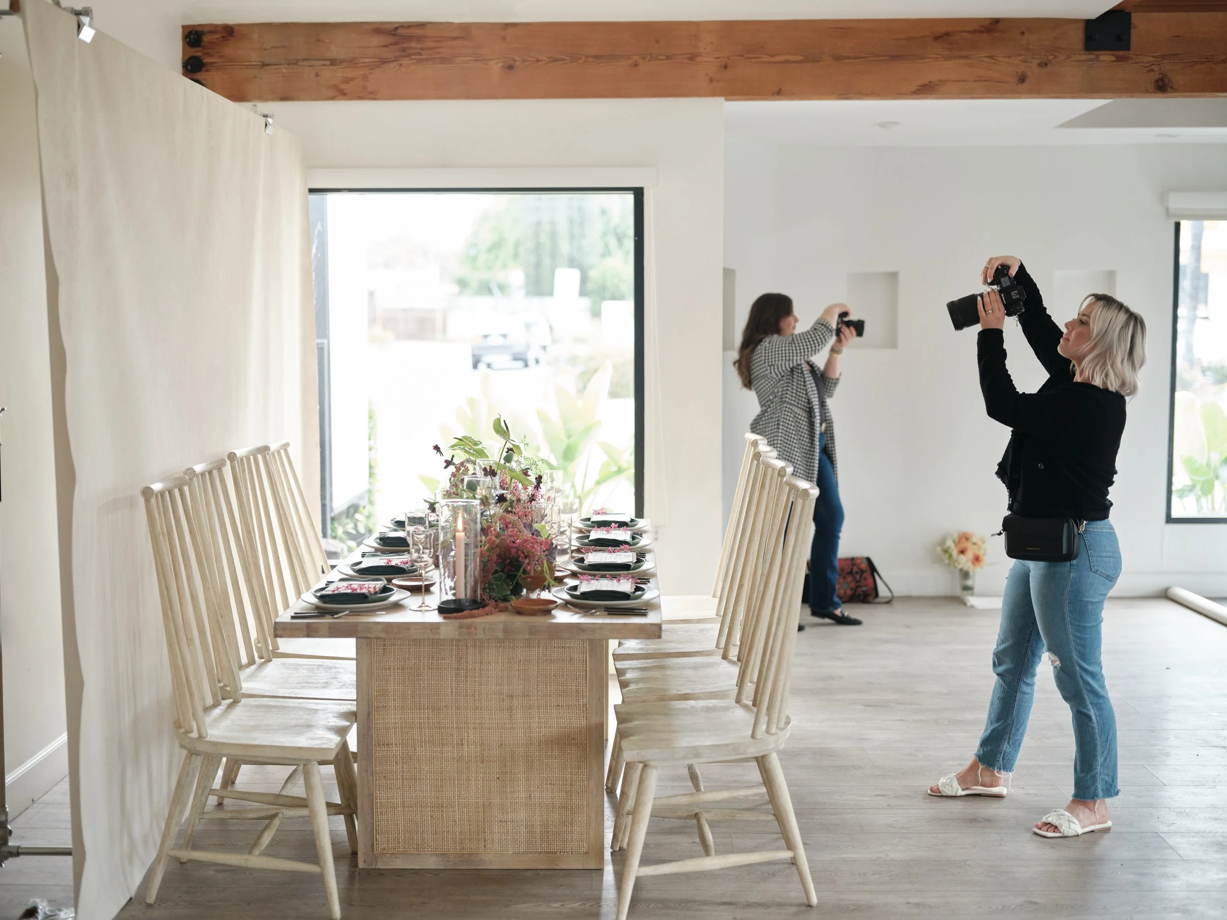
Behind every styled tablescape photo is intentional lighting. These photographers are using the exact principles from our lighting guide: windows providing soft directional light, proper distance between subject and backdrop, angles that reveal texture instead of flattening it. You don't need a studio. You need to understand how light interacts with your backdrop.
Subject Placement: The Distance That Changes Everything
Where you place your subject relative to the backdrop matters as much as where you place the backdrop relative to light.
Too close (less than 3 feet): Your subject casts shadows onto the backdrop. The backdrop and subject blend together visually. You lose separation.
The sweet spot (4-6 feet): Clean separation between subject and backdrop. No shadow interference. The backdrop texture reads clearly without competing with your subject. This is where I shoot 90% of my product photos.
Maximum blur zone (6-8+ feet): At this distance, combined with a wide aperture and longer focal length, your backdrop becomes a soft wash of color and texture. The specific brushstrokes disappear into creamy bokeh, but the hand-painted quality still comes through as organic variation rather than flat uniformity.
The further your subject is from the backdrop, the more the backdrop falls into natural shadow (assuming your light source is primarily on your subject). This creates automatic separation without any additional work.
I painted SILT specifically for photographers who want moody, dramatic separation. That dark taupe naturally recedes when your subject is properly distanced and lit.
Time of Day: The Color Shift Nobody Talks About
Here's something that surprised me when I started photographing my backdrops in different conditions: the same backdrop looks like different colors depending on when you shoot.
Morning light is cooler. Even warm-toned backdrops like SANDSTONE will read slightly less warm in early morning window light.
Late afternoon light is warmer. Golden hour flooding through a window will add warmth to everything, including your backdrop. A neutral taupe can start reading almost peachy.
Midday indirect light is the most neutral. If you want to see the "true" color of your backdrop, this is when to photograph it.
None of these is wrong. They're just different. I actually love how my backdrops shift throughout the day. It means one backdrop gives you multiple looks depending on when you schedule your sessions.
But if color accuracy matters for a specific shoot, pay attention to your light temperature. A grey backdrop that looked perfect during your afternoon test might surprise you at a 9am session.
Perpendicular positioning changes everything. SANDSTONE lit correctly with simple window light. Shop: chasingstone.com/shop-all/p/sandstone
The Perpendicular Principle in Practice
Let me walk you through exactly how I set up for the product photos you see on our website.
My studio has north-facing windows. The light is consistent throughout the day (no direct sun blasting through), soft, and slightly cool.
I set my backdrop stand about 8 feet from the windows, with the backdrop surface running parallel to the window wall. This means light from the windows hits the backdrop at roughly a 90-degree angle.
My subject (or product, or flat lay setup) sits 4-5 feet in front of the backdrop. The light hits the subject first, then continues to rake across the backdrop surface.
From my camera position, I see the subject fully lit and the backdrop with visible texture and gentle shadowing on one side. The backdrop reads as dimensional, as intentional, as a designed element rather than just "something behind the subject."
This same setup works in any room with decent window light. North-facing windows are ideal (consistent, no harsh direct sun), but any window works if you're mindful of harsh light patches.
When Direct Sunlight Actually Works
I just told you to avoid direct sunlight. Now I'm going to contradict myself.
Hard, direct sunlight is difficult. It creates harsh shadows, blown highlights, and challenging contrast. Most portrait situations call for softer light.
But sometimes hard light is exactly what you want. Editorial work. Fashion. Dramatic portraiture. Images where you want intensity rather than softness.
In these situations, hand-painted backdrops handle direct light better than you'd expect. The texture breaks up the light in interesting ways. You get hot spots and deep shadows that create drama rather than just difficulty.
UMBER, our dark chocolate brown, looks incredible with hard directional light slicing across it. The texture pops. The color gains richness. It's moody in the best way.
This isn't beginner territory. You need to know what you're doing with hard light before you try it. But if you're comfortable with dramatic lighting, don't assume your hand-painted backdrop won't hold up. It will.
Cloudy Days: The Giant Softbox
Overcast skies turn the entire sky into a massive softbox. The light is even, diffused, and wraps around everything.
This is the easiest lighting condition for backdrop work. You almost can't mess it up.
Position your backdrop perpendicular to your largest window. Place your subject 4-6 feet in front. Shoot. The light will be soft enough that texture remains visible without harsh shadows, and even enough that you don't need to worry about hot spots.
If your images look flat on cloudy days, the issue isn't the light. It's probably subject-to-backdrop distance. Move your subject further from the backdrop to create more natural separation.
The One-Window Setup Everyone Can Use
You don't need a studio. You don't need multiple windows. You need one decent window and enough floor space to position a backdrop.
Here's the minimal setup:
Window: Any window that doesn't have direct sun blasting through it during your shoot time. Sheer curtains help diffuse harsh light if needed.
Backdrop position: Stand or wall-mount your backdrop so the surface is perpendicular to the window. If your window is on the north wall, your backdrop is on the east or west wall.
Subject position: 4-6 feet in front of the backdrop, positioned to receive the window light from the side (not from behind).
Camera position: Opposite the window, with the backdrop behind your subject from your perspective. The window light illuminates the side of your subject's face while raking across the backdrop.
This creates the classic portrait lighting setup with one modification: the backdrop is positioned to show its texture rather than flatten it.
I've seen photographers create stunning work with this exact setup in spare bedrooms, living rooms, and garage studios. You don't need fancy. You need intentional.
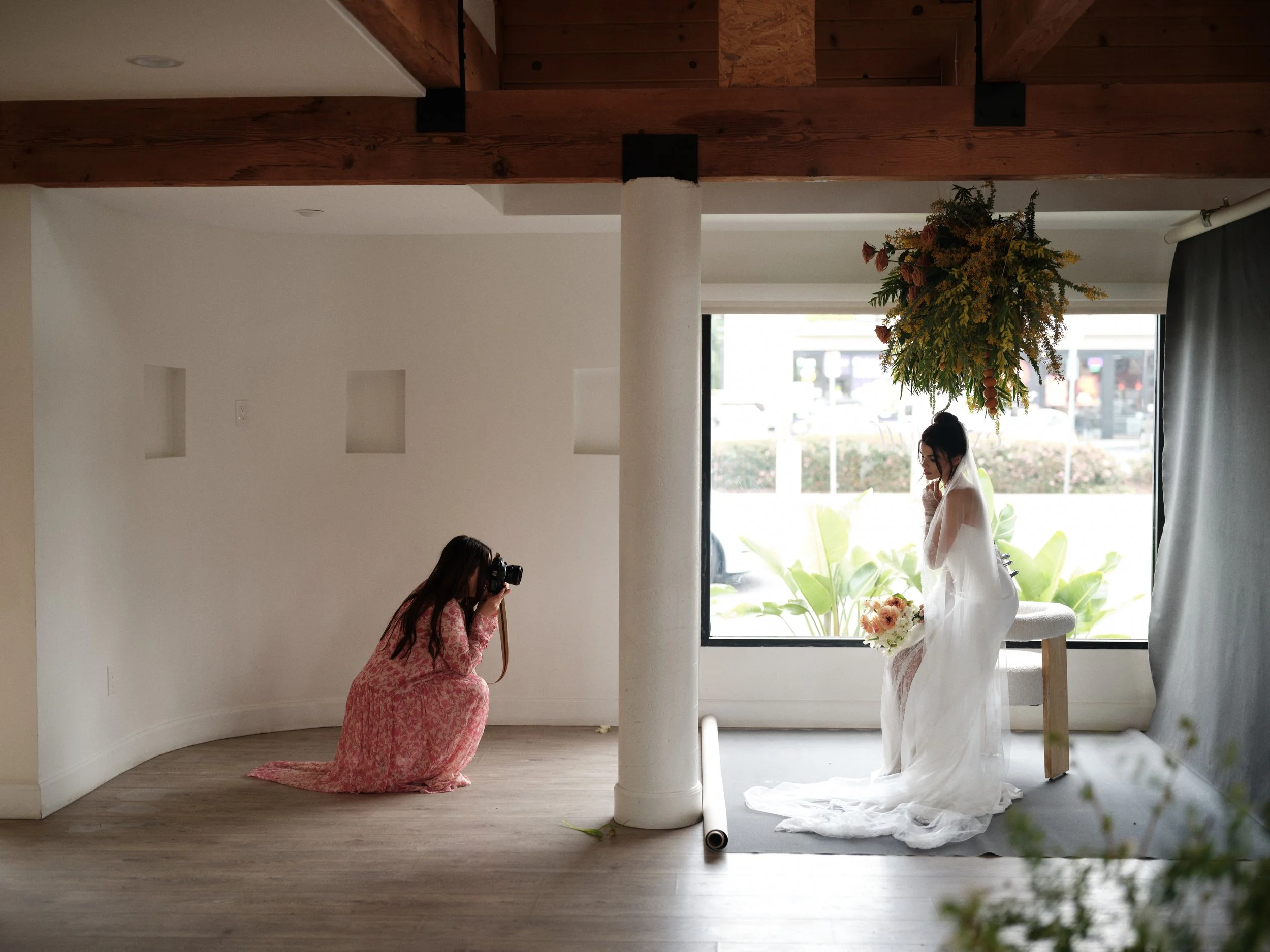
Every wedding photographer needs to know this setup. One window providing directional light, bride positioned to receive it from the side, backdrop (or wall) far enough behind for natural separation. This creates the dimensional, professional images clients expect. The lighting blog post breaks down exactly how to replicate this in any space with decent window light.
What Changes with Darker Backdrops
Light-colored backdrops are forgiving. They reflect enough light that you can see texture in almost any setup.
Dark backdrops absorb light. They require more intentional positioning to avoid becoming black voids.
If you're working with deeper colors like SERPENTINE or BRONZITE, you have two options:
Option 1: Let it go dark. Position your subject further from the backdrop and let the dark color fall into shadow. This creates dramatic separation and moody atmosphere. The backdrop texture won't be visible, but the color still comes through as deep richness.
Option 2: Add fill light to the backdrop. Position a reflector (white foam core works great) on the shadow side of your backdrop to bounce some window light back onto the surface. This keeps the texture visible while maintaining the dark, moody feel.
Neither approach is wrong. It depends on the look you want. I use both regularly depending on the project.
Testing Your Setup Before Client Sessions
Every new backdrop deserves a test shoot before you use it with paying clients. Not because the backdrop might be wrong, but because you need to learn how it behaves in your specific space with your specific light.
Here's my testing process:
Morning test: Set up the backdrop and shoot a few frames at whatever time you'd normally schedule morning sessions. Note how the color reads, how much texture is visible, how the shadows fall.
Afternoon test: Repeat in afternoon light. Compare to morning. Notice the differences.
Distance test: Shoot the same setup with your test subject (a mannequin head works, or just a vase with flowers) at 3 feet, 5 feet, and 7 feet from the backdrop. See how the backdrop changes at each distance.
Angle test: Without moving your subject, shoot from directly in front, then 45 degrees to the left, then 45 degrees to the right. The backdrop texture will reveal differently at each angle.
Twenty minutes of testing saves hours of frustration during actual sessions. You'll know exactly how your backdrop behaves before a bride is standing in front of it.
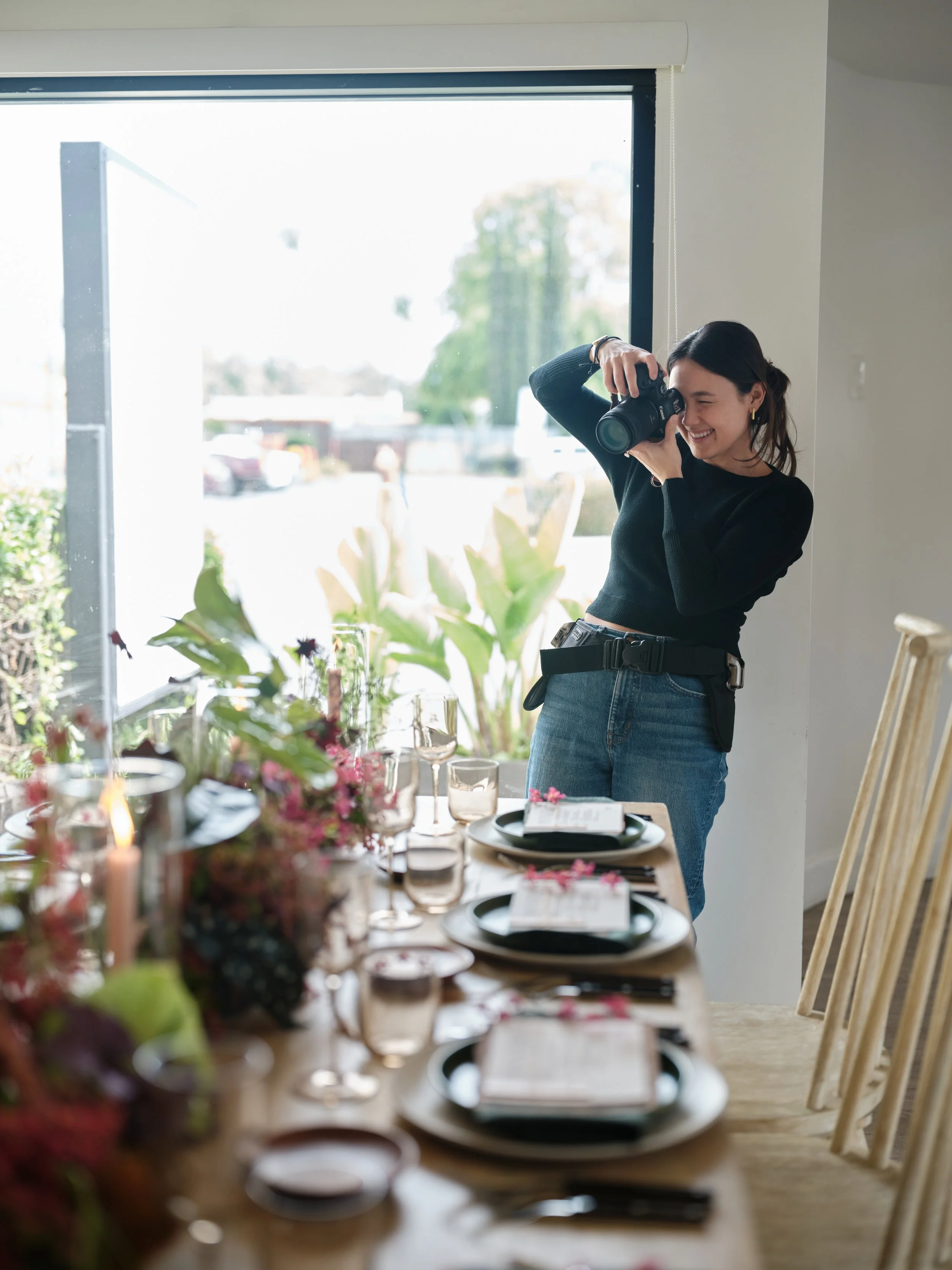
This is the natural light setup in action. One large window providing soft directional light, photographer positioned to use that window light on the tablescape. No expensive lighting gear. Just understanding how to position yourself relative to the light source.
The Light You Have Is Enough
I've photographed backdrops in professional studios with $50,000 worth of lighting equipment. I've also photographed them in my garage with one window and a piece of white foam core.
The garage photos aren't worse. They're just different.
Natural light is enough. One window is enough. You don't need to buy more equipment to make your hand-painted backdrop look good. You need to position what you have intentionally.
Backdrop perpendicular to light source. Subject 4-6 feet in front. Camera positioned so the light rakes across the backdrop surface rather than hitting it straight-on.
That's the formula. Everything else is refinement. Learn more in our complete photography backdrop guide.
Explore our full collection of hand-painted canvas backdrops at chasingstone.com/shop-all. And when you shoot them, remember: it's not a wall. It's a painting. Light it like one.
Related Reading

Creators of premium photography backdrops and styling surfaces
Trusted by thousands of discerning creatives worldwide
Every piece is handcrafted with intention in Orange County, California