
Color Theory for Photographers: Understanding the Wheel, Harmony, and Contrast
Updated on Apr. 18, 2026
I spent my first two years as a backdrop painter making colors I thought looked beautiful on their own. Gorgeous deep purples. Vibrant teals. Rich burgundies.
They sat in my studio unsold.
The colors that flew off the shelves? Taupe. Warm grey. Soft tan. Colors I initially dismissed as boring.
It took me longer than I'd like to admit to understand why. The answer wasn't about which colors are prettiest. It was about which colors work. And understanding that requires knowing something most photographers skip entirely: color theory.
This guide breaks down the practical color knowledge that will change how you think about backdrops, wardrobe choices, and why some images just feel right while others feel off.
For a complete overview of photography backdrops, start with our ultimate backdrop guide.
The right backdrop color isn't about trends. It's about color theory that works. MONTEVERDE's cool blue-green creates natural harmony with warm earth tones, proving why complementary colors make subjects stand out every time.
The Color Wheel: Your Foundation
Every color decision you make as a photographer traces back to the color wheel. You don't need to memorize it, but you need to understand how it works.
Primary, Secondary, and Tertiary Colors
Primary colors are red, yellow, and blue. They cannot be created by mixing other colors.
Secondary colors come from mixing two primaries:
Red + Yellow = Orange
Yellow + Blue = Green
Blue + Red = Purple
Tertiary colors fill the gaps between primary and secondary colors. These are the hyphenated names: red-orange, yellow-orange, yellow-green, blue-green, blue-purple, red-purple.
The wheel arranges all of these in a circle based on their relationships. Colors next to each other share underlying hues. Colors across from each other are opposites.
This arrangement isn't arbitrary. It's the key to understanding why certain color combinations feel harmonious and others feel like a fight.
Warm vs. Cool: The Wheel Split in Half
Draw a line down the middle of the color wheel.
Warm colors live on one side: reds, oranges, yellows, and the colors adjacent to them. These colors advance visually (they feel closer) and evoke energy, warmth, and intensity.
Cool colors live on the other side: blues, greens, purples, and their neighbors. These colors recede visually (they feel further away) and evoke calm, distance, and serenity.
This warm/cool divide matters for backdrop selection. A warm backdrop pushes forward slightly, wrapping your subject in warmth. A cool backdrop recedes, creating more visual separation between subject and background.
Neither is better. They create different feelings.
The Six Color Harmonies Every Photographer Should Know
Color harmony refers to combinations of colors that are visually pleasing together. There are six primary harmony types, and each creates a different emotional response.
1. Complementary: Maximum Contrast
Complementary colors sit directly opposite each other on the wheel.
Examples:
Blue and orange
Red and green
Yellow and purple
What it creates: High contrast, visual tension, drama. Both colors appear more vibrant when placed together.
When to use it: When you want your subject to pop dramatically against the background. A person in a warm orange sweater against a blue backdrop creates instant visual separation. The classic teal-and-orange color grade in cinema uses this principle.
Watch out for: Too much of both colors at full saturation can be jarring. One color typically dominates while the other accents.
The backdrop that works when you don't know what you need. ALDER's warm taupe flatters all skin tones and harmonizes with any styling. Shop: chasingstone.com/shop-all/p/alder
2. Analogous: Peaceful Harmony
Analogous colors sit next to each other on the wheel.
Examples:
Blue, blue-green, green
Orange, red-orange, red
Yellow, yellow-green, green
What it creates: Cohesion, peace, natural flow. Because these colors share underlying hues, they blend seamlessly.
When to use it: When you want a calm, unified feeling. Nature photography often features analogous schemes naturally (autumn leaves in reds, oranges, yellows). For portraits, analogous color schemes feel sophisticated and editorial without the drama of complementary contrast.
Watch out for: Without enough value contrast (light vs. dark), analogous schemes can feel flat. Make sure something in the frame is clearly lighter or darker than the rest.
3. Triadic: Balanced Vibrancy
Triadic colors form a triangle on the wheel, evenly spaced.
Examples:
Red, yellow, blue (the primaries)
Orange, green, purple (the secondaries)
What it creates: Vibrant energy with more balance than complementary schemes. The three colors create visual interest while the even spacing maintains harmony.
When to use it: When you want energy and color variety without chaos. Fashion and editorial photography often uses triadic schemes. The key is letting one color dominate while the other two accent.
Watch out for: Using all three colors at equal intensity creates visual competition. Pick a hero color and let the others support it.
4. Split Complementary: Contrast with Nuance
Split complementary uses one base color plus the two colors adjacent to its complement.
Examples:
Blue with yellow-orange and red-orange (instead of just orange)
Red with blue-green and yellow-green (instead of just green)
What it creates: The contrast of complementary colors with more nuance and sophistication. It's easier to balance than pure complementary because the contrast is spread across two colors.
When to use it: When you want the visual pop of complementary colors but find pure complements too harsh. This works beautifully for portraits where you want the subject to stand out but the overall image to feel refined.
5. Tetradic (Double Complementary): Complex Color Stories
Tetradic schemes use four colors: two complementary pairs.
Examples:
Blue, orange, red, green
Yellow, purple, red-orange, blue-green
What it creates: Rich, complex color stories with lots of variety. This is the most challenging harmony to balance.
When to use it: Editorial and fashion work where complexity serves the concept. Product photography where you need multiple colors to feel cohesive. This requires careful attention to balance.
Watch out for: Four colors can easily become chaotic. Typically one or two colors dominate significantly while the others appear in smaller amounts.
6. Monochromatic: One Color, Many Values
Monochromatic schemes use a single hue with variations in lightness and saturation.
Examples:
Light blue, medium blue, dark blue
Pale pink, dusty rose, deep burgundy
What it creates: Unity, sophistication, calm. The lack of color contrast puts emphasis on form, texture, and light.
When to use it: When you want the color itself to tell the story. Monochromatic portraits feel intentional and artistic. This scheme also works beautifully for moody, atmospheric images.
Watch out for: Without value contrast, monochromatic images can feel flat. Vary your lights and darks within the single hue.
Color and Emotion: What Different Hues Communicate
Colors carry psychological weight. This isn't mystical; it's documented through research and cultural association. Understanding what colors communicate helps you make intentional choices.
Warm Colors
Red: Passion, power, urgency, danger, love. Red demands attention. In portraits, red draws the eye immediately. Use it intentionally because it will dominate.
Orange: Energy, warmth, enthusiasm, creativity. Orange feels approachable and friendly. It's less aggressive than red but still energetic.
Yellow: Optimism, happiness, warmth, caution. Pure yellow is surprisingly difficult to photograph well. Muted yellows (gold, mustard) are more versatile.
Photographers ask us all the time: 'What backdrop color makes food look most appetizing?' The answer isn't what you'd expect. Light neutrals like YARROW don't compete with your subject. They make every color in your composition feel more intentional and vibrant.
Cool Colors
Blue: Calm, trust, professionalism, sadness. Blue is the most universally liked color. It's a safe choice that rarely offends but can feel cold in portraits without warm elements to balance.
Green: Nature, growth, balance, envy. Green feels organic and calming. Muted sage greens work beautifully in portraits; saturated greens can reflect onto skin unfavorably.
Purple: Creativity, royalty, mystery, spirituality. Purple sits between the warmth of red and the coolness of blue. It works well for artistic, creative portraits.
Neutral Colors
White: Purity, cleanliness, simplicity. White reflects light onto your subject, which can create unwanted brightness on skin. Off-whites and creams are more forgiving.
Black: Elegance, drama, sophistication, mystery. Black absorbs light and creates natural contrast with any skin tone. It's a safe choice for dramatic portraits.
Grey: Neutrality, balance, professionalism. Grey is the ultimate neutral. It doesn't compete with anything and lets your subject be the focus.
Brown/Tan/Taupe: Earthiness, warmth, stability, reliability. These neutrals contain warmth that flatters skin while remaining neutral enough to work with any wardrobe.
Color Theory Applied to Backdrops
Here's where theory becomes practice. Every backdrop color choice should be intentional based on what you now understand about harmony and emotion.
The Warm Neutral Default
I recommend warm neutrals (taupe, putty, soft tan) as every photographer's first backdrop for a reason that goes beyond "they work with everything."
Warm neutrals occupy a specific position on the color wheel. They're not pure grey (which can feel cold). They're not saturated brown (which limits versatility). They sit in a sweet spot that contains just enough warmth to complement human skin while remaining neutral enough to not compete with other colors in the frame.
From our collection, colors like LIMESTONE, BENTONITE, and SANDSTONE occupy this sweet spot. They're the colors that get used on 80% of shoots because they harmonize with everything.
Complementary Backdrop Choices
Want your subject to pop? Choose a backdrop that complements (sits opposite on the wheel) the dominant color your subject is wearing.
Examples:
Subject in blue? Try a warm tan or terracotta backdrop (orange family).
Subject in red? A sage green backdrop creates beautiful contrast.
Subject in yellow? A dusty purple or lavender adds sophisticated tension.
From our collection, CLAY (terracotta) works beautifully against cool blue tones. CELADONITE or OLIVINE (sage/olive greens) complement warm red and pink tones. LAVENDER QUARTZ adds dimension to warm golden subjects.
See complementary colors in action? Our CLAY backdrop's warm terracotta creates stunning contrast with cool blue florals. This is why photographers choose backdrops based on color theory, not trends. Shop: chasingstone.com/shop-all/p/clay
Analogous Backdrop Choices
Want harmony over contrast? Choose a backdrop in the same color family as your subject's wardrobe.
Examples:
Subject in dusty pink? A soft blush or nude backdrop creates cohesion.
Subject in olive green? A sage or deeper green backdrop feels unified.
Subject in navy? A grey or slate backdrop shares the cool family.
This approach creates sophisticated, editorial images where everything feels intentionally curated rather than contrasted.
Skin Tones and Backdrop Color: The Practical Guide
This is where color theory becomes non-negotiable. Get backdrop and skin tone relationships wrong, and no amount of editing fixes it.
Understanding Skin Undertones
Every person's skin has an undertone: warm, cool, or neutral. The undertone doesn't change with tanning or seasons. It's the underlying hue beneath the surface color.
Warm undertones: Yellow, golden, peachy, olive. If the veins on the inside of their wrist look greenish, they likely have warm undertones. Gold jewelry typically flatters them more than silver.
Cool undertones: Pink, red, blue. If wrist veins look blue or purple, they likely have cool undertones. Silver jewelry typically flatters them more than gold.
Neutral undertones: A mix of both. Veins may look blue-green. Both gold and silver jewelry look equally good.
Backdrop Colors for Warm Skin Tones
Warm skin contains yellow and golden undertones. To flatter these undertones:
Do use:
Earthy colors: terracotta, rust, warm browns, golden tans
Warm greens: sage, olive, moss
Warm neutrals: taupe, putty, camel
Muted warm colors: dusty rose, burnt orange
Avoid or use carefully:
Cool greys (can make warm skin look sallow)
Cool blues (can clash with golden undertones)
Stark white (reflects cool light onto skin)
From our collection, SANDSTONE, CLAY, OLIVINE, and warm neutrals like LIMESTONE and BENTONITE all flatter warm skin tones beautifully.
Backdrop Colors for Cool Skin Tones
Cool skin contains pink and blue undertones. To flatter these undertones:
Do use:
Cool neutrals: grey, slate, blue-grey
Dusty blues: powder blue, slate blue, navy
Cool greens: teal, emerald
Jewel tones: sapphire, amethyst, ruby
Soft pastels: lavender, dusty pink
Avoid or use carefully:
Orange-heavy terracottas (can clash with pink undertones)
Mustard yellow (can make cool skin look washed out)
Overly warm browns without cool elements
From our collection, colors like CELESTITE (dusty blue), SILT (cool-toned dark taupe), and SERPENTINE (cool deep green) work beautifully with cool skin tones.
The Universal Colors
Some backdrop colors work across virtually all skin tones because they contain a balanced mix of warm and cool elements or sit in a truly neutral position.
Safe for everyone:
Warm taupe (the slight warmth flatters all skin without clashing with cool undertones)
Soft grey with warm undertones
Dusty rose (contains both pink and warmth)
Muted sage (balances warm and cool)
This is why BENTONITE (mid-taupe with warm grey undertones) is one of our best sellers. It threads the needle between warm enough to flatter skin and neutral enough to work universally.
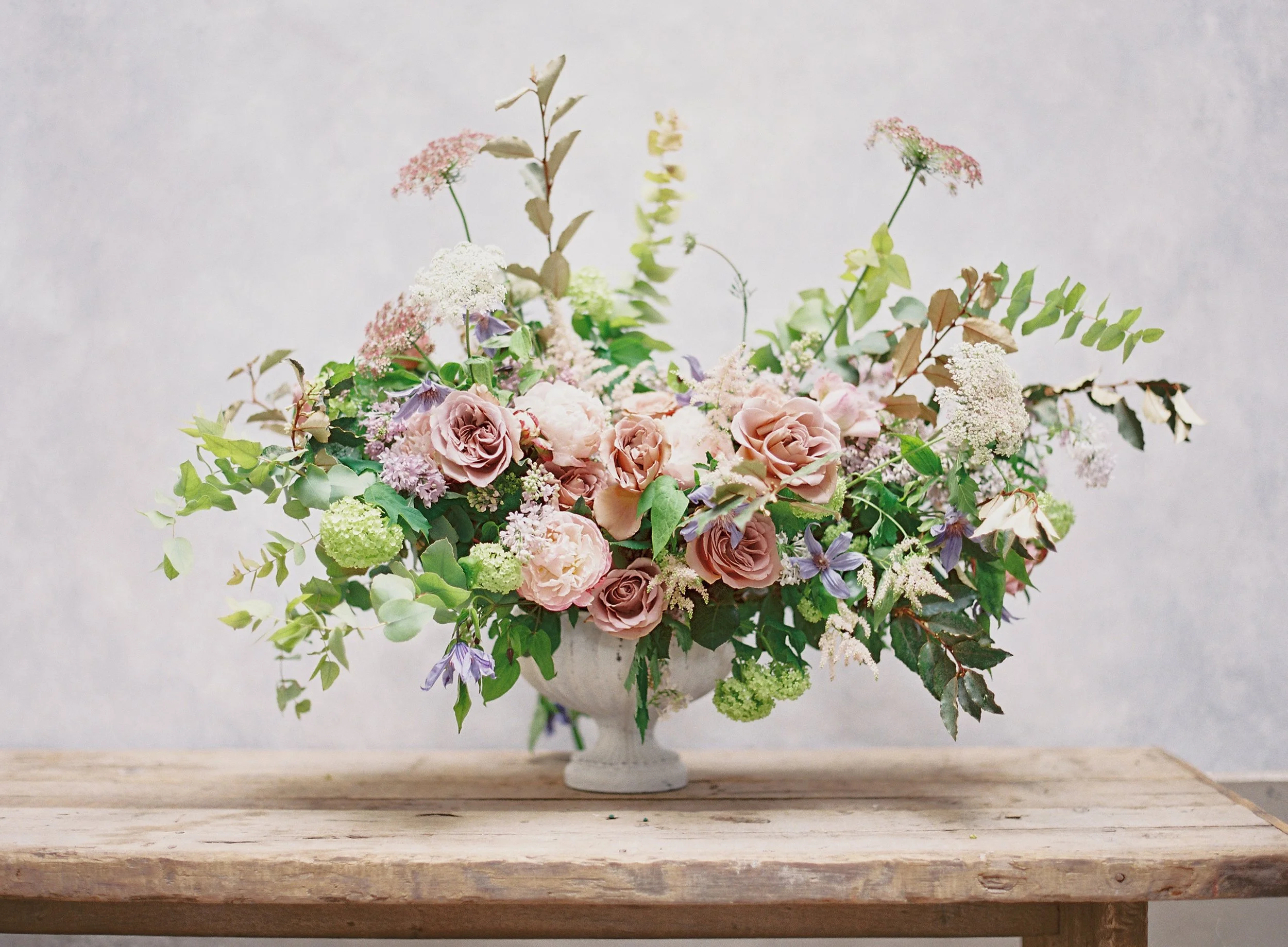
This is the backdrop that handles 80% of wedding work. BENTONITE contains just enough warmth to complement romantic florals without competing for attention. Notice how the pinks, purples, and greens create analogous harmony while the backdrop quietly supports the entire composition.
Common Color Mistakes Photographers Make
Mistake 1: Choosing Backdrop Colors in Isolation
A color that looks beautiful on its own might photograph terribly against skin. Always evaluate backdrop colors in context: against skin tones, under your typical lighting, with common wardrobe colors.
That gorgeous emerald green? It might reflect green onto your subject's skin. Test before you commit.
Mistake 2: Too Many Competing Colors
Every color in your frame competes for attention. Subject's red dress, teal backdrop, yellow chair, pink flowers? That's four colors fighting each other.
Limit your palette. One to three colors maximum for most portraits. Let one dominate.
Mistake 3: Ignoring Color Temperature in Lighting
Your backdrop color changes under different light temperatures. A warm neutral backdrop under cool window light looks different than under warm tungsten.
Test your backdrops under your actual shooting conditions. What you see in your studio may shift on location.
Mistake 4: Following Trends Over Flattery
That trending neon backdrop might get Instagram engagement, but will it flatter your portrait clients? Probably not.
Trends pass. Flattering, timeless color choices build portfolios that book clients for years.
Mistake 5: Forgetting About Wardrobe
You can't control what clients wear. A backdrop that looks gorgeous against white and cream might clash horribly with the bright red dress your bride's aunt shows up in.
Versatile neutral backdrops handle wardrobe surprises. Statement backdrops require wardrobe coordination.
Building a Color-Conscious Backdrop Collection
Armed with color theory knowledge, here's how to build a backdrop collection strategically:
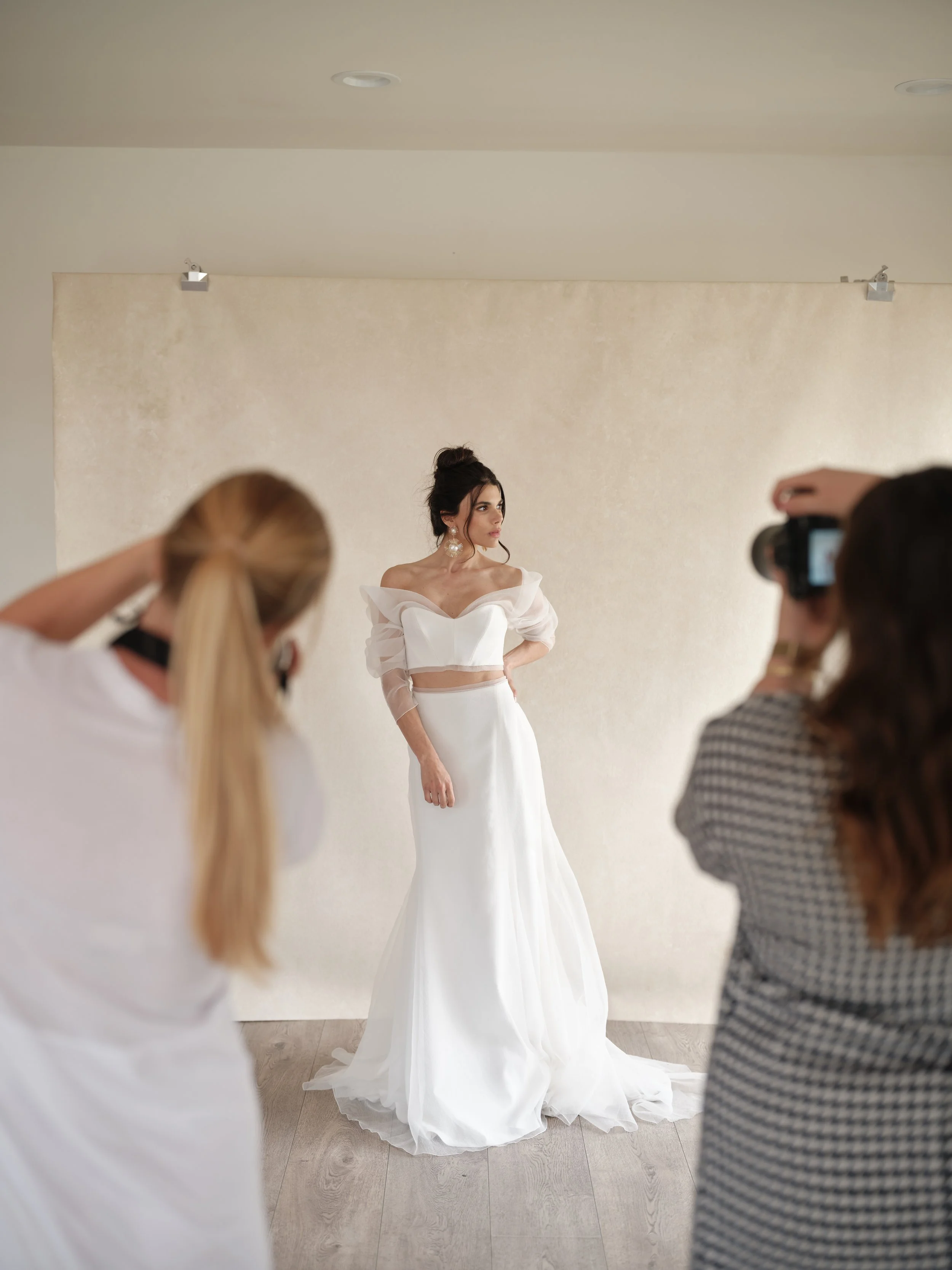
Behind every timeless bridal portrait is an intentional backdrop choice. LIMESTONE creates this clean, elegant look because warm neutrals let your subject shine without competing. Notice how the monochromatic palette puts all the emphasis on the bride, the dress details, and the light? Exactly as it should be.
Your First Backdrop: The Workhorse Neutral
Choose a warm neutral that flatters all skin tones and harmonizes with any wardrobe. LIMESTONE, BENTONITE, or SANDSTONE from our collection all serve this purpose.
This backdrop handles 80% of your work. It's the one you grab when you're not sure what you need.
Your Second Backdrop: Expanding Your Range
Based on your style and the type of work you book, choose a color that gives you options your neutral can't:
For moody editorial work: A deep, rich color like UMBER (chocolate brown) or SERPENTINE (deep green)
For light and airy work: A soft, pale color like CELESTITE (dusty blue) or LAVENDER QUARTZ (soft purple)
For bold contrast: A saturated earthy tone like CLAY (terracotta) that creates complementary pop with cool wardrobes
Your Third Backdrop: The Specialty Piece
Now you can add something specific to your style or a gap in your collection. This might be a color you love that attracts your ideal clients, even if it's less versatile.
Putting It All Together
Color theory isn't about memorizing rules. It's about developing intuition for what works and why.
When you understand the wheel, you stop guessing which colors go together. When you understand harmony types, you can create specific emotional responses. When you understand skin undertones, you stop accidentally making clients look unflattering.
Every backdrop I paint, every color I develop, comes back to these principles. The colors that sell aren't the ones I think are prettiest in isolation. They're the ones that work with human skin, harmonize with common wardrobes, and create the emotional response photographers want.
That's why warm neutrals dominate. That's why muted, sophisticated colors outperform saturated primary colors. That's why understanding color theory changes your work.
Your Next Step
Start paying attention to color in every image you admire. Ask yourself: what's the dominant color? What harmony is at play? How does the backdrop relate to the skin tone?
You'll start seeing patterns. The photographers whose work you admire aren't lucky. They're making intentional color choices, whether they articulate it as "color theory" or not.
If you're ready to apply this knowledge to your backdrop collection, explore our hand-painted canvas backdrops organized by color family at chasingstone.com/shop-all.
Every backdrop is hand-painted in my Orange County studio with these principles in mind. The colors aren't random. They're intentional choices designed to flatter skin, harmonize with wardrobes, and create the emotional response your portraits deserve. Learn more in our complete photography backdrop guide.
Frequently Asked Questions
What is color theory in photography?
Color theory in photography is the practice of understanding how colors interact, influence mood, and work together to create visually compelling images. It includes knowledge of the color wheel, color harmonies like complementary and analogous schemes, and how different colors affect the perception of your subject.
What are complementary colors in photography?
Complementary colors sit directly opposite each other on the color wheel. Examples include blue and orange, red and green, yellow and purple. When used together in photography, complementary colors create maximum contrast and visual tension, making subjects pop against backgrounds.
What backdrop color is best for warm skin tones?
For warm skin tones with yellow, olive, or golden undertones, earthy backdrop colors work beautifully. Terracotta, sage green, warm browns, and golden tans enhance the natural warmth in skin. Avoid cool blues and greys that can make warm skin look sallow or washed out.
What backdrop color is best for cool skin tones?
For cool skin tones with pink, red, or blue undertones, dusty blues, soft greys, and cool-toned neutrals create flattering contrast. Jewel tones also photograph well with cool skin. Be careful with orange-heavy terracottas that can clash with pink undertones.
What is analogous color harmony?
Analogous colors sit next to each other on the color wheel, such as blue, blue-green, and green. This harmony creates a cohesive, peaceful feeling in photographs because the colors share underlying hues and blend naturally together. Analogous schemes work well for calm portraits and nature photography.
How do I determine if someone has warm or cool skin undertones?
Look at the veins on the inside of their wrist. If veins appear greenish, they have warm undertones. If veins appear blue or purple, they have cool undertones. If it is hard to tell, they likely have neutral undertones. You can also observe whether gold or silver jewelry looks more flattering against their skin.
What colors should photographers avoid using together?
Avoid pairing saturated primary colors at full intensity, as they can create jarring images. Red and green at full saturation can feel like Christmas. Neon or overly bright colors reflect onto skin and create unflattering color casts. Multiple bold colors competing for attention creates visual chaos rather than harmony.
Why do warm neutral backdrops work for most portraits?
Warm neutrals like taupe, putty, and soft tan contain undertones that complement the natural warmth present in all human skin. They do not compete with the subject or cast unflattering color onto skin. The subtle warmth creates a flattering glow while the neutral base works with any wardrobe color.
Last updated: January 2026
Related Reading

Creators of premium photography backdrops and styling surfaces
Trusted by thousands of discerning creatives worldwide
Every piece is handcrafted with intention in Orange County, California