
How to Create Cohesive Flat Lay Collections for Your Portfolio
Updated on April 12, 2026
What makes some wedding photographers' portfolios instantly recognizable? You scroll through their work and immediately know it's theirs, even before checking the name. The flat lays feel intentional, the color story flows naturally, and every image connects to create a cohesive visual narrative.
That's not luck. It's the result of strategic decisions about styling surfaces, color palettes, composition, and editing that align with their brand and attract their ideal clients.
Creating cohesive flat lay collections for your portfolio means developing a recognizable style that runs through all your work. It's about making intentional choices that tie everything together into a clear, compelling narrative. When potential clients browse your portfolio, they should immediately understand your aesthetic and feel confident you'll deliver consistent, beautiful imagery on their wedding day.
This guide will walk you through building portfolio flat lays that feel intentionally connected, professionally polished, and authentically you.
A strong flat lay portfolio is built on consistency. Repeating tones, textures, and styling choices creates a cohesive, recognizable look across every image.
Understanding What Cohesion Actually Means
Before we dive into the how, let's clarify what we mean by cohesion. Many photographers misunderstand this concept, thinking it means rigid sameness or creative limitation. It doesn't.
Cohesion is about creating visual harmony across your body of work. It's the aesthetic thread that connects your images even when the subjects, venues, and specific details differ. When someone looks at 20 of your flat lays side by side, they should feel like they're viewing a curated collection from one artist, not a random assortment from multiple sources.
Think of it like a well-designed home. Each room might serve a different purpose and have distinct elements, but the overall design philosophy ties everything together. The color palette flows. The style feels consistent. The choices feel intentional. That's cohesion.
For flat lay photography, cohesion shows up in several key areas:
Styling surface selection consistency. The mats you choose create a foundational aesthetic. When you're constantly switching between vastly different surface types (rough wood one day, sleek marble the next, fabric another), your portfolio lacks that professional polish. Instead, working with a curated collection of complementary styling surfaces creates instant visual harmony.
Color palette alignment. Your editing style and the colors that dominate your images should feel related. This doesn't mean everything needs the same colors, but the overall temperature (warm versus cool) and saturation levels should be consistent with your brand.
Compositional approach. The way you arrange elements speaks to your artistic sensibility. Some photographers love minimal, spacious compositions with lots of negative space. Others prefer abundant, layered styling. Both are valid, but mixing approaches randomly creates visual confusion.
Lighting mood. Bright and airy versus moody and dimensional. These are both beautiful options, but they represent different aesthetics. Your portfolio should consistently reflect your chosen approach.
Editing style. This ties directly to your overall brand. The way you handle color grading, contrast, and tone should be recognizable across all your flat lays.
The goal isn't restricting your creativity. It's channeling your creativity through a consistent aesthetic lens so clients immediately understand what you offer.
Choosing Your Foundation: Styling Surface Strategy
Your styling surfaces are the literal foundation of every flat lay you create. They're where cohesion begins, and getting this right makes everything else fall into place more easily.
Start With a Curated Collection
The biggest mistake photographers make is collecting too many disparate styling surfaces. They buy whatever catches their eye without considering how pieces work together. The result? A closet full of mats but no clear aesthetic direction.
Instead, approach surface selection like building a capsule wardrobe. You want pieces that all work together, creating maximum versatility with minimum confusion.
The three-surface starter strategy: Begin with three complementary hand-painted surfaces or three fabric surfaces that share an aesthetic sensibility. When these three surfaces all appear in your portfolio, they create instant cohesion because they were chosen to work together from the start.
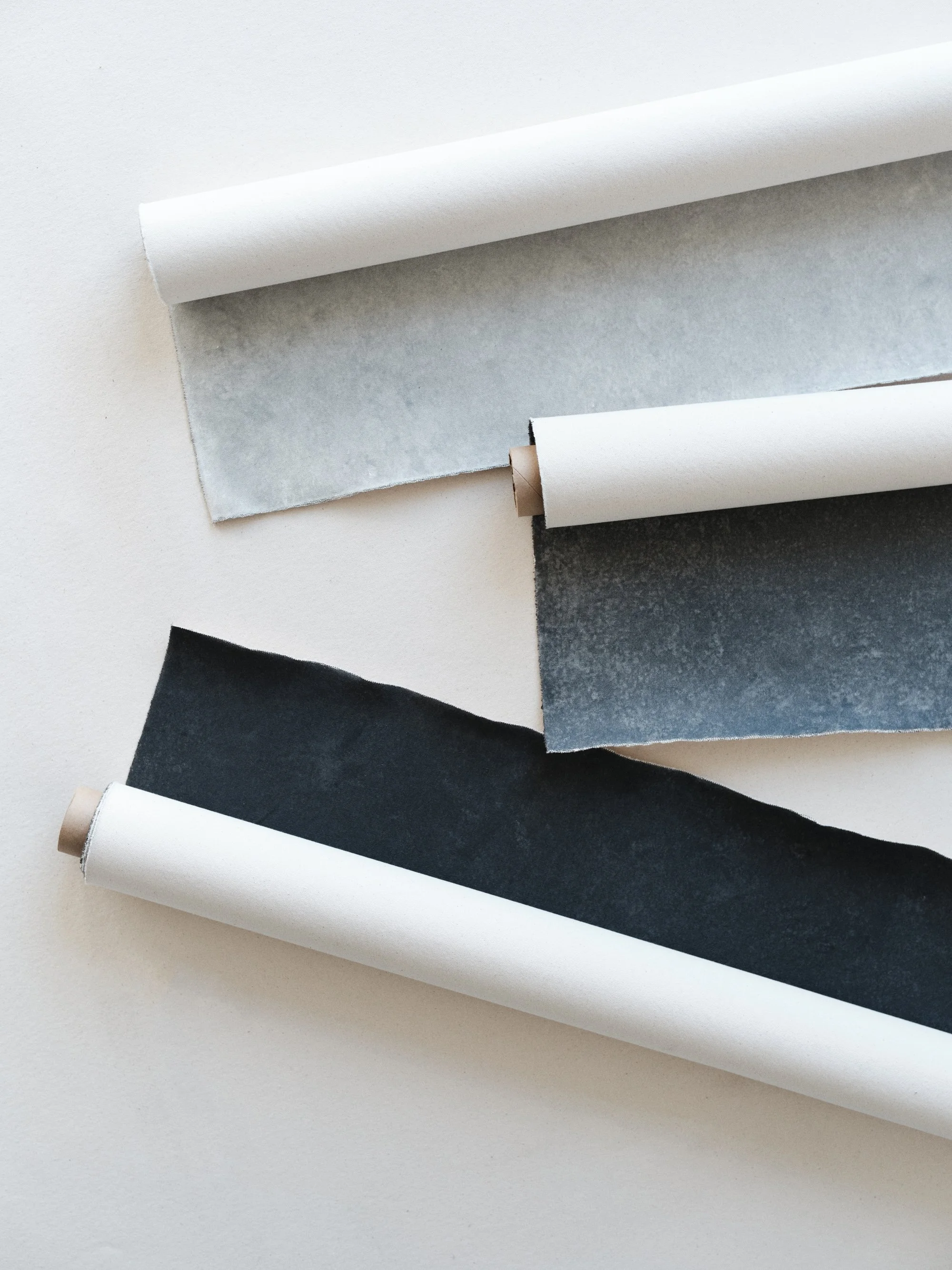
Ever feel stuck using the same background for every shoot? Having multiple rollable surfaces in different tones makes styling feel effortless and more intentional.
For example, if you're drawn to warm, romantic imagery, you might choose three surfaces in complementary warm tones: Chateau with its soft cream tones, Yarrow in warm beige, and Marrakech with gentle terracotta undertones. Every flat lay shot on any of these surfaces will feel related because the warmth connects them.
If you prefer fresh, modern aesthetics, you might select cooler tones: Avalon with its soft white base, Vik in pale gray, and Dogwood with blue-gray undertones. Again, instant visual cohesion across all your work.
Hand-Painted vs. Fabric: Making the Right Choice
Both hand-painted surfaces and fabric surfaces can create beautiful cohesion, but they offer different aesthetic qualities that align with different photographer styles.
Hand-painted surfaces provide an artisanal, editorial quality. Each surface is painted by hand on premium canvas, creating subtle texture variations and painterly depth. No two are exactly identical, which adds to their artful quality. If your brand leans romantic, timeless, or editorial, hand-painted surfaces reinforce that aesthetic every time you use them.
The consistency in hand-painted surfaces comes from their shared artistic approach. Even when you're using different colors from the collection, they all have that same handcrafted texture and depth that makes them feel related.
Fabric surfaces offer sophisticated practicality without sacrificing beauty. These are stain-resistant mats (approximately 34" x 25.5") with Greenguard Gold certified vegan wool faces and OEKO-TEX certified organic cotton canvas backing. The stain and moisture resistance is protected with PFAS and PFOS free technology that never degrades.
If your brand emphasizes modern professionalism, practical elegance, or contemporary style, fabric surfaces align beautifully. They also create cohesion through their consistent material quality and refined aesthetic across different colorways.
The mixed approach: Many photographers find success using primarily one type (hand-painted or fabric) as their foundation, with the other type as an occasional complement. This approach maintains cohesion while offering flexibility. For example, you might shoot 80% of your portfolio flat lays on hand-painted surfaces, using fabric surfaces specifically for on-location weddings where their spill-proof quality is essential.
The key is making this choice intentionally rather than randomly switching based on what's convenient for each wedding.
Styling Mat Pairing Principles
Once you have your core collection, understanding how to pair surfaces strategically ensures your portfolio feels cohesive even as you rotate through different options.
Temperature consistency: Keep surfaces within the same temperature family. If your three core surfaces are warm-toned, they'll all work together seamlessly. Randomly introducing a very cool surface disrupts the visual harmony.
Intensity alignment: Surfaces should be similar in intensity even if they differ in color. Three soft, muted tones work together. Three rich, saturated tones work together. One soft surface and one intensely saturated surface create jarring contrast.
Texture relationship: When all your styling surfaces share similar texture qualities (whether that's the painterly texture of hand-painted canvas or the refined texture of fabric), they feel related even in different colors. This subtle consistency builds cohesion you might not consciously notice but definitely feel.
Developing Your Color Palette for Portfolio Cohesion
Color is where many photographers unknowingly sabotage their portfolio cohesion. Understanding how to approach color strategically transforms scattered imagery into a curated collection.
Defining Your Brand Color Temperature
Every photographer's work leans warm, cool, or neutral. This isn't about the colors in your subjects (those vary by wedding), but about the overall temperature feeling in your images.
Warm-leaning portfolios feature creams, beiges, soft yellows, peachy tones, and warm grays. Even when photographing cool-colored details, the styling surfaces, lighting, and editing maintain an overall warmth. This aesthetic feels romantic, cozy, intimate, and inviting.
Cool-leaning portfolios showcase true whites, soft grays, blue-grays, and cooler neutrals. The overall feeling is fresh, modern, sophisticated, and editorial. Even warm-colored wedding details are balanced by cool surfaces and editing choices.
Neutral portfolios carefully balance warm and cool, never leaning too far in either direction. This aesthetic feels versatile, timeless, and professionally polished.
Here's the critical decision: choose one temperature and commit to it across your portfolio. When you shoot warm one wedding and cool the next, your portfolio feels disjointed. Consistency in color temperature creates powerful visual cohesion.
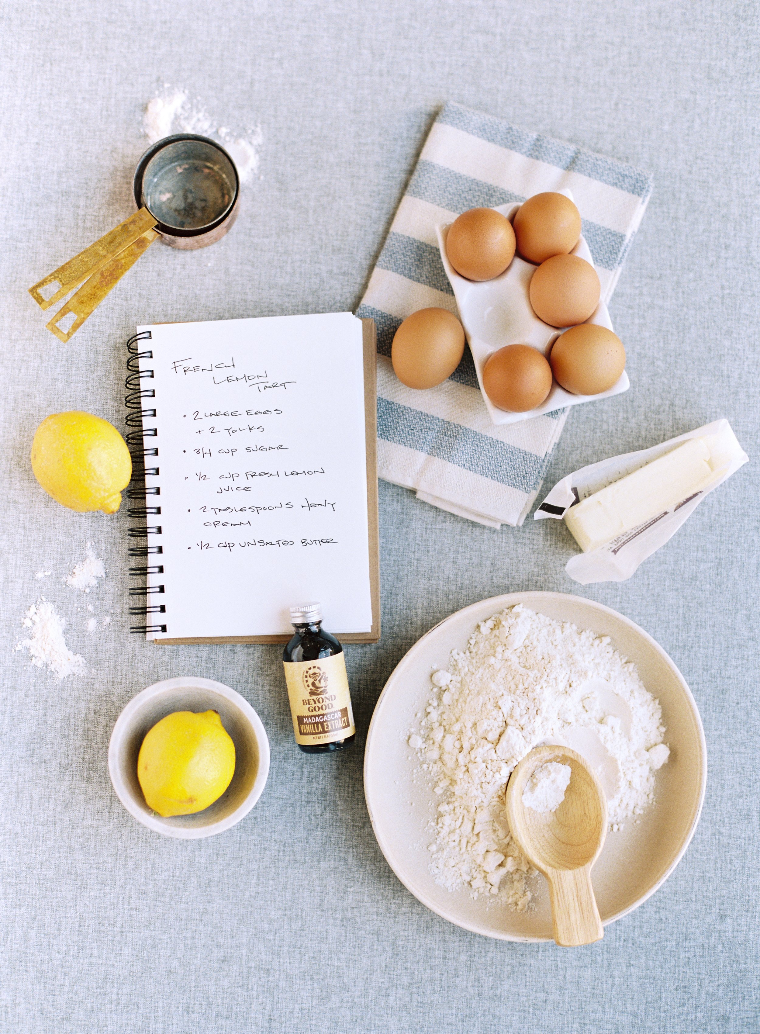
Beautiful flat lays start with real, relatable details. Fresh ingredients, a handwritten recipe, and soft linen textures come together to create a natural, cohesive story.
Styling Surface Colors and Your Overall Palette
Your styling surface colors directly impact your portfolio's color story. This is why starting with three complementary surfaces is so powerful. You're essentially choosing your palette foundation upfront.
For warm portfolios: Select surfaces in cream, warm beige, terracotta, soft peach, or warm gray families. Chateau, Yarrow, and Marrakech automatically warm your images and create cohesion across different weddings.
For cool portfolios: Choose surfaces in true white, soft gray, blue-gray, or cooler neutral families. Avalon, Vik, and Dogwood keep your images feeling fresh and modern regardless of the wedding details you're photographing.
For neutral portfolios: Opt for perfectly balanced grays, true taupes, or greige tones like Ironwood that don't lean noticeably warm or cool.
When you photograph a spring garden wedding with pastel details, a rustic fall barn wedding with deep burgundy accents, and a modern winter celebration with jewel tones, your styling surfaces tie them all together visually. The spring wedding shot on your soft cream surface relates to the fall wedding shot on your warm beige surface because they share that warm temperature.
The 80/20 Rule for Portfolio Color
Here's a strategy that creates cohesion while preventing monotony: use your core surface colors for 80% of your portfolio flat lays, reserving 20% for occasional variety within your established palette.
Your three core surfaces form the foundation (that 80%). They appear repeatedly in your portfolio, creating the visual thread that ties everything together. Clients scrolling your work see these surfaces again and again, which builds recognition and cohesion.
The remaining 20% gives you freedom to experiment with complementary surfaces that still align with your aesthetic but offer variety. Maybe you typically shoot on cream, beige, and warm gray, but for a particularly editorial styled shoot, you use a deeper taupe. This adds interest without disrupting cohesion because the taupe still fits your warm, romantic palette.
Compositional Consistency: Your Visual Signature
How you arrange elements is as important as what you're photographing. Developing a consistent compositional approach creates instant recognition in your work.
Identifying Your Natural Style
Most photographers naturally gravitate toward one of these compositional approaches:
Minimal and spacious: You love clean compositions with generous negative space. Objects occupy maybe 30-40% of your frame, with the rest devoted to breathing room. This style feels modern, sophisticated, and intentional.
Balanced and classical: You're drawn to carefully balanced arrangements where visual weight is evenly distributed. These compositions feel refined, timeless, and professionally polished.
Abundant and layered: You enjoy creating rich, full compositions with multiple elements that overlap and interact. This style feels romantic, editorial, and visually complex.
Organic and natural: Your arrangements have an effortless, slightly undone quality. Items feel casually placed rather than rigidly positioned. This style feels authentic, relaxed, and artistic.
None of these is right or wrong. The key is identifying which resonates with you, then consistently approaching your portfolio flat lays through that lens.
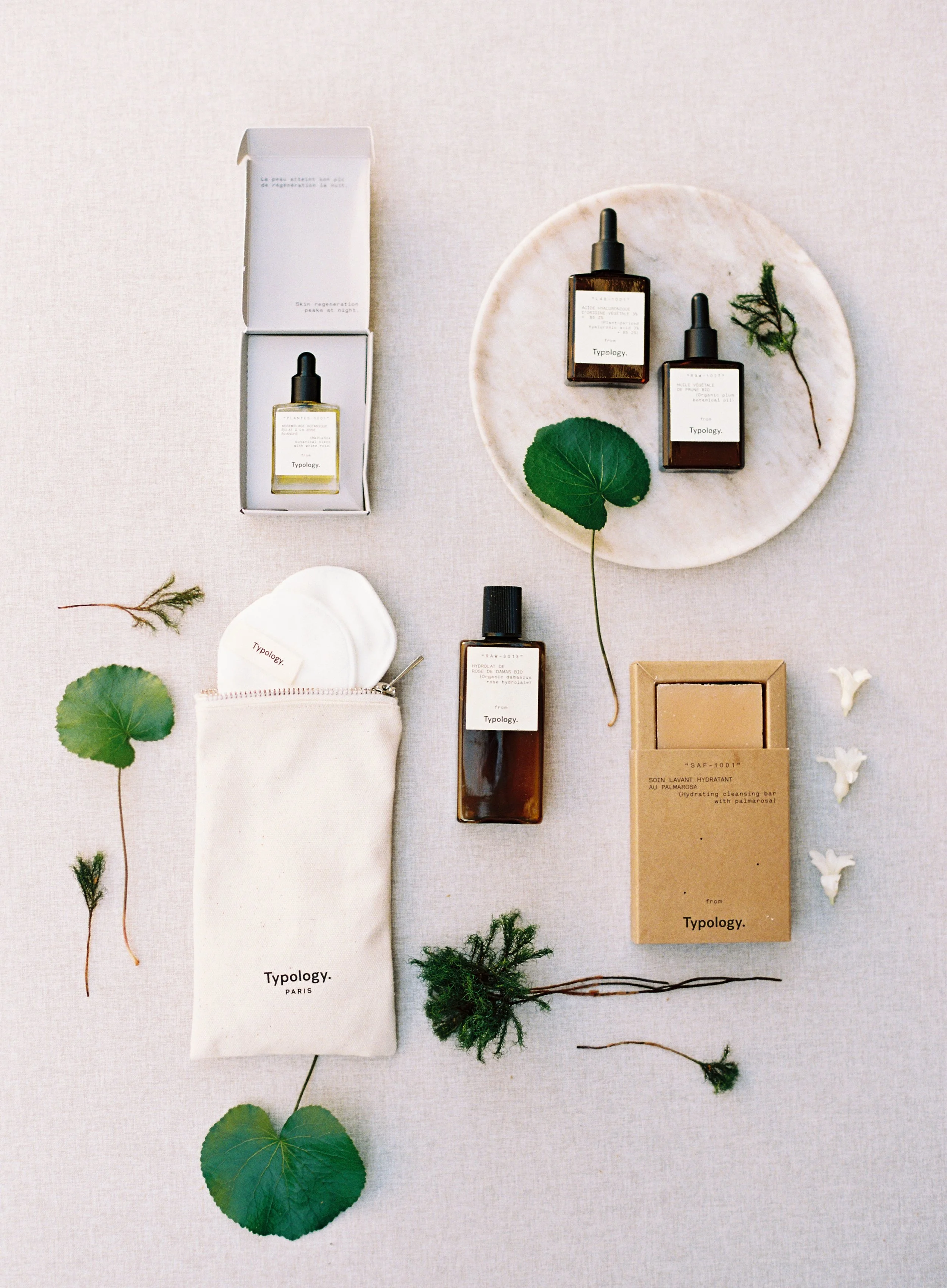
Strong flat lays are built through thoughtful combinations. Skincare, fresh fruit, florals, and natural textures work together to create a cohesive, elevated look.
Creating Your Compositional Rules
Once you know your natural style, develop simple guidelines that ensure consistency:
Negative space ratio: Decide roughly how much of your frame should be empty space. If you're minimal, you might aim for 60-70% negative space. If you're abundant, maybe 20-30%. Staying within this range across images creates cohesion.
Layering approach: Will you typically overlap elements significantly, or do items stay mostly separate? Make this consistent.
Frame usage: Do objects regularly extend beyond the frame edge (creating that editorial, cropped feeling), or do compositions stay fully contained within the frame? Consistency here matters.
Hero element placement: Where does your main subject typically live in the frame? Following the rule of thirds is great, but being consistent about whether your hero element is usually upper third, lower third, or centered creates visual rhythm across your portfolio.
Prop density: How many objects typically appear in your compositions? Some photographers rarely include more than five elements. Others regularly style with ten or more. Staying within your typical range prevents some images from feeling sparse while others feel cluttered.
The Flat Lay Formula That Creates Cohesion
Here's a practical formula you can apply to every portfolio flat lay:
Start with your hero element (invitation suite, rings, etc.) positioned according to your compositional approach
Add 2-3 supporting elements that complement and enhance the hero
Include texture through 1-2 organic elements (florals, fabric)
Assess negative space and ensure it aligns with your typical ratio
Check visual balance according to your style (even balance, asymmetrical, organic)
Photograph from directly overhead to maintain that clean flat lay aesthetic
When you follow a consistent formula, your images naturally feel connected even when the specific objects differ.
Lighting and Mood: The Invisible Cohesion Creator
Lighting is the secret ingredient many photographers overlook when building portfolio cohesion. The way you light your flat lays dramatically impacts mood, and consistency in mood creates powerful cohesion.
Choosing Your Lighting Approach
Bright and airy: Soft, even light with minimal shadows. Highlights are bright but not blown out. This approach feels romantic, dreamy, and optimistic. If this is your aesthetic, every portfolio flat lay should have this same quality light.
Soft and dimensional: Gentle directional light that creates subtle shadows, adding depth without drama. This approach feels sophisticated, refined, and professionally polished. Consistency here means always having that gentle directionality.
Moody and dramatic: Stronger directional light creating more pronounced shadows and contrast. This approach feels editorial, artistic, and bold. Committing to this means embracing those shadows consistently.
The trap photographers fall into is lighting based on convenience rather than consistency. Maybe you shoot bright and airy when you have great window light, but resort to flat overhead lighting when you don't. The result? A portfolio that feels scattered.
Instead, commit to your lighting approach and create it consistently, even if that means bringing supplemental lighting or modifiers to achieve your desired look regardless of venue conditions.
Window Light Strategies for Consistency
Most wedding photographers rely on natural window light for flat lays. Here's how to maintain consistency:
Choose your window position religiously. If your style uses side lighting (light coming from the left or right of your composition), always position your surface to achieve this. Don't sometimes use side lighting and sometimes use front lighting. Pick one.
Consistent diffusion approach. If you diffuse harsh sunlight with a sheer curtain or diffusion panel, do this every time. Don't sometimes diffuse and sometimes shoot in direct sun based on what's convenient.
Time of day awareness. If possible, shoot flat lays at similar times of day across weddings. Morning light has different qualities than afternoon light. While you can't always control timing, being aware of how different light affects your images helps you make adjustments to maintain consistency.
Reflector use. If you typically use a reflector to fill shadows, make this your standard practice. If you prefer the contrast without fill, stay committed to that approach.
How Styling Surfaces Affect Light
Here's something many photographers don't consider: your styling surface choice impacts how light behaves in your images, which affects overall mood and cohesion.
Hand-painted surfaces with their subtle texture create gentle variations in how light reflects. This adds dimension and depth that's particularly beautiful with directional lighting. When you consistently use hand-painted surfaces across your portfolio, you're also consistently getting that dimensional light quality.
Fabric surfaces offer a more even, consistent light reflection. The vegan wool texture is soft and uniform, creating reliable light quality across different shooting conditions. This consistency in how light behaves contributes to portfolio cohesion.
When you mix vastly different surface types (highly reflective surfaces one day, very matte surfaces the next), you're introducing variations in light quality that can disrupt cohesion even if everything else is consistent.
Editing for Brand Cohesion
Your editing is the final layer that ties everything together or breaks cohesion entirely. This is where you take all the good work you've done in shooting and either reinforce your brand or undermine it.
Developing Your Signature Edit
Every successful wedding photographer has an editing style that's recognizable across their work. For flat lays, this needs to be even more consistent than your other photography because these images often appear grouped together in portfolios and social media.
Color grading consistency: Decide how you'll handle color temperature in editing. Will you warm images slightly? Keep them neutral? Add a cool cast? This should be consistent across all portfolio flat lays regardless of the original lighting conditions.
Contrast approach: Are your images typically high contrast (deep blacks, bright whites) or lower contrast (softer blacks, more muted whites)? Consistency here dramatically impacts cohesion.
Saturation and vibrance: How punchy or muted are your colors? Some photographers love rich, saturated colors. Others prefer soft, desaturated palettes. Both work beautifully, but mixing approaches looks confused.
Highlight and shadow handling: How bright are your whites? How dark are your shadows? Keeping these consistent means even if you photograph different objects on different surfaces, the tonal range stays similar.
Creating Your Flat Lay Preset
The smartest move for portfolio cohesion is developing a Lightroom preset specifically for your flat lays. This preset should:
Establish your baseline color temperature. If you shoot warm, your preset adds warmth. If you shoot cool, it adds coolness. This corrects for variations in actual lighting and ensures color consistency.
Set your contrast and tone curve. This ensures every image has the same tonal quality regardless of how it was lit originally.
Define your color grading. Any color shifts you typically add to shadows or highlights should be baked into the preset.
Handle white point consistently. Flat lays often include white or cream elements (invitations, fabric). Your preset should handle these consistently so whites look the same across images.
Once you have this preset, apply it as a starting point to every flat lay. You'll still make individual adjustments, but you're starting from a consistent foundation that ensures cohesion.
The Before and After Test
Here's how to know if your editing is creating cohesion: place 10-12 of your portfolio flat lays side by side (you can do this in Lightroom's grid view or create a quick collage). Look at them together without focusing on any single image.
Does the overall collection feel harmonious? If so, your editing is working. If certain images stand out as different (too warm, too cool, too contrasty, too flat), you've found inconsistencies to address.
Could someone identify these as all being from the same photographer? If a stranger could reasonably think these images came from different sources, you need more editing consistency.
This test is brutal but valuable. It reveals editing inconsistencies you might not notice when viewing images individually.
Building Your Portfolio Strategy: Selection and Presentation
Creating cohesive flat lays is one thing. Choosing which ones to feature in your portfolio is another. Strategic selection amplifies the cohesion you've built.
Curating for Maximum Impact
Your portfolio shouldn't include every flat lay you've ever shot. It should showcase your absolute best work that most clearly represents your brand aesthetic.
The similarity principle: Images that are too similar weaken your portfolio. You don't need five nearly identical invitation suite flat lays. But images that are too different create confusion. Find the balance: varied subjects and compositions that still feel cohesively yours.
Surface rotation visibility: When potential clients browse your portfolio, they should see your core surfaces repeatedly. This creates recognition. "Oh, she always shoots on these beautiful painted surfaces" becomes part of your brand identity.
Color palette evidence: Your chosen color temperature should be obvious across your portfolio. Someone should be able to look at your flat lays and say "this photographer clearly loves warm tones" or "this work has such a fresh, cool aesthetic."
Compositional consistency showcase: Your portfolio should make your compositional approach clear. If you're known for minimal, spacious flat lays, that should be evident throughout. If abundant styling is your signature, every portfolio flat lay should demonstrate this.
The Portfolio Refresh Strategy
Portfolios need regular updating to stay fresh, but updates should reinforce cohesion rather than introduce new directions randomly.
Add strategically: When adding new portfolio flat lays, ensure they align with your established aesthetic. They should feel like natural additions to your existing collection, not departures from it.
Remove ruthlessly: If older work no longer represents your current style or doesn't align with your cohesion goals, remove it. Your portfolio should reflect where you are now, not where you were three years ago.
Batch assess: When considering portfolio updates, look at all your flat lays together. New additions should strengthen the overall cohesion, not weaken it.
Surface Investment as Portfolio Investment
Here's something many photographers don't realize: investing in quality styling surfaces isn't just about having nice mats for weddings. It's a direct investment in portfolio cohesion and, by extension, your brand.
When you shoot with carefully selected hand-painted surfaces or curated fabric surfaces, you're ensuring every flat lay you create has the potential to be portfolio-worthy. The consistency in surface quality, texture, and aesthetic means you're building cohesion into every shot from the moment you set up.
Compare this to constantly hunting for surfaces at venues or making do with whatever's available. Those flat lays might be okay, but they rarely reach portfolio quality, and they certainly don't contribute to cohesion. You end up with a collection of compromised images rather than a curated portfolio.
The photographers with the most cohesive, stunning portfolio flat lays aren't lucky. They're strategic. They've invested in styling surfaces that align with their brand, and they use those surfaces consistently to build recognition and cohesion.

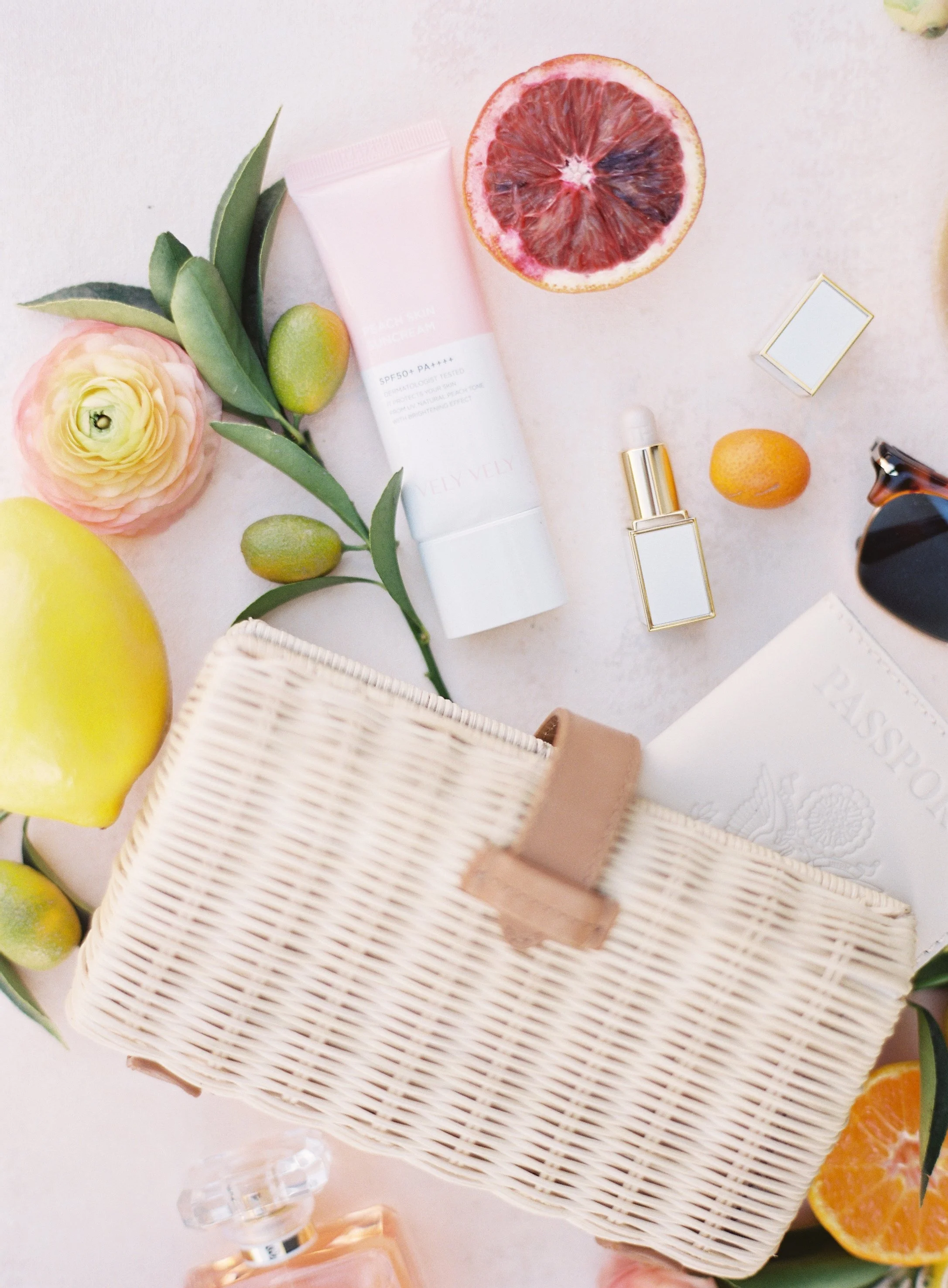
Less clutter. More impact. Negative space and thoughtful placement make everything stand out.
Your Portfolio, Your Brand Identity
Your flat lay portfolio isn't separate from your brand. It IS your brand, visually expressed through detail photography. Every styling surface choice, every compositional decision, every lighting approach, every edit contributes to the story you're telling about who you are as an artist.
Cohesion is what transforms a collection of nice images into a powerful portfolio that attracts your ideal clients. When couples browse your work and feel that instant recognition ("this aesthetic is exactly what I want for my wedding"), that's cohesion working its magic. When other photographers comment "I always recognize your work immediately," that's cohesion building your reputation.
The path to portfolio cohesion isn't complicated, but it does require intention. It means making strategic decisions about your styling surfaces, committing to a color palette, developing a consistent compositional approach, maintaining lighting mood, and editing with brand awareness. It means curating your portfolio to showcase this consistency rather than including everything you've ever shot.
Most importantly, it means understanding that cohesion isn't about limitation. It's about focus. It's about knowing exactly what you offer aesthetically and delivering that consistently, beautifully, every single time.
Ready to build the portfolio cohesion that sets you apart? Start with the foundation: explore our hand-painted surface collections, each piece handcrafted in California to provide the consistent, beautiful backdrop your portfolio deserves. Build your perfectly curated collection with three complementary surfaces chosen to work together seamlessly, creating instant visual harmony across all your flat lay work.
Your most cohesive portfolio is one intentional choice away.

Creators of premium photography backdrops and styling surfaces
Trusted by thousands of discerning creatives worldwide
Every piece is handcrafted with intention in Orange County, California