
Behind the Scenes: How to Style a Wedding Invitation Suite on the Wedding Day

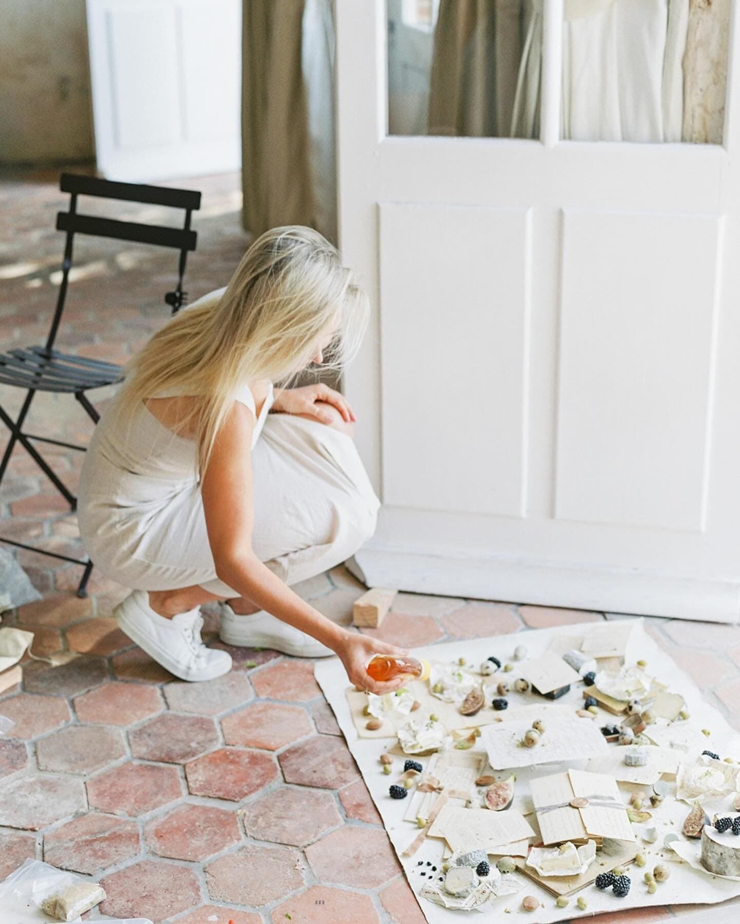
There is a particular quiet I love in the early part of a wedding morning, when soft window light falls across paper and you can see the fibers of a handmade card and the faint bite of letterpress catching the light like the grain in weathered stone. An invitation suite carries so much intention: months of choices about paper, type, color and words, gathered into a few small pieces that will be kept for a lifetime. When I paint a flat lay surface, I am thinking of moments exactly like this one, when a photographer sets a suite down on a canvas that holds a little of a faraway place, and the paper and the painted texture begin to speak to each other. This is a behind the scenes look at how to style that suite on the wedding day itself, from the first moment you open the envelope to the final frame.
Quick Answer
To style a wedding invitation suite, lay out every piece first and choose the main invitation as your anchor. Place it near the center or on a third, then layer the smaller pieces around and beneath it at gentle angles: envelope, response card, details card. Use a surface large enough to leave generous negative space, such as a 26x20 or 35x28 flat lay. Add one or two personal details, like the rings or a few stems from the bouquet. Light from a window to one side, shoot from directly above, and keep the camera parallel to the surface.

The Pieces of a Wedding Invitation Suite and Their Hierarchy
Before you place anything, open the suite and lay every piece out flat so that you can see what the couple has given you. Suites vary enormously, and the styling hierarchy changes depending on what is there.
The main invitation is the anchor. It carries the couple's names, the date and the place, and it usually holds the most considered design, the finest paper and any special printing such as letterpress, foil or engraving. Everything else in the composition supports it. A great many invitations are printed at five by seven inches, a size that travels in an A7 envelope of about five and a quarter by seven and a quarter inches, as the printing guide from PrintKeg explains, though square, oversized and folded formats are increasingly common.
The envelopes come next. The outer envelope often carries calligraphy, a return address on the flap, postage and sometimes a wax seal, and a beautifully addressed envelope can be a second hero in the frame. A patterned envelope liner is a gift to the photographer, because it adds color and pattern when the flap is opened and angled toward the camera. Inner envelopes appear in more formal suites and can be layered between the outer envelope and the invitation.
The response card and its envelope are smaller companions. Response cards are often four and a quarter by five and a half inches, the A2 size, and they usually echo the invitation's design in a quieter way. Details cards, accommodation cards, maps and website cards vary in size and are supporting voices.
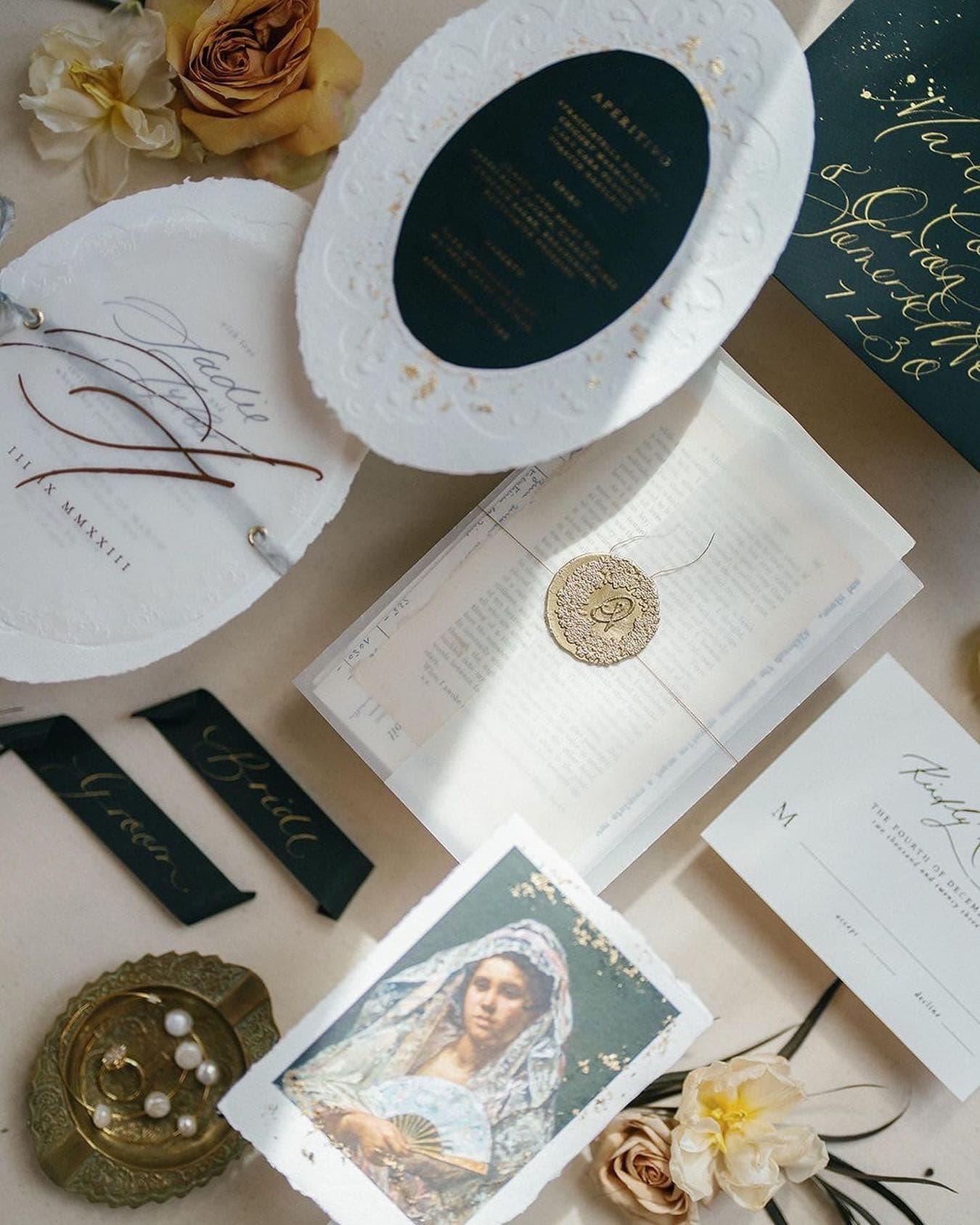
Then there are the binding and finishing elements: belly bands, silk ribbon, vellum wraps, twine, wax seals, custom stamps and envelope liners. These pieces carry texture and personality, and couples often care about them a great deal, so they deserve to be visible. Day of paper goods, such as menus, place cards, ceremony programs and vow books, can be photographed with the suite or in their own small arrangements.
Once you see the whole set, read its design language. A black tie suite with engraving and heavy cotton paper asks for restraint, precise alignment and quiet supporting details. A garden suite with watercolor, deckled edges and handmade paper invites a looser, more organic arrangement with stems and soft overlaps. Let the paper tell you how formal the styling should be.
Choosing the Right Surface for Invitation Suite Flat Lays
The surface is the ground on which every other decision rests, and it is often the difference between a detail image that feels like a hotel desk and one that feels like a page in a magazine.
Size matters first. A five by seven invitation, a response card and an envelope arranged with comfortable breathing room fill an area of roughly sixteen by twenty inches. Our Petite hand painted flat lay, at 26 by 20 inches, gives you room around that core for one or two accents and a little negative space at each edge. The Standard size, at 35 by 28 inches, lets you include rings, shoes, florals and heirlooms in the same frame, or step back for a wider, airier composition, and it gives you margin to crop in any orientation. If you prefer fabric, our stain resistant fabric flat lays in vegan wool or textured velvet are about 34 by 25.5 inches, which is close to the Standard size.
Color and value come next. Paper is usually white, ivory or cream, and its edges disappear against a surface of the same value. A surface one or two steps deeper than the paper, a soft grey, a warm stone or a muted color drawn from the suite's own palette, makes every card edge read crisply without any heavy contrast. If the suite has a strong accent color, such as a deep green envelope or a terracotta liner, choose a surface that sits quietly beside that color instead of matching it exactly, so the stationery stays the focus.
Texture is the last consideration, and it is where a hand painted surface does its gentlest work. Flat paper laid on a flat, uniform surface can look stiff. A surface with soft, layered variation gives the eye a sense of depth around the paper without competing with the type. Our hand painted flat lays, each named for a place near and faraway, are made to carry that quality: a firsthand experience of a landscape translated onto canvas, rollable so it can travel to the wedding morning with you.
For a classic ivory and blush suite, we often suggest Chateau, a faint, dove grey with subtle, light blue highlights that sits just a step deeper than ivory paper, so every card edge reads softly and clearly. One lovely pairing beside it is Joshua Tree, a faded mauve and rose quartz that gathers up the blush in the suite and lets it rest on a warmer ground, so the paper and the painted surface feel as though they were dreamt up together.
There is a practical side to surface choice on a wedding day as well. Getting ready rooms are full of coffee, champagne, makeup and hairspray. If you work close to that activity, our stain resistant fabric flat lays were made for exactly that kind of setting, with patented GREENGUARD Gold Certified stain proofing infused into each fiber, so a spill rolls off and can simply be blotted away. They are fabric, with their own soft woven texture, and they sit beautifully alongside the painted surfaces in a kit.
Composition and Placement Techniques for Invitation Suites
With the surface down and the pieces in front of you, build the arrangement from the anchor outward.
Place the main invitation first. For a classic, formal look, center it and square it to the frame. For a more editorial feel, set it on one of the thirds, a little above or below center, so that the eye has room to travel. Then place the next largest piece, usually the envelope, partly behind or beside the invitation, overlapping by an inch or two. Layering the envelope beneath the invitation at a slight angle, perhaps five to fifteen degrees, gives depth and a sense of a suite that has just been opened. Continue with the response card and details card, each smaller piece tucked under or beside a larger one, so that the sizes step down as the eye moves away from the anchor.
Overlaps should reveal what matters. Never cover the couple's names or the date on the invitation, and make sure the calligraphy on the envelope and any illustration on the cards remain readable. A good test is to ask whether each piece is showing its best quarter, the part with the most design, and to adjust until it is.
Choose a structure and commit to it. A grid layout, where every piece is squared to the frame with even gaps, perhaps an inch to an inch and a half between them, reads clean, modern and architectural, and suits formal and minimalist suites. A layered, organic layout, with soft angles and overlaps, reads romantic and relaxed, and suits garden, destination and bohemian suites. Mixing both approaches in one frame tends to look unresolved, so decide which story you are telling.
Leave negative space on purpose. Empty areas of surface give the paper room to breathe and give the couple and their designer space for text if the image is used in an album or on a website. As a starting point, keep at least two to three inches of surface between the outermost piece and the edge of the frame, and let one side of the composition hold more open space than the others.
Let some elements fall off the edge. A stem, a length of ribbon or the corner of a menu crossing the frame edge suggests that the scene continues beyond the picture, which makes a still arrangement feel lived in. Keep the hero pieces fully inside the frame and let only the accents break the edge.
For more on visual weight, odd numbers and balance in overhead work, our guide to flat lay composition rules goes deeper into the principles behind these choices.

Styling Details: Rings, Ribbon, Florals and Finishing Touches
The finishing touches are where the couple's own story enters the frame. Use them with restraint, choosing one or two that matter instead of everything at once.
Rings
The rings are often the most personal object of the morning. For a ring image with the suite, set the rings on the invitation itself, near the couple's names but not covering them, or nest them in a small ring box placed at the edge of the anchor card. Turn the stone toward your light source so it catches a highlight. Photograph a frame with the rings and one without, so the couple has both a clean stationery image and a ring detail. Handle rings carefully, ideally over the surface and away from the edge of any table or bed, and return them to the person responsible as soon as you finish.
Ribbon
Silk ribbon adds movement, and it can guide the eye through the composition. Lay a length loosely across one corner, tie it around a stack of cards as a soft bow, or let it trail from beneath the invitation toward the frame edge. To hold ribbon in place, tuck its ends beneath a card or weigh them with a small object out of frame. If you use pins or clips, use them only into the ribbon or the paper, never into the surface itself, because a pin through canvas or fabric leaves a mark. When a ribbon end or a curling card needs a little help to stay put, a small dab of removable adhesive such as museum putty is safe to use on our hand painted flat lays.
Florals and Organic Elements
A few stems from the bouquet, or a single bloom from the florist, connect the suite to the rest of the day. Choose small flowers and greenery with interesting shapes, and place them at the edges of the composition where they frame the paper without hiding it. Keep wet stems off the paper and the surface, and blot them before placing them. Seasonal fruit, a small dish, a fragment of lace from the gown or an heirloom handkerchief can all play the same supporting role.
Wax Seals, Stamps and Small Accents
Wax seals, vintage stamps and small charms are tiny pieces of texture that reward close attention. Group stamps in a gentle overlapping line along the envelope, and angle a wax seal so the light rakes across its relief. These details are excellent subjects for a second, tighter frame once the full suite is photographed.

Lighting an Invitation Suite: Window Light, Foil and Letterpress
Paper is quietly reflective and full of small relief, so light decides how much of its craft the camera sees.
Begin with a window. Set your surface on a table, a desk, a bed or the floor within about three to six feet of a window, with the window to one side of the frame or at the top edge of the frame, beyond the surface. Shoot from directly above. The window must never be behind you, because your body will cast a shadow across the paper. If the sun is streaming directly in, soften it with a sheer curtain or a diffusion panel, or move a little farther from the window to soften the falloff. A white card or reflector on the side opposite the window lifts the shadows for a bright, clean image, and a black card there deepens them for something moodier.
Raking light is a gentle ally for letterpress and handmade paper. Light that arrives from a low angle, skimming across the surface from the side, makes every pressed letter cast a tiny shadow, so the impression reads clearly. If the paper looks flat, move the setup so the light comes from a lower angle, or turn the surface so the light travels across the lines of type.
Foil behaves like a small mirror. Depending on the angle between the light, the paper and the lens, gold foil can read bright and metallic or dark and almost brown. Rotate the invitation slowly, or tilt it a few degrees with a small piece of folded card tucked beneath it, until the foil catches the window light. For engraving and blind deboss, the same patience pays off.
Vellum is translucent and loves soft, low side light. Lay vellum over a card so the text beneath shows through, and let the window light glance across it so its gentle sheen and the printing below both read clearly. If the vellum curls, rest a small weight on its edge or roll it gently the opposite way before placing it.
Dappled light, when sun falls through leaves or sheer fabric, can be beautiful for garden and destination suites, as long as the shadows fall across the surface and the accents and not across the couple's names. Move the setup until the text sits in an even patch of light.
Camera Settings and Overhead Technique
A sharp, square overhead image starts with keeping the camera parallel to the surface. Turn on the grid or the electronic level in your viewfinder, and adjust until the edges of the invitation line up with the grid lines. Even a small tilt makes rectangular cards look like trapezoids.
Height depends on your lens and how much area you want to frame. With a 50mm lens on a full frame camera, framing the width of a 26 by 20 inch Petite surface requires the camera to be roughly three feet above it, and framing a 35 by 28 inch Standard surface requires about four feet. That often means standing on a sturdy chair or a small step stool. A 35mm lens brings you closer, at a little over two feet for the Petite, but watch the edges of the frame for slight distortion. For detail frames of rings or wax seals, a macro lens around 90 to 105mm lets you fill the frame from a comfortable working distance.
For the full suite, an aperture of f/4 to f/5.6 keeps every card sharp from edge to edge even with slight layering. For detail frames, f/2.8 lets the focus fall gently away from the ring or seal. Use a shutter speed of at least twice your focal length if you are handheld, so 1/100 second or faster with a 50mm, and raise your ISO before you let the shutter drop. Set a custom white balance on the paper itself, or on a grey card at the same spot, so ivory reads as ivory and white reads as white.
For a closer look at the tools many photographers carry for detail work, our guide to essential photography gear for wedding flat lays covers lenses, stands and styling kits in more depth.

A Ten Minute Invitation Suite Workflow for the Wedding Day
On a real wedding morning, the suite rarely gets more than a few minutes, so a repeatable workflow is worth more than any single trick.
Before the day, ask the couple in your planning questionnaire to set aside a complete suite, including the envelope, liner, any wax seal or stamps and the day of paper, in one labeled bag or box with their rings and heirloom details. Pack your own kit the night before: one or two rolled flat lay surfaces, a lint roller, a soft brush, a length of neutral silk ribbon, a small ring box or dish, tweezers for placing small pieces, a white and a black card, and a small clamp. Rolled surfaces travel in their tube or a linen bag and lay flat in moments, which is part of why they suit a wedding day so well. Roll each hand painted flat lay paint side in, so that when you unroll it in the getting ready room it rests on its durable, wipeable canvas back rather than on the painted face.
When you arrive, find the best window in the getting ready room before you unpack anything, ideally away from the busiest part of the room. Roll out the surface, clear any dust with the lint roller or soft brush, and lay out every piece of the suite beside it.
In the first two or three minutes, build and photograph the full suite: anchor, envelope, supporting cards, one accent. Make one frame squared and one slightly looser.
In the next three or four minutes, make your variations. Remove a card or two for a simpler composition, add the rings for a ring detail, open the envelope flap to show the liner, and angle the invitation to catch the foil.
In the last few minutes, move in close for details: the wax seal, the stamps, the calligraphy on the envelope, the ring on the corner of the invitation. Then return every piece to the couple's bag in the same order you found it.
Our guide to getting ready photography in hotel rooms covers how to find and shape the best light in those same spaces for the portraits that follow. For stationery designers photographing their own work in the studio, where time is less of a constraint, our guide to how stationery designers photograph their work offers a different set of considerations.
Troubleshooting Common Invitation Suite Styling Challenges
Even with a careful plan, the wedding day brings surprises. These are the situations photographers meet most often, and gentle ways through them.
When the suite is incomplete, perhaps only the invitation and its envelope, lean into simplicity. Center the invitation, layer the envelope beneath it at a soft angle, add one meaningful accent such as the rings or a single bloom, and give the arrangement generous negative space. A minimal composition, thoughtfully lit, can be every bit as lovely as an elaborate one.
When the invitation is oversized, square or folded, let its unusual shape lead. Use the larger Standard surface, center the piece, and keep supporting elements few, so the unique format becomes the clear hero.
When a piece is damaged, with a bent corner, a smudge or a correction on an addressed envelope, position it so the flaw falls beneath another card or just outside the frame. Avoid spending precious minutes trying to repair something that cannot be repaired.
When a do it yourself suite has pieces that do not quite match, look for the shared thread, usually a color or a level of formality, and build around that. A neutral surface and very simple accents keep the differences from drawing attention.
When the light is poor, the kindest fix is often to move. A different window, a doorway, a bathroom with a frosted window or a hallway with a skylight may hold better light than the main suite. If there is no good window at all, bounce a small flash or LED off a white wall or ceiling to the side of the setup, so it behaves like soft window light.
When the room is small or crowded, a rollable surface can go almost anywhere flat: a bed, an ottoman, a dresser top or a clean section of floor. Keep the surface away from the hair and makeup station to protect it from spray and powder.
When the suite was left at home or arrives late, photograph whatever is available, and ask whether a spare suite can be brought to the reception, where a quiet corner during setup can give you a second chance.
Frequently Asked Questions
What size surface do I need to photograph a wedding invitation suite?
A five by seven invitation with its envelope and response card fills about sixteen by twenty inches when arranged with breathing room. A Petite flat lay at 26 by 20 inches covers that core with space for an accent or two. A Standard flat lay at 35 by 28 inches gives you room for rings, florals and shoes, and margin to crop in either orientation. Choose the larger size if you like airy compositions.
What is the best light for invitation suite flat lays?
Soft window light from one side of the frame, or from the top edge beyond the surface, is ideal. Place the setup within three to six feet of the window and shoot from directly above, keeping the window from behind you so your shadow stays off the paper. Diffuse direct sun with a sheer curtain, and use a white card opposite the window to soften shadows, or a black card to deepen them.
How do I photograph gold foil on a wedding invitation?
Foil reflects light like a small mirror, so its appearance depends on the angle between your light, the invitation and the lens. Rotate the card slowly, or tilt it a few degrees with a small folded card tucked beneath, until the foil catches the window and reads bright and metallic. Check at full magnification on your camera, because foil can look dark brown at the wrong angle.
Where should I place the rings in an invitation suite photo?
Set the rings on the main invitation near the couple's names without covering them, or nest them in a small ring box at the edge of the anchor card. Turn the stone toward the light so it catches a highlight, and shoot one frame with the rings and one without. Handle rings over the surface and away from table edges, and return them promptly.
How do I keep the invitation suite looking straight in overhead photos?
Keep the camera sensor parallel to the surface. Turn on the grid or electronic level in your viewfinder and adjust until the card edges line up with the grid lines, because a slight tilt turns rectangles into trapezoids. Stand on a sturdy step stool so you can shoot straight down, use f/4 to f/5.6 for edge to edge sharpness, and correct any small remaining tilt with a perspective tool in editing.
How long should invitation suite styling take on a wedding day?
With a prepared kit and a suite gathered by the couple in advance, ten minutes is enough for a full arrangement, a few variations and close details. Spend the first few minutes on the complete suite, the next few on simpler versions and a ring frame, and the last few on wax seals, stamps and calligraphy. Finding the best window before you unpack saves the most time.
Bringing the Suite to Life
Every invitation suite is a small record of how a couple chose to welcome the people they love, and photographing it with care is one of the quiet gifts a wedding photographer can give. As Jose Villa has said of our surfaces, "Chasing Stone has been a favorite of mine since I first tried them. Not only do they add texture and style to my subject matter, they are easy to take with me wherever I go!" I hope these notes help you carry that same ease into every wedding morning, so that you too can continue to create and share your art. If you are dreaming up a surface for your own detail kit, you are warmly invited to explore our hand painted flat lays. What story will the next suite you photograph tell?
Shop the look