
Flat Lay Composition Rules That Create Stunning Images
Posted on Feb. 26, 2026
I remember the exact moment composition clicked for me.
I was shooting a fall wedding at a vineyard estate in Temecula. Three years into my career, totally confident in my technical skills. I laid out the bride's invitation suite on my styling surface, surrounded it with her rings, a sprig of olive branch, and some ribbon. Everything was visible. The exposure was perfect. The colors were beautiful.
When I delivered that gallery, the bride loved the ceremony photos. She loved the portraits. She never once mentioned the flat lays. Not in her review. Not on Instagram. Not when she referred me to her sister the following spring.
That silence told me something my ego didn't want to hear. My flat lays were forgettable.
I spent the next six months studying everything from Dutch Golden Age still life paintings (Pieter Claesz knew more about flat lay composition in the 1630s than most of us do now) to the editorial spreads in Martha Stewart Weddings. I tore apart every image I admired and tried to figure out why my eye moved through some compositions like water and got stuck in others like mud.
What I discovered is that the gap between forgettable detail shots and the ones that stop a bride mid-scroll almost never comes down to having better objects to photograph. It comes down to knowing where to put them.
Composition is the architecture of your image. It's the invisible structure that determines whether someone lingers or keeps scrolling. Whether a bride feels something when she sees your detail shots, or just sees a nice picture of her rings. Whether an editor at Style Me Pretty pulls your submission or passes on it.
If you've already nailed the fundamentals of flat lay photography (equipment, camera settings, lighting, general workflow), this guide goes further. These are the composition rules and frameworks that separate competent flat lays from the ones that actually book clients.
If you're brand new to flat lay photography, start with our Ultimate Flat Lay Photography Guide for Wedding Photographers first, then come back here when you're ready.
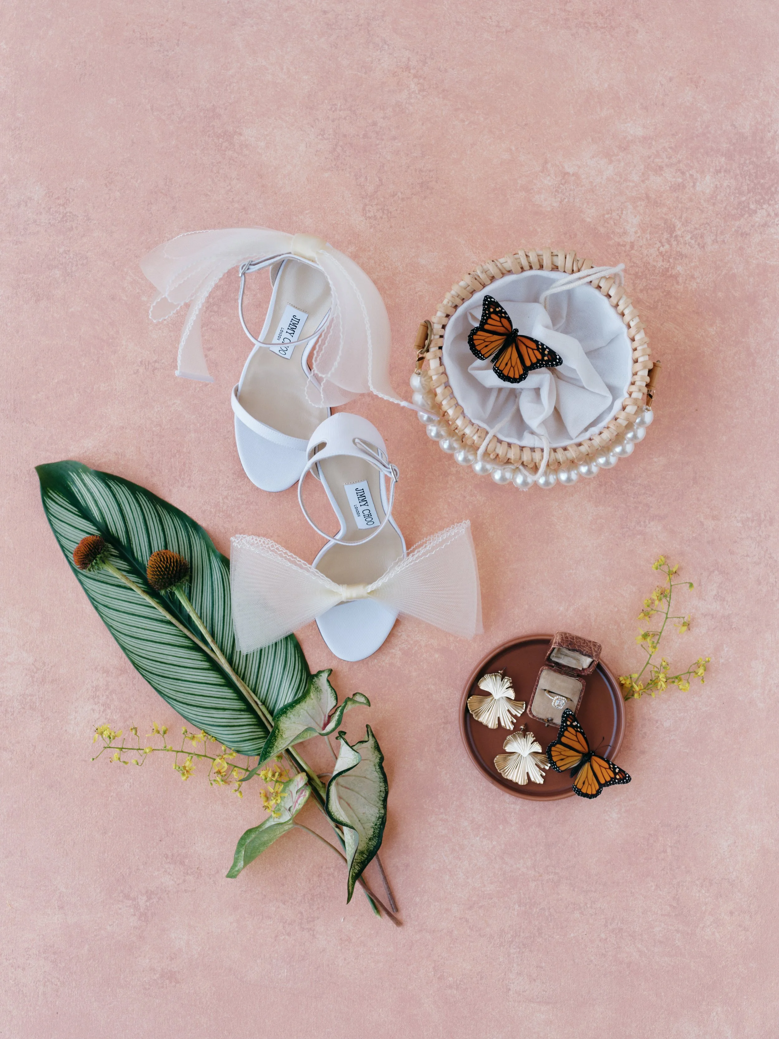
Great flat lay composition isn't about having the most expensive details to photograph. This bridal scattered spread works because every element, from the Jimmy Choo heels to that tropical leaf diagonal, has a deliberate role. That's the difference between documenting and composing.
Why Composition Matters More Than Your Gear or Your Objects
Here's something that took me embarrassingly long to learn: a simple invitation, a ring, and a sprig of greenery composed with intention will outperform a table overflowing with Cartier boxes and custom letterpress arranged without purpose. Every single time.
I've reviewed hundreds of portfolios at this point, and the pattern is always the same. Photographers with mid-range gear and strong composition instincts produce flat lays that feel editorial. Photographers with $5,000 camera bodies and no compositional sense produce images that feel like evidence photos.
Composition is what gives a flat lay its visual logic. It's the invisible framework that tells your viewer where to look first, where to look next, and how to feel about what they're seeing. Without it, you're just documenting objects. With it, you're telling a visual story.
The photographers who consistently produce editorial-quality flat lays haven't memorized a secret formula. They've internalized a set of principles that guide every placement decision, often without conscious thought. That's where this guide takes you.
Rule #1: Establish a Clear Visual Hierarchy
Every flat lay needs a star. One element that your viewer's eye lands on before it travels anywhere else. Without this hierarchy, your composition is a collection of objects with no story. It's like a movie where every character talks at the same volume.
How Visual Hierarchy Actually Works
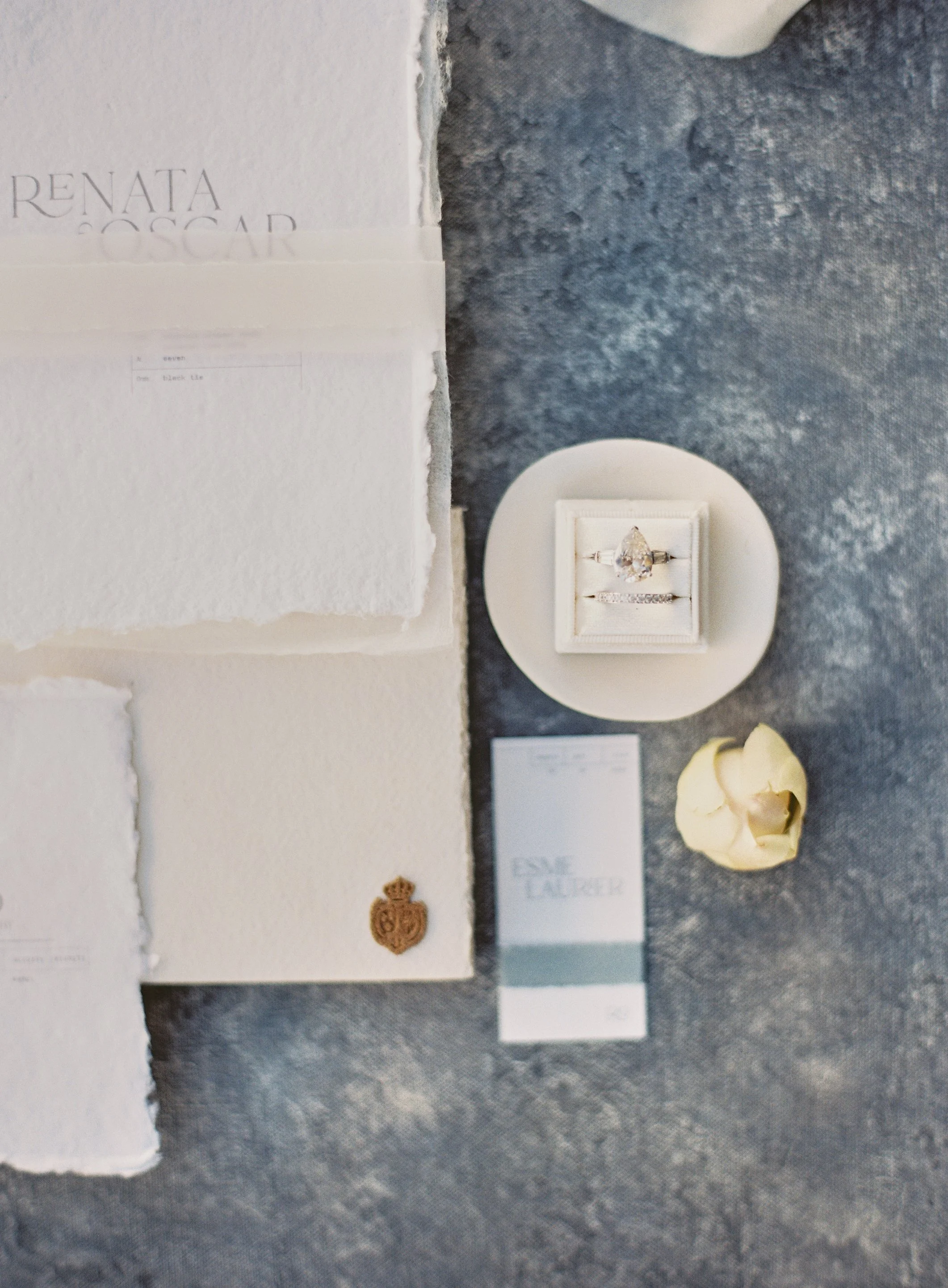
Visual hierarchy is controlled by three factors: size, contrast, and placement. The largest object naturally draws the eye. The element with the most contrast against your surface demands attention. And objects placed at compositional "power points" (more on those in a moment) carry more visual weight than objects near edges or corners.
For a wedding flat lay, your hero element is usually the invitation suite or the ring. Everything else plays a supporting role. That doesn't mean supporting elements are unimportant. They're what give the image its richness. But they should enhance the hero, not fight it.
Here's a test I use before I ever pick up my camera: I squint at the arrangement until everything goes slightly blurry. If I can still immediately identify the focal point, the hierarchy is working. If my eye wanders aimlessly, I need to rethink the arrangement. Try it right now on the last flat lay in your camera roll. You'll see what I mean.
The Supporting Cast Principle
Think of your flat lay like a movie poster. The lead is front and center. Supporting cast is visible but not stealing scenes. Background elements set the tone without demanding attention.
When you arrange a flat lay, assign every single object a role before you place it. Is this a lead? A supporting player? An accent detail? That role determines its size in the frame, its proximity to the hero, and its tonal relationship to the surface.
The most common mistake I see in portfolio reviews (and I made this mistake for years) is giving every element equal visual weight. Five objects, similar sizes, evenly spaced, similar tonal values. The result reads as a grid of things rather than a composed image. It's the visual equivalent of monotone speaking. Technically correct. Completely flat.
Vary the scale. Let some elements occupy more frame real estate. Let others recede. That variation is the hierarchy, and it's what pulls a viewer into your work and keeps them there.
Photographers ask us all the time: 'How do I make a stationery flat lay feel editorial instead of just organized?' This is the answer. Scattered over grid. Diagonal ribbon leading line. Botanicals breaking the upper edge. A surface with enough texture to make all that negative space feel intentional, not empty.
Rule #2: Use Compositional Frameworks (Then Learn When to Break Them)
You already know the rule of thirds. It shows up in every photography basics course and we cover it in our common flat lay mistakes guide. But the rule of thirds is really the entry-level framework. Once you've internalized it, there are more sophisticated structures that create significantly stronger visual impact.
The Golden Spiral
The golden spiral (sometimes called the Fibonacci spiral) is based on a mathematical ratio found throughout nature. Nautilus shells, sunflower seed patterns, hurricane formations. In flat lay terms, it gives you a natural, curving pathway for the eye to follow through your composition.
I place my hero element at the tightest point of the spiral (usually in the lower-right or lower-left area of the frame), then arrange supporting elements along the spiral's expanding curve. Here's the practical trick: ribbon, foliage, or fabric draping can literally trace the spiral's path. The result is organic flow that feels effortless even though every inch was deliberate.
You don't need to overlay the actual spiral graphic on your images. After studying it a dozen or so times, you develop an intuitive feel for that curving flow. It just becomes part of how you see.
The Diagonal Method
Diagonal lines are more dynamic than horizontal or vertical arrangements. Always. They suggest movement and energy because our eyes naturally follow diagonal lines through a frame.
I use diagonals constantly. An invitation angled at maybe 15 degrees rather than perfectly squared to the frame. A ribbon trailing from upper-left to lower-right. Florals cascading along an implied diagonal. These small rotations transform static arrangements into compositions that breathe.
Last spring I was shooting a modern minimalist wedding at a downtown LA loft. The stationery was all clean lines and sharp geometry. My first instinct was to square everything up, match the vibe. The shots were technically sharp and completely lifeless. The moment I rotated the invitation maybe 20 degrees and let the ribbon cut diagonally across the frame, the entire composition woke up. Same elements. Completely different energy.
The Phi Grid
The phi grid looks similar to the rule of thirds but the intersecting lines sit slightly closer to center, based on the golden ratio (1.618). The difference is subtle in theory and surprisingly noticeable in practice. Compositions built on the phi grid feel tighter, more intimate, and more balanced.
I reach for the phi grid when I'm working with fewer elements. Three or four objects. A ring, an invitation, maybe one flower. The phi grid's closer intersections create a cohesive cluster that doesn't feel scattered or lost, which is the constant risk with minimal compositions and generous negative space.
When to Break Every Framework
Here's the honest truth: compositional frameworks are training wheels. Essential at first. Gradually less necessary. Eventually, you internalize the principles behind them and start placing objects based on gut feeling, which is really just trained intuition that you can't articulate fast enough for your conscious mind to keep up.
The flat lays I'm proudest of didn't follow any single framework cleanly. They borrowed from several. A golden spiral here, a strong diagonal there, a rule-of-thirds placement anchoring the hero. The frameworks give you vocabulary. Fluency comes from shooting.
Rule #3: Understand Visual Weight
Not every object carries equal presence in a composition, even when they're physically the same size. Visual weight refers to how much attention an element commands based on its color, tone, texture, and position in the frame. Ignoring visual weight is why some perfectly "balanced" arrangements still feel lopsided.
What Creates Visual Weight
Dark objects feel heavier than light ones. A black velvet ring box pulls more visual attention than a cream envelope twice its size. That's visual weight overriding physical size.
Saturated colors demand attention before muted ones. A deep burgundy wax seal on a neutral surface is going to grab your eye before anything else in the frame, even if it's the smallest object there.
Texture adds weight too. Complex, textured elements (a raw linen ribbon with visible weave, a wax seal with deep impressions, dried botanicals with intricate structure) draw more attention than smooth, simple objects. This is one reason hand-painted styling surfaces work so well for flat lays. Their subtle texture adds enough visual interest to fill negative space without competing with your styled objects for attention.
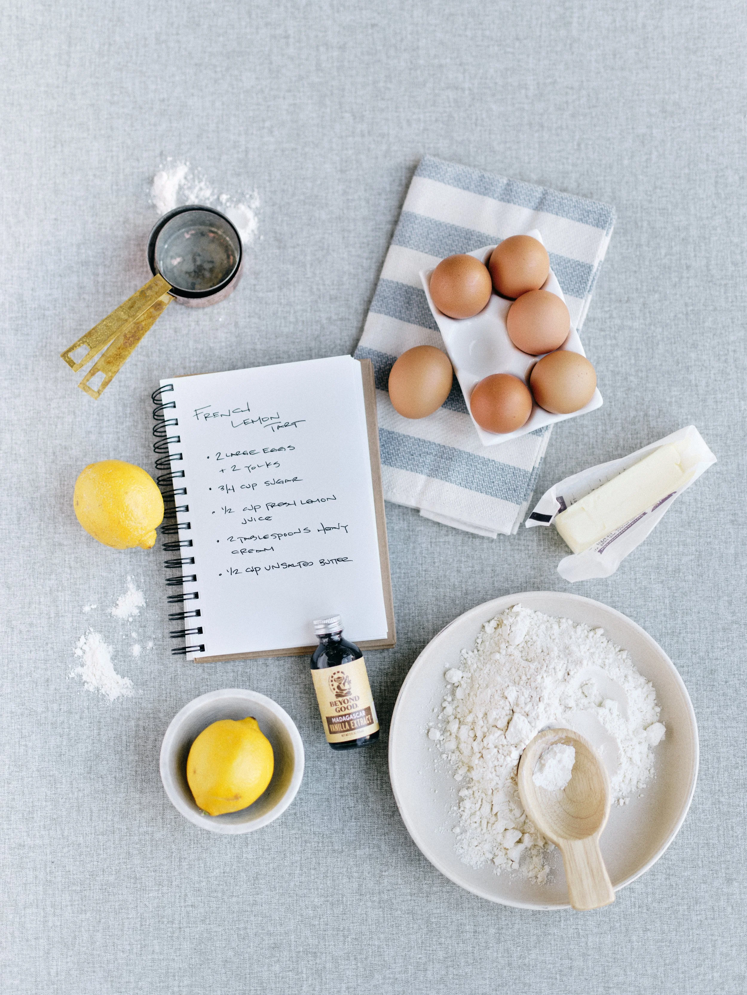
The same composition principles that make a wedding stationery flat lay editorial-worthy work just as powerfully for food photography. Clear visual hierarchy with the recipe notebook as hero, scattered ingredient placement, and a surface with enough tonal texture to make all that negative space feel intentional rather than empty.
Balancing Weight Across the Frame
Visual balance does not mean symmetry. It means distributing visual weight so the composition doesn't feel like it's about to tip over. Think of a playground seesaw: one heavy kid close to the center balances two lighter kids further out.
I learned this viscerally shooting a luxury stationery suite at a Montecito estate wedding. The calligrapher had used heavy black envelopes with gold foil addresses. Gorgeous. I grouped all three envelopes on the left side of my composition, placed the lighter ivory inserts on the right. Technically, I was following the rule of thirds. Visually, the image felt like it was sliding off the left edge of the frame. Those dark envelopes carried so much visual weight that nothing on the right could counterbalance them.
The fix was simple once I understood the problem: I moved one dark envelope to the right side as an anchor. Instant balance. Same objects. Same surface. Totally different feel.
When you're arranging elements, periodically step back (or glance at your tethered screen) and ask: does this feel balanced, or does one area feel heavier? Trust your gut. It will tell you before your brain can explain why.
Rule #4: Treat Negative Space as Your Most Powerful Tool
We touched on negative space in our Ultimate Flat Lay Guide, but it deserves much deeper attention here because it is, genuinely, the single most underused composition tool I encounter in photographer portfolios.
Negative Space Is Not Empty Space
This reframe changed my work overnight. Negative space is not where your composition ends. It's an active element you are deliberately shaping, the same way you'd deliberately place a ring or an invitation.
Pay attention to the shapes created between your objects. Irregular, organic shapes (formed by the natural edges and curves of scattered elements) feel sophisticated and editorial. Uniform rectangular gaps between evenly spaced objects feel like a spreadsheet.
When I compose a flat lay now, I spend as much time looking at the spaces between objects as I do at the objects themselves. That shift in attention is what separates the arrangement-focused photographer from the composition-focused photographer.
Here's where surface choice becomes a composition decision, not just an aesthetic one. On a plain white surface, negative space reads as emptiness. On a hand-painted surface with subtle tonal variation, negative space becomes visually active. The brushstroke texture and subtle color shifts fill that space with warmth and depth, which means you can use much more negative space without the composition feeling sparse or unfinished.
The Breathing Room Ratio
I adjust my object-to-space ratio based on what the image needs to accomplish:
For Instagram and social media: roughly 50/50. Half objects, half surface. Enough visual density to read well at small sizes on a phone screen.
For editorial submissions to wedding blogs and magazines: closer to 40/60 (fewer objects, more space). Editors need room for text overlays and headlines, and generous space reads as confidence and intentionality. This is the ratio that gets images featured.
For hero ring shots and single-detail highlights: 30/70 or even 20/80. Maximum breathing room. Maximum impact.
The photographers I mentor who struggle most with composition almost universally share the same issue: they're afraid of space. They keep adding elements because open surface feels like a mistake, like they forgot something. But the editorial flat lays that get published, the ones that book four-figure and five-figure weddings, almost always feature generous, confident negative space. It's what gives the work its authority.
Rule #5: Master Edge Tension and Strategic Cropping
What happens at the edges of your frame matters as much as what happens in the center. Maybe more, because edges are where amateur work reveals itself fastest.
Letting Elements Leave the Frame
Beginners keep everything safely inside the frame. Every object fully visible. Every edge contained. The result feels boxed in, cautious, and small.
Professional flat lay compositions intentionally let elements exit the frame. A trailing ribbon disappearing off the bottom edge. A eucalyptus stem leaving the left side. A fabric edge bleeding past the upper right corner. These deliberate exits create the impression that your composition extends beyond what the viewer can see. Instead of a contained arrangement, you've created a window into a larger, more abundant scene.
I use this on nearly every wedding flat lay I shoot. Ribbon or foliage extending past at least two edges of the frame. It's one of the fastest visual upgrades you can make, and it costs nothing except a willingness to let go of the idea that every object needs to be fully visible.
Surface Edge Anxiety
Every flat lay photographer knows this fear: the moment you see the edge of your styling surface creeping into the frame, with hotel carpet or a tabletop visible behind it.
Nothing breaks the editorial illusion faster. And if you're constantly cropping tight to hide surface edges, you're cutting off compositional options before you even explore them. You can't create generous negative space if you're squeezing your frame to avoid showing where your surface ends.
This is where surface size becomes a direct composition factor. A surface that gives you room (larger petite and standard sizes for flat lay work, or 8x10 and 8x14 canvas backdrops when you're shooting vertical or larger arrangements) means you can frame wider, breathe more, and make compositional choices based on what the image needs rather than what your surface allows.
Rule #6: Create Intentional Eye Flow
A well-composed flat lay doesn't just sit there looking attractive. It moves. Your viewer's eye should travel through the frame in a deliberate path, guided by lines, shapes, and tonal contrast you've built into the arrangement.
Leading Lines in Flat Lays
Leading lines aren't just for landscape photography. In flat lays, they're created by ribbon, botanical stems, the edge of an envelope, a calligraphy pen, even the implied invisible line between two related objects. These lines guide the viewer's eye from element to element, creating a visual journey.
My go-to technique: I use a length of silk ribbon as a literal leading line connecting my major composition elements. It might start near the invitation, curve gently past the rings, and trail off toward a sprig of greenery at the frame edge. The viewer's eye follows that ribbon without thinking about it, encountering each story element along the way.
One of my favorite flat lays from last year was a moody fall invitation suite where I used a piece of hand-dyed charcoal ribbon in a loose S-curve through the frame. The ribbon connected the wax-sealed envelope at the top to the rings at the center to a cluster of dried florals at the bottom. Three seconds of ribbon placement turned a nice arrangement into a composition with genuine narrative flow.
The Entry Point
Every flat lay needs a visual front door. A place where the viewer's eye enters the frame before it goes exploring.
In Western cultures, we tend to "read" images the same way we read text: upper-left to lower-right. You can work with this tendency by placing your entry point (the highest-contrast or highest-weight element) in the upper-left area and letting the composition flow diagonally toward the lower right. It's not an absolute rule, but it works with the viewer's hardwired scanning pattern rather than against it.
Circular Flow vs. Linear Flow
Linear flow moves the eye in one direction through the frame. It's clear, storytelling-friendly, and works for flat lays where there's a natural sequence: invitation, then rings, then details, then florals.
Circular flow keeps the eye moving in a loop within the frame, drawing attention continuously back toward the center. This is powerful for minimal compositions where you want the viewer to linger. A ring placed at center, surrounded by a loose oval of small florals and a curved ribbon, creates circular flow that holds attention far longer than a linear arrangement.
I choose between them based on the image's purpose. Detail shots for the couple's wedding album? Linear flow, clear narrative. A portfolio hero image for Instagram? Circular flow, because more time spent looking at your image is exactly what the algorithm rewards.
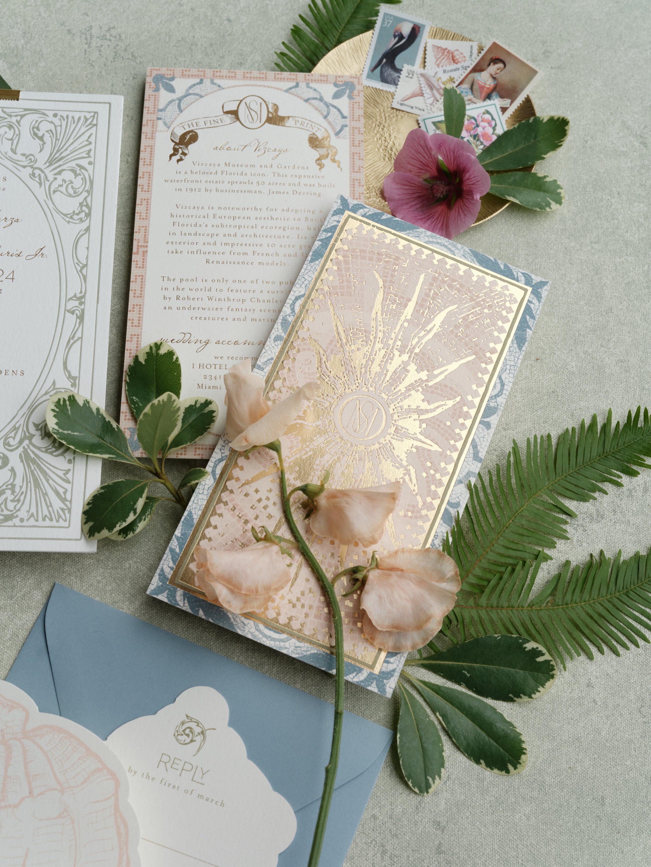
The most ornate stationery suite in the world can disappear into a plain white background. Notice how the sage tonal variation of this hand-painted surface creates just enough contrast to let the gold foil, blush sweet peas, and vintage stamps each hold their own visual weight without competing. That's a surface working as a compositional partner, not just a backdrop.
Rule #7: Use Rhythm and Repetition to Create Cohesion
Rhythm in visual composition works exactly like rhythm in music. Pattern and expectation. Tension and release. Your eye finds rhythmic compositions satisfying for the same neurological reasons your brain finds a good beat satisfying.
Repeating Elements
Including multiples of a similar element (three sprigs of eucalyptus, two matching ribbon tails, a cluster of dried flower heads) creates visual rhythm. Your eye bounces between them, generating movement and cohesion across the frame.
Odd numbers almost always feel more dynamic than even numbers. Three of something reads as artful. Four reads as symmetrical. This isn't mystical. Odd groupings create natural asymmetry, which introduces the slight visual tension that makes compositions interesting. It's why groupings of three show up everywhere in editorial flat lays, from magazine covers to wedding blog features.
Repeating Shapes
Look for shapes that echo each other across your composition. The circle of a ring can be echoed by a wax seal, a round perfume bottle cap, or the curve of a ranunculus petal. The straight edges of an invitation can be echoed by a vow book or a place card. These shape relationships create unconscious visual connections that make the entire composition feel unified, even when the objects have nothing functionally in common.
I started noticing this in the work of fine art photographers I admire. Their flat lays always feel whole, like every object belongs. When I analyzed why, it was shape repetition. Circles talking to circles. Lines talking to lines. Once you see it, you can't unsee it.
Tonal Rhythm
This is the advanced technique: building rhythm through alternating tonal values. Light element, dark element, light element, dark element. As the eye moves through the frame, it encounters this alternation as visual tempo. It's subtle. Most viewers can't articulate it. But it's the reason certain flat lays feel rich and layered while others feel flat, even with identical objects.
Your surface plays a direct role here. A surface with natural tonal variation (lighter areas, slightly warmer or darker areas) gives you tonal rhythm to compose against. Place lighter objects where the surface runs a touch darker. Place a dark ring box where the surface lightens. That interplay of tones creates contrast that moves the eye through your composition organically. This is incredibly difficult to achieve on a plain white background, and it's one of the biggest practical advantages of working on hand-painted surfaces with organic tonal variation.
Rule #8: Choose the Right Composition Type for the Moment
Not every flat lay calls for the same layout. The photographers who book premium clients can shift between composition types fluidly based on what the moment, the client, and the content require.
The Gathered Arrangement
Objects loosely collected in a natural-looking cluster, usually centered or slightly off-center. This feels organic and unforced, like the bride set these things down on a table and they just happened to look beautiful. It works for intimate wedding details where the composition should feel personal rather than produced.
Best for: invitation suite overviews, bridal accessories, groom's details.
The Scattered Spread
Elements distributed across the entire frame with intentional irregularity. Nothing evenly spaced. Some items overlap. Others float in open space. This is the editorial standard for magazine-style flat lays because it feels dynamic, artistic, and abundant.
Best for: styled shoots, portfolio hero images, social media content, brand photography for florists and stationers.
The Grid
Objects arranged in deliberate rows or columns with consistent spacing. Structured. Graphic. Almost architectural. It works for content where organization and completeness are the point: a stationery suite showing every single insert, a collection of accessories documented individually.
Best for: stationery suites, product photography, brand content, knolling-style arrangements.
The Minimal Frame
One or two elements swimming in generous negative space. This is the most editorial approach and the hardest to execute well because there is absolutely nowhere to hide. Every millimeter of spacing is visible. The relationship between your object and the frame edges becomes the entire composition.
Best for: ring shots, single-detail hero images, editorial submissions where the publication needs headline and text overlay space.
On a typical wedding day, I cycle through all four. A gathered arrangement for the initial invitation suite shot. A scattered spread for the wide detail overview. A grid for the stationery documentation shot. A minimal frame for the hero ring image. That range gives couples a gallery with real variety, not twelve versions of the same layout.
The minimal frame composition is the hardest to execute well because there is nowhere to hide. Every millimeter of spacing is visible. Every tonal relationship between object and surface is on full display. The reason this works is the blue hand-painted surface providing just enough contrast and depth to make all that open space feel intentional and confident rather than sparse.
Rule #9: Let Your Surface Inform Your Composition
Your styling surface is not just a background. It's an active compositional partner. Treating it as dead space underneath your objects is leaving visual potential on the table.
Texture Direction
Hand-painted surfaces have a subtle visual grain from brushstroke direction. This is invisible to most people looking at a single image, but it affects how the eye moves across the frame. Aligning your primary composition flow with the texture direction feels harmonious and effortless. Going against it introduces subtle tension and energy.
Try this: before you start placing objects, rotate your surface 90 degrees and shoot the same arrangement both ways. Compare the results. You'll feel the difference even if you can't immediately articulate it.
Tonal Zones
Most hand-painted surfaces have natural tonal variation. Slightly lighter patches, slightly warmer or cooler areas. These aren't flaws. They're compositional tools.
I keep mental notes about my favorite surfaces. My Joshua Tree flat lay surface has a warmer area in the lower third that's perfect for anchoring a composition. My Chateau has a gentle cool shift in the upper portion that creates atmosphere for minimal arrangements. When I'm setting up, I orient the surface so those tonal zones work for what I'm shooting, not against it.
Color Temperature as a Composition Variable
Warm surfaces (tans, terracottas, warm grays) make objects feel grounded and substantial. Cool surfaces (sage, dusty blue, soft gray) create more visual separation between objects and background, which makes compositions feel lighter and more spacious.
Neither is better. They serve different moods. But understanding how your surface temperature interacts with your objects gives you one more variable to control. Our Color Theory for Photographers guide breaks down these relationships in depth if you want to go further.
Putting It All Together: A Wedding Day Composition Workflow
Theory matters. But on a wedding day with twenty minutes and a bride checking the clock, you need a system. Here's the exact workflow I've refined over hundreds of weddings.
Minutes 0 to 2: Surface and Light. I set up my styling surface near the best available natural light, usually beside the largest window in the getting-ready room. Surface angled so I get soft, directional light with gentle shadows that add dimension. (Our guide to lighting hand-painted backdrops covers this in full detail.)
Minutes 2 to 5: Hero and Framework. I place the invitation suite as my anchor, positioning it at a strong power point in my chosen framework. Before anything else goes down, I decide my composition type based on the wedding's personality: gathered for rustic intimate weddings, scattered for modern editorial weddings, minimal for high-end luxury affairs. That one decision shapes everything that follows.
Minutes 5 to 10: Supporting Elements and Flow. Rings, ribbon, florals, accessories. Each addition gets a quick gut-check against the rules in this guide. Is the hierarchy clear? Is visual weight balanced? Do I have a deliberate eye path? Am I building rhythm? I glance at my tethered screen after every two or three additions and adjust.
Minutes 10 to 12: Edge Check and Refinement. I verify my edges are clean: no visible surface boundary, elements extending past the frame in at least two places, no tangent points (more on those below). I refine spacing, angle one or two items differently, let the ribbon fall a bit more naturally.
Minutes 12 to 15: Shoot Multiple Variations. I capture the main composition, then quickly reshoot two or three variations. Tighter crop on the rings. Wider frame with more breathing room. One detail close-up. Same styling, different compositions. Four to six distinct portfolio-quality images.
Fifteen minutes. That's what a composition system gives you. Not more time fumbling. More time creating.
Three Practice Exercises That Will Visibly Improve Your Work
Reading about composition builds understanding. Only practice builds instinct. These are the three exercises I assign every photographer I mentor, and they work.
Exercise 1: The Three-Object Challenge
Choose exactly three objects. Set up your surface. Arrange those three objects ten completely different ways. Photograph every arrangement. Review them side by side at the end.
Which compositions pull your eye in? Which feel dead on arrival? Which create natural flow? This exercise strips away the crutch of "adding more stuff" and forces you to solve composition with nothing but placement, spacing, and orientation. It's harder than it sounds, and more valuable than a weekend workshop.
Exercise 2: The Subtraction Progression
Start with a full, complex composition. Maybe eight elements. Photograph it. Then remove one object, restyle slightly, and photograph again. Repeat until you're down to one or two items.
Now review the entire series in order. Most photographers are genuinely surprised to discover that the compositions get stronger as elements come out. That moment of realization, that less really does give you more, rewires how you approach flat lays permanently.
Exercise 3: Four Types, Same Objects
Take one set of wedding details and style them four different ways: gathered, scattered, grid, minimal. Same objects. Same surface. Four compositions that look and feel completely different.
This builds your ability to shift between composition types on wedding days without hesitation. It also reveals which types you're naturally strongest at, and which need more work.
Composition Traps Even Experienced Photographers Fall Into
I still catch myself in these. The goal isn't to never slip. It's to recognize the pattern quickly.
The Perfection Trap
Overly precise arrangements look manufactured. If every element is perfectly parallel, every gap identical, every angle mirrored, the composition reads as sterile. Clinical. Like someone used a ruler and a protractor.
Real editorial work has a quality of studied casualness. The Japanese call it wabi-sabi. Introduce small imperfections on purpose. Angle one element slightly off-axis. Let a ribbon tail fall where gravity takes it. Tilt one botanical so it breaks the pattern. These controlled imperfections are what make a composition feel like it was created by a human with good taste, not assembled by a machine.
(Our Art of Imperfection article explores why handmade texture and organic variation produce more compelling work than machine-made uniformity. The same philosophy applies directly to composition.)
The Tangent Trap
Tangent points happen when objects just barely touch each other, or just barely touch the frame edge. They're visually uncomfortable because they create ambiguity. Is this object overlapping or separate? Is it inside the frame or leaving it?
Your eye gets stuck at tangent points, and not in a good way. The fix is simple: either overlap intentionally (creating clear depth and connection) or separate with obvious space. Avoid the awkward almost-touching in-between.
The Centering Default
Under time pressure, every photographer reverts to centering. It's instinctive. It feels safe. It is safe. It's also the most forgettable composition choice you can make.
When you feel the centering impulse on a wedding day, force yourself to move your hero element to a rule-of-thirds intersection instead. Just that one shift, five inches in any direction, will improve the composition dramatically. It takes two seconds and zero extra equipment.
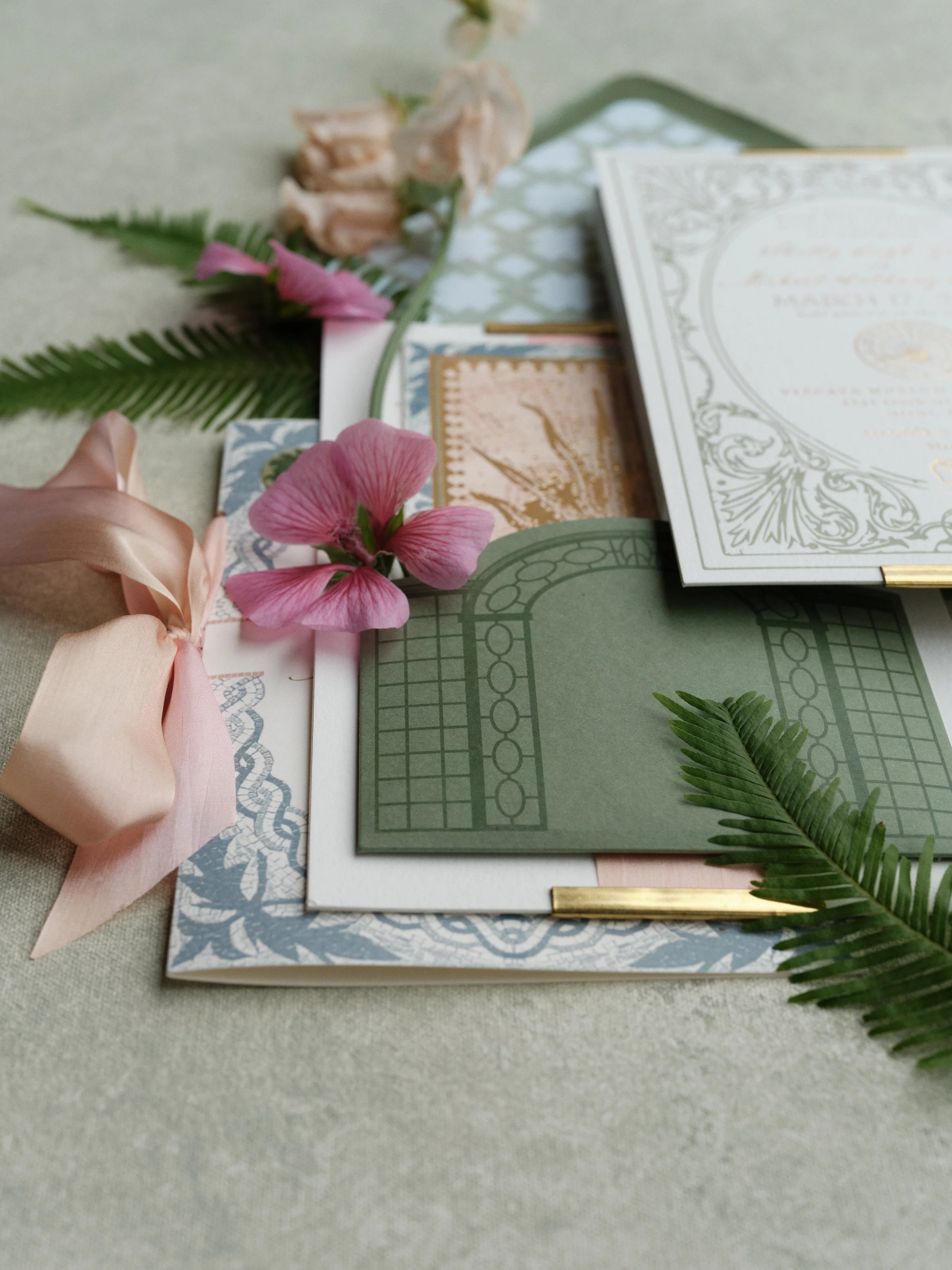
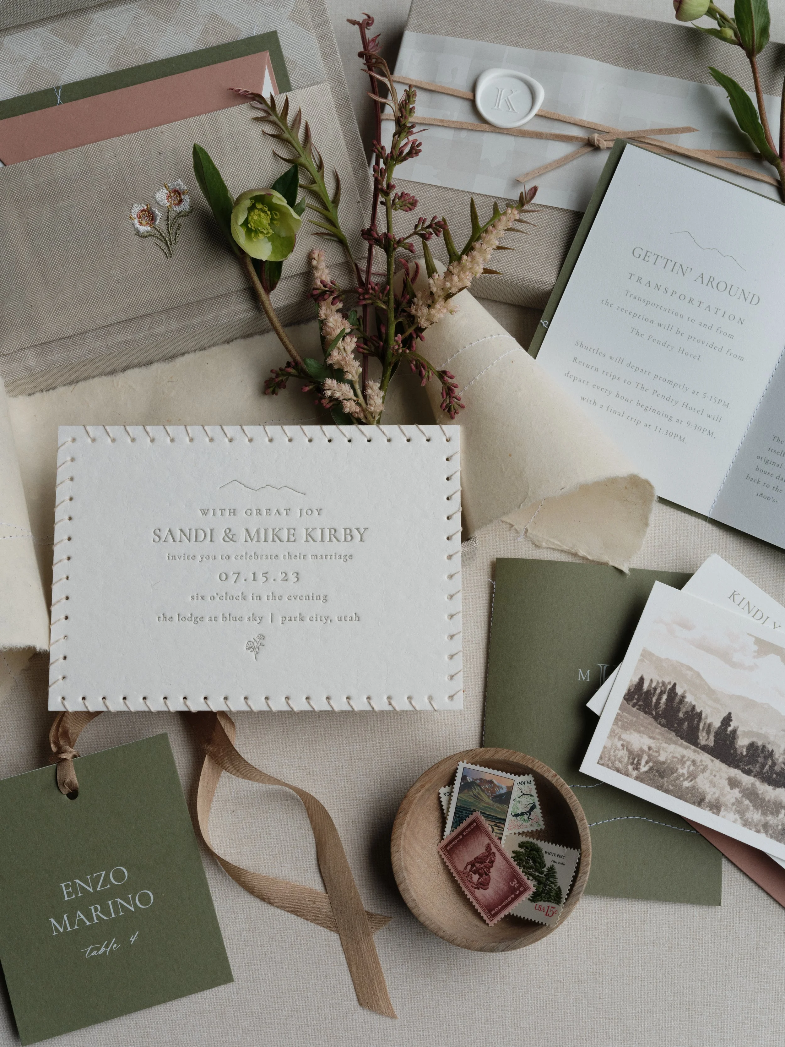
This is what a gathered arrangement looks like when every element earns its place. Layered stationery suite, blush ribbon leading line, pink geranium accent, tropical ferns framing both edges. If your gathered flat lays feel cluttered rather than curated, the difference is in how deliberately each supporting element is assigned its role.
Frequently Asked Questions About Flat Lay Composition
What is the most important composition rule for flat lay photography?
Establishing a clear visual hierarchy. Every flat lay needs one element that immediately draws the viewer's eye (the "hero"), with all other objects playing supporting roles. Without hierarchy, you have a collection of objects instead of a composed image. Size, contrast against your surface, and strategic placement at power points in your compositional framework all contribute to hierarchy.
What is the rule of thirds in flat lay photography?
The rule of thirds divides your frame into a 3x3 grid. Placing your hero element at one of the four intersection points rather than dead center creates natural visual interest and a more dynamic composition. It's the foundational compositional framework, and most cameras can display this grid overlay in your viewfinder or live view. For more advanced options, explore the golden spiral, diagonal method, and phi grid covered earlier in this guide.
How much negative space should a flat lay have?
It depends on the purpose. For social media, aim for roughly 50% objects and 50% surface. For editorial submissions, push toward 40% objects and 60% space (editors need room for text). For single-object hero shots, 30% or even 20% objects works beautifully. The key insight: negative space isn't wasted space. On a hand-painted surface with subtle texture and tonal variation, it becomes an active part of the composition.
How do I make my flat lay compositions look more editorial?
Four changes create the biggest editorial impact. First, let elements extend beyond the frame edges. Second, use more negative space than feels comfortable. Third, introduce diagonal angles rather than squaring everything to the frame. Fourth, work on a surface with organic tonal variation rather than a plain flat color. These four adjustments, combined, will shift your work closer to what you see in magazine features.
How do I balance a flat lay composition?
Balance is about visual weight, not symmetry. Dark objects, saturated colors, and heavily textured items carry more visual weight than light, muted, or smooth ones. Distribute this weight across your frame so no single area feels heavier than the rest. A large dark element on one side can be balanced by two or three smaller elements on the other, or by a single element placed further from center.
What's the difference between flat lay composition types?
Four main types: gathered (objects in a loose natural cluster, feels organic and personal), scattered (elements distributed across the frame with intentional irregularity, feels editorial and dynamic), grid (objects in rows or columns with consistent spacing, feels graphic and organized), and minimal (one or two objects in generous space, feels editorial and confident). Professional photographers shift between all four on a single wedding day.
Why do my flat lays look amateur even with nice styling?
The most common culprits are centered placement (move your hero off-center), equal visual weight across all objects (create clear hierarchy through size and contrast variation), no elements leaving the frame (let ribbon or foliage extend past edges), and not enough negative space (remove objects until the composition breathes). Our 10 Common Flat Lay Mistakes guide covers additional technical issues to check.
Build a Collection That Supports Your Strongest Compositions
Every composition rule in this guide works on any styling surface. But they work noticeably better when your surface contributes tonal variation, organic texture, and visual depth rather than just sitting passively beneath your objects.
Every Chasing Stone surface is hand-painted by Jennifer in our Orange County, California studio. The subtle brushstroke texture, gentle tonal shifts, and organic color variation aren't just aesthetic choices. They're functional composition tools that activate negative space, provide natural contrast for eye flow, and give your flat lays the dimensional, editorial quality that books premium clients and gets published.
Explore the full collection of hand-painted flat lay surfaces, spill-proof fabric flat lay mats, and hand-painted canvas backdrops at chasingstone.com.

Creators of premium photography backdrops and styling surfaces
Trusted by thousands of discerning creatives worldwide
Every piece is handcrafted with intention in Orange County, California