
Skin Tone and Backdrop Color: A Photographer's Guide to Flattering Every Client
February 24, 2026 · 14 min read
You can nail the lighting. You can nail the pose. You can coach the most natural, gorgeous expression out of your client. But if the backdrop behind them is casting a sickly green undertone across their jawline or washing out the warmth in their skin, none of that matters. The image falls flat in a way that's hard to fix in post, and harder still to explain to a client who wonders why they don't look like themselves in their own portraits.
The relationship between backdrop color and skin tone is one of the most underappreciated technical skills in portrait photography. It's not something most photographers think about when they're starting out, because it's not as visible as lighting mistakes or composition errors. But once you understand it, you start seeing it everywhere: in the portraits you admire, in the work that books premium clients, and in the subtle reason why certain images just feel right while others feel slightly off.
This guide is the practical breakdown. Not abstract color theory (we have a separate deep guide for that), but the real-world, session-by-session knowledge of which backdrop colors flatter which skin tones, why they work, and how to build a backdrop collection that handles every client who walks through your door.
Wedding season is coming. Do you know which backdrop color will actually flatter your bride's skin tone? This guide breaks down the pairings that make every complexion glow.
Why Backdrop Color Affects Skin Tone (The Physics You Need to Know)
Before we get into specific pairings, it helps to understand what's actually happening when a backdrop interacts with your subject's skin. This isn't just aesthetic preference. It's physics.
Every surface in a photograph reflects light. Your backdrop is typically the largest single-color surface in the frame, which means it's reflecting a significant amount of colored light back onto your subject. Photographers call this "color spill" or "color contamination," and it's happening whether you notice it or not.
A bright green backdrop throws green reflected light onto the edges of your subject's face, neck, and shoulders. A deep red backdrop warms the shadow side of the face. Even a white backdrop can cool the color temperature of the light reaching your subject, depending on the ambient conditions.
This reflected light is most visible on skin, because skin is translucent. Unlike fabric or hair, skin allows light to penetrate slightly below the surface before bouncing back. This is called subsurface scattering, and it's the same optical property that makes skin look alive rather than like painted plastic. But it also means skin picks up environmental color casts more readily than any other surface in your frame.
The practical takeaway: your backdrop color is essentially a secondary light source. It's influencing how your subject's skin renders in the final image, and it's doing so across every shot in the session. Getting this relationship right at the point of capture saves you hours of color correction work later and produces images with a warmth and accuracy that no amount of editing can replicate from scratch.
Understanding Skin Undertones (The Foundation of Every Good Pairing)
Skin tone is surface-level: how light or dark someone's complexion appears. Undertone is what's happening beneath that surface, and it's the variable that actually determines which backdrop colors will flatter and which will clash.
There are three undertone categories, and every human being on the planet falls somewhere in this spectrum regardless of their surface skin tone.
Warm undertones show yellow, golden, or peachy hues beneath the skin's surface. If you look at the veins on the inside of someone's wrist and they appear greenish, that person likely has warm undertones. Warm-undertoned skin tends to tan easily and looks best in gold jewelry. This undertone is common across a wide range of complexions, from fair with golden freckles to deep with rich amber warmth.
Cool undertones show pink, red, or bluish hues beneath the surface. Veins appear blue or purple. Cool-undertoned skin tends to burn before tanning and looks best in silver jewelry. Again, this crosses all complexion depths, from porcelain-fair with pink cheeks to deep with blue-black richness.
Neutral undertones are a balanced mix of warm and cool. Veins appear blue-green. Neutral-undertoned individuals can typically wear both gold and silver jewelry without one looking obviously better. They're the most flexible subjects from a backdrop perspective, but even neutral undertones lean slightly warm or slightly cool.
Here's the critical insight for photographers: undertone matters more than surface depth when choosing a backdrop. A fair-skinned client with warm golden undertones and a deep-skinned client with warm golden undertones will often be flattered by the same family of backdrop colors, even though their complexions look completely different at a glance. The undertone is the constant. The surface depth just determines how much contrast the backdrop needs to provide.
The Universal Rule (and When to Break It)
The conventional wisdom you'll hear in every photography education context is simple: warm skin tones pair with cool backdrops, and cool skin tones pair with warm backdrops. This complementary approach creates contrast and visual separation between the subject and the background.
That rule works. It's a solid starting point, and if you followed it exclusively for your entire career, you'd produce competent portraits. But it's also incomplete, and following it rigidly will limit your creative range and your ability to serve specific client needs.
Here's what the conventional rule misses: complementary contrast isn't always the goal. Sometimes you want harmony. Sometimes the most flattering portrait is one where the backdrop and the skin exist in the same tonal family, creating a cohesive, enveloping warmth that wraps around the subject. This analogous approach (backdrop and skin in related color families) produces images that feel intimate and intentional. It's the approach that defines editorial portraiture and fine art work, and it's the approach that clients paying premium prices are increasingly drawn to.
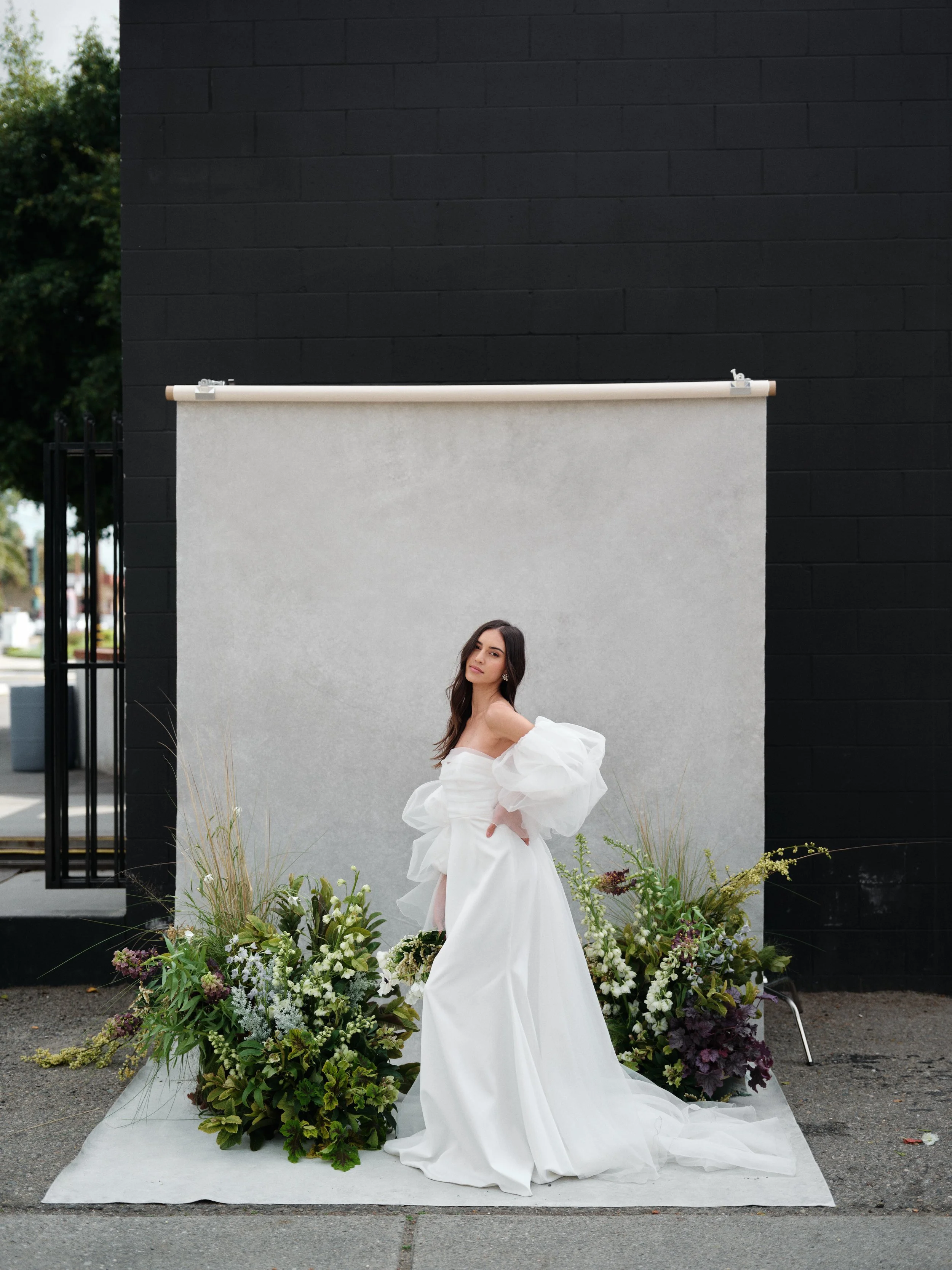
Dark backdrops don't have to swallow your subject. When the lighting is sculpted and the warm tones in your styling balance the cool of the backdrop, fair skin holds its glow beautifully against the depth.
The real skill isn't memorizing whether warm pairs with cool or warm pairs with warm. The real skill is reading the specific person in front of you, understanding what the image needs to accomplish, and choosing accordingly. A corporate headshot for a law firm website might call for complementary contrast and a neutral backdrop that lets the subject command attention. A maternity portrait might call for analogous harmony and a soft warm backdrop that creates a cocoon of warmth around the expectant mother. Same client could appear in both scenarios with completely different backdrop needs.
The best backdrop choice isn't the one that follows a rule. It's the one that makes your specific client look like the best version of themselves in the context of what the image needs to accomplish.
Practical Pairings: Fair Skin Tones
Fair skin is the most reactive to backdrop color because it reflects the most environmental light back to camera. The translucency is higher, which means subsurface scattering picks up backdrop color spill more aggressively than medium or deep skin tones. Small backdrop color shifts that are invisible on deeper complexions can be dramatically visible on fair skin.
What Works
Warm neutrals and soft earth tones. This is the safest, most universally flattering family for fair skin with any undertone. Colors in the taupe, sand, and warm putty range create gentle warmth that makes fair skin glow without overwhelming it. There's a reason portrait photographer Lindsay Adler, one of the most-published educators in the industry, has publicly cited warm beige as one of her two essential backdrop colors. It works because it adds warmth to the skin without shifting the hue. The skin looks healthier, more dimensional, and more alive.
Our LIMESTONE lives in this range, a light warm tan that photographs as a sophisticated neutral under virtually any lighting condition. For fair skin specifically, it provides enough warmth to prevent the washed-out look that white and cool gray backdrops can create, while staying subtle enough that it never competes with the subject.
Muted sage and dusty green. For fair skin with warm (golden or peachy) undertones, muted greens create a beautiful complementary relationship that's gentle rather than jarring. The green backdrop enhances the natural warmth in the skin without the intensity that a saturated green would create. Think soft olive, dusty sage, faded moss, not kelly green or emerald. CELADONITE and OLIVINE both work beautifully here, with CELADONITE being the lighter, airier option and OLIVINE providing more depth.
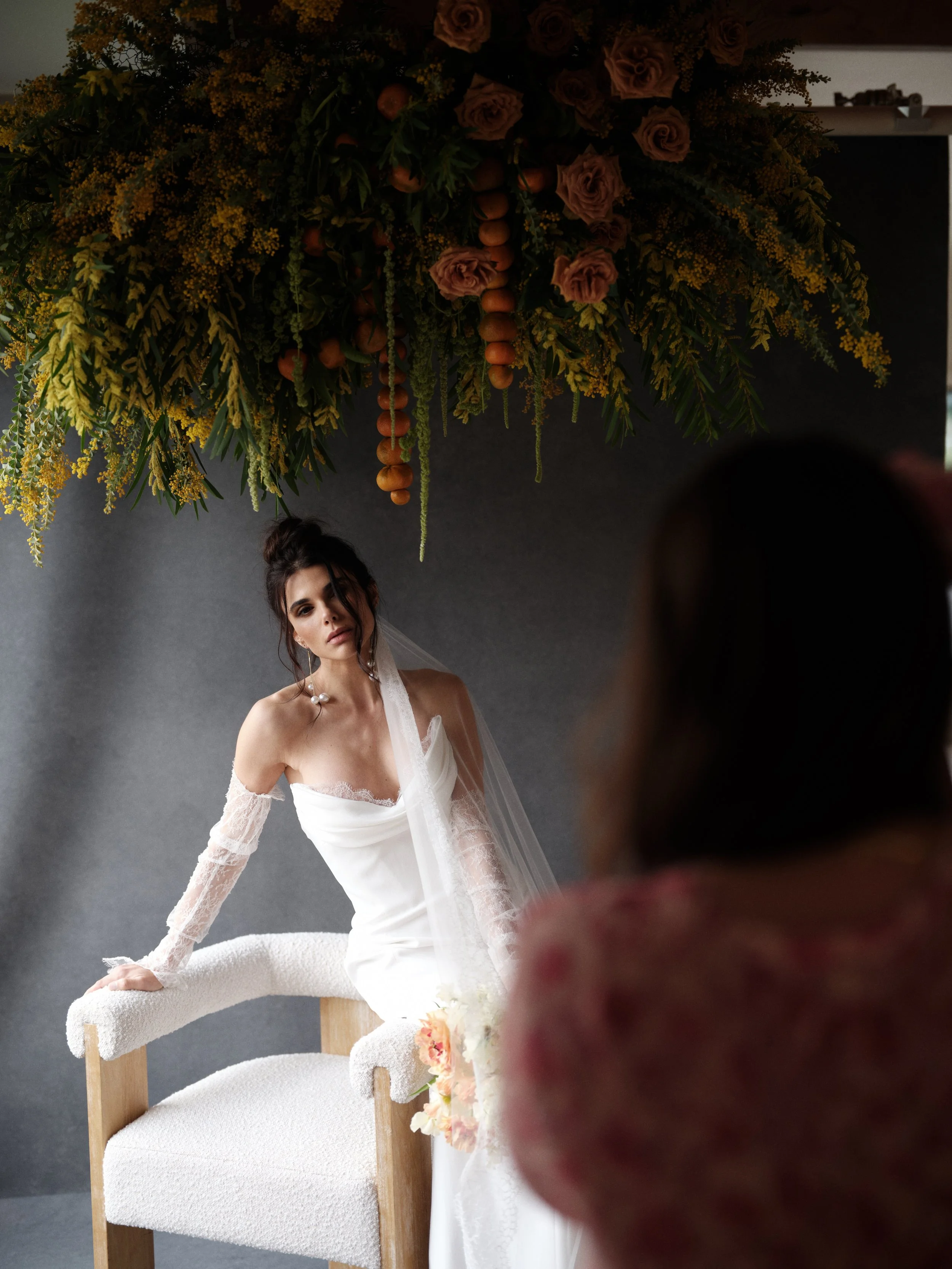
Soft lavender and muted mauve. For fair skin with cool (pink or rosy) undertones, soft purple-family colors create analogous harmony that enhances the natural blush in the complexion. This is a classic combination for bridal portraits and feminine-leaning editorial work. LAVENDER QUARTZ was designed specifically for this kind of pairing, with enough warmth in the undertone to avoid looking cold or clinical.
What to Avoid
Pure white backdrops can make fair skin look flat and lifeless in natural light because there's no tonal contrast or warmth to anchor the subject. Cool grays without any warmth create a clinical, corporate feel that works for headshots but can make fair skin look pallid in softer portrait contexts. Saturated warm colors (bright orange, true red) can overwhelm fair complexions and cast noticeable color spill on the edges of the face.
Practical Pairings: Medium Skin Tones
Medium skin tones, from olive and golden to warm bronze, are the most versatile from a backdrop perspective. The moderate level of melanin provides enough inherent contrast that these skin tones hold their ground against a wider range of backdrop colors. They're less reactive to color spill than fair skin and don't require as much deliberate contrast as deep skin.
This is the skin tone range where you can take the most creative risks with backdrop color, and where the difference between a good and great backdrop choice is often about mood and intention rather than technical flattery.
What Works
Rich earth tones and warm browns. This is analogous harmony at its best. Golden and bronze skin tones against warm brown backdrops create a monochromatic richness that reads as sophisticated and intentional. The key is that the backdrop needs to be clearly lighter or darker than the skin to maintain separation. If the tonal values are too similar, the subject fades into the background rather than emerging from it.
BENTONITE (mid-taupe with warm grey undertones) and SANDSTONE (light peach-brown) both offer warm earth-family colors with enough tonal variation to provide separation against medium complexions. For darker medium tones, CLAY, a faded terracotta, creates a striking complementary warmth that brings out golden undertones beautifully.
Deep, saturated jewel tones. This is where medium skin tones get to shine in ways that lighter and deeper complexions sometimes can't. A rich emerald green, deep plum, or saturated navy creates dramatic contrast that medium skin handles with confidence. The skin reads as warm and luminous against the depth of the color. These are editorial choices that photograph dramatically and translate beautifully to large-format prints, the kind of wall art that becomes the centerpiece of a room. SERPENTINE, our dark moss green, and AMETRINE, a mid-purple with amethyst tones, are both strong options for this kind of work.
Warm muted pinks and terracotta. Olive-undertoned skin (common in Mediterranean, Middle Eastern, and Latin American complexions) benefits enormously from warm pinks and terracottas. These colors counteract the greenish-yellow cast that olive skin can sometimes take on in photographs, bringing out the underlying warmth and creating a healthy, vibrant look. This is one of the most impactful backdrop choices you can make for clients with olive skin, and it's a pairing that many photographers don't realize exists until they see it in practice.
If you've ever wondered why some portraits just feel warm and natural while others look slightly off, the answer is usually the backdrop. A warm neutral behind fair skin with golden undertones creates that effortless glow that clients love and that's almost impossible to recreate in editing.
What to Avoid
Yellow and orange backdrops can be tricky with golden-undertoned medium skin because the color families are too close. Instead of creating harmony, they can make the skin look sallow or jaundiced. Cool gray without warmth can make olive skin look greenish. True black can work but requires careful lighting to avoid losing the subject into the shadows, particularly with darker medium complexions.
Practical Pairings: Deep Skin Tones
Deep skin tones are the most stunning canvases in portraiture, and they're also where photographers most frequently make backdrop mistakes, usually by defaulting to safe choices rather than embracing what actually makes deep skin look extraordinary.
The photography industry has a well-documented history of underserving darker skin tones, from film stocks calibrated to lighter complexions to digital camera sensors with limited dynamic range in deeper tones. While technology has improved dramatically, the backdrop conversation hasn't always kept pace. Too many guides default to recommending dark backgrounds "to avoid too much contrast," which often results in images where the subject disappears rather than commanding the frame.
What Works
Warm mid-tones are your foundation. The sweet spot for deep skin tones is backdrops that are clearly lighter than the skin without being so light they create harsh contrast. Warm taupes, caramels, and sand tones create a tonal range that lets deep skin be the richest, most saturated element in the frame while still providing enough contrast for the subject to clearly separate from the background. Fashion photographer Jade Keshia Gordon, who specializes in photographing darker skin tones, has identified nudes, browns, and pinks as her go-to backdrop colors for exactly this reason.
SANDSTONE, LIMESTONE, and MICA (light tan with golden shimmer undertones) all live in this mid-tone warm range and create beautiful results with deep skin. The hand-painted texture in these surfaces also matters significantly: the subtle variations in color catch light at different angles, creating a backdrop that has dimension and life rather than sitting flat behind the subject.
Warm pinks and muted mauve. Pink-family backdrops create a surprisingly flattering effect against deep skin tones. The pink brings out warmth and radiance in the complexion without competing for attention. This is particularly effective for bridal portraits, editorial beauty work, and any context where the goal is to make the skin look luminous and healthy. RHYOLITE and LAVENDER QUARTZ both work in this territory.
Bold, saturated color. Deep skin tones handle saturated color better than any other complexion. A vibrant rust, deep teal, or rich plum creates breathtaking portraits where the skin and the backdrop each bring out the best in the other. The natural richness of deep skin provides grounding warmth, while the saturated backdrop provides energy and visual interest. These are the portfolio images that stop people mid-scroll and get shared across social media, because they're not playing it safe. PURPURITE, our dark mauve with magenta undertones, creates particularly striking results against deep, warm-undertoned skin.
True black for intentional drama. Black backgrounds work with deep skin tones, but not by default. They work when the lighting is deliberate and sculpted, creating highlights and contours that allow the subject's features to emerge from the darkness with dimensionality. This is Rembrandt lighting territory, where the drama comes from carefully controlled pools of light rather than overall illumination. When done well, it's breathtaking. When done carelessly (flat lighting against a dark backdrop), the subject gets lost.
What to Avoid
Pure white backdrops without careful lighting can create an unflattering contrast ratio that makes deep skin look darker than it actually appears, particularly in digital capture where dynamic range limitations are most exposed. Cool grays can flatten the richness of deep skin by stripping warmth from the image. Yellow and orange backdrops can cause blending issues where the warm tones of the skin and the warm tones of the backdrop merge rather than contrasting.
The Texture Variable (Why Material Matters as Much as Color)
Everything above assumes a flat, uniform backdrop color. But here's where it gets interesting: texture changes the equation.
A solid-color backdrop reflects light uniformly. Every point on the surface sends the same color back toward your subject. A textured backdrop, particularly a hand-painted canvas with visible brush variation, reflects light at different angles across the surface. Some areas catch more light and appear lighter. Some areas sit in micro-shadows and appear darker. The overall color spill onto your subject is softer, more diffused, and more natural because it's not a single uniform color cast.
This is a significant practical advantage. A hand-painted backdrop in a warm taupe will produce gentler, more forgiving color interaction with skin tones than a solid taupe seamless paper, because the color variation in the painted surface creates a more complex, less aggressive reflected light. The effect on skin is subtler and more organic. For a detailed look at how hand-painted texture changes the way light and color behave in portraits, our guide to The Art of Imperfection covers this in depth.
Texture also provides a visual benefit beyond color interaction. A textured backdrop creates tonal separation between the subject and the background through surface detail alone, which means you're less dependent on dramatic color contrast to achieve subject separation. You can choose a backdrop in a similar tonal range to your subject's skin (analogous harmony) without the subject blending into the background, because the texture provides visual distinction that a solid color would not.
This is one of the key reasons hand-painted canvas produces more consistently flattering portraits across diverse skin tones than seamless paper or vinyl. The texture does heavy lifting that solid-color surfaces simply can't. Our hand-painted canvas vs. muslin comparison breaks down the material differences in detail.
Building a Skin-Tone-Inclusive Backdrop Collection
If your client base includes people of all skin tones (and if you're running a portrait business in 2026, it should), your backdrop collection needs to work across the full spectrum. Here's how to build one strategically.
The Two-Backdrop Starting Point
If budget constrains you to two backdrops, choose these:
One warm neutral in the light-to-mid taupe range. This is your every-session workhorse. A warm taupe with enough depth to provide separation against fair skin and enough lightness to provide contrast against deep skin. BENTONITE is specifically designed to sit in this universal range. It's the backdrop equivalent of a 50mm lens: not flashy, not specialized, just reliably beautiful across virtually every scenario.
One warm mid-tone with gentle color. This could be a soft blush, muted sage, or warm clay. It gives you a second "look" that adds emotional variety to your sessions without introducing colors that clash with any skin tone. The key word is "muted." Saturated colors are harder to make universally flattering. Desaturated, warm-leaning colors with painterly texture work across the widest range of complexions.
Expanding to a Full Collection
Once you've established your foundation and understand how you actually use it in sessions, expand by adding:
A rich, warm dark tone. UMBER (dark chestnut brown) or SILT (dark taupe with brown undertones) for moody editorial work. These dark backdrops provide drama without the harsh contrast that pure black creates, and they maintain enough warmth to flatter skin tones that cool darks would make look ashy.
A bold signature color. This is the backdrop that defines your brand. A saturated green, a deep plum, a rich rust. Choose it based on the work you want to attract, and know that it will work best with certain skin tone ranges. That's fine. Your signature look doesn't need to be universal. It needs to be you.
Our backdrop buying guide covers sizing for each of these collection tiers, and the three-backdrop studio bundle makes the initial investment more accessible if you're building from scratch.
Lighting Adjustments That Make Any Backdrop Work Better
Even the most perfectly chosen backdrop color can be undermined by poor lighting, and a slightly imperfect backdrop choice can be rescued by good lighting. Here are the lighting variables that interact most directly with backdrop-skin relationships.
Distance between subject and backdrop. The farther your subject stands from the backdrop, the less color spill affects their skin. At 6-8 feet of separation, reflected color from the backdrop becomes negligible on most surfaces. At 2-3 feet (common in small studios or on-location setups), color spill is significant. If you're working in tight spaces, choosing warm neutrals over saturated colors becomes more important specifically because of color spill at close distances.
Light direction and backdrop illumination. If your backdrop is lit separately from your subject, you have control over how much light it reflects. A brighter backdrop reflects more color onto the subject. Pulling light off the backdrop (letting it fall into relative shadow) reduces color spill and deepens the apparent color, which can make a mid-tone backdrop function as a dark backdrop and shifts the skin-tone interaction accordingly. Our guide to lighting hand-painted backdrops with natural light covers these techniques in detail.
White balance and color temperature. Your camera's white balance directly affects how both the skin and the backdrop render. Shooting warmer (higher Kelvin) makes warm-toned backdrops appear richer and cooler backdrops appear more neutral. Shooting cooler (lower Kelvin) makes cool backdrops more pronounced and warm backdrops more subdued. Getting your white balance right in camera, rather than correcting in post, preserves the natural relationship between skin and backdrop that you saw with your eye on set.
Flagging and negative fill. A black flag or V-flat placed between the backdrop and the subject's shadow side blocks reflected color spill from the backdrop while maintaining the backdrop's appearance in the frame. This is the professional solution for using saturated backdrops at close distances without color contamination. It's a simple tool that dramatically expands the range of backdrop colors you can use effectively with any skin tone.
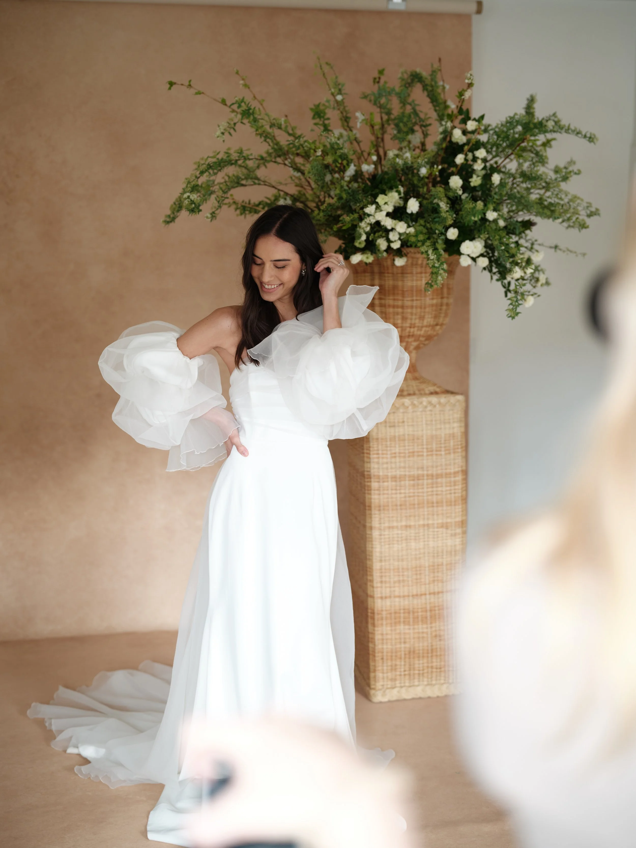
The backdrop behind your subject isn't just a background. It's a secondary light source. This warm neutral canvas brings out the golden warmth in medium skin tones without color spill, giving you images that need almost no color correction in post.
Session-Specific Backdrop Recommendations
Different types of sessions have different requirements for how backdrop color relates to skin tone. Here's the practical breakdown by session type.
Wedding Portraits
You're photographing a bride (and sometimes a couple, bridal party, or family) whose skin tone you typically know in advance from engagement sessions or consultations. The backdrop needs to work with white or ivory gown fabric, with the wedding's color palette, and with the subject's skin. Warm neutrals dominate here because they meet all three requirements simultaneously. They complement white fabric, they harmonize with virtually any wedding color scheme, and they flatter across skin tone ranges.
For wedding photographers, our 2026 wedding photography trends guide covers how backdrop color trends are evolving and what's booking premium clients this year. The complete guide on how wedding photographers use hand-painted backdrops shows these principles in action across real sessions.
Corporate Headshots
Skin tone flattery is important, but so is projecting professionalism. Warm neutrals and warm grays work across all skin tones while reading as polished and corporate-appropriate. Avoid cool grays for warm-undertoned clients, as they can create an unnatural color tension. Our portrait photography backdrops guide covers the full spectrum of non-wedding portrait scenarios.
Maternity and Newborn
Intimacy and warmth are the priority. Soft, warm-leaning colors that create a cocoon-like environment around the subject. This is analogous harmony territory: warm skin against warm backdrop, with the textural variation of hand-painted canvas providing the visual interest that a solid color would lack. Our newborn photography backdrops guide goes deep on the specific considerations for photographing babies, including how backdrop color interacts with newborn skin, which is significantly more reactive to environmental color than adult skin.
Boudoir
Mood and emotion are driving the backdrop choice more than strict skin-tone flattery. Deep, rich colors (dark plum, warm brown, muted mauve) create the intimate atmosphere that boudoir work requires. Warm neutrals work but may read as too conservative for the genre. The key is that whatever color you choose should have warmth in it. Cool darks can create an unintentionally harsh or cold mood that works against the vulnerability and intimacy that boudoir photography aims to capture.
The Mistake Most Photographers Make (and How to Avoid It)
The single biggest mistake photographers make with backdrop color selection isn't choosing the wrong color. It's choosing for themselves instead of for the client.
You might love moody greens because they match your brand aesthetic. But if your next client has olive-undertoned medium skin, that moody green might make their complexion look sallow. You might prefer light, airy creams because they fit your editing style. But for a client with very fair, cool-undertoned skin, that cream backdrop might wash them out completely.
The professional approach is to look at the person in front of you and choose accordingly. This is why the minimum viable collection for a working portrait photographer is at least two to three backdrops that cover different tonal ranges. You need options. One backdrop, no matter how beautiful, cannot flatter everyone.
This is also why the initial consultation or pre-session questionnaire is so valuable. When you know your client's skin tone in advance, you can prepare the right backdrop before they arrive. You save setup time. You avoid the awkwardness of switching backdrops mid-session because the first choice isn't working. And you project the kind of expertise and preparedness that clients remember when they write reviews and send referrals.
Where Color Theory Meets the Real World
Color theory gives you the framework. Real-world experience gives you the judgment. The best backdrop recommendations in this guide will get you 90% of the way to consistently flattering portraits. The remaining 10% comes from shooting, evaluating, and refining your eye over hundreds of sessions.
Pay attention to which images clients select for their wall art orders. Note which backdrop-skin combinations consistently get the most enthusiastic responses. Track which pairings you find yourself color-correcting in post versus the ones that need almost no adjustment. Over time, you'll develop an intuitive understanding of what works that goes beyond any written guide, including this one.
The photographers commanding the highest rates in 2026 aren't the ones with the most expensive gear or the most elaborate setups. They're the ones who understand how all the elements in a portrait work together to flatter their subject, and who show up to every session with the tools and knowledge to make every client look extraordinary regardless of their complexion. Backdrop choice is one of the most controllable, highest-impact variables in that equation.
For the foundational color theory knowledge that underpins everything in this guide, our Color Theory for Photographers guide covers the wheel, harmony types, and contrast principles from the ground up. For the practical backdrop selection guidance that follows from this color knowledge, our Ultimate Photography Backdrop Guide for 2026 connects the dots between theory and purchasing decisions.
Ready to build a backdrop collection that flatters every client? Explore hand-painted canvas backdrops in warm neutrals, muted tones, and rich darks, each one handcrafted in California with the painterly texture that creates natural, forgiving color interaction with every skin tone.
Shop Backdrops → | See Our Collection →
Sources & References: Subsurface scattering principles in human skin rendering, as documented in Jensen et al. (2001), "A Practical Model for Subsurface Light Transport," published in Proceedings of ACM SIGGRAPH. Color spill and reflected light behavior in studio photography, per "Light Science & Magic" by Fil Hunter, Steven Biver, and Paul Fuqua (5th edition, Routledge). Lindsay Adler's published backdrop recommendations via Savage Universal and SLR Lounge educational content. Jade Keshia Gordon's guide to photographing darker skin tones via Digital Camera World. Color psychology research from the Journal of Experimental Psychology: General on warm vs. cool color perception. Munsell Color System documentation on skin tone classification used in dermatological and photographic applications. Professional Photographers of America (PPA) portrait pricing benchmarking data.

Creators of premium photography backdrops and styling surfaces
Trusted by thousands of discerning creatives worldwide
Every piece is handcrafted with intention in Orange County, California