Flat Lay Photography Ideas: 100+ Examples for Every Photography Niche
Posted on Feb. 19, 2026
You have the camera. You have the eye. But every flat lay photographer hits the same wall eventually: you stare at a surface full of objects and think, what am I actually doing with this composition?
Whether you're a wedding photographer styling invitation suites on Saturday mornings, a food photographer building out recipe content, or a product photographer shooting skincare lines for DTC brands, flat lay photography is one of the most versatile (and most creatively demanding) skills in your toolkit. The overhead angle strips away the depth and dimension you normally rely on, which means composition, color, texture, and styling have to do all the heavy lifting.
That's why we built this guide. Not another surface-level listicle with five generic tips. This is a working reference organized by photography niche, packed with specific, actionable flat lay photography ideas you can bring to your next shoot. We've sourced techniques from professional photographers across industries and paired them with real-world styling advice that actually translates from concept to camera.
If you're newer to flat lay work, our Ultimate Flat Lay Photography Guide covers the foundational workflow from start to finish. Consider this companion piece your idea vault.
A note on surfaces: Every flat lay idea in this guide depends on the surface underneath it. A beautifully styled composition falls apart on a distracting or cheap-looking background. We'll mention surface recommendations throughout, but if you want the deep breakdown on choosing the right one, our Complete Flat Lay Surface Guide has everything you need.
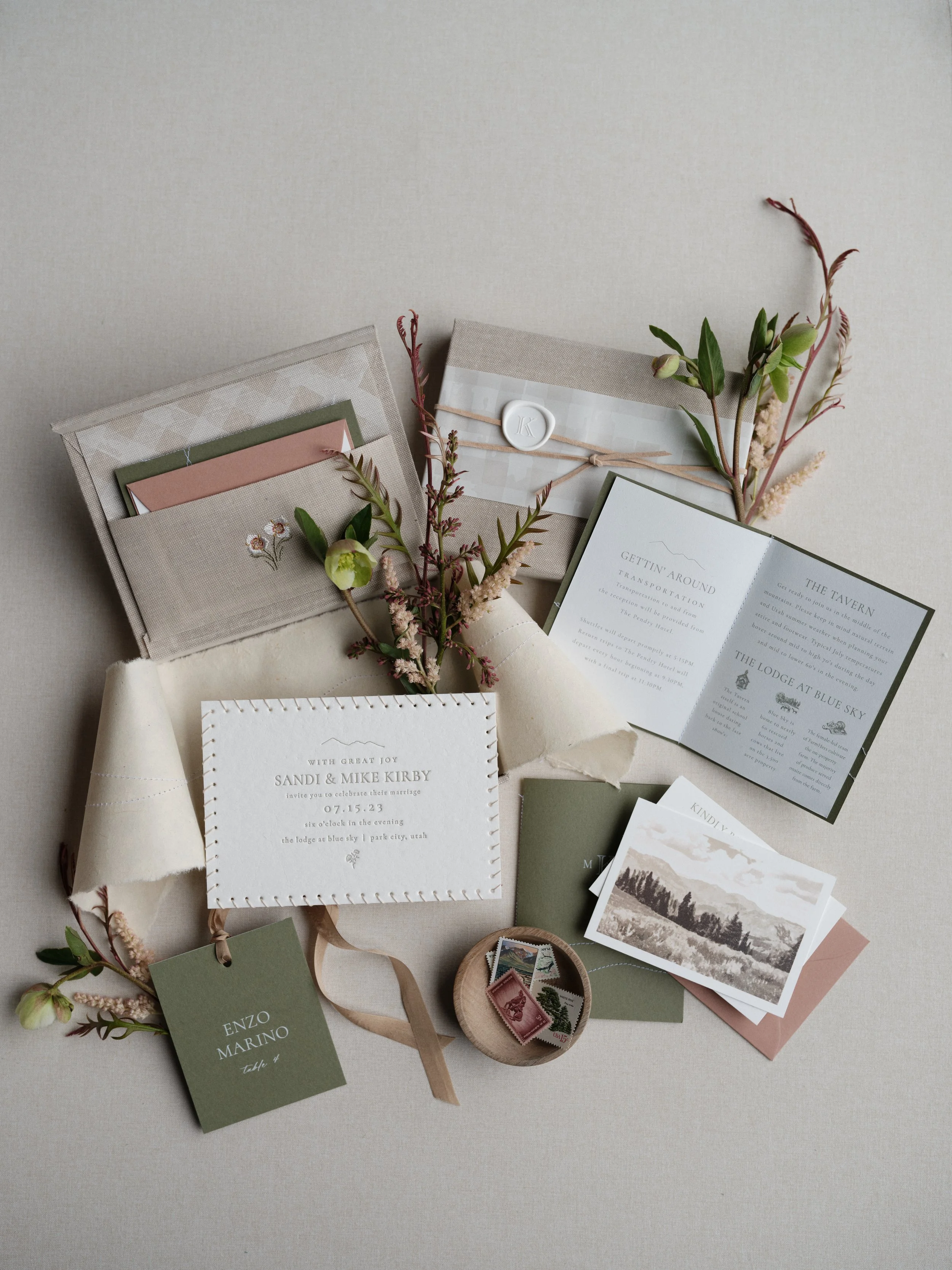
The difference between a flat lay that gets featured and one that gets scrolled past? It starts with the surface underneath. This sage and blush invitation suite was styled on a hand-painted neutral that lets every detail shine without competing for attention.
Wedding Flat Lay Photography Ideas
Wedding detail photography is where flat lay work matters most to your bottom line. These images land in galleries, get featured in publications, fill your Instagram grid, and directly influence how couples perceive the quality of your work. A strong flat lay section in a wedding gallery tells potential clients that you care about the full story of their day, not just the big moments.
The challenge is that you're working with someone else's objects, on someone else's timeline, often in less-than-ideal lighting conditions. Having a mental library of composition ideas before you arrive is what separates stressed from confident on a wedding morning.
Invitation Suite Compositions
The full suite spread. Lay every piece of the invitation suite out individually so the couple can see each card, envelope, and insert in context. Place the main invitation at center, then radiate outward with the RSVP card, details card, envelope with calligraphy, and any envelope liner. This is often the first flat lay you'll create on a wedding morning, and it sets the tone for everything that follows.
The envelope liner reveal. Request two envelopes from the stationer (or ask the couple to save extras). Place one face-up showing the calligraphy and another open to expose the liner. This immediately doubles the visual interest without adding any extra elements.
The vow book pairing. Place handwritten vow books alongside the invitation suite to create a narrative connection between the couple's first communication with guests and their private promises to each other. The contrast between printed stationery and handwritten text adds texture to the composition.
The wax seal detail. If the suite includes wax seals, position one or two loose seals near the sealed envelope to show both the process and the finished product. Extra wax beads scattered sparingly around the edges add organic texture without cluttering the frame.
The layered stack. Rather than spreading everything flat, angle cards at slight overlaps so each piece is visible but they're connected as a cohesive suite. This works especially well when the stationery has textural elements like letterpress, foil stamping, or deckled edges that catch the light differently at angles.
The ring-on-paper placement. Set the engagement ring or wedding bands directly on a word or phrase from the invitation that holds meaning. "Forever" or the couple's names work well. Use a macro lens or close crop for this shot.
The botanical frame. Ask the florist for trimmings and loose stems, then use flowers and greenery to frame the invitation suite. Position florals along two adjacent edges (creating an L-shape) rather than surrounding the entire suite, which tends to look busy from above.
The textile layering shot. Place a piece of silk ribbon, linen napkin, or velvet fabric underneath one corner of the invitation suite so it peeks out and adds color and texture without competing with the stationery itself.
The stamp story. Vintage stamps, custom postage, or international stamps tell a story. Lay the stamped envelope alongside the suite and include a few loose stamps as props. This is a detail most photographers overlook entirely.
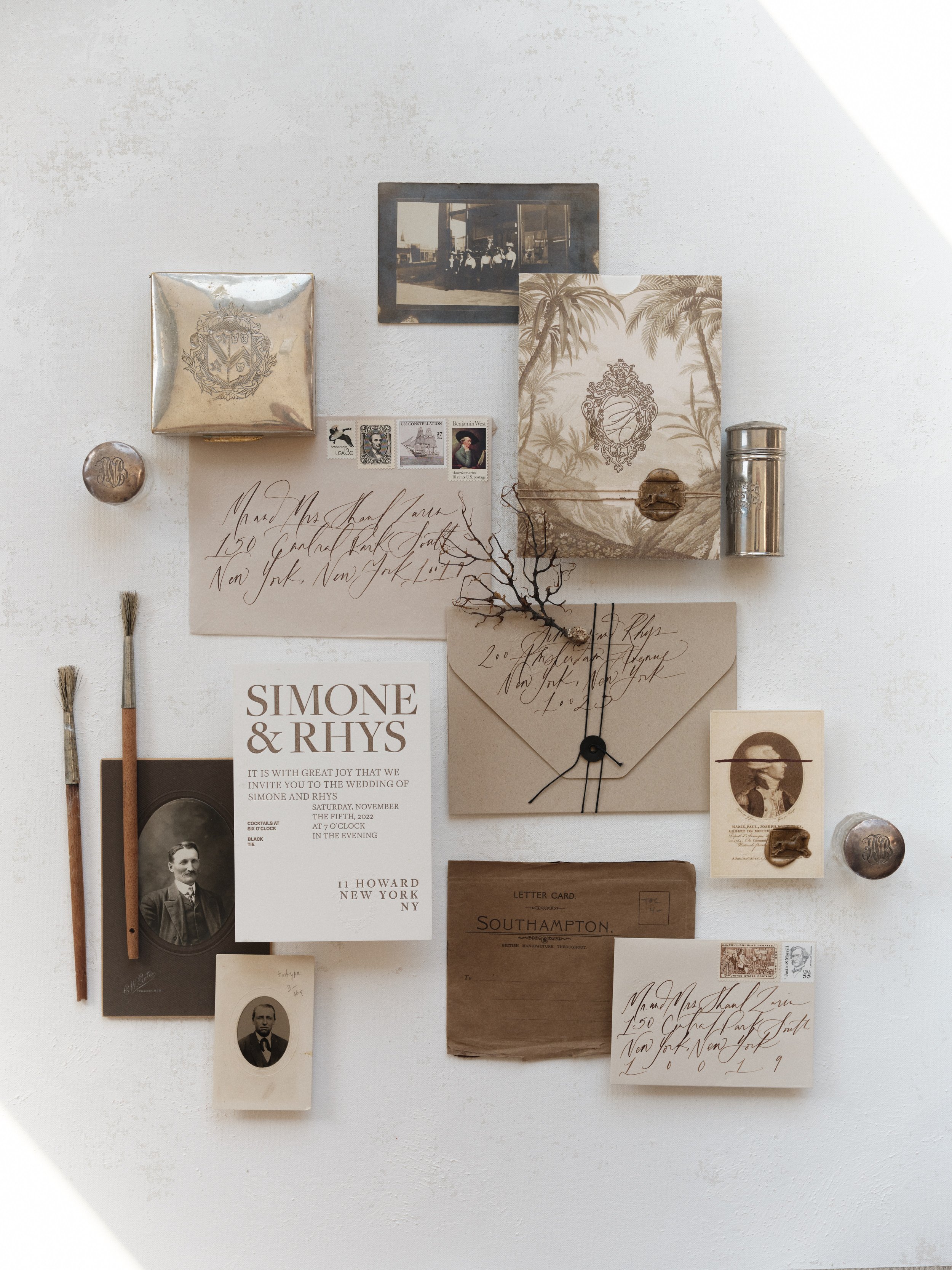
You found the perfect vintage props for your styled shoot but now the composition feels busy and disconnected. The fix? A neutral surface that unifies everything. When the background does the heavy lifting, even the most eclectic flat lay styling feels intentional.
The negative space composition. Place the invitation suite off-center with significant breathing room on one side. This creates space for text overlay if the image gets used on social media or the couple's wedding website, and it reads as intentionally editorial rather than cluttered.
The venue address envelope. Have the calligrapher address one envelope to the venue itself. It's a small detail that grounds the flat lay in the specific location and adds another layer of narrative to the image.
The reply card story. Feature the RSVP card alongside a pen, creating the sense that someone just finished filling it in. Small storytelling moments like this make flat lays feel alive rather than staged.
The calligraphy close-up. Isolate a single piece of calligraphy (a place card, the main envelope, a menu) and shoot it tight with just a hint of the surface showing. This celebrates the stationer's craft and makes an excellent portfolio piece for attracting calligrapher collaborations.
The cultural detail integration. For multicultural weddings, include cultural elements alongside the standard suite. Bilingual invitations, ceremonial programs, or traditional motifs deserve their own moment in the flat lay.
The tissue paper and liner layer. Unfold tissue paper liners or translucent vellum overlays so they're partially covering other cards, creating depth and a sense of unwrapping. This adds dimension to an otherwise completely flat composition.
For gear recommendations specific to wedding flat lay work, see our Wedding Flat Lay Gear Guide.
Ring and Jewelry Compositions
The ring box portrait. Photograph the open ring box alone on a textured surface, centered in the frame. The box becomes as much a part of the story as the ring. Velvet boxes photograph especially well on hand-painted surfaces because the material contrast creates natural visual interest.
The ring stack on ribbon. Balance wedding bands and the engagement ring on a coiled piece of silk ribbon. The soft material catches light differently than metal and creates beautiful color contrast.
The loose diamond or gemstone context shot. If the couple has their ring designed custom, ask if they have a certificate or any documentation. Photograph the ring alongside these elements to tell the full provenance story.
The heirloom ring comparison. When the bride wears an heirloom ring or incorporates a family piece, photograph it alongside a photo or detail from the original wearer. This is the kind of storytelling that gets published.
The ring in floral bed. Nestle the ring inside a bloom (garden roses work perfectly because the petals create natural cradles). Shoot directly overhead so the flower fills most of the frame with the ring as the focal point at center.
The his-and-hers layout. Place the bride's jewelry (rings, earrings, bracelet) on one side and the groom's accessories (watch, cufflinks, tie bar) on the other, creating a visual conversation between the two.
The detail tray composition. Small ceramic dishes, vintage saucers, or acrylic styling blocks create elevation changes that add dimension. Stack or layer two or three surfaces and place different pieces of jewelry on each level.
The ring with perfume bottle. Perfume bottles are one of the most photogenic objects on a wedding day. Place the ring near or leaning against the bottle, connecting scent and sentiment.
The macro ring on fabric. Shoot the ring sitting directly on the textured surface, no props, just the ring and the surface. This minimalist approach showcases the craftsmanship of both the jewelry and your surface choice. Hand-painted canvas surfaces with organic texture make this shot sing.
The ring with handwritten note. If the groom or bride writes a card to their partner, photograph the ring resting on the handwritten text. The intimacy of the handwriting paired with the formality of the ring is a natural storytelling moment.
Bridal Details and Getting Ready Compositions
The shoe and veil pairing. Bridal shoes photographed with a portion of the veil draped alongside them. Don't try to show the entire veil. Let it trail in from one edge of the frame and pool around the shoes organically.
The perfume collection. Many brides have a signature scent for the day. Photograph the bottle alongside any other beauty products she's using, arranged as a curated beauty flat lay.
The garter and something blue. If the bride has a garter, photograph it alongside other "something" items: something old, new, borrowed, blue. This is a classic flat lay theme that tells a personal story.
The hair accessories detail. Photograph hair combs, pins, or a tiara alongside floral elements that will also appear in the hair, connecting the getting-ready process to the finished look.
The bouquet deconstruction. Before the bouquet is fully assembled (or ask the florist for extras), photograph individual stems and greenery arranged loosely around the bride's accessories. This bridges the gap between floral and bridal detail photography.
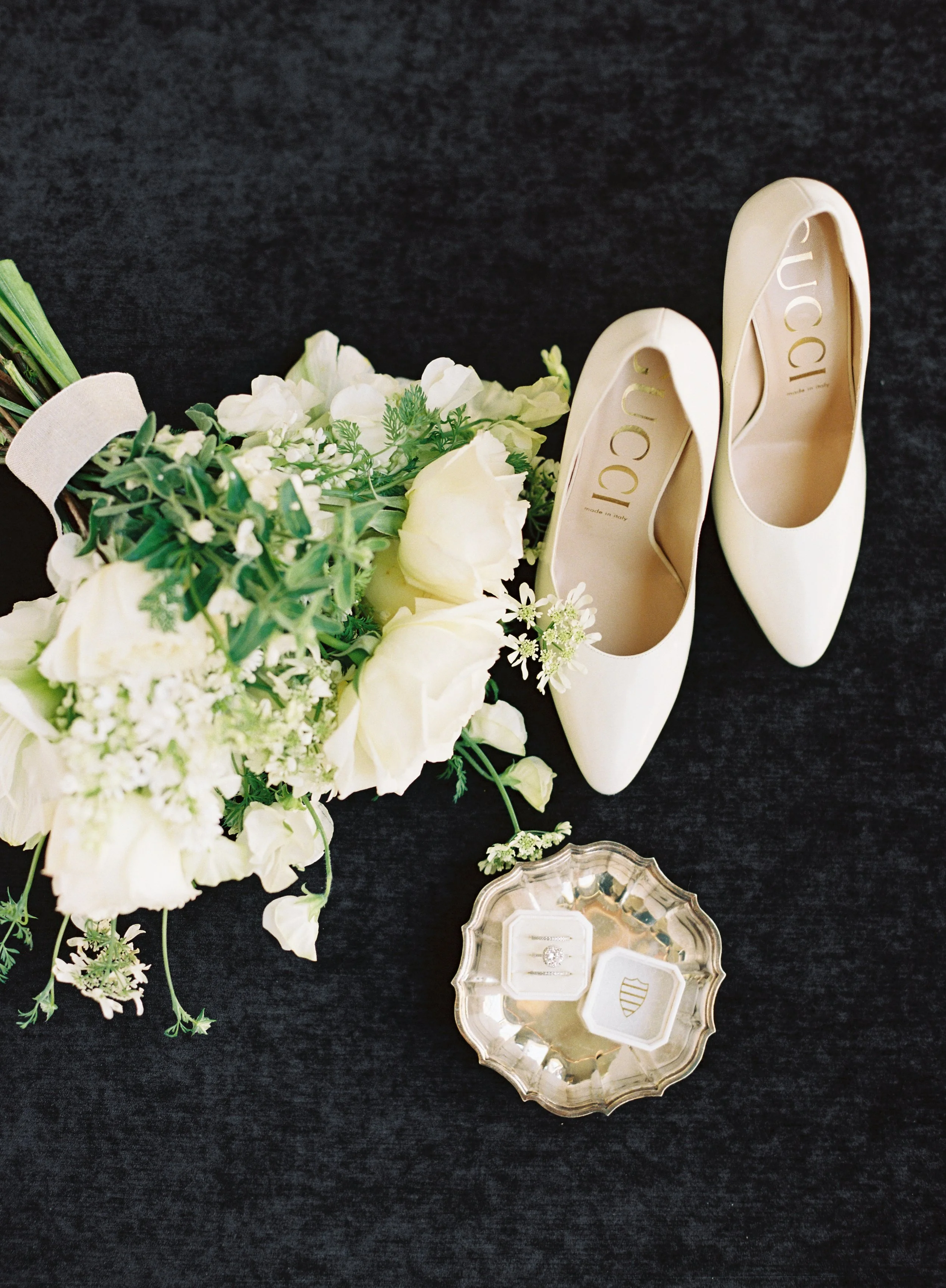
White shoes, white bouquet, white ring boxes. When every detail shares the same color family, a dark surface creates the contrast that keeps each element distinct. This is why building a surface collection with a moody option changes your bridal detail photography overnight.
The clutch or bag contents. For brides who carry a clutch during the reception, spread out its contents (lipstick, tissue, emergency kit) for a candid, lifestyle-inspired flat lay.
The morning coffee moment. The bride's coffee cup alongside her jewelry, vow book, or a getting-ready robe creates a relaxed, editorial feeling. This flat lay feels personal and real.
The gift exchange. Photograph gifts from bride to bridesmaids (or groom to groomsmen) as a styled flat lay. Include the packaging, cards, and contents arranged together.
The heirloom collage. If the bride is incorporating family heirlooms (grandmother's brooch, mother's earrings, a vintage handkerchief), photograph them together with a handwritten note explaining their significance.
The dress detail with accessories. Rather than photographing the hanging dress (which isn't flat lay), lay a section of the dress fabric flat and place accessories on top. The lace or beading of the dress becomes the background texture.
The groom's pocket contents. Watch, wallet, cufflinks, boutonniere, a personal note. This is the groom's version of the bridal detail flat lay and it's woefully undershot at most weddings.
The program and ceremony elements. Lay the ceremony program alongside unity candles, sand vases, or other ceremony-specific items.
The table number with reception details. Menu cards, place cards, table numbers, and favor boxes create a preview of the reception aesthetic when composed together.
The escort card display. If escort cards are designed as individual pieces (rather than a seating chart), photograph a selection arranged in a grid or organic scatter pattern.
The day-of timeline flat lay. If the couple has a printed timeline or day-of schedule, photograph it alongside a watch, a phone showing the time, or other time-related elements. This adds a documentary quality to the detail section.
Need help avoiding common styling mistakes? Check out 10 Common Flat Lay Photography Mistakes and How to Fix Them.
Florist and Botanical Flat Lay Photography Ideas
Florists need flat lay photography for their own marketing just as much as wedding photographers need it for galleries. Whether you're a florist photographing your own work or a photographer building relationships with florists through styled shoots, botanical flat lays have some of the highest engagement rates on social media because flowers are inherently photogenic from above.
The key difference between amateur and professional botanical flat lays is understanding that flowers photograph differently overhead than they do at eye level. Blooms that look full and dimensional from the side can read as flat circles from above. Choosing the right varieties and understanding how to use greenery for texture separation makes all the difference.
The bloom gradient. Arrange flowers from lightest to darkest across the frame, creating a color gradient. This works beautifully for showcasing a florist's range and becomes a powerful portfolio piece.
The ingredient breakdown. Before building an arrangement, lay out every stem, filler, and greenery element individually, labeled or in order of use. This is the floral equivalent of a recipe ingredient shot, and florists can use it for educational content.
The seasonal palette. Photograph a selection of blooms that represent a single season. Spring pastels, summer brights, fall jewel tones, winter whites and greens. These images work for seasonal marketing and are immediately identifiable in a scroll.
The single stem study. One perfect bloom, one beautiful surface, no distractions. This is the minimalist's flat lay, and it works especially well for highlighting rare or unusual varieties. A hand-painted surface with organic texture makes the simplicity feel intentional rather than sparse.
The bouquet overhead. Photograph a finished bouquet lying flat on the surface, shot directly overhead. The circular shape of most hand-tied bouquets creates a natural focal point. Add the ribbon tails extending toward one corner for movement.
The petal scatter. Loose petals scattered across the surface around a central arrangement or object. Rose petals are classic, but ranunculus petals, poppy petals, or dried flower petals each create a different mood.
The tool and bloom pairing. Floral shears, wire, tape, and ribbon alongside the flowers they're used with. This behind-the-scenes look resonates with both consumers (who appreciate the craft) and other florists.
The wreath deconstructed. Lay out the components of a wreath in order of assembly, then photograph the finished wreath separately. Side-by-side comparisons of "before" ingredients and "after" arrangements perform extremely well on Pinterest.
The color family study. Photograph five to eight different varieties that all share a color family (all blush, all burgundy, all cream). The subtle differences in tone, petal shape, and texture within a single color range showcase expert-level floral knowledge.
The dried versus fresh comparison. Lay the same variety in both fresh and dried form side by side. This is excellent content for florists who sell dried arrangements and want to show clients what to expect.
The stem anatomy shot. Photograph a single stem from multiple angles: the bloom overhead, the stem profile, a close-up of the leaves. Arrange all views together in one flat lay composition. Educational and visually interesting.
The arrangement in progress. Partially built arrangement lying flat with additional stems positioned nearby, as if the florist just stepped away. This feels authentic and gives followers a window into the creative process.
Understanding how color relationships work across your surfaces and florals matters. Our Color Theory for Photographers Guide breaks down harmony and contrast in practical terms.
Stationery and Calligraphy Flat Lay Photography Ideas
Stationers, calligraphers, and paper goods designers rely almost entirely on flat lay photography to market their work. Their products are two-dimensional by nature, which means the flat lay angle is the most honest and effective way to showcase them. The surface choice underneath stationery is critical because it becomes, in effect, the framing for the artwork.
The suite in context. Photograph the full invitation suite as it would arrive in the mail: nested inside the envelope, partially pulled out, with the envelope liner visible. This "unboxing" angle helps potential clients visualize receiving the suite.
The detail crop series. Shoot extreme close-ups of foil stamping, letterpress impression, deckled edges, and calligraphy strokes. These detail shots demonstrate quality craftsmanship and justify premium pricing.
The process progression. Lay out the stationery creation process from sketch to finished piece. Include pencil drafts, ink tests, color swatches, and the final printed suite. This tells the brand story in a single image.
The calligraphy tool layout. Nibs, ink bottles, pen holders, guidelines, and practice sheets arranged around a finished piece. This showcases the tools of the trade and appeals to both clients and fellow calligraphers.
The paper swatch collection. For stationers who offer paper choices, lay out samples in a gradient or grid showing different textures, weights, and colors. This is practical content that doubles as an ordering reference for clients.
The envelope art showcase. Address an envelope in the studio's signature calligraphy style and photograph it alone on a textured surface. The contrast between elegant handwriting and an organic background creates immediate visual impact.
The wax seal process. Photograph the wax, seal stamp, melting spoon, and finished sealed envelope together. Process-oriented content consistently outperforms finished-product-only content for stationery brands.
The menu and place card mockup. Show how the stationer's day-of pieces will look on a reception table by laying out a menu, place card, and table number with tableware and a napkin. This helps couples visualize the complete day-of experience.
The custom monogram in use. Photograph the monogram across multiple applications: invitation, cocktail napkin, wax seal, favor tag. Showing the monogram's versatility justifies the custom design investment.
The seasonal collection launch. Arrange all pieces from a new collection on a surface that complements the seasonal palette. Spring collection on a soft sage surface, fall collection on a warm clay surface. The surface does half the styling work for you.
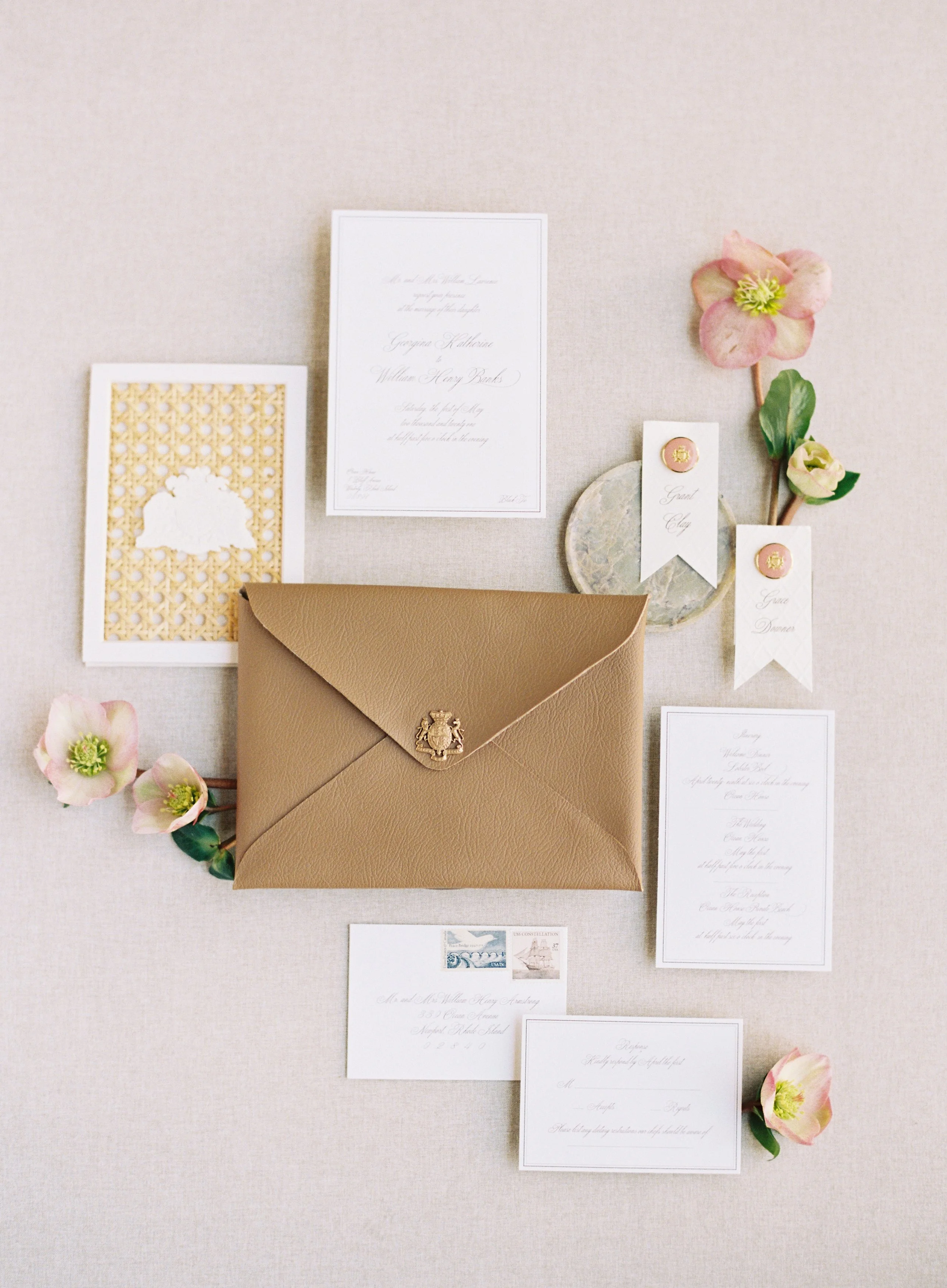
Some invitation suites arrive at a wedding and you just know they deserve more than a quick snap on the hotel bed. A dedicated flat lay surface turns a five-minute detail shot into the kind of image that gets you published and tagged by the stationer.
Food Flat Lay Photography Ideas
Food photography was one of the earliest adopters of the flat lay angle, and for good reason. Plates, bowls, and ingredients are designed to be viewed from above. The challenge in food flat lay work is making the composition feel natural and appetizing rather than clinical and overly styled. Real-world messiness (a dusting of flour, a drip of sauce, scattered crumbs) is what separates editorial food photography from catalog shots.
The recipe ingredient spread. Lay out every ingredient for a recipe in individual bowls or measuring cups, arranged in a grid or organic scatter. This is the classic food flat lay and it works because it serves both as beautiful photography and practical content.
The baking in progress. Flour-dusted surface with a rolling pin, cookie cutters, dough, and finished cookies. The contrast between raw and finished elements creates visual storytelling.
The charcuterie board overhead. Photograph the full board from directly above, then pull back to include surrounding elements like glasses, napkins, and crackers. The board itself becomes the composition within a composition.
The breakfast spread. Coffee, toast, fruit, and a newspaper or magazine create the quintessential morning flat lay. This composition works for restaurants, cafes, food bloggers, and lifestyle brands.
The hands-in-frame cooking shot. Include hands in the flat lay, actively stirring, chopping, or arranging. This requires a friend or client to pose while you shoot from above, but it brings an otherwise static composition to life instantly.
The single plate hero. One beautifully plated dish, centered on the surface with minimal surrounding elements. Let the food be the star. This works best when the plate has strong visual contrast with the surface underneath.
The cocktail or coffee art overhead. Photograph a latte or cocktail from above to showcase foam art or garnish placement. The circular form of a glass or cup creates natural compositional anchoring.
The spice palette. Lay out spices in small bowls or directly on the surface in small piles, creating a color-driven composition. The warm tones of turmeric, paprika, cinnamon, and cumin photograph beautifully on neutral surfaces.
The seasonal harvest layout. Vegetables, fruits, and herbs arranged by color to create a gradient. This is strong content for farm-to-table restaurants, farmers' markets, or seasonal menu launches.
The restaurant branding flat lay. Menu, business card, napkin with logo, and signature dish composed together. This is the restaurant's version of a brand flat lay, and it gives them a polished image set for social media and press.
The dessert collection. Multiple desserts (pastries, cookies, cake slices) arranged in a grid pattern on parchment paper or a textured surface. This grid approach creates visual order that makes the viewer want to study each individual item.
The deconstructed dish. Take a finished dish and separate its components, laying each one out individually with the finished dish at center. This is educational content that also photographs beautifully.
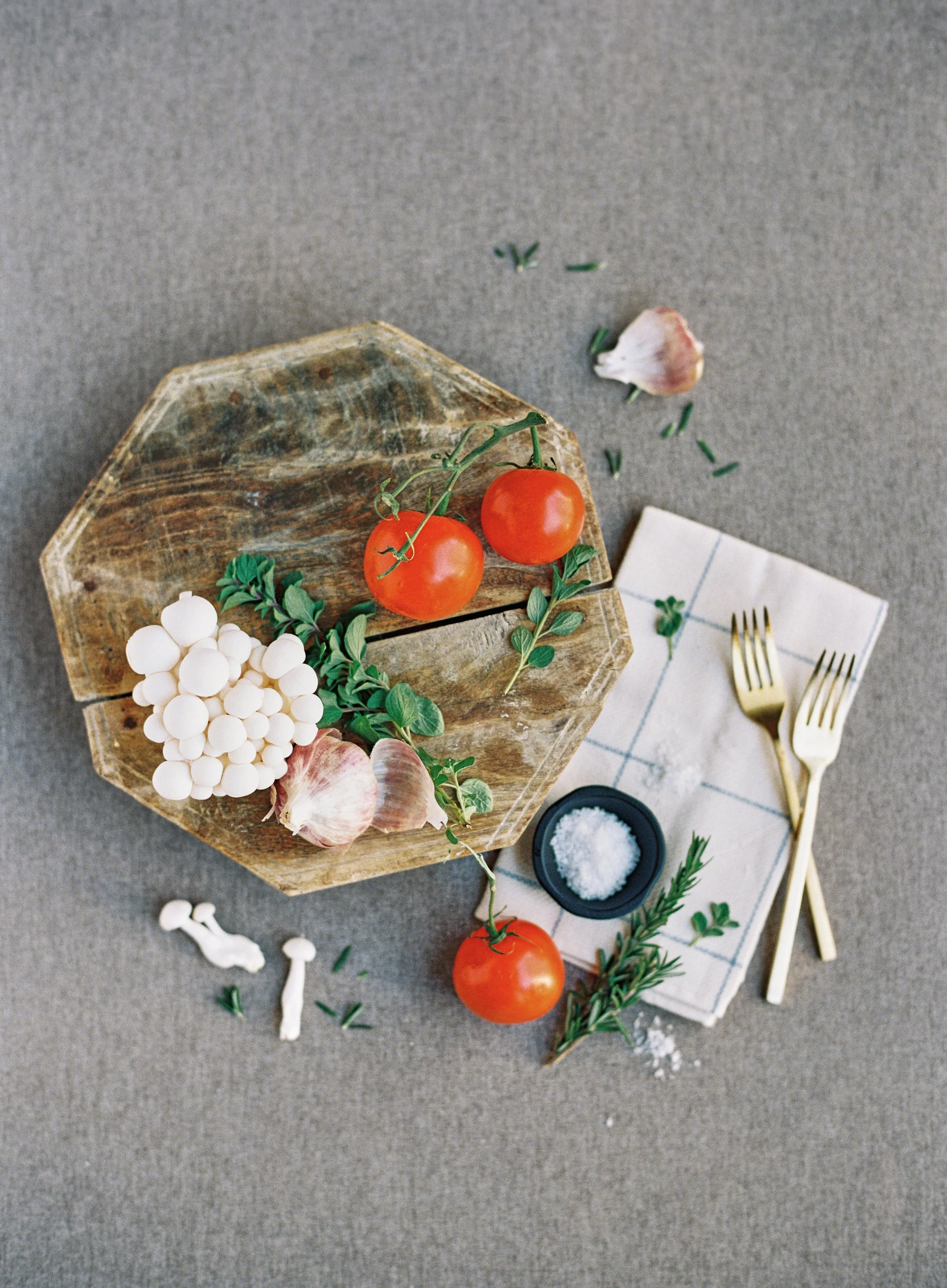
Fresh ingredients. Rustic wood. A surface that makes it all feel effortless. Shop hand-painted photography surfaces at chasingstone.com.
Product and E-Commerce Flat Lay Photography Ideas
Product photography flat lays serve a dual purpose: they need to be aesthetically compelling for social media and practical enough for e-commerce listings. The best product flat lays communicate what the product is, who it's for, and why it matters, all without a single word of copy. The surface underneath becomes the brand's visual environment, so choosing one that aligns with the brand's positioning is just as important as styling the products themselves.
The product grid. Arrange multiple products (or variations of the same product) in a precise grid pattern. This works for any brand with a product line: skincare, candles, stationery supplies, even tech accessories. The grid communicates professionalism and makes the lineup instantly scannable.
The unboxing flat lay. Show the product alongside its packaging, tissue paper, box, and any included inserts. This gives customers a preview of the full experience and works especially well for subscription boxes and gifting brands.
The lifestyle context shot. Place the product in its natural use environment without showing it being used. A journal with a pen and coffee. A skincare product with a towel and candle. A tech gadget with a plant and notebook. The surrounding objects suggest a lifestyle without being heavy-handed.
The color variant showcase. When a product comes in multiple colors, lay out every option in a visually pleasing arrangement (fan pattern, circle, gradient line). This is practical shopping content that also photographs as portfolio-worthy.
The size comparison. Place the product next to a familiar reference object (a hand, a coin, a standard envelope) to communicate scale. This is one of the most useful flat lay images for e-commerce because it answers the question customers always ask.
The brand identity flat lay. Logo, business cards, packaging, product, and any branded elements arranged together. This is the visual equivalent of a brand board and works as the hero image for "about" pages and press kits.
The ingredient or material callout. For products that tout specific ingredients or materials, photograph the raw ingredient alongside the finished product. Raw cacao next to a chocolate bar. Lavender sprigs next to a candle. Cotton bolls next to a fabric product.
The seasonal product styling. Refresh the same product flat lay for each season by swapping surrounding props and surface colors. Same product, completely different mood. This approach keeps a social feed feeling fresh without requiring new product launches.
The before-and-after pair. Photograph the product in its packaging ("before") and then unwrapped and ready to use ("after"). Showing both states helps the customer understand exactly what they're getting.
The scale and texture hero. Place a single product on a richly textured surface with nothing else in the frame. Let the texture of the surface create all the visual interest, making the product feel premium by association. This is where investing in a quality styling surface pays for itself many times over.
Fashion and Beauty Flat Lay Photography Ideas
Fashion flat lays have to communicate style, texture, and wearability without a model. Beauty flat lays need to convey luxury, efficacy, and aspiration from a bird's eye angle. Both niches demand surfaces that complement without competing, and both benefit from compositions that feel curated rather than cluttered.
The outfit of the day. A complete outfit laid flat: top, bottoms, shoes, accessories, and a bag. Arrange the pieces roughly in the shape of a body to help the viewer imagine wearing them. Slightly rumpled fabric reads as more natural than perfectly pressed.
The accessories edit. Watch, sunglasses, wallet, bracelet, and phone case arranged on a neutral surface. This works for fashion brands, accessory companies, and lifestyle content creators.
The skincare routine lineup. Cleanser, toner, serum, moisturizer, and SPF arranged in the order of application. This is functional content that performs well on TikTok and Instagram because it tells viewers exactly how to use the products.
The makeup bag spill. Stage a cosmetics bag tipped on its side with products "spilling" out. This candid-feeling arrangement is more engaging than a rigid grid because it introduces movement and personality.
The texture and swatch close-up. Photograph a lipstick swatch, foundation drop, or fabric texture as a tight overhead crop. These detail shots work as carousel content and give followers a reason to swipe.
The seasonal wardrobe capsule. Photograph the key pieces of a seasonal capsule wardrobe arranged together. This creates aspirational content that's also shoppable.
The jewelry collection on stone or painted surface. Necklaces, rings, and earrings arranged on a natural stone tile or hand-painted surface. The organic texture provides visual contrast that makes metal and gemstones pop.
The fragrance story. Perfume bottle surrounded by objects that evoke the scent profile: citrus peel for a fresh fragrance, dried flowers for a floral, leather and wood for a warm scent. This creates a multi-sensory flat lay.
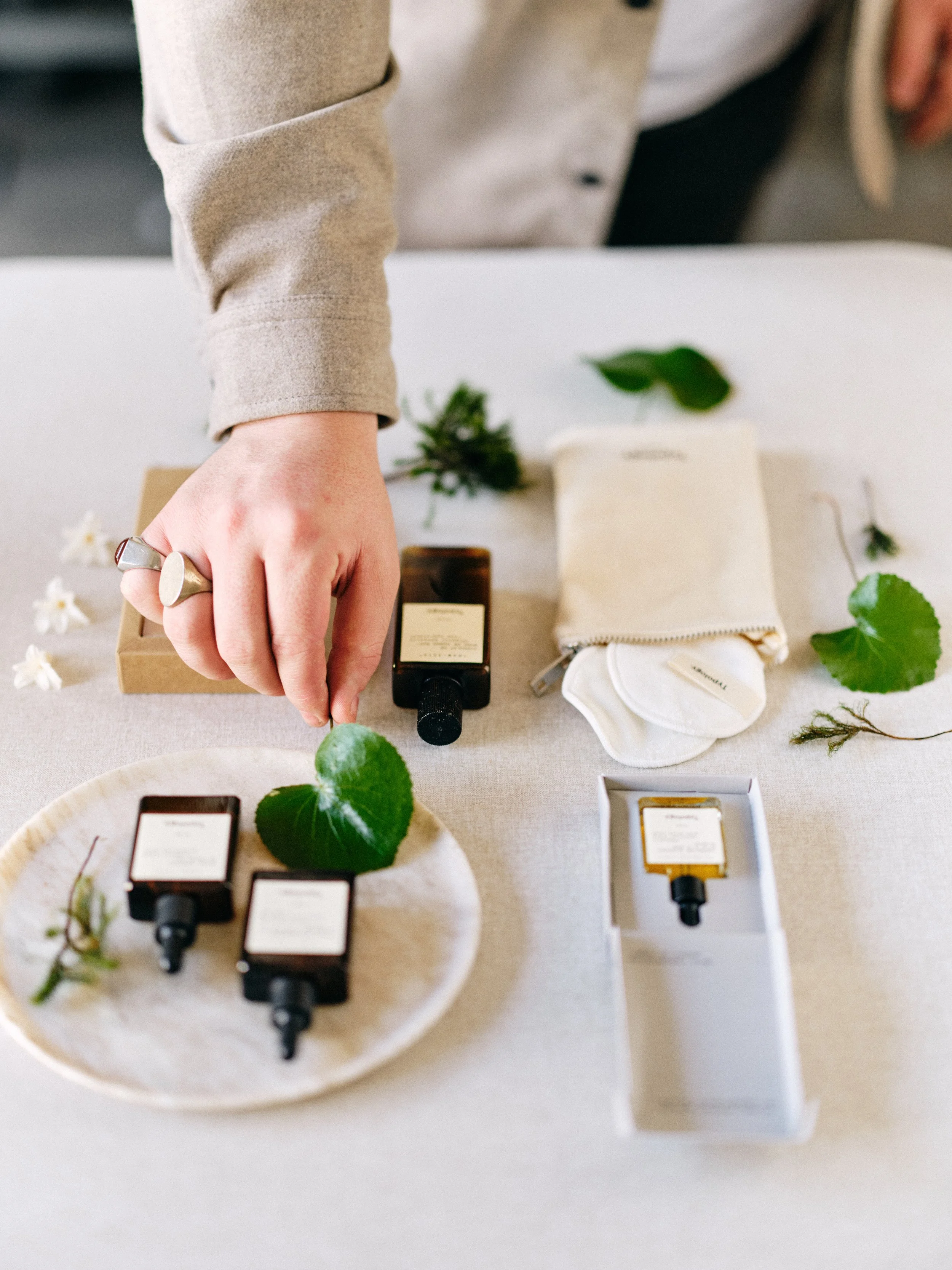
Amber bottles. Fresh botanicals. Hands that bring the composition to life. One surface tying it all together. Shop hand-painted photography surfaces at chasingstone.com.
Travel and Lifestyle Flat Lay Photography Ideas
Travel and lifestyle flat lays have become their own genre on social media, and for good reason. They compress an experience or a moment into a single, scannable image. These compositions work for travel bloggers, hospitality brands, tourism boards, and anyone who wants to communicate the feeling of a place or an experience.
The packing flat lay. Everything going into the suitcase, arranged neatly on a bed or surface. Passport, clothes, toiletries, guidebook, sunglasses. This is aspirational content that makes followers want to book a flight.
The destination essentials. Postcards, a map, local currency, sunscreen, and a travel journal arranged on a textured surface. The combination of practical items and romantic elements captures the tension between planning and spontaneity that makes travel compelling.
The hotel room amenities. Welcome amenities, room key, hotel stationery, and a coffee cup. This works for hotel marketing and for travel photographers documenting the details of a stay.
The "what's in my bag" layout. The contents of a bag spread out around the bag itself. This format works across niches (diaper bag for parent content, camera bag for photography content, work bag for professional content) because the container and its contents tell a story about the person.
The daily essentials. Phone, keys, wallet, headphones, coffee, notebook. This hyper-personal flat lay feels like a snapshot of someone's life and resonates because everyone can relate to the ritual of pocketing the same items every day.
The reading flat lay. An open book surrounded by a candle, reading glasses, a warm beverage, and a cozy textile. This is peak lifestyle content and performs consistently well across all social platforms.
The self-care spread. Bath salts, candles, a face mask, essential oils, and slippers arranged on a warm surface. The flat lay format makes self-care feel intentional and curated.
Newborn and Family Flat Lay Photography Ideas
Newborn flat lays capture the tiniest details of the earliest days. These images become some of the most cherished in any family's collection because they preserve the scale and fragility that fades so quickly.
The announcement flat lay. Ultrasound photo, baby shoes, a onesie, and an announcement sign arranged on a soft, warm surface. This is the most-shared flat lay genre in existence, which means getting it right has real word-of-mouth impact for photographers.
The tiny wardrobe. Newborn outfits, hats, booties, and swaddles arranged by color or size. Parents love these images because they capture how impossibly small everything was.
The hospital keepsakes. Wristband, footprint card, birth certificate, and a photo from the first moments. This documentary-style flat lay preserves details that parents often forget in the blur of those first days.
The monthly milestone. The same surface and composition repeated monthly with the baby's current stats, a milestone card, and objects that represent growth (increasingly larger shoes, for example). Consistency in the surface and composition makes the progression visually powerful.
The nursery detail collection. A mobile element, a stuffed animal, the nameplate from the door, and a blanket arranged together. This connects the family's preparation and anticipation to the baby's arrival.
The family heirloom and baby pairing. A grandparent's watch alongside a newborn's wristband. A parent's baby photo next to the new baby's photo. These generational pairings create emotional depth in a single frame.
Seasonal Flat Lay Photography Ideas
Seasonal flat lays keep your content calendar full and your portfolio relevant year-round. They work across every niche because seasonal themes are universally understood and immediately create mood.
The spring bloom flat lay. Fresh tulips, cherry blossoms, or peonies with pastel accessories on a soft, airy surface. The key to spring flat lays is keeping the palette light and the composition open, letting breathing room convey the sense of new beginnings.
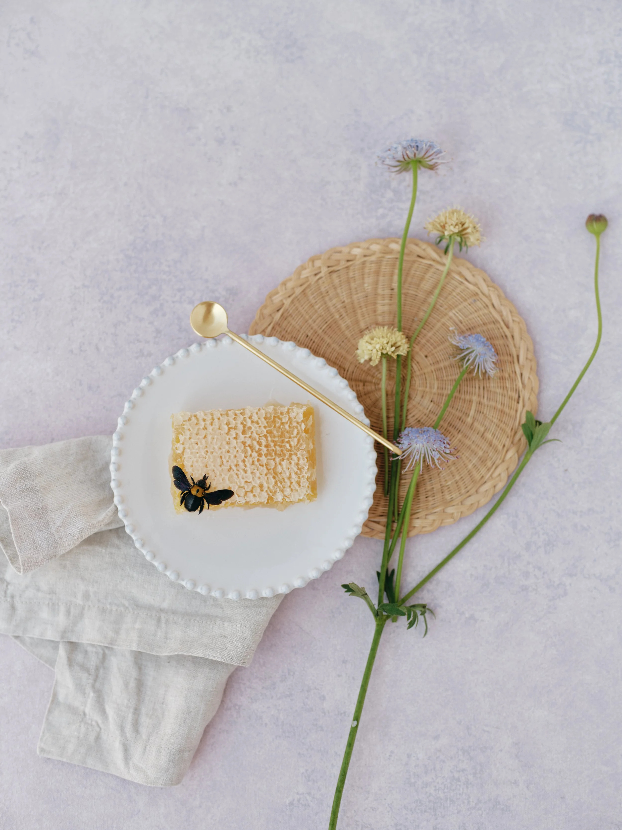
Spring content shoots are around the corner. A soft lavender hand-painted surface adds dimension to minimalist food styling without overpowering a single beautiful subject. Shop flat lay surfaces at chasingstone.com.
The summer essentials. Sunglasses, sunscreen, a straw hat, and citrus fruits. Bright colors on warm neutral surfaces create the casual, sun-drenched feeling of summer.
The autumn harvest. Dried leaves, cinnamon sticks, a warm beverage, and knitwear on a rich, warm surface. Fall flat lays work best when the surface tone complements the warm palette rather than contrasting it. Think clay, terracotta, or warm taupe.
The winter holiday. Gift wrapping supplies, ornaments, greenery, and ribbon on a deep green or moody neutral surface. The contrast between sparkling metallic elements and matte organic textures is what makes holiday flat lays feel festive without being kitschy.
The Valentine's Day detail. Red and blush florals, a handwritten note, chocolates, and ribbon. This is prime content for florists, stationers, and wedding photographers.
The back-to-school layout. Notebooks, pens, a laptop, and a coffee cup. This works for brand content, social media, and anyone targeting the energy of fresh starts that September brings.
The New Year's reset. A planner, goal-setting journal, healthy snacks, and motivational elements on a clean, fresh surface. This composition channels intention and new beginnings.
Brand Photography and Business Flat Lay Ideas
Every small business, creative entrepreneur, and service provider needs flat lay imagery for their marketing. These compositions establish visual identity and create a library of images that can be used across websites, social media, email headers, and print materials. The surface choice becomes part of the brand identity itself.
The workspace flat lay. Laptop, phone, notebook, pen, coffee, and a plant arranged on a desk or surface. This is the universal "I'm a professional" flat lay and it works because it's endlessly customizable to any brand's aesthetic.
The brand color palette. Arrange objects that represent the brand's color palette together on a neutral surface. This reinforces visual identity and creates an image that can be reused in presentations, pitch decks, and social media.
The client welcome kit. For service providers who send welcome packages, photograph every element: the box, tissue, card, guide, and any branded merchandise. This flat lay works for social media, website service pages, and onboarding emails.
The behind-the-scenes tools. For makers and creatives, lay out the tools of your trade: paintbrushes, fabric swatches, code printouts, camera gear. This humanizes the brand and lets potential clients see the real work behind the finished product.
The testimonial flat lay. Print a client quote on a card and photograph it alongside the product or service it refers to. This is visual social proof that stops the scroll.
The launch countdown. Arrange elements of an upcoming product or service launch with a date card. Use this in the weeks leading up to release for building anticipation.
The pricing or menu card. For service-based businesses, photograph printed pricing guides or service menus on beautiful surfaces. This makes practical content feel on-brand.
The year-in-review collage. Print small photos representing key moments of the year and arrange them on a surface with the year printed or written in the center. Strong end-of-year content that encourages engagement.
Choosing the Right Surface for Your Flat Lay Photography
Every idea in this guide shares one thing in common: the surface underneath determines whether the final image looks amateur or intentional. The wrong surface fights your composition. The right surface supports it quietly, adding texture, color, and dimension without pulling focus from your styled objects.
For wedding and stationery work, hand-painted surfaces with subtle organic texture create the most versatile foundation. The slight color variation in a hand-painted surface catches light differently across the frame, which prevents the "flat" look that solid-color backgrounds create in overhead shooting. Surfaces like warm putty neutrals, soft sage tones, or muted blush work across nearly every wedding color palette.
For food and product photography, you want surfaces that complement the product's color temperature. Warm foods photograph best on warm neutrals or natural tones. Cool-toned products (tech, skincare with blue packaging) read better on grey or blue-toned surfaces.
For lifestyle and brand photography, the surface becomes part of the brand identity. Choosing a surface that aligns with the brand's color palette and aesthetic creates consistency across the entire image library.
Our Complete Flat Lay Surface Guide goes deep on material comparisons, sizing, and how to match surfaces to specific niches.
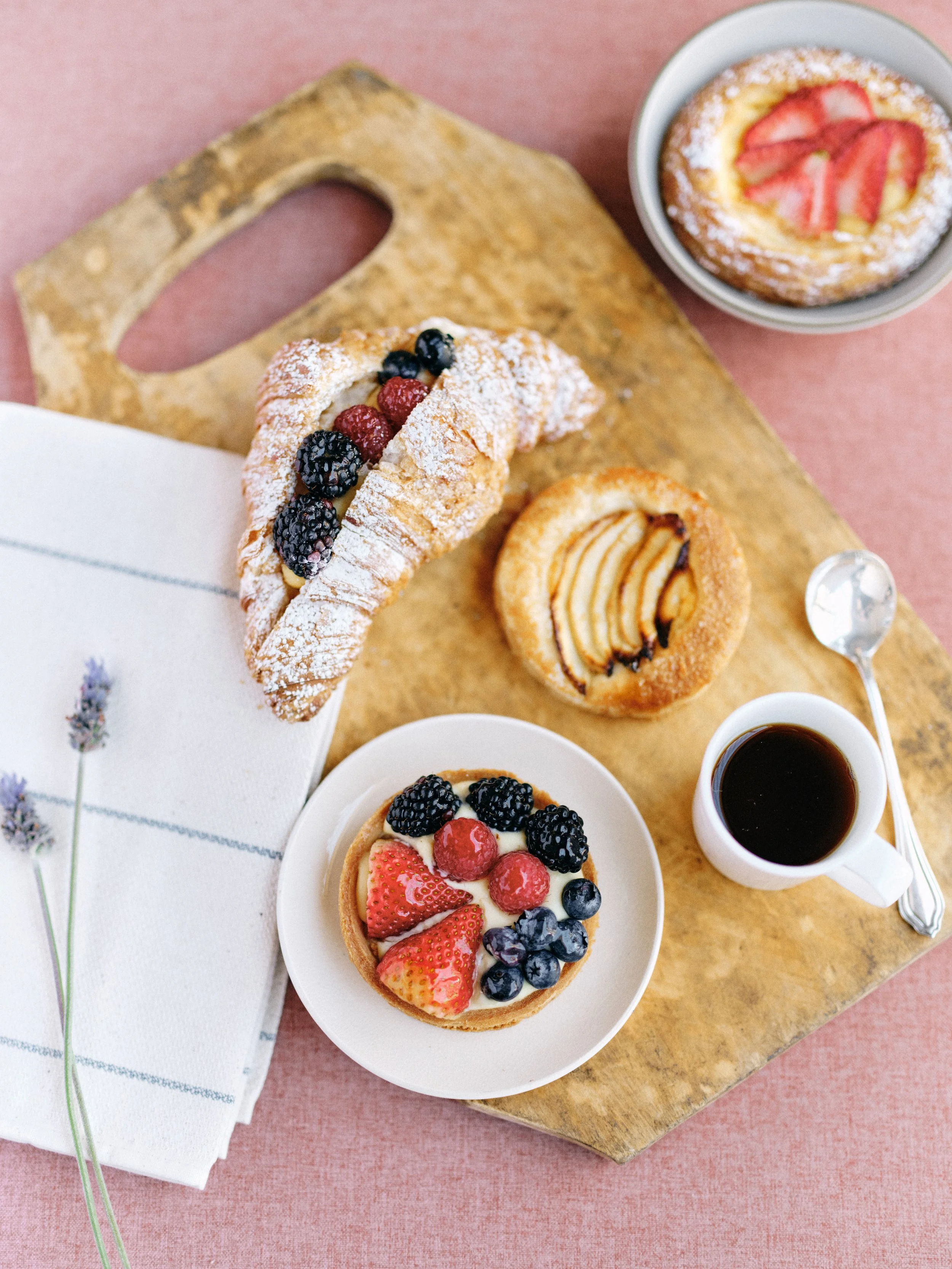
Berry croissant, fruit tarts, espresso, and a sprig of lavender. This breakfast flat lay works because the warm pink surface complements every warm tone on the cutting board without clashing with the cool blues and purples of the berries. That's what a well-chosen surface does for food photography.
Composition Techniques That Make Flat Lays Work
Having 120 ideas means nothing if you can't compose them well. A few composition frameworks will carry you through nearly any flat lay scenario.
The C-Shape. Arrange your primary objects in a C or horseshoe pattern, leaving the opening of the C at one edge of the frame. This naturally guides the viewer's eye through the composition and creates a sense of openness without leaving too much negative space.
The Diagonal. Place your hero object at the center and arrange supporting elements along a diagonal line from one corner to the opposite corner. This creates dynamic energy that keeps the composition from feeling static.
The Grid. For product-heavy flat lays, arrange items in an even grid pattern. This works when you have multiple objects of similar size and want to communicate order, variety, or a collection.
The Overflow. Let objects extend beyond the edges of the frame. This creates the feeling that the scene continues beyond what the camera captures, which makes the composition feel more natural and less staged.
The Breathing Room Rule. Leave at least 20% of your surface visible with no objects. This negative space prevents the flat lay from feeling cramped and gives the viewer's eye a place to rest. On a textured, hand-painted surface, that negative space isn't really "empty" because the surface texture does visual work on its own.
For a complete visual breakdown of how to light your surfaces for maximum texture and dimension, read How to Light Hand-Painted Backdrops: Natural Light Techniques That Actually Work.
Building a Surface Collection for Multiple Niches
If you photograph across multiple niches (and most working photographers do), building a small collection of surfaces that covers the range of your work is smarter than buying one surface per project. Three well-chosen surfaces can handle 90% of flat lay scenarios across weddings, products, food, and brand photography.
Start with a warm neutral. This is your workhorse. A warm putty, soft beige, or light taupe surface works with nearly every color palette and every niche. It won't compete with colorful objects, it flatters skin tones in any flat lays that include hands, and it ages well in portfolios. This single surface should handle most of your wedding and stationery work immediately.
Add a moody option. A darker surface in charcoal, deep sage, or slate opens up editorial and dramatic work. This is where food photography, moody brand shoots, and dramatic floral compositions come alive. The contrast between light objects and a dark surface creates instant visual impact.
Include one color accent. A dusty blue, soft sage, or warm clay surface gives you a third option with personality. This becomes your signature surface for portfolio work and styled shoots where you want to create a specific mood.
For guidance on choosing sizes, materials, and building your collection strategically, our Photography Backdrop Buying Guide covers everything.
Put These Ideas to Work
The difference between a photographer who shoots flat lays occasionally and one who's known for them is simple: the known photographer shows up with ideas already in their head, surfaces already in their bag, and the confidence that comes from knowing exactly what they're going to create.
Bookmark this guide. Revisit it before your next shoot. Pick three ideas that match the work you're doing this week and commit to executing them well. Over time, you'll develop your own variations, your own signature compositions, and a portfolio of flat lay work that attracts the exact clients you want.
The surface underneath tells the story you don't have to say out loud. Choose one that works as hard as you do.
Shop hand-painted flat lay surfaces at chasingstone.com.
Related Guides
Flat Lay Photography for Weddings: The Ultimate Guide for Photographers
The Complete Flat Lay Surface Guide for Wedding Photographers
Wedding Flat Lay Photography Gear: Complete Equipment Guide 2026
10 Common Flat Lay Photography Mistakes and How to Fix Them
Color Theory for Photographers: Understanding the Wheel, Harmony, and Contrast
How to Light Hand-Painted Backdrops: Natural Light Techniques That Actually Work
Photography Backdrop Buying Guide: What Size Do You Need
How to Clean and Care for Hand-Painted Canvas Backdrops
2026 Wedding Photography Trends: Backdrops, Colors & Textures That Book Clients
Portrait Photography Backdrops: The Complete Guide for Non-Wedding Photographers
How Wedding Photographers Use Hand-Painted Backdrops Successfully
Creators of premium photography backdrops and styling surfaces
Trusted by thousands of discerning creatives worldwide
Every piece is handcrafted with intention in Orange County, California

