
Best Camera Settings for Photography Backdrops: Aperture, ISO, and Distance Guide (2026)
Posted on Apr. 29, 2026
The best camera settings for photography backdrops begin with this foundational distinction: f/1.8 to f/2.8 for portraits (to render the surface with tonal presence), f/8 to f/11 for product work (to keep the entire composition sharp and intentional), and ISO between 100 and 400 in controlled light, paired with a subject distance of 4 to 6 feet from the surface to eliminate shadows and maintain compositional separation. But these numbers mean nothing without understanding the material beneath them. Hand-painted canvas backdrops are not neutral surfaces waiting to disappear behind your subject. They are paintings, and like all paintings, they respond to light and aperture with dimensional specificity that vinyl and muslin simply cannot match.
Essential Settings by Session Type
Portrait: f/2.0 to f/2.8, ISO 200-400, 85mm lens, subject 4-6 feet from canvas. Product: f/8 to f/11, ISO 100, tripod-mounted, subject 18-24 inches away. Editorial: f/2.8 to f/5.6, ISO 200-400, 50mm or 85mm, subject 5-8 feet from backdrop. These settings preserve the hand-painted canvas texture while maintaining proper subject separation and tonal depth.
Canvas Demands Precision. Vinyl Demands Nothing.
Most photographers carry the same camera settings from job to job like a formula that never changes. This habit works fine on vinyl rolls and muslin surfaces, which are engineered to be optically flat and visually neutral. But when you move to a hand-painted canvas backdrop, your old settings become liabilities. The texture that makes the canvas worth the investment becomes either invisible or chaotic, depending on what you dial in.
Jennifer hand-paints every Chasing Stone backdrop herself, a process that takes two to three days per canvas. The result is not a printed surface or a dyed fabric. It is a layered, textured surface with visible brushstrokes, subtle color transitions, and micro-topography that catches and diffuses light in ways that printed surfaces cannot replicate. This is why a hand-painted canvas backdrop costs what it costs. This is also why it demands different camera settings.
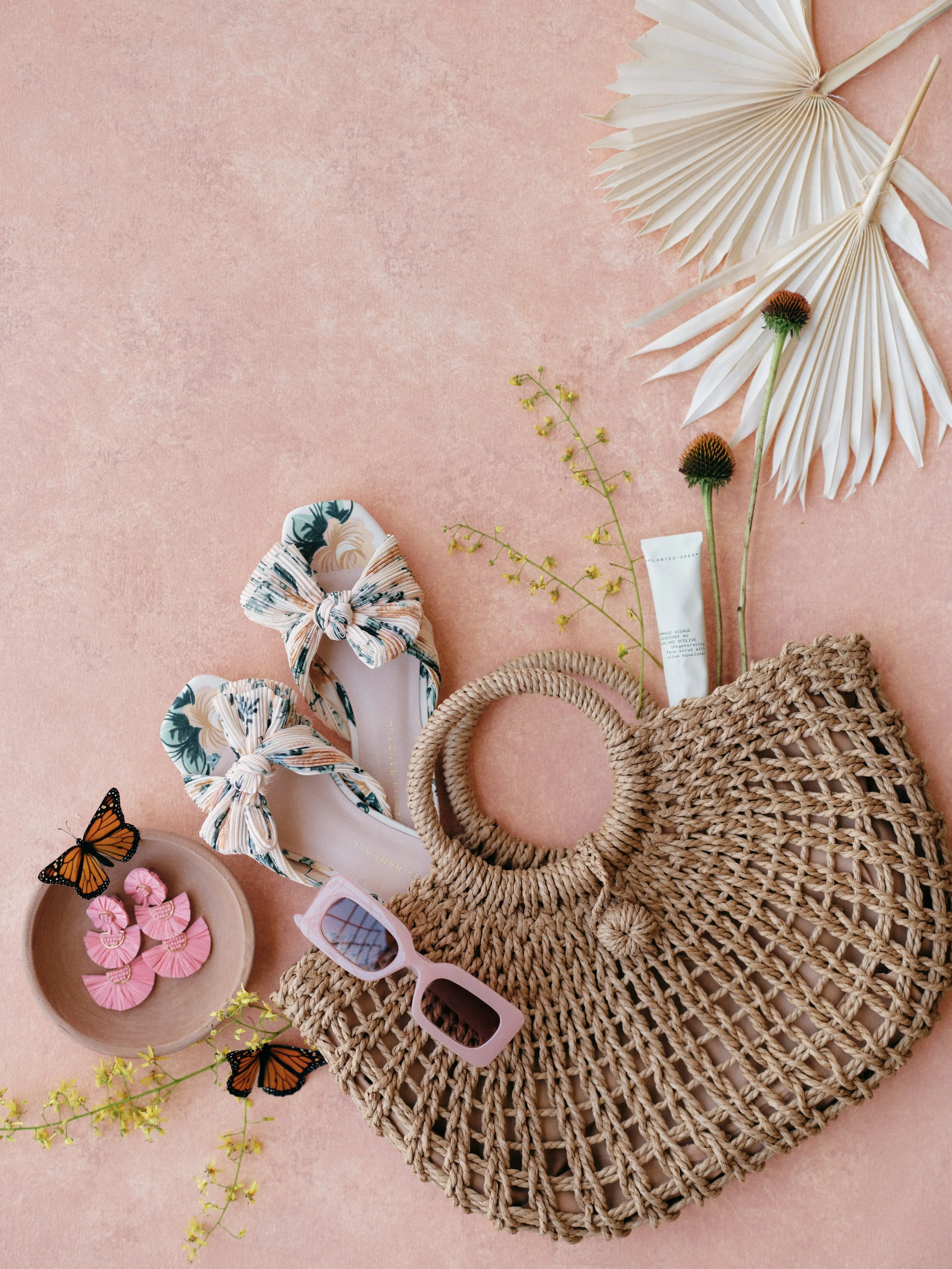
Flat lay camera settings make or break the shot. Shoot the San Miguel at f/8 to f/11, ISO 100, and 12 to 18 inches overhead to capture every brushstroke of that muted terracotta exactly as it was painted.
When you shoot at f/16 on canvas, every brushstroke becomes a landscape of micro-shadows. The texture dominates the frame and competes with your subject. When you shoot at f/1.0, the backdrop collapses into monochromatic mush and you lose the color depth entirely. The sweet spot sits somewhere in the middle, but it is not the same middle as vinyl. Canvas texture is a compositional asset only when your aperture, ISO, and distance are aligned to preserve it without letting it overwhelm the frame.
Hand-painted canvas absorbs light and reveals dimensionality. Vinyl reflects light and hides imperfections. This material difference is not a preference. It is physics. Your camera settings must account for it.
Getting the light right is only half the equation. You also need the aperture and ISO settings that preserve canvas texture under that light.
Aperture: The Variable That Reveals or Buries the Surface
Aperture controls more than depth of field. On hand-painted canvas, aperture controls whether the backdrop becomes a collaborator or a distraction in your image.
For portrait work, the aperture range of f/1.8 to f/2.8 is the sweet spot because it accomplishes two things simultaneously: it keeps the subject's face in sharp focus while softening the backdrop enough that it reads as atmosphere rather than texture grid. At f/1.4 or f/1.0, the canvas becomes an impressionistic wash of color. If you are working with a warm colorway like Clay or Limestone, this extreme softness can be intentional and beautiful. But most photographers invest in hand-painted canvas specifically because they want the texture and color depth to be visible. At f/1.0, that investment becomes invisible.
Product photography and flat lay work flip this entirely. Here you want everything sharp, from your subject to the backdrop surface. This means f/8 to f/11. But here is where many photographers make a mistake: they assume that if f/11 is good, then f/16 is better. On hand-painted canvas, f/16 turns the backdrop into visible texture noise. With vinyl, texture noise is irrelevant because there is no real texture. With canvas, it becomes a competing visual element. Stay at f/8 to f/11 for product work and let the canvas texture render as a refined surface detail rather than as a landscape of paint. For a detailed breakdown of recommended aperture, ISO, and distance settings organized by portrait, product, and editorial session types, see our complete camera settings guide by session type.
Editorial and fashion photography often lives in the f/2.8 to f/5.6 range, where the backdrop texture is visible enough to provide atmosphere and color context, but soft enough that the backdrop reads as a designed element rather than a sharp surface. For more on compositional frameworks with backdrops, our definitive backdrop guide explores the full landscape of how to think about backdrop as a compositional tool.
Camera Settings for Hand-Painted Backdrops by Session Type
The table below reflects the optimal settings across 2026 shooting conditions. These assume studio strobes or controlled natural light. For continuous light or mixed ambient conditions, adjust shutter speed as needed and raise ISO accordingly. All focal length recommendations assume full-frame; crop sensor users should increase subject-to-backdrop distance by approximately 50 percent to compensate for sensor magnification.
Note: Different backdrop materials require different metering approaches. Hand-painted canvas, muslin, and vinyl all interact with light differently. For a comprehensive comparison of these materials and how they affect your lighting and exposure decisions, see our full backdrop materials comparison guide.
2026 Optimal Camera Settings for Hand-Painted Canvas Backdrops
| Session Type | Aperture | ISO | Shutter Speed | Focal Length | Subject-to-Backdrop |
|---|---|---|---|---|---|
| Headshot / Tightly Framed Portrait | f/1.8 – f/2.8 | 200 – 400 | 1/250 – 1/500 | 85mm or longer | 4 – 6 ft |
| Full-Length Portrait | f/2.0 – f/2.8 | 200 – 400 | 1/250 – 1/500 | 50 – 85mm | 5 – 7 ft |
| Product Photography | f/8 – f/11 | 100 | 1/125 – 1/250 | 35 – 50mm | 18 – 24 in |
| Editorial / Fashion | f/2.8 – f/5.6 | 200 – 400 | 1/250 – 1/500 | 50 – 85mm | 5 – 8 ft |
| Flat Lay Styling | f/8 – f/11 | 100 | 1/125 – 1/250 | 35 – 50mm | 12 – 18 in overhead |
ISO: The Texture Paradox
This is where many photographers stumble. ISO noise and hand-painted texture are visually similar at a glance. Both create small variations across a surface. When you stack them on top of each other, the result is not texture. It is visual chaos.
In controlled studio environments with strobes, lock ISO at 100. Strobes provide powerful, consistent light, so there is no reason to raise sensitivity. When you move to natural light or ambient sources, stay between ISO 200 and 400 whenever possible. At ISO 400, the canvas texture remains tonally distinct from any sensor noise. The surface reads as painted, not grainy. Once you climb to ISO 800, the two become indistinguishable from one another. Your carefully chosen hand-painted backdrop starts looking like noise with color.
ISO noise and canvas texture merge visually around ISO 800. For canvas, this is the threshold beyond which your backdrop stops looking painted and starts looking digital. Stay below it whenever your light allows.
Backdrop colorway matters here too. Dark surfaces like Slate, Graphite, or Carbon show sensor noise far more readily than light tones, because noise becomes visible against the darker base. Light backdrops like Silt, Bentonite, or Mica actually hide minor noise slightly better simply because you are starting with a lighter foundation. But this should not make you complacent. Use the lowest ISO your light allows, regardless of backdrop color. For detailed guidance on lighting approaches for hand-painted surfaces, our dedicated guide on natural light with canvas backdrops covers window placement and reflector strategy in depth.
Distance: The Variable Photographers Ignore Until It Is Too Late
Aperture and ISO get all the attention. Distance gets none. But distance controls two critical things: shadow density and optical separation between subject and backdrop.
Place your subject within 2 to 3 feet of the canvas and you will inevitably cast shadows on the surface. Hard shadows behind the head or shoulders. Dark, distracting shadows that kill the clean, intentional look of the image. Move your subject to 4 to 6 feet and shadows either disappear entirely or soften into subtle gradations that feel intentional rather than accidental. That distance also allows light sources to spread and diffuse before hitting the canvas, which results in more even illumination across the entire surface.
Distance also manipulates how much blur you get at any given aperture, through lens focus geometry. At f/2.8, a subject positioned 3 feet from the canvas will have a slightly sharper backdrop than a subject positioned 6 feet away. This is powerful if you understand it. If your aperture is f/2.8 and the backdrop is still too sharp, do not automatically open to f/1.8. Try moving your subject further from the canvas instead. You will often achieve better blur quality without sacrificing depth of field on the subject's face or eyes.
For typical portrait sessions, position your subject 4 to 6 feet from the canvas. This prevents shadows, allows light to spread naturally, and gives you enough blur at f/2.0 to f/2.8 that the backdrop functions as atmosphere. For tighter headshots where you want maximum separation and blur, increase to 5 to 7 feet. For editorial and fashion work where you want the backdrop color and tone to be visible and contextual, 5 to 8 feet creates that balance. Product and flat lay work requires closer distances because perspective and framing are different. Keep products 12 to 24 inches from the canvas surface to avoid perspective distortion.

Small adjustments in aperture, ISO, and subject distance make a big difference. The right camera settings help photographers bring out the depth and texture of canvas backdrops every time.
Focal Length and the Compression Question
Focal length does not change aperture math, but it changes how the backdrop sits in your composition and how it compresses in the frame relative to your subject.
For portraits, 85mm and 135mm are the standard choices because they compress depth slightly, making the backdrop appear more prominent and visually closer to the subject in the final image. An 85mm lens at f/2.8 will render the out-of-focus backdrop smoother and more compressed than a 50mm at the same aperture and the same subject distance, simply because the narrower angle of view treats the out-of-focus areas differently. If you want the hand-painted backdrop color and tone to be prominent and integral to the portrait, choose 85mm or longer.
A 50mm lens gives you more of the canvas in the frame and less compression. This focal length works well for full-body portraits or editorial work where you want environment and context visible. The backdrop is still soft at f/2.8, but it occupies more real estate, so it becomes more compositionally present. Wide lenses like 35mm can work with hand-painted backdrops in fashion or editorial contexts, but they require careful subject placement because wide angles exaggerate the difference between in-focus and out-of-focus zones. Use prime lenses rather than zooms for backdrop sessions. Primes force compositional intention. Zooms invite complacency.
Hand-Painted Canvas Versus Vinyl: How Material Changes Everything
The simplest way to understand why canvas demands different settings is to understand what happens on the surface when light hits it. On vinyl, light bounces off uniformly because the surface is smooth and reflective. On hand-painted canvas, light catches the peaks of brushstrokes and creates shadows in the valleys. This micro-relief is why the canvas is beautiful. It is also why your exposure and aperture choices matter more.
Softer, more diffuse light reveals canvas texture beautifully. Hard, directional light creates too much drama on the brushstrokes, turning them into harsh shadows. Softboxes, umbrellas, and diffused window light illuminate the surface evenly while preserving dimensionality. Small, direct sources will make canvas texture look chaotic.
Because canvas is absorptive rather than reflective, you might find yourself needing approximately one-third stop more light than you would with vinyl to reach the same exposure. Rather than raise ISO, try opening aperture slightly. An f/2.0 on canvas might deliver better texture clarity than f/2.8 on vinyl at the same subject distance, because you are getting the light you need while preserving the texture quality. Warm-toned backdrops like the Clay hand-painted canvas, our Limestone backdrop, and Sandstone reflect warm color beautifully and hide slight underexposure. Cool tones like Slate, Celestite, and Silt are more sensitive to exposure variance. If you are shooting cool backdrops, nail exposure precisely.
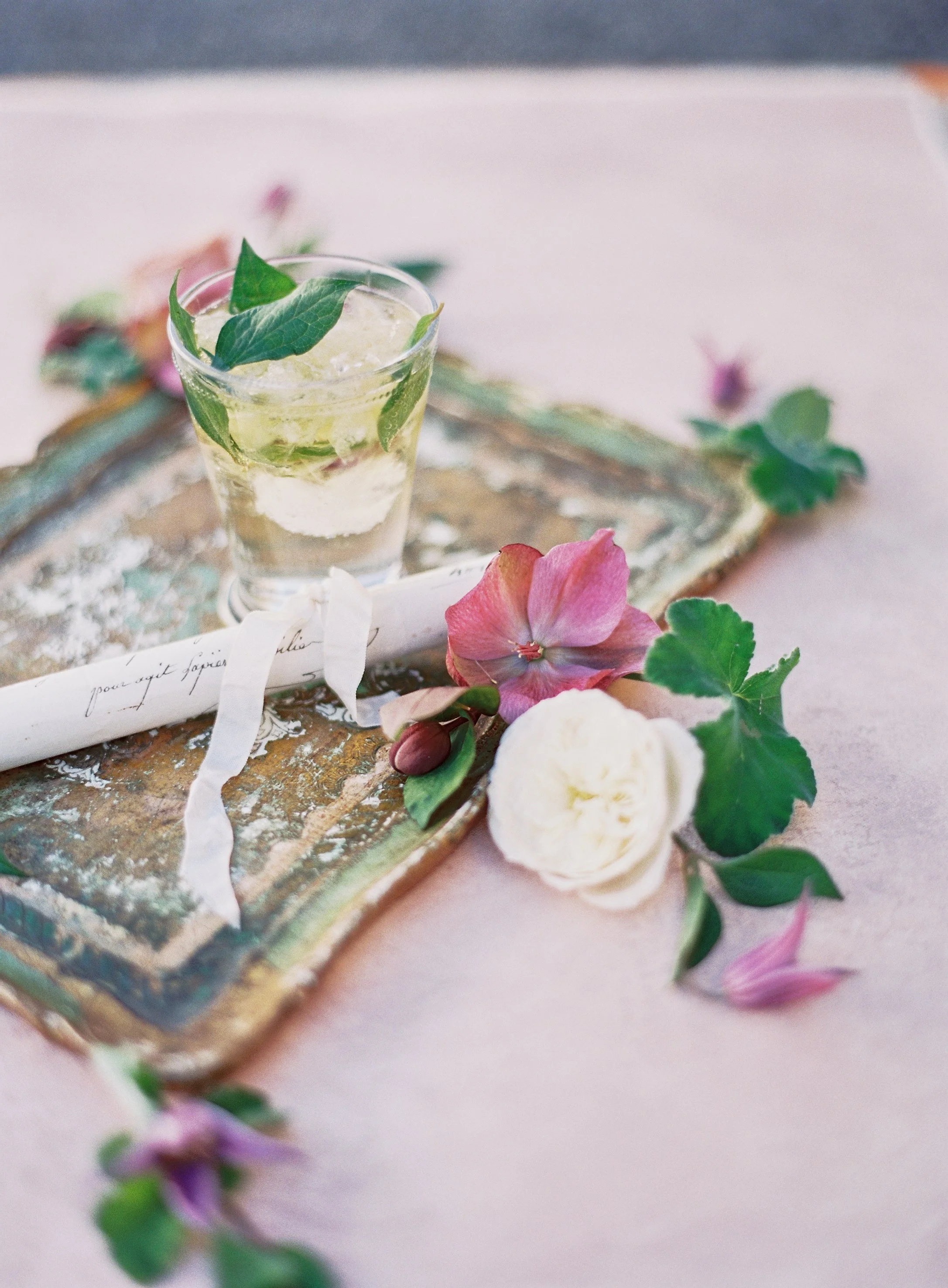
It's the small details that tell the full story. An experienced wedding photographer knows how to capture styled elements like cocktails, florals, and paper goods with intention and clarity using hand-painted canvas backdrops for softer, beautiful textures.
The Four Settings Mistakes That Ruin Canvas
The first mistake is shooting too wide open. Photographers acquire f/1.0 glass and assume more blur is always better. With hand-painted canvas, extreme aperture opens render the backdrop completely out of focus and often monochromatic. You lose color information, texture visibility, and dimensionality. Unless your intention is to abstract the backdrop into a pure color wash, stay in the f/1.8 to f/2.8 range for portraits. Once you've chosen your backdrop, dial in detailed camera settings for every session type to make sure the canvas texture photographs the way you intend.
The second mistake is crowding the subject against the canvas. Photographers position subjects 2 feet from the backdrop to make the backdrop matter compositionally. But 2 feet guarantees shadows and often causes the backdrop to appear unnaturally large and close. You do not need your subject pressed against the canvas for it to be compositionally present. Four to six feet is enough. The backdrop is still prominent, but shadows are eliminated and light has room to work.
The third mistake is ISO set too high out of abundance of caution. Photographers shoot at ISO 1600 to be safe and then notice the backdrop looks grainy and muddy. ISO noise and canvas texture compete for visual space. Lower ISO, even if it means adjusting aperture or adding a light source, always looks cleaner on canvas. The texture stays defined and painterly rather than noisy.
The fourth mistake is incorrect white balance for the backdrop colorway. Warm backdrops like Clay need a warmer color temperature, around 5600K to 6000K, to look rich and dimensional. Cool backdrops like Slate need slightly cooler white balance, around 5000K to 5400K, to maintain their depth. Shooting neutral white balance on a warm backdrop makes it look slightly flat. Shooting warm white balance on a cool backdrop makes it look dingy. Use your camera's white balance to favor the backdrop's underlying color tone, or shoot in RAW and adjust in post-processing for precision.
Frequently Asked Questions
What aperture creates the most blur on a hand-painted canvas backdrop?
Apertures between f/1.0 and f/1.8 blur canvas aggressively, though you will lose color information and texture visibility. For professional work, f/1.8 to f/2.8 blurs the backdrop enough to separate it from your subject while keeping the canvas tonally visible and compositionally useful. Wider apertures work for fine art portraiture where abstraction is the goal, but they underutilize the investment in hand-painted canvas texture.
What is the best ISO for studio photography with hand-painted backdrops?
In studio with strobes, lock ISO at 100. With continuous light or natural window light, use ISO 200 to 400. Avoid climbing above ISO 400 because sensor noise becomes visually similar to canvas texture, and the two will merge into visual chaos rather than clean, defined canvas character. If you cannot expose properly at ISO 400, add a light source instead of raising ISO.
How far should the subject stand from a hand-painted canvas backdrop?
For portrait sessions, position your subject 4 to 6 feet from the canvas. This distance prevents hard shadows, allows light to spread across the surface, and creates enough separation that the backdrop reads as atmosphere. For tighter headshots, move to 5 to 7 feet. For product and flat lay work, keep the subject 12 to 24 inches from the surface.
Do hand-painted backdrops require different camera settings than vinyl or muslin?
Yes, substantially. Hand-painted canvas is matte and absorptive, while vinyl is reflective. Canvas requires softer, more diffuse light, approximately one-third stop more exposure, and lower ISO settings to render texture properly. You should shoot canvas at f/2.0 to f/2.8 for portraits, opening up slightly compared to vinyl, and keep ISO at 200 to 400 in natural light, staying lower than you might with flat backdrops. Canvas texture is a feature, not a defect, so settings must preserve it.
What focal length is best for portrait work with hand-painted backdrops?
For traditional portraits, 85mm to 135mm compresses depth and makes the backdrop appear more prominent in the frame. Focal lengths between 50mm and 85mm give you more backdrop context while maintaining subject separation. Avoid ultra-wide angles unless you are shooting editorial work where the backdrop is meant to be very present. Use prime lenses to force compositional intention.
Can you use natural light only with hand-painted canvas backdrops?
Yes, but you need consistent, diffuse light. Large north-facing windows or overcast outdoor light works beautifully with canvas. Direct, harsh sunlight creates excessive texture drama and makes brushstroke shadows look overly prominent. Indoors, use large reflectors or subtle fill flash to open shadows and create even illumination across the canvas surface.
How do I expose correctly for very dark versus very light hand-painted backdrops?
Dark backdrops like Slate and Graphite hide underexposure but show overexposure harshly. Light backdrops like Silt and Mica hide overexposure but show underexposure immediately. For dark backdrops, err toward proper-to-under exposure to preserve richness. For light backdrops, nail exposure precisely because color shifts are visible across lighter tones. Shooting in RAW provides maximum flexibility for both extremes.
Should I adjust settings for different hand-painted backdrop colorways?
Aperture and ISO remain constant. What changes is white balance and exposure latitude. Warm colorways like Clay are forgiving of slight underexposure and benefit from warm white balance around 5600K to 6000K. Cool colorways like Slate require precise exposure and cool white balance around 5000K to 5400K to maintain depth. These shifts are subtle, perhaps 200 to 400K, but they make the difference between a backdrop that sings and one that looks muted or dingy.
Camera Settings as Creative Language
Dialing in aperture, ISO, and distance correctly is not about following a formula. It is about understanding that hand-painted canvas is a surface that responds to light with intention. When your settings align with that responsiveness, the backdrop stops being a background element and becomes a collaborator in the image.
Start with f/2.0 to f/2.8 for portraits, ISO 200 to 400, an 85mm lens, and 4 to 6 feet of distance. This creates a soft, separated backdrop that remains tonally visible and compositionally integrated. If you are shooting product work, move to f/8 to f/11, ISO 100, and 18 to 24 inches. If you are working with editorial or fashion imagery, split the difference at f/2.8 to f/5.6, ISO 200 to 400, and 5 to 8 feet. These settings work because they are tuned to canvas, not against it.
Don’t overlook your details. The right wedding photographer captures every element that makes your day complete.
When hand-painted canvas does not perform the way you expected, the settings are usually the issue. Review your aperture choice. Review your distance. Lower your ISO. These adjustments compound into images that actually showcase the backdrop investment. Explore our full collection of hand-painted backdrops to find colorways that match your studio aesthetic. Each backdrop is unique because Jennifer hand-paints every single piece in her California studio. No two are identical. That uniqueness becomes an asset when your camera settings are aligned to capture it.
Questions about which backdrop colors or sizes work best for your session? Reach out to info@chasingstone.com and we will help you choose the right hand-painted canvas backdrop for your work.

Creators of premium photography backdrops and styling surfaces
Trusted by thousands of discerning creatives worldwide
Every piece is handcrafted with intention in Orange County, California