
Photography Session Planning Guide: Choosing the Right Backdrop Before Your Shoot (2026)
By Jennifer Kidd — Chasing Stone Co-Founder

Posted on Jul. 14, 2026
The portrait that stops a viewer mid-scroll was not improvised. The wardrobe was selected weeks in advance. The location was scouted. The lighting was considered. And long before the camera came out, the backdrop choice had already been made, with intention, by someone who understood that this single surface would carry half the compositional weight of the entire image.
Backdrop selection is the most consequential pre-session decision a photographer makes. Not the lens. Not the light. The backdrop. It sets the emotional temperature, determines how skin tones will read, creates the spatial depth that separates subject from viewer, and dictates which light sources will collaborate with the image rather than fight it. This is why the world's most discerning photographers, from editorial teams at luxury publications to fine art portraitists whose work lives in galleries, treat photography session planning and backdrop selection as seriously as they treat their lighting kit.
The five-variable framework we share here is built on thousands of hours observing how our hand-painted canvas backdrops responds to light, how different color families interact with human skin, and how the contextual layers of wardrobe, season, and narrative shape the final image. It is a decision-making system that transforms backdrop selection from a last-minute scramble into a strategic conversation that happens before the first frame is captured.
Bridal session booked and backdrop not chosen yet? The backdrop decision should happen before wardrobe, not after. A cool neutral like GRAPHITE creates exactly this kind of chromatic separation between a white gown and the surface behind it. Shop Chasing Stone at chasingstone.com.
Quick Answer
Effective photography session planning for backdrop selection requires evaluating five variables before your shoot: the emotional narrative of the session, your client's skin undertone, their wardrobe palette, the quality of light you intend to use, and the season or context in which the final image will live. Use these five variables together to choose a hand-painted canvas surface that collaborates with every other element in the frame.
We have watched hand-painted canvas backdrops reveal dimensions under studio light that vinyl and paper surfaces simply cannot replicate. Jennifer paints each of our canvases by hand over two to three days, layering pigment in a way that creates tonal depth visible only under directional light. The difference between this kind of surface and a mass-produced backdrop is not aesthetic preference. It is physics: cotton canvas absorbs and diffuses directional light, while synthetic materials reflect it, creating hot spots and tonal flatness that no amount of post-processing can recover.
The Five-Variable Framework for Backdrop Selection
Professional photographers know that every decision made before the shoot shapes what happens during it. The backdrop is no exception. But unlike the camera or the lens, a backdrop cannot be changed mid-session. The choice is fixed. This is why the framework we have developed focuses on five variables that work together to eliminate guesswork and orient every session around intention.
These variables do not exist in isolation. A client's skin undertone informs the emotional narrative you want to tell, which then shapes the colorway choice, which then influences how you will position your key light. Wardrobe informs the textural relationship between fabric and painted canvas. Light quality determines whether a warm-toned surface will glow or fall flat. Season adds a final layer of context that ties the image to a moment in time.
The photographers who master backdrop selection are the ones who have learned to hold all five variables at once, to see how they intersect, and to make decisions from inside that intersection rather than treating backdrop choice as an isolated aesthetic call. This framework teaches you to do exactly that.
Variable One: Reading the Emotional Narrative
Every session tells a story. The story may be explicit, as in bridal editorials or fashion shoots where the narrative is articulated before the first shot. Or it may be subtle and understated, as in a fine art portrait where the mood emerges from the intersection of light and surface and the quiet presence of the person being photographed. Either way, the backdrop is the stage on which that story unfolds.
Emotional direction shapes colorway choice more than any other single variable. A bridal session calls for surfaces that evoke romance, timelessness, and luminosity. A boudoir session requires depth, intimacy, and a sensuality that comes from color saturation and warm undertones. A corporate headshot demands clarity, authority, and the clean geometry of modern professional space. These are not opinions about taste. They are observations about how the human eye reads color, how certain hues trigger certain emotional responses, and how the photographer's job is to make those connections visible.
The principles of color harmony we explore in our comprehensive color theory guide apply directly here. When you understand how complementary and analogous relationships work on the color wheel, the conversation about emotional direction becomes a conversation about color relationships rather than vague aesthetic preference.
The table below maps session types to emotional direction and the colorway families that serve them. Use this as a starting point. Your knowledge of the client, their industry, their personal aesthetic, and the context in which the final images will live should refine these choices further. But this table is your foundation.
Photography Session Planning: Session Type to Colorway Selection Guide (2026)
Notice how the same colorway appears across different session types. Sandstone works for bridal, maternity, and senior portraits because it carries versatility: warm enough to feel nurturing, neutral enough to let skin tones dominate, luminous enough to feel aspirational without being performative. This is why photographers who know their backdrops intimately often develop strong relationships with specific surfaces. They understand not just the color, but the tonal depth and the way light moves across the painted canvas at different angles and under different sources.
UMBER is one of the most requested surfaces in our collection for editorial bridal work, and this image shows exactly why. The warm brown depth of the hand-painted canvas creates a cohesive tonal world with the subject's warm skin undertones, the dark hair, and the blush and burgundy florals, without the backdrop ever drawing the eye away from the subject's face.
Variable Two: Skin Undertone as Your First Filter
A session plan without regard for skin undertone is incomplete. The same backdrop will read dramatically differently depending on whether your subject has warm, cool, or neutral undertones. This is not a matter of personal preference. It is color science.
When you place warm undertones against warm-toned canvas, the effect is harmonic: the colors work together, creating a cohesive image where the subject and the backdrop occupy the same emotional space. When you place cool undertones against cool-toned canvas, you achieve similar coherence. But when you create deliberate contrast, placing cool undertones against warm canvas or vice versa, you create visual tension that can feel either sophisticated or discordant depending on every other variable in the frame.
A cool-undertoned subject photographed against our warm Rose-Quartz hand-painted canvas creates chromatic separation that makes the subject visually advance in the frame, a principle editorial photographers have relied on for decades. This is the same reason Renaissance painters placed cool-toned skin against warm ochre backgrounds.
We have developed a comprehensive skin tone and backdrop color guide that walks through undertone identification and specific colorway recommendations for every client type. Reference it during your session planning conversations. It will answer questions that generic backdrop advice leaves hanging.
The undertone consideration also shapes how you think about the range of surfaces you should carry. A photographer who primarily shoots warm-undertoned clients might build their collection heavily around clay, earth, and neutral tones. A photographer who works with a broader diversity of skin tones will naturally develop a wider palette, moving between warm and cool families strategically. This is not about having every color available. It is about understanding the logic of how color relationships shape the final image, and building your collection around that logic rather than accumulating surfaces without a unifying strategy.
Variable Three: Wardrobe as a Compositional Layer
The backdrop does not stand alone. It exists in relationship to the wardrobe, and this relationship is compositional. When wardrobe and backdrop work together, the subject feels integrated into the image. When they fight, the subject gets lost between competing visual weights.
The traditional rule of matching backdrop to wardrobe misses nuance. Sometimes matching creates harmony. Sometimes it creates visual noise, two patterned surfaces fighting for attention. Sometimes strategic contrast between wardrobe and backdrop creates the separation that makes the subject pop. The decision depends on the wardrobe itself, the texture of the painted canvas, and the overall mood you are building.
A flowing wedding dress in ivory against a warm, textured cream canvas like Limestone creates visual softness, the fabrics in dialogue with each other. The same dress against a saturated jewel tone like Lapis creates visual drama, the pale gown vibrant against the depth. Neither is correct. The choice depends on the editorial direction you are pursuing.
The texture of hand-painted canvas becomes particularly important here. Jennifer paints every surface herself, layering pigment over two to three days per piece, which means the brushwork, the direction of each stroke, and the micro-texture of the canvas all contribute to how wardrobe reads against it. A finely detailed fabric, like silk charmeuse or meticulously pleated linen, can stand against a heavily textured backdrop because the two textures create visual separation. A simpler wardrobe, a plain cashmere sweater or a minimal column dress, often benefits from resting against a more evenly painted surface where the canvas texture reads as softness rather than visual competition. Consider both the color relationship and the textural relationship as you plan.
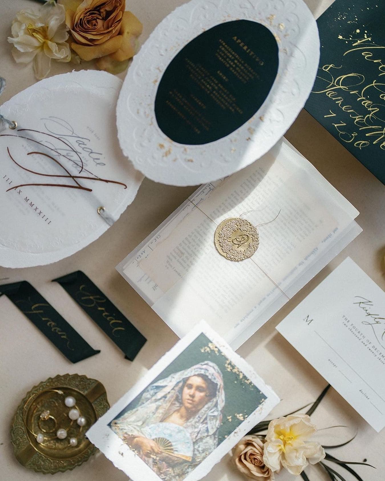
The same hand-painted canvas backdrop that hangs behind your subject can be laid flat for detail work. CELESTITE’s soft dusty blue tone creates natural chromatic separation from gold jewelry and white velvet ring boxes, letting every detail read clearly without the surface competing for attention. One canvas, two uses, every bridal session.
When your client is uncertain about wardrobe, guide the conversation toward fabric weight and color temperature rather than specific garments. A client who knows they are wearing "something light and flowing in cream" gives you enough information to recommend warm neutral backdrops. A client who says "structured, black, modern" gives you enough information to consider cool architectural grays or bold saturated surfaces. The specificity of the wardrobe conversation informs the specificity of your backdrop recommendation.
Variable Four: Light Quality and Direction
Light is the medium of photography, and the backdrop is the surface on which that light performs. Not all backdrops respond the same way to the same light, and understanding these differences is essential to planning a session where the backdrop collaborates with your lighting rather than against it.
Hand-painted cotton canvas has inherent properties that determine how it reacts to light direction. Because the pigment is layered onto the surface rather than printed into the fiber, and because the canvas itself has texture and weave, directional light from the side or from above creates subtle shadow and dimension that synthesizes with your key light. The canvas becomes luminous in a way that flat surfaces cannot replicate. This is the reason editorial photographers and fine art portraitists reach for hand-painted canvas specifically: it responds to light the way a painting in a museum responds to light, with depth that changes as the source moves.
Vinyl and mass-produced paper backdrops, by contrast, tend to reflect light specularly. When you place a hard light source near the camera position, these surfaces bounce it directly back, creating a hot spot and a tonal flatness that reads as two-dimensional. The same light source aimed at hand-painted canvas gets absorbed and diffused, creating a fall-off of tone that feels three-dimensional. This is not a subtle difference. Under controlled studio conditions, it is immediately visible in the final image.
Warm-toned canvases like Clay and Umber glow under tungsten and warm window light, their undertones amplified by sympathetic color temperature. The same surfaces under cool north-facing light can read flat without supplemental warmth. Plan your light temperature alongside your photography session planning and backdrop selection.
This is why session planning includes a conversation about where the images will be shot and what light will be available. An indoor studio session under controlled lighting allows you to choose backdrops based purely on color and emotion, because you control the light quality. An outdoor or window-lit session requires that you choose backdrops that will respond well to the available light. A bridal couple photographed in late afternoon golden light will read beautifully against warm neutrals like Sandstone because the light temperature and the canvas tone are in harmony. The same couple photographed in overcast midday light, cool and flat, might benefit from a canvas with more chromatic presence to create visual interest in the backdrop itself.
As you plan, ask yourself: Where will the light come from? What is its quality, warm or cool? Is it directional or diffused? Will the backdrop be lit the same way the subject is lit, or will it be backlit, or side-lit separately? These questions refine your backdrop choice from a general emotional direction into a specific surface that will perform optimally in the exact conditions where you will use it.
Variable Five: Season and Final Context
The final variable is context: where the image will live, when it will be seen, and what narrative moment it occupies in the client's larger story. A bridal portrait that will appear in an autumn wedding feature lives in a different temporal and visual context than a bridal portrait shot in spring. A senior portrait captured in late fall carries seasonal resonance that an indoor studio shot in January does not.
This is not about being literal with seasonal colors. It is about understanding that images are consumed in context, and the backdrop is part of how that context reads. An autumn wedding editorial demands backdrops that feel consonant with the season, even if the shoot itself takes place in June. A spring maternity session benefits from surfaces that suggest renewal and lightness. An evergreen fine art portrait, the kind we explore in our guide to choosing timeless backdrop colors for heirloom portraits, should transcend season entirely, living instead in the realm of timeless portraiture where the image feels relevant regardless of when it was captured.
Ask your client about the final use of the images. Will they appear in a publication with a seasonal context? Will they be printed and hung in a home, and if so, what is the interior aesthetic they will complement? Will they live online, where they compete for attention against infinite other images? Will they become personal family heirlooms seen primarily in private settings? Each answer shapes the backdrop decision in specific and practical ways.
A corporate headshot, for example, lives primarily in a digital professional context. The backdrop serves a utilitarian purpose: clarity, professionalism, the right amount of visual interest without distraction. The seasonal context is irrelevant. But a fine art maternity portrait might be printed as a large statement piece that will hang in a nursery for years. The backdrop choice becomes an aesthetic commitment to how that room will look and feel. Suddenly, seasonal consideration, the client's home aesthetic, and the long-term resonance of the color choice all matter deeply.
The Session Planning Conversation: Questions to Ask Before the Shoot
A strong session plan begins with a conversation, ideally two to three weeks before the shoot. This is not a transactional checklist. It is a collaborative dialogue where you gather the information that allows you to make an intentional backdrop choice, and where the client begins to understand that their images will be shaped by thoughtful pre-production work.
Use the framework above to structure this conversation. Begin by asking about emotional direction and context. What is the primary use of these images? Will they appear in a publication, on a website, or as personal prints? What feeling should they convey? Is this a session about romance, professionalism, creative expression, or personal milestone?
Move into wardrobe. What is the client planning to wear? If they are uncertain, ask about their personal aesthetic, their professional style, or the editorial direction you are pursuing together. Describe your backdrop collection in terms of emotional and color families rather than listing individual colors. "We have a range of warm, luminous neutrals that feel romantic and timeless, and we have deeper, more saturated surfaces for sessions where you want visual drama." Let the client's wardrobe choice inform your recommendation rather than prescribing a surface and asking the client to dress around it.
Ask about skin undertone and lighting context. Where will the session take place? What is the light source? How does the client feel about their skin tone and which colors have historically made them feel confident? Share your skin tone and backdrop color guide if the client is uncertain, and use it as a discussion tool rather than a prescription.
A cool-undertoned subject with blue eyes and fair skin reads most beautifully against cool neutral surfaces like SILT, where the backdrop recedes completely and the subject's natural coloring becomes the entire visual story. This is variable two of our five-variable session planning framework in action: skin undertone as your first filter for every backdrop decision.
Finally, share your specific recommendation and explain the reasoning. "Based on your wardrobe, your skin tone, and the window light we will be working with, I am recommending our Rose-Quartz canvas. The soft mauve undertones will create beautiful chromatic separation from your skin, the warmth will amplify the afternoon light coming through the windows, and the overall mood feels romantic and editorial without being safe." When you explain the reasoning, the client understands that the choice is intentional, not arbitrary, and they become invested in the creative decision alongside you.
You might also consider offering your clients a visual preview of backdrop options in the weeks before the session. We have written extensively about how to present backdrop options to photography clients, and that resource includes specific frameworks for making the selection process collaborative while preserving your creative authority and expertise.
Putting It Together: A Complete Planning Walkthrough
Let us walk through a specific example: planning backdrops for an editorial bridal session that will appear in a luxury wedding publication in autumn.
Variable one is emotional direction. The feature will be positioned as "romantic editorial bride," which suggests backdrops that feel aspirational, timeless, and luminous rather than trendy. This narrows us toward warm neutrals and soft blush tones rather than saturated colors or bold contrasts.
Variable two is skin undertone. The bride has warm undertones with golden warmth in her complexion, which means we can lean confidently into warm-toned canvas without concern about creating an unharmonious color relationship. We are not fighting against her skin. We are amplifying it.
Variable three is wardrobe. The dress is a traditional ivory silk gown with delicate lace detailing. The texture is intricate and demands a backdrop that will not compete visually. A heavily textured or boldly patterned surface would create visual noise. Instead, we want a surface that feels soft, neutral enough to let the dress dominate, but with enough warmth to feel luxurious rather than clinical.
Variable four is light quality. The shoot will take place in a studio with controlled lighting. The photographer has chosen to work with warm tungsten supplemented by large soft boxes to create dimensional light that will reveal the texture of the lace. The backdrop will be lit separately with a subtle setup designed to create gentle dimension without harsh shadows.
Variable five is seasonal context. The feature will run in an autumn issue, which means the visual language should feel consistent with autumn aesthetic: warm, earthy, romantic, with a sense of seasonal richness that resonates with readers experiencing that time of year.
Putting all five variables together, we recommend our Limestone hand-painted canvas backdrop. It is a pale, sun-bleached cream with warm undertones that will create a luminous, airy feeling without competing with the ivory gown. The warmth amplifies the tungsten light without creating too much chromatic presence. The subtle texture reads as soft and romantic, in conversation with the lace without overwhelming it. The seasonal associations feel right for the editorial context. And the undertone works in perfect harmony with the bride's warm complexion.
If the same bride were being photographed for a fine art portrait rather than an editorial feature, or if the session were taking place in overcast window light rather than controlled studio light, the recommendation might shift. Perhaps we would choose Rose-Quartzinstead, which carries more chromatic presence and would create visual interest in a subtle light condition. Or if the aesthetic direction were more modern and sculptural, we might consider Slate, the cool architectural gray that reads like polished concrete, to create intentional chromatic contrast that makes the subject visually pop against its clean geometry. The logic of the framework remains the same. The specific choice changes based on the variables.
Frequently Asked Questions
How do I choose a backdrop color for a client I have not met yet?
Begin with the information you do have: the session type, the stated wardrobe, and the available light. Ask yourself which emotional direction serves the session. If you are still uncertain, reach out to your client and ask directly about skin undertone and any colors that have historically made them feel confident. Most clients appreciate the invitation to collaborate on this decision. If the client remains uncertain, offer them two to three options before the session and let them see the surfaces in person.
Should I match the backdrop to the client's wardrobe or create contrast?
There is no universal rule. Match when you want the subject and backdrop to feel integrated and harmonious. Create contrast when you want the subject to visually separate from the background. The choice depends on the emotional direction of the session, the specific colors involved, and the overall composition. In general, exact color matching (tan wardrobe against tan backdrop) often reads as flat. Either close harmony with subtle tonal variation, or intentional chromatic contrast, tends to read more intentional and more considered.
How many backdrops do I need for a full portrait session?
A traditional two-hour session can easily yield stunning variety from a single backdrop, especially if you move the light source or shift the subject's position within the frame. A longer session designed to show maximum variety might benefit from two to three surfaces. Many photographers build their practice around a carefully curated collection of five to seven core backdrops they know intimately, rather than acquiring thirty surfaces they use rarely. Depth of knowledge with fewer surfaces produces stronger work than surface-level familiarity with many.
Does backdrop color affect how I set my white balance?
Yes, particularly with warm and cool backdrops at the extreme ends of the spectrum. A session against a deeply saturated blue like Lapis will push your camera's auto white balance toward warmer compensation if you allow it. For precision, shoot a custom white balance off a gray card before the session begins, which removes the color cast of the backdrop from influencing your in-camera settings. This is especially important in mixed-light situations where your white balance is already challenged by multiple sources.
What backdrop colors work best for dark skin tones?
The most sophisticated backdrop choices for all skin tones depend on undertone rather than depth of tone. Warm undertones read beautifully against warm canvases like Clay, Umber, and Hematite, and against cool neutrals like Slate for intentional contrast. Cool undertones work beautifully with cool-toned canvases and with saturated jewel tones. Rather than thinking about skin tone depth, think about undertone and the emotional direction of the session.
How far in advance should I plan my backdrop selection for a session?
Ideally, finalize your backdrop choice during the initial consultation or planning conversation, typically two to three weeks before the session. This gives you time to source the specific surface if you do not keep it in active rotation, and it allows the client to move into the session confident in the creative direction. Backdrop selection should happen in tandem with wardrobe planning so the two decisions inform each other rather than happening in isolation.
Can I use the same backdrop for both headshots and full-length portraits?
Absolutely. A neutral surface like Sandstone or Graphite works for both framing styles without visual strain. The backdrop serves the same compositional function regardless of how much of the subject's body is in frame. Hand-painted surfaces, because they lack representational imagery and instead offer continuous tonal variation, tend to work across multiple framing styles effortlessly, from tight headshots to wide environmental portraits.
Begin with Intention
Photography session planning is where craft begins. The camera comes later. The light comes later. The moment, the presence, the connection between photographer and subject comes later. But the backdrop decision, the choice made weeks before the shoot even begins, shapes everything that follows. It is the quiet, invisible architecture that holds the entire image together.
When you approach photography session planning and backdrop selection as a strategic decision grounded in color theory, light physics, material properties, and creative intent, you move from choosing a backdrop because it is available or because it matches the client's dress, to choosing a surface because you have done the thinking and the deliberation that separates professional portraiture from documentation.
The photographers whose work stops viewers mid-scroll are the ones who have made hundreds of small intentional choices before the shutter opens. Backdrop selection is one of those choices. When you master it, using the five-variable framework as your guide, you claim control over one of the most powerful compositional elements available to you.
Explore our full collection of hand-painted canvas backdrops with this framework in mind. Consider how each surface responds to light, which clients and which emotional directions it serves, and how it might become a core part of your creative language for years to come. If you have questions about which surfaces work for your specific practice, reach out at info@chasingstone.com. We are here to help you build a backdrop collection that serves your vision for the next decade of your work.
By Jennifer Kidd — Chasing Stone Co-Founder