
Fine Art Portrait Photography: Choosing Timeless Backdrop Colors for Heirloom Photos (2026)
Posted on Jun. 30, 2026
There is a particular quality to a portrait that was made to last. You recognize it the moment you see one hanging above a mantel or propped on a gallery wall: the subject emerges from a field of color that feels neither dated nor deliberately modern, the tones so carefully calibrated that the image could have been made this morning or forty years ago. That quality, more often than not, begins with the backdrop. Hand-painted canvas backdrops in earth tones and muted neutrals produce the same luminous, dimensionally rich quality found in classical oil portraiture, which is precisely why they remain the surface of choice for photographers whose fine art portrait photography backdrop colors are selected not for a season but for a generation.
The distinction matters because heirloom portraiture is not simply a genre. It is a promise. The image will be printed large, framed with intention, and displayed in a home where it will be seen thousands of times over decades. A backdrop color that photographs beautifully today but reads as unmistakably "2024" or "2019" undermines that promise. The photographers who understand this, the ones whose work appears in the pages of Over the Moon and whose prints hang in private collections, choose their surfaces with the same deliberation a painter brings to preparing a canvas. They choose hand-painted photography backdrops because no other material delivers the tonal depth that heirloom work demands.
Jennifer, Chasing Stone's sole artist, approaches every canvas with this permanence in mind. Each backdrop takes two to three days to complete: layering pigment by hand onto premium cotton canvas, building the kind of chromatic depth that a single-pass digital print cannot replicate. The result is a surface that does not merely sit behind the subject but collaborates with the light, shifting in warmth and dimension as the source angle changes, the way a painting in a gallery reveals new detail as you move past it.

Quick Answer
The most timeless fine art portrait photography backdrop colors are warm earth tones (Limestone, Sandstone, Clay) and cool neutrals (Silt, Bentonite, Slate) rendered on hand-painted cotton canvas. These palettes echo the tonal ranges found in classical portraiture and remain visually current across decades because they are rooted in natural pigment relationships rather than seasonal trends. Chasing Stone's hand-painted backdrops begin at $497 for a 5x8 ft canvas, with each piece individually painted by artist Jennifer in California.
What Makes a Portrait "Heirloom Quality" and Why the Backdrop Matters More Than You Think
The word "heirloom" has been borrowed so liberally by the photography industry that it risks losing its meaning. In the fine art tradition, an heirloom portrait is a photograph made with the same intentionality as a commissioned painting: the subject is styled with restraint, the lighting is sculptural rather than flat, and the final print is produced at a scale and on a medium designed to endure physically and aesthetically for generations. The backdrop is not an afterthought in this equation. It is the tonal foundation upon which every other decision rests.
Consider the difference between a portrait made against a seamless paper roll and one made against a hand-painted canvas in Sandstone. The paper gives you a uniform field of color, serviceable and clean. The canvas gives you a living surface: warm undertones that shift subtly from center to edge, brushstroke texture that catches directional light and produces micro-shadows the camera reads as depth, and a chromatic complexity that makes the subject's skin look luminous rather than simply correct. The paper backdrop does its job. The canvas backdrop elevates the portrait into something that belongs on a wall.
This is why the backdrop color decision in heirloom work carries more weight than it does in commercial or event photography. In a headshot session, the backdrop serves a functional role: separate the subject, maintain brand consistency, hold attention on the face. In heirloom portraiture, the backdrop serves an aesthetic role inseparable from the artistic merit of the final image. The color you choose will live in that client's home for decades. It will hang beside furniture that changes, in rooms that are repainted, through design trends that cycle from maximalism to minimalism and back. The backdrop color must transcend all of it.
The Physics of Timelessness: Why Hand-Painted Canvas Outlasts Every Other Surface
Before discussing which colors endure, it is worth understanding why the material itself matters. Hand-painted cotton canvas absorbs and diffuses studio light in a fundamentally different way than vinyl, muslin, or digitally printed fabric. This is not marketing language. It is physics.
Vinyl backdrops reflect light directionally, producing hot spots that flatten the tonal range of the image and create a surface sheen visible in the final print. Muslin absorbs light unevenly due to its loose weave, and its tendency to wrinkle introduces texture that the photographer did not choose and cannot fully control. Digitally printed canvas applies a single layer of ink to the surface, producing color that reads as flat and uniform under close inspection.
Hand-painted cotton canvas absorbs and diffuses studio light, while vinyl reflects it, creating hot spots that flatten the tonal range of the image. This is the difference between a surface that collaborates with your lighting and one that fights it.
Hand-painted canvas operates by a different principle entirely. Jennifer builds each Chasing Stone backdrop through multiple layers of pigment applied directly to the cotton weave. The paint bonds with the fiber rather than sitting on top of it. Each successive layer modifies the one beneath, creating chromatic depth: a Limestone canvas is not one shade of warm taupe but dozens of closely related tones visible at the micro level, the way the skin of a ripe peach is not one color but a gradient of warmth. When studio light hits this surface, it is absorbed into the pigment layers and re-emitted with a softness that the camera captures as dimensional richness. The effect is the same phenomenon that gives oil paintings their luminosity: light traveling through translucent layers of pigment and returning to the viewer's eye with depth.
For the fine art portrait photographer, this material behavior has a direct creative consequence. The backdrop does not merely provide a field of color behind the subject. It provides a field of light. The tonal transitions in the painted surface create a gentle, organic gradient from warm to cool, from light to shadow, that mirrors the way light falls across the subject's face. The portrait and its background become a unified composition rather than a figure pasted onto a flat plane.
This is the reason photographers like Jose Villa and the editorial teams at luxury publications gravitate toward hand-painted surfaces. The material does not just photograph well. It photographs like a painting, which is precisely the register that heirloom portraiture requires.

Pet photographers ask us all the time which canvas works best for animals with light coats. Silt is almost always the answer. Enough contrast to define the subject, enough warmth to keep it from feeling clinical.
Fine Art Portrait Photography Backdrop Colors That Endure Across Decades
The palette of timelessness is not a mystery. Walk through any major portrait gallery, from the National Portrait Gallery in London to the private collections of families who have commissioned painted portraits for generations, and you will find the same tonal families recurring across centuries: warm earth, cool stone, muted rose, and deep shadow. These palettes endure because they are derived from the natural world rather than from trend forecasting. Earth pigments do not go out of style because the earth does not go out of style.
Translating this principle into color theory for photography means choosing backdrop colors that occupy the middle ground between warm and cool, between saturated and muted, between light and dark. The extremes date themselves. A backdrop that is aggressively teal reads as 2015. A backdrop that is millennial pink reads as 2018. A backdrop that is warm taupe, cool stone gray, or soft blush reads as timeless because these tones have been the foundation of portraiture for four hundred years.
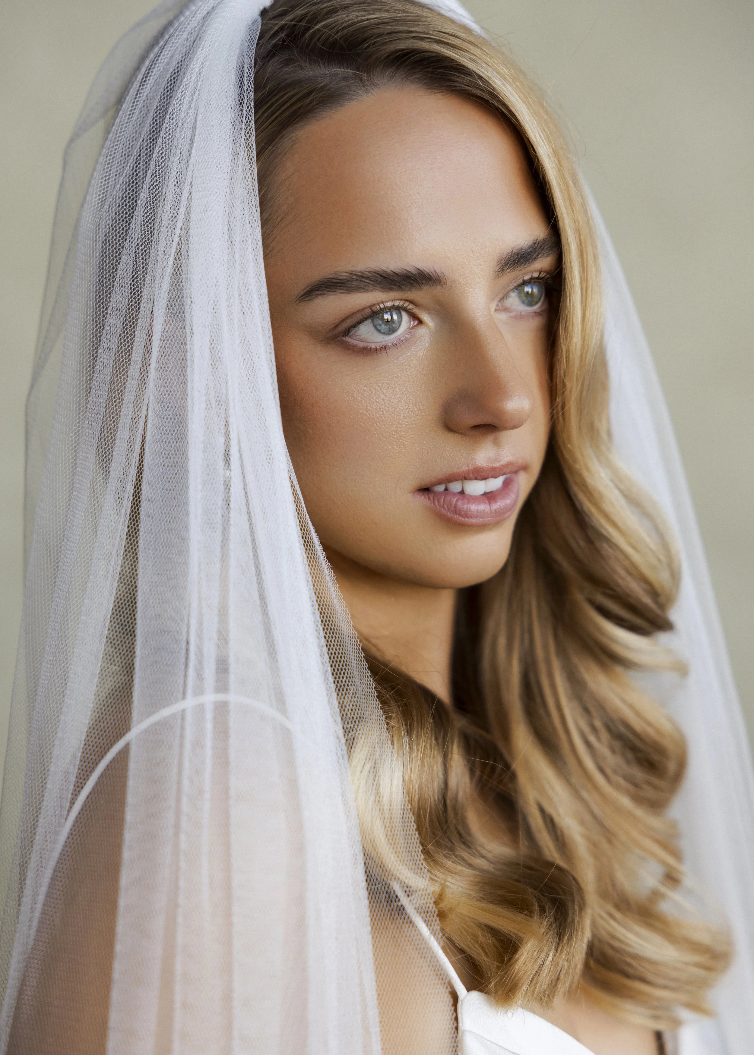
Warm Earth Tones: The Foundation of Heirloom Portraiture
If you are building a fine art portrait practice and can invest in only one backdrop, it should be a warm earth tone. This is not opinion. It is the accumulated evidence of centuries of portraiture. The Old Masters painted their subjects against warm, umber-toned grounds because warm backgrounds make skin luminous. The same principle applies in photography: a warm neutral backdrop creates a color harmony with the yellow and red undertones present in every human skin tone, regardless of the subject's complexion depth.
Limestone is Chasing Stone's bestselling colorway for good reason. It is a warm taupe that reads as quietly elegant in every lighting condition, from soft window light to sculpted Profoto setups. It flatters fair, medium, and deep complexions alike because its undertone sits in the narrow band between yellow and pink that the eye reads as neutral warmth. Sandstone occupies a similar space with slightly more golden warmth, making it exceptional for sessions where the photographer wants the image to feel sun-touched even in a controlled studio environment. Clay introduces a terracotta richness that grounds editorial portraits with an earthy confidence, while Umber moves into deeper brown territory for portraits that demand a sense of gravity and historical weight.
Cool Neutrals: The Architectural Foundation
Where warm earth tones evoke the painted grounds of Rembrandt and Sargent, cool neutrals evoke the stone walls of Renaissance architecture: the plaster of a Florentine palazzo, the limestone of a Parisian gallery, the concrete of a contemporary art museum. These are the tones that feel permanent because they reference the built environment that surrounds fine art.
Silt is a pale cool gray that provides extraordinary versatility for fine art portraiture. It reads as almost white in high-key lighting but reveals subtle cool undertones when the exposure is brought down, giving the photographer a range of moods from a single surface. Bentonite is a warm mid-gray that bridges the gap between the cool and warm palettes, making it perhaps the most universally functional backdrop for photographers who work across multiple portrait styles. Slate, a concrete-like architectural gray, anchors the cool neutral family with a density and sophistication that reads as contemporary without feeling trendy, the visual equivalent of a gallery wall in a modern museum.
Blush and Mauve: The Romantic Heirloom Palette
The third pillar of timeless portraiture color is the blush and mauve family, which occupies a unique position in the fine art spectrum. These tones have appeared in portraiture since the Rococo period, when painters like Vigee Le Brun bathed their subjects in rose-tinted atmospheres that conveyed femininity, warmth, and romantic idealism. In 2026, the blush palette has moved well beyond the oversaturated "millennial pink" of the previous decade into something more nuanced and enduring.
Rose-Quartz delivers a soft pink that is muted enough to avoid trend association but present enough to impart warmth and tenderness to bridal, maternity, and fine art portraits. For deeper romance, Rhodonite introduces a mauve-pink complexity that references the dusty rose tones appearing across editorial mood boards in 2026 while remaining rooted in a palette that has been beautiful for centuries. Lavender-Quartzextends the family into soft violet territory, a tone that photographs with exceptional subtlety against fair and medium complexions.
Deep Tones for Dramatic Fine Art Portraits
Not all heirloom portraiture is soft and light. Some of the most enduring portraits in the Western canon, from Caravaggio's chiaroscuro compositions to Irving Penn's stark studio work, draw their power from darkness. Deep-toned backdrops create portraits of dramatic intensity that command wall space.
Graphite, a deep charcoal, provides the density needed for Rembrandt-style portraiture where the subject emerges from shadow. Carbon approaches true black but retains the tonal variation of hand-painted texture, preventing the flat, featureless void that a solid black seamless would produce. For photographers drawn to jewel-toned fine art work, Lapis offers a deep saturated blue that references the ultramarine grounds of Renaissance painting and creates striking contrast against warm skin tones.
Chasing Stone's hand-painted canvas backdrops begin at $497 for a 5x8 ft surface, with each piece individually painted in California by artist Jennifer over two to three days. No two canvases are identical, because no two paintings are identical.

Heirloom infant portraiture. SLATE canvas. A composition built to last.
Fine Art Portrait Backdrop Color Recommendations by Style and Mood (2026)
| Portrait Style | Recommended Colorways | Mood & Character | Best For |
|---|---|---|---|
| Classic Heirloom warm | Limestone, Sandstone | Timeless warmth, gallery-quality elegance | Family portraits, bridal, maternity, senior portraits |
| Earthy Editorial | Clay, Umber | Grounded richness, organic warmth | Editorial portraits, creative headshots, fine art commissions |
| Modern Minimalist | Silt, Bentonite, Slate | Contemporary calm, architectural neutrality | Contemporary fine art, gallery submissions, commercial fine art |
| Romantic Heirloom | Rose-Quartz, Rhodonite, Lavender-Quartz | Soft femininity, Rococo warmth | Bridal portraits, maternity, boudoir, editorial beauty |
| Dramatic Chiaroscuro | Graphite, Carbon | Intensity, gravity, Old Master drama | Fine art commissions, gallery work, dramatic editorial |
| Jewel-Toned Fine Art | Lapis, Azurite, Serpentine | Bold sophistication, painterly depth | Creative fine art, fashion editorial, conceptual portraiture |
Color Theory for the Heirloom Photographer: Reading Undertones and Light
Choosing a timeless backdrop color is not simply a matter of selecting a shade you find beautiful. It requires understanding how that color will interact with the specific skin tone of the subject in front of you and the specific quality of light in your studio. This is the point where fine art portraiture becomes genuinely technical, where the photographer's eye must function like a painter's, reading undertones rather than surface colors.
Every human skin tone contains a combination of warm and cool undertones. The warm component comes from hemoglobin and melanin, producing the red, yellow, and golden hues visible beneath the surface. The cool component comes from venous blood and light scatter through the skin, producing blue and violet undertones visible at the temples, inner wrists, and under the eyes. As we explored in our guide to skin tone and backdrop color, undertone matters more than surface depth when choosing a backdrop that will flatter rather than compete.
The conventional wisdom holds that warm skin tones pair with cool backdrops and cool skin tones pair with warm backdrops. This is a useful starting point that becomes insufficient the moment you begin working at the level heirloom portraiture demands. The real skill is reading the specific person in front of you: noticing that a subject with warm surface tones may have cool undertones that emerge in certain light, or that a subject with deep skin will look extraordinary against a backdrop whose warmth is slightly different in temperature from their own, creating subtle tonal counterpoint rather than a match.
This is where the chromatic complexity of hand-painted canvas becomes a practical advantage rather than an aesthetic luxury. A Limestone backdrop is not a single temperature. The layered pigment contains warm and cool notes that respond differently depending on the angle and quality of light. Under north-facing window light, the cool undertones come forward, making it an excellent pairing for subjects with warm skin. Under tungsten-balanced artificial light, the warm notes dominate, creating harmony with cooler complexions. A single canvas, because of its painted depth, can serve as both a warm and a cool backdrop depending on how it is lit.
The Difference Between Timeless and Trendy: A Framework for Backdrop Selection
We have spent years watching backdrop trends cycle through the photography industry, and the pattern is remarkably consistent. Every eighteen to twenty-four months, a new "it" color emerges: sage green in 2020, terracotta in 2021, dusty blue in 2022, rich burgundy in 2023. Photographers invest in the trending color, shoot it heavily for a season, and then watch as the images begin to feel dated almost as quickly as the trend arrived. The portraits are technically excellent. The color simply anchors them to a moment rather than transcending it.
The framework we use for advising photographers on timeless backdrop selection is built on three principles that Jennifer has refined through painting thousands of canvases and observing which colorways clients return to year after year.
The framework for choosing timeless fine art portrait backdrop colors rests on three principles: proximity to natural pigment (earth and mineral tones that predate trend cycles), middle saturation (muted enough to recede, rich enough to contribute), and temperature neutrality (neither aggressively warm nor aggressively cool).
Principle one: proximity to natural pigment. Colors derived from earth and mineral sources, the ochres, siennas, umbers, and stone grays that painters have used for millennia, do not participate in trend cycles because they predate trend cycles. Every Chasing Stone colorway is named for a mineral or geological formation precisely because the palette is drawn from the earth's own color library. Limestone is not a designer's invention. It is a material reality that has been beautiful for as long as humans have noticed it. Choosing backdrops from this range is choosing colors that were timeless before the concept of trendiness existed.
Principle two: middle saturation. Colors at the extremes of saturation date themselves. A neon-bright backdrop screams its decade. A completely desaturated backdrop, true gray with no undertone, reads as clinical rather than artistic. The sweet spot for heirloom portraiture is middle saturation: muted enough that the color recedes behind the subject, rich enough that it contributes warmth, mood, and dimension to the composition. This is the saturation level at which hand-painted canvas excels, because the layered pigment creates saturation through depth rather than through intensity. The color is felt more than it is seen.
Principle three: temperature neutrality. The backdrops that endure occupy the narrow band between warm and cool. They are not aggressively warm (which reads as nostalgic or deliberately retro) and not aggressively cool (which reads as modern and therefore eventually dated). They sit in the zone where the viewer cannot immediately name the temperature, where the backdrop feels simply "right" without calling attention to itself. Bentonite, Limestone, and Silt all occupy this zone, which is why they are among the most requested colorways for fine art portrait sessions.
Bridal portraits are made once. An heirloom image this close requires a backdrop with enough tonal depth to hold up at large print sizes and on gallery walls for decades. Bentonite canvas was made for this.
Building an Heirloom Portrait Backdrop Collection
A fine art portrait photographer who specializes in heirloom work does not need twenty backdrops. They need three to five surfaces chosen with the same intentionality they bring to every other element of their practice, covering the full range of moods and skin tone pairings while maintaining the cohesive visual identity that distinguishes fine art work from general portraiture.
The foundation collection we recommend for heirloom portrait specialists begins with one warm neutral (Limestone or Sandstone), one cool neutral (Silt or Bentonite), and one emotive accent (Rose-Quartz for romantic work, Graphite for dramatic work, or Clay for editorial warmth). These three surfaces, particularly in the 8x10 ft size that accommodates full-length and environmental posing, cover the vast majority of fine art portrait scenarios. Our guide to creating cinematic depth with backdrops explores how even a focused collection can produce extraordinary range when combined with intentional lighting and composition.
For photographers ready to expand, a fourth and fifth canvas introduce specific creative capabilities. A deep tone like Graphite or Carbon opens the door to chiaroscuro work and dramatic low-key portraiture. A jewel tone like Lapis or Serpentine enables the kind of bold, painterly editorial work that distinguishes a portfolio in a competitive market. The Studio Pack Three bundle offers meaningful savings on a curated three-backdrop investment, making the foundation collection accessible at approximately $457 per canvas rather than the individual price.
The economics deserve consideration. Photographers whose fine art sessions command $1,500 to $5,000 recoup the cost of a hand-painted canvas within one to three sessions. The canvas itself, properly cared for, serves the practice for years. As we explored in our analysis of negative space and minimalist composition, a single well-chosen backdrop often produces more compelling work than a studio full of mediocre alternatives, because constraint breeds intentionality.
Frequently Asked Questions
What are the best backdrop colors for fine art portrait photography?
The most timeless fine art portrait backdrop colors are warm earth tones like Limestone and Sandstone, cool neutrals like Silt and Bentonite, and muted blush tones like Rose-Quartz. These palettes are derived from natural mineral and earth pigments, which means they transcend seasonal trends and remain visually current across decades. Hand-painted canvas in these colorways produces the tonal depth associated with classical oil portraiture.
Why do fine art photographers prefer hand-painted canvas backdrops over vinyl or muslin?
Hand-painted canvas absorbs and diffuses studio light, creating dimensional tonal transitions that the camera captures as painterly depth. Vinyl reflects light directionally, producing hot spots and a surface sheen that flattens the image. Muslin wrinkles unpredictably and lacks the chromatic complexity of layered pigment. For heirloom portraiture where the final print is displayed as wall art, the material quality of the backdrop directly affects the artistic merit of the finished work.
How much do hand-painted photography backdrops cost for fine art portrait work?
Chasing Stone's hand-painted canvas backdrops begin at $497 for a 5x8 ft surface, with 8x10 ft canvases at $797 and the full-length 8x14 ft size available for photographers who need coverage for standing and environmental poses. Three-canvas bundles offer savings of approximately $120 to $300 depending on size. Each canvas is individually hand-painted in California by artist Jennifer over two to three days.
What backdrop color is most flattering for all skin tones in portrait photography?
Warm neutrals in the taupe-to-beige range, such as Limestone and Bentonite, are the most universally flattering backdrop colors because their undertone sits in the narrow band between yellow and pink that harmonizes with the warm and cool components present in every human skin tone. The chromatic complexity of hand-painted canvas enhances this versatility: the layered pigment contains both warm and cool notes that respond differently depending on lighting angle, allowing a single canvas to flatter a wide range of complexions.
How do I choose between warm and cool backdrop tones for fine art portraits?
Read the undertone of your subject's skin rather than the surface color. If the veins on the inner wrist appear greenish, the subject likely has warm undertones that pair beautifully with slightly cooler backdrops like Silt or Slate. If the veins appear more blue or purple, the subject has cool undertones that will be flattered by warmer canvases like Sandstone or Clay. For the highest versatility, choose backdrops in the temperature-neutral zone (Limestone, Bentonite) that bridge both worlds.
What size backdrop do I need for fine art portrait photography?
For headshots and close-up fine art portraits, a 5x8 ft canvas provides ample coverage while keeping the investment accessible at $497. For three-quarter and full-length heirloom portraits, the 8x10 ft size at $797 is the professional standard, offering enough surface area for standing poses, flowing fabric, and compositional breathing room. The 8x14 ft canvas accommodates full-length poses, couples, and family groupings with generous negative space.
Can I use one backdrop for both warm and cool lighting setups?
Yes, and this is one of the principal advantages of hand-painted canvas over printed or vinyl surfaces. Because the layered pigment contains both warm and cool notes at the micro level, a single canvas shifts temperature depending on the light source. A Limestone canvas reads slightly cool under north-facing daylight and slightly warm under tungsten-balanced artificial light. This dual-temperature behavior gives the fine art photographer significantly more range from each surface than a flat-printed backdrop would allow.
How do I care for hand-painted canvas backdrops to make them last?
Hand-painted canvas backdrops require minimal maintenance: gentle spot-cleaning with a damp cloth for surface marks, and always rolling (never folding) for storage to preserve the paint surface and canvas structure. Store rolled canvases vertically or horizontally on the cardboard core they ship on. With proper care, a hand-painted canvas backdrop will serve a fine art portrait practice for years, making the cost-per-session negligible over the life of the investment.
Begin Building Your Heirloom Collection
The finest fine art portrait photography backdrop colors are not the ones that look beautiful in isolation. They are the ones that make your subject look timeless, that collaborate with your light, and that will look as quietly perfect on a gallery wall in 2046 as they do today. Hand-painted canvas is the only surface material that delivers this combination of chromatic depth, light responsiveness, and enduring visual relevance. It is the material painters have used for centuries, and the material the most discerning portrait photographers use now.
Every Chasing Stone canvas is painted by hand in California, one surface at a time, with the care and intention that heirloom work deserves. No two are identical, because no two paintings are identical. That is not a limitation. It is the defining principle of fine art.
Explore the full collection of hand-painted photography backdrops to find the tones that will define your portrait work for years to come. For personalized colorway recommendations based on your studio lighting and client base, reach us at info@chasingstone.com.

Creators of premium photography backdrops and styling surfaces
Trusted by thousands of discerning creatives worldwide
Every piece is handcrafted with intention in Orange County, California