
The Complete Chasing Stone Color Guide: Every Backdrop and When to Use It
Updated on Apr. 18, 2016
I get asked the same question constantly: "Which color should I buy?"
It's a fair question. Looking at dozens of colors on a screen, trying to imagine how each one will photograph in your space with your light and your clients, is genuinely difficult. Colors that look similar in product photos can behave completely differently in use.
This guide is my attempt to answer that question for every color in our collection. Not marketing copy. Real talk about what each backdrop actually looks like, how it photographs, who it's for, and when you should choose it over similar options.
Bookmark this page. Reference it when you're deciding. And if you're still unsure after reading, reach out. I'd rather help you pick the right color than have you buy something that doesn't serve your work. For a complete overview of photography backdrops, start with our ultimate backdrop guide.
THE NEUTRALS
Neutrals are the backbone of any backdrop collection. They work with every skin tone, every wardrobe, every style. If you're buying your first backdrop, start here.
LIMESTONE
The color: Light tan with warm undertones. Think sun-bleached linen or pale desert sand.
How it photographs: Bright and airy without being stark. The warmth prevents it from reading as cold or clinical. Enough variation in the paint to add interest without distraction.
Best for: Light and airy portrait work. Newborns. Headshots where you want warmth. Brands with clean, organic aesthetics. Photographers who shoot in bright natural light.
Choose this over BENTONITE if: You want something lighter and warmer. LIMESTONE is the brighter option.
Skip this if: You want more drama or contrast. LIMESTONE is friendly, not moody.
BENTONITE
The color: Mid-taupe with warm grey undertones. The color of wet clay or well-worn leather.
How it photographs: The most versatile neutral in the collection. Warm enough to flatter skin, neutral enough to disappear behind any subject. Reads as professional without being boring.
Best for: Literally everything. Headshots, families, seniors, bridal. If you only own one backdrop, this should probably be it.
Choose this over LIMESTONE if: You want something slightly more sophisticated and less bright. BENTONITE has more depth.
Skip this if: You specifically want a lighter, airier feel. BENTONITE is mid-tone, not light.
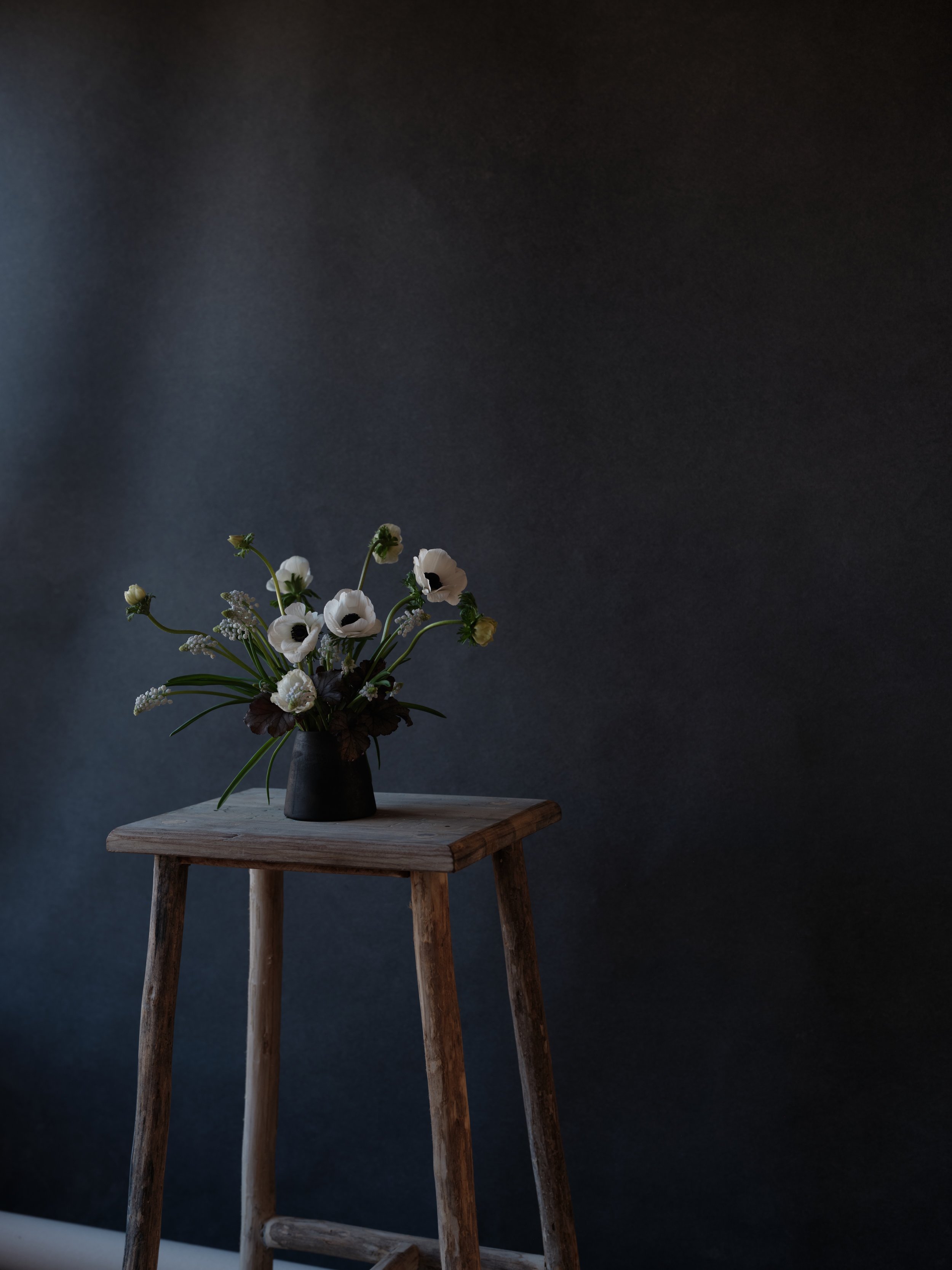
Bentonite is the backdrop we recommend when photographers ask 'which color works for everything?' Warm enough to flatter, neutral enough to disappear. See the full color guide to find your perfect match.
SILT
The color: Dark taupe with brown undertones. Like river sediment or storm clouds over desert.
How it photographs: Moody and dramatic while still being a neutral. Creates beautiful contrast with lighter subjects. The brown undertones keep it from feeling cold.
Best for: Editorial work. Senior portraits with attitude. Anyone wanting a moodier neutral. Photographers who shoot with dramatic lighting.
Choose this over BENTONITE if: You want more depth and drama. SILT is the moody sibling.
Skip this if: You need something that works for everything. SILT has a specific vibe that won't suit every client.
THE BROWNS
Earth tones that feel warm and organic. These are the backdrops that look like they came from somewhere real.
SANDSTONE
The color: Light peach-brown. Warm desert earth tones with a rosy quality.
How it photographs: Incredibly flattering to skin. The peachy undertones add warmth without reading as orange. One of the most universally flattering colors in the collection.
Best for: Newborn photography. Maternity. Boudoir. Anyone with warm skin tones. Spring and summer sessions where you want warmth without heaviness.
Choose this over LIMESTONE if: You want more warmth and color. SANDSTONE is warmer and pinker.
Skip this if: Your aesthetic is cool-toned or you primarily photograph clients with very cool skin tones.
CLAY
The color: Faded terracotta with rust undertones. Like old pottery or sun-baked earth.
How it photographs: Earthy and sophisticated. More saturated than the neutrals but still versatile. The faded quality keeps it from being overwhelming.
Best for: Fall sessions. Boudoir. Editorial work. Photographers with an earthy, organic brand aesthetic. Works beautifully with greenery and natural elements.
Choose this over SANDSTONE if: You want more color saturation and a terracotta feel rather than peachy warmth.
Skip this if: You need a true neutral. CLAY is definitely a color, not just a warm neutral.
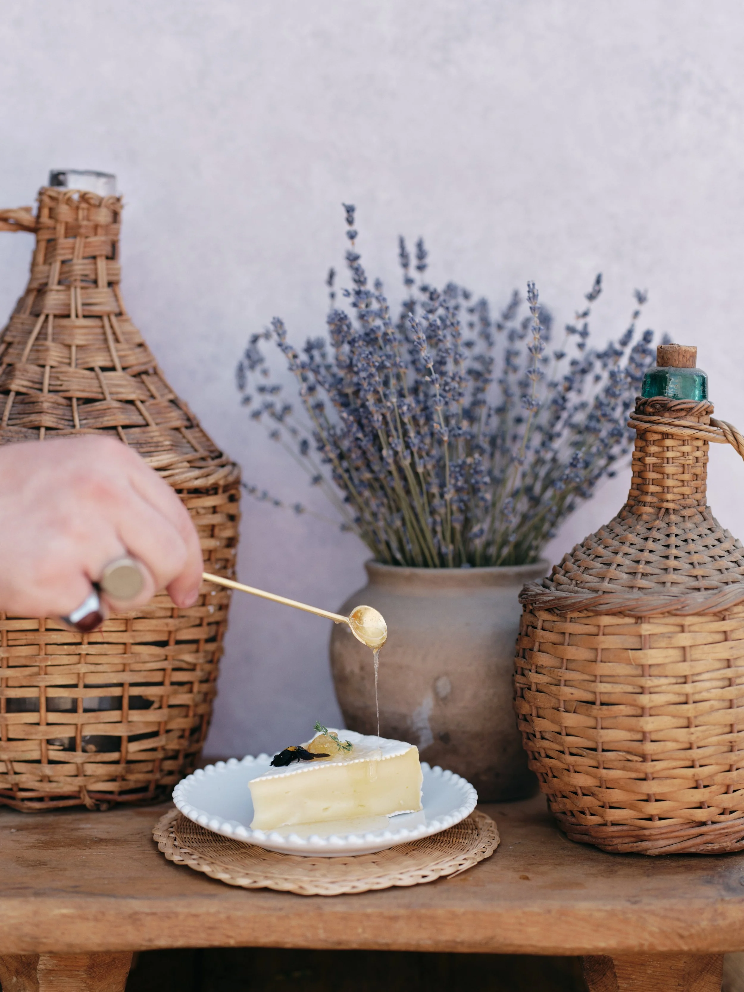
Clay works beautifully with jewel tones and organic arrangements because the faded terracotta undertones add warmth without competing. See how each backdrop color photographs in this complete color guide.
UMBER
The color: Dark chestnut brown with chocolate undertones. Rich and deep.
How it photographs: Dramatic and moody. Creates beautiful separation with lighter subjects. The chocolate warmth prevents it from feeling harsh.
Best for: Editorial portraits. Fine art work. Fall sessions. Dramatic headshots. Photographers who love contrast.
Choose this over BRONZITE if: You want pure rich brown without metallic undertones.
Skip this if: You shoot primarily light and airy work. UMBER is the opposite of that.
MICA
The color: Light tan with golden shimmer undertones. Like sunlit sand.
How it photographs: Luminous and warm. The golden quality catches light beautifully. Brighter than LIMESTONE with more personality.
Best for: Golden hour portraits. Glamour work. Sessions where you want extra luminosity. Warm skin tones.
Skip this if: You want a true neutral without any golden shimmer.
TRAVERTINE
The color: Mid brown with natural stone-like variation. Like the actual travertine stone.
How it photographs: Organic and textured. More visual interest than a flat brown. The variation adds depth.
Best for: Photographers wanting an organic, stone-like feel. Works well for product photography and branding.
Choose this over UMBER if: You want mid-tone brown rather than dark. TRAVERTINE is lighter and less dramatic.
BRONZITE
The color: Dark chocolate brown with subtle bronze metallic undertones.
How it photographs: Sophisticated and luxurious. The bronze undertones add dimension and richness. Very editorial.
Best for: High-end editorial work. Boudoir. Glamour. Fine art portraits.
Choose this over UMBER if: You want that metallic depth and extra sophistication.
Skip this if: Metallic undertones don't fit your aesthetic.
THE GREENS
Greens are having a moment, and for good reason. They complement skin tones beautifully and add organic interest without overwhelming.
CELADONITE
The color: Light sage green. Soft, muted, almost dusty.
How it photographs: Calming and organic. Soft enough to work as a near-neutral but with enough green to add interest. Very on-trend without being trendy.
Best for: Spring sessions. Organic brand aesthetics. Photographers wanting to add green to their collection without going bold. Works beautifully with florals.
Choose this over OLIVINE if: You want something lighter and softer. CELADONITE is the gentlest green.
Skip this if: You want impact. CELADONITE is subtle.
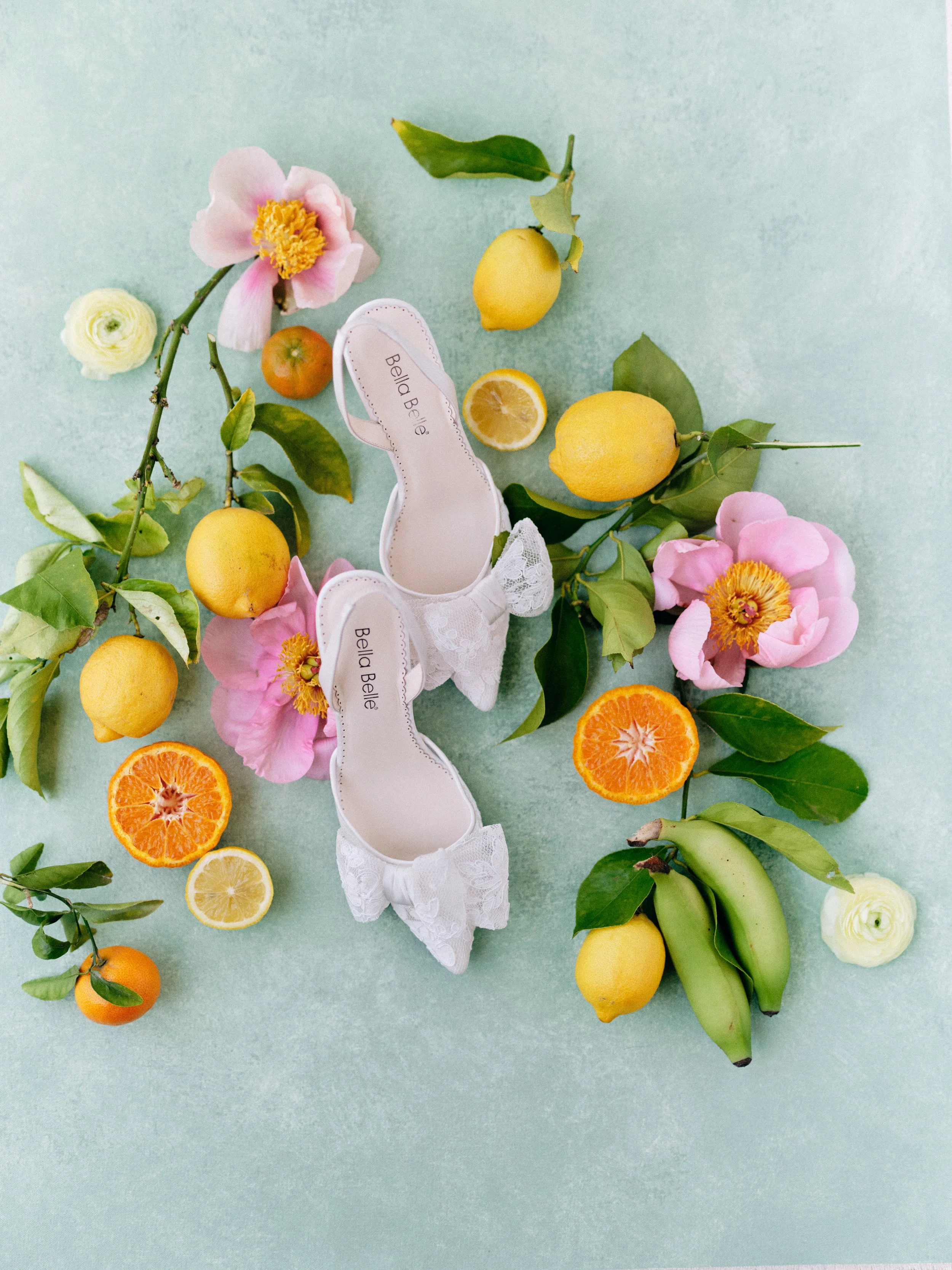
Celadonite works beautifully for bridal and spring product photography because it's green enough to add organic interest but soft enough to feel like a neutral. See how it lets bright citrus and pink florals shine.
OLIVINE
The color: Mid-tone green with olive undertones. Like actual olives or sage after rain.
How it photographs: Earthy and versatile. The olive undertones keep it from feeling too bright or too dark. Works year-round.
Best for: Year-round portrait work. Photographers who want green without commitment to a specific season. Complements both warm and cool skin tones.
Choose this over CELADONITE if: You want more presence and depth. OLIVINE is the middle ground.
SERPENTINE
The color: Dark moss green with black undertones. Deep and dramatic.
How it photographs: Moody and botanical. Creates dramatic contrast. The black undertones give it serious depth.
Best for: Editorial work. Boudoir. Dramatic portraits. Fall and winter sessions. Photographers with a dark, moody aesthetic.
Choose this over OLIVINE if: You want drama and depth. SERPENTINE is the boldest green.
Skip this if: You need versatility across client types. SERPENTINE has a specific mood.
THE BLUES
Blues are classic for a reason. They work with almost every skin tone and create instant calm.
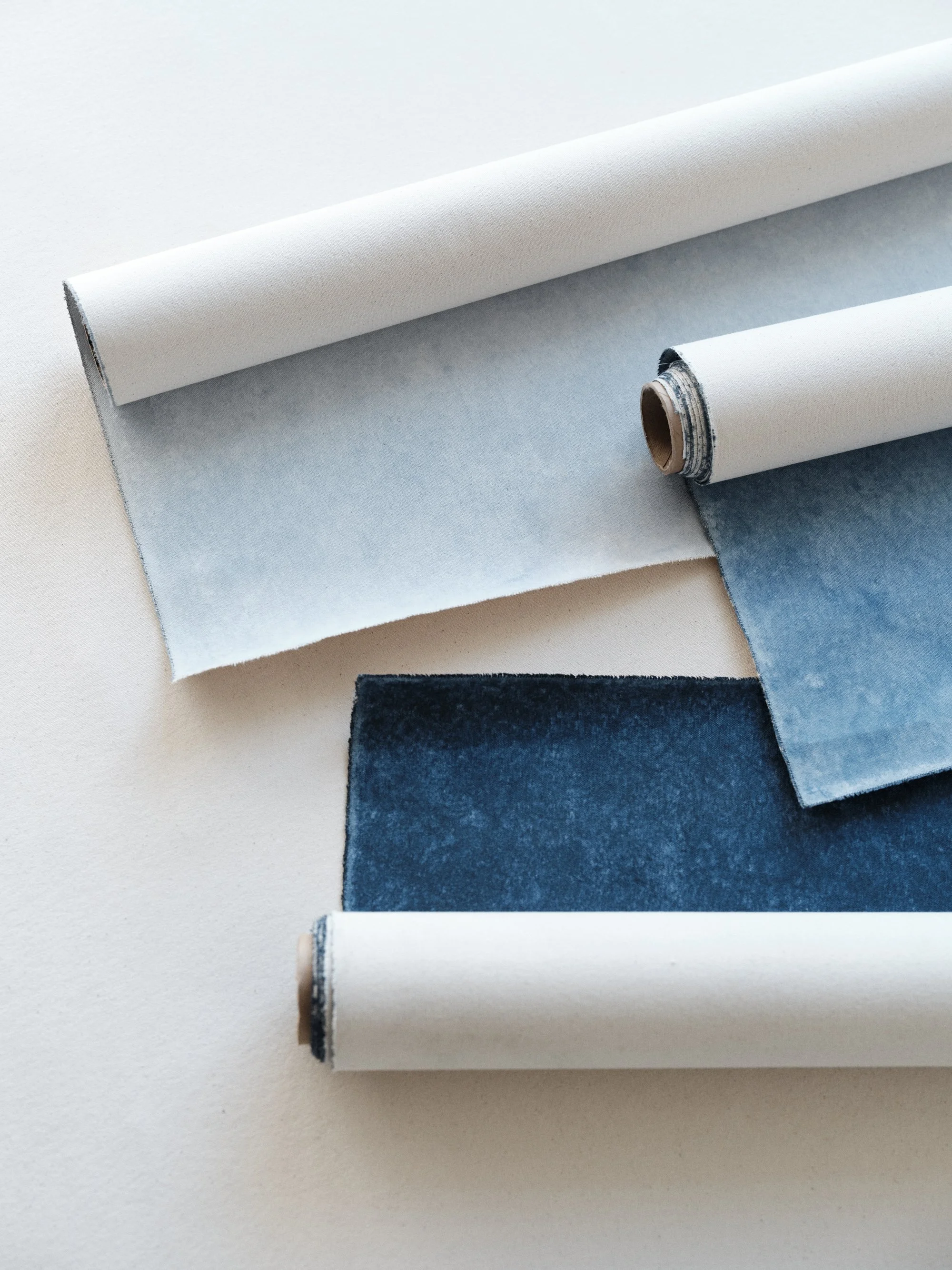
Choosing between blues gets easier when you see them together. Celestite whispers, Lapis speaks with confidence, and Azurite demands attention. Each has its place in your backdrop collection.
CELESTITE
The color: Light sky blue. Soft, ethereal, dreamy.
How it photographs: Airy and romantic. The softest blue in the collection. Creates a dreamy, almost heavenly quality.
Best for: Romantic portraits. Maternity. Newborns. Light and airy aesthetic. Cool skin tones.
Choose this over LAPIS if: You want something soft and subtle. CELESTITE whispers.
Skip this if: You want blue that makes a statement.
LAPIS
The color: Mid-denim blue. Rich and saturated. Like your favorite worn jeans.
How it photographs: Classic and versatile. Enough saturation to be interesting, not so much that it overwhelms. The most universally useful blue.
Best for: Family portraits. Seniors. Anyone wanting classic blue. Works across seasons and client types.
Choose this over CELESTITE if: You want more presence. LAPIS has confidence.
Choose this over AZURITE if: You want versatility over drama.
AZURITE
The color: Dark marine blue. Deep ocean tones approaching navy.
How it photographs: Dramatic and sophisticated. Creates beautiful contrast with lighter subjects. Moody without being black.
Best for: Editorial work. Fine art portraits. Dramatic headshots. Winter sessions.
Choose this over LAPIS if: You want depth and drama. AZURITE is serious.
Skip this if: You shoot primarily light and bright work.
THE GREYS
True greys without warm or cool undertones pulling them in different directions. Clean and professional.
SLATE
The color: Light grey with cool undertones. Clean and crisp.
How it photographs: Fresh and professional. The cool undertones give it a modern feel. Very clean.
Best for: Corporate headshots. Product photography. Photographers wanting true neutral grey. Modern brand aesthetics.
Choose this over BENTONITE if: You specifically want cool-toned grey rather than warm taupe.
Skip this if: You want warmth. SLATE is intentionally cool.
GRAPHITE
The color: Mid charcoal grey. Sophisticated and timeless.
How it photographs: Professional and versatile. Dark enough to create contrast, light enough to see texture. The workhorse grey.
Best for: Headshots. Corporate portraits. Anyone wanting classic grey backdrop look.
Choose this over CARBON if: You want texture visibility and mid-tone rather than near-black.
CARBON
The color: Near-black grey. Dark and dramatic.
How it photographs: Bold contrast. Makes subjects pop. Creates that classic studio look with dark background.
Best for: Dramatic portraits. Low-key lighting. Photographers wanting near-black without pure black.
Skip this if: You need to see backdrop texture. CARBON goes dark.
Need drama without pure black? Carbon creates bold contrast that makes white florals pop. Perfect for moody editorial work. Shop the darkest backdrops at chasingstone.com.
THE PINKS
From subtle blush to bold statement pink. Romantic, feminine, and surprisingly versatile.
ROSE QUARTZ
The color: Soft pastel pink. Gentle blush tones.
How it photographs: Romantic and soft. Feminine without being saccharine. Very flattering to most skin tones.
Best for: Newborns. Maternity. Boudoir. Valentine's sessions. Brands with feminine aesthetics.
Choose this over RHODONITE if: You want subtle and soft. ROSE QUARTZ is gentle.
Skip this if: Pink isn't part of your brand at all.
RHODONITE
The color: Bold carnation pink. Vibrant and confident.
How it photographs: Makes a statement. Saturated enough to create impact while still being sophisticated.
Best for: Fashion work. Editorial. Bold brand aesthetics. Photographers who want pink with confidence.
Choose this over ROSE QUARTZ if: You want impact. RHODONITE is bold.
HEMATITE
The color: Berry-toned pink with mauve undertones. Dusty and sophisticated.
How it photographs: Romantic with depth. The mauve undertones add sophistication. More complex than pure pink.
Best for: Editorial boudoir. Sophisticated feminine portraits. Fall romantic sessions.
Choose this if: You want pink with edge and sophistication.
THE PURPLES
Romantic, creative, and editorial. Purples make a statement while remaining surprisingly versatile.
LAVENDER QUARTZ
The color: Faded lilac with warm pink undertones. Soft and ethereal.
How it photographs: Romantic and dreamy. The warm undertones prevent it from feeling cold. Very bridal.
Best for: Bridal portraits. Romantic sessions. Spring work. Dreamy aesthetics.
Choose this over AMETRINE if: You want something soft and subtle.
Lavender Quartz: the soft lilac backdrop that brings romantic, editorial style to food and product photography. Explore all purple tones at chasingstone.com.
AMETRINE
The color: Mid purple with amethyst tones. Rich and regal.
How it photographs: Confident and sophisticated. A true purple without leaning too pink or too blue.
Best for: Editorial work. Creative portraits. Photographers wanting statement purple.
Choose this over LAVENDER QUARTZ if: You want more presence and saturation.
PURPURITE
The color: Dark mauve with magenta undertones. Bold and dramatic.
How it photographs: Editorial and high-fashion. Creates dramatic mood. The magenta undertones add energy.
Best for: Fashion work. Editorial portraits. Bold creative work.
Skip this if: You need versatility. PURPURITE is specific.
HOW TO CHOOSE
If you're still unsure, here's my framework:
Buying your first backdrop? BENTONITE or LIMESTONE. You cannot go wrong with a warm neutral.
Adding to a neutral collection? Look at what you wish you had. Wanting more drama? Add SILT or UMBER. Wanting more color? Start with OLIVINE or CLAY.
Building for specific work? Match to your niche. Newborn photographers need SANDSTONE. Corporate headshot photographers need SLATE or GRAPHITE. Boudoir photographers need CLAY or SERPENTINE.
Following your creative vision? Buy what excites you. The backdrops you're drawn to are probably the ones that fit your aesthetic.
Still stuck? Email us. I'd rather help you pick the right color than have you guess wrong.
Learn more in our complete photography backdrop guide. Explore the full collection at chasingstone.com/shop-all.
Related Reading

Creators of premium photography backdrops and styling surfaces
Trusted by thousands of discerning creatives worldwide
Every piece is handcrafted with intention in Orange County, California