
The Stories Behind the Names: How Travel Inspires Our Backdrop Collection
Posted on Feb. 5, 2026
People ask me all the time why our backdrops have such strange names.
BENTONITE. CELESTITE. SERPENTINE. They sound like geology terms, not photography products. And honestly, they are geology terms. But that's only part of the story.
When I started naming backdrops, I wanted something that meant something. Not "Light Grey #3" or "Warm Neutral." Something that carried the feeling of where the color came from. Something that told a story before you even saw the product.
Every backdrop in our collection is named for a place, a mineral, or a moment that inspired it. Some are obvious. Some require explanation. All of them mean something to me.
This is the first in a series about those stories.
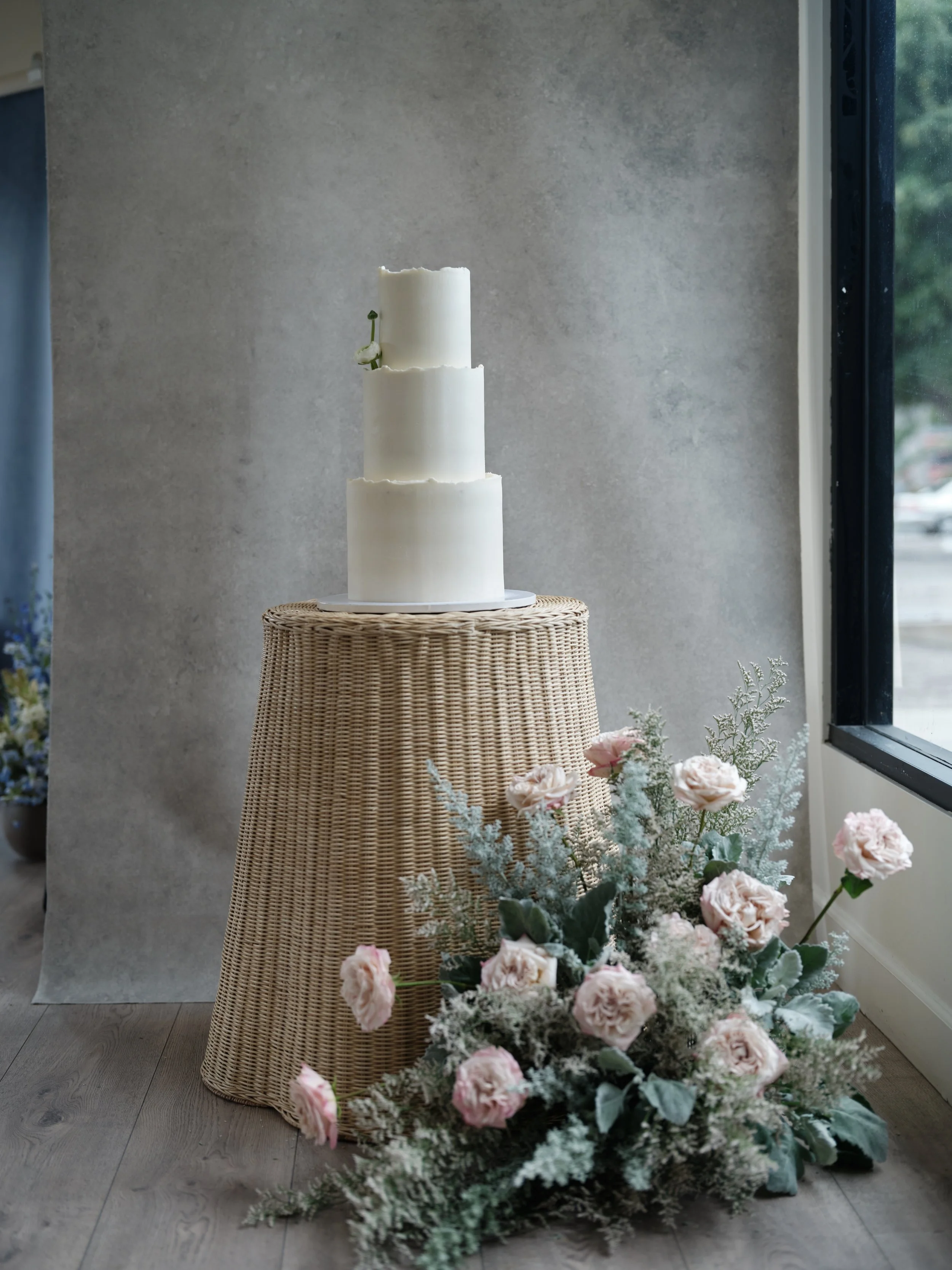
This wedding cake was photographed on one of our mineral-inspired canvas backdrops. Each backdrop name carries a story from Morocco to Iceland. Explore the collection and find the surface that tells your story.
It Started in Morocco
The summer before I launched Chasing Stone, I spent three weeks wandering through Morocco. Marrakech. Fes. Chefchaouen. The Atlas Mountains. I wasn't planning to start a backdrop company. I was just traveling.
But I couldn't stop noticing walls.
Everywhere I looked, there was color and texture that I'd never seen anywhere else. Plaster that had been painted and repainted over decades, layers of terracotta and ochre bleeding through. Blue doors faded by sun until they were the exact color of sea glass. Stone worn smooth by centuries of hands and sandaled feet.
I took hundreds of photos. Not of the famous sites. Of walls. Of surfaces. Of the way afternoon light hit ancient plaster in a medina alleyway.
When I got home, I couldn't stop thinking about those surfaces. How they'd photograph. How they'd feel behind a portrait subject. How nothing I could buy captured that same quality.
So I started trying to paint it.
The first backdrop I ever made was inspired by a wall I photographed in Marrakech. Warm, dusty, with layers of history visible in the texture. I didn't know what I was doing. The result was imperfect. But when I photographed a friend against it, something clicked.
That backdrop eventually became what we now call MARRAKECH. The color has evolved through dozens of iterations, but the feeling is still that wall. Still that afternoon. Still that moment when I realized surfaces could carry stories.
MARRAKECH was born from a wall I couldn't stop thinking about in Morocco. That warm, layered texture shows up differently in every image, like this wedding cake editorial. When a backdrop has a story, your images carry that story too.
The Flat Lay Collection: A World Tour in Paint
Our flat lay surfaces are the most obviously travel-inspired. Each one is named for a specific place, and each place was chosen because something about it demanded to be painted.
SANTORINI came from a week on that island, watching how the white buildings absorbed and reflected the Aegean light. The blue isn't the bright blue of postcards. It's the softer, dustier blue of actual Santorini at golden hour, when the harshness fades and everything goes soft.
HAVANA came from Cuba, obviously. But not the colorful vintage car Cuba of tourist photos. The Cuba I fell for was the crumbling decay. Plaster falling off colonial buildings to reveal layers of paint beneath. Turquoise and coral and cream all fighting for space on the same wall. Beautiful because of the imperfection, not despite it.
CHEFCHAOUEN is named for Morocco's famous blue city. I spent two days there, lost in winding streets where every surface was some shade of blue. Not uniform. Not coordinated. Just blue, everywhere, in a hundred variations. The flat lay surface tries to capture that particular cornflower tone that dominated, the one that made even harsh midday light feel soft.
MONTEVERDE came from Costa Rica's cloud forest. That deep viridian green, almost black in shadow, that makes you feel like you're being swallowed by jungle. I painted it thinking about the humidity, the density, the way that green seemed to have weight.
PROVENCE is lavender fields at dusk. SAKURA is Japanese cherry blossoms. VIK is Iceland's black sand beaches. JOSHUA TREE is California desert at sunset.
Each name is a shorthand for a feeling. When a photographer chooses HAVANA over SANTORINI, they're not just choosing a color. They're choosing an atmosphere. A story. A place their images will reference even if their subjects have never been there.
The Minerals: When Chemistry Becomes Color
The canvas backdrops are named differently. Instead of places, they're named for minerals and geological formations. There's a reason for this.
Paint is chemistry. Pigments come from somewhere. The colors we see in the natural world aren't random; they're the result of specific mineral compositions reflecting specific wavelengths of light.
When I'm developing a new backdrop color, I often start with actual mineral references. What does iron oxide look like when it oxidizes? That's your terracottas, your rusts, your CLAYs. What happens when copper weathers? That's your verdigris, your patinas, your aged greens.
BENTONITE is named for bentonite clay, that grey-brown mineral used in everything from cat litter to face masks. The color has that same earthy warmth, that sense of something pulled from the ground.
LIMESTONE references the sedimentary rock, pale and warm and ancient. SANDSTONE evokes those peachy desert formations. TRAVERTINE is the stone used in Roman architecture, cream and tan with natural variation.
CELESTITE is named for the pale blue mineral, soft and almost ethereal. SERPENTINE is the deep green mineral that looks almost black until light catches it right. OLIVINE is the green mineral found in volcanic rock, that particular olive tone that feels both warm and cool simultaneously.
The mineral names do something the place names don't: they emphasize the materiality of the backdrops. These aren't printed surfaces. They're pigment on canvas. They have weight and texture and substance. Naming them after minerals honors that physical reality.
This is GRAPHITE, our mineral-inspired canvas backdrop. Named for the deep grey carbon mineral, it brings moody sophistication to food photography and editorial styling. Explore the collection and discover the stories behind the names.
Why Naming Matters
I could have called everything by color codes. Warm Grey 01. Taupe 04. Terracotta Medium. That's what a lot of backdrop companies do.
But names create connection. When you tell a client you're shooting on HAVANA, that means something different than shooting on "brown backdrop." It sets an expectation. It creates atmosphere before anyone sees the actual surface.
Names also help me stay honest about what I'm making. If I'm painting something called MARRAKECH, I have a responsibility to that place. The color needs to actually feel like Morocco. Not just be a generic warm tone that could be anywhere.
Every time I introduce a new color, the naming process forces me to articulate what makes it different. What story is it telling? What feeling does it evoke? Where did it come from?
If I can't answer those questions, the color isn't ready.
The Places I Haven't Been Yet
There are places I want to paint that I haven't visited. Japan beyond the cherry blossoms. The coast of Portugal. The Scottish Highlands. Iceland beyond the black sand beaches.
Part of me thinks I shouldn't paint a place until I've been there. Until I've felt the light and touched the walls and understood the atmosphere firsthand.
But then I remember that I'm not painting literal places. I'm painting feelings. And feelings can come from photographs, from stories, from conversations with people who've been there and describe it perfectly.
Maybe the next collection will include somewhere I've only imagined. Maybe that's okay. Maybe the best backdrops aren't documentaries. They're interpretations.
The One That Means the Most
Every backdrop means something to me, but some mean more than others.
MATERA is named for the ancient Italian city where people have lived in carved stone caves for 9,000 years. I visited during a trip through southern Italy, not expecting much. What I found was one of the most extraordinary places I've ever seen.
The stone there isn't just old. It's been shaped by millennia of human hands. Worn smooth in some places, rough in others. The color shifts from cream to grey to soft gold depending on the time of day. Walking through the sassi, the ancient cave district, I felt like I was inside geology. Inside history.
The flat lay surface I painted after that trip tries to capture the texture of those walls. The way they feel ancient without feeling cold. The way they hold warmth even in shadow.
When I paint MATERA, I'm back in those narrow streets. Morning light filtering between stone buildings. The smell of someone's grandmother making pasta. The weight of all those centuries pressing down and somehow feeling not heavy but warm.
That's what I want every backdrop to do. Not just be a color. Be a place. Be a story. Be a moment you can photograph against, even if you've never been there yourself.
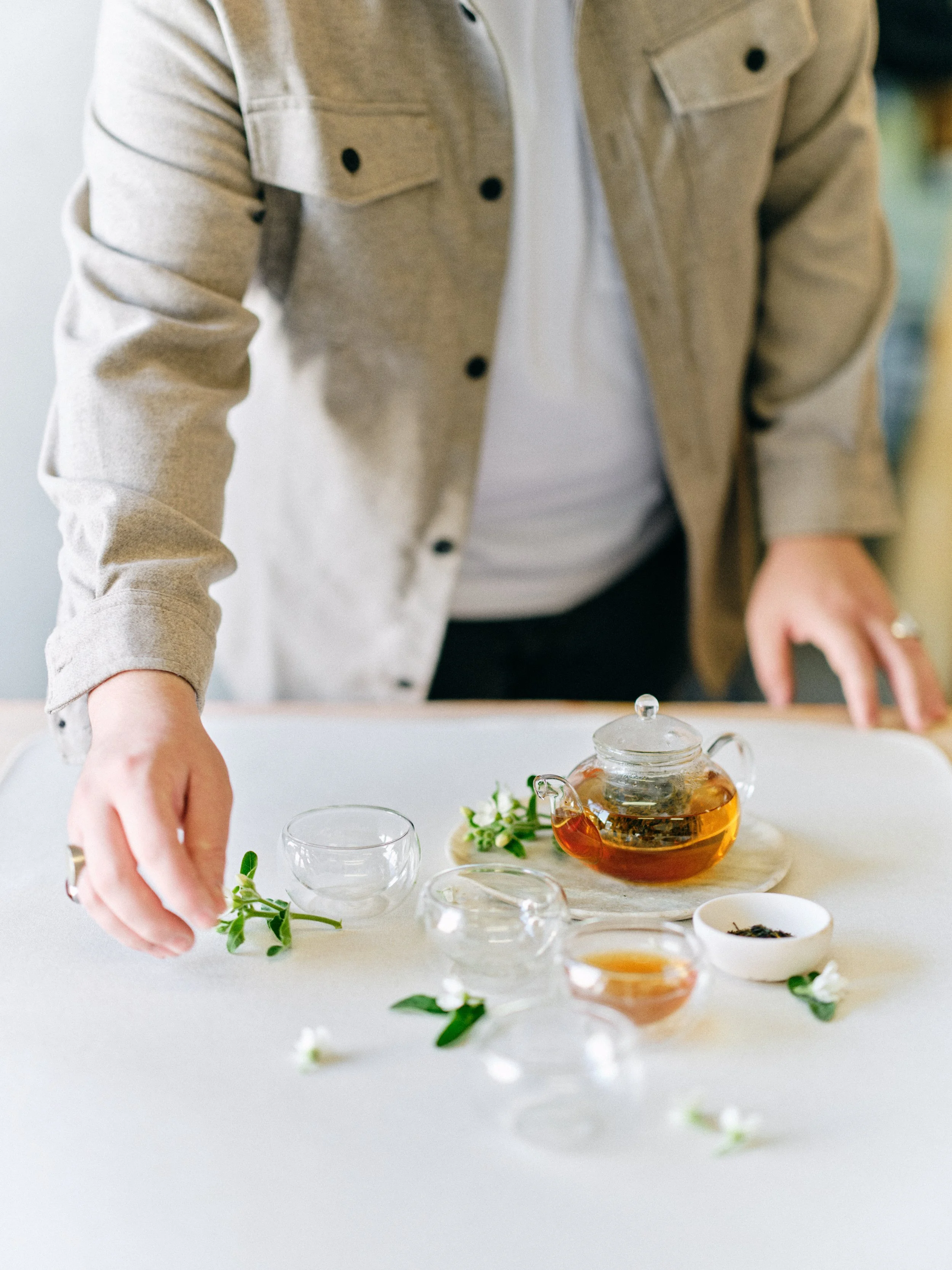
MATERA means something to me. Named for the Italian city where stone walls have been shaped by millennia of hands, this backdrop carries that ancient warmth without feeling cold. This tea styling shows how surfaces inspired by real places create depth in everyday moments.
More Stories Coming
This is the first post in a series about the stories behind our names. Future posts will dive deeper into specific colors, specific trips, specific moments when a place became a backdrop.
If you've ever wondered why CHEFCHAOUEN is that particular blue, or what HALEAKALA has to do with Hawaii, or why I named a dark green after a snake mineral, those answers are coming.
For now, browse our collections and notice the names. Think about what they evoke before you even see the color. That response, that feeling, is intentional. It's the first layer of the story your images will tell.
Explore Hand-Painted Flat Lays →
Related Reading

Creators of premium photography backdrops and styling surfaces
Trusted by thousands of discerning creatives worldwide
Every piece is handcrafted with intention in Orange County, California