
How to Photograph Flower Arrangements: A Florist's Portfolio Corner (2026)

There is a moment in every arrangement, usually just after the last stem settles into place, when the flowers seem to lean toward the window as if they already know where the light is coming from. I have always imagined that quiet hour in a florist's studio, with buckets on the floor, petals on the bench and the morning sun moving slowly across a plain wall, because it reminds me that the most beautiful things we make are often the most fleeting. A garden rose will open and fall within days, and a ranunculus will bow its head before the week is out, so the photograph you take before the van leaves is the only lasting record of the care you poured into each piece. When I began painting surfaces in 2018, I was thinking of crumbling stone and weathered plaster, those old world walls that hold light so softly, and I find that florals belong in front of them more naturally than almost anything else, since both are gifts of nature translated by hand.
Quick Answer
To photograph flower arrangements well in your own studio, set aside one permanent corner beside a large window, hang a muted, textured backdrop about three to five feet behind a plinth or stool, and place the arrangement so the window light falls across it from the side or slightly behind. Keep the camera at the height of the arrangement's widest point, use a longer focal length from a few steps back, and lock your white balance and exposure so every piece is photographed the same way. Choose backdrop colors a shade or two quieter than your flowers, and photograph each arrangement before delivery.
Choosing the Right Spot in Your Studio or Warehouse
The most important decision you will make happens before you buy anything at all, and it is simply where your corner will live. Florists tend to work in spaces built for labor, with concrete floors, cooler doors, long benches and shelves of vessels, and the light in those rooms is often generous but scattered. Walk your space at the hours you usually finish arrangements, because that is when you will actually photograph them, and look for the largest window or roll up door that receives open sky without direct sun striking the floor in hard patches.
Painters have long favored this kind of light, which is why so many traditional artists' studios in the Northern Hemisphere were built with north facing windows: the light arrives from open sky rather than direct sun, so it holds a fairly steady color through the day and casts soft, forgiving shadows. South of the equator, a south facing window offers the same quality. You do not need a perfect north window to make beautiful portfolio photos, but if you have a choice between two openings, the one that never admits a hard beam of sunlight will give you far more consistent results across a year of work.
Once you have chosen your window, measure the floor beside it. A good starting point for a portfolio corner is roughly twelve to fifteen feet of depth from the wall where your backdrop will hang to the place where you will stand, which leaves room for the plinth a few feet in front of the canvas and for you to step well back from it, and enough width that the backdrop can sit beside the window rather than directly across from it. If your window is on the left wall, for instance, the backdrop would stand along the far wall with its left edge a few feet from the window frame, so that light travels across the face of the arrangement and grazes the canvas behind it. That raking light is what reveals the texture of a hand painted surface, the soft mottling and gentle shifts of tone, and it is also what gives petals their dimension.
Keep the corner clear of the clutter that builds up in any working studio. A bucket of greens just out of frame will bounce green light into your shot, a bright white cooler door can act as an unwanted reflector, and a busy shelf behind your shoulder can show up as reflections in glass vessels. If you can, leave the corner set up permanently, with the backdrop hung and the plinth in place, because the single greatest obstacle to a consistent portfolio is the ten minutes it takes to assemble a setup on a busy delivery morning. If you are working with very little room, our guide to home studio backdrop solutions for limited space and low ceilings offers more ideas for fitting a backdrop into a tight footprint.

Backdrops for Florists: Size, Hanging, and the Plinth
When florists think about backdrops, they are usually picturing one of two things: a centerpiece or bridal bouquet photographed as a portrait, or a large installation such as an arch, a hanging cloud of blooms or a ceremony piece. Each calls for a slightly different setup, so it helps to think about which kind of work fills most of your calendar.
For arrangements, bouquets, compotes, bud vase collections and most centerpieces, a 5' x 8' backdrop is ample. Like all of our backdrops, it hangs on its short side, so the 5 foot edge runs across the top and the canvas stands 5 feet wide and 8 feet tall. A centerpiece on a plinth rarely stands taller than three feet, even with branches, and with the camera a few steps back the canvas will fill the frame comfortably with room to spare at the edges. Our backdrops do not come with a stand, and for the floating look, where the canvas hangs smooth and straight with no visible pole, we use a C-stand with the Floating Photography Backdrop Adapter Mount. A 5' x 8' needs one stand and one adapter, which keeps the footprint small enough to leave standing in the corner of a working studio.
The Plinth, the Stool, and the Floor
The surface your arrangement rests on matters nearly as much as the backdrop behind it. Many florists reach for a wooden stool, a plaster plinth, a stack of old books or a simple pedestal, and any of these works beautifully as long as it lifts the piece away from the floor and the base of the backdrop. When the arrangement sits too close to the bottom edge of the canvas, you lose the sense of air around it, and you are more likely to catch the place where the backdrop meets the floor.
Choose a plinth height that brings the widest part of the arrangement to about the middle of the frame when you are standing at a natural distance. For most table arrangements, a stool between eighteen and thirty inches tall does this well. Keep the plinth itself quiet in color and finish, since a glossy painted stool will throw reflections and a strongly colored one will compete with the vessel. A plinth that echoes the backdrop, such as a pale stone colored pedestal before a light tan canvas, reads as a single calm setting, while a dark wooden stool before a pale canvas grounds the composition and gives the eye a resting place at the base.
A plinth set roughly three to five feet in front of the backdrop is a sensible place to begin, since that distance lets the texture of the canvas fall gently out of focus so it reads as atmosphere behind the flowers while also keeping any shadow from the arrangement from landing on the backdrop itself. If you find a dark shape of the arrangement appearing on the canvas, move the plinth forward a foot at a time until it disappears.

Installations, Arches, and Larger Work
For larger work, such as arches, ceremony pieces, tall urn arrangements and floral cakes and other sculptural pieces, the larger backdrops are worth considering. An 8' x 10' hangs 8 feet wide and 10 feet tall, and an 8' x 14' hangs 8 feet wide and 14 feet tall, with its extra length free to sweep onto the floor beneath a grounded piece. Either gives you room for tall installations and for a piece photographed alongside a person for scale, and if you are photographing an arch, measure its width against that 8 foot span before you build. Each of those sizes hangs from two stands and two adapters. Our photography backdrop buying guide on what size you need goes into the proportions in more depth.
Installations bring their own considerations. A large piece often needs to be built in place, so plan to construct it in front of the backdrop with the canvas already hung, keeping drop cloths and buckets well clear of the painted surface. Our painted canvas is not food safe and does not care for saturation, so mist arrangements before they come to the set and let them drip dry, and if a little water does land on the canvas, a damp cloth will lift a water based mark. Mechanics such as chicken wire, foam alternatives and zip ties tend to show at the base of a large piece, so photograph installations from slightly above center height, which naturally hides the base behind the front blooms, or finish the base with loose foliage before you shoot.

Reading the Window: Light Direction for Flower Arrangements
Light shapes a floral photograph more than any other choice you will make, and a single window, used thoughtfully, offers far more variety than it first appears to. There are three positions worth learning, and once you have tried each one in your own corner you will find yourself choosing among them by instinct.
The first is side light, with the window at roughly ninety degrees to the line between your camera and the arrangement. This is the most dimensional light you can use, and it is the one I would begin with. One side of the arrangement glows and the other falls into soft shade, which carves out the cup of every rose and the ruffle of every peony. Side light also grazes across the backdrop, so the brushwork and mottled tones of a hand painted canvas come forward. If the shadow side becomes too dark, stand a white foam board or a folded reflector on the opposite side, about two to three feet from the arrangement, and move it closer or farther until the shade softens to your taste.
The second is three quarter backlight, with the window behind the arrangement and to one side, so light comes toward the camera at an angle. This is the most romantic light for florals, because thin petals such as sweet peas, poppies, cosmos and garden roses become translucent and seem to glow from within. It does require care, since the camera is facing partly into the light, so shade your lens with a hand or a hood and expose for the front of the arrangement rather than the bright edges. A reflector placed in front of the arrangement, low and angled upward, will lift the face of the flowers without flattening the glow.
The third is front light, with the window behind you. It is the flattest of the three and the least flattering for most arrangements, since it fills every shadow and reduces depth, but it can be useful for documenting a piece clearly for a client who wants to see exactly what they ordered. I would treat it as a record shot and keep side or three quarter backlight for the images you place in your portfolio.
Distance from the window shapes the light as much as direction does. Adorama's explanation of the inverse square law describes how doubling the distance between a light and a subject leaves only about a quarter of the light falling on that subject, and it notes that this is what lets you control the balance between subject and background. In practice, this means an arrangement placed two to four feet from the window will be noticeably brighter than a backdrop standing several feet behind it, which gives you a gentle, natural darkening of the canvas behind the flowers. If you want a brighter, airier background, bring the backdrop closer to the plinth. If you want a moodier, more painterly look, move the arrangement closer to the window and let the canvas fall farther away into shade. Our article on how lighting changes your backdrop's entire personality shows how much one surface can shift through this simple adjustment.
On bright days when direct sun does enter the window, hang a sheer white curtain or a sheet of diffusion fabric across the glass. It will turn a hard beam into a broad, soft source and protect your blooms from the heat at the same time.
Distance, Height, and Lens: The Geometry of a Good Floral Portrait
I like to think of an arrangement as a portrait sitter, because the same principles that flatter a face also flatter a bouquet. The first is camera height. Place your lens at the height of the arrangement's widest point, which for most centerpieces is the band of focal blooms just above the rim of the vessel. Shooting from standing height looks down on the piece and makes it appear squat, while shooting from too low can exaggerate the vessel and hide the top of the design. When you want to show the overall shape of a low, garden style centerpiece as a guest at the table would see it, raise the camera slightly and tilt down, but keep that as an intentional variation rather than your default.
The second is focal length and distance. A longer lens used from farther back compresses the space between the arrangement and the backdrop, makes the canvas appear larger behind the flowers and avoids the stretched edges that come from standing very close with a wide lens. On a full frame camera, a short telephoto in the range many portrait photographers favor will serve you well, and on a phone, the longest built in lens your phone offers is usually the most flattering choice for this kind of work. In most studios that means standing somewhere around seven to ten feet from the plinth, which is why the depth of your corner matters so much.
The third is aperture. You want the whole arrangement to feel sharp from the front blooms to the trailing stems, with the backdrop softened behind it. A moderate aperture will usually give you that balance, though the right setting depends on your focal length, your distance and the depth of the arrangement. Wide apertures can look dreamy in a single focal bloom but often leave half of a lush centerpiece out of focus, which a bride or planner viewing your portfolio will read as a technical slip.
Finally, consider your framing. Leave generous space above the tallest stem and to either side, because you will crop these images in several ways for your website, your social channels and the occasional publication submission. An arrangement crammed to the edges of the frame offers no room for a vertical crop or a headline, and it is much harder to fix later than a little extra air.

Phone or Camera for Florist Portfolio Photos
A great many florists photograph their work with a phone, and there is no shame in it. A recent phone in good window light, held steady and set thoughtfully, can produce portfolio images that sit comfortably beside work from a dedicated camera, especially when they are mainly seen on a screen. The difference between an ordinary phone photo and a lovely one usually comes down to a handful of habits.
Use a small tripod or a phone clamp on a light stand so that every image is taken from the same height and angle. Tap to focus on the main bloom, then hold to lock both focus and exposure, and drag the exposure slider down slightly so that the brightest petals keep their detail. White and pale blooms lose their delicate veining quickly when overexposed, and once that detail is gone no editing will bring it back. Turn off any automatic beauty or enhancement settings that smooth texture, and avoid portrait or blur modes, which can leave strange halos around fine stems, airy grasses and clouds of baby's breath.
A dedicated camera earns its place when you want larger files for print or publication, more control over depth of field, cleaner results in dim winter light, or tethered shooting where the image appears on a larger screen as you work. Whichever you choose, the most important rule is consistency: photograph every piece with the same device, from the same place, in the same light, so that your portfolio feels like one cohesive body of work.
There is something quietly moving, for me, in watching a portfolio return again and again to the same canvas, so that a whole year of a florist's work begins to read as one long, unfolding story told in the same soft light.
Colors That Flatter Florals
Choosing a backdrop color for florals is a quieter decision than choosing one for portraits, because the flowers are already doing the singing. My guiding principle is that the backdrop should sit a shade or two softer than the arrangement, sharing a little of its warmth or coolness, so the eye travels to the blooms first and the canvas holds them like a gentle wall of old plaster.
For florists who work in a wide range of palettes, a light, warm neutral is the most versatile place to begin. Limestone carries light tan tones, Sandstone is a light peach brown, and Mica is a pale grey brown, and each of these sits behind ivory garden roses, blush ranunculus, apricot tulips and dried grasses without pulling attention. If your work leans toward whites and greens, consider the cooler quiet of Slate, a light grey, or Celadonite, a faint cool green with a light tan undertone, which lets foliage read as part of a single harmonious palette.
When a piece is pale and airy, a darker backdrop can give it presence. Graphite, a mid charcoal grey, and Carbon, a near black with faint charcoal highlights, make white anemones, hellebores and pale roses appear almost luminous, and they lend themselves to moody, painterly compositions with side light falling across the blooms. Silt, a dark taupe, offers a warmer version of that drama, and Umber, a dark chestnut brown, pairs beautifully with autumnal work in rust, copper and burgundy.
For florists whose signature is color, it often helps to choose a backdrop that relates to the flowers in a quieter key. Clay, a faded terracotta brown, sits warmly behind peach, coral and marigold arrangements. Celestite, a light sky blue, gives yellow and orange blooms a fresh, open contrast, since blue and orange sit across from each other on the color wheel. Rose Quartz, a soft pastel pink, flatters arrangements in deeper berry and wine tones without echoing the same pink. Olivine, a dusty sage green that leans cool, makes pinks and corals feel natural and grounded, as though they were still growing in a garden. If you would like to understand the reasoning behind these pairings more fully, our article on color theory for photographers walks through complementary and analogous relationships in plain terms.
Because each of our backdrops is painted by hand and may vary slightly from the photos in color and texture, I always suggest choosing by tone and temperature first, warm or cool, light or dark, and then letting the individual character of your canvas become part of your studio's signature. If you build a corner with two backdrops, a pairing of one light warm neutral and one deeper tone covers almost every arrangement you will make in a year, and a florist who wants three can find that combination in our backdrop bundles.

Photographing Before Delivery: A Calm Routine That Fits a Busy Morning
The hardest part of building a florist portfolio has very little to do with cameras and everything to do with time. Arrangements are often finished minutes before they leave, and the temptation is to snap a quick photo on the bench or skip it altogether. A simple routine that you repeat every time is what protects your portfolio from the pressures of a wedding Saturday.
Begin by building the photograph into your production schedule as its own step, after the final stem and before the arrangement is boxed or loaded. Ten minutes is usually enough once your corner is permanent, and those ten minutes will serve you for years. Carry the piece to the plinth, turn it slowly until you find its best face, which is usually the side you designed as the front, and step back to your marked camera position. A small piece of tape on the floor where you stand and where the plinth sits will save you from re-measuring every time.
Take one straight on image at your standard height and framing, then one from three quarter angle, then a close detail of the focal blooms and any unusual stems or textures. If the vessel is special, such as a vintage compote, a hand thrown ceramic or a client's heirloom, take one image that features it clearly. For bridal bouquets, photograph the bouquet on its own, resting in a vessel or held by a team member's hands against the backdrop, and then a detail of the ribbon or binding. Before you move the arrangement, glance at the images on a larger screen if you can, because a stray leaf, a bent petal or a drip on the vessel is easy to miss on the back of a camera.
Keep a small kit beside the corner so you never go searching for tools mid morning: a soft brush or lint roller for petals and pollen that drift onto the canvas, a damp cloth, a spray bottle you use only away from the set, a reflector, and a pair of snips for any last adjustments. Remove lily anthers before the arrangement comes near the backdrop, and if a little pollen does land on the canvas, lift it gently with a soft brush or lint roller.
When I photograph my own finished pieces, I work in soft, diffused but bright white light of around 5300K, which I chose because it is accurate for color and has a dynamic, interesting falloff across the surface. That same balance of softness and accuracy is what I would look for at your window, since it lets petals keep their true color while the canvas behind them settles gently into shade.
Keeping a Season of Work Consistent for Instagram and Your Website
A florist's portfolio is read as a whole. A planner scrolling your grid or a couple browsing your website forms an impression from the rhythm of many images together, and a portfolio photographed in one corner, with one or two backdrops and the same quality of light, reads as the work of an artist with a clear point of view. That consistency is often what makes a small studio feel established.
Start by deciding on a standard frame. In January 2025, Instagram head Adam Mosseri announced that profile grids would move from squares to taller rectangles, and Planoly's guide to Instagram's vertical grid explains that the grid now previews posts at a 3:4 ratio while the feed still shows a 4:5 portrait post at its full size. Because 3:4 is a little narrower than 4:5, a 4:5 image loses a sliver from each side in the grid preview, and Instagram's Adjust Preview option lets you reposition that thumbnail after posting. Since upright arrangements are naturally vertical, I would photograph them in portrait orientation, keep the arrangement centered with a little breathing room at the sides, and the same frame will then sit gracefully in both the feed and the grid. For your website, the same vertical images work beautifully in gallery layouts, and a few wider frames that show the corner, the plinth and the window light make lovely banner images.
Next, fix your settings. On a camera, set a custom white balance from a grey card held where the arrangement sits, and note your aperture, shutter speed and ISO for a typical bright morning. On a phone, lock exposure each time, use the same lens and turn off automatic adjustments that vary from shot to shot. When you edit, build one gentle preset and apply it to every arrangement in the season, adjusting only exposure and a touch of white balance as the light changes. The texture and tone of the backdrop will then appear the same from image to image, which is a large part of what makes a grid feel calm and intentional.
Think, too, about the rhythm of your backdrops through the year. Some florists keep one backdrop for the entire season so that every piece lives in the same setting, and others alternate between a light and a dark canvas so the grid breathes. Both approaches can be lovely, and what matters most is choosing your rhythm deliberately at the start of the season. Pairing a warm neutral with your spring and summer work and a deeper tone for autumn and winter arrangements gives your portfolio a natural seasonal arc that mirrors the flowers themselves.
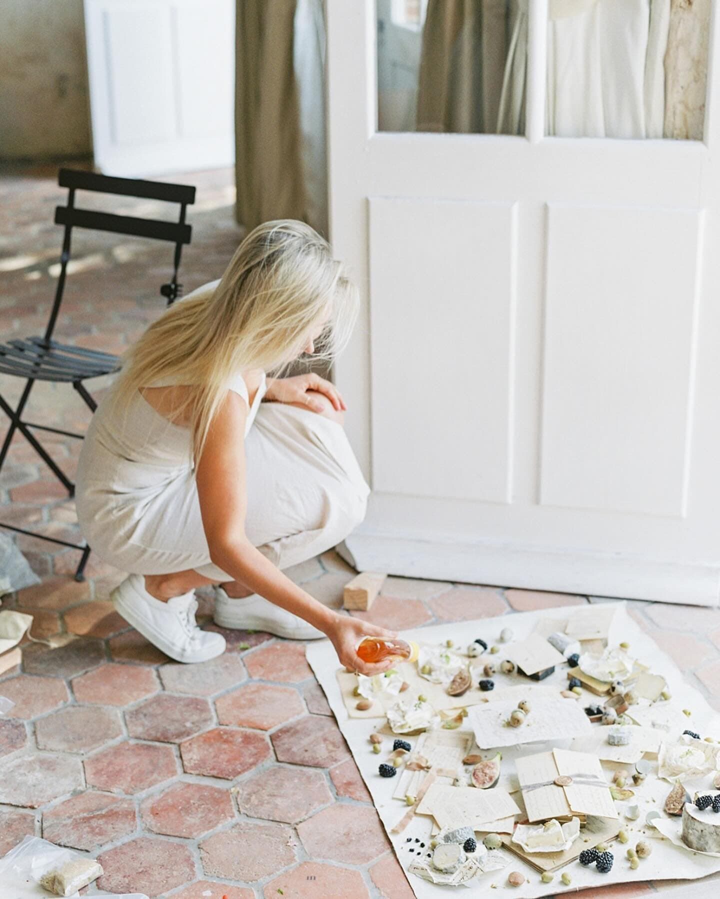
Finally, remember that your portfolio corner is also a place to tell the story of your craft. A few images of your hands placing the final stem, of buckets of fresh product waiting to be conditioned, or of a team building an installation in front of the backdrop all give your audience a glimpse of the care behind each piece. These behind the scenes images sit naturally alongside the finished arrangements when they share the same light and setting, and they help a couple understand the artistry they are investing in. If you also photograph overhead details such as boutonnieres, loose blooms or the elements of a bridal suite, our companion guide to styling flat lays for florists covers that work from above, so the two together form a complete portfolio practice.

Frequently Asked Questions
What is the best backdrop for florists photographing arrangements?
A textured, muted backdrop in a light warm neutral is the most versatile choice for florists, because it sits gently behind a wide range of palettes without competing with the blooms. A 5' x 8' size is ample for centerpieces, bouquets and most table arrangements, while larger 8' x 10' or 8' x 14' sizes suit arches and installations. Adding a second, deeper tone gives you contrast for pale and white arrangements.
How do florists take professional photos of their arrangements?
A reliable approach is to photograph every piece in one dedicated corner, beside a large window with soft, indirect light. They place the arrangement on a plinth or stool a few feet in front of a backdrop, shoot from the height of its widest point with a longer lens, and lock exposure and white balance. Repeating the same setup for each arrangement creates a cohesive body of work.
What light is best for photographing flower arrangements?
Soft window light from the side or slightly behind the arrangement is the most flattering for florals. Side light gives petals dimension and reveals the texture of the backdrop, while three quarter backlight makes thin petals glow. Avoid direct sun, which creates harsh shadows and can wilt blooms, by hanging a sheer curtain or diffusion fabric across the window, and use a white reflector to soften the shadow side.
Can I photograph my floral portfolio with a phone?
Yes, a recent phone can produce beautiful portfolio images in good window light. Mount it on a small tripod so every photo shares the same height and angle, use the longest built in lens, lock focus and exposure on the main bloom, and lower exposure slightly to protect detail in pale petals. Avoid portrait blur modes, which can leave halos around fine stems and airy foliage.
What color backdrop makes flowers stand out?
A backdrop a shade or two quieter than the flowers lets the arrangement lead. Light tan and pale grey brown tones suit most palettes, dark charcoal or near black makes white and pale blooms appear luminous, and a soft blue offers fresh contrast for yellow and orange flowers because the two sit opposite each other on the color wheel. Choose by warmth and depth first, then refine.
How far should a flower arrangement be from the backdrop?
Place the arrangement about three to five feet in front of the backdrop. That distance softens the texture of the canvas into a gentle atmosphere behind the blooms and keeps the arrangement's shadow from landing on the backdrop. Moving the arrangement closer to the window and farther from the backdrop darkens the background for a moodier look, while bringing the backdrop closer brightens it.
An Invitation to Your Own Corner
Florists carry a deep reverence for the brief life of a flower, the way a bloom opens, peaks and fades on its own gentle schedule, and a portfolio corner is simply a way of honoring that life before it passes. A window, a plinth and a hand painted canvas, set up once and returned to with care, can hold a whole season of your work in the same soft light, so that the arrangements you send out the door each week remain with you as a body of art you can share for years.
Seeing an arrangement resting in front of one of our canvases never stops moving me, the living bloom and the painted stone each carrying a small piece of the natural world. Painted canvas has been a medium of choice for photographers' backdrops for generations because it stands the test of time, and I love that a surface made to last can hold something as fleeting as a flower.
If you are dreaming up a corner of your own, I would love for you to explore our collection of hand painted backdrops, each one painted by hand in Orange County on premium cotton canvas and made to order. What beauty will you capture in yours?
Shop the look