
How Lighting Changes Your Backdrop's Entire Personality
Posted on Mar. 19, 2026
I keep a folder on my desktop called "Same Canvas" that I show to photographers who are hesitant about committing to a single backdrop color.
It contains 6 images, all shot on the same Bentonite backdrop over the course of one afternoon. In the first few, the backdrop reads as a soft, luminous warm taupe. The mood is open, airy, fresh. You'd call it a spring palette.
By the last few images, the same canvas reads almost like a deep chocolate brown. The mood is intimate, dramatic, editorial. It looks like a completely different backdrop. The kind you'd associate with a moody winter editorial or a dramatic fashion spread.
Nothing changed between those images except how I lit the backdrop. Same canvas. Same paint. Same physical surface. Six different personalities.
That folder is the fastest way I've found to demonstrate something most photographers discover slowly through trial and error: your backdrop doesn't have a fixed look. It has a range. And learning to control that range through lighting is one of the most valuable technical skills you can develop as a portrait or wedding photographer.
Our lighting fundamentals guide covers the perpendicular positioning principle and basic window light setup. This article goes further. This is about using light as a creative instrument to deliberately shift a backdrop's mood, color, and visual weight within a single session.
Every wedding photographer has a moment when the light, the subject, and the backdrop all come together perfectly. Having the right surface behind your subject is what makes those moments repeatable.
Why Hand-Painted Canvas Responds to Lighting Differently Than Flat Surfaces
Before getting into specific techniques, it helps to understand why this works at all.
A printed vinyl backdrop or a sheet of seamless paper has a uniform surface. Light hits it and bounces back evenly. Whether you flood it with soft light or rake it with hard directional light, the surface reads essentially the same. Brighter or darker, sure. But the character doesn't change. It's still a flat, uniform surface.
Hand-painted canvas has real physical dimension. Brushstrokes create ridges. Paint layers create thickness variation. The canvas weave shows through in some areas and disappears under heavy paint in others. This means that when you change how light interacts with the surface, you're changing which physical features become visible and which recede.
Soft, even light minimizes the perception of texture. Everything is evenly illuminated, so the ridges and valleys of the brushwork blend into a smooth wash of color. The backdrop reads as lighter, softer, more neutral.
Hard, directional light maximizes texture. Ridges catch highlights while recessed areas fall into shadow. The color appears darker and more complex because you're seeing the full range of the paint layers rather than a blended average. The backdrop gains weight, drama, and visual presence.
This is physics, not opinion. And it means that every hand-painted backdrop in your collection has at least two personalities hiding inside it, waiting for you to bring them out with light.
The Bright and Airy Setup
Let's start with the look that dominates wedding photography right now: clean, luminous, and open. The kind of images where everything feels bathed in natural warmth and the backdrop recedes into a gentle wash of tone behind the subject.
The light source. Large window, open shade, or a big softbox. The key word is "large." A large, diffused light source wraps around your subject and your backdrop evenly, filling shadows and reducing contrast across the entire scene. The bigger the light source relative to your subject, the softer and more even the illumination.
On a wedding day, this means positioning your backdrop near the largest window in the room and working during the hours when indirect daylight floods the space. North-facing windows are ideal because the light stays consistent and soft throughout the day without direct sun creating harsh patches.
Backdrop positioning for bright work. This is where you intentionally break the perpendicular rule from the lighting guide. For bright, airy images, you actually want more light hitting the backdrop face, not less. Position the backdrop at roughly a 60 to 70 degree angle to the window rather than a full 90. This allows light to wrap further across the surface, filling in the micro-shadows that create visible texture and producing a smoother, softer read.
You're trading texture depth for evenness. The backdrop will show less dimension but will read as lighter, cleaner, and more ethereal. For photographers going after that bright editorial look, this is exactly the goal.
Subject distance. Place the subject closer to the light source (near the window) and the backdrop further from it. Light falls off with distance. By putting space between your subject and the backdrop, the backdrop receives less light than the subject. This creates natural separation and makes the backdrop read as a soft, slightly shadowed environment rather than a bright wall.
The counterintuitive part: even though the backdrop is receiving less light, it reads as "bright" because the overall exposure is set for the well-lit subject. The backdrop falls into a gentle mid-tone that feels airy and open without being blown out.
Camera settings that support the bright mood. Slight overexposure (half a stop to a full stop above meter reading) lifts the entire image and pushes the backdrop further into ethereal territory. A wide aperture (f/2 to f/2.8) softens the backdrop texture into a creamy, even wash. Together, these settings produce the luminous, airy quality that makes a mid-tone canvas like Limestone or Mica read as almost white.
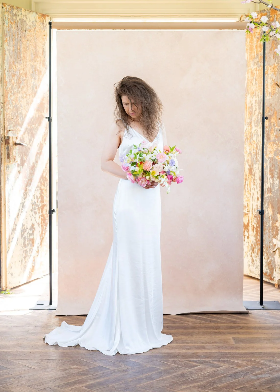
Colors that respond well to the bright approach. Lighter neutrals and warm tones naturally photograph brighter. Limestone, Sandstone, Rose Quartz, and Celestite all lean into this mood easily. But here's what surprises most photographers: mid-tone backdrops like Bentonite and Celadonite can also read as bright and open when lit this way. They won't look white, but they'll feel luminous rather than heavy.
The contrast between the bright open window light and the dark canvas behind it tells the whole story. Knowing where to place your backdrop relative to your light source is what separates good portraits from great ones.
The Moody and Dramatic Setup
Now the opposite end of the spectrum. Dark, intimate, editorial. The kind of images where the backdrop feels like it's pulling the viewer into the frame rather than opening up around the subject.
The light source. Small, directional, and controlled. A narrow window with curtains pulled mostly shut. A single strobe with a gridded modifier. A reflector bouncing hard light from a specific angle. The key is restricting how much light reaches the scene and controlling exactly where it falls.
Moody lighting is subtractive. You're not adding darkness. You're removing light. You're taking away fill. You're letting shadows exist instead of eliminating them.
The flag technique. This is the single most useful tool for moody backdrop work, and it requires nothing more than a piece of black foam core, a V-flat, or even a dark jacket hung over a stand.
Position a flag (any large, dark, non-reflective surface) between your light source and your backdrop. The flag blocks light from reaching the backdrop while allowing it to still illuminate your subject. The result: your subject is well lit while the backdrop falls into shadow behind them.
This is how you take a mid-tone backdrop and make it read as dark. A Bentonite that photographs as warm taupe in open light becomes almost a deep umber when flagged. A Clay that reads as soft terracotta in bright setups becomes a deep, rich umber when you restrict the light reaching it.
The beauty of this technique is precision. By adjusting the flag's position (closer to the light source blocks more, further away blocks less), you control exactly how dark the backdrop reads. You can go from "slightly moody" to "nearly black" with inches of movement.
The inverse square law in practice. Light intensity falls off dramatically with distance. At twice the distance, you get one quarter the light. This physical law is your friend for moody work.
Position your light source close to the subject (3 to 4 feet away) and the backdrop far behind (6 to 8 feet from the subject). The light hitting the subject is intense. The light reaching the backdrop has traveled twice the distance, so it's fallen to a fraction of that intensity. Your backdrop goes dark without any modifiers, flags, or post-processing.
This works with window light too. Pull the subject close to the window (within 2 feet) and push the backdrop to the far side of the room. The natural falloff does the work for you.
Camera settings that support the moody mood. Slight underexposure (half a stop to a full stop below meter reading) deepens shadows and gives the backdrop additional weight. A moderate aperture (f/3.5 to f/5.6) keeps enough texture visible on the backdrop to maintain its hand-painted character rather than reducing it to a featureless dark plane. You want the viewer to sense that there's something behind the subject, not just blackness.
Colors that respond well to the moody approach. Darker and mid-tone backdrops naturally lean moody. Silt, Umber, Graphite, Serpentine, and Carbon barely need encouragement. But the real power of the moody approach is what it does to medium-toned and lighter backdrops. A Lapis blue that reads as bright denim in open light becomes a deep navy when flagged. A Lavender Quartz that photographs as soft blush in bright setups takes on a dramatic plum quality in moody light.
This is why mid-tone backdrops are arguably the most versatile purchase you can make. They have the widest range between their bright personality and their moody personality. A very light or very dark backdrop has less room to shift.
The In-Between: Controlled Natural Light
Most wedding day scenarios fall between the extremes. You're not shooting in a perfectly bright studio and you're not in a blacked-out room with a single strobe. You're in a hotel suite at 2pm with two windows, mixed light temperatures, and 20 minutes to shoot portraits before the timeline moves on.
Here's how to read those real-world scenarios and steer the mood in the direction you want.
Two windows, same wall. Common in hotel rooms. Use one window as your key light and control the other. If you want brighter, leave both open. If you want moodier, close the curtains on the window that's hitting the backdrop and leave open the one lighting your subject. One set of curtains gives you a full mood shift.
One large window. This is the most versatile scenario. Position your subject near the window and your backdrop perpendicular to it (the standard setup from our lighting guide). For brighter, scoot the backdrop closer to the window so more light reaches it. For moodier, pull it further away so light falls off before reaching the surface. You can shift the entire mood by moving the backdrop 3 feet in either direction.
Direct sunlight streaming in. Hard light is dramatic by nature. If you have a shaft of direct sunlight, you can use it for intentionally moody work by positioning your subject in the light and your backdrop in the shadow. The contrast between the bright subject and dark backdrop creates instant drama. This isn't the soft, controlled moodiness of flagged light. It's raw and editorial. It works best with subjects who can handle high-contrast lighting on their face and with backdrops in warm or neutral tones that read as rich rather than dull in shadow.
Overcast days. The giant softbox in the sky creates even, low-contrast light that naturally leans bright and flat. If you want moody on an overcast day, you'll need to actively subtract light from the backdrop with flags or distance. Without intervention, overcast light pushes everything toward the bright, flat, even end of the spectrum.
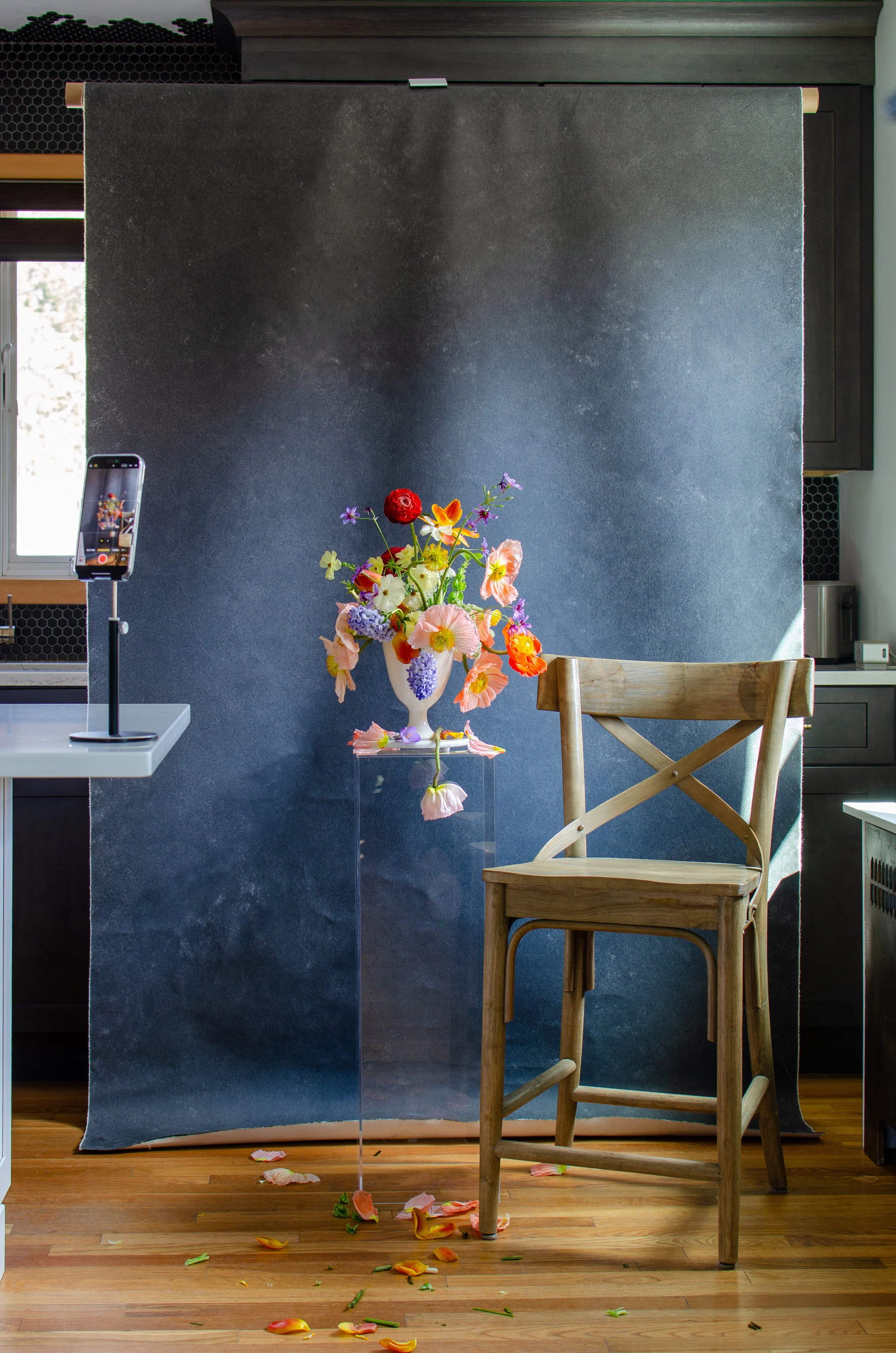
A dark backdrop does not mean a dark studio. This entire setup is lit by natural window light. Knowing how to position your canvas relative to the light source is what creates the drama.
One Session, Two Moods: A Practical Walkthrough
Here's how I structure a session when I want to deliver both bright and moody images from a single backdrop, which is most sessions.
I arrive early and assess the light. Where is it coming from, how strong is it, what's the quality? I identify my key window and note which direction the backdrop needs to face for my standard perpendicular setup.
Bright series first. I start with the airy look because it requires the most available light, and light fades as the day goes on. Backdrop angled slightly toward the window. Subject close to the light. Wide aperture. Slight overexposure. I shoot the compositions that benefit from openness and warmth: soft bridal portraits, romantic couples work, anything where the mood should feel inviting and luminous.
Transition to moody. Without moving the backdrop, I shift three things. First, I close curtains or position a flag to block light from reaching the backdrop. Second, I move the subject further from the window (or keep them in place and push the backdrop further from the subject). Third, I adjust my exposure down. The whole transition takes about 90 seconds.
Now the same Sandstone backdrop that was reading as a soft peach glow five minutes ago becomes a deep, warm earthy tone. I shoot the editorial compositions: dramatic angles, intentional shadow, the work that makes art directors pay attention.
The reveal moment. When I show clients their gallery and they see both looks, the response is always the same. "Wait, that's the same backdrop?" That moment is worth everything. It tells the client they hired a photographer who thinks creatively. It tells them their gallery has range. And it tells them the investment was worth it.
For creative composition techniques that pair with these lighting shifts, our companion article covers angles, crops, and framing strategies that multiply variety even further.
How Each Color Family Transforms
Not every color responds to lighting shifts the same way. Understanding your specific backdrops' range helps you plan which looks to pursue during a session.
Warm neutrals (Limestone, Bentonite, Sandstone, Mica). These have the widest practical range. In bright light, they read as clean, warm, and nearly luminous. In moody light, they deepen into rich, earthy tones that feel sophisticated rather than heavy. This is why warm neutrals are the most recommended starting point for building your collection. They give you the most mood versatility from a single purchase.
Cool neutrals (Slate, Graphite, Carbon). These start darker and lean moody by nature. In bright light, they read as clean and modern. In moody light, they go very dark very quickly. The range is narrower, but the moody end is extraordinarily dramatic. If your brand leans editorial and dark, these backdrops deliver that look with minimal lighting effort.
Earth tones (Clay, Silt, Umber, Travertine). Earth tones deepen beautifully in moody light. Clay moves from faded terracotta to deep rust. Travertine shifts from warm khaki to rich aged stone. The transformation feels organic because the colors already reference natural materials that we associate with both sunlit and shadowed environments.
Blues (Celestite, Lapis, Azurite). Blues are fascinating because they shift in hue as well as value. In bright light, blues read as open, airy, and romantic. In moody light, they deepen and sometimes take on a slightly purple or teal quality depending on the light temperature. Celestite in bright light is dreamy sky blue. Flag it into shadow and it becomes a quiet, contemplative steel.
Greens (Celadonite, Olivine, Serpentine). Greens also shift in character. Bright light brings out the yellow and warm undertones, making them feel fresh and botanical. Moody light emphasizes the blue undertones, pushing them toward deeper, more mysterious forest tones. Celadonite in bright open light reads as spring. In moody side light, it becomes autumn.
Pinks and purples (Rose Quartz, Lavender Quartz, Hematite). These shift the most dramatically in perceived character. Rose Quartz in bright light is soft, romantic, feminine. In moody light, it takes on a dusty, vintage quality that reads as entirely different. Hematite in bright light is berry-toned and vibrant. In shadow, it becomes a deep, brooding mauve that belongs in a Dutch master painting.
The Flat Lay Connection
Everything in this article applies to flat lay surfaces just as much as backdrops. The physics are identical. Light direction, quality, and intensity transform your flat lay surface's mood the same way they transform a vertical backdrop.
For flat lay work specifically, the single most effective mood shift is the angle of your light source relative to the surface. Light coming from directly beside the flat lay (at surface level) creates maximum shadow and drama. Light coming from above and behind (over your shoulder as you shoot overhead) fills the surface evenly and reads as bright and clean.
Our flat lay photography guide covers the complete workflow for overhead shooting. But when you combine those composition techniques with the mood-shifting strategies from this article, you open up a range of looks from your flat lay collection that most photographers never explore.
A Joshua Tree surface lit flat from above for a bright invitation suite looks warm and inviting. The same surface with hard side light raking across it for a moody ring detail looks like aged desert stone. Same surface. Same session. Two completely different stories.
Clean, bright, and effortlessly styled. This is what even overhead light does on a white textured surface. If your flat lay work is not looking like this, your backdrop might be the problem. Shop at chasingstone.com.
The Business Case for Mastering Both Moods
Learning to shift moods during a single session has a direct impact on your business in three ways.
Gallery diversity. Clients who receive a gallery with both bright and moody images feel like they got more value. The range suggests a longer, more involved session even if you shot everything in the same 30-minute window. Their album has chapters rather than one continuous note.
Broader portfolio appeal. Some clients are drawn to bright, airy work. Others want dark and dramatic. If your portfolio shows only one mood, you're invisible to the other half. Showing range from the same backdrop demonstrates versatility without diluting your aesthetic, because the cohesion comes from the surface and color choices while the lighting demonstrates creative range.
Fewer backdrops, more looks. This is the practical bottom line. A photographer who can light one backdrop two ways effectively owns two backdrops. Three lighting approaches? Three backdrops. This math is why we consistently tell photographers to invest in fewer, higher-quality surfaces and master the technique on each one rather than buying a dozen cheap options and shooting them all the same way.
One well-chosen mid-tone neutral that you can push bright or pull moody will serve more sessions than three single-mood backdrops you never learn to manipulate.
That's not a sales pitch. That's math. And it's the reason the "Same Canvas" folder on my desktop keeps growing.
Ready to find the backdrop with the widest creative range? Explore hand-painted canvas backdrops in every color family, each built with the texture and depth that responds to your lighting decisions. See the full collection at chasingstone.com.

Creators of premium photography backdrops and styling surfaces
Trusted by thousands of discerning creatives worldwide
Every piece is handcrafted with intention in Orange County, California