
Second Shooter Coordination Guide: Maintaining Backdrop Consistency Across Teams (2026)
Posted on Jul. 28, 2026
There is a moment in every gallery review when you see it: the frame where the visual language shifts. The skin tones cool by half a stop. The backdrop loses its tonal depth. The brushstroke texture that had been catching light so beautifully in every preceding image suddenly flattens into a uniform wash. It is the frame where your second shooter stepped behind the canvas and made their own decisions about distance, angle, and exposure. In a wedding gallery built on hand-painted canvas backdrops, that inconsistency is not a minor editing fix. It is a fracture in the visual identity of the entire day.
Maintaining second shooter backdrop consistency across a multi-photographer team requires deliberate coordination around surface handling, lighting position, camera settings, and post-production alignment. A hand-painted canvas surface, with its dimensional texture and directional light response, amplifies both the reward of getting this coordination right and the cost of getting it wrong. The same brushstroke topography that makes a Chasing Stone canvas look like a painting in the final frame will reveal every misalignment between shooters with equal clarity.
This guide is the briefing document your team needs before the first shutter fires.
Quick Answer
Second shooter backdrop consistency depends on four coordinated elements: matched camera settings (white balance set to the same fixed Kelvin value, exposure within a third of a stop), consistent lighting angle relative to the canvas texture, proper handling protocol to protect the hand-painted surface, and aligned post-production profiles. Brief your team on all four before the session begins, not during it.
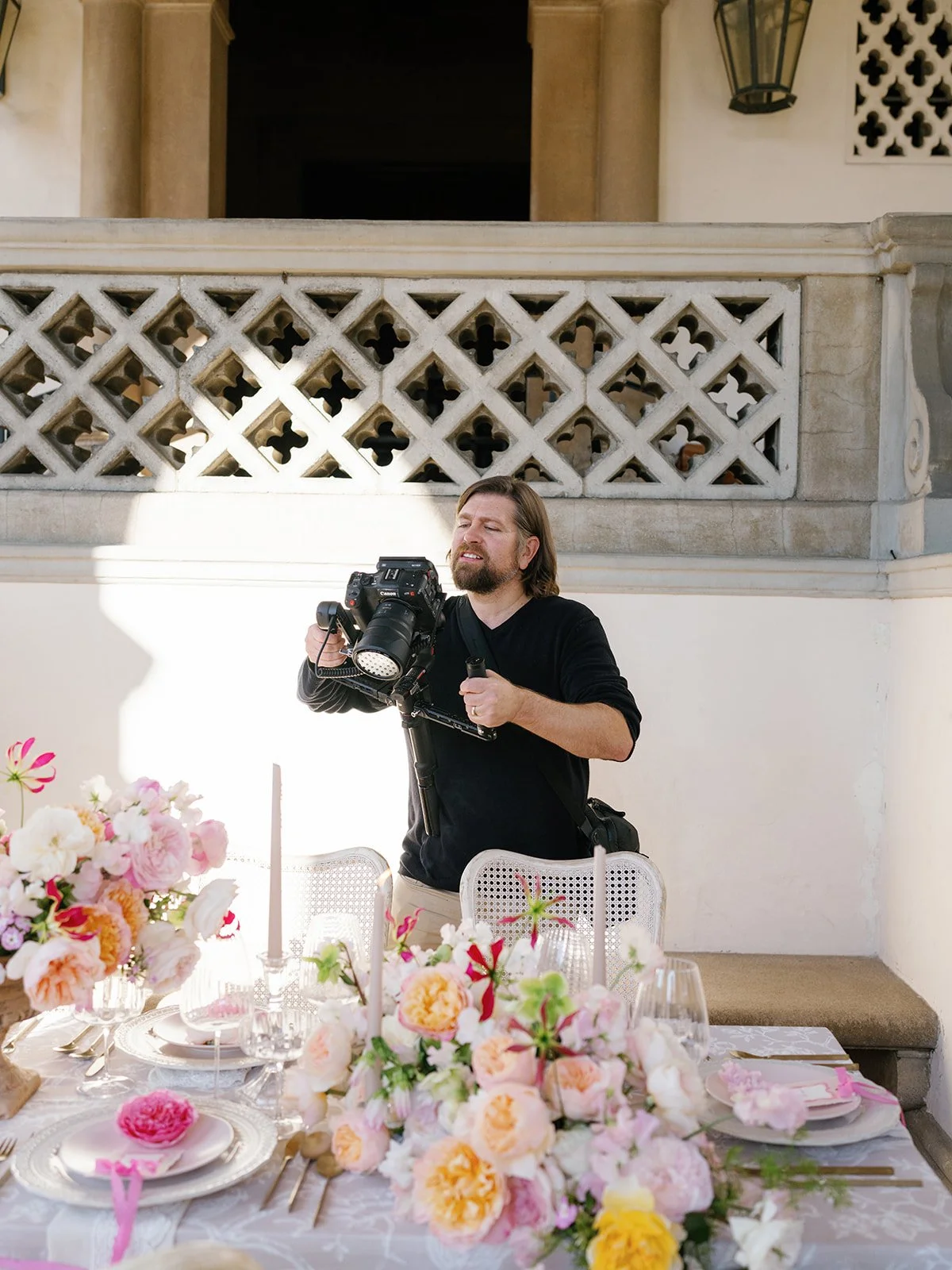
A hand-painted canvas only looks consistent across a wedding gallery when your whole team knows how to work with it. Here's what we teach every second shooter before the first shutter fires.
Why Backdrop Consistency Breaks Down on Multi-Photographer Wedding Shoots
The inconsistency rarely comes from incompetence. It comes from assumptions. A lead photographer who has spent months working with their hand-painted canvas backdrops develops an intuitive relationship with the surfaces: the angle at which Limestone reveals its warmest undertone, the distance at which Slate's concrete-gray texture reads as dimension rather than noise, the exposure compensation that keeps Sandstone from going chalky under flash. That intuition is invisible knowledge, and it does not transfer by proximity.
A second shooter arriving on the morning of a wedding day has none of that embedded understanding. They see a canvas backdrop on a C-stand. They meter for the subject's face. They shoot. The resulting images may be technically competent, but they will not match the lead's work, because the backdrop is not a neutral element in the frame. It is a responsive surface, and it responds differently depending on how you approach it.
The three most common points of divergence between a lead and second shooter's backdrop images are light direction relative to the canvas weave, white balance interpretation of the hand-painted pigment layers, and subject-to-backdrop distance affecting how much texture resolves in the final image. Each of these variables is controllable. None of them is obvious to someone encountering the surface for the first time.
Hand-painted canvas is a directional surface: it responds to light the way a painting in a gallery responds to light, revealing different character depending on the angle of illumination. When two photographers light the same canvas from different directions, the gallery will show what appears to be two entirely different backdrops.
This is not a problem unique to hand-painted backdrops, but hand-painted surfaces expose it more dramatically. A mass-produced vinyl or printed muslin backdrop has a uniform surface with minimal texture, so there is less to get wrong. But there is also less to get right. The entire value proposition of a hand-painted canvas, the tonal depth, the directional texture, the way layered pigment collaborates with light, depends on the photographer understanding how to work with the surface. When your team shares that understanding, the gallery is seamless. When they do not, the viewer's eye catches the fracture before the conscious mind identifies it.
The Physics of Hand-Painted Canvas: Why Your Second Shooter Needs a Briefing
Every backdrop Jennifer paints at Chasing Stone involves two to three days of layered brushwork on premium cotton canvas. The resulting surface is not flat in any meaningful sense. Each stroke leaves a ridge. Each pigment layer has a slightly different reflectance. The cotton canvas weave itself creates a micro-texture beneath the paint. When light hits this surface at an angle, the ridges catch highlights on one side and fall into micro-shadow on the other, producing the dimensional quality that distinguishes a hand-painted canvas from any printed alternative.
This is the physics your second shooter needs to understand: hand-painted canvas is directional. Move the light source and the surface changes character entirely. A Chasing Stone Limestone backdrop lit from camera-left at 45 degrees will show warm, creamy depth with visible brushstroke texture. The same backdrop lit straight-on will flatten to a uniform pale wash, losing the very quality that justified the investment. The difference is not subtle. It is the distance between a surface that looks like a painting and one that looks like a wall.
The practical implication for a multi-photographer shoot is this: if your lead is shooting with the key light raking across the canvas from the left, and the second shooter repositions the backdrop station with the light coming from directly overhead, the two resulting image sets will not match. The backdrop will read as two different surfaces in the gallery. No Lightroom preset will reconcile the difference, because the difference is optical. It happened at the moment light met canvas, before the shutter opened.
We see this constantly in the creative community that works with our surfaces. The lead photographer's images show the full depth and dimension of the canvas: the tonal shifts, the brushstroke shadows, the luminous quality that only layered pigment on cotton produces. The second shooter's images show something that could be a painted wall or a sheet of colored paper. Same backdrop. Same session. Different understanding of how the surface works with light.
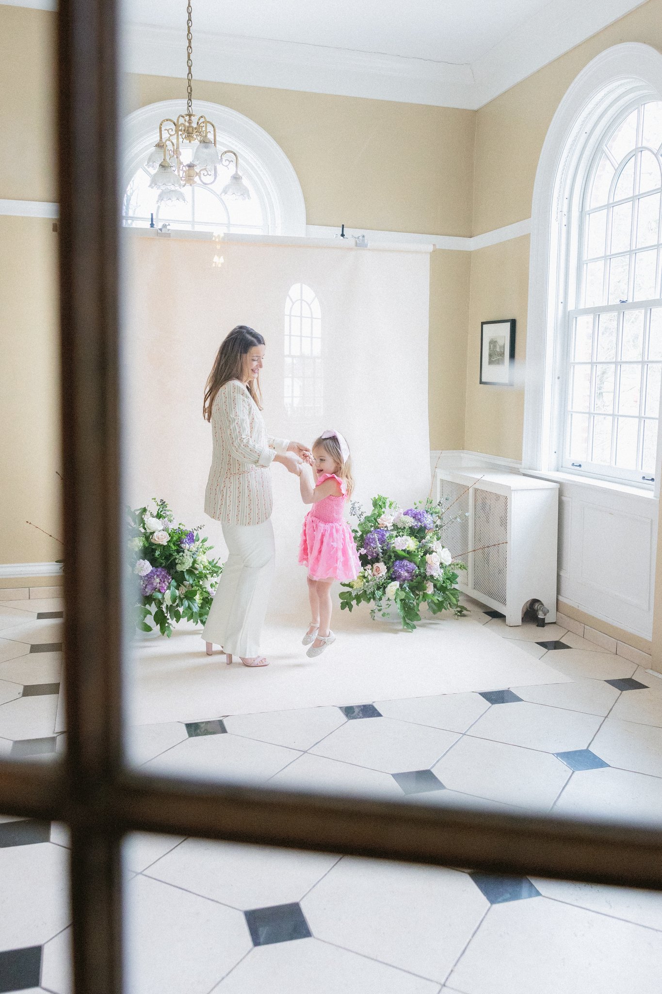
Every hand-painted canvas responds to light differently depending on who's behind the camera. We help photographers brief their teams so moments like this look the same no matter who's shooting.
Pre-Session Coordination: Building the Second Shooter Backdrop Brief
The investment in pre-session coordination pays for itself in post-production hours saved and gallery consistency achieved. A fifteen-minute briefing before the first shutter fires prevents hours of Lightroom corrections that may never fully reconcile the divergence. The briefing is not a formality. It is the single highest-leverage action you can take for the visual coherence of the final gallery.
Your second shooter briefing should cover five categories, and each one maps to a specific variable that affects how the hand-painted backdrop reads in the final image.
Second Shooter Backdrop Briefing Checklist: Five Categories for Visual Consistency
| Category | What to Communicate | Why It Matters for Canvas |
|---|---|---|
| Lighting Position | The angle and direction of key light relative to the canvas surface (e.g., 45 degrees camera-left) | Canvas texture is directional; changing light angle changes the backdrop's visible character and tonal depth |
| White Balance | The fixed Kelvin value both cameras will use (e.g., 5200K), not auto white balance | Hand-painted pigment layers shift color under different white balance interpretations; auto WB will read the canvas differently between camera bodies |
| Exposure Compensation | Your compensation values for each specific backdrop colorway being used that day | Dark backdrops like Carbon absorb light aggressively; light backdrops like Limestone reflect more than meters expect; each requires calibrated compensation |
| Subject Distance | How far the subject stands from the canvas (e.g., four feet for three-quarter, six feet for full-length) | Distance determines how much brushstroke texture resolves in the final image and how the backdrop renders in bokeh |
| Handling Protocol | How to set up, adjust, reposition, and store the canvas between setups | Hand-painted surfaces require specific care; improper handling can damage a surface that took Jennifer two to three days to paint |
The briefing does not need to be a formal document, though we will discuss building a reference sheet later in this guide. It can be a five-minute walkthrough at the backdrop station before the first look, demonstrating each variable with the actual surface and lighting in position. The key is specificity. "Shoot at f/2.8 with the key light from the left at 45 degrees, white balance at 5200K, subject four feet from the canvas" is actionable. "Just match my style" is not.
Camera Settings Synchronization for Second Shooter Backdrop Consistency
The single most impactful setting to synchronize across your team is white balance. When two cameras interpret the same hand-painted surface with different white balance values, the resulting color divergence runs through every pixel of the backdrop, affecting skin tones, wardrobe colors, and the overall mood of the frame. Auto white balance compounds the problem because each camera body makes its own decision about how to interpret the pigment layers, and those decisions will differ between bodies, especially if the shooters are using different camera systems or sensor generations.
Set a fixed Kelvin value for both cameras. For studio work with continuous lighting on a warm-toned canvas like Clay or Sandstone, 5000K to 5200K typically preserves the warmth of the hand-painted pigment without pushing the backdrop toward orange. For cooler surfaces like Celestite or Slate, 5400K to 5600K keeps the tones neutral without introducing unwanted blue shift. The exact value matters less than the fact that both cameras use the same value. Consistency is the objective. Precision happens in post-production.
A fixed Kelvin white balance is the single most impactful setting for second shooter backdrop consistency: when two cameras interpret a hand-painted canvas surface with different white balance values, the color divergence runs through every pixel of the frame, from the backdrop to the skin tones to the wardrobe.
Beyond white balance, aperture affects how the canvas texture renders in the final image. At f/1.4 to f/2.0 with the subject four feet from the canvas, the brushstroke texture dissolves into a creamy, painterly wash that reads as pure color and tone. At f/4.0 to f/5.6, the texture sharpens and becomes a visible compositional element, with individual brushstrokes legible in the frame. Neither approach is wrong, but the two look dramatically different side by side in a gallery. Agree on an aperture range before the first session begins. For a detailed breakdown of aperture, ISO, and distance combinations for different session types, our comprehensive camera settings guide covers every variable.
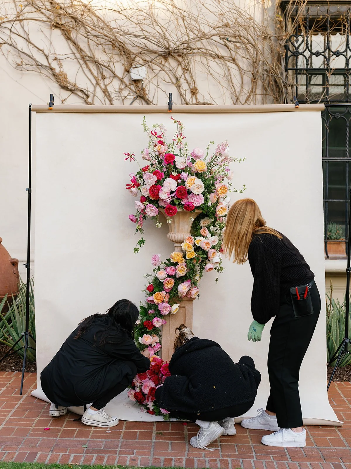
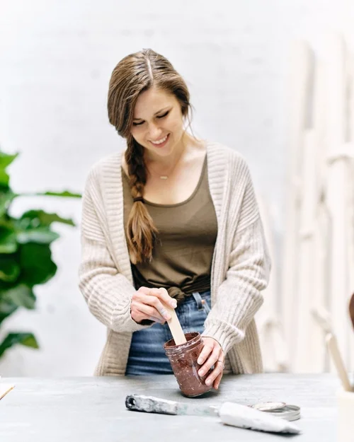
This is what coordination looks like before the brief: a team building the backdrop's foreground before lighting, camera settings, or a single subject ever enters the frame.
Exposure compensation requires calibration to the specific backdrop colorway. A dark surface like Carbon or Graphite absorbs light aggressively, and your camera's meter will overexpose to compensate, washing out the rich darkness that makes these backdrops compelling. A light surface like Silt or Limestone reflects more light than the meter expects, potentially leading to underexposure that muddies the subtle warm tones. Share your compensation values with your second shooter for each colorway you plan to use that day, and have them verify with a test frame before the session begins.
Focal length selection determines backdrop coverage and perspective compression. An 85mm lens at eight feet from the subject produces a very different backdrop rendering than a 50mm lens at five feet, even if the framing is similar. The longer lens compresses the canvas texture, while the wider lens exaggerates it. If your gallery aesthetic depends on consistent backdrop rendering, specify a focal length range for the backdrop station.
Lighting Consistency: Teaching Your Team to Read the Canvas
If you can teach your second shooter one principle about lighting hand-painted canvas, teach them this: the light direction relative to the canvas surface is more important than the light intensity. A hand-painted surface is not a flat reflector. It is a topographic surface with ridges, valleys, and layered pigment that create their own micro-landscape. The direction from which light strikes that landscape determines whether the texture reads as dimensional or flat, warm or cool, richly detailed or uniformly abstract.
The simplest way to communicate this is a sixty-second lighting demonstration before the session. Position the key light at the angle you intend to use. Point out the shadows forming along the brushstroke ridges, the way the pigment layers reveal different tones at different depths. Then move the light to a flat, straight-on position and show your second shooter how the texture vanishes, how the surface that moments ago looked like a painting now looks like a wall. This single demonstration prevents an entire day's worth of visual inconsistency.
For on-location work where natural light is the primary source, the principle translates to window position. If your backdrop station places the canvas with light raking across it from a window on the left, brief your second shooter to maintain that orientation if they need to reposition the setup for a different part of the venue. Rotating the canvas 90 degrees relative to the window changes the light-texture interaction entirely, and the resulting images will not match yours even if every camera setting is identical.
Studio setups with controlled lighting offer more precision but require the same coordination. Our complete lighting tutorial for hand-painted canvas walks through modifier selection, distance ratios, and angle optimization for each colorway family. Share the specific modifier type, power setting, and angle you are using with your second shooter, and if they are setting up a secondary backdrop station, have them replicate the lighting geometry precisely. An identical softbox at the same power but a different angle will produce a fundamentally different canvas rendering.
Light direction relative to the canvas surface matters more than light intensity for second shooter consistency. A hand-painted backdrop is a topographic surface: brushstroke ridges and layered pigment create their own micro-landscape that responds to the angle of illumination, not just its brightness.
The common mistake is focusing on light quality, soft versus hard, warm versus cool, while ignoring light direction. A second shooter may bring an identical modifier and set it to the same power, but if they position it at a different angle relative to the canvas weave, the backdrop will look fundamentally different in the image. Quality without direction is an incomplete brief.
Backdrop Handling Protocol: Protecting the Surface During a Multi-Shooter Day
A hand-painted canvas backdrop is a piece of fine art that happens to serve a functional role in your studio. Jennifer hand-paints every surface at Chasing Stone over two to three days of layered brushwork, building the tonal depth and texture that no machine process replicates. Your second shooter needs to understand this distinction, because the handling protocol follows from it.
Canvas backdrops should always be rolled, never folded. Cotton canvas has memory, and a hard crease in a hand-painted surface will leave a visible line that no amount of careful steaming fully removes. When your second shooter needs to move the backdrop between setups, they should roll it around the cardboard core it shipped on, painted side facing inward, with kraft paper or a clean cotton sheet interleaved to prevent the painted surfaces from touching.
Setup and takedown require clean, dry hands. Oil and moisture from skin transfer to the painted surface and can leave marks that are especially visible on lighter colorways like Silt, Limestone, or Rose-Quartz. Brief your team to handle the canvas by the unpainted edges and to avoid touching the painted face during positioning.
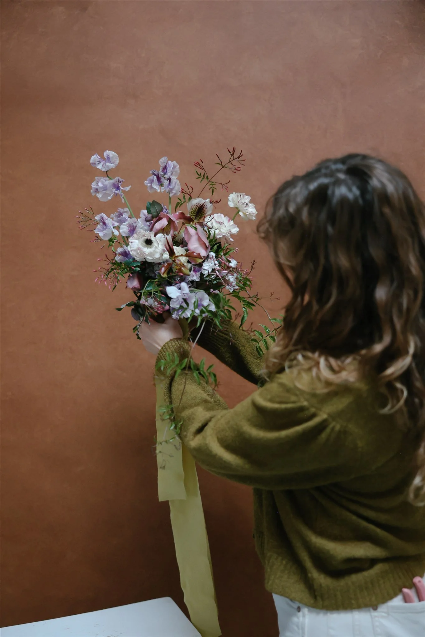
Warm-toned backdrops like this one hold their richness when the whole team shoots at the same fixed Kelvin value. That's the kind of detail we build into every briefing.
For transport between venues on a wedding day, the backdrop travels inside the rigid cardboard tube it was shipped in, or in a dedicated canvas transport bag. It never goes loose in the back of a vehicle where equipment cases, tripod legs, or shoes can press against the painted surface. For the complete protocol on protecting hand-painted canvases across years of professional use, our long-term care and storage guide covers cleaning, rolling, humidity considerations, and storage environment recommendations.
If your team is working with multiple backdrops throughout the day, a dual backdrop setup on C-stands with floating adapter mounts allows switching between surfaces in under sixty seconds without any handling of the painted face. The Chasing Stone floating adapter mount attaches to a standard C-stand and holds the backdrop by its top edge, keeping the canvas taut and wrinkle-free while eliminating the need to touch the painted surface during transitions.
The handling briefing takes two minutes. The damage from skipping it lasts the lifetime of the backdrop.
Post-Production Alignment: Editing for a Cohesive Backdrop Gallery
Even with disciplined coordination on the day of the shoot, minor variations between cameras, positions, and lighting will exist. Post-production is where those variations are reconciled into a seamless gallery. The key is establishing a shared editing baseline before either photographer starts culling.
Start with a reference frame. Before the session begins, have both photographers capture the same subject against the same backdrop under the same light. In post-production, edit the lead photographer's reference frame to the desired final look, then sync those exact settings to the second shooter's reference frame. Note the adjustments needed to bring the second shooter's frame into alignment: that delta becomes the camera profile offset you apply to all of the second shooter's backdrop images as a batch correction.
White balance synchronization in Lightroom is straightforward when both cameras shot at the same fixed Kelvin value. If one camera drifted during the day, or someone accidentally bumped the white balance dial, use the backdrop canvas itself as a neutral reference point. Select the white balance eyedropper and click on an area of the backdrop that should read as a known tone. A Slate backdrop should render as clean, cool architectural gray: not warm, not blue. If the sampled value differs between cameras, correct the second camera's entire batch to match before applying any creative edits.
For color profile consistency across different camera bodies, create a camera-specific profile for each body using a ColorChecker card and Lightroom's DNG Profile Editor or a similar calibration workflow. This ensures that both cameras interpret the same pigment layer with the same color response, even if they use different sensors or color science. Apply these profiles as the first step before any creative edits or preset application.
The critical insight is that backdrop consistency is a pre-preset issue. If the cameras disagree about the fundamental color of the hand-painted canvas, no creative preset applied afterward will make the gallery look cohesive. The divergence lives beneath the creative layer, in the raw color interpretation of the surface. Fix it there, and the creative edits flow consistently across both shooters' work.
Building a Second Shooter Reference Sheet for Backdrop Sessions
The most effective coordination tool is the simplest: a single-page reference sheet that your second shooter can review in five minutes and keep on their phone throughout the day. The reference sheet distills your backdrop briefing into concrete, actionable parameters. It is not a style guide or a mood board. It is a technical specification document that eliminates ambiguity at the point of capture.
A complete reference sheet includes the backdrop colorway name and the lighting setup for each station (key light position, modifier type, distance from subject), camera settings (aperture, shutter speed, ISO, fixed Kelvin white balance), subject-to-backdrop distance for each framing type (headshot, three-quarter length, full-length), and handling notes for the specific canvas being used that day.
Include a single reference image for each backdrop setup: one frame that shows exactly how the final image should look. This visual reference eliminates more confusion than any written specification can, because it shows the texture rendering, the color tone, and the overall mood that the lead photographer is building toward. A photograph of the desired result communicates in an instant what would take paragraphs to describe in words.
Share the reference sheet digitally so updates during the day, such as a backdrop swap, a lighting adjustment, or a venue change, can be pushed in real time. For photographers managing how they present backdrop options to clients, this same organizational approach extends naturally from client-facing communication to team-facing coordination.
The most respected wedding photography teams in the industry operate with this level of deliberate coordination. When a gallery maintains the same tonal signature across every frame, the same surface quality, the same visual weight from the first portrait to the last, that consistency is not accidental. It is the product of a briefing that was specific enough to follow, a team that understood the surfaces they were working with, and a shared commitment to the visual language of the day.
Consistency as a Signature of Craft
The difference between a wedding gallery that feels like a single, cohesive visual story and one that feels like two photographers happened to be in the same room is not talent. It is coordination. And with hand-painted canvas backdrops, that coordination is both more demanding and more rewarding than with any mass-produced alternative, because the surface itself has more to give when the team knows how to work with it.
A hand-painted canvas surface by Chasing Stone, whether it is the warm depth of Sandstone, the blush softness of Rhodonite, or the architectural restraint of Slate, is designed to respond to light and lens with dimensional richness that no printed or manufactured surface can replicate. When your entire team knows how to unlock that response consistently, the gallery becomes greater than any individual frame. The backdrop becomes not just a surface behind the subject, but a unifying visual element that ties every image into a single, intentional narrative.
The investment in second shooter backdrop consistency coordination is small: a fifteen-minute briefing, a reference sheet, a shared Kelvin value, an agreed-upon handling protocol. The return is a gallery your clients frame on their walls, a portfolio that demonstrates the kind of attention to detail that separates the extraordinary from the merely competent, and a team culture that treats every element of the frame, including the surface behind the subject, with the care it deserves.
Explore our full collection of hand-painted canvas backdrops, or reach us at info@chasingstone.com for guidance on building a multi-backdrop studio collection that serves your team's creative vision.
Frequently Asked Questions About Second Shooter Backdrop Coordination
How do I ensure my second shooter uses the same camera settings for backdrop photography?
Set a fixed Kelvin white balance value for both cameras (typically 5000K to 5600K depending on the backdrop colorway), agree on an aperture range that produces consistent texture rendering, and share exposure compensation values for each specific backdrop being used that day. The most important setting to synchronize is white balance, because auto white balance will interpret hand-painted pigment layers differently between camera bodies, creating color divergence that is difficult to fully correct in post-production.
Should my second shooter use the same fixed white balance when shooting on canvas backdrops?
Yes. A fixed, matched white balance is the single most impactful setting for backdrop consistency across multiple photographers. When two cameras interpret a hand-painted surface with different white balance values, the resulting color divergence affects not only the backdrop tone but also skin tones and wardrobe colors throughout the frame. Set both cameras to the same Kelvin value before shooting begins, and verify the match by comparing test frames side by side on the camera screens.
How do I brief a second shooter on handling a hand-painted canvas backdrop?
Cover three essential points: always roll the canvas around its core (never fold), handle by the unpainted edges with clean dry hands to avoid transferring oil or moisture to the painted surface, and transport in the original rigid cardboard tube or a dedicated canvas bag. Lighter colorways like Limestone, Silt, and Rose-Quartz are especially susceptible to showing marks from improper handling. The briefing takes two minutes and protects a surface that Jennifer hand-paints over two to three days of layered brushwork.
Can two photographers shoot on the same backdrop simultaneously?
Yes, with spatial coordination. Position both photographers on the same side of the subject to maintain consistent light direction relative to the canvas texture. If photographers shoot from opposite sides, each camera will capture different shadow patterns in the brushstroke texture, creating images that look like two different backdrops in the final gallery. For larger formats like the 8x10 ft or 8x14 ft hand-painted canvas, there is ample surface area for two shooting positions as long as the lighting angle remains consistent from both vantage points.
How do I match my second shooter's backdrop photos in post-production?
Start with a reference frame shot by both photographers under identical conditions before the session, then calibrate the exposure and white balance offset between cameras in Lightroom. Apply camera-specific color profiles created with a ColorChecker card to ensure consistent color rendering across different sensor types. The key insight is that backdrop color consistency is a pre-preset issue: if the two cameras disagree about the fundamental tone of the canvas surface, creative presets applied on top will not reconcile the underlying color divergence.
What size hand-painted backdrop works best for a multi-photographer team?
For teams shooting simultaneously from different angles, the 8x10 ft or 8x14 ft hand-painted canvas provides enough surface area for two photographers to work with a subject while maintaining consistent backdrop coverage in both frames. The 8x14 ft size allows full-length posing with room for both photographers to find their angles without the canvas edge appearing in frame. For teams taking turns on the same backdrop station rather than shooting simultaneously, the 5x8 ft size works well for headshots and three-quarter framing, though the larger formats reduce the need for repositioning between shooters.
Creators of premium photography backdrops and styling surfaces
Trusted by thousands of discerning creatives worldwide
Every piece is handcrafted with intention in Orange County, California