
Camera Settings for Backdrop Photography: Aperture, Distance, and Background Blur
Posted on Apr. 7, 2026
I'm going to tell you something that might sound counterintuitive if you've spent any time reading photography blogs: shooting wide open at f/1.4 in front of a hand-painted backdrop is usually a waste of that backdrop.
I know. Every portrait photography guide on the internet will tell you to open up your aperture as wide as possible for that creamy, blurred background. And if you're shooting against a chain-link fence or a cluttered parking lot, that's great advice. Blur that mess into oblivion.
But you didn't invest in a hand-painted canvas backdrop so it could become an indistinct smear of color behind your subject. You invested in it because the texture, the brushstrokes, the subtle color variation all add something to the image that a flat wall never could.
So why would you immediately blur all of that away?
This is the conversation nobody's having about backdrop photography settings. Not "how do I blur my background" (there are 10,000 articles about that already and none of them were written for photographers shooting on hand-painted surfaces). The real question is: how do you use your camera settings to control exactly how much of your backdrop's character shows up in the final image? Because that's where the creative decisions live.
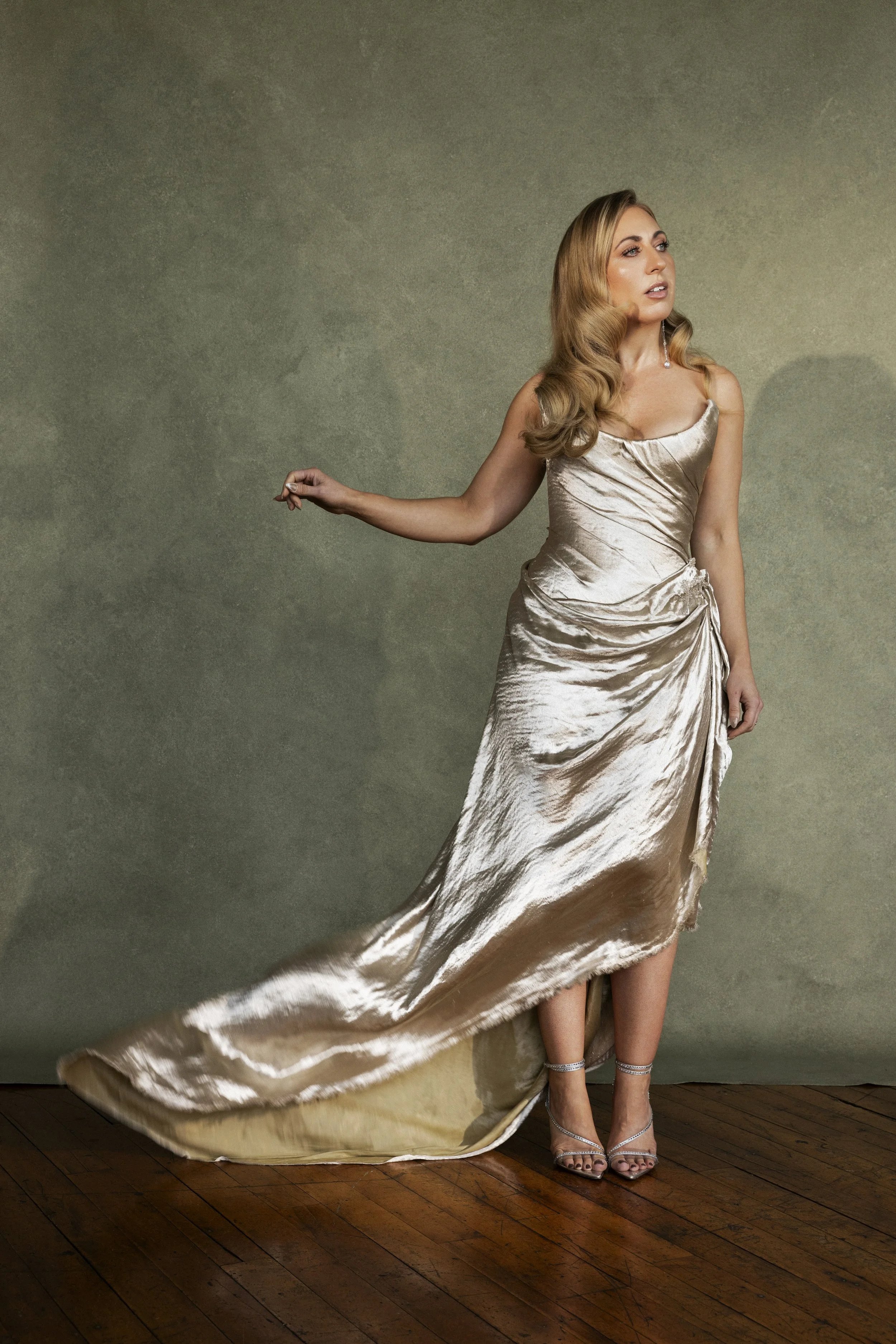
The right aperture and subject distance make the difference between a blurry color wash and a backdrop with visible texture. Small camera setting changes can completely transform backdrop portraits.
The Three Variables That Control Everything
You need to understand three things that determine how your backdrop appears in every image. These aren't mysteries. They're physics. And once you understand how they interact, you'll stop guessing and start making choices that serve the image.
Variable 1: Aperture (your f-stop). This controls depth of field, meaning how much of your image is sharp from front to back. A wider aperture (lower f-number like f/1.8) creates a thinner slice of focus. A narrower aperture (higher f-number like f/8) keeps more of the scene sharp.
Variable 2: Subject-to-backdrop distance. How far your subject stands from the backdrop surface. This is the variable most photographers don't think about enough, and it's honestly the one that gives you the most dramatic control. A bride standing 2 feet from the backdrop will keep that backdrop relatively sharp at any aperture. That same bride 8 feet away will throw it into significant blur even at moderate f-stops.
Variable 3: Focal length. A longer lens (85mm, 105mm, 135mm) compresses the scene and magnifies whatever blur exists. A shorter lens (35mm, 50mm) renders backgrounds with less apparent blur at the same aperture and distance.
These three variables multiply each other's effects. Change one and you get a subtle shift. Change two and the look transforms completely. The photographers whose backdrop work looks effortlessly polished aren't more talented than you. They've just internalized how these three variables talk to each other.
Why "Always Shoot Wide Open" Is Bad Advice for Backdrop Work
Here's my confession. For the first year after I started using hand-painted backdrops in my own photography, I shot almost everything at f/1.8 or f/2.0. Because that's what the internet told me to do for portraits. Wide open. Maximum blur. Creamy bokeh. No exceptions.
My images were fine. Subjects were sharp. Backgrounds were soft and pleasant. But when I studied the work of photographers I admired, the ones whose backdrop portraits were getting published in magazines and featured on wedding blogs, their images looked different from mine. The backgrounds had presence. There was texture visible behind the subject. The backdrop wasn't just a blob of color. It was contributing something to the composition.
I remember sitting in my office at 11pm pulling up one of those images in Lightroom, zooming into the background, trying to reverse-engineer their editing trick. I was convinced it was a Photoshop technique. Some texture overlay I didn't know about.
There was no trick. They were shooting at f/3.5 instead of f/1.8.
That was the night I realized I'd been thinking about backdrops the same way I thought about ugly hotel walls and parking lot fences. As something to eliminate. But a hand-painted backdrop isn't a problem to blur away. It's a creative element to feature at whatever intensity serves the image. That shift in thinking changed my entire approach.
Using directional lighting and moderate apertures helps reveal the texture and depth of hand-painted photography backdrops.
The Aperture Spectrum: What Each F-Stop Actually Does to Your Backdrop
I've tested this extensively with our backdrops, shooting the same setup at every aperture from f/1.4 through f/11. Here's what actually happens at each range. The differences are more dramatic than most photographers realize, and knowing this spectrum means you can dial in exactly the look you want before you fire a single frame.
f/1.4 to f/1.8: The Color Wash.
At these apertures with the subject 4 to 6 feet from the backdrop, you're getting maximum blur. The backdrop becomes a soft wash of color. Zero visible texture. No brushstrokes. No paint variation. Just a smooth, diffused tone that could be anything behind your subject.
This isn't wrong. It's a deliberate choice. If you want your subject completely isolated with nothing competing for attention, this delivers it. The hand-painted quality still helps here because the organic color variation creates a warmer, more natural-looking blur than you'd get from a solid vinyl surface. But you're seeing the ghost of the texture, not the texture itself.
I use this range for close-up beauty work where the face is everything. Tight headshots. Moments where the emotion on someone's face needs zero visual competition. If I'm shooting a bride during an emotional first look with her dad and I want nothing in the frame except that expression, I'm at f/1.8 and the backdrop is a feeling, not a feature.
f/2.0 to f/2.8: The Sweet Spot Most Portrait Photographers Should Live In.
This is where things get interesting, and where I shoot probably 60% of my backdrop work.
At f/2.0 with a subject 4 to 5 feet from the backdrop, you start seeing suggestions of texture. The brushstrokes aren't crisp, but they're present as soft, organic variation. The backdrop reads as a textured surface rather than a flat color field. Your viewer can tell there's something intentional behind the subject even if they can't articulate what it is.
At f/2.8, the texture becomes more defined. You can see the directional quality of the brushwork. Light and shadow play across the surface in a way that registers as deliberate. The backdrop is contributing to the image without fighting the subject for attention.
I think of this range as the supporting actor zone. Your subject is the lead. The backdrop makes the scene better by being there and doing its job. Nobody in the audience is watching the supporting actor instead of the lead, but take them out and the whole thing feels flat.
A photographer in San Diego told me something last year that stuck with me. She said she'd been shooting at f/1.4 on her 85mm for two years because she thought that's what made her work look "professional." She tried f/2.5 on a whim during a bridal session and her exact words were: "Oh. That's what I've been missing." Her backdrop suddenly looked like the backdrop she'd fallen in love with on our website. She'd been erasing it from her own images the entire time.
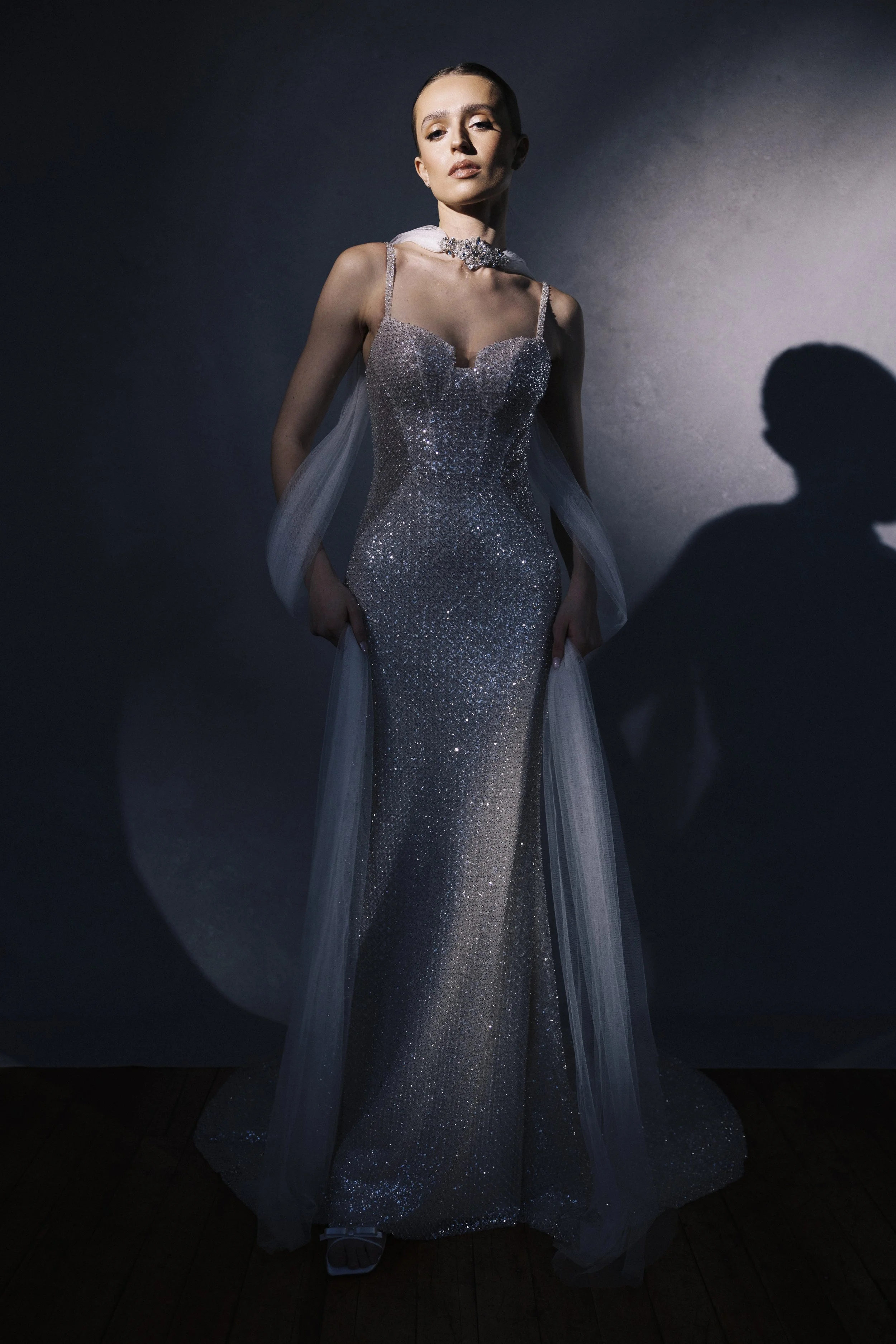
f/3.5 to f/5.6: The Editorial Range.
Now the backdrop becomes a co-star. The hand-painted texture is clearly visible. Individual brushstrokes read as deliberate artistic detail. The color variation across the surface creates visual richness that you can feel in the image.
This is the aperture range where the difference between a hand-painted canvas and a cheap printed backdrop becomes painfully obvious. I don't say that to be dramatic. It's literally true. A printed backdrop at f/4 looks like a flat surface with an image on it because that's what it is. A hand-painted canvas at f/4 looks like an actual painted surface with depth and dimension because the physical texture catches light and casts micro-shadows that your camera resolves as real three-dimensionality.
The trade-off: your depth of field is wider, which means you get more of your subject in focus. A lot of photographers think of this as a limitation. I think of it as a benefit. At f/1.8, if a bride angles her head even slightly, the tip of her nose might be sharp but her far ear is soft. At f/4, her entire face is tack sharp. For portraits where you want that crisp, editorial precision, this range actually gives you better subject rendering while simultaneously showcasing your backdrop.
When I use this range: editorial bridal portraits intended for publication. Fashion-influenced work. Any image where I want the backdrop to clearly communicate "this was a deliberate creative decision, not just whatever was behind the subject." Group portraits of 2 to 4 people where I need the depth of field anyway.
f/5.6 to f/8: Full Texture, Full Context.
At these apertures, the backdrop is rendered with near-full sharpness. Every brushstroke is legible. The paint layers are visible. The image communicates clearly that your subject was photographed in front of a hand-painted canvas, and that canvas is part of the artistic statement.
Most portrait photographers reflexively avoid this range because the internet has convinced them that wider apertures always equal better portraits. That's not true, and some of the most striking editorial portraits I've seen were shot at f/5.6 or f/8 where the backdrop and the subject coexist in the same visual space with equal clarity. It feels intentional. It feels like art direction.
I shot a styled bridal editorial last spring at f/5.6 on ourSerpentine backdrop, the deep moss green one. The texture was fully visible. The moody green created this rich, almost Renaissance-painting quality behind the bride in her white gown. The images were the most-shared from that entire editorial, and the thing every other photographer commented on was the backdrop. They could see it. They could feel it in the image. That doesn't happen at f/1.4.
f/8 and beyond: The Detail Zone.
Primarily for product and detail photography where you need everything sharp. A pair of bridal shoes sitting on a backdrop, shot at f/8, gives you crisp product detail and fully rendered backdrop texture. These images look like they belong in a catalog or a brand campaign. The backdrop becomes the styling environment rather than just the background.
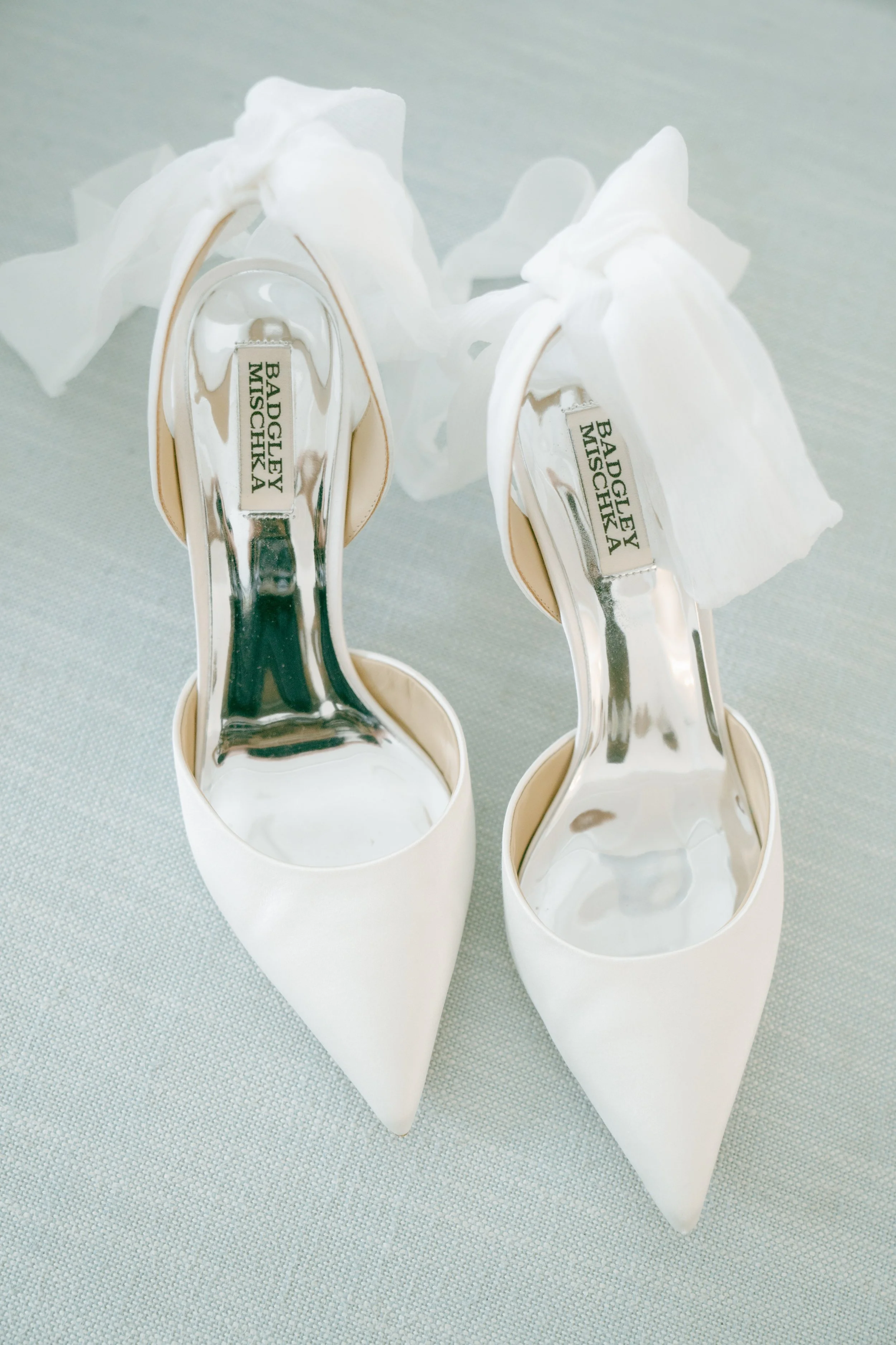
Many photographers shoot detail shots wide open out of habit. But for items like bridal shoes, stopping down helps showcase both the product and the backdrop texture.
Focal Length: How Your Lens Choice Rewrites the Aperture Rules
Everything I described above assumes a mid-range focal length around 85mm. Change the lens and every recommendation shifts. Understanding this is what keeps you from being confused when you shoot at f/2.8 on your 50mm and the backdrop looks different than f/2.8 on your 85mm.
50mm on full frame.
The 50mm is the lens most photographers reach for first because they own one and it's light and comfortable. For backdrop work, it's a solid choice with one caveat: it shows more backdrop texture at any given aperture than a longer lens would. At f/2.8 on a 50mm, you'll see noticeably more detail in the backdrop surface than you'd see at f/2.8 on an 85mm. The shorter focal length creates less background magnification.
This means two things. If you want that soft, dreamy backdrop look on a 50mm, you need to open wider or increase your subject-to-backdrop distance. And if you want to feature the texture intentionally, the 50mm actually makes that easier because you don't need to close down as far.
One real advantage for backdrop work: the 50mm's wider field of view means you see more of the backdrop in your frame. If you're working with a 5x8 backdrop and need to maximize coverage, the 50mm is more forgiving than a longer lens that crops tighter and might catch backdrop edges in the frame.
85mm (where I live).
This is my primary lens for backdrop portraits and where all my aperture descriptions are calibrated. The 85mm compresses backgrounds slightly, which does two things for you: it magnifies whatever blur exists, and it makes the backdrop appear closer to the subject, creating a more intimate, enveloping quality.
At 85mm, you have the most elegant control over the blur-to-texture spectrum. You can go from complete color wash at f/1.8 to fully readable brushstrokes at f/5.6, with a gorgeous gradient of options between. There's a reason every portrait lens guide recommends the 85mm. On backdrops specifically, it's the lens that gives you the most creative range.
105mm to 135mm.
These focal lengths amplify everything. The backdrop blur at f/2.8 on a 135mm approaches what you'd get at f/1.8 on an 85mm. The compression makes the backdrop feel like it's wrapping around the subject rather than sitting behind them.
The practical challenge: you need serious shooting distance. To frame a waist-up portrait at 135mm, you might be standing 8 to 10 feet from your subject. If your subject is 5 feet in front of the backdrop, your camera is now 13 to 15 feet from the backdrop surface. That distance amplifies blur even further.
I love these focal lengths for tight portraits and beauty work on backdrops. The combination of compression plus a moderate aperture like f/2.8 to f/3.5 at 105mm produces backgrounds that feel painterly and rich. If you've ever seen a backdrop portrait that somehow looked like an oil painting came to life behind the subject, it was probably shot at 100mm+ with a moderate aperture. That combination is magic.
35mm and wider.
I'll be direct: wide angles aren't my first choice for backdrop portraits. The wider perspective shows more of the room around the backdrop edges, the perspective distortion isn't flattering for faces, and the background blur is significantly reduced at any aperture.
That said, they have their place. Environmental shots where you want to show the full setup. Full-length bridal portraits where you need the entire gown and train and you're working with a standard-size backdrop. Behind-the-scenes content where context matters more than background perfection.
If you're shooting wider than 50mm in front of a backdrop, that backdrop is going to be relatively sharp. Know that going in and compose accordingly.
Your backdrop might look flat simply because your subject is standing too close. Increasing subject-to-backdrop distance instantly adds depth and separation.
The Distance Variable: Free and Wildly Underused
Here's what I've noticed in years of talking with photographers about their backdrop work: almost everyone asks about aperture. Almost nobody asks about distance. This is backwards.
Distance is the most powerful variable you have for controlling backdrop blur, and it costs you nothing to change. No new lens. No new settings. You literally just ask your subject to take two steps forward.
2 to 3 feet from the backdrop.
The backdrop will be relatively sharp at almost any aperture. Even at f/1.8, it's only a couple of feet outside your focal plane, which isn't enough distance to create heavy blur. The texture will be visible and present.
This distance works when you intentionally want the backdrop as a prominent visual element. Think portrait-in-front-of-a-painted-wall energy. The surface and the subject coexist in the same visual space.
The risk: your subject can cast shadows onto the backdrop with side lighting. You also lose the natural light falloff between subject and background that creates separation. If you're working at this distance, flat or frontal lighting tends to produce cleaner results than strong directional light. The lighting guide covers this positioning in detail.
4 to 6 feet (the standard working distance).
This is where all my aperture descriptions above are calibrated and where I shoot most of my backdrop portraits. At this distance, you have full aperture control. You can show texture or blur it depending on your f-stop. You're in the driver's seat.
This range also creates natural light falloff between subject and backdrop. If your subject is closer to the window, the backdrop naturally falls a stop or two darker, which adds depth to the image automatically. No editing required. No additional lighting. Just physics doing something beautiful for free.
6 to 8+ feet.
Even moderate apertures produce significant backdrop blur at this distance. At f/2.8 with an 85mm lens and the subject 8 feet from the backdrop, you're approaching the color-wash look most photographers associate with shooting wide open, but you're getting it at an aperture that gives you much better depth of field on your subject's face. Both eyes sharp, both ears sharp, and still that beautiful soft background.
I discovered this distance trick by accident during a wedding where the bridal suite was actually large enough (rare) to set up with real breathing room. I placed the bride 7 feet from the backdrop, shot at f/2.8, and the resulting image had this gorgeous soft quality to the background while her face was perfectly sharp edge to edge. I'd been struggling to get that combination for months by juggling aperture alone. Turns out the answer was just putting more air between the subject and the surface.
The practical limitation: you need more physical space, and you need a backdrop large enough that it still fills the frame from further away. An 8x10 with a subject 8 feet in front requires careful framing to avoid edges. The 8x14 size gives you significantly more freedom at these distances.
Settings for Specific Scenarios (What I Actually Shoot At)
Theory is useful. Here's what I actually dial in when real clients are standing in front of real backdrops.
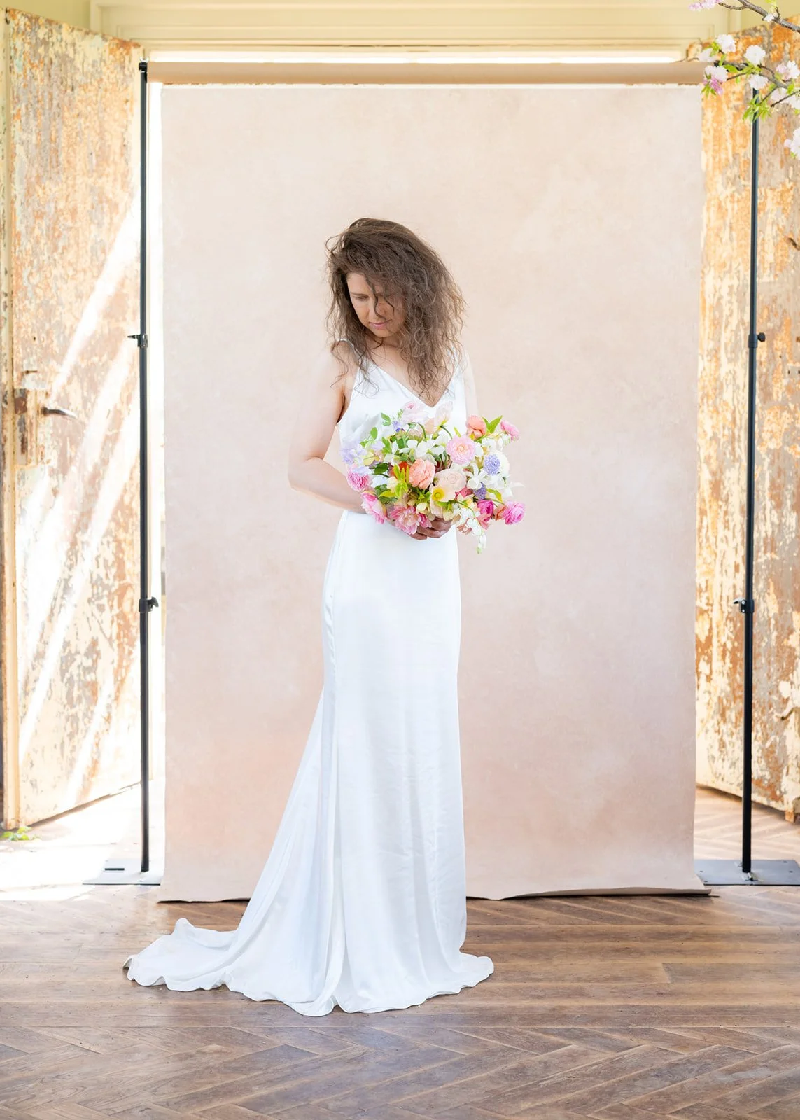
Single bridal portrait, waist-up.
85mm, f/2.8, subject 5 feet from backdrop. Backdrop reads as textured and intentional without competing with the bride. Both eyes in comfortable focus even with slight head angles. This is my default and where I start every session before deciding if the specific image calls for more or less blur.
If the gown has heavy detail and I want the background simpler, I'll open to f/2.0. If I'm shooting for a blog submission where I want the backdrop's character to really come through, I close to f/3.5 or f/4.
Full-length bridal portrait.
I switch to 50mm or 70mm to capture the full gown without needing to stand in an adjacent room. Because the shorter focal length reduces background blur, I'll open to f/2.0 to maintain separation. Subject distance stays around 5 feet.
Full-length work is where backdrop size becomes non-negotiable. The 5x8 handles tighter compositions, but full-length with any negative space around the subject demands 8x10 or larger. I've been burned by this exactly once. A bride in a cathedral-length train, me at 50mm trying to capture the whole scene, and the backdrop edges creeping into frame on both sides. I cropped aggressively and it was fine, but I ordered an 8x14 the following week.
Couple's portrait.
Two people occupy a wider area and a deeper plane than one person. I shoot at f/3.5 to f/4 on an 85mm, which gives enough depth for both faces while the backdrop renders with soft, visible texture. At this aperture with the couple 5 feet from the backdrop, the look is editorial and cohesive. The backdrop reads as a deliberate styling choice, which is exactly the energy couples respond to.
Bridal party group of 4 to 6 people.
Groups require f/4 to f/5.6 because people never stand in a perfectly straight line and someone's shoulder is always 8 inches closer to you than someone else's nose. At these apertures, the backdrop texture is fully visible and becomes a significant design element.
This is genuinely a good thing. Group photos at f/5.6 where the backdrop reads clearly look styled and intentional rather than "blurry stuff behind a bunch of people." Some of my favorite group shots have the backdrop fully rendered, because it makes the whole image look like it was art-directed rather than improvised.
Product and detail shots on a vertical backdrop.
Bridal shoes, bouquets, jewelry displayed against a backdrop surface. f/4 to f/8 depending on product depth. At these apertures, the hand-painted texture is gorgeous and the product sits within a visual environment rather than floating in a colored void.
For floral work especially, something beautiful happens at f/5.6. The bouquet is crisp, the backdrop texture is visible, and the combination looks like the image was shot for a magazine feature rather than a vendor portfolio. Florists notice this. Florists who notice this refer their clients to you.
Getting-ready portraits in tight spaces.
Hotel rooms mean shorter subject-to-backdrop distances, often 3 to 4 feet rather than the ideal 5 to 6. I compensate by opening to f/2.0 to f/2.5 on my 85mm. This creates enough blur to produce separation despite the shorter distance while still letting some backdrop character come through.
The shorter distance actually helps with 5x8 backdrop coverage in cramped rooms because less of the backdrop needs to fill the frame when you're working closer together.
The Mistake I See Photographers Make Over and Over
A photographer invests $797 in a hand-painted Limestone backdrop specifically because they love the texture and warmth in the product photos. They set it up, put a client in front of it, shoot everything at f/1.4 on an 85mm with the subject 6 feet away, and then send me a message asking why their backdrop "doesn't look like the photos on the website."
I get this message at least twice a month.
The product photos on our website are shot at f/4 to f/5.6. That's how you see the texture. That's how you see the brushwork. That's how the surface looks like a hand-painted canvas instead of a generic colored background.
If you shoot any hand-painted backdrop at f/1.4 from 6 feet away, you'll get a beautiful soft background. But you'll get roughly the same look you'd get from a $40 roll of seamless paper in a similar color. You've paid for artistry and then your camera settings erased it.
I don't say this to make anyone feel bad. I say it because the fix takes zero dollars and about three seconds. Close down two stops. That's it. The backdrop you already own will suddenly look like the backdrop you fell in love with.
How Sensor Size Changes the Math (And Why Crop Sensor Shooters Shouldn't Panic)
I shot on a crop sensor Canon for three years before switching to full frame, and one of the things I wish someone had told me earlier was how it affected my backdrop work specifically.
On a crop sensor (APS-C), your effective depth of field at any given aperture is deeper than on full frame. f/2.8 on a crop sensor with an 85mm equivalent lens (which is about a 56mm actual lens on APS-C) renders more like f/4 on full frame in terms of background blur.
When I made the switch to full frame, I had to relearn my backdrop settings because suddenly f/2.8 was giving me noticeably more blur than I was used to. Images that had shown beautiful texture on my crop sensor were now softer and more diffused at the same settings. It took me about a month to recalibrate my instincts.
If you're on crop sensor and trying to match the backdrop looks you see from full-frame shooters on Instagram, you'll need to open about a stop wider for the same blur effect. f/1.8 on crop gives you roughly what f/2.5 to f/2.8 gives on full frame. This isn't a disadvantage. It actually means you can show more backdrop texture at wider apertures without extra effort. Your crop factor is secretly working in your favor for textured backdrop photography.
Dark Backdrops vs. Light Backdrops: The Color Curve
The tone of your backdrop influences how your settings play out in ways that surprised me when I first started shooting across our full color range.
Light backdrops like Limestone, Sandstone, and Celestite reflect more light and tend to read brighter in the frame. When blurred, they become this luminous, almost glowing field behind the subject, which is gorgeous for light-and-airy work. At sharper apertures, they show texture more readily because the highlight-to-shadow contrast across the brushstrokes is naturally more visible.
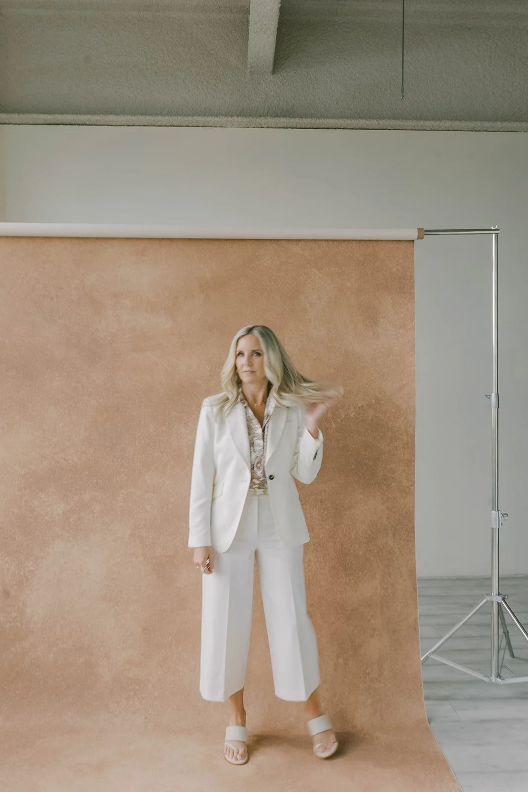
A simple studio setup like this gives photographers full control over subject distance, aperture, and how much backdrop texture appears in the final image.
Dark backdrops like Serpentine, Umber, and Carbon absorb more light and can fall toward near-black if your subject is significantly brighter. The blur on dark surfaces tends to feel moody and recessive, like the subject is emerging from shadow.
Here's the practical difference that matters: if you want visible texture on a dark backdrop, your light positioning is even more critical than your aperture. A dark surface only reveals its texture when light rakes across it at an angle. You can shoot at f/4 all day, but if the light is hitting that dark backdrop straight-on or not reaching it at all, you won't see the brushstrokes regardless. The lighting guide covers the perpendicular positioning technique for this exact situation.
Light backdrops are more forgiving. Dark backdrops reward precision. Neither is better. They're different instruments.
The Cheat Sheet (Screenshot This)
Maximum blur (color wash, subject isolated): f/1.4 to f/1.8 | subject 6+ feet from backdrop | 85mm or longer
Soft texture (backdrop present but not dominant): f/2.0 to f/2.8 | subject 4 to 6 feet from backdrop | 85mm
Visible texture (editorial, styled look): f/3.5 to f/5.6 | subject 4 to 6 feet from backdrop | 50 to 85mm
Full texture (product shots, detail work): f/5.6 to f/8 | subject 2 to 4 feet from backdrop | any focal length
Group portraits: f/4 to f/5.6 | subject 4 to 5 feet from backdrop | 50 to 85mm
These are starting points, not commandments. Your creative intent, your lighting, and the specific image you're building should drive the final decisions. But if you're staring at your camera before a session wondering where to start, these will put you in the right neighborhood immediately.
The 12-Shot Test That Teaches You More Than Any Article
Here's what I'd encourage you to do before your next paid shoot. Set up your backdrop at home or in your studio. Place something at 3 feet, 5 feet, and 7 feet from the surface. A mannequin head works. A vase of flowers works. Your reluctantly cooperative spouse works. Shoot each position at f/1.8, f/2.8, f/4, and f/5.6 on your most-used portrait lens.
Twelve test shots. Ten minutes of your time. Those twelve images will teach you more about how your specific backdrop behaves with your specific gear in your specific light than anything I've written here.
I still do this whenever I paint a new backdrop color. The camera doesn't care what I intended when I mixed the paint. It captures what's actually there. And what's actually there is always slightly different from what I expected, because light and texture have their own relationship that exists independent of the painter's plan.
Print those test shots or save them to your phone. Reference them before sessions. Within a month, the settings become instinct. Your f-stop isn't a guess anymore. It's a creative decision you make in two seconds because you've already seen exactly what each combination produces.
The Connection That Ties Everything Together
Your camera settings and your light positioning are two halves of the same equation, and understanding this is what separates photographers who control their backdrop images from photographers who get lucky sometimes.
The lighting guide covers how light angle reveals or flattens texture on a hand-painted surface. This article covers how aperture reveals or softens that texture from the camera's perspective.
When both work together, the results compound. Perpendicular light raking across the surface creates micro-highlights and shadows in the brushstrokes. A moderate aperture like f/2.8 to f/4 resolves those highlights and shadows as visible, three-dimensional texture. The backdrop gains a quality that neither lighting nor aperture could create alone.
When they work against each other, the results cancel. You can light the backdrop perfectly, with gorgeous angled light revealing every brushstroke, then shoot at f/1.4 and blur it all into soup. Or you can shoot at f/5.6 for maximum resolution, but if the light is hitting the surface dead-on, there's no texture to resolve because the flat lighting eliminated the shadows that create visual depth.
Light creates the texture. Your aperture decides how much of it to show. Your distance determines the baseline blur level that aperture then fine-tunes. Master all three, and every hand-painted backdrop in your collection becomes a creative instrument you can play with confidence.
Explore the full collection of hand-painted canvas backdrops at chasingstone.com. Every color responds to these principles the same way because every surface is built with the same hand-painted texture on premium cotton canvas. The only question is which color matches the work you want to create.
Related Reading
How to Light Hand-Painted Backdrops: Natural Light Techniques That Actually Work
Hand-Painted Canvas vs Muslin Backdrops: A Photographer's Honest Comparison
Portrait Photography Backdrops: The Complete Guide for Non-Wedding Photographers
Color Theory for Photographers: Understanding the Wheel, Harmony, and Contrast
How Wedding Photographers Use Hand-Painted Backdrops Successfully
2026 Wedding Photography Trends: Backdrops, Colors & Textures That Book Clients

Creators of premium photography backdrops and styling surfaces
Trusted by thousands of discerning creatives worldwide
Every piece is handcrafted with intention in Orange County, California