
How to Light Hand-Painted Canvas Backdrops: Natural Light Techniques That Actually Work
Updated on May 5, 2026
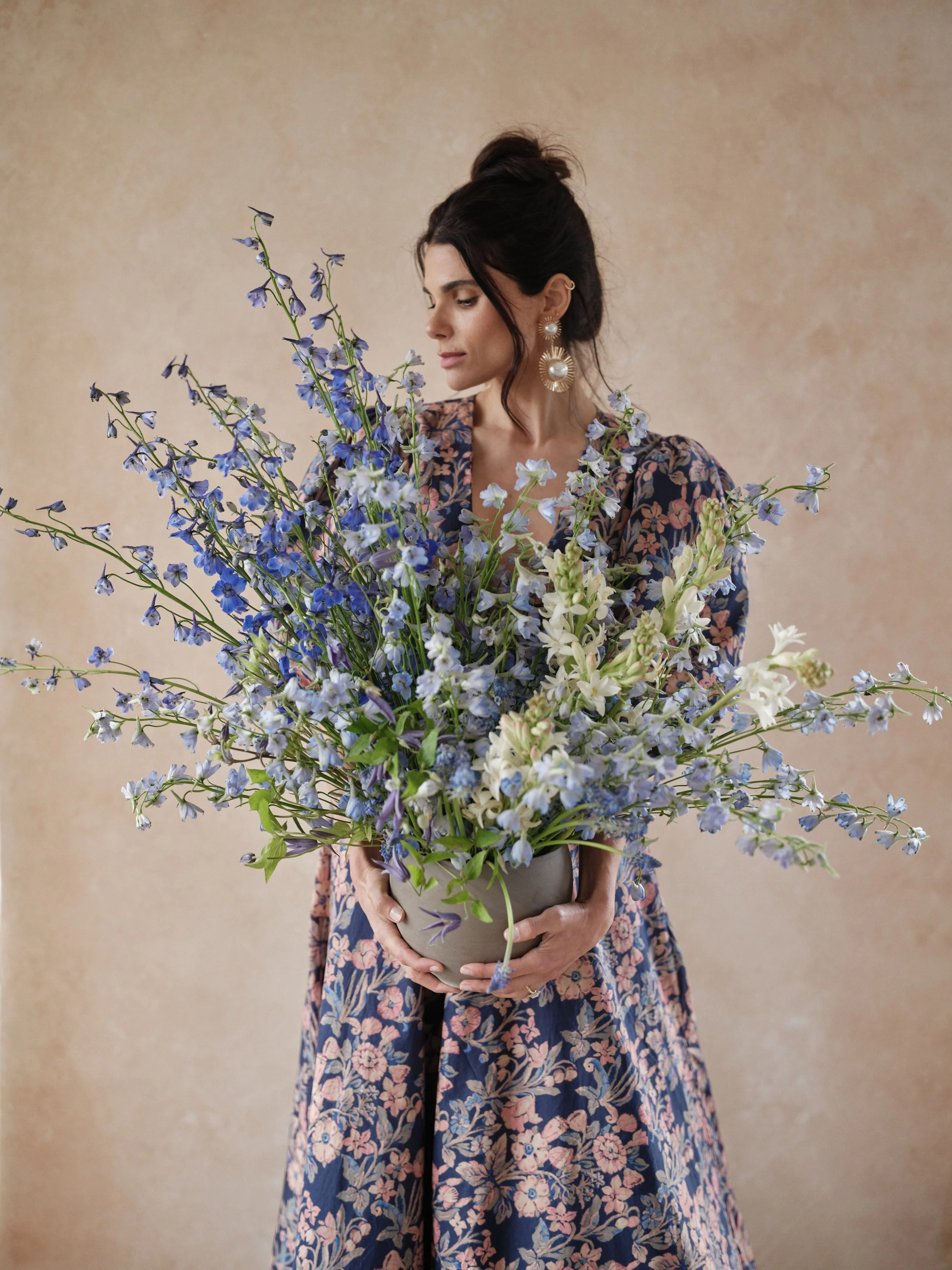
There is a moment, early in the morning, when north-facing studio light drops to a precise angle and a hand-painted canvas reveals something that no printed surface ever could. The brushstrokes cast their own micro-shadows. The layered pigment shifts from cool undertone to luminous surface. The backdrop stops being a surface and becomes a presence in the frame, a collaborator in the image rather than a device.
This is what hand-painted canvas does that no other surface material can: it responds to light the way a painting in a gallery responds to light. Directionally. Dimensionally. With a depth that transforms as the source moves. But this reciprocal relationship between canvas and light only happens when you understand the physics beneath it. The wrong light destroys what makes the canvas worth owning. The right light turns a $497 investment into something no one forgets.
Hand-painted canvas responds to light fundamentally differently than vinyl, muslin, or paper backdrops. If you're wondering how to choose between these materials, our detailed comparison guide explores texture, light interaction, durability, and cost for each option.
The Essential Principle
Hand-painted canvas absorbs and diffuses light instead of reflecting it uniformly. This means the angle, quality, and even the color temperature of your light becomes a creative choice. You are not lighting a surface. You are sculpting with light to make visible the artist's hand in every frame.
This guide walks you through how to see light as canvas sees it, and how to position that light so the texture and painterly depth of a hand-painted backdrop becomes the thing your viewer's eye cannot look away from. We will explore why direction matters more than intensity, how natural light behaves differently than artificial light on canvas, and how to build lighting systems that work across an entire session with multiple backdrops and changing color tones.
Struggling to get your canvas backdrop to look dimensional? The right natural light angle makes all the difference. Learn how to reveal texture before your next shoot.
The Physics of Canvas vs. Mass-Produced Surfaces
A hand-painted canvas backdrop is not a canvas because Jennifer uses canvas. It is a canvas because canvas material behaves fundamentally differently when light meets it. Jennifer hand-paints every Chasing Stone backdrop herself, a process that takes two to three days per piece. That time is invested in layering pigment, controlling how much absorbs into the weave versus sits on the surface, and creating variations in color and tone that no mechanical print can replicate.
When light hits a vinyl roll, a muslin sheet, or a paper backdrop, it bounces off a largely uniform, reflective surface. The light spreads. It scatters. It fills the surface evenly. When light hits canvas, something entirely different happens. The weave itself creates micro-topography. The hand-applied pigment sits at varying depths. Some light absorbs into the fiber. Some reflects off the surface. The interaction is complex, layered, responsive.
The result is tactile dimensionality. The texture is not a visual trick. It is a physical property of the surface. Under the wrong light, that property disappears. The canvas becomes flat. The investment becomes invisible. Under the right light, the brushwork becomes the subject's equal, a visual statement as powerful as the person in front of it.
This is why lighting a hand-painted canvas backdrop requires a different approach than lighting any other surface. You are not trying to evenly illuminate something. You are trying to reveal something that is already there, waiting for light to uncover it. That revelation happens through angle, through softness, through the interplay of shadow and highlight across the surface itself.
Why Directional Light Is Non-Negotiable
The angle of light to the canvas surface determines whether texture is visible or invisible. This is the single most important variable in the equation. A light positioned parallel to the canvas, or nearly so, creates an even wash. The texture disappears. A light positioned at a sharp angle to the canvas, particularly at a 45-degree angle or steeper, creates micro-shadows across the weave and the brushstrokes. These shadows are the visibility of texture. Without them, the canvas is just color.
Think of photographing sand dunes at dawn versus noon. The sand at noon, when light falls nearly perpendicular, looks flat and featureless. The sand at dawn, when light grazes across at a low angle, reveals every ripple and grain. The canvas works identically. Directional light sculpts. Flat light erases.
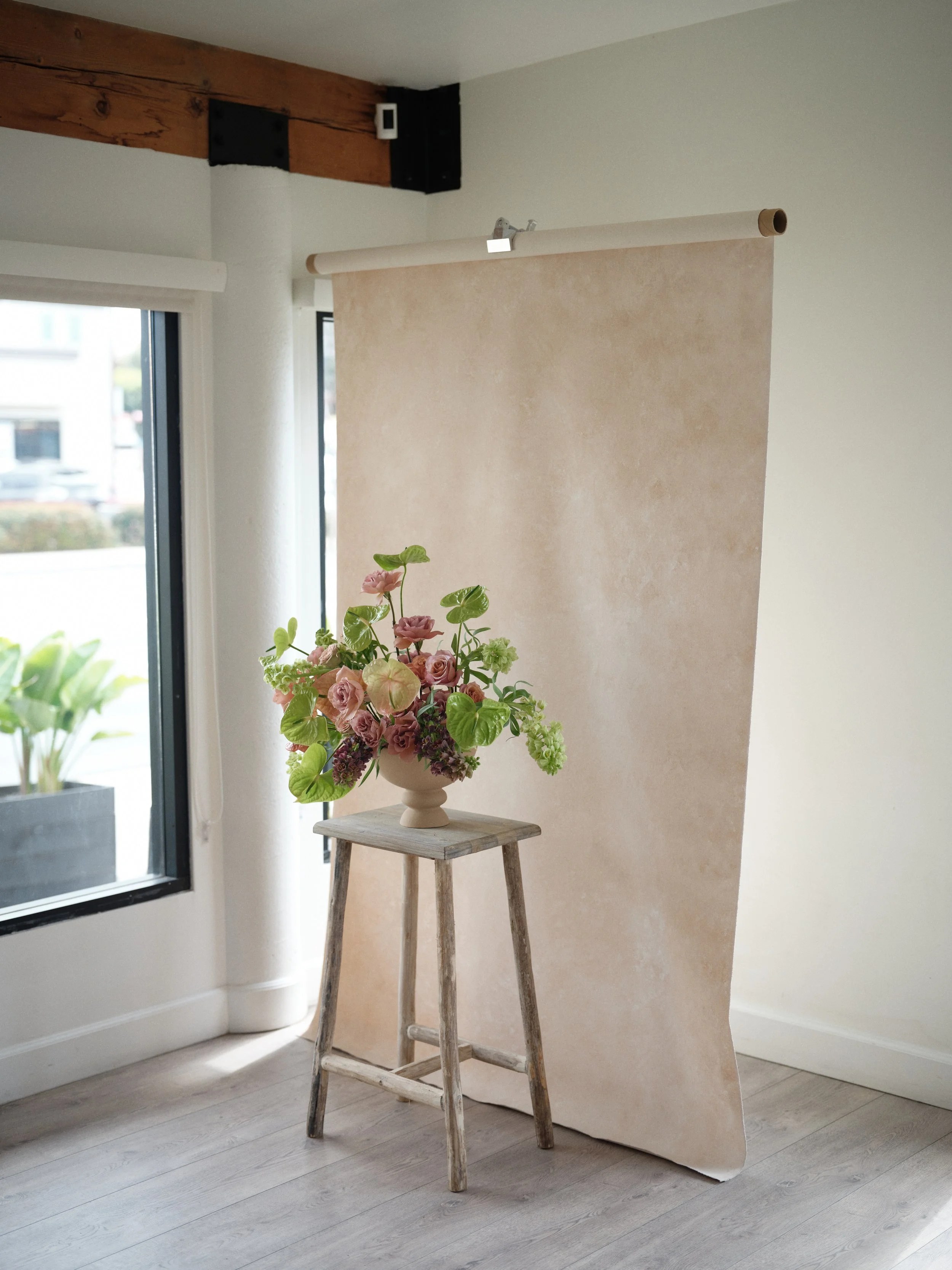
This is why natural north light in a studio is often ideal for canvas backdrops. North light is diffused (soft), but if you position your subject and canvas relative to the window so the light falls across the canvas at an angle rather than head-on, you get the best of both: soft light that reveals texture because of the angle, not despite the softness. The south, east, or west light from a window can work equally well if you position deliberately.
The 45-Degree Principle
Light that grazes across a surface at a 45-degree angle or steeper creates maximum texture visibility. Light that falls perpendicular to the surface creates maximum flatness. Position your light source relative to the canvas to control this angle. Moving the light 12 inches higher can shift from subtle texture to pronounced texture. Test and adjust.
Natural Light in the Studio: The Clear Advantage
Natural light has one overwhelming advantage for hand-painted canvas backdrops: it is inherently directional, it is soft, and it does not require equipment. A north-facing window provides this ideal combination. The light is cool (5600K), consistent throughout the day relative to diffused studio light, and comes from a relatively fixed direction.
The challenge is consistency. Window light changes angle throughout the day. Cloud cover shifts the color temperature. In winter, north light is weak. In summer, the same north light at noon fills the entire studio uniformly. For consistency within a session, natural light requires you to work within a window of time and understand how light angle will shift during your shoot.
Most photographers don’t realize their backdrop isn’t the problem, it’s the lighting. With the right natural light direction, hand-painted canvas reveals texture, depth, and dimension every time.
Many photographers solve this by shooting tethered in a natural light studio, reviewing images as they shoot, and adjusting subject position slightly as light angle shifts. Others position backdrops to face the window but several feet away, so the light has diffused further and becomes even more uniform across the backdrop surface. The best approach depends on your studio space and the look you want.
For color-specific backdrops, natural light reveals different characteristics than artificial light. A cool-toned backdrop like Slate or Celestite sings under north light because north light is cool. A warm-toned backdrop like Clay or Limestone looks richer under slightly warmer light, but north light still renders it beautifully because the cool quality makes the warm tones pop by contrast. This is not a limitation. This is why you test every setup.
Your backdrop's full potential only emerges when you know how to light canvas backdrops to reveal texture. Lighting is as important as backdrop selection, and the right directional light transforms a beautiful canvas from invisible to absolutely breathtaking.
Artificial Light: Precision and Control
Studio strobes or continuous LED panels offer control that natural light cannot match. You can position the light at exactly the angle you want. You can adjust intensity to taste. You can add multiple lights without worrying about cloud cover or time of day. For high-volume sessions, styled shoots, or situations where consistency is paramount, artificial light is the professional choice.
For canvas backdrops, the best artificial light is soft and directional simultaneously. This means a medium to large softbox (48 inches or larger is ideal), or a beauty dish, positioned to fall across the backdrop at a 45-degree angle. The softness means the texture reveal is graceful, not harsh. The directional positioning means the texture is still visible because of the angle, not despite it.
A single large softbox positioned as key light, combined with a white reflector on the shadow side for fill, creates a complete lighting system. The key light reveals texture. The reflector controls shadow depth and prevents the backup from falling too dark. This setup works on any backdrop color because you can adjust the color temperature of the strobes via gels if needed.
Many photographers in fine art studios use a hybrid approach: natural light as the primary source, with a supplemental strobe or LED panel positioned as a hair light specifically to sculpt the backdrop texture. This gives the soft quality of window light with the controlled texture reveal of directional artificial light. It is the best of both worlds, and it is very common in high-end editorial work.
Most photographers think the backdrop is the problem, but it is actually the lighting. Soft angled natural light brings out the texture and depth hand painted canvas is known for.
Color Temperature and Canvas Personality
A hand-painted backdrop does not have a single personality. Its personality shifts with the light that reveals it. Jennifer mixes pigments with an understanding that they will be lit in studios, and studio light varies. But some backdrops are optimized for certain color temperatures, and knowing this changes how you light them.
The warm tones in our collection, Limestone, Clay, Sandstone, Umber, and Bronzite, reach full saturation under light slightly warmer than pure daylight. Tungsten light (3200K) makes them glow. Daylight strobes (5600K) still render them beautifully, but the saturation is slightly cooler. If you are shooting with strobes and want warm backdrops to reach maximum richness, adding a CTO gel (color temperature orange) to warm the light slightly unlocks more of the pigment's depth. The texture becomes more pronounced because the eye perceives richness and focuses on variation rather than flatness.
The cool tones, Slate, Celestite, Silt, Graphite, and Bentonite, thrive under daylight or cool LED (6000K+). Cool light makes cool colors read as pure and detailed. Warm light makes cool backdrops look muddy or greenish. If you are shooting with tungsten continuous light and want to light a cool backdrop well, add a small bit of supplemental daylight-balanced light, or accept the warmer aesthetic as an intentional creative choice.
This does not lock you into one light temperature per backdrop. It means understanding the relationship so you can make choices. If you want moody warmth in a portrait with a cool-toned Slate backdrop, you can use daylight key light on the subject and add warm hair light specifically to the backdrop. The contrast becomes intentional storytelling instead of accidental mismatch.
Building a Multi-Backdrop Session Lighting System
Professional photographers often work with three to five hand-painted backdrops in a single session. Each backdrop has slightly different color characteristics. Lighting them all consistently while allowing each to look its absolute best requires a system.
The professional approach is to build a main key light that works on all backdrops, then adjust the supplemental light or modify the main light's color for each backdrop. For example: use a 48-inch softbox with daylight-balanced strobes as your main key light throughout the session. This is your constant. For warm backdrops, either gel the light slightly warmer, or accept the daylight balance. For cool backdrops, ensure a small amount of daylight-balanced fill light so the cool colors read clearly. Then, add a hair light or backdrop-specific light in the color temperature that suits each individual backdrop.
Alternatively, build flexibility into your light sources. Use daylight-balanced strobes for the key and fill (works on all backdrops), then add a tungsten continuous light as a hair light on warm backdrops only. This gives you one consistent subject light and flexibility on how the backdrop is sculpted. Professional editorial photographers often use this system because it is fast and it delivers consistency shot to shot.
Great portraits are not just about the subject. The way you light a hand painted canvas backdrop is what creates depth, texture, and that elevated studio look.
The Setup That Works in Real Sessions
Rather than overwhelming you with theory, here are three practical lighting configurations that professionals use and that you can implement immediately.
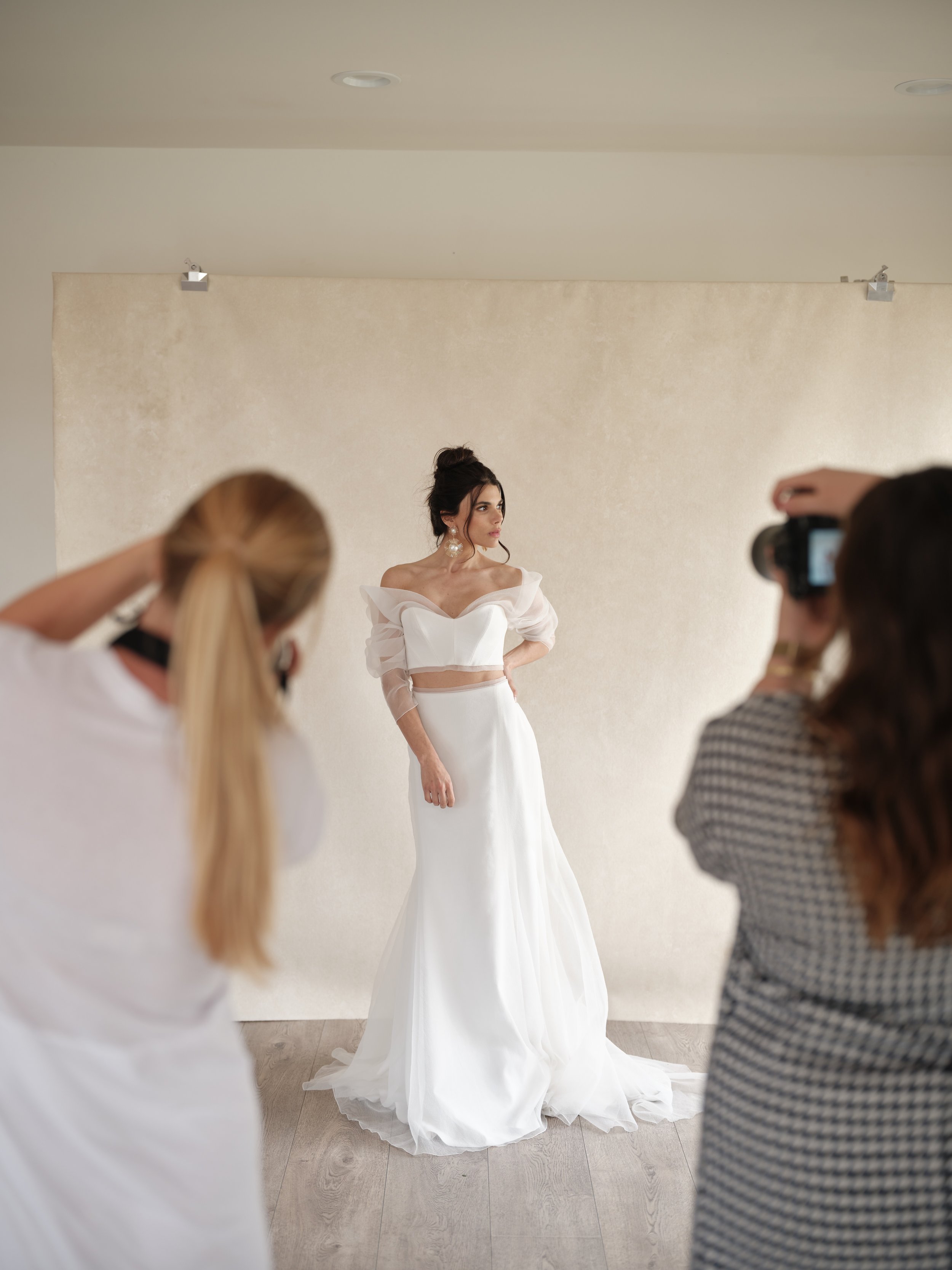
The Single-Light Natural Setup
Position your subject two to three feet in front of a north-facing window. Place the hand-painted canvas backdrop three to five feet behind the subject. The window light falls across the canvas at an angle because the canvas is not directly in front of the window. The angle reveals texture. A white reflector on the shadow side fills any darkness. Total equipment: a reflector. This is the simplest setup and it creates stunning results on any backdrop color because north light is cool and works well across the entire Chasing Stone range.
Adjust the subject distance from the canvas to control how much the light angle reveals. The further the canvas sits behind, the more diffused the light becomes. The closer the canvas sits, the more directional the light reveals on the surface. Most photographers position the canvas where the light feels right when they review test frames.
The Artificial Light Key Plus Reflector
Use a 48-inch softbox as your key light, positioned at a 45-degree angle to the canvas, about 6 to 8 feet away from the subject, and slightly above eye level. Position a 5-foot white reflector on the shadow side. The key light reveals texture because of the angle. The reflector fills shadows and controls how dark the shadowed side of the canvas appears. Adjust reflector distance to control fill brightness. This is the professional studio standard because it is simple, consistent, and works in any light color environment.
The Three-Light Editorial Setup
Key light: 48-inch softbox at 45 degrees, above eye level. Fill light: a white reflector or second strobe at 2 to 3 stops below the key. Hair light: a third strobe in a small reflector or grid, positioned behind the subject at a shallow angle toward the canvas itself. This light does not touch the subject. It sculpts the backdrop texture specifically. For maximum control, the hair light can be a different color temperature than the key and fill, allowing you to warm a cool backdrop or add creative contrast. This is the setup editorial photographers use when the backdrop is as important as the subject.
Mistakes That Flatten the Canvas
Avoid these errors and your canvas texture will remain visible in every frame.
Lighting the backdrop straight-on. If your light source is perpendicular to the canvas surface, the light falls evenly and texture disappears. Always position light at an angle. The sharper the angle, the more pronounced the texture. Even slight angles reveal more than flat lighting.
Insufficient key light intensity. If your key light is too weak relative to the ambient light, the texture reveal becomes subtle. For pronounced texture visibility, the key light should be dominant. In natural light studios, this sometimes means positioning the canvas to receive direct window light rather than fill light spilling in from the room.
Using the wrong modifier size. A small softbox or bare strobe creates hard light that casts harsh shadows and looks ugly on human subjects while making texture look rough rather than painterly. Always use at least a 36-inch softbox, ideally 48 inches or larger. Larger modifiers diffuse the light further, revealing texture gracefully rather than harshly.
Ignoring color temperature entirely. Lighting a warm-toned backdrop under pure cool daylight, or vice versa, makes colors read flatly. Test your setup and pay attention to how the backdrop color responds. Adjust light color temperature, or use warmer or cooler supplemental light. This adjustment takes 30 seconds and transforms the richness of the final image.
Filling shadows too brightly. Over-filling shadows with too much reflector or too-bright fill light washes out texture. Keep fill light 2 to 3 stops below the key light so shadows remain visible and texture continues to show. If your fill light is too bright, move the reflector further away or reduce the fill light intensity.
Positioning the canvas too close to camera. Canvas backdrops work best at 3 to 5 feet behind the subject. Too close and the backdrop fills too much of the frame and competes with the subject. Too far and the light that sculpts texture loses its directional power. Find the sweet spot for your space and lock it in.
Working With Specific Backdrop Colors
The Chasing Stone color palate divides roughly into warm earth tones, cool neutrals, and saturated colors. Each category responds slightly differently to light, and knowing this makes you confident in your lighting choices across an entire session.
Warm tones (Clay, Limestone, Sandstone, Umber, Bronzite, Hematite) reach maximum richness under light warmer than daylight, or under daylight with warm fill. If you are shooting daylight balanced and want these colors to sing, add warm supplemental light as a hair light or adjust your fill light toward warm. The pigments in these backdrops were mixed with the expectation that they would be lit warmly in fine art studios. Honor that intention and the colors become luminous.
We hear this constantly. Why does my backdrop look dull in photos? Then we adjust the light angle and suddenly the texture and color come to life.
Cool tones (Slate, Celestite, Silt, Graphite, Bentonite) are most beautiful under daylight or cool-balanced LED light. Slate specifically is an architectural concrete gray, not a jewel tone, and it reveals its elegant neutrality under cool light. Under warm light, cool tones flatten. If you must light cool backdrops with warm-balanced light, ensure enough cool fill light that the colors read clearly rather than muddy.
Saturated colors (Lapis, Azurite, Purpurite, Rhodonite) respond well to light that honors their saturation. For deep blues and purples, daylight-balanced light prevents them from looking murky. The key is ensuring enough intensity in your light that the saturation reads rather than sinks into shadows. Use a prominent key light and controlled fill so the color pops without becoming flat.
Frequently Asked Questions
Can I light a canvas backdrop with only natural light, or do I need strobes?
Natural light alone is entirely sufficient. A north-facing window with the canvas positioned at an angle to the light is a complete lighting solution. Many professionals prefer natural light for canvas because it is inherently soft and the directional angle is built in. Studio strobes add consistency and control, but are not required.
How do I know if my light angle is steep enough to reveal texture?
Shoot test frames and review at 100 percent zoom. If you see the brushstrokes and the weave of the canvas, the angle is revealing texture. If the backdrop looks flat and uniform in color, the angle is too perpendicular to the surface. Adjust the light source position until the texture becomes visible in the test frames, then lock in that position.
Should the key light hit the subject and the backdrop equally, or is it okay for the backdrop to look different?
It is absolutely okay for the backdrop to be lit differently. In fact, many photographers intentionally position the key light primarily to reveal the backdrop, then use fill light to properly expose the subject. The key light and the subject light do not have to be the same. This gives you freedom to sculpt the backdrop independently.
Is it better to use one large light or multiple smaller lights?
One large softbox is simpler and often better for canvas backdrops because it creates soft, directional light from a single source. Multiple smaller lights can create competing shadows that distract from the canvas texture. Start with one large key light and add complexity only if you want it.
How close can the key light be to the canvas without making the backdrop look overexposed?
The key light should be 6 to 8 feet from the subject with the canvas 3 to 5 feet behind the subject. This positioning allows the light to remain directional across the canvas without being so intense that it washes out detail. If your light is too close to the canvas, the intensity becomes hard to control. If it is too far, the directional quality weakens.
What if my studio does not have a north-facing window?
Any window works if you position the canvas to receive light at an angle. East and west light are warmer than north light, which changes how colors render but does not prevent texture from being visible. South light works but changes angle more dramatically throughout the day. Position deliberately and test. The angle matters more than the direction.
Can I light multiple backdrops in one session if they are different colors?
Absolutely. Use a main strobe or main window that is daylight balanced as your primary key light, which works on all backdrops. Adjust the supplemental light (fill or hair light) by color temperature per backdrop. For warm backdrops, add warmth to the hair light. For cool backdrops, keep the light daylight balanced. This gives you one consistent main light and flexibility on backup.
The Relationship Between Light and Canvas
At the highest level, lighting a hand-painted canvas backdrop is about understanding that the surface is not passive. It is not waiting to be lit. It is waiting to be revealed. The texture, the brushwork, the layered pigment, the subtle color variation, all of these are already there. Your job as a photographer is to position light so that what is already there becomes visible to the camera and the viewer.
This is why direction matters more than intensity. Why angle matters more than equipment budget. Why understanding your specific backdrop color matters more than following a generic recipe. You are in conversation with the surface, asking it to show you what it is capable of. The answer arrives through light. Beyond camera settings, canvas backdrop lighting techniques become the invisible hero of your image quality. The right lighting angle reveals texture and dimensionality that no camera setting alone can achieve.
For photographers working with Chasing Stone hand-painted canvas backdrops, this conversation is the difference between a setup that looks professional and a setup that looks elevated. The texture is why the canvas costs what it costs. Light is how you honor that investment in every frame. Start with directional, soft light at a 45-degree angle to the canvas. Adjust from there. Trust the feedback of your test frames. Every session teaches you something new about how light and hand-painted canvas speak to each other.
Ready to build your hand-painted canvas backdrop lighting system? Explore our complete collection of hand-painted photography backdrops and discover how the right light transforms your entire visual language. Have questions about backdrop colors, sizing, or how a specific surface will perform in your studio light? Reach out to our team and we will help you choose the right canvas for your space and vision.
Going Deeper
Lighting is one dimension of working with hand-painted backdrops. To build complete mastery, explore these complementary guides: camera settings that maximize texture in backdrop photography, how canvas compares to vinyl and muslin in real studio conditions, and the color theory behind choosing backdrops that work with your subjects and your light.

Creators of premium photography backdrops and styling surfaces
Trusted by thousands of discerning creatives worldwide
Every piece is handcrafted with intention in Orange County, California