
Posing with Backdrops: How to Use Your Background as a Compositional Tool
Posted on Mar. 26, 2016
I photographed a bride last spring who was nervous about portraits. She told me she didn't know what to do with her hands, didn't know how to stand, and was worried she'd look stiff.
I set up our CLAY backdrop near a window in her getting-ready suite and asked her to lean her shoulder blades against the canvas. Just rest there. That single point of contact changed everything. Her weight shifted naturally. One hip dropped. Her shoulders relaxed. She looked down at her bouquet and exhaled.
I got the shot before she realized I was shooting.
That moment taught me something I now think about on every single shoot: your backdrop isn't just what's behind your subject. It's a physical element they can interact with, lean into, move away from, and respond to. When you start treating your backdrop as part of the composition rather than a passive background, your posing gets better, your compositions get stronger, and your subjects relax because they finally have something concrete to do.
This is the piece of the puzzle that most posing guides completely ignore. They'll teach you hand placement and chin angles all day. But they rarely talk about the relationship between your subject and the surface behind them, which is honestly where some of the most impactful decisions in any portrait happen.
Your Backdrop Is the Largest Element in Your Frame
Here's something obvious that photographers overlook constantly: in a portrait shot against a backdrop, the backdrop occupies the majority of your frame. More visual real estate than your subject's face. More than their outfit. More than any prop or styling element you've introduced.
That means the backdrop isn't a passive player in your composition. It's the dominant one.
I realized this during a styled shoot two years ago. I kept repositioning the model, adjusting her arms, tweaking her chin angle. The images looked fine. Technically correct. But flat. Then I stepped back and actually looked at the backdrop itself. Our SANDSTONE canvas had this beautiful concentration of warm, lighter tones slightly off-center. I moved the model so her face landed right in that lighter zone, and suddenly the backdrop was doing the work for me. The natural tonal variation drew the eye exactly where I wanted it.
That was the session where I stopped posing my subject first and placing the backdrop behind them. Now I compose with the backdrop first. Where does the texture concentrate? Where does the color shift? Where do the brushstrokes create natural energy across the surface? Those answers tell me where to place my subject and how to direct their body.
A hand-painted canvas has visual movement built into it. Jennifer paints each of our backdrops with intentional variation, subtle shifts in tone and texture that create what I think of as a current across the surface. When you align a subject's body language with that current rather than against it, the whole image feels cohesive. When you deliberately place them in tension with it, you get dynamic energy.
Both work. But both require you to actually see the backdrop first.

Stop treating your backdrop like a background. Use it as a compositional tool that anchors the pose and gives your subject something natural to interact with.
How Distance Changes Your Posing Options (Not Just Your Bokeh)
If you've read our guide to lighting hand-painted backdrops, you know that subject-to-backdrop distance affects how texture renders in your final image. But here's what that guide didn't cover: distance also changes what your subject can physically do in the frame, and that changes your entire posing approach.
I think of it as three zones, each with a completely different posing personality.
The contact zone is the most underused distance in portrait photography, and it's where some of my favorite images happen. When a subject leans against the backdrop, rests a hand on it, or presses their back into the canvas, the backdrop becomes part of their physical world rather than a separate element floating behind them.
I stumbled into this during a bridal session at a cramped Airbnb in Laguna Beach. The room was so small that my subject basically had to stand against the backdrop. Instead of fighting it, I leaned into it (literally, and she did too). I asked the bride to press both palms flat against the CLAY canvas and look over her shoulder toward me. The texture of the hand-painted surface showed up in sharp detail right next to her fingers. It looked like she was leaning against a centuries-old Italian wall. That image booked me three weddings from her bridal party alone.
Contact-distance posing works best when the poses feel weight-bearing and natural. Leaning one shoulder back. Sliding down to sit on a low stool with the canvas rising behind. Pressing a forearm against the surface while looking away from camera. The key is giving the pose a reason to exist. Nobody naturally stands ramrod straight against a wall. They lean. They rest. They settle. Let them.
The working zone (roughly 3 to 6 feet from the backdrop) is where most portrait photographers default, and it's the most versatile. You get clean separation, the texture softens depending on your aperture, and your subject has room to move without casting shadows onto the canvas.
This is the zone for couples who need space to interact with each other rather than the backdrop. Two people leaning into each other, foreheads touching, one person whispering something that makes the other laugh. The backdrop at working distance becomes a consistent stage that unifies these moments without interfering. You have room to direct movement and you're not worried about anyone bumping into anything.
The atmosphere zone (6+ feet) is where the backdrop becomes less about texture and more about color and mood. At wider apertures, the brushstrokes dissolve into soft bokeh, but the hand-painted quality still reads as organic warmth rather than the plastic flatness you get from vinyl.
I use atmosphere distance for motion-based posing. Walking toward camera. Spinning in a dress. Tossing a veil. A fabric-heavy bridal gown in motion against a blurred wash of SERPENTINE dark green is one of the most dramatic images you can create on a wedding day. The movement forgives any edge creep from the canvas boundaries, and the color field behind the subject makes them absolutely glow.
Each zone has its posing personality. Contact is intimate and grounded. Working distance is versatile and relational. Atmosphere is dramatic and free. The best portrait sessions move through all three.
A neutral hand-painted backdrop creates a clean stage for natural, relaxed portrait posing.
Using Your Subject's Body to Create Lines Within the Backdrop
Composition in photography often comes down to lines. Leading lines, diagonal lines, curved lines. Most composition tutorials talk about finding these lines in your environment. But when you're shooting against a backdrop, you get to create them with your subject's body.
A bride standing straight with arms at her sides creates a vertical line centered in the frame. The backdrop reads as two symmetrical halves on either side of her. It's clean, it's balanced, and it's also a bit static.
Now ask her to shift her weight to one hip and extend one arm to hold her veil. Suddenly you have a diagonal line cutting across the backdrop from her raised hand down through her dropped hip. The backdrop's visual space becomes asymmetric. One side has more breathing room than the other. That asymmetry creates movement and a natural path for the viewer's eye.
This is where understanding the rule of thirds intersects with posing. If you want your subject at the left third of the frame, their body's lines should generally create energy moving into the larger open space on the right. And here's why this matters so much with hand-painted backdrops specifically: the texture fills that open space with visual interest rather than emptiness. On seamless paper, the negative space is just dead air. On a canvas with brushstroke variation, the negative space has life. It holds the viewer's eye instead of losing it.
I had a realization about this during a boudoir session last year. The subject was positioned at the right third of the frame, looking left. The left two-thirds of the image was "just" backdrop. On seamless paper, that would have been a problem. Too much nothing. But on our BENTONITE canvas, the texture and tonal shifts in that space were doing real work. The image felt balanced even though the subject occupied a relatively small portion of the frame. The backdrop was carrying the composition.
That's the practical takeaway: hand-painted texture lets you give your subjects more negative space than you normally would, which creates portraits that feel editorial and spacious rather than cramped and centered.
The Texture Direction Principle
This is something I don't see other photographers talking about, and honestly it might be the single most useful idea I've developed from working with hand-painted canvases for years.
Every hand-painted backdrop has a texture direction. It's subtle, but look at any of our canvases closely and you'll notice the brushstrokes tend to flow in a general direction. Maybe the strokes sweep horizontally. Maybe there's a diagonal drift of color variation. Maybe the texture has a slightly lighter zone that your eye naturally gravitates toward.
I discovered this by accident. I was shooting a series of portraits on the same backdrop and couldn't figure out why the images where my subject faced left felt more pleasing than the ones where she faced right. The posing was identical, just mirrored. The light was the same. But something was off.
When I looked at the backdrop itself, I noticed the brushstrokes had a subtle left-to-right sweep. When my subject faced left (into the sweep), the whole image felt harmonious. When she faced right (against the sweep), the image had an uneasy energy. Not bad, exactly. Just tense.
Once I saw it, I couldn't unsee it. And now I use it deliberately.
When your subject's body lines follow the texture direction, the image feels calm and cohesive. Everything flows together. This works beautifully for romantic, soft portraits where you want the viewer's eye to glide through the image without resistance.
When your subject's body lines cross the texture direction, you get visual friction. This is powerful for dramatic bridal work, editorial fashion, or any portrait where you want the subject to feel like they're commanding the space rather than blending into it.
Neither approach is better. They're tools. But being aware of texture direction gives you an intentional choice rather than leaving it to chance.
Next time you set up a backdrop, spend 30 seconds just looking at it before your subject steps in front of it. Notice which way the visual energy flows. Then decide: do I want this portrait to flow with it or push against it?
The 45-Degree Rule: Getting Four Images From One Pose
In our 2026 wedding photography trends post, we talked about the multi-angle approach as a technique that separates professional work from amateur portfolios. Let me show you exactly how this works in practice, because it's one of the highest-value habits you can build.
When you photograph a posed portrait straight on, the backdrop reads as a flat plane. The texture is visible but uniform across the surface. Your composition is symmetrical from left to right.
Move 30 degrees to your right while keeping your subject in the same pose, and the entire image shifts. The backdrop now has perspective. One edge is closer to you (and slightly larger in frame), while the other recedes. The texture responds to this angle change because light hits the brushstrokes differently, creating a gradient of highlight and shadow that adds depth you didn't have before.
Now drop from eye level to waist height. Same pose, same 30-degree offset. Completely different portrait. Your subject now has a slight upward presence, and the backdrop fills more of the upper frame with texture.
I shot a bridal portrait series last October on our BENTONITE backdrop. Same pose, same dress, same window light. I moved through four positions: straight-on at eye level, 40 degrees right at eye level, straight-on at waist height, and 40 degrees right at waist height. The bride held her bouquet exactly the same way the entire time. She didn't even know I was doing anything different.
The couple received twelve final images from that sequence that look like we spent an hour on portrait variety. The whole thing took maybe six minutes. On a wedding day where every minute counts, that efficiency is everything.
If you want more on maximizing your backdrop setup time, our guide to how wedding photographers use hand-painted backdrops covers the full logistics.
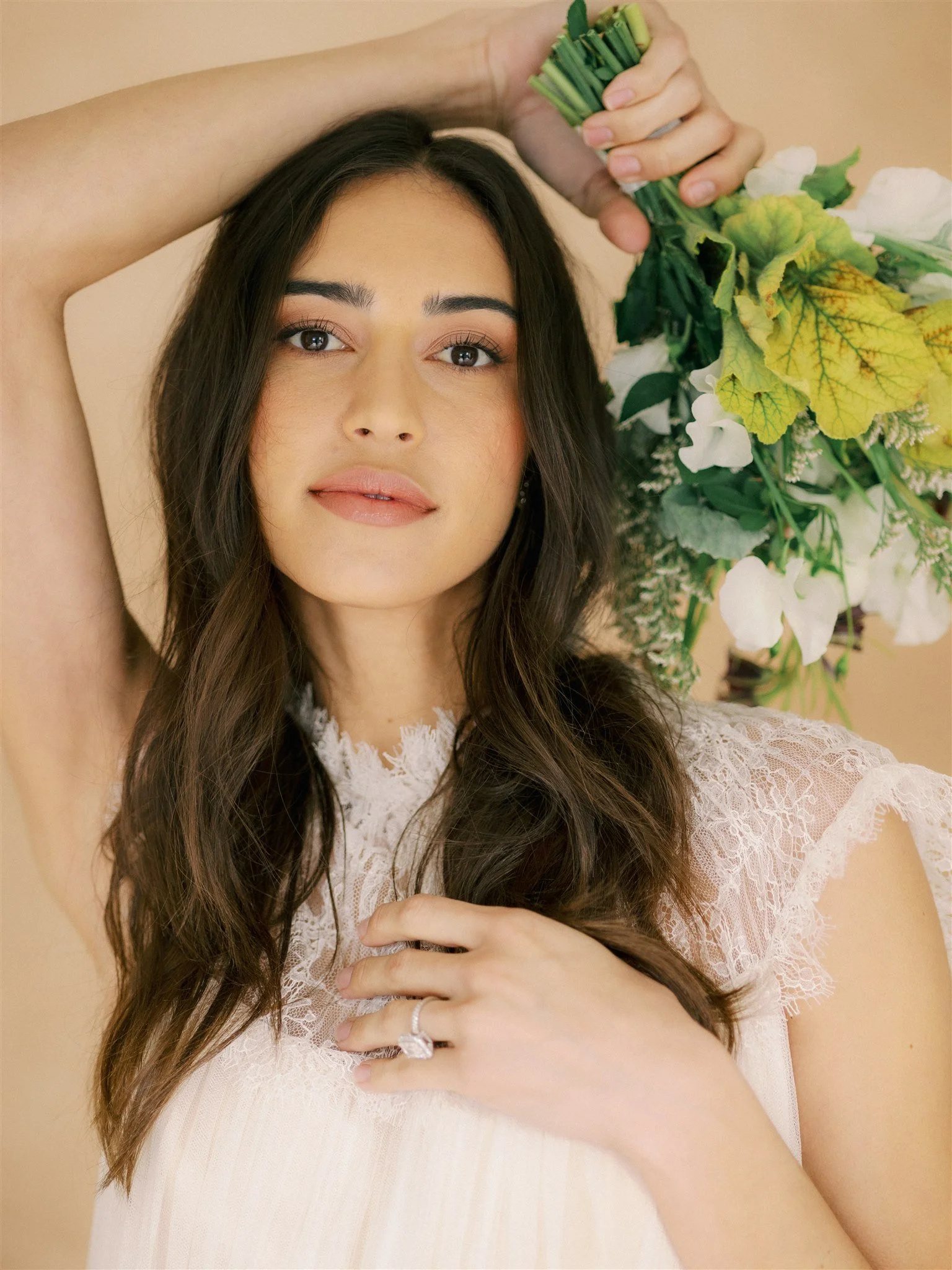
Using props like a bouquet against a neutral backdrop adds shape, movement, and balance to the portrait.
Color as a Posing Decision, Not Just an Aesthetic One
Most photographers choose a backdrop color based on mood or aesthetic preference. Warm neutral for romantic. Dark green for moody. Dusty blue for soft and airy. (If you want to go deeper on the theory, our color guide for photographers covers the fundamentals.)
But color also directly affects your posing options, and this is something even experienced photographers miss.
When your subject and backdrop are in similar tones (a bride in ivory against LIMESTONE, for example), there's very little contrast separating foreground from background. That means your posing has to create the separation instead. You need strong silhouettes, extended limbs that break away from the body, and clear negative space between the subject's outline and the backdrop edges. A bride standing with her arms tight to her sides will look like she's dissolving into the canvas. But that same bride with one arm extended holding a trailing ribbon? Now her body creates a clear shape the viewer can read instantly.
I learned this the hard way during a maternity session on a cream backdrop. The mom wore a cream gown. Everything was gorgeous to my eye, but the initial frames were mush. No separation. I widened her stance, had her extend both arms with fabric draped between them, and suddenly the composition worked. Her body created a clear shape against the similar-toned background. That one adjustment saved the whole session.
When there's high contrast between subject and backdrop (a dark gown against SANDSTONE, a white dress against SERPENTINE), the color does the separation work for you. You have more freedom to use subtle, quiet poses because the viewer doesn't need body shape to distinguish foreground from background. This is where minimal posing really shines. Hands softly clasped. Weight barely shifted. Eyes closed. The contrast carries the image, and the quiet pose adds emotional weight.
The color bridge technique is the most sophisticated version of all this, and it's the one that makes clients ask "how did you do that?" Choose a styling element that echoes the backdrop color and place it deliberately within the pose. A bouquet with warm terracotta tones held by a bride against our CLAY backdrop creates a color echo between foreground and background. Where you position that bouquet (waist level, chest height, extended to one side) determines where the bridge appears in the frame. It ties the layers of the image together in a way that feels intentional but not obvious. Share this concept with the florists you work with. When they understand what you're doing, they become your best collaborators.
Practical Posing Sequence: From Safe to Signature
Theory is great. But on a wedding day when you have 15 minutes for portraits and a nervous couple, you need a system. Here's the posing progression I use with backdrop portraits, starting with the most universally flattering and building toward editorial territory.
Start with the lean. Have your subject lean one shoulder against the backdrop. This is the single most effective pose for putting someone at ease because it gives them something to do with their weight. It creates an automatic angle in their body. And it looks good on literally everyone. I've used this as my opening pose for hundreds of sessions and I've never had it fail. The backdrop gives the lean a physical purpose that leaning against empty air never would.
Move to the turn. From the lean, ask your subject to slowly turn their shoulders away from the backdrop while keeping their feet planted. This creates a three-quarter angle that's universally flattering and produces a diagonal body line across the canvas. Don't rush this. Sometimes the best frame happens mid-turn, not at the end of it.
Add the look. Once the body is positioned, direct the eyes. Looking directly at camera creates connection. Looking away toward the light source creates mood. Looking down creates intimacy. Each eye direction changes the emotional tone of the portrait without requiring any body movement.
Introduce the prop. For bridal portraits, this is usually the bouquet. For other portrait work, it might be a jacket slung over one shoulder, a hat, or simply the subject's own hands brought to their face or hair. Props give the subject something to interact with, which makes poses feel lived-in rather than held. The prop also occupies space between the subject and backdrop, adding shape and visual interest to the composition.
Push to editorial. Once you've captured safe, beautiful images with the first four steps, you have creative permission to experiment. This is where you try the dramatic full-body lean, the eyes-closed moment, the close crop where only texture and a sliver of face fill the frame. These are the images that end up on your Instagram grid and attract the next booking at your premium rate. You've already delivered the gallery. Now make something for yourself.
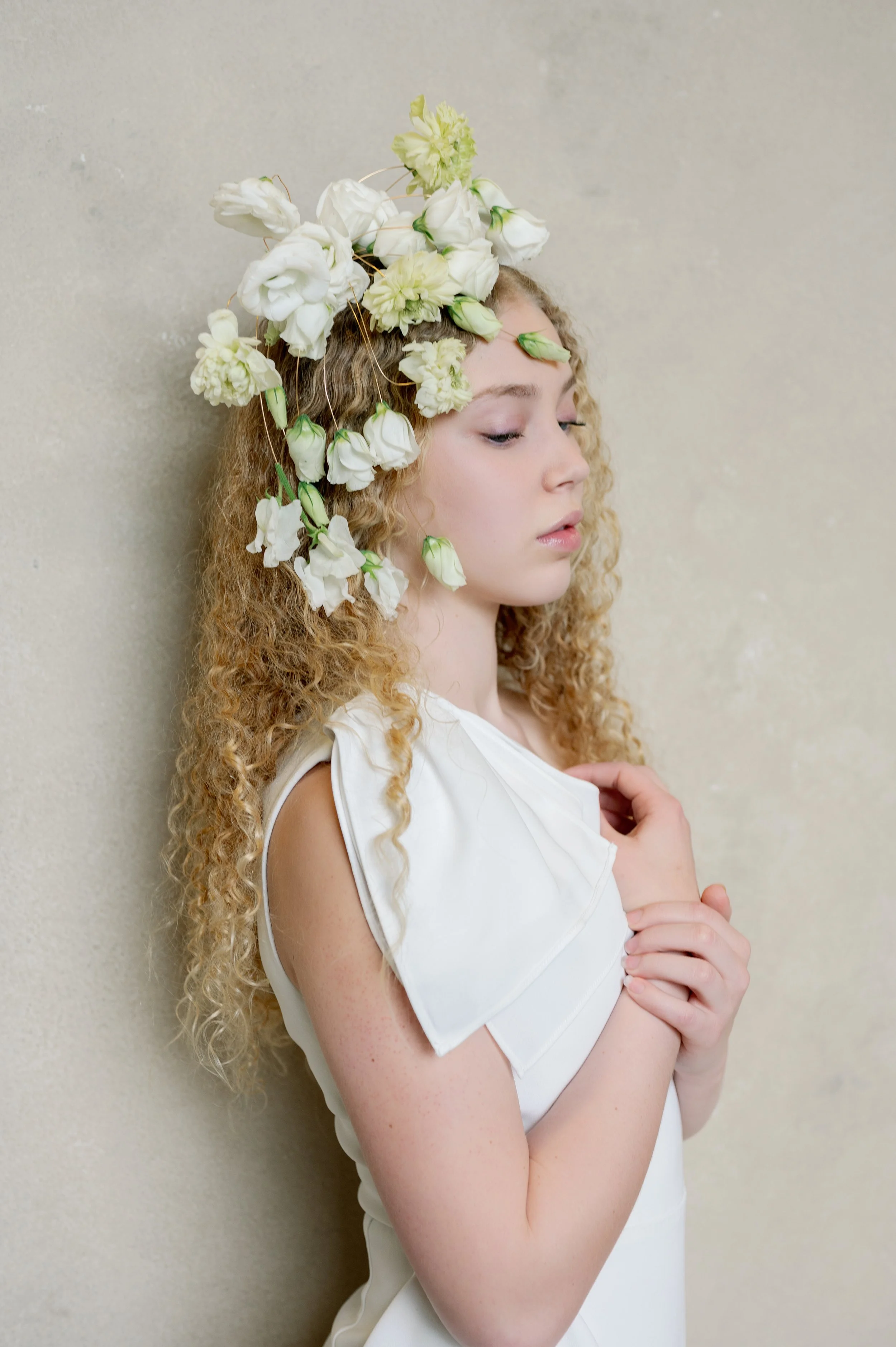
Strong portraits come from thoughtful composition. A textured backdrop and layered foreground elements give the image depth and direction.
Group Portraits: The Triangle Formation
Group portraits against backdrops are where most photographers panic, and I understand why. You've got multiple bodies, varying heights, someone who always blinks, and a backdrop that suddenly feels way too small.
I photographed a bridal party of seven last fall. Seven women, all in floor-length dresses, in a hotel room the size of a walk-in closet. My 8x10 backdrop was set up against the one decent wall. The initial instinct was to line everyone up shoulder-to-shoulder, get the shot, move on. And that instinct produces the kind of image that looks like a team photo at a corporate retreat.
Instead, I used what I call the triangle formation. The bride sat on a low ottoman in front of the backdrop. Two bridesmaids stood directly behind her, slightly apart. Two more stood behind them, further apart. The remaining two filled in at the back, creating the widest point of the triangle. The formation naturally created height variation, depth layers, and (this is the important part) visible backdrop between and around the group.
That last detail is the key: in a group portrait, the backdrop should be visible between people, not just behind them. Those glimpses of textured canvas between bodies are what make the image feel intentional rather than crammed. If the backdrop disappears entirely behind a wall of shoulders, you've lost the reason you set it up in the first place.
This is also where backdrop size becomes non-negotiable. A 5x8 handles a couple or an individual beautifully. For groups of four or more, you need the 8x10 at minimum. For full bridal parties, the 8x14 gives you the coverage to actually compose rather than crop carefully and hope for the best. Our size guide breaks this down in detail.
The second thing that saves group portraits: varied posing within the group. If everyone stands the same way, the eye registers a pattern and moves on fast. Mix it up. One person leaning, one standing tall, one with arms crossed, one holding flowers at her side. Different body shapes throughout the group keep the viewer's eye exploring the frame. And the backdrop's texture fills the spaces between those varied shapes with visual interest.
The Foreground Element Trick
Here's one final technique that I use on almost every backdrop session now, and it's the thing that makes clients say "I don't know what you did differently, but these look like a magazine."
Instead of shooting clean through open space to your subject against the backdrop, introduce a slight foreground element. This could be the edge of a veil draped across the bottom corner of the frame. A bridesmaid's shoulder in soft focus at the left edge. A cluster of florals placed on a stool in the immediate foreground. Even your own positioning where the lens barely catches the doorframe of the room.
A photographer friend of mine calls this "the sandwich." Your image becomes three layers: foreground, subject, backdrop. Two layers (subject and background) is a portrait. Three layers is cinematic.
I started doing this after studying the editorial bridal images I admired most in print publications. The subject was never floating alone in front of a background. There was always something between the viewer and the subject, even if it was just a soft wash of something at the edge of the frame. That extra layer of depth is what makes you lean into an image.
I tested it on a real wedding the following weekend. I placed a small arrangement of loose florals on a chair about two feet in front of me, slightly to the left, so they blurred into a soft wash of color in the bottom-left corner. The bride stood at working distance from the LIMESTONE backdrop. The resulting image had three distinct layers of depth and looked like it was shot in a Tuscan villa. It was shot in a Marriott.
Try it once. You won't go back.
Neutral backdrops like LIMESTONE help isolate the subject so small pose adjustments feel intentional and refined.
The Backdrop Is Your Creative Partner
Most photographers think of backdrops as solutions to a problem. Bad venue? Pull out the backdrop. Ugly walls? Cover them up. And that's absolutely a valid reason to invest in quality canvas.
But the photographers whose work I admire most, the ones booking premium packages and getting featured in editorial publications, use backdrops proactively. They don't reach for the backdrop when the venue fails them. They reach for it when they want a specific outcome that only a controlled, intentional background can provide.
That's the shift. From emergency tool to creative partner.
When you start seeing your hand-painted canvas as the largest element in your composition, everything changes. Your posing directions become more purposeful. Your camera angles become more varied. Your portraits develop a quality that couples can feel even if they can't articulate what's different about your work versus someone else's.
They just know they want it. And that's what books weddings.
Ready to build your backdrop collection with intention? Explore our full range of hand-painted canvas backdrops, built for photographers who see backgrounds as creative tools. For help choosing the right size, start with our backdrop buying guide.

Creators of premium photography backdrops and styling surfaces
Trusted by thousands of discerning creatives worldwide
Every piece is handcrafted with intention in Orange County, California