
Maternity Photography Backdrops: Flattering Colors and Flowing Fabric Considerations
Posted on Mar. 31, 2026
Maternity photography has a visual problem that no other portrait niche shares. Your subject is wearing flowing fabric, usually a lot of it, in motion, draped across a body that is at its most dimensionally dramatic. Every element in the frame is in conversation with every other element: the backdrop color reacts to the gown color, the gown fabric catches and reflects light from the backdrop, and the pregnant body itself creates curves and shadows that interact with both surfaces simultaneously.
Get that three-way relationship right and you produce images that feel like fine art. The kind that parents frame at 30x40 and hang above the mantle for the next twenty years. Get it wrong and you produce images where a beautiful woman in a beautiful dress somehow looks washed out, visually chaotic, or like she's floating in front of a surface that has nothing to do with the rest of the frame.
This guide is about the specific backdrop considerations that make maternity photography different from every other portrait genre, and about how to make choices that consistently produce the ethereal, sculptural, emotionally resonant work that maternity clients are willing to pay premium prices for.
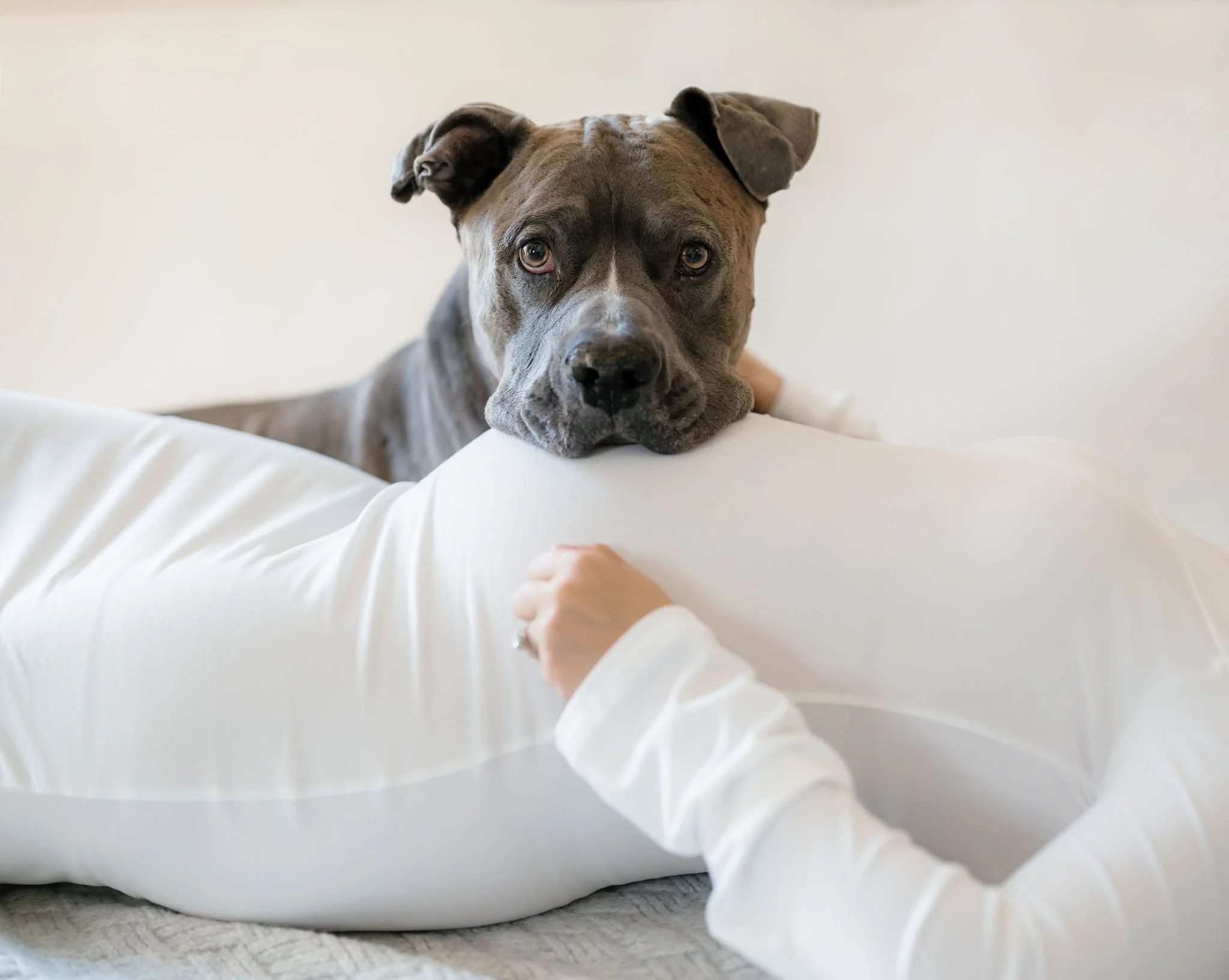
Soft neutral backdrops help white maternity gowns photograph cleanly while keeping the focus on the connection between mom, baby, and the family pets who are part of the story.
What Makes Maternity Backdrop Selection Different from Standard Portraiture
In a typical headshot or senior portrait, your subject occupies a relatively compact area of the frame. The backdrop is the dominant visual surface. In maternity work, the opposite is often true. A full-length flowing gown can fill 60-70% of the frame, making the fabric itself the largest color surface in the image. The backdrop becomes secondary in terms of visual area but remains critical in terms of color interaction, because it's still the surface that sets the tonal environment for the entire photograph.
This creates a specific hierarchy of decisions that maternity photographers need to internalize. The gown color and fabric come first. The backdrop needs to respond to what the client is wearing, not the other way around. You can't ask a pregnant woman who's 34 weeks along and already anxious about being photographed to change into a different dress because your backdrop doesn't work with her wardrobe. You need backdrops that are flexible enough to handle whatever walks through the door, or you need a large enough collection to match any gown color with confidence.
The other distinction is scale. Maternity portraits are almost always full-length or three-quarter length. You're showing the entire silhouette, the curve of the belly, the drape of the fabric, often with movement incorporated. That means your backdrop needs to provide consistent color and texture across a larger area than a standard headshot backdrop would cover. A 5x8 canvas works for most portrait niches, but maternity photographers who regularly shoot full-length with fabric movement find that the 8x10 or even 8x14 sizes give them the breathing room to capture sweeping gown trains and tossed fabric without cropping around canvas edges. Our photography backdrop buying guide covers the sizing math for different session types and framing preferences.
The Color Conversation: Gown, Skin, and Backdrop Working Together
Maternity photography is one of the few portrait genres where you're actively managing a three-surface color relationship. The backdrop, the gown, and the skin all need to coexist harmoniously. Miss the balance on any one of those and the image feels off, even if the viewer can't articulate exactly why.
Here's the framework that working maternity photographers use to make this manageable.
Start With the Gown, Not the Backdrop
Most maternity clients arrive with their dress selected, either purchased specifically for the session, rented from the photographer's client closet, or borrowed from a friend. That gown is the emotional anchor of the session. It's the piece she's been thinking about, the piece she feels beautiful in, and the piece you need to build your visual decisions around.
White and ivory gowns are the most common by a significant margin. Flowing chiffon, tulle, and crepe in bridal white dominate maternity wardrobes because they photograph with movement, they reference the bridal aesthetic that many women associate with "special occasion portraiture," and they're universally flattering on pregnant silhouettes. If 60% of your maternity clients show up in white or cream, your backdrop collection needs to handle white fabric beautifully as its baseline capability.
After white, the most common maternity gown colors in 2026 are soft blush and dusty rose, muted sage and olive, warm earth tones (terracotta, rust, camel), and jewel tones for clients going editorial. Your backdrop collection doesn't need to match every possible gown color. It needs to complement the gown families that represent 90% of your bookings.
Backdrop Colors That Work With White and Ivory Gowns
White gowns are simultaneously the easiest and the most unforgiving wardrobe to photograph. They're easy because white is chromatically neutral; it will sit cleanly against almost any backdrop color without clashing. They're unforgiving because white fabric picks up reflected color from the backdrop surface aggressively. A saturated green backdrop will cast a visible green tint onto white chiffon, particularly in the folds and shadows where the fabric isn't in direct light. That color contamination is subtle in person but obvious in the final image, and it's a pain to correct in post.
The solution is warm neutrals. Backdrops in the taupe, sand, putty, and warm gray family complement white gowns without casting unwanted color onto the fabric. The white reads as clean and luminous. The warm backdrop provides visual depth and richness without competing. This is why LIMESTONE and BENTONITE show up consistently in maternity photographers' studios. They solve the white gown problem reliably while still providing enough textural interest to keep the background from looking flat.
For maternity photographers who want a second option beyond warm neutrals, muted sage is the most versatile color accent for white gowns. The gentle green provides a subtle complementary contrast with the warmth in the client's skin without contaminating the white fabric, because sage is desaturated enough that its reflected light is minimal. CELADONITE handles this beautifully, and it adds an organic, botanical quality that resonates with the natural, life-affirming mood that maternity sessions are built around.
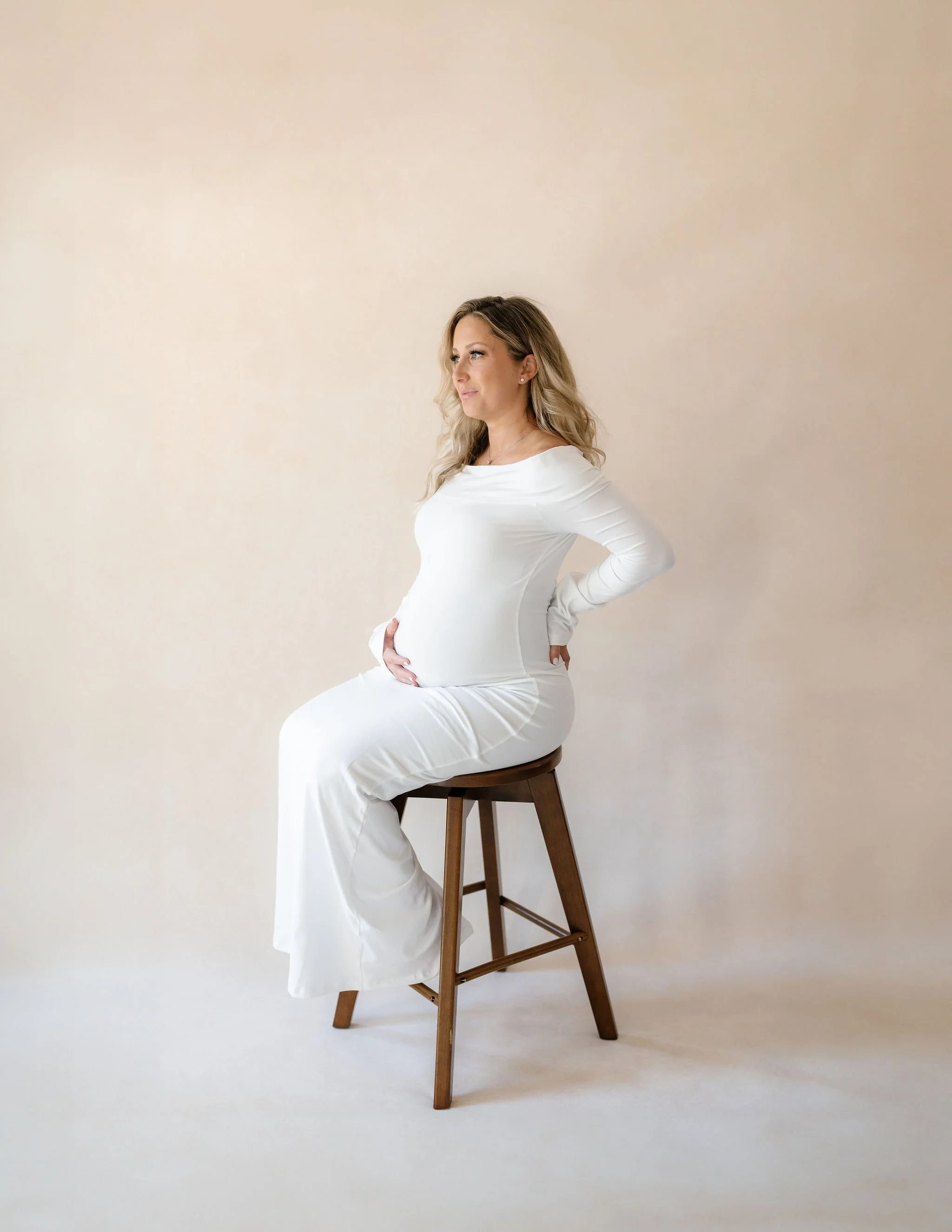
Neutral studio backdrops are a reliable choice for maternity photography. They complement white gowns while keeping the focus on the shape and movement of the fabric.
Backdrop Colors That Work With Warm-Toned Gowns
Blush, dusty rose, terracotta, rust, and camel gowns are all in the warm color family, which means they pair naturally with backdrops that share that warmth. Analogous harmony (warm gown against warm backdrop) creates the cohesive, enveloping feel that characterizes editorial maternity work. The entire frame wraps the client in warmth, and the image reads as intimate and intentional.
SANDSTONE (light peach-brown) and CLAY (faded terracotta) work particularly well here because their painted surfaces contain enough color variation to create visual distinction from the gown fabric even when the overall tone is similar. A flat, solid-color backdrop in the same warm family as the gown risks blending. A hand-painted canvas in the same family creates harmony with enough textural separation to keep the gown distinct from the background.
For bolder warm gowns (bright rust, deep terracotta), consider creating contrast by going lighter and more neutral with your backdrop rather than matching the intensity. LIMESTONE or MICA (light tan with golden undertones) provide a lighter, more neutral ground that lets the gown's color command attention without the backdrop fighting for the same visual real estate.
Backdrop Colors That Work With Cool-Toned and Jewel-Tone Gowns
Emerald, sapphire, deep plum, and dusty blue gowns call for a different backdrop strategy. The gown itself is already making a strong color statement, which means the backdrop needs to either support that statement or step back entirely.
Supporting the statement means choosing a backdrop in a related color family. A dusty blue gown against CELESTITE (soft blue-grey) creates a monochromatic elegance that's popular in fine art maternity work. A deep plum gown against PURPURITE (dark mauve with magenta undertones) is bold and editorial.
Stepping back means going neutral. And here's where warm neutrals earn their reputation as the most versatile investment a maternity photographer can make. A warm taupe like BENTONITE lets literally any gown color shine without competing, conflicting, or contaminating. When a client shows up in a gown color you didn't expect and you have five minutes before the session starts, a warm neutral is the backdrop that saves the day every time.
Our color theory for photographers guide covers the underlying principles of complementary versus analogous color harmony in detail, and our skin tone and backdrop color guide addresses how to balance backdrop choice with your client's complexion, which adds a fourth variable to the maternity equation.
The Flowing Fabric Problem (and Why Your Backdrop Material Matters)
Here's the technical issue that maternity photographers face more than any other portrait niche: flowing fabric in motion.
Chiffon trains, tulle skirts, tossed silk, draped organza. Movement shots are a signature element of maternity photography and often the most-requested images in the session. The client wants that image of herself with fabric swirling around her, belly silhouetted against the light, looking like a goddess.
Your backdrop needs to handle this technically and aesthetically.
The Technical Considerations
When fabric is in motion, it creates visual noise: soft edges, translucent layers, areas where the backdrop shows through semi-sheer material. If your backdrop is a flat, uniform color (seamless paper, solid vinyl), the areas where sheer fabric overlaps the backdrop look distinctly different from areas where opaque fabric covers it. You see a hard line between "backdrop visible" and "backdrop hidden" that creates a cut-out quality rather than a seamless integration.
Hand-painted canvas eliminates this problem because the surface has tonal variation. Where sheer fabric overlaps the backdrop, the backdrop's visible texture creates a gradual transition rather than a hard edge. The fabric and the backdrop blend organically because the backdrop isn't a single uniform color; it's a field of subtle variations that the sheer fabric mediates rather than masks. The visual result is that the fabric appears to emerge from and dissolve into the background naturally, which is exactly the ethereal quality that defines the best maternity work.
This is one of those differences that's difficult to describe in words but immediately obvious when you compare images side by side. Our hand-painted canvas vs. muslin backdrops comparison shows the material-level differences, and The Art of Imperfection explains why painterly variation produces more forgiving, more organic results than uniform surfaces.
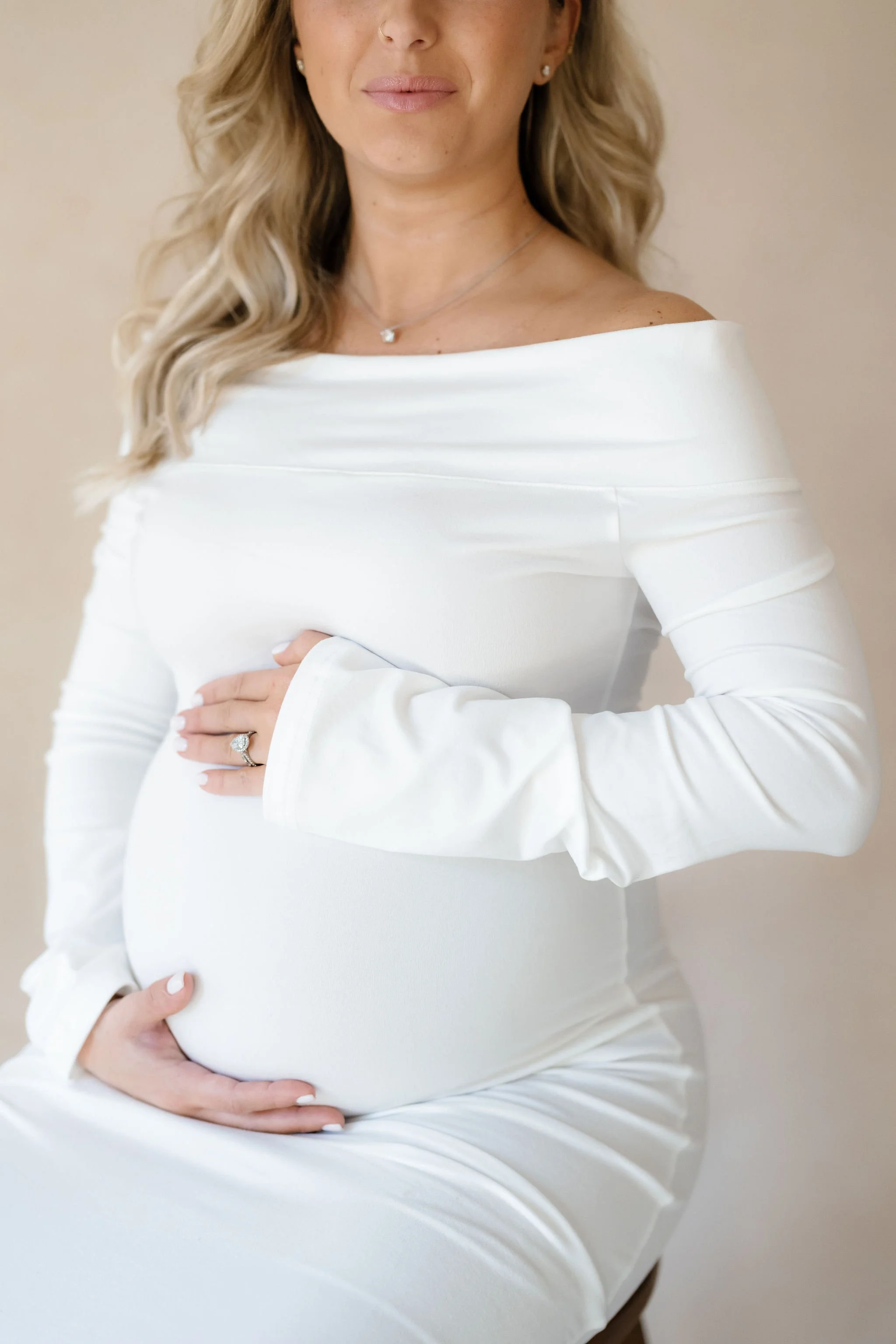
One of the most requested maternity shots: hands gently resting on the baby bump. A neutral hand-painted canvas backdrop keeps the moment soft, timeless, and distraction-free.
The Aesthetic Considerations
Beyond the technical mechanics, there's an aesthetic relationship between backdrop texture and fabric movement. Flowing fabric creates organic, curved, unpredictable shapes. A flat, textureless backdrop creates a static, uniform plane. The contrast between the two is jarring. The fabric says "movement, life, energy" while the backdrop says "nothing is happening here." The image feels split into two unrelated worlds.
A textured, hand-painted backdrop creates a visual conversation with the fabric. Both surfaces have organic variation. Both respond to light in complex ways. Both have a handmade, imperfect quality that reads as artful rather than manufactured. The fabric flows and the backdrop holds steady, but they feel like they belong in the same image because they share a visual language of texture and variation.
This is particularly important for maternity photography because the emotional register of the genre is warmth, life, and organic beauty. Everything in the frame should reinforce that register. A hand-painted surface does. A flat vinyl or paper surface doesn't.
Backdrop Reflectivity and Sheer Fabric
One more technical note that maternity photographers discover the hard way: vinyl backdrops reflect light. When you toss sheer chiffon in front of a vinyl surface, the backdrop's reflective quality can create specular highlights that show through the fabric, creating bright spots that are nearly impossible to retouch convincingly. Seamless paper has the same issue to a lesser degree, particularly when lit from the side.
Hand-painted canvas on cotton is naturally matte. It absorbs light rather than reflecting it, which means sheer fabric draped or moving in front of the surface maintains consistent exposure without unexpected bright spots bleeding through. This matters in every maternity session where movement and sheer fabric are involved, which is most of them. Our guide to lighting hand-painted backdrops covers how the matte surface of painted canvas interacts with different lighting scenarios.
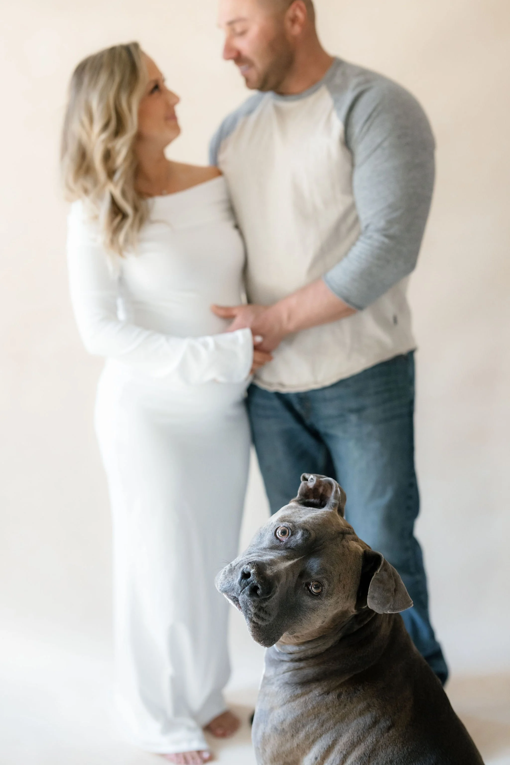
In maternity photography, neutral studio backdrops keep the focus on family connection while complementing soft fabrics and natural skin tones.
Maternity Backdrop Colors That Photograph Timelessly
Maternity photos are among the most emotionally significant images a family will ever own. They document a moment that literally cannot be recreated. A moment that exists for a few weeks and then transforms into something entirely new. Parents return to these images for decades, which means the aesthetic choices you make need to hold up over time in a way that goes beyond even wedding photography.
Here's what consistently works, and why.
Warm Neutrals (The Universal Foundation)
Every working maternity photographer needs at least one warm neutral backdrop. This is the surface that handles the white gown client, the jewel tone client, the "I don't know what I'm wearing yet" client, and the partner shots where you're coordinating two wardrobe choices simultaneously. Warm taupes, sands, and soft putty tones create an environment that's warm enough to feel intimate but neutral enough to let any gown color and skin tone take center stage.
BENTONITE (mid-taupe with warm grey undertones) and LIMESTONE (light warm tan) cover the most common maternity scenarios. BENTONITE is the more versatile of the two for photographers who photograph diverse skin tones, because its balance of warm and neutral elements works across the full complexion spectrum. LIMESTONE is slightly warmer and lighter, which makes it particularly beautiful for fair-skinned clients in white or ivory.
Muted Earth Tones (The Editorial Layer)
Once your neutral foundation is in place, earth tones add the creative range that separates your maternity portfolio from competitors'. Faded terracotta, warm clay, and soft peach-brown tones are having an extended moment in maternity photography, and for good reason. They create warmth and richness without the coolness or starkness that some pregnant clients find unflattering. They also photograph beautifully with the natural wood, dried floral, and organic prop elements that define maternity styling in 2026.
SANDSTONE and CLAY are the two to consider here. SANDSTONE is lighter and softer, working as an elevated neutral that adds just a touch of peach warmth. CLAY is richer and more editorial, creating the kind of warm, moody atmosphere that distinguishes fine art maternity work from standard studio portraiture.
Soft Sage and Olive (The Organic Choice)
Green-family backdrops connect to the themes of growth, life, and nature that maternity photography inherently carries. A pregnant woman photographed against a muted sage backdrop doesn't need additional props or styling to make the image feel organic and meaningful. The color itself carries that connotation.
The saturation level is critical here. Bright greens feel juvenile and themed. Deep, saturated greens can feel heavy. Muted, dusty greens feel sophisticated and intentional. CELADONITE (light sage) and OLIVINE (mid green with olive undertones) are the range to consider, with CELADONITE being the safer, more universally flattering choice and OLIVINE providing more depth for clients who want a moodier, more editorial result.
Soft Lavender and Mauve (The Feminine Statement)
For clients who want a distinctly feminine, romantic feel, soft purple-family backdrops create an atmosphere that no other color range can replicate. Lavender reads as dreamy and ethereal. Mauve reads as sophisticated and editorial. Both work beautifully with the white and blush gowns that dominate maternity wardrobes, and both photograph with a warmth that cool purples lack.
LAVENDER QUARTZ (faded lilac with warm pink undertones) is the specific backdrop we'd recommend for maternity photographers adding a soft color accent. It has enough warmth in the undertone to avoid the cool, clinical quality that some purple backdrops create, and it pairs naturally with both warm and cool skin tones.
Rich Darks (The Fine Art Statement)
Dark backdrops in maternity work create drama, contrast, and a fine art quality that clients seeking high-end portraiture are drawn to. A pregnant silhouette against a dark backdrop, lit with a single directional source, produces images that reference classical painting. These aren't the images every client wants, but they're the images that stop scrollers, win competitions, and justify premium pricing.
Choose darks with warmth. UMBER (dark chestnut brown) and SERPENTINE (dark moss green with black undertones) create depth without the starkness of pure black. They maintain enough visual texture and warmth that the image feels inviting even in its drama, which is important for maternity work where emotional warmth is always part of the equation.
Setup and Lighting Specifics for Maternity Backdrops
Maternity sessions have practical requirements that differ from standard portrait work, and your backdrop setup needs to account for them.
Distance and Coverage
Full-length maternity portraits with flowing fabric require more shooting distance than headshots or three-quarter portraits. You need room for the full silhouette, plus the gown train, plus space for fabric movement if you're doing tossed or draped shots. That means your camera-to-subject distance is typically 8-12 feet, which means the backdrop needs to fill a wider field of view.
For studio work, an 8x10 backdrop provides comfortable coverage for most full-length maternity compositions without constant framing adjustments. For photographers who regularly shoot with long fabric trains or want the freedom to capture horizontal compositions with a partner, the 8x14 size eliminates canvas-edge anxiety entirely. Our ultimate photography backdrop guide covers the specific size recommendations for each session type.
Lighting for Fabric and Backdrop Together
The ideal maternity lighting setup reveals the curve of the belly, creates dimension in the flowing fabric, and renders the backdrop with enough visual interest to be a supporting element rather than a flat wall. That's a lot of work for your lighting to do simultaneously.
The single most effective approach: large, soft, directional light from one side. A large window (ideal) or a large softbox positioned at roughly 45 degrees to the subject creates gentle highlight on the belly, beautiful shadow-to-highlight transitions across the gown fabric, and soft light falloff on the backdrop that lets the painted texture emerge naturally. The backdrop is brighter near the light source and gradually darkens toward the opposite edge, creating the organic gradient that hand-painted surfaces are designed to produce.
If you're using a second light on the backdrop itself, keep it subtle. The goal is to open up the shadow side slightly, not to illuminate the backdrop evenly. Even illumination flattens a hand-painted surface and removes the tonal depth that makes it worth having in the first place.
Managing the Temperature
Maternity sessions, like newborn sessions, benefit from warm rooms. Your client is often partially undressed, physically uncomfortable at 33+ weeks of pregnancy, and emotionally vulnerable. A warm, comfortable environment keeps her relaxed, which translates directly into better expressions, more natural movement, and a willingness to try the poses and fabric toss shots that produce the most dramatic images.
This means your lighting setup needs to accommodate warmth without overheating the space. Low-power continuous LEDs and natural window light are your friends. High-powered strobes that generate significant heat are your enemy. Hand-painted canvas backdrops are advantageous here because they photograph beautifully under low-power continuous light and natural light conditions that other materials struggle with. Vinyl and glossy paper need more aggressive lighting to look good, which often conflicts with the warm, gentle environment your client needs.
Building a Maternity-Specific Backdrop Collection
If maternity is a significant part of your business, or if you're looking to expand into this high-demand niche, here's how to build your collection strategically.
The Essentials (Start Here)
One warm neutral in 8x10 size. This is your workhorse. BENTONITE or LIMESTONE, depending on whether you lean toward mid-tone versatility or light, airy warmth. This single backdrop will handle 70% of your maternity sessions if chosen well. The 8x10 size is the recommendation specifically for maternity because full-length coverage is non-negotiable in this genre.
One muted accent color in 5x8 or 8x10. CELADONITE (soft sage), SANDSTONE (warm earth), or LAVENDER QUARTZ (soft lilac), depending on your brand aesthetic and the clients you want to attract. This gives you a second "look" within each session without requiring a wardrobe change, and it adds the editorial dimension that separates your portfolio from photographers shooting against plain walls.
The Complete Collection (Where You're Headed)
A warm dark for fine art work. UMBER or SERPENTINE. This is the backdrop that produces your most dramatic portfolio images and your most-requested prints. It also crosses over into boudoir and newborn work, making it a multi-genre investment.
A bold editorial color. CLAY (faded terracotta), OLIVINE (mid olive), or AMETRINE (mid purple with amethyst tones). This is your signature piece, the backdrop that makes your work recognizable and attracts clients who want something beyond standard maternity portraiture.
For photographers building their full collection at once, the three-backdrop studio bundle in the 8x10 size offers meaningful savings. Pairing that with a single accent-color 5x8 gives you a four-backdrop collection that handles virtually every maternity scenario.
Connecting Maternity to Your Other Portrait Offerings
One of the smartest business moves a portrait photographer can make is creating visual continuity between maternity and newborn sessions for the same family. When the maternity portraits and the newborn portraits share a cohesive color story, the combined gallery tells a narrative arc that clients find irresistible. Many photographers offer bundled maternity-newborn packages specifically because the visual pairing strengthens the perceived value of both sessions.
If you're photographing a maternity client on LIMESTONE at 34 weeks and then photographing her newborn on the same LIMESTONE backdrop two months later, the continuity is powerful. The before-and-after creates a story that parents treasure and that looks stunning as a diptych or triptych wall art arrangement. Our newborn photography backdrops guide covers the specific considerations for infant sessions, including how backdrop colors interact with newborn skin.
This also applies to your flat lay work. The tiny details of a maternity session (ultrasound images, the baby's first outfit, a pair of impossibly small shoes) can be styled and photographed on flat lay surfaces from the same color family as your portrait backdrops, creating a gallery that feels unified from the wide-angle environment shot to the intimate detail close-up. The complete flat lay surface guide covers surface selection and styling principles that apply directly to maternity detail work.
The backdrops you invest in for maternity work don't exist in isolation. They serve your wedding portrait work, your headshot clients, your bridal sessions, and your newborn sessions. Every additional genre you can photograph on the same canvas is additional revenue from the same investment. That's the practical case for building your collection around versatile, timeless colors rather than niche-specific surfaces you can only use for one type of session.
For a broader view of how professional portrait photographers across all niches approach backdrop selection, including strategies that translate directly to maternity work, our portrait photography backdrops guide covers the full landscape.
Ready to create stunning maternity portraits? Explore hand-painted canvas backdrops that photograph beautifully with flowing fabric, flatter every skin tone, and provide the texture and warmth that maternity clients want on their walls for decades. Every surface is handcrafted in California on premium cotton canvas.
Shop Backdrops → | See Our Collection →
Sources & References: Maternity photography timing and session best practices per the National Association of Professional Child Photographers (NAPCP) educational standards. Fabric behavior and light interaction principles from "Light Science & Magic" by Fil Hunter, Steven Biver, and Paul Fuqua (5th edition, Routledge). Subsurface scattering and reflected color behavior in portrait photography as documented in "The Filmmaker's Eye" by Gustavo Mercado. Color psychology and emotional association research from the Journal of Experimental Psychology: General. Industry wardrobe and styling trends compiled from NAPCP, PPA, and published maternity photography education content (2025-2026). Client color preference data referenced from maternity photographer surveys published by Tiny Dreamers Studio and Stephany Ficut Photography.

Creators of premium photography backdrops and styling surfaces
Trusted by thousands of discerning creatives worldwide
Every piece is handcrafted with intention in Orange County, California