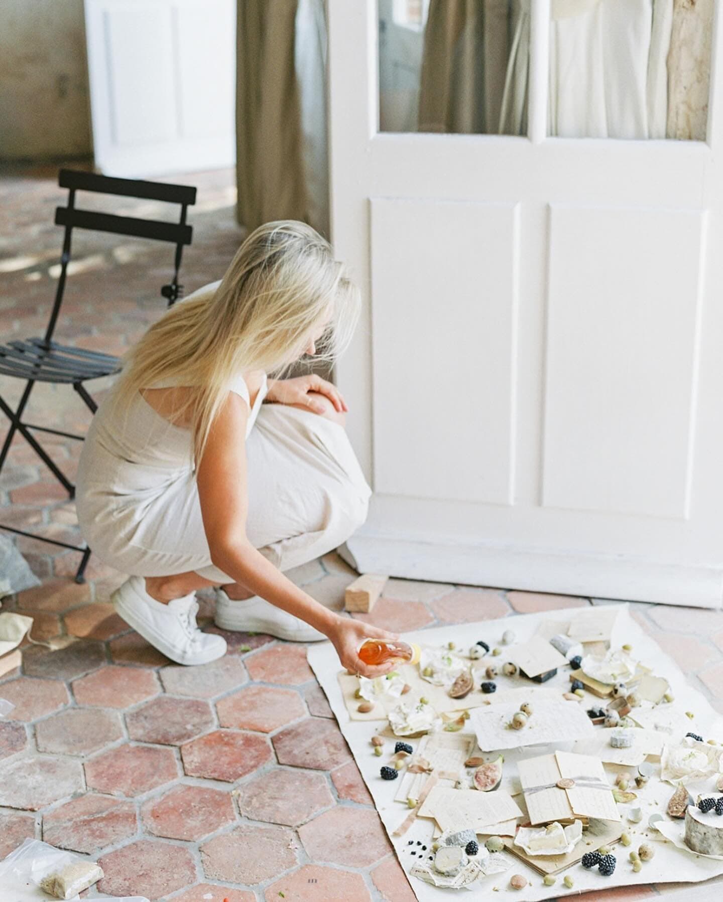

Flat Lay Backgrounds for Product Photography: Choosing a Surface by Product

When I walk through an old town and run my hand along a sun-warmed wall, I notice how every object set against it seems to settle into place, a terracotta pot or a folded linen or a basket of lemons, each one made more itself by the weathered plaster behind it. That quiet conversation between an object and the surface it rests upon is what first drew me to painting surfaces in 2018, and it is still what I think about every time I mix a new colorway. A product photograph is that same conversation, held in a frame no larger than a tabletop, and the surface you choose decides whether your product speaks clearly or has to compete to be heard.
Quick Answer
The best flat lay background for product photography is the one whose texture, value and color support the product's own qualities. Glossy or reflective products such as skincare and jewelry usually look best on a matte, softly textured surface in a value that contrasts with the product. Handmade goods such as ceramics, candles and stationery benefit from a surface with gentle character that echoes their craft. Clothing needs a large, calm surface with little pattern. Food should always rest on a plate or board, never on the surface itself. Pure white paper remains the standard for marketplace listings, while painted canvas, boards and fabric shine for brand and lifestyle imagery.
Why the Surface Matters So Much in Product Photography
In a portrait, the backdrop sits several feet behind your subject and falls softly out of focus, so its texture becomes a gentle wash of tone. In a product flat lay, the surface sits directly beneath the object, in the same plane of focus, lit by the same light, and filling most of the frame. Every brushstroke, every fiber, every speck of grain is rendered as sharply as the product itself. That is why a surface that feels lovely in your hand can become loud on camera, and why a surface that seems almost plain in person can give a product the most room to breathe.
I find it helpful to think of three qualities in every surface, and to consider each one against the product before anything else. The first is texture, which is the physical relief of the surface and how it catches raking light. The second is value, which is how light or dark the surface reads once you strip away its color, the way it would appear in a black and white photograph. The third is color, including its undertone, warm or cool, and its saturation. A product has the same three qualities, and the most beautiful flat lays come from pairing them with intention so that the surface supports the product in at least two of the three and offers a gentle contrast in the third.
A simple practice I return to again and again is to set the product on a candidate surface, take a single frame with your phone, and convert it to black and white. If the product's edges dissolve into the surface, the values are too close, and you will spend your edit fighting for separation. If the product stands out clearly in monochrome, the color can do whatever you like and the image will still hold together. For a deeper look at how hue and undertone interact, our post on color theory for photographers walks through the color wheel with surfaces in mind.
Paper, Boards, Painted Canvas and Fabric: An Honest Comparison
Before we look at individual products, it helps to understand what each family of product photography surfaces does well and where it asks something of you in return. I paint canvas surfaces for a living, so I want to be especially fair to the other materials, because a thoughtful studio usually holds more than one kind.
Paper flat lay backgrounds
Background paper is the most familiar starting point, and for good reason. It is affordable, widely available in dozens of colors, and gives an even, matte field with almost no texture. According to Roberts Camera's product listing, Savage Widetone paper comes in roll widths that include 26, 53 and 107 inches, in 71 colors, with a fine tooth surface that does not reflect. The narrowest roll is a sensible width for tabletop work, and the wider rolls can sweep up a wall into a gentle curve behind taller products.
The honest limits of paper are that it creases, scuffs and stains easily, it curls at the cut edge, and once it is marked you tear off the soiled length and use more. A paper flat lay background also carries no visual character of its own, which is exactly right when you want the product to stand alone and less helpful when you want the image to carry a sense of place or craft. Paper is wonderful for clean catalog work and for testing a color before you commit to a more lasting surface.
Boards
Flat lay boards for product photography are usually printed vinyl or a printed image mounted to a rigid panel, often in a marble, wood or concrete pattern. They are rigid and wipe clean easily, which makes them practical for messy work. A printed pattern does repeat, however, and under raking light the surface reveals itself as a flat print with a faint sheen, which can read as artificial when the camera is close. Larger rigid boards can also be heavy and awkward to carry to a client's studio or a hotel room, and they take up real space when you own more than a few.
Painted canvas
A hand painted canvas surface carries true physical texture, built up from layers of paint, so light falls into its valleys and catches its ridges the way it would on old plaster or weathered stone. That relief is what gives a painted surface its depth on camera, and it never repeats, since each one is made by hand. I paint on cotton canvas because it has a luxurious, heavy weight feel while still being light enough for one person to maneuver easily. Our hand painted flat lays come in a Petite size of 26 by 20 inches and a Standard size of 35 by 28 inches, and they roll for travel and storage, paint side in, so that when you unroll one it rests on its durable, wipeable canvas back rather than on its painted face. The considerations are that painted canvas must never be creased or folded, it needs a little care when cleaning, and, like every Chasing Stone surface, it should never have food placed directly on it.
Fabric
Fabric surfaces bring a soft, tactile quality that suits textiles, beauty and lifestyle work. Ordinary fabric wrinkles and absorbs spills. Our stain resistant fabric flat lays, in vegan wool and textured velvet at about 34 by 25.5 inches, are protected by the only patented GREENGUARD Gold Certified stain proofing compound. It is infused into each fiber, so spills roll off and the protection lasts for the life of the fabric. Our fabric surfaces are not hand painted, and their character comes from weave and nap, which reads beautifully in close detail shots and with products that want warmth and softness.
If you have wondered whether that kind of protection earns its place in a kit, our post on whether spill-proof photography mats are worth it looks at the question in depth.
The Best Background Colour for Product Photography
There is a practical answer and an artistic answer, and both are true. The practical answer is that many marketplaces ask for white. Photoroom's guide to Amazon product images, and a post from Amazon's own team on its Seller Forums, both describe the main listing image as sitting on a pure white background of RGB 255, 255, 255, with the product filling about 85 percent of the frame. Amazon's requirements can change, so check Seller Central before you shoot a listing. If you sell on a marketplace, a pure white sweep of paper or a lightbox is the honest tool for that one image, and no textured surface will replace it.
The artistic answer belongs to every other image you make: the secondary listing photos, your website, your social feed, your wholesale line sheets, your editorial pitches. Here the best color is the one that sits in thoughtful relationship to the product and to the brand. I offer three gentle rules for choosing.
The first rule is to choose by value before hue. A pale product generally wants a mid or darker surface, and a dark product generally wants a light or mid surface, so that the outline remains crisp. A cream candle on a cream surface can be lovely if you light for shadow, but it asks more of you than a cream candle on a warm taupe.
The second rule is to choose by undertone. Warm products, honey glass, amber bottles, terracotta, gold jewelry, kraft packaging, usually feel most at home on surfaces with a warm undertone. Cool products, silver, clear glass, blue ceramics, white porcelain, usually feel most composed on cool or neutral surfaces. Pairing a warm product with a cool surface creates contrast and energy, which can be wonderful when you intend it.
The third rule is to let the brand's palette lead over time. A single beautiful photograph matters less than a feed or catalog that feels like one family. Choosing two or three surfaces that belong to the brand and using them consistently will do more for recognition than chasing a new color each week.
Choosing a Surface by Product
What follows is how I think about each common product category, with the surface qualities I reach for and the lighting choices that bring them together. Please treat these as starting points to test against your own products and light, since every piece you photograph has its own personality.
Skincare and beauty products
Skincare bottles and jars are often glossy, translucent or reflective, and they carry fine print on their labels that must stay legible. A glossy product on a glossy surface doubles every reflection, so a matte surface is almost always the kinder choice. A softly textured painted surface or a fine paper gives you a quiet field that will not throw glare back into the bottle.
For value, look at the packaging rather than the contents. White and frosted packaging separates beautifully on a mid-value surface with a little warmth, which keeps the white from turning grey. Amber and dark glass separate well on a light surface, where the light passing through the glass can glow. A warm surface such as Matera, a warm taupe with slightly cooler undertones, offers that mid-value warmth without drawing attention from the label.
Light skincare from the side and slightly behind, with a large diffused source such as a window with sheer fabric or a softbox placed about three to four feet away. Then place a white card on the opposite side, just outside the frame, to lift the shadow side of the bottle. Watch the label carefully as you move the light, since a quarter turn of the bottle can move a hot reflection off the brand name entirely.

Candles
Candles are wonderful subjects for a textured surface, because so many are poured by hand and sold on the story of their making. Wax tends to be matte and soft, vessels are often ceramic, glass or tin, and the product usually wants to feel warm and lived in. A painted surface with visible character echoes that handmade quality, and a warm or neutral surface supports the glow you want the candle to suggest.
If you photograph a candle lit, the flame becomes the brightest point in the frame, and you will want to expose for the room and let the flame sit just under clipping. A slightly darker, warmer surface helps the flame and its halo carry. If you photograph it unlit, lean on side light and a lower angle to show the texture of the wax and the label together. Always keep an open flame well away from any surface, fabric or painted, and from dried florals in the composition, and never leave a lit candle unattended on set.
Jewelry
Jewelry asks the most precise work of any product category, since it is tiny, highly reflective and judged in fine detail. A surface for jewelry needs enough texture to feel luxurious without competing at a scale close to the piece itself, and its value must separate cleanly from the metal. Gold tends to sing on warm mid tones and cool pale blues, and silver tends to read beautifully on cool greys and soft darks.
I have written about this category in its own post, so rather than repeat it here, I would gently point you to our guide on how to photograph jewelry on premium backdrops, which covers macro working distance, reflections and styling the smallest pieces.

Stationery and paper goods
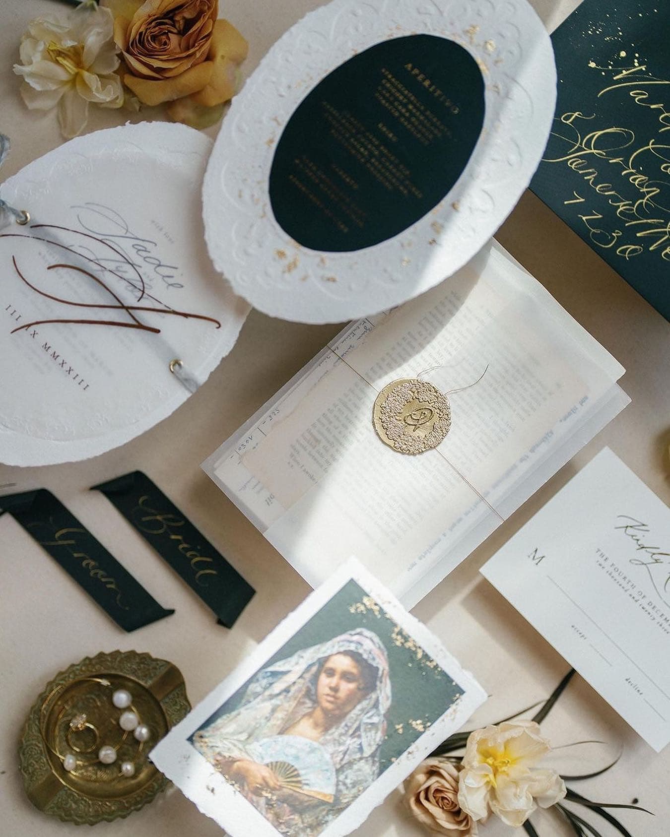
Stationery has a lovely irony, which is that it is paper and so it often looks flat and lifeless on more paper. Invitation suites, notebooks, prints and cards come alive on a surface with some tooth and depth, since the surface gives the paper an edge to rest against and a shadow to cast. Watch the value of your paper stock closely. Bright white card stock on a pale surface loses its edges, and a mid-value or darker surface makes those edges crisp.
Color is often the most expressive choice here. A deep green or a muted blue can make a cream suite feel botanical or coastal, and a pale warm surface can make kraft and earthy inks feel gentle and unified. Shoot stationery straight overhead, with the camera sensor parallel to the surface so the rectangles of each card stay true, and use a long enough lens to avoid bending the edges of the frame. A level on the camera hot shoe or the in-camera level helps more than any amount of correction later.

Ceramics and pottery
Ceramics are crafted objects whose glaze and clay body are the whole story, and they deserve a surface that feels like it belongs in the same studio. Glazes range from glossy to satin to raw, and they often carry subtle color variations that a busy surface would drown out. I like a surface with gentle texture and a quiet, related hue for ceramics, so a speckled cream bowl on a warm taupe, or a blue-glazed dish on a pale cool surface, where the surface repeats one note from the glaze and lets the piece carry the rest.
Glossy glazes show every reflection of your light and your room, so use a large soft source and look at the curve of the vessel from your camera position before you shoot. A black card held just outside the frame can add a defining dark line along the rim, which gives round forms their shape. For stacked plates and bowls, shoot a little above eye level of the stack as well as straight down, since the overhead view flattens them into circles and loses the craft of their walls.

I have seen moments like these many times, a glaze catching soft light as it rests on one of our painted surfaces, and watching a maker's craft settle against my own never stops moving me.
Clothing and textiles
Clothing is where most makers first discover that the surface needs to be larger than they expected. A folded shirt or a styled outfit laid flat can easily need a surface several feet across, and a busy texture under an entire garment quickly becomes overwhelming. The best flat lay background for clothes is usually calm, with low pattern and a value that separates from the fabric, so that the garment's cut, drape and color read first.
For a full outfit, a large sheet of paper on the floor or a broad, quiet backdrop laid flat is often the most practical choice, and one of our backdrops can rest on the floor and even be stepped on as you style, as long as you watch that it never creases, since any footprints lift with a dry rag and a white art gum eraser, and a fabric surface or a textured painted surface comes into its own for detail shots of a collar, a button placket, a knit or a label, where texture beside texture makes a rich frame. Steam the garment first, plan the folds, and shoot from a sturdy stand or ladder so the camera is level over the center of the piece.
Clothing brand work has enough nuance that I gave it a full post of its own. Our guide to fashion flat lay photography for clothing brands covers garment folding, styling and backdrop choices in detail, so I will leave the full method there.

Food and drink
Food is the one category where I must be most direct about the surfaces we make. Our surfaces are not food safe. Painted canvas and our fabric surfaces are made for styling and photography, and food should never be placed directly on them. When food is part of the scene, please set it on a plate, board, tray, marble slab or other food-safe vessel, or lay a sheet of parchment between the food and the surface, and treat the surface as the setting around the plates. Anything that has touched the surface should be treated as a prop only and never eaten.
With that boundary in place, a textured surface can be wonderful for food. Grey and blue-grey surfaces make fresh produce look crisp and vivid, warm neutrals make bread and pastry feel golden and comforting, and darker surfaces bring a moody, painterly quality to rich dishes and wine. Food generally loves back light or side light, since it reveals steam, glistening sauces and the translucence of fruit, so place your main light behind and to one side of the scene and fill gently from the front.
Spills are part of any food shoot. On painted surfaces, blot water-based marks right away with a damp cloth and avoid saturating the canvas, and on our stain resistant fabric, let the spill roll off and blot. Our post on how to clean and care for flat lay styling surfaces covers every surface type.

Flat Lay Texture Surfaces and Scale
One subtlety that catches many photographers is the relationship between the scale of the texture and the scale of the product. A surface that reads as a soft, painterly field behind a pair of shoes can look like rough terrain beneath a ring, because the camera is so much closer and the texture is magnified along with the product.
I think of three working distances. At the scale of clothing and full tablescapes, the camera is several feet above the surface, and even bold texture softens into a gentle pattern. At the scale of skincare, candles, stationery and ceramics, the camera is perhaps two to three feet away, and texture reads clearly but comfortably. At the scale of jewelry and small details, the camera may be inches away with a macro lens, and texture becomes landscape. For that closest work, choose the calmest area of a surface, or a surface with fine, even texture, and use a slightly wider aperture to soften whatever falls just beyond the product.
Light also changes the scale of texture. Light that rakes across the surface from a low angle exaggerates every ridge, and light from high above flattens it. If a surface reads as too busy, raise your light or add more diffusion before you abandon the surface altogether. If it reads as too flat, lower the light and bring it around to the side. Learning to dial texture up and down with light is one of the most freeing skills in product work, because it lets a single surface serve many products.
Building a Product Styling Surfaces Library
A working library of product styling surfaces does not need to be large. Many product photographers work with a small handful and come to know them deeply, the way a painter comes to know a favorite brush. A thoughtful library usually covers a range of values, so you always have a light, a mid and a dark option, and a range of undertones, so you can pair warm with warm, cool with cool, or set them against each other for contrast.
A gentle starting point might be a white or very pale paper for marketplace and clean catalog work, a warm mid-value painted surface for handmade goods and skincare, a cool or neutral painted surface for silver, glass and ceramics, a dark surface for drama and for pale products, and a stain resistant fabric surface for beauty products and scenes where spills are likely, with food always kept on its own plates. From there, add colors that belong to the brands you photograph most often.
Among our painted flat lays, the warm neutrals include Matera, a warm taupe with slightly cooler undertones, and San Miguel, a muted terracotta with soft golden-cream highlights. The cooler and blue family includes Chateau, a faint dove grey with subtle light blue highlights, and Havana, a soft blue with a mild watercolor effect and lightly textured patches of white like crumbling plaster. For drama, Vik is a charcoal-black with inky tones and heavy grit texture, and Monteverde is a deep viridian green with black overtones. Among our fabric surfaces, Buckwheat is a multi-toned greige vegan wool, Alder a multi-toned muted grey, and Anemone a vivid black velvet.
Size is worth considering as well. The Petite size suits small products and tight overhead frames, and the Standard size gives room for a styled grouping of several products with props. When we ship painted surfaces, up to three of the same size can share a single core, which also makes a lovely, compact way to carry a traveling kit from one client to the next.
Every colorway can serve a product beautifully, and when a product client is building a first library, one lovely trio we often suggest is Matera, a warm taupe with slightly cooler undertones, Chateau, a faint dove grey with subtle light blue highlights, and Vik, a charcoal-black with inky tones, so that a warm mid, a cool pale and a dark option are all within reach from the very first shoot.
Styling Products on Textured Surfaces
Once the surface is chosen, a few habits will help the product and surface feel like they belong together. Leave more negative space than feels natural at first, since a textured surface gives the empty areas of the frame something to hold, and that breathing room lets the product feel considered. Repeat one color from the product in a single prop, a sprig of greenery, a ribbon or a ceramic dish, rather than introducing many new colors. Keep props in a related material family, so natural linen, raw wood, stone and dried botanicals sit comfortably on painted surfaces, while polished acrylic and plastic often feel out of place against handmade texture.
Think about the edges of the surface too. On a tabletop surface, the edge must stay out of frame, so measure your frame before you style. A practical method is to set the camera, frame the empty surface, and place small pieces of tape at the corners of the frame on the surface, then style within those marks. With practice, those marks become second nature, and the styling flows more freely within them.
Keep the surface flat, and remember that a painted surface must never be creased or folded. In cold weather painted surfaces may stiffen, and rolling them gently in the opposite direction helps them relax. Small curls at the corners can be held with a discreet weight placed just outside the frame, or with a little removable adhesive such as museum putty, which is safe to use on a hand painted flat lay.
A Simple Workflow for Testing Surfaces Against a New Product
When a new product arrives in the studio, I suggest a short ritual before the real shoot begins. Set up your light as you plan to use it, then place the product on each candidate surface in turn and take the same frame on each one, with the same exposure and the same white balance. Lay the frames side by side on your screen, then view them again in black and white. Usually one or two surfaces separate themselves immediately, and you can then refine the styling on those alone.
Pay particular attention to how the camera renders color on each surface, since a surface can shift the camera's automatic white balance and pull the product color with it. Setting a custom white balance from a grey card under your light, and keeping it fixed across the test, means the product's true color is what you judge. For brands with exacting color standards, photograph a color reference card in the first frame of each setup so the edit can be matched to it later.
Keep notes on which surfaces worked for which products, since over time those notes become a guide to your own taste and to each client's brand.
Frequently Asked Questions
What is the best flat lay background for product photography?
The best flat lay background is one that contrasts with the product in value and supports it in texture and undertone. Matte surfaces suit glossy products such as skincare and jewelry, softly textured painted surfaces suit handmade goods such as candles, ceramics and stationery, and calm, large surfaces suit clothing. Pure white paper remains the standard for marketplace main images. Most photographers keep a small library with a light, a mid and a dark option in warm and cool undertones.
What is the best background colour for product photography?
For marketplace listings, the answer is usually pure white, since Amazon's main image guidelines, as summarized by Photoroom and Amazon's Seller Forums, call for a pure white background. For brand, website and social imagery, choose a color that contrasts with the product in value and harmonizes with it in undertone. Warm products such as gold, amber glass and terracotta tend to look best on warm neutrals, while silver, clear glass and blue ceramics tend to look best on cool or neutral surfaces.
What is the best flat lay background for clothes?
Clothing needs a surface large enough to hold the whole garment and calm enough that the cut and color read first. A large sheet of paper on the floor or a broad, quiet backdrop laid flat works well for full outfits, as long as the backdrop is never creased. Textured painted or fabric surfaces are lovely for close detail shots of collars, knits, buttons and labels. Choose a value that separates from the fabric, and steam garments before styling.
Are paper flat lay backgrounds good for product photography?
Paper is affordable, comes in many colors, and gives an even matte field that suits clean catalog and marketplace work. Savage Widetone paper, for example, is sold in roll widths that include 26, 53 and 107 inches. Paper creases, scuffs and stains easily, so soiled lengths are torn off and replaced, and it carries no texture of its own. Many photographers use paper for white-background images and textured surfaces for brand and lifestyle work.
Can I put food directly on a painted flat lay surface?
No. Chasing Stone surfaces are not food safe, so food should never be placed directly on them. Set food on a plate, board, tray or other food-safe vessel, or use a sheet of parchment as a barrier, and let the surface act as the setting around it. Treat anything that has touched the surface as a prop only. Blot water-based spills promptly with a damp cloth, and on stain resistant fabric, let spills roll off and then blot.
How big should a flat lay surface be for product photography?
Size depends on the product and the number of items in the frame. A single skincare bottle, candle or piece of jewelry fits comfortably on a smaller surface such as our Petite size of 26 by 20 inches. A grouping of several products with props needs more room, which is where a Standard size of 35 by 28 inches helps. Full garments usually need a larger surface than either, such as wide paper or a backdrop laid flat.
Find the Surface Your Products Have Been Waiting For
Every product you photograph was dreamt up and made by someone who cared about it, and the surface beneath it is a small way of honoring that care. I hope this guide helps you look at your own products with fresh eyes, noticing their texture, their value and their undertone, and choosing a surface that lets those qualities speak.
If you would like to see the full range of colorways we paint, each one painted entirely by hand in Orange County and inspired by firsthand experiences in near and faraway pockets of the world, our hand painted flat lay collection is a lovely place to begin, and our stain resistant fabric flat lays are there for the products that live closer to spills. What will you set upon your next surface, and what story will it tell?
Shop the look