
How to Choose Backdrop Colors That Complement Every Skin Tone
Updated on Apr. 17, 2026
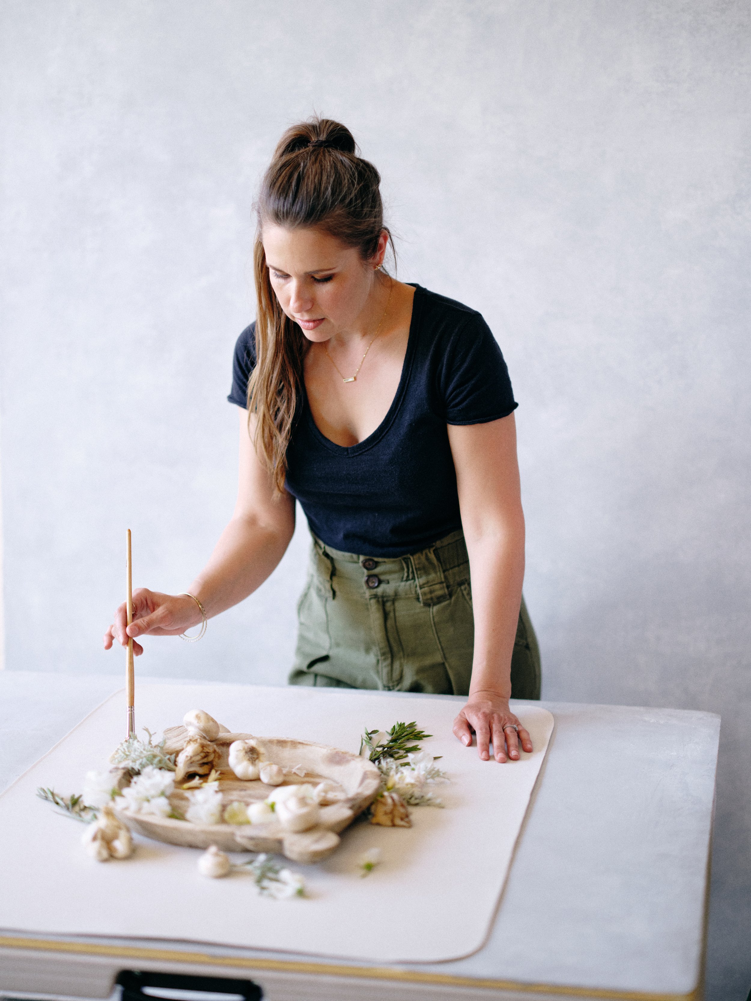
I once shot an entire bridal editorial on a backdrop I was convinced would be my signature color. It was a deep teal green. Moody. Dramatic. Looked absolutely stunning in my studio under controlled lighting with no one standing in front of it.
The moment my first model stepped onto set, something was wrong. Her skin had a sickly greenish cast along her jawline and neck. The teal was bouncing colored light directly onto her face, and no amount of white balance adjustment could fully fix it. We finished the shoot. I delivered the images. And I spent four hours in post trying to neutralize skin tones that should have been beautiful straight out of camera.
That was the shoot that taught me something I'd been ignoring: a backdrop doesn't just sit behind your subject. It actively participates in how their skin photographs. The color of your backdrop reflects light, influences white balance, and creates color casts that either flatter or fight the person standing in front of it. For a complete overview of photography backdrops, start with our ultimate backdrop guide.
This isn't something most photographers think about until it bites them. Then they think about it constantly.
If you already understand the fundamentals of color theory (the wheel, harmony types, warm vs. cool relationships), this guide builds on that foundation with the specific, practical knowledge of how backdrop colors interact with human skin. If you want to brush up on the color basics first, our Color Theory for Photographers guide covers that ground thoroughly.
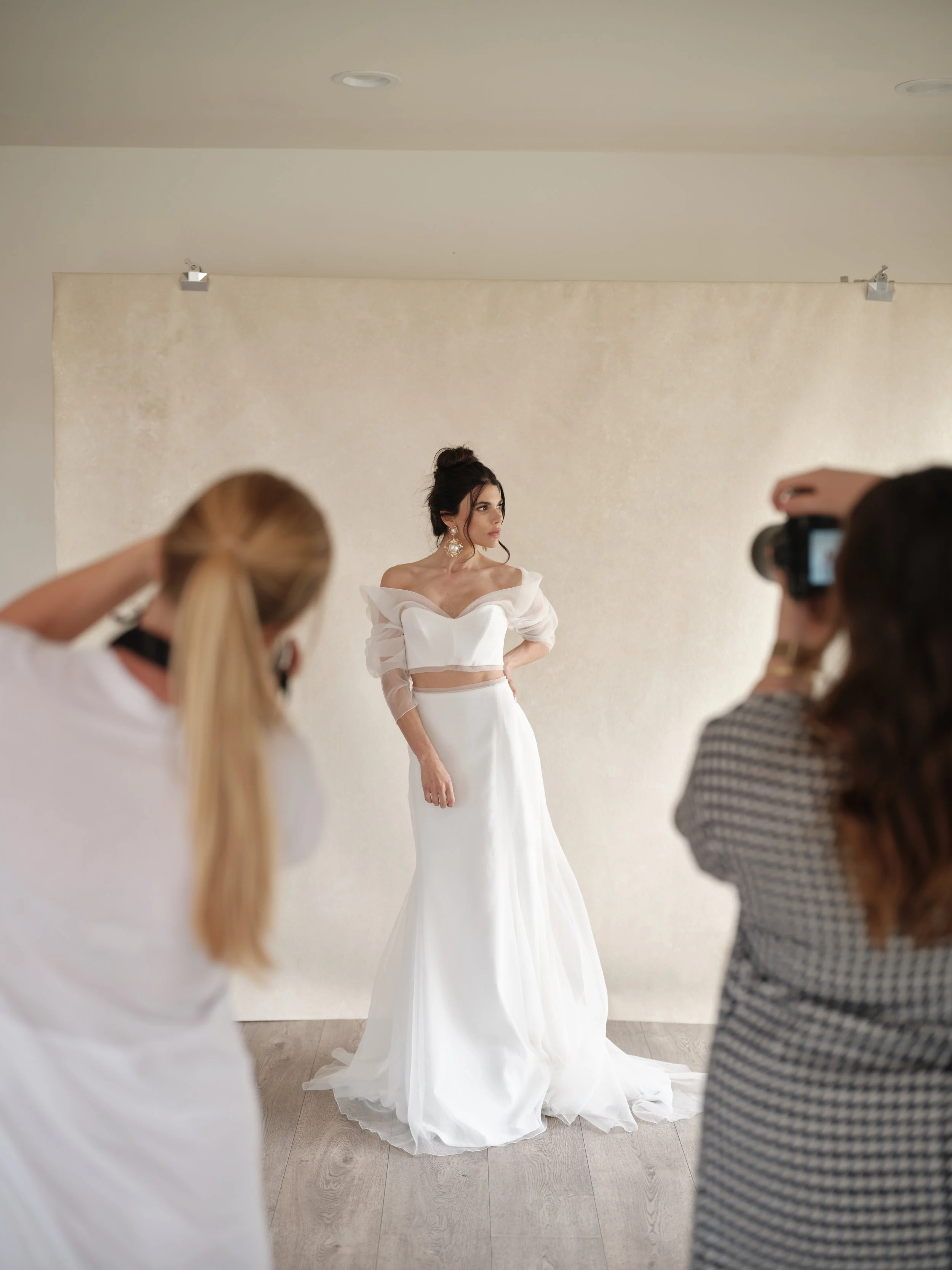
Notice how the warm neutral backdrop disappears behind the white gown without competing for attention? That is not an accident. Before your next bridal session, make sure your backdrop color is working with your client's skin tone, not against it. The wrong choice means hours of skin tone correction in post.
Why Skin Tone Matters More Than Any Other Variable in Backdrop Selection
You can choose a backdrop that photographs beautifully on its own. You can choose a backdrop that complements the wardrobe, the flowers, the set design. But if it doesn't flatter the person standing in front of it, none of that matters.
The person is the subject. Their skin is the largest continuous surface area in your frame. And if their skin looks off, the entire image feels wrong, even if the viewer can't articulate exactly why.
Here's what makes this genuinely tricky: skin tone isn't one variable. It's at least three working simultaneously.
Surface color is what we casually call someone's complexion. Fair, light, medium, olive, tan, deep, dark. This is the most obvious variable and the one most photographers consider when choosing backdrops.
Undertone is the subtle warmth or coolness beneath the surface. Someone with fair skin can have warm (golden, peachy) undertones or cool (pink, rosy, bluish) undertones. Someone with deep skin can lean warm (amber, caramel) or cool (mahogany, espresso with blue-red undertones). Undertone is less obvious than surface color but arguably more important for backdrop selection, because it determines which colors create harmony and which create visual friction.
Overtone is the additional color influence sitting on top of the base. Redness, sallowness, sun damage, freckles, rosacea. These are the things your client is most self-conscious about, and your backdrop color can either minimize them or put them on a billboard.
The reason some backdrops seem to magically "work with everyone" while others are hit-or-miss comes down to how they interact with these three layers. Let's break that interaction down.
The Science of Reflected Color (Why Your Backdrop Is Secretly Lighting Your Subject)
Before we get into specific colors, you need to understand a phenomenon that many photographers overlook entirely: color contamination through reflected light.
When light hits your backdrop, some of that light bounces back toward your subject. If your backdrop is a saturated color, that reflected light carries color information with it. A red backdrop bounces warm red light onto your subject's shadow side. A blue backdrop pushes cool blue light onto skin. A green backdrop (as I learned the hard way with my teal) casts green onto jawlines, necks, and any surface facing the backdrop.
This effect is strongest when three conditions are present: the subject is close to the backdrop, the backdrop is large relative to the frame, and the backdrop is highly saturated. It's weakest when the subject is far from the backdrop, the backdrop is muted or neutral, and the lighting on the subject is strong enough to overpower the bounce.
This is why neutral and low-saturation backdrops are so much more forgiving for portrait work. They still bounce light, but that bounced light carries minimal color information. The result is clean skin tones that need minimal correction in post.
It's also why hand-painted surfaces with subtle tonal variation tend to produce better skin tones than solid, uniform-color backgrounds. The variation breaks up the reflected light, preventing a single concentrated color cast from dominating your subject's shadow areas. I didn't understand this until I started comparing the same subject photographed on a flat vinyl backdrop versus a hand-painted canvas in a similar hue. The vinyl produced noticeable, uniform color contamination. The canvas, with its natural texture and tonal shifts, produced significantly cleaner skin because the reflected light was more complex and blended.
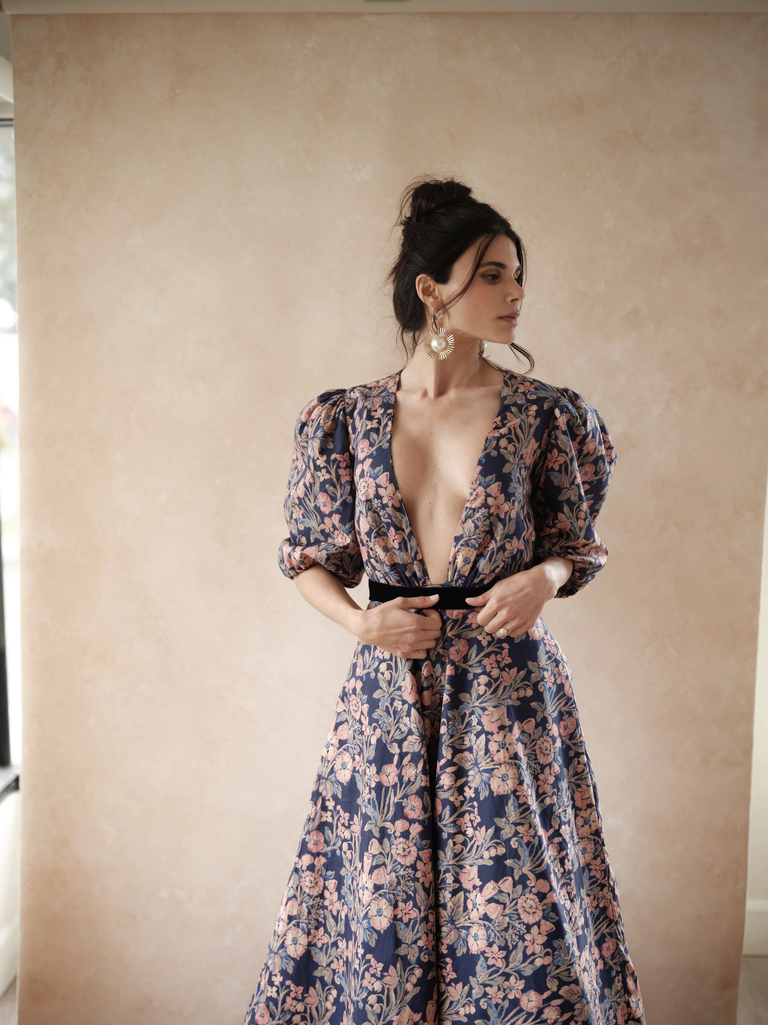
A warm neutral backdrop earns its place in every portrait studio because of moments like this. Bold floral pattern, cool-toned dress, warm skin. The backdrop is doing the quiet work of keeping all three elements in harmony without drawing attention to itself. That is what the right backdrop color is supposed to do.
Think of it this way: a solid-color surface reflects like a mirror, pushing one pure hue at your subject. A hand-painted surface reflects like stained glass, pushing a blend of related tones that your subject's skin absorbs more gracefully.
Understanding Undertones: The Variable That Changes Everything
Here's a scenario that happens at every photographer workshop I teach: someone asks "what backdrop color works best for portraits?" as though there's one answer. There isn't. Because a backdrop that makes one person glow can make another person look washed out or ruddy, depending on their undertone.
How to Identify Undertones in Your Clients (In About 30 Seconds)
You don't need to be a dermatologist. You need to notice three things, and you can do it during the first minute of a session while you're making small talk.
Look at the veins on the inside of their wrist. Greenish veins suggest warm undertones. Bluish or purple veins suggest cool. If you see both, they're likely neutral.
Notice which metal flatters them. If they're wearing gold jewelry and it looks harmonious with their skin, they lean warm. If they're wearing silver and it looks right, they lean cool. If both work, neutral.
Look at how their skin responds to light. Warm undertones tend to have a golden or peachy luminosity in the highlights. Cool undertones show more pink or rosy brightness. This is most visible on the forehead and cheekbones where light naturally hits.
I run this quick mental checklist during setup or during the first few test shots. It takes half a minute and directly informs which backdrop I reach for, or how I adjust my lighting if the backdrop is already set.
How Undertones Interact with Backdrop Colors
The core principle is this: backdrop colors that share or gently complement your subject's undertone produce harmonious, flattering results. Backdrop colors that clash with the undertone create visual friction that reads as "something's off with the skin."
Warm-undertone subjects look best against warm backdrops: tans, warm taupes, terracottas, warm grays, soft browns, muted warm greens. These surfaces create a tonal environment that reinforces the skin's natural warmth. The warmth in the backdrop and the warmth in the skin have a conversation that feels cohesive. Cool backdrops don't necessarily look bad on warm-undertone subjects, but they create more contrast, which can read as dramatic or slightly disconnected.
Cool-undertone subjects look best against cool or neutral backdrops: soft grays, dusty blues, muted sage greens, lavenders, cool taupes. These surfaces harmonize with the pink or blue-red base in the skin without amplifying it. The most common mistake I see with cool-undertone subjects is placing them against very warm backdrops, which can make their skin appear sallow or washed out by contrast.
Neutral-undertone subjects are your wildcards. They can handle both warm and cool backdrops comfortably, which is why they tend to look good in everyone's portfolio regardless of the photographer's preferred palette. If you photograph a high volume of diverse clients and want maximum versatility, building your collection around colors that work for neutral undertones means you'll rarely miss.
Backdrop Colors That Flatter Across the Full Spectrum
Now let's get specific. Not every photographer can afford a different backdrop for every skin tone and undertone combination. You need workhorse colors that perform across the widest range of subjects with the least post-processing headache.
The Universal Warmth Zone: Warm Taupes and Soft Browns
If I could only have one backdrop for all portrait work for the rest of my career, it would live in the warm taupe to soft brown range. Colors like Bentonite, Limestone, and Mica sit in this zone.
Here's why they work universally: warm taupes contain a balanced blend of warm and cool pigments. They're warm enough to flatter golden and amber undertones without going so warm that they overwhelm cool or neutral skin. The brown base contains both red and yellow, which are the two pigment families already present in all human skin to varying degrees. It's not magic. It's pigment chemistry.
I photographed a family of six last fall with skin tones ranging from the mother's very fair, cool-pink Irish complexion to the father's deep warm-brown Nigerian skin and four kids who fell everywhere in between. One backdrop. Bentonite. Every single person's skin looked luminous. The warm taupe complemented the father's warmth while the gray undertone harmonized with the mother's cool tones. I didn't do a single selective skin correction in post. Not one.
That session is the reason I tell every portrait photographer I talk to to start their collection in the warm taupe family.
Earthy Mid-Tones: Browns and Terracottas
Moving warmer and deeper, colors like Sandstone, Clay, and Travertine create rich, editorial warmth that's particularly beautiful for medium and deep skin tones. The earthy pigments in these backdrops relate naturally to the melanin warmth in darker skin, creating a tonal harmony that feels grounded and luxurious.
Before your next portrait session, ask yourself if your backdrop is doing everything it should. SANDSTONE handles cool-toned subjects, warm-toned subjects, bold florals, white gowns, and everything in between. If your current backdrop is making you think twice about which clients to book, it is time to upgrade.
For fair-skinned subjects, these warmer backdrops still work but they create more contrast. The subject pops forward from the background more dramatically. This can be exactly what you want for editorial or fashion-forward portraiture. It's less ideal for soft, romantic bridal work where you might want the subject and background to melt into each other.
One thing I've noticed over years of shooting on terracotta and clay-toned surfaces: they make warm-toned jewelry (gold bands, rose gold accessories) look incredible. If you photograph brides or portrait clients who wear warm metals, an earthy backdrop creates a cohesive color story from background to smallest detail. Everything speaks the same tonal language.
Cool Neutrals: Grays and Dusty Blues
Cool backdrops like Slate, Graphite, and Celestite are the classic portrait choice for a reason. Gray, in particular, is theoretically the most "neutral" backdrop because it adds no color to reflected light. It just bounces desaturated light back at your subject.
In practice, grays flatter cool-undertone subjects beautifully and work well for neutral undertones. Where they can stumble is with very warm-toned subjects, especially in warm lighting conditions. Warm skin against cool gray can create a visual disconnect where the subject looks like they were composited onto the backdrop rather than photographed in front of it. It's subtle. Most clients won't notice. But you'll feel it when you're editing, and it'll bother you.
Dusty blues like Celestite and Lapis photograph beautifully with both fair and deep skin tones, but pay attention to undertone. A cool dusty blue is gorgeous behind cool-undertone skin. That same blue behind strongly warm-undertone skin can feel like a slight mismatch. Not a disaster. Just not seamless.
Greens: The Surprisingly Versatile Family
Green backdrops have an interesting relationship with skin because green sits opposite red on the color wheel, and all human skin contains red pigment. This means green backdrops create natural complementary contrast that makes skin appear more vibrant and alive. It's the same reason salads look better on green plates than white ones. Complementary colors amplify each other.
The critical variable is saturation. Highly saturated greens (my teal disaster, remember) bounce too much green light onto skin and create visible color contamination. Muted, dusty greens like Celadonite and Olivine retain that complementary vibrancy effect without the color-cast problem. The saturation is low enough that the reflected light stays relatively clean while the visual contrast still makes skin glow.
Sage and olive tones are particularly beautiful for warm-undertone subjects because the yellow component in green harmonizes with the golden warmth in the skin. For cool-undertone subjects, a cooler or darker green like Serpentine picks up the cool notes without clashing.
I've shot maternity sessions, senior portraits, and bridal work on muted greens and the skin consistently looks luminous across all of them. Greens have quietly become one of my most-reached-for backdrop families specifically because of how reliably they interact with skin.
Pinks, Mauves, and Purples: Beautiful but Requires Awareness
This is where photographers get tripped up most often. Pink and mauve backdrops like Rose Quartz, Ametrine, and Lavender Quartz are romantic and editorial. But pink reflects pink light onto your subject, and skin already contains pink and red pigments.
For fair-skinned subjects with cool (pink) undertones, a pink backdrop can amplify existing redness or ruddiness. If your subject has rosacea or is prone to flushing, a pink backdrop will make it more visible. Not subtly. Noticeably. I shot a bridal portrait series on a rosy backdrop early in my career and the bride's cheeks and nose, which had barely-there redness in person, looked sunburned in the images. It was a painful lesson.
The workaround: choose a very muted, desaturated pink or mauve (which is exactly where colors like Ametrine live), increase the distance between subject and backdrop to minimize reflected color, or use strong directional key lighting that overpowers the bounced pink.
For medium and deep skin tones, pinks and mauves are significantly more forgiving because the reflected pink gets absorbed into the skin's existing pigment rather than sitting visibly on the surface. Some of the most stunning editorial portraits I've ever seen were deep skin tones against soft mauve backdrops. The contrast between warm brown skin and cool pink-purple is genuinely breathtaking. If you photograph clients with deep skin and you're not experimenting with mauves, you're missing out on some of the most beautiful portrait work available to you.
Rose Quartz, Rhodonite, and Hematite sit at three different points on the pink and mauve spectrum for a reason. A barely-there blush handles fair skin differently than a deeper dusty rose. Knowing which one to reach for based on your client's undertone is what separates a flattering portrait from one that needs significant skin correction in post.
The Real-World Challenge: Couples and Groups with Different Skin Tones
This is the scenario every wedding and portrait photographer faces regularly, and almost no articles address it. You have two people (or an entire family) standing in front of one backdrop, and their skin tones are meaningfully different. Maybe drastically different.
You can't swap backdrops mid-shot. You need one color that works for both.
I remember a couples session at a boutique hotel in Santa Barbara last year. She was Scandinavian with porcelain-fair, pink-undertone skin. He was Dominican with deep olive-warm skin. Beautiful couple. Enormous skin tone range. I'd brought three backdrops and needed to choose one for their portrait session.
My first instinct was a cool gray. Safe, right? Neutral for everyone. But when I did a quick test shot, his skin looked fantastic (the warmth popped against the cool background) while her skin looked slightly washed out. The cool gray was doubling down on her already-cool complexion, draining the warmth from her face.
I switched to Limestone, a warm light tan. Test shot. His skin still looked rich and luminous (the warm backdrop harmonized with his warmth). Her skin now had a gentle glow (the warm backdrop was lending just enough warmth to counteract her naturally cool cast). Both faces looked healthy and present. That was the backdrop for the session.
The Overlap Strategy
Think of each person's ideal backdrop palette as a circle on a Venn diagram. There's always some overlap, even when the subjects look completely different. Your job is to find the backdrop that lives in that overlapping zone.
For couples where one person has fair, cool skin and the other has deep, warm skin, the overlap zone is almost always warm neutrals. Something like Bentonite or Limestone works because the warmth complements the deeper skin while the neutral base doesn't fight the cooler skin.
Muted sage green is another reliable overlap. The complementary contrast effect benefits all skin tones, and the low saturation prevents any single complexion from looking wrong.
What to avoid for diverse couples and groups: very warm backdrops (will flatter the warm-toned partner and potentially wash out the cool-toned one), very cool backdrops (the reverse problem), and any saturated color that creates dramatically different color casts on light skin versus dark skin in the same frame.
Lighting as the Equalizer
When you're working with diverse skin tones on a single backdrop, your lighting choices become your most important tool. Strong, clean key lighting from the front minimizes the influence of backdrop-reflected color on both subjects. The more light you put on the subjects relative to the ambient bounce from the backdrop, the less the backdrop's color touches their skin.
Our guide to lighting hand-painted backdrops covers the technical side of this in depth.
The Wedding Day Rescue: What to Do When the Backdrop Isn't Ideal for This Client
You've read this entire guide. You understand undertones. You've built a smart collection. And then you show up to a wedding and realize the bride has a skin tone and undertone combination that doesn't love the backdrop you brought.
It happens. Here's how to handle it without panicking.
Increase the Distance
The simplest fix is pulling your subject further from the backdrop. Even two or three extra feet dramatically reduces the intensity of reflected color contamination. You'll lose some background blur (the backdrop will be slightly more in focus), but the skin tone improvement is worth the trade-off. If you're shooting at f/2.8 or wider, the backdrop will still read as soft and textured even at increased distance.
Overpower with Key Light
If you can't increase distance (small room, limited space), increase the power of your key light relative to ambient. A stronger light on the subject's face means the skin's illumination is dominated by your clean light source, not by the colored bounce from the backdrop. Even adding a reflector on the subject's shadow side to push clean white light toward their face can make a meaningful difference.
Rotate or Reposition the Backdrop
Hand-painted backdrops have tonal variation. Different areas of the same backdrop have slightly different warmth and saturation. If a particular zone is casting unflattering reflected light, try repositioning your subject in front of a different area of the canvas. A lighter, less saturated area will bounce less color. I've solved skin tone issues on set simply by shifting the backdrop six inches to the left.
Embrace It as a Creative Choice
Sometimes the contrast between skin and backdrop is actually beautiful, just different from what you originally planned. A warm-undertone subject against a cool backdrop creates visible tonal contrast. If you lean into it with confident lighting and intentional posing, it can look strikingly editorial rather than "wrong." Some of my most-liked Instagram images have been happy accidents where the skin-to-backdrop relationship wasn't "flattering" in the traditional sense but was visually arresting.
Post-Processing as a Last Resort
If all else fails, targeted skin tone correction in post is straightforward. In Lightroom, use the HSL panel to shift the hue and saturation of the orange and red channels (where skin tones live). A small hue shift toward yellow warms up skin that's reading too pink or cool. A small saturation reduction cleans up any color cast from backdrop bounce. This should be a last resort, not your plan. But knowing you can fix it takes the pressure off.
A Practical Skin-Tone Backdrop Reference
After years of shooting diverse subjects, I've developed a mental framework I use on every session. It's not a rulebook. People are too varied for rigid rules. But it gives me a reliable starting point that I adjust based on the specific client and lighting conditions.
For fair skin with warm undertones, I reach for warm taupes, soft browns, and muted sage greens first. These surfaces reinforce the golden warmth in the skin without overpowering it. I'm cautious with very cool grays (can wash them out) and saturated pinks (can amplify any ruddiness).
For fair skin with cool undertones, I gravitate toward cool grays, dusty blues, muted sage, and soft lavenders. These harmonize with the pink-rosy base without adding more pink than the skin can handle. I'm careful with strongly warm terracottas, which can make cool fair skin look sallow by comparison.
For medium skin with warm undertones, the range opens up. Terracottas, warm browns, olive greens, warm taupes, warm grays. The melanin provides enough depth that most colors work. I pay attention mainly to saturation: at close range, highly saturated colors can still cause contamination.
For medium skin with cool undertones, I favor cool grays, muted sage, dusty blues, soft mauves, and neutral taupes. Very warm orangey backdrops at close range are the main combination I watch out for.
That cool gray backdrop behind her is doing exactly what it should for medium skin with cool undertones. Before your next session, take 30 seconds to identify your client's undertone. The backdrop you reach for next will either make their skin glow straight out of camera or cost you an extra hour in post.
For deep skin with warm undertones, nearly everything works beautifully. Rich browns, terracottas, warm taupes, olive greens, dusty mauves. The richness and depth of the melanin harmonizes with an incredibly wide range of backdrop colors. Some of the most stunning portrait work you'll ever shoot happens when deep warm skin meets a confident backdrop choice. Don't default to safe neutrals every time. Experiment.
For deep skin with cool undertones, cool grays, deep greens, dusty blues, muted purples, and neutral taupes create the most harmonious results. Very warm-leaning backdrops can occasionally clash with the cool undertone, so I tend to start neutral and warm up gradually.
For neutral undertones at any skin depth, you're working with the most versatile canvas. Both warm and cool backdrops photograph well. Start with warm taupes (the universal sweet spot) and expand your range based on your creative vision and the mood of the session.
Common Skin-Tone Mistakes and How to Avoid Them
Choosing Backdrops Based on How They Look Empty
This is the mistake I opened this article with, and it remains the most common one I see. A backdrop can look breathtaking in a product photo or on an empty studio wall and still be terrible for portraiture if it casts unflattering reflected light on skin. Always evaluate a backdrop with a person in front of it, ideally under the lighting conditions you'll actually be shooting in. Even a quick phone selfie of yourself standing in front of the surface tells you more than any product photo ever will.
Matching the Backdrop to the Wardrobe Instead of the Skin
Wardrobe coordination matters. But when the backdrop flatters the outfit and not the face, you've made the wrong priority call. The face is what people look at first, last, and longest. Always optimize for skin tone, then coordinate wardrobe within that framework. I've had stylists push for backdrop choices that perfectly matched a dress while making the model's skin look terrible. The dress looked great. Nobody noticed because all they could see was the skin.
Using High-Saturation Colors for Close-Up Portraiture
The closer your subject is to the backdrop, and the tighter your crop, the more the backdrop's color influences their skin. A saturated blue or green that looks perfectly fine for a full-length shot can create obvious color contamination on a headshot where the subject is two feet from the surface. For close-up work, always lean toward lower saturation.
Ignoring the Lighting-Backdrop-Skin Triangle
Backdrop color, lighting color, and skin undertone form a triangle. Change any one variable and the other relationships shift. A warm backdrop in warm late-afternoon window light creates double-warmth that can push skin tones toward orange. A cool backdrop in cool overcast light can make fair skin appear gray or lifeless. The best results come from balanced triangles where your light and backdrop gently complement the skin rather than both pushing the same direction at once.
Assuming "Flatters All Skin Tones" Means "Looks Identical on Everyone"
I'll be honest here, because I've seen this shortcut in our own product descriptions: no backdrop is truly universal. Warm taupes come closest, which is why they're the most popular portrait backdrops in the industry. But "closest" doesn't mean "identical." A warm taupe looks slightly different behind cool-undertone skin than behind warm-undertone skin. The difference is small enough that the backdrop works for both. But acknowledging that difference makes you a better photographer because you'll adjust your lighting and distance to optimize for each client rather than assuming one setup handles everything.
Frequently Asked Questions About Backdrop Colors and Skin Tones
What color backdrop is most universally flattering for all skin tones?
Warm taupes and warm mid-grays come closest to universally flattering. Colors in the taupe family contain a balance of warm and cool pigments that complement both warm and cool undertones without clashing with either. A warm taupe like Bentonite or a light tan like Limestone will flatter the widest range of clients with the least amount of post-processing correction needed.
Why does my backdrop make my subject's skin look green (or red, or blue)?
Your backdrop is reflecting colored light onto your subject through a phenomenon called color contamination. It happens most with saturated backdrop colors, close subject-to-backdrop distances, and large backdrop coverage areas. The fix: switch to a more neutral or muted backdrop, increase the distance between subject and backdrop, or overpower the reflected color with stronger directional key lighting on the subject.
What backdrop color is best for photographing dark skin tones?
Deep skin tones with warm undertones look particularly stunning against rich browns, terracottas, warm taupes, and muted greens. The melanin warmth creates beautiful harmony with earthy tones. Deep skin with cool undertones pairs well with cool grays, dusty blues, and muted purples. In general, deep skin tones are the most versatile and photograph beautifully against the widest range of backdrop colors.
What backdrop color should I avoid for fair skin?
Strongly saturated colors, since fair skin shows reflected color cast more visibly than darker skin. Specifically, be cautious with saturated pinks and reds (they amplify redness and rosacea), saturated greens at close range (visible green cast on jawline and neck), and very warm orangey tones (can make fair cool-toned skin look sallow). Muted, desaturated versions of these same colors are usually fine because the reflected light carries much less color information.
How do I choose a backdrop when photographing a couple with very different skin tones?
Find the "overlap zone" between their ideal palettes. Warm taupes, warm mid-grays, and muted sage greens are the most reliable overlap colors for diverse couples. Avoid strongly warm or strongly cool backdrops, as these will flatter one partner at the expense of the other. Strong, clean front lighting also helps minimize the backdrop's color influence on both subjects equally.
Does backdrop texture affect how skin tones photograph?
Yes, meaningfully. Hand-painted surfaces with natural tonal variation bounce more complex, blended light back toward the subject compared to flat, uniform-color surfaces. This blended reflected light is more forgiving across different skin tones because it doesn't push a single concentrated hue onto the skin. It's one of the practical reasons hand-painted canvas outperforms vinyl or solid-color paper for portrait work with diverse subjects.
Should I match my backdrop to my client's wardrobe or their skin tone?
Always prioritize skin tone. The face is where the viewer's eye goes first and stays longest. A backdrop that flatters the outfit but creates an unflattering skin cast is a poor trade-off every time. Optimize for skin tone first, then coordinate wardrobe within that framework.
How do I fix bad skin tones caused by my backdrop in post-processing?
In Lightroom, use the HSL panel to shift the hue and saturation of the orange and red channels where skin tones live. A small hue shift toward yellow warms up skin that reads too pink or cool. A small saturation reduction cleans up color cast from backdrop bounce. In Photoshop, a targeted Hue/Saturation adjustment layer on the skin areas gives you more precise control. But treat post-processing as a last resort. Getting the skin tone right in camera through proper backdrop and lighting choices saves significant time and produces more natural results.
We hear this from photographers all the time: 'My backdrop looks fine but the skin just feels a little off.' Cool gray is one of the most misunderstood backdrop colors because it works beautifully for some clients and creates a subtle disconnect for others. The difference almost always comes down to undertone.
Build a Backdrop Collection That Flatters Every Client Who Walks Through Your Door
Understanding how color interacts with skin is what separates photographers who consistently produce luminous portraits from those who spend hours correcting skin tones in post. The right backdrop doesn't just sit behind your subject. It actively participates in making them look their best.
Every Chasing Stone backdrop is hand-painted by Jennifer in our Orange County, California studio on premium cotton canvas. The subtle tonal variation in each surface creates complex, forgiving reflected light that flatters a wider range of skin tones than flat, uniform alternatives. And every color in our collection has been tested across diverse subjects in real shooting conditions, not just photographed empty on a studio wall. Learn more in our complete photography backdrop guide.
For guidance on what size backdrop works for your portrait specialty, our backdrop sizing guide covers the decision in detail. For a complete walkthrough of building your collection strategically by session type, our portrait photography backdrop guide maps out the path.
Explore the full collection of hand-painted canvas backdrops,hand-painted flat lay surfaces, and spill-proof fabric flat lay mats at chasingstone.com.

Creators of premium photography backdrops and styling surfaces
Trusted by thousands of discerning creatives worldwide
Every piece is handcrafted with intention in Orange County, California